The Badacsony, deep tones, soil and a characteristic flavor all on one label. Studio NUR gave life to a new label design for renewing Sike Balázs Pincéje winery, placing poetry and maximalism in the center of the label’s visual world. Let’s see the details.
Balázs Sike has been creating his dynamic and light SKIZO wines since 2010, at the same time, he also started to experiment with wines built on characteristics of the production area with his wife, Réka Velényi, a few years ago. This is how the latest premium collection of the winery, the Sike Balázs pincéje selection came to life, in which, compared to the SKIZO classic wines, modernism and technology are forced to take a back seat while the area of production, the vine variety and longer ageing come into the spotlight.
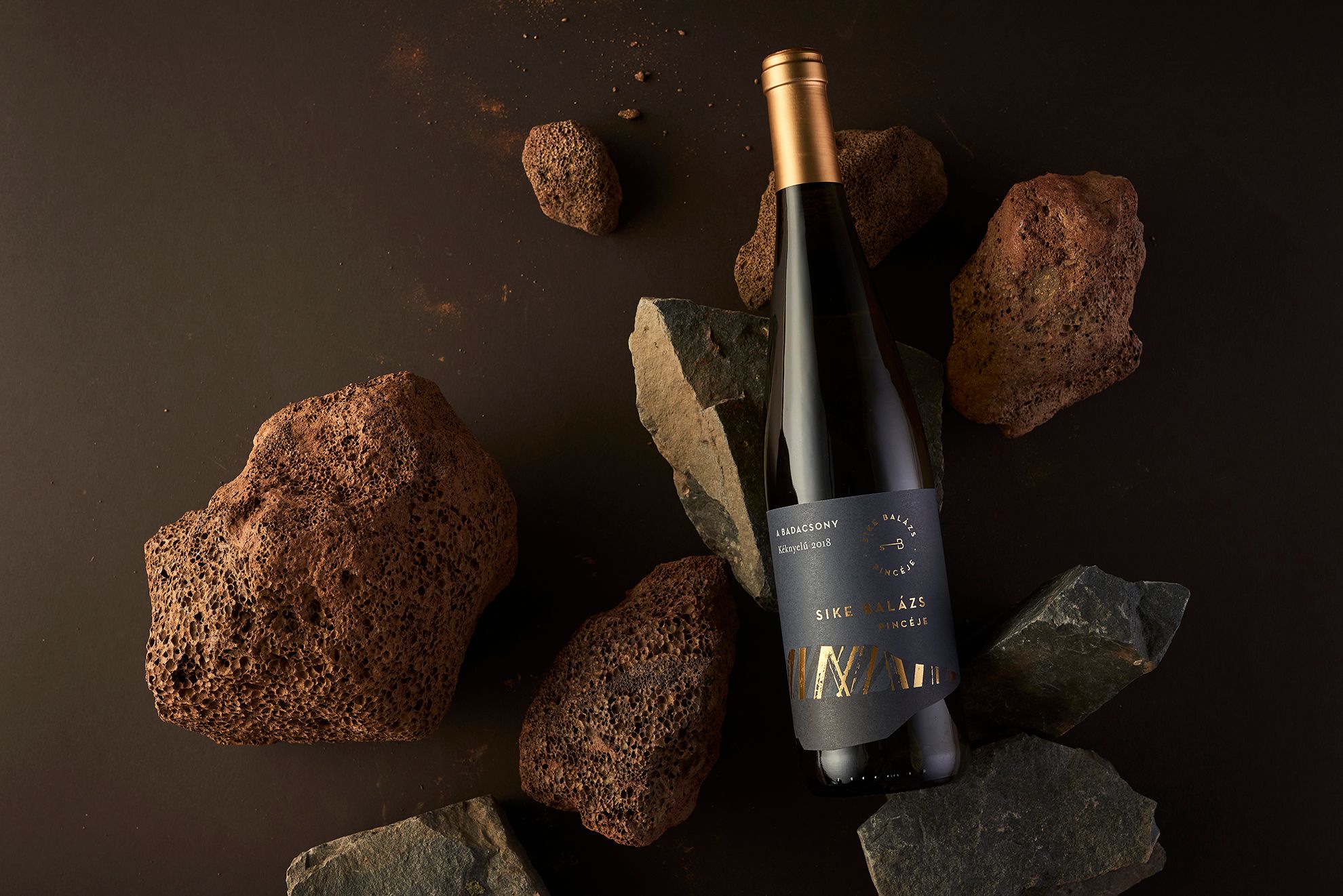
After the visual image of the series titled HEGYEINK, studio NUR designed a new label, putting the terroir nature (the scent and taste resulting from the combined features of the soil, the micro-climate and the land) of the selection into the center of attention.
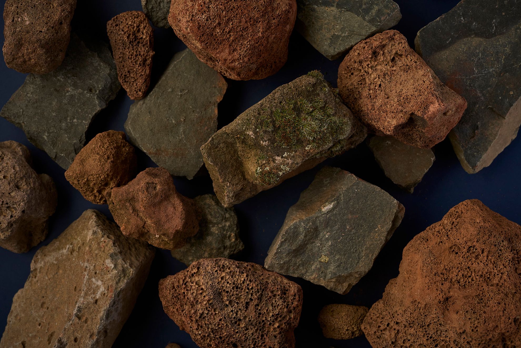
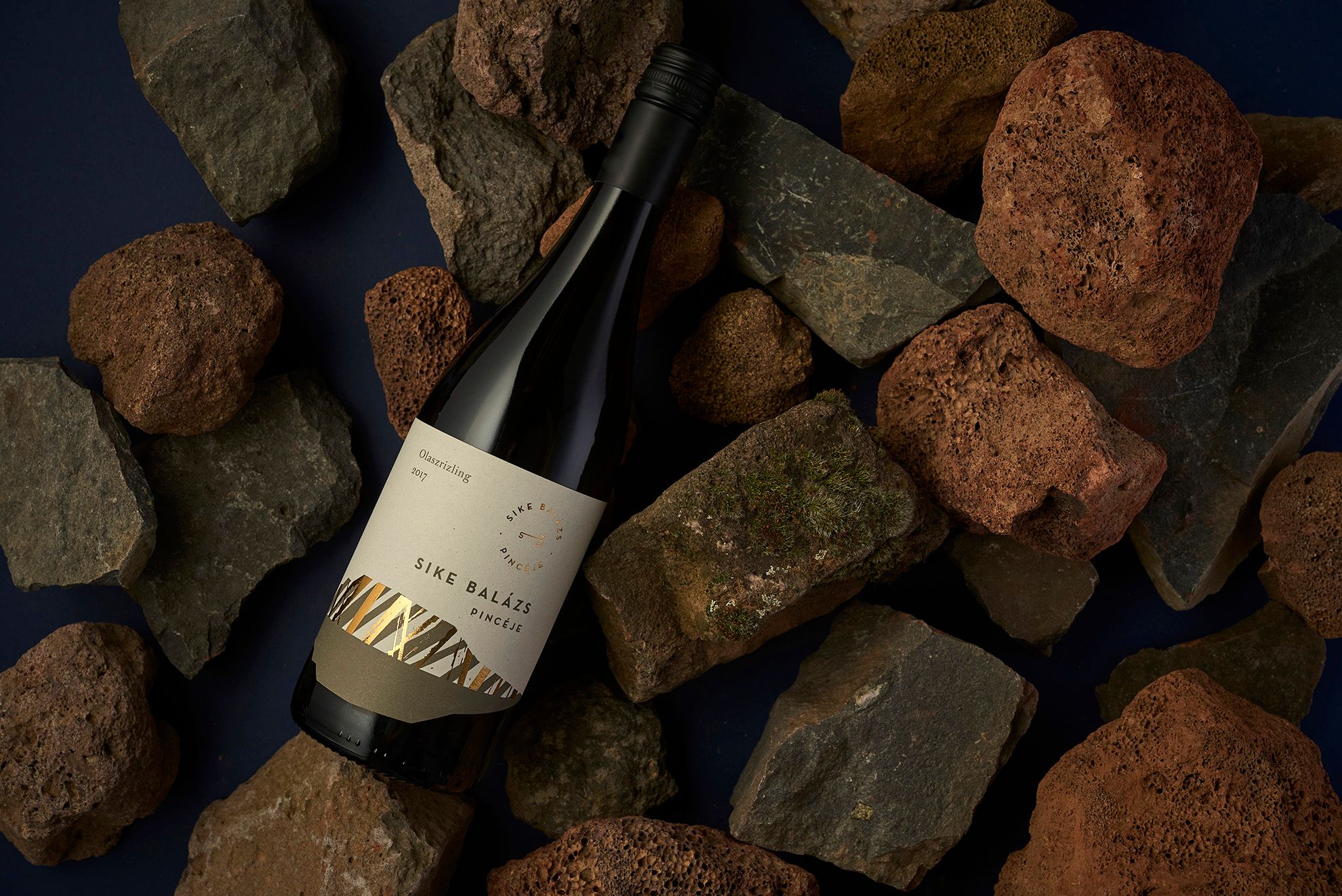
The graphics of the label display the characteristic features of Badacsony in an abstract manner, with particular attention to the vertical rhythm of basalt organs, framed by the characteristic silhouette of the monadnock. The various types of wines are matched with various earthy tones, determined mainly by the sense of color triggered by the given wine for Balázs Sike, the owner of the winery. The gold-silver hot foil stamping in contrast with the deep tones enhances the premium nature of the wines, while the hierarchy between them is further emphasized by the dark colored labels.

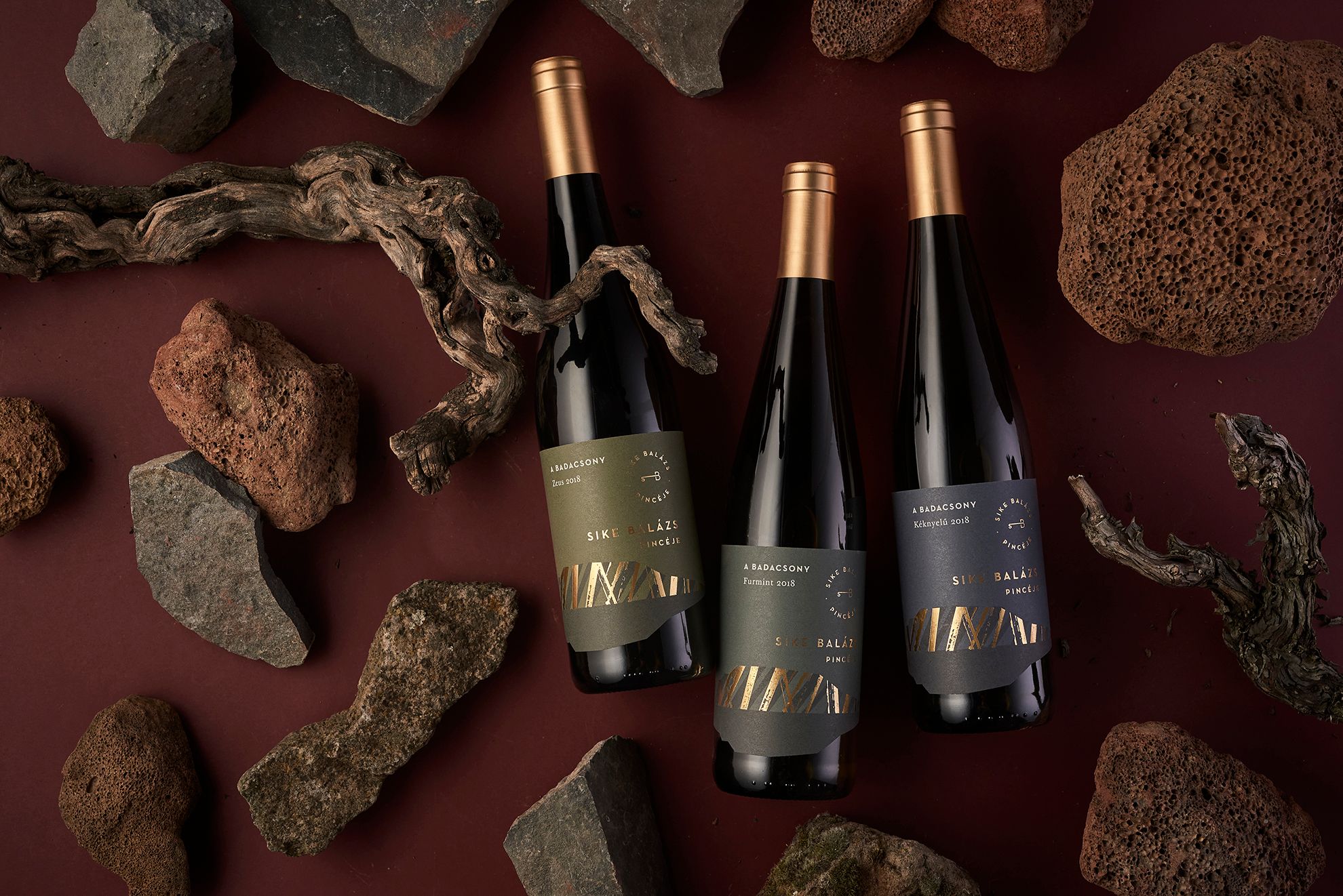
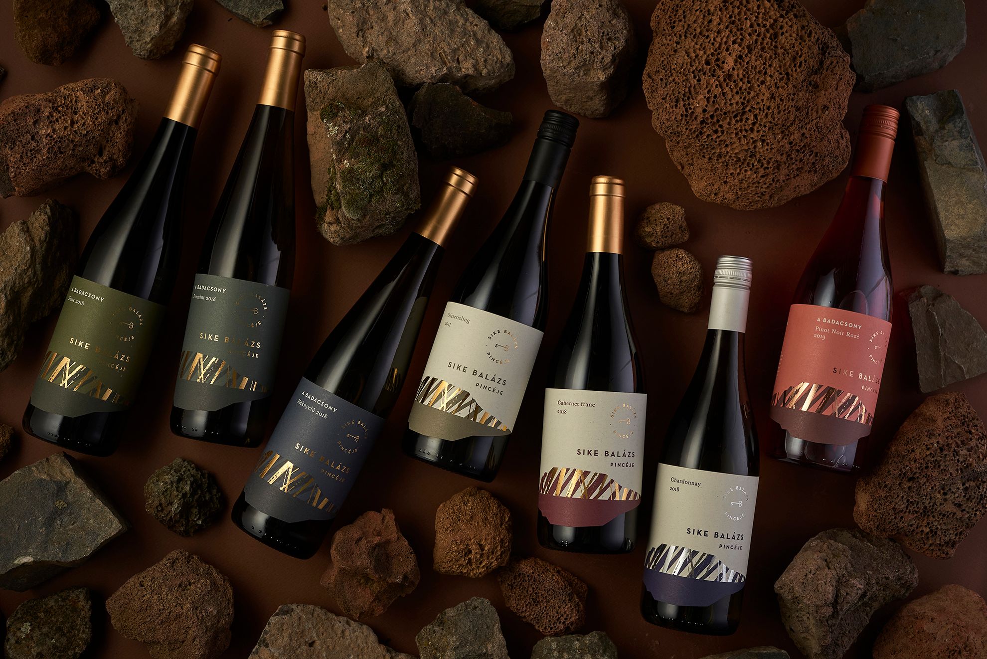
If you’d like to try the characteristic and aromatic wines, look for the Sike Balázs pincéje premium selection on the website of the winery.
Photo: András Zoltai
Art direction: Eszter Laki
Graphic designer Eszter Laki, Réka Imre
Studio NUR| Web | Facebook | Instagram
Sike Balázs pincéje | Web | Facebook | Instagram
A cosmonautics museum hidden in a wooden church in Ukraine
12 things you need to know about Design Center
