The newly launched STRUCTURA Functional Dentistry is unconventional in many ways: it focuses on real healing instead of promoting a beautiful and “quick” smile. As for the brand identity—it is both professional and revolutionary. Interview!
Dentist Dr. Rebeka Pittner is not just trying to launch another practice, but also takes a complex approach to dentistry: an innovative dental clinic, she says, not only aims to correct aesthetics but also to cure. But how can this become visible to patients? Or: how can a dental clinic be cool after all? Rebeka turned to the designers of DARE STUDIO Fanni Zámbó and István Zámbó, to design an image that could present the STRUCTURA functional dental clinic in an authentic way, with a big dose of cool factor.
Rebeka, let’s start at the beginning: what do we mean by functional dentistry?
Dr. Rebeka Pittner: Functional dentistry is characterized by the fact that it strives to preserve and/or restore function in all dental interventions. This is particularly important because, if we leave aside primary care, private dental practices promote a beautiful and “quick” smile. I don’t want to take the edge off this, but I have seen many times a smile that is beautiful but functionally incorrect. What does it mean? Faulty speech or chewing function, changes in swallowing, which affect the chewing joint, the associated muscles and, through them, virtually the entire musculoskeletal system. The concept that I work with structures the treatments in order to achieve a functional rehabilitation that goes beyond the head and neck region and aims at stabilizing the whole body.
The word ‘structure’ refers not only to the organization of the medical side, but also to the reorganization of the human body. Going from the basics, step by step, to meeting aesthetic needs. Nor does this concept exclude beauty, but it does not consider it the organizing force of treatments. It is a shift in thinking that makes a dental practice look different: it takes on a different dynamic, putting dental interventions in a broader perspective.

What ideas did you bring to the DARE STUDIO team? As I understand it, it was an explicit request on your part that classic, worn-out clichés such as a “tooth” or “denture” should not appear in the design…
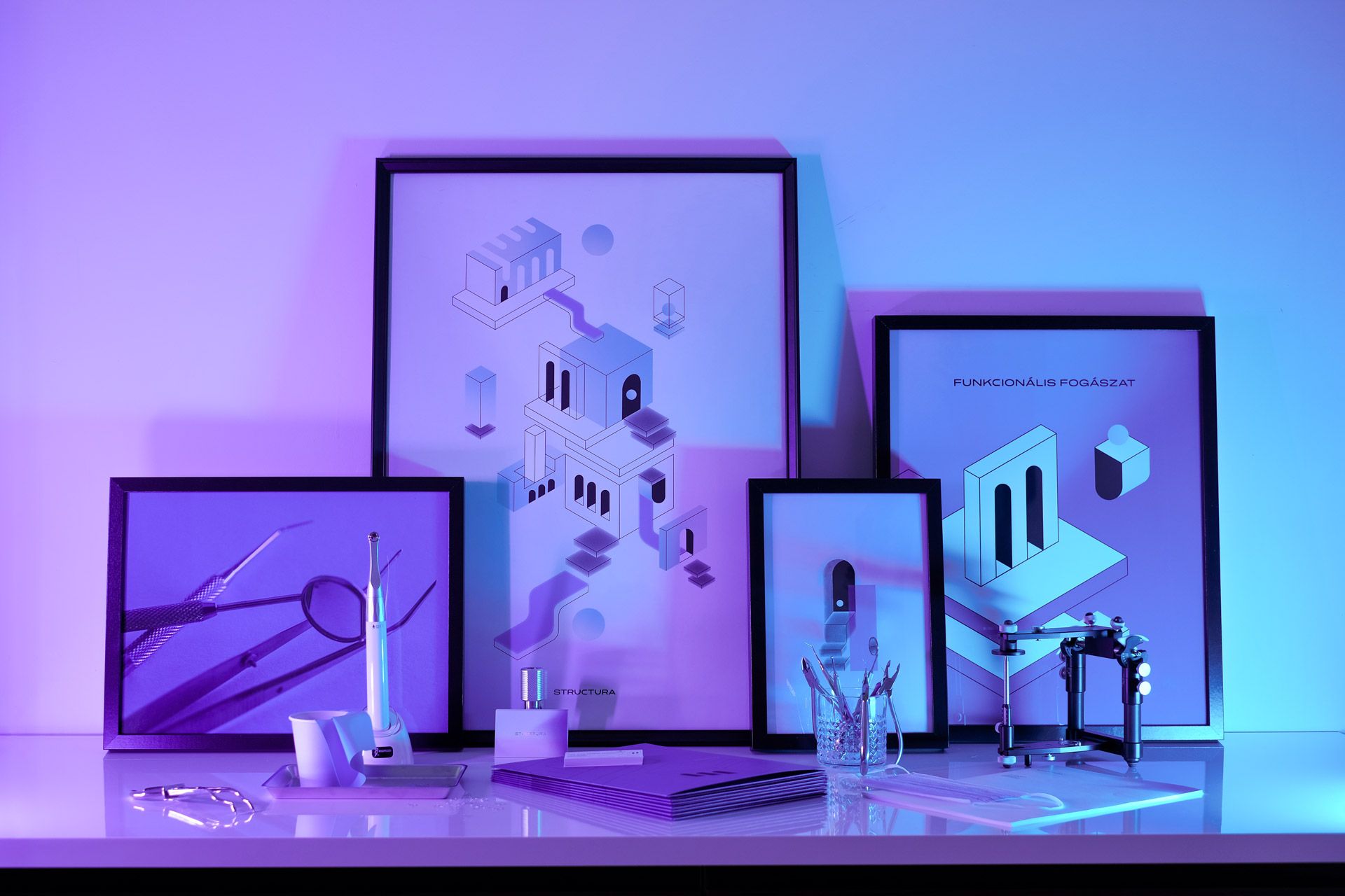
Rebeka: I approached DARE STUDIO with this very idea, to really change the look of all the elements of the identity, to reflect the approach. I really didn’t want to use teeth, it was a conscious decision. I don’t think in terms of teeth, I think in terms of a system, which of course has elements, and as a dentist, I can influence the dynamics of the head and neck region by changing the teeth.
Most of my inspiration came from architecture. This is also due to the fact that orthodontics, my narrow field of specialty, is practically building dental arches, which—in a good case—form a unit like a well-functioning building. Force-resistance pairs are created to keep the structure stable. As a dentist, my goal can be no greater than to account for as many effects as possible that can impact the head and neck region.
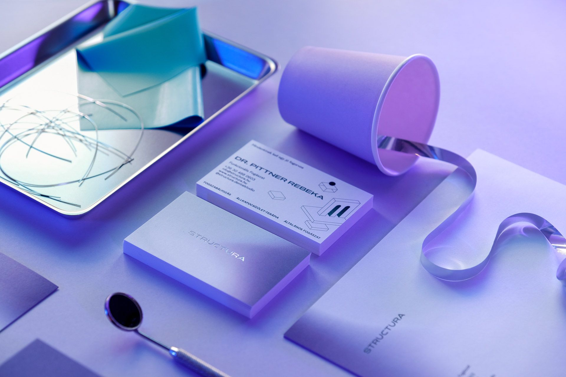
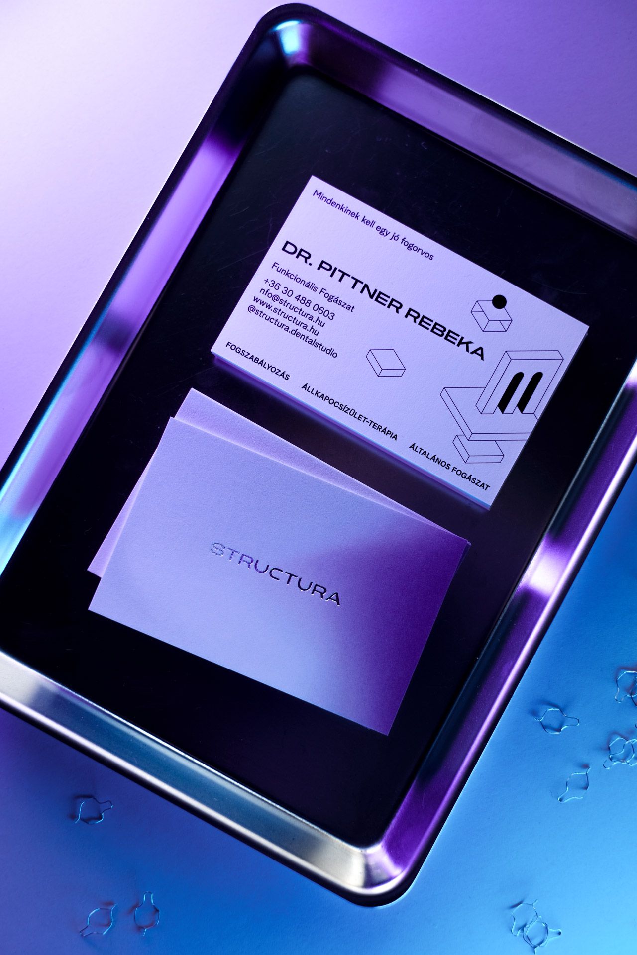
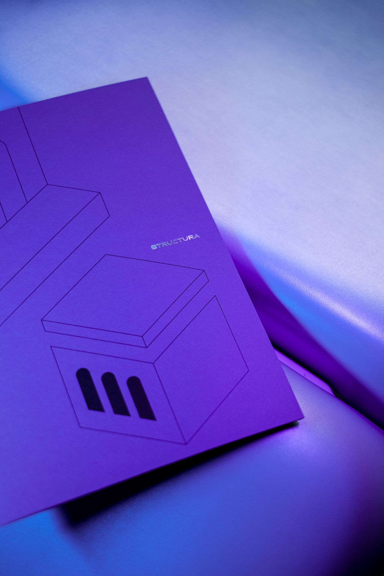
Again, when I try to make the principles clear, I use architecture to help me, for example, designing a treatment on a solid foundation: I want to achieve a unit that is hard to break down and that will last in the event of a windstorm, flood or earthquake. I passed these ideas on to Fanni and her team—and that’s how identity elements such as stair treads and arches were born.
Fanni, tell us a little bit about the design process, about working together: how difficult was it for you as graphic designers to think outside the box with STRUCTURA?
Fanni Zámbó: For us, the peak of creativity is always when we can design beyond the obvious, beyond the first associations. Often, we have to fight for an unconventional concept with our clients, because it takes a good dose of daring to get them to try something they haven’t tried at least a hundred times before. Of course, this kind of attitude is not something you can expect on every project, so we were delighted when Rebeka approached us.
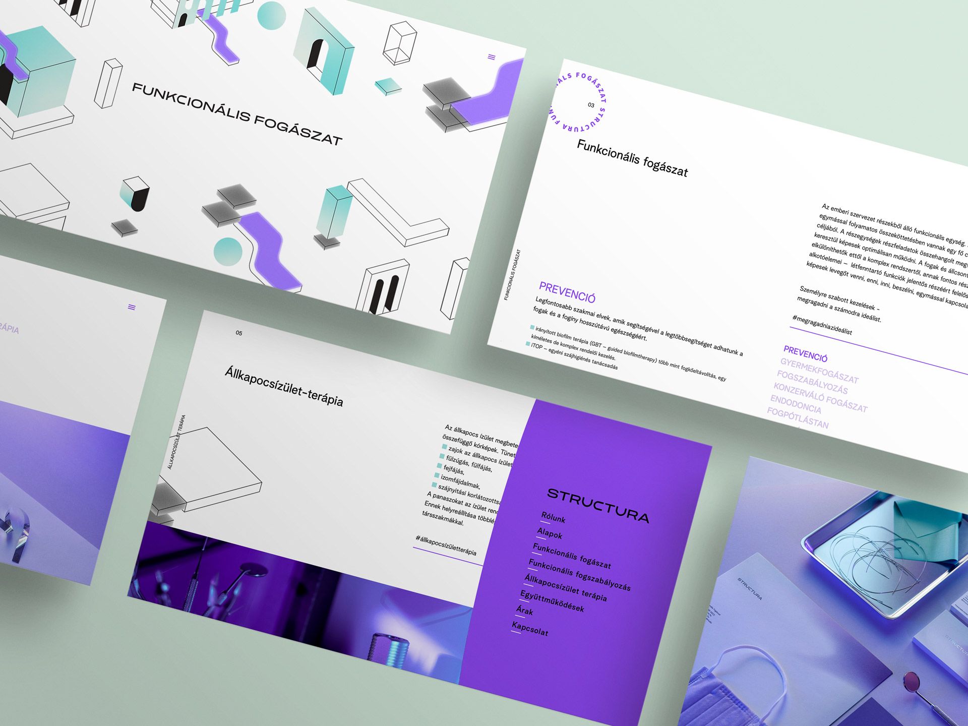
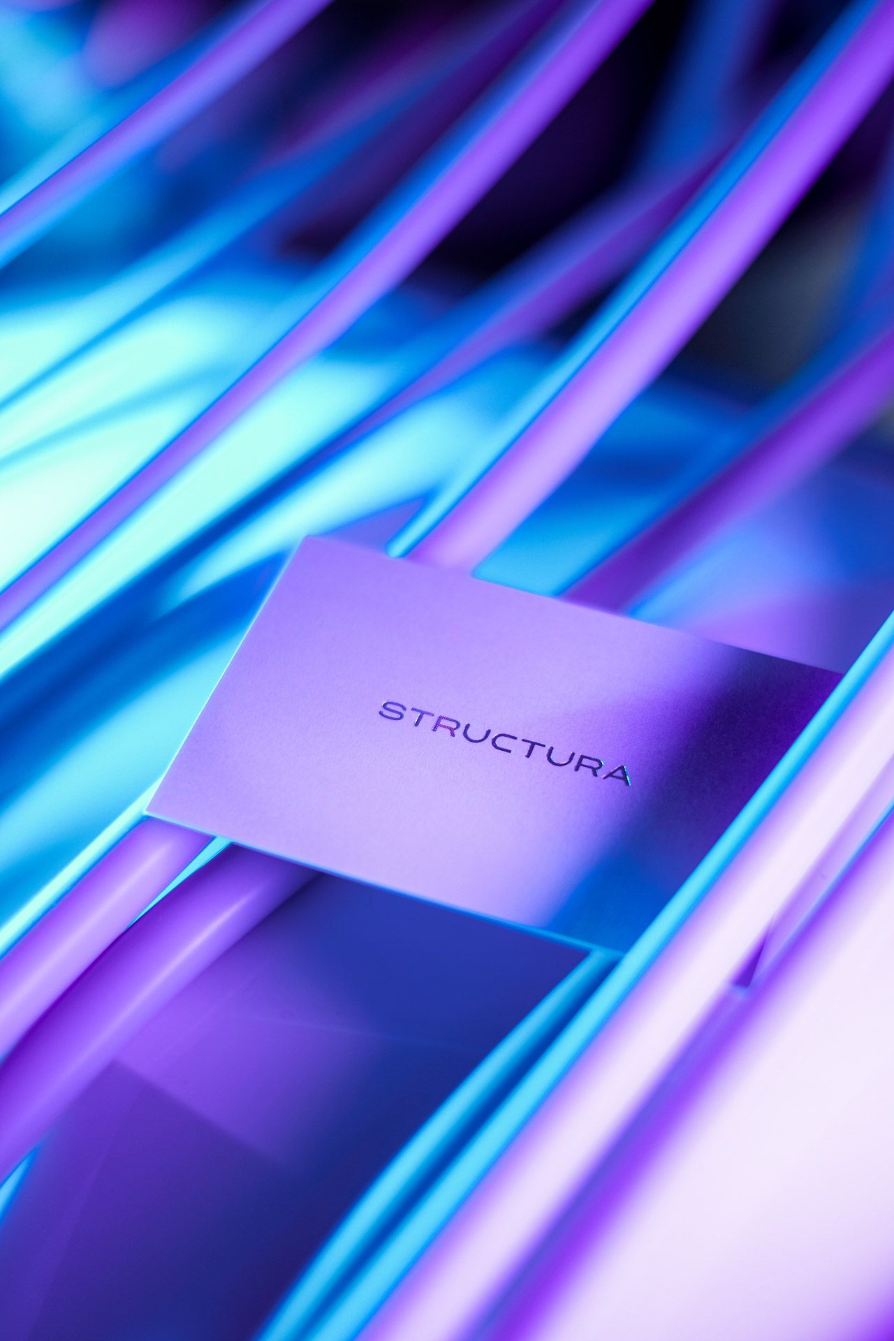
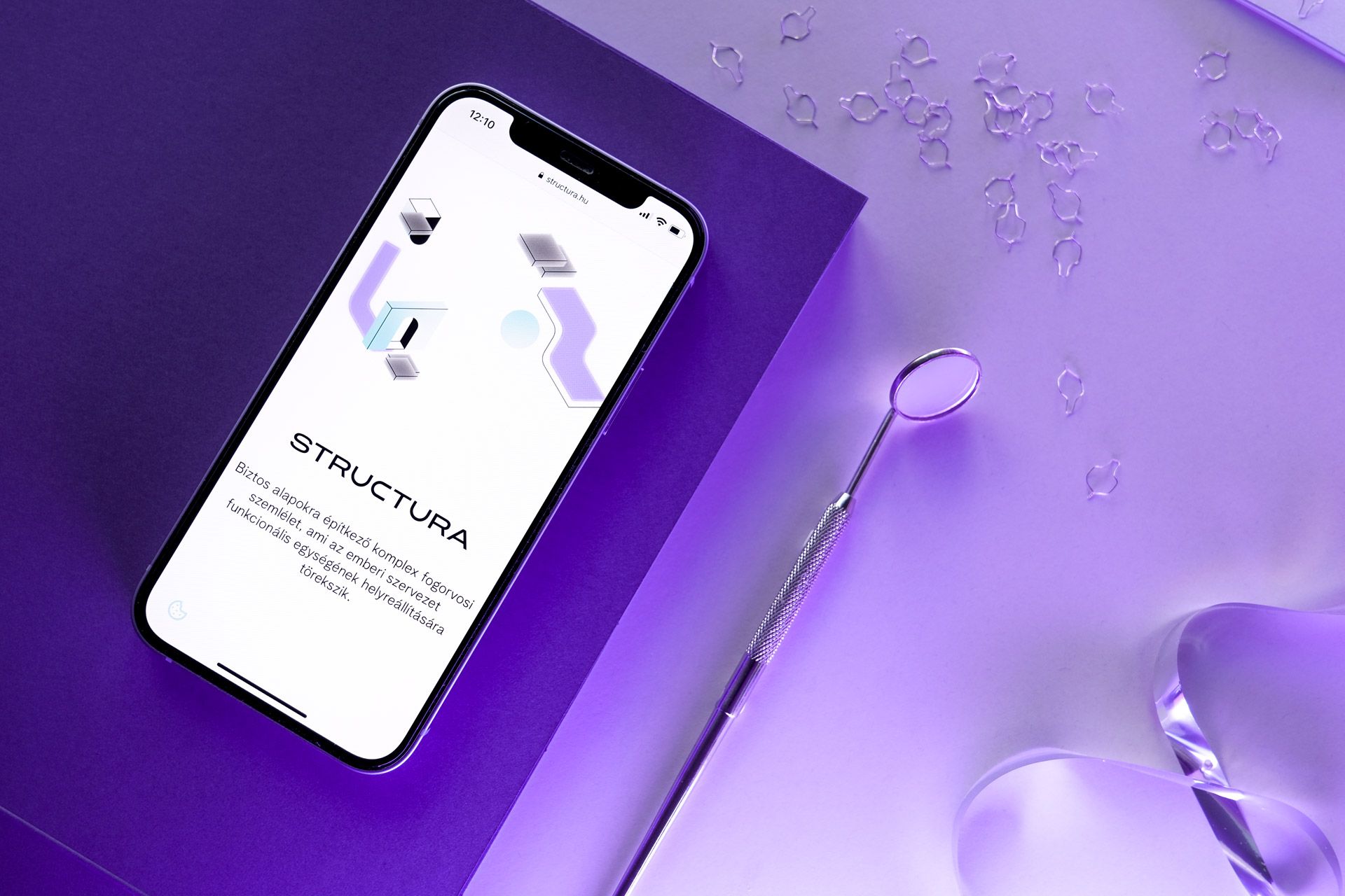
We always start the planning with a thorough discussion, after which we make two or three mood boards. These already include colors, typography, logo sketches—it gives a sense of the visual direction. Rebeka could articulate the feeling she wanted to communicate to her clients. So, there were elements that we fixed at the beginning of the project, such as purple-neon colors and integrating the architecture in some way. When we looked around the dental practices, it was clear that this was going to be the right direction. The most exciting thing about this project is how to present a dentistry without any clear iconography.
How did the color scale develop and how did you arrive at the architectural elements?
Fanni: Given that we had the color scheme from the start of the project, the bigger challenge was to find the illustration. We looked at different architectural drawing styles. In the early stages, we also had anatomical drawings and a combination of these with architecture. In the end, we went for a single abstract direction.
The single identity does not end with the website. If my information is correct, you have also paid attention to details such as workwear, business cards…
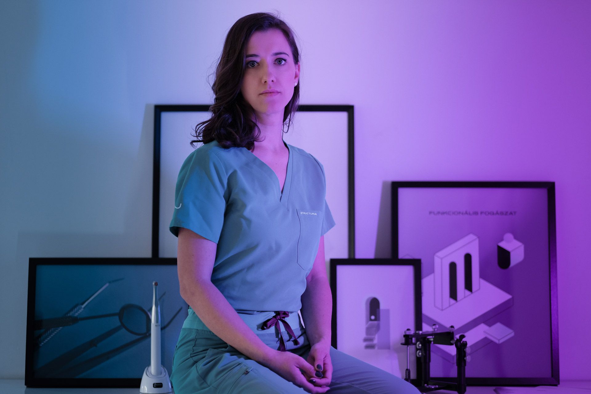
Fanni: We think a well-built visual system—all the components that a company’s customers will encounter—should be recognizable and branded. Such was the case with the website, which had to be both professionally informative and graphically interesting. We designed the basic branding features (business card, letterhead, folder, social media presence), but also the workwear and the images that would be displayed in the office. The identity is constantly expanding and evolving with the business, so there are always new opportunities for further collaboration.
Photos: Era Belléncs
STRUCTURA | Web | Facebook | Instagram
DARE STUDIO | Web | Facebook | Instagram
Paradigma Ariadné’s latest work evokes the geometric world of the countryside
Mama’s cooking, in Chinese | Authentic lunch at ZHU & Co.