A very exciting new chapter begins in the life of HYPEANDHYPER: in addition to the bilingual online magazine, the first printed, English-language HYPE publication will be published in May 2021. New format, new brand identity, new contents in the spirit of Eastern European identity: we talked to founder Gergely Fáy and designer Miklós Kiss about the mission of HYPE and the rebranding process that fits into it inherently.
“Around 2010, all sorts of huge ideas were going through our heads, yet we did not know how and what to start. If I remember correctly, I wrote my first posts on a free blog platform that is not around since then, about which our friends Lackó and Mizó said that it was not good enough and we should do it more properly. Then they put the website together and HYPEANDHYPER was launched. The goal was to create a comprehensive design magazine. Back then, such magazines were immensely popular here and abroad as well,” recalled HYPE founder László Bárdos and Gergely Fáy in a joint interview three years ago.
The blog—which started in 2012, still as a hobby then—kept growing organically over the years, both in terms of content and mission. During its heroic era, the site was running with ten permanent Budapest authors, and eight freelancers joined the team from Baltic countries. “This was the time when venues with good visual identities started to appear in Budapest: cafes and shops that had already projected a new quality. Until then, Budapest was not a cool place in the trendsetter community, but this started to change around that time,” said Gergely.
The prehistoric HYPE was already looking for good content, trying to display every topic on the website that was worth mentioning from London through Los Angeles to Korea. If it had started in the eighties, it might have been called “coolandsuper” but, in the end, it remained hypeandhyper, which is actually “a statement about what we’re looking for as well as an ironic allusion that all that is hype is not necessarily hyper and vice versa,” explained Gergely.
Later, the webshop was launched, followed by a short, one-year silence. HYPE was revived in 2018, to then be able to make progress on its own way in January 2020 with a full editorial staff and office. By this time, the focus of the online magazine was becoming increasingly clear. It was around this time that Gergely began collecting research papers and background materials on the region, which unambiguously showed that there are much more things that connect the countries of the region than things that separate them.
“From here came the realization that we need to get to know each other’s markets, since a Warsaw designer can help a Hungarian designer much better with his Polish market experience on how to be successful than a French or American one would. Based on this, we turned our passion into a mission. I’ve had enough of the fact that VICE and Freunde von Freunden usually write about this region as if it was a total mess, or like, ‘well, there’s a cool techno-DJ somewhere in an Eastern European cellar who can hit the level of Berlin‘. We need to be aware that things that look Western are not the only things in the region that can be cool. We are different, our roots are different. And it’s not a quality issue, it’s not better or worse, it’s just different. This area is very fragmented with a complex historical background, the borders are not exact, and everyone is full of grievances. However, if we can look past this, the unity is already visible with an abundance of similarities. ‘What you can’t tell doesn’t exist,‘ they say. But it exists. This must be described and presented in the magazine,” said Gergely.
The HYPE team is still working with this same approach, and this spirituality, or an expanded and more complete version of it, will be taken forward in the printed publication that debuts in May 2021, with a completely new look to add. Although the trendy logo and brand identity, designed nine years ago—and used to this day—has led many to believe that the HYPE online magazine is not Hungarian, the rebranding campaign opens a whole new chapter in HYPE’s life. “This identity renewal is not just a matter of prestige. It also reflects on the fact that we are preparing to publish a magazine that can stand on the global stage, which customers can look at in any newspaper store in the world and know what quality of content they get,” added Gergely.
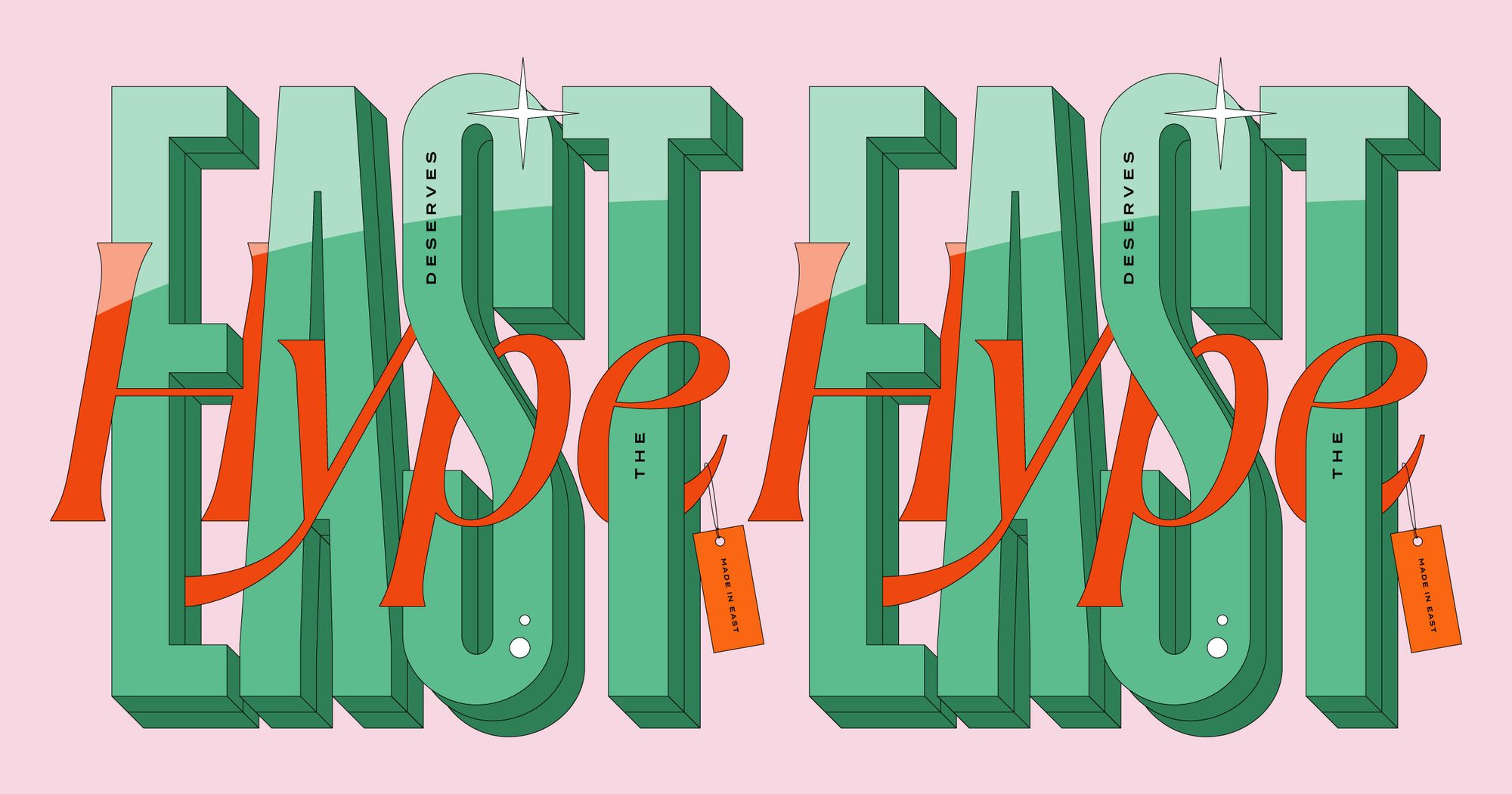
The new identity was created by Miklós Kiss, a designer internationally renowned thanks to his conceptual work, who has already conquered China as well as Korea. He made the first HYPE sketches back in January 2021, and by now, after several modifications, the new logo and the full layout have been finalized, which, although they are not specifically eastern, represent the region very well.
“I did a little research on what the ten things are that people immediately think about when it comes to Eastern Europe. Google mostly showed cities and buildings—in the results list, the Parliament and the Prague Castle were alternating in the first two places. In reality, however, we cannot define this region. People still think of it the way Western Europe had seen it after the fall of the Berlin Wall. The region takes shape based on lists in the articles of American, British and French magazines, instead of us, people living here defining it. In the print magazine, we make an attempt at this. We’re identifying the East! Just like the Kinfolk magazine did with Scandinavia. Except that in a lot more colorful way,” Miklós said.
“Easternness” is, of course, present in the socialist realist blocks of flats, street murals, people’s way of dressing, folk art, but so far, it has not been built into a coherent whole yet. All of this is embedded in a global aspect on HYPE, further broadening the spectrum. The new brand identity of both the printed and online magazines is meant to showcase this unified diversity. Because as Miklós pointed out, “the identity doesn’t work without content!” And what is the color of the East? According to Kiss Miklós, it’s the right combination of pastel and vibrant colors.
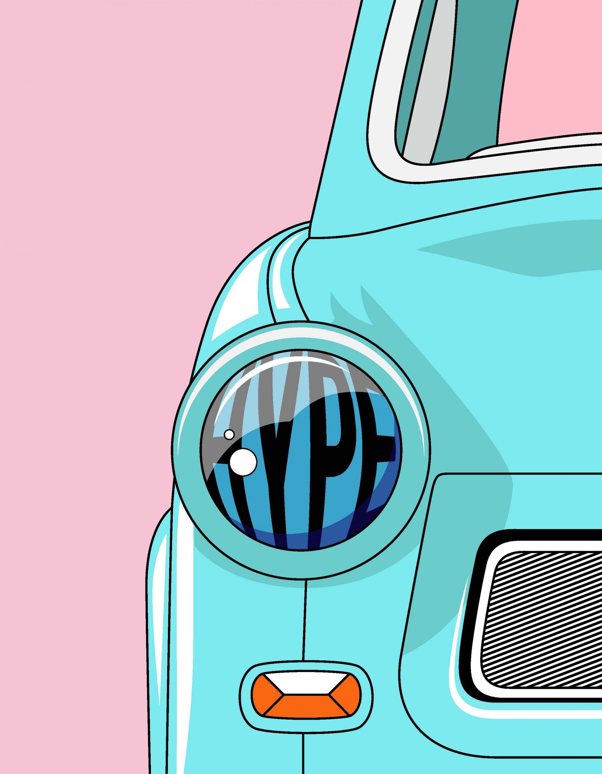
“My parents’ old photos come to mind, which over time have gotten a bit yellow or slightly bluish. Then I am reminded of old ladies in blue house dresses, sitting in the bright red armchairs of the hairdressing salon, under vintage, yellow hairdryers. This is the color spectrum we’ve lifted over to our days,” says Miklós.
The artistic director of Forbes, Júlia Bethlen is responsible for the layout of the magazine. According to Miklós, the joint work is very smooth and efficient, where Julia is an engineer and Miklós is a dreamer. In addition to the Termina and Hungarumlaut fonts, one of Miklós’ unpublished works, the font Chloé makes its debut on the beautiful, colored pages, which was named after the designer’s cat. “Delicate sophistication and silly playfulness are both present in the font. The latter is also reflected in the fact that multiple versions of each character are available in the font set. It’s a bit like Eastern Europe: It doesn’t have such a strict system, it doesn’t necessarily move forward straight ahead, but that’s why it’s so beautiful.”
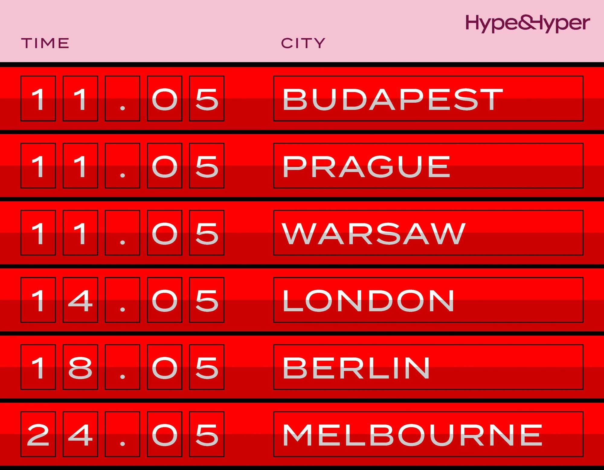
In addition to Hungary and the EU, the 150-page English-language magazine, which debuts in May, 2021, will also be sold in Great Britain, America and Australia. With the launch of the printed HYPE, the identity of the online magazine will also be updated—in addition to the new logo and layout, the content will also be renewed.
Special breakfast places in Eastern Europe | TOP 5
The Kyiv metro through the eyes of an artist | Michał Klimecki