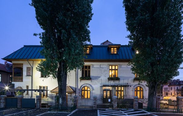
Graphic design has been focusing on bottle labels, including wine bottle labels, for a long time, therefore this segment had enough time to get the hang of market demands from traditional ones to the most extreme. In our current project selection, we have selected wine labels that are special and exceptional in their design.
Red wine has been an integral part of people’s beverage selection for a minimum of two millennia. Wine, as the fruit of human labor, already appeared in the Christian culture, so it has always been highly valued. In the households of early days, the drink was stored in huge clay pots and ceramics, then in the village world in demijohn bottles, and eventually, keeping up with the modernity of the world influenced by the Industrial Revolution, they began to fill this special nectar in tinted glass bottles with clean design. Due to the similarity of glass series production, labeling became the easiest way to distinguish, and label design soon developed into a special graphic task.
A handful of creatives and advertising professionals work year after year to impress consumers with wine bottles, not only with their content, but also with their appearance. As a result, wine packages that arouse our interest can often push the boundaries of extremities. This week, we’ve selected projects from Austria to Spain that bring something new to store shelves in terms of their use of materials, printing technology or graphic design.
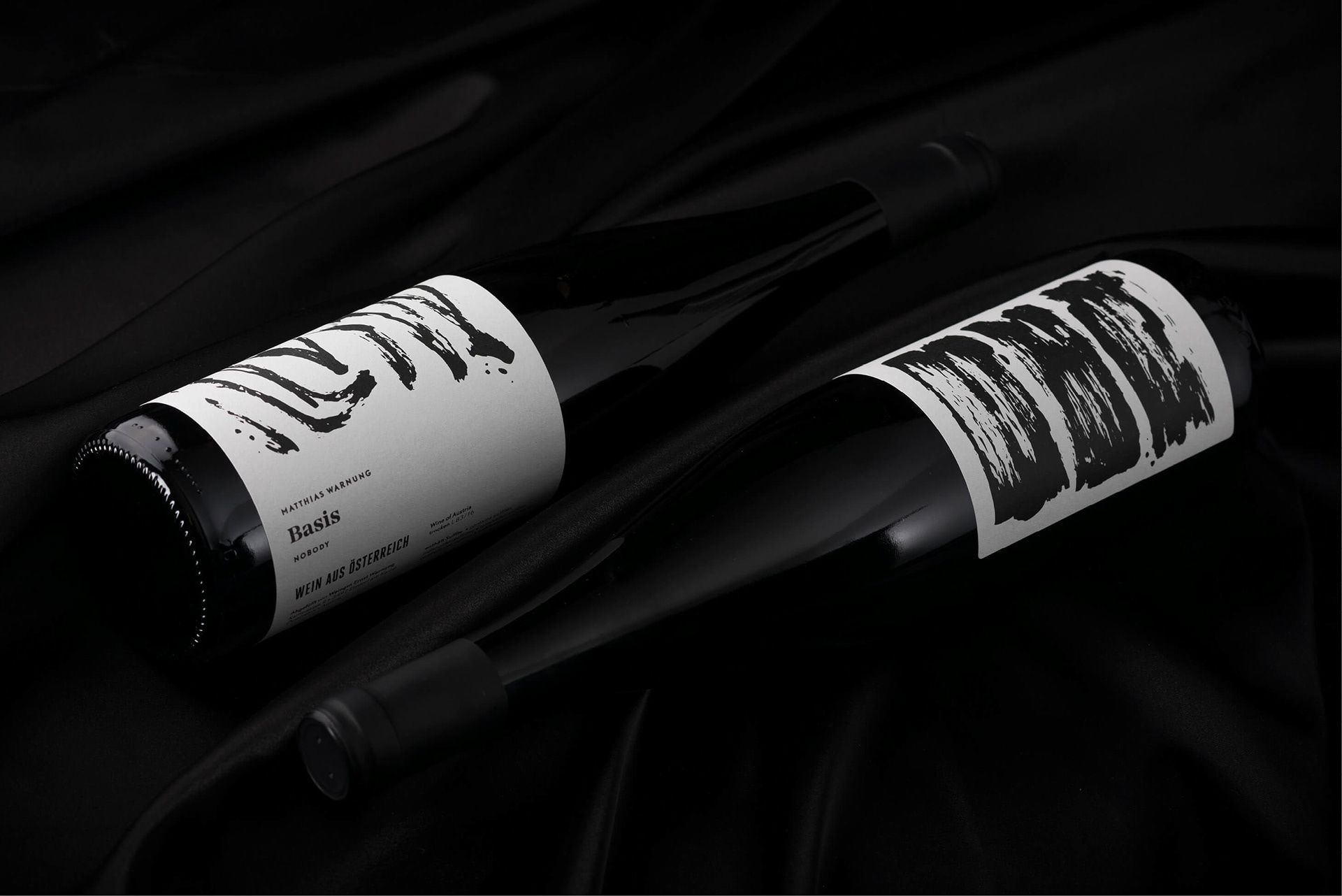
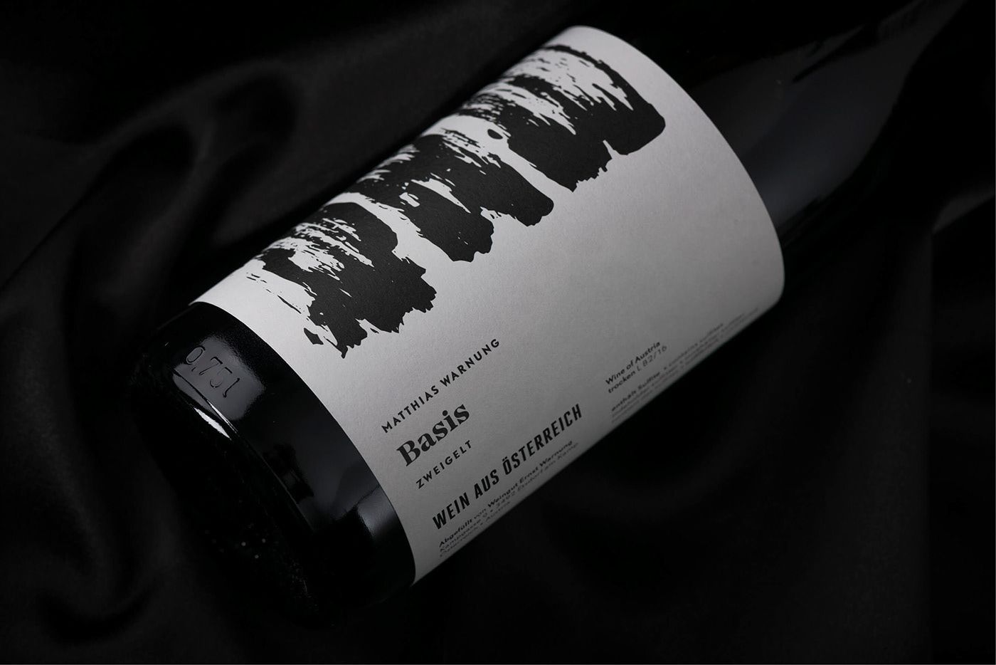
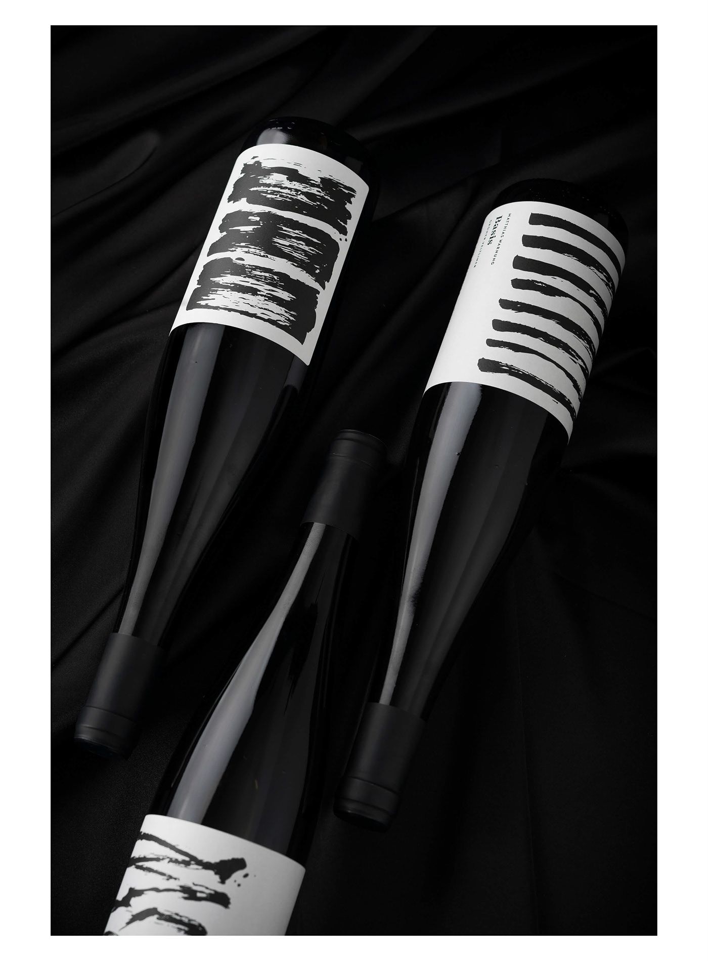
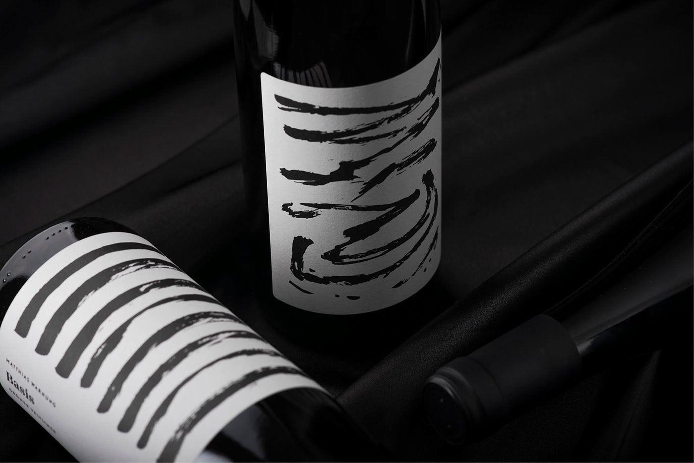
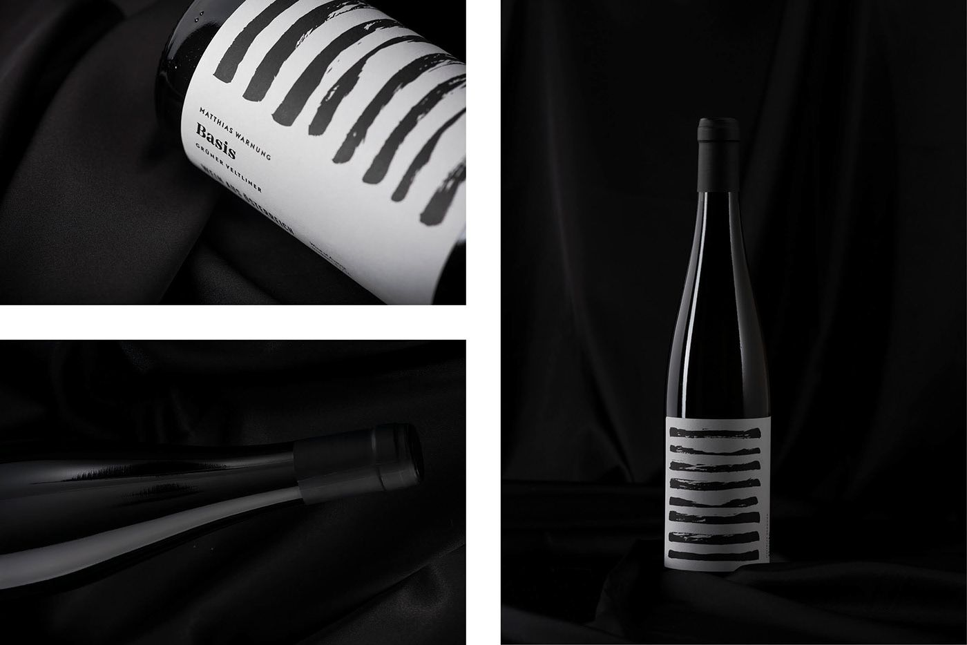
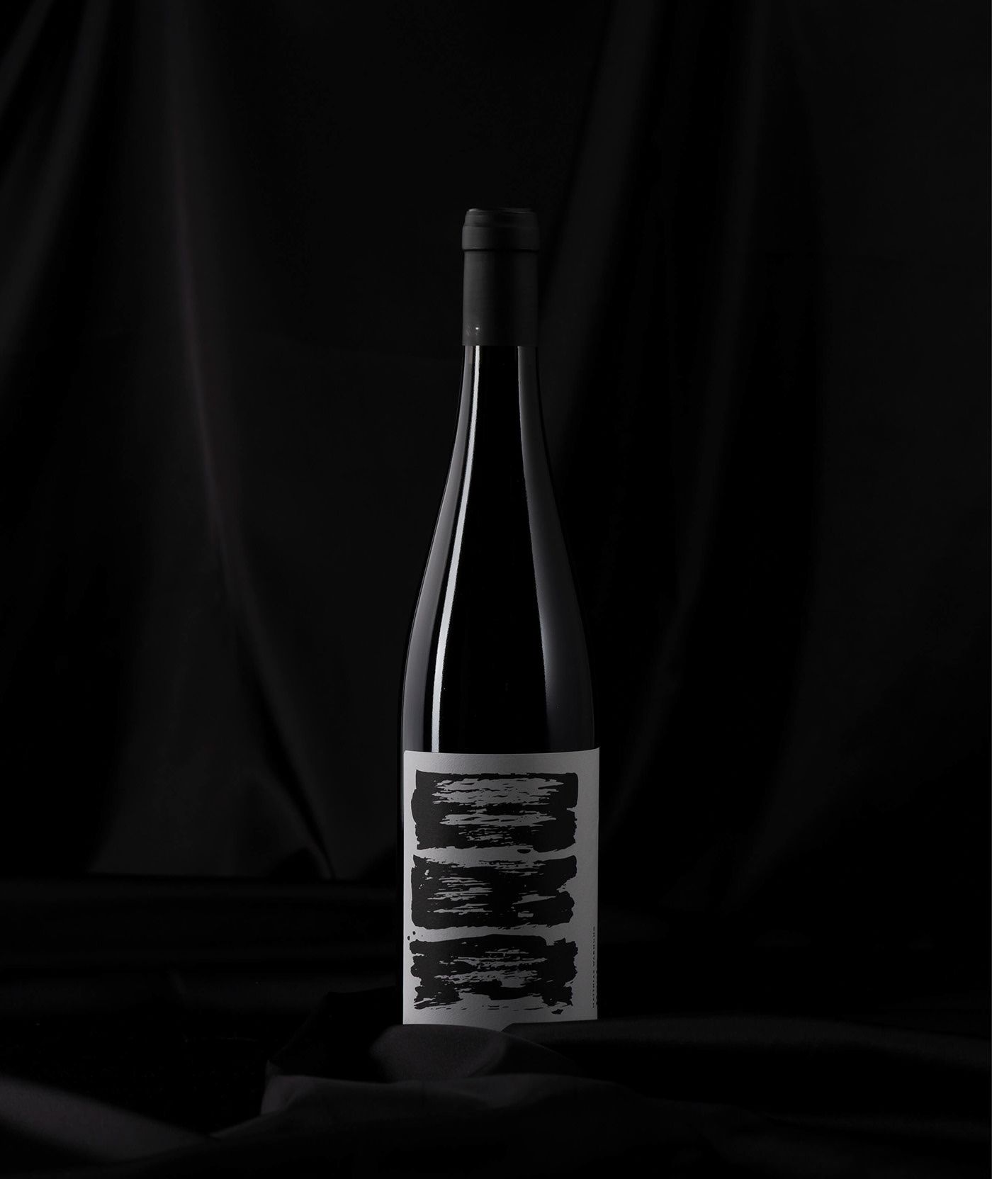
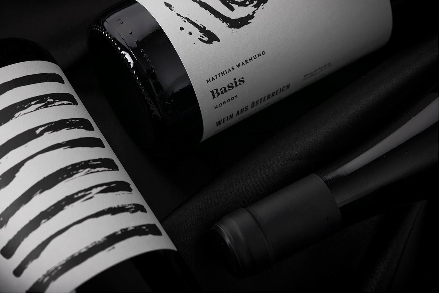
Basis by Matthias Warnung | Graz / Klagenfurt, Austria
Lukas Diemling
Dominic Erschen
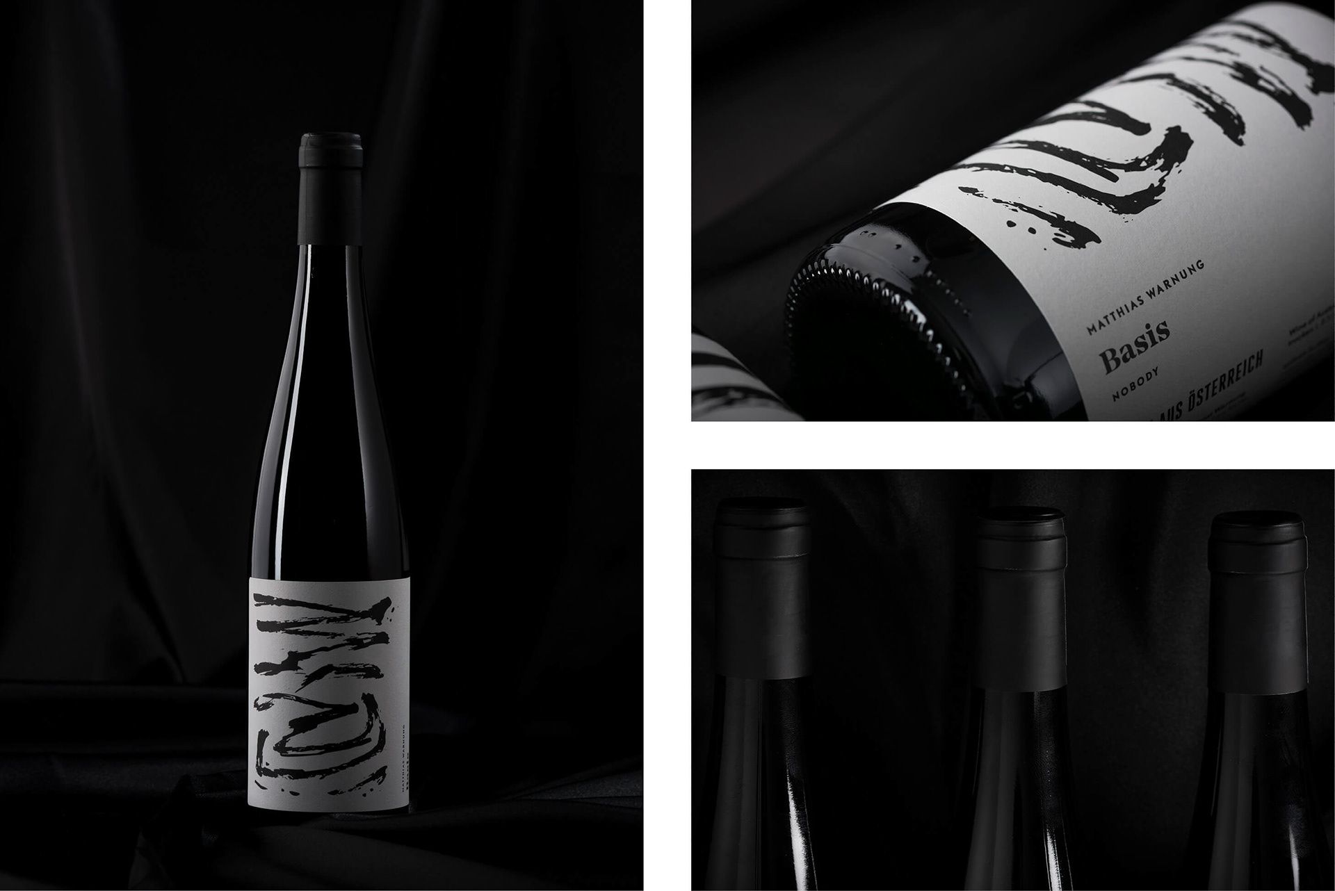
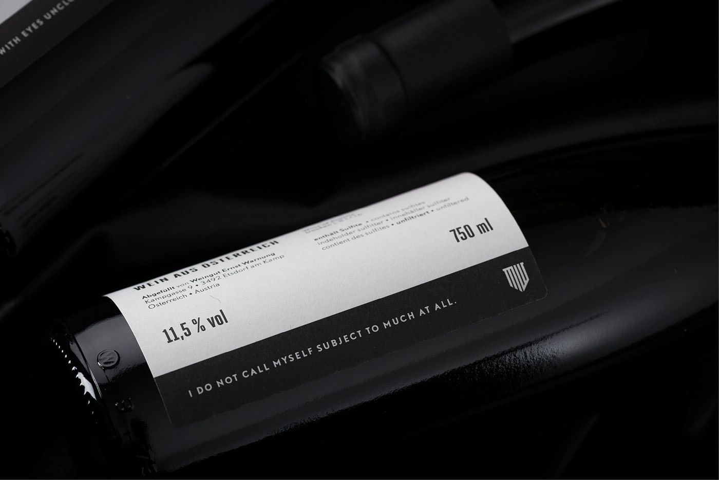
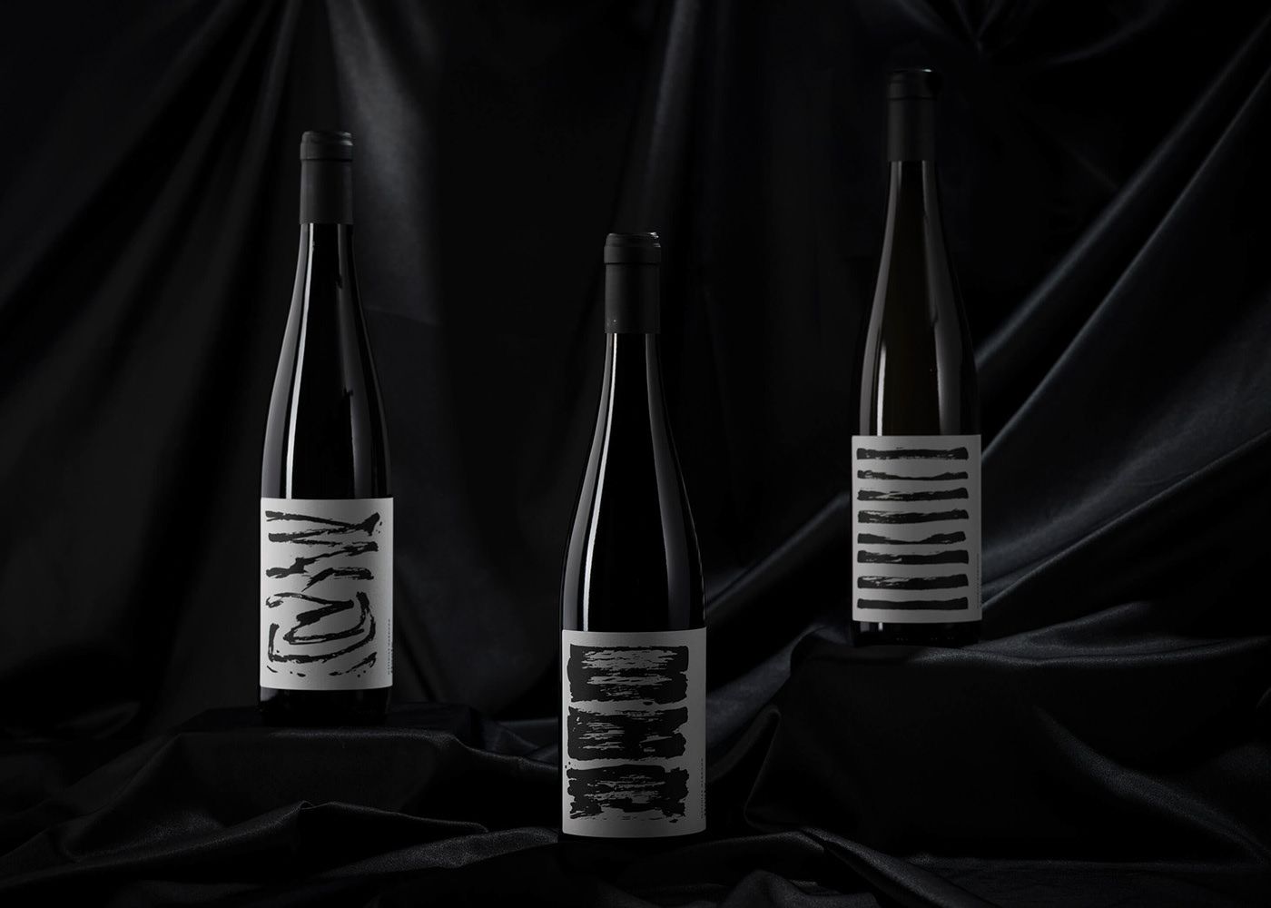
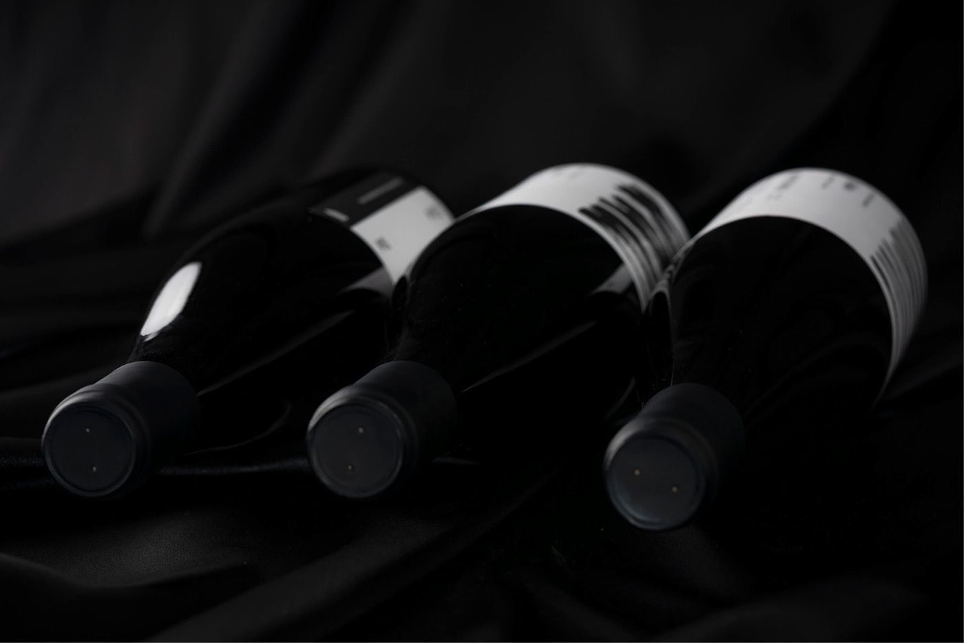
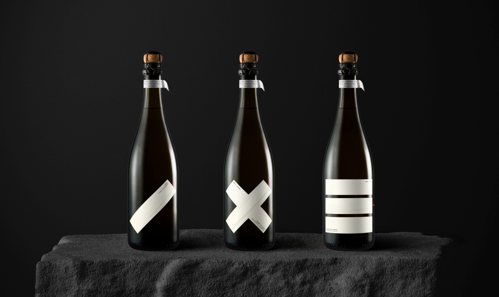
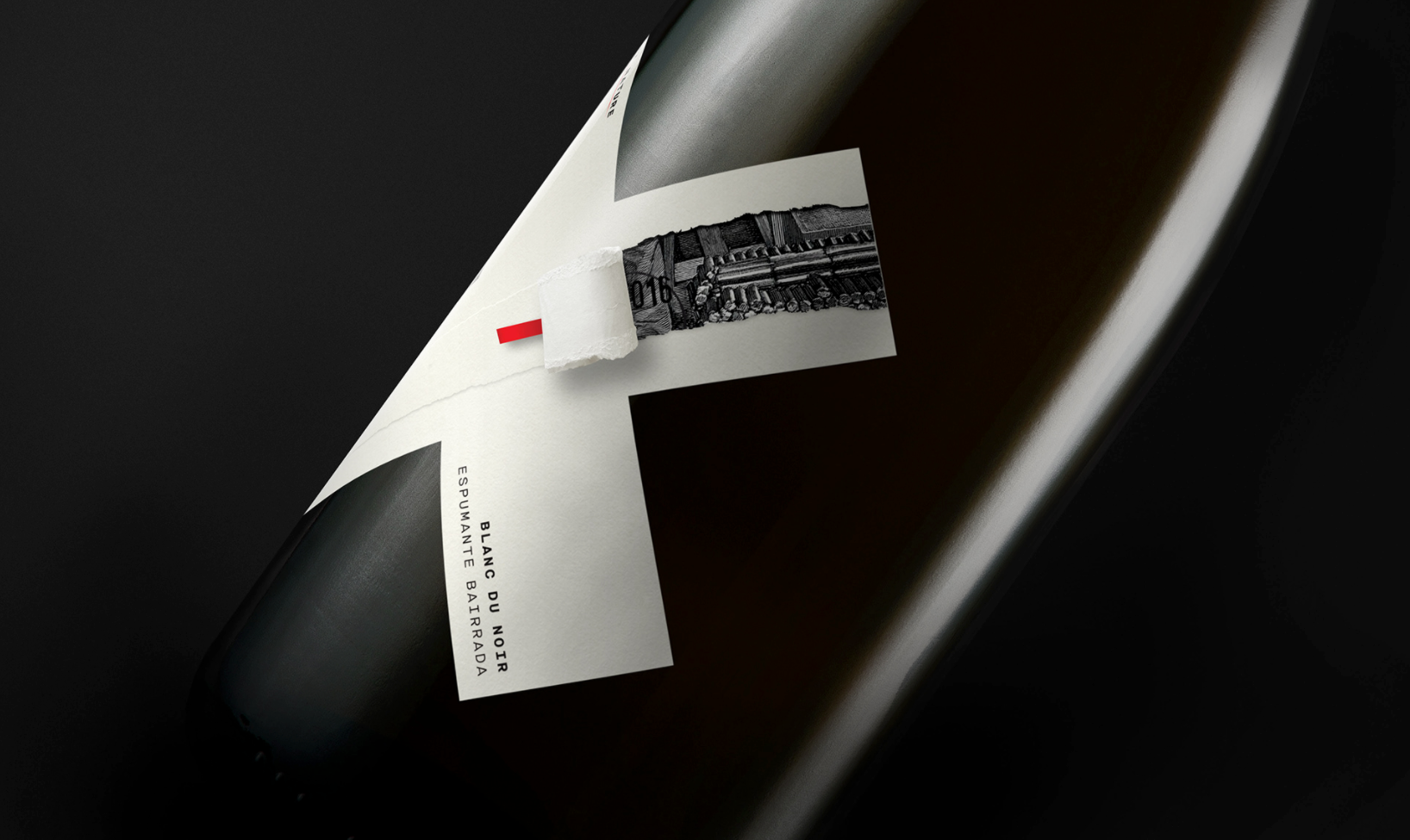
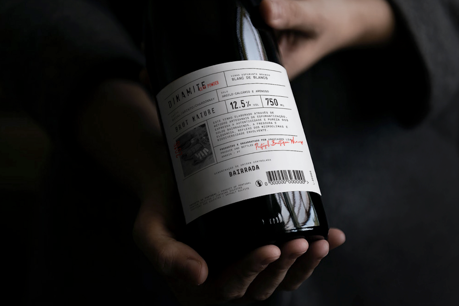
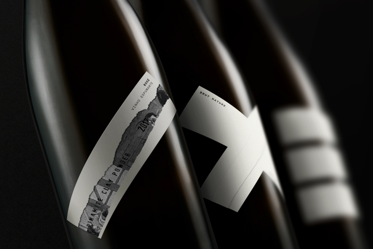
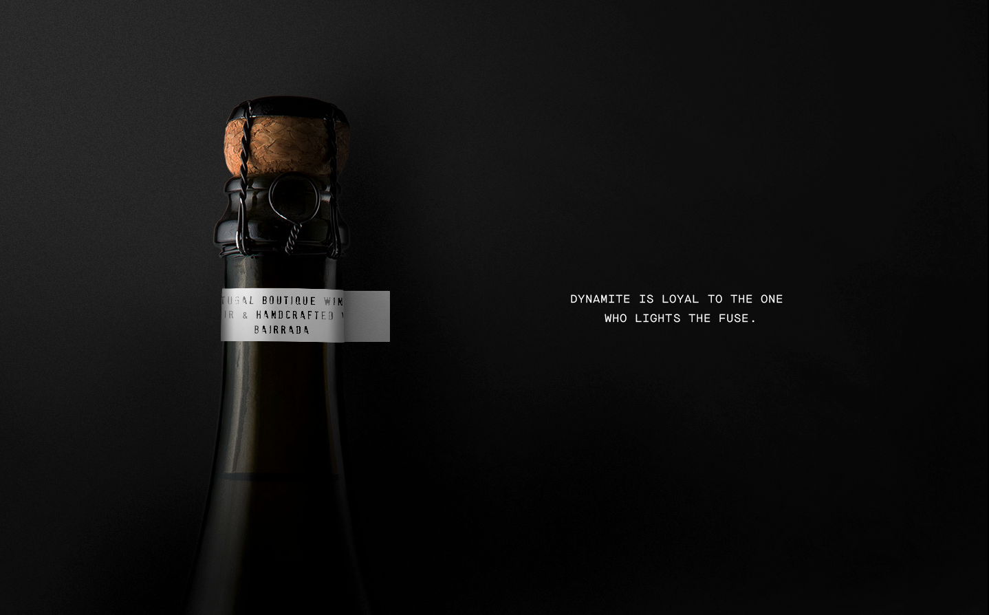
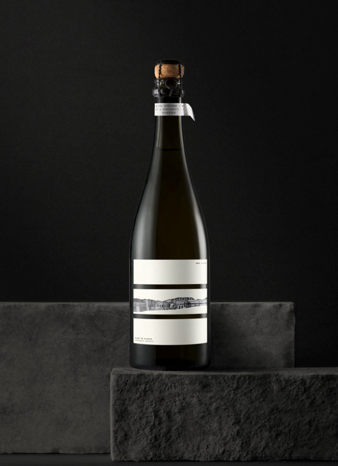
Dinamite Collection | Porto, Portugal
327 creative studio

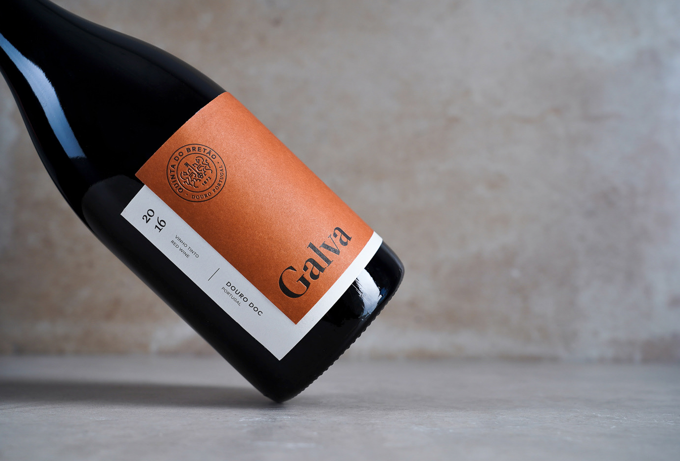
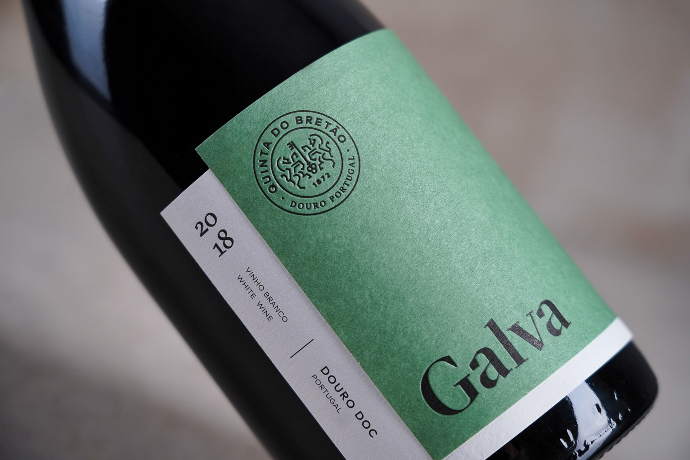
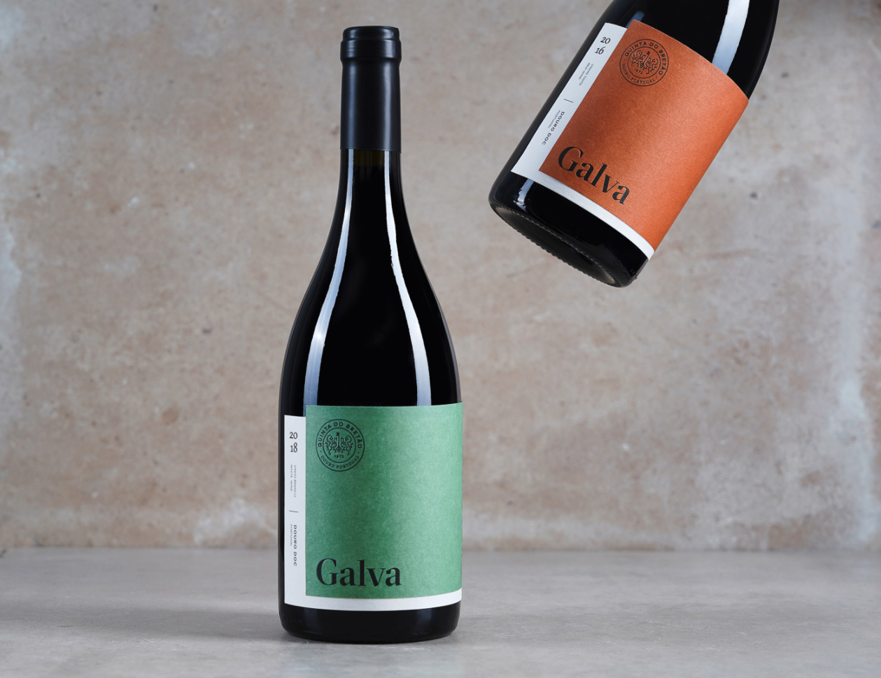
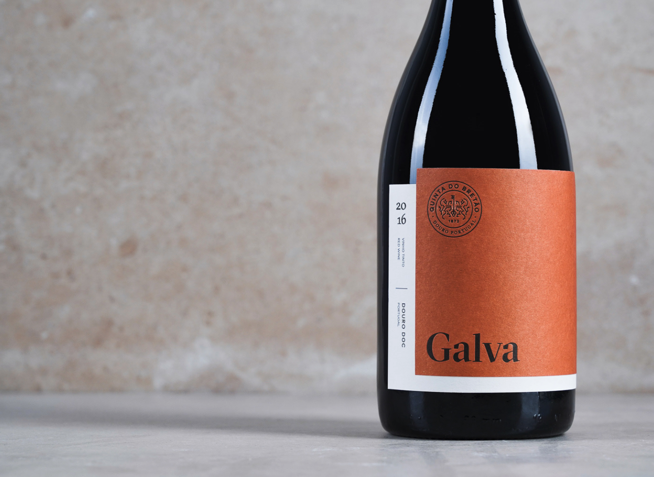
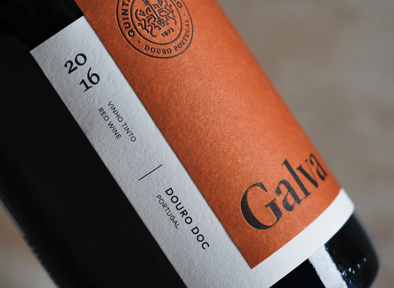
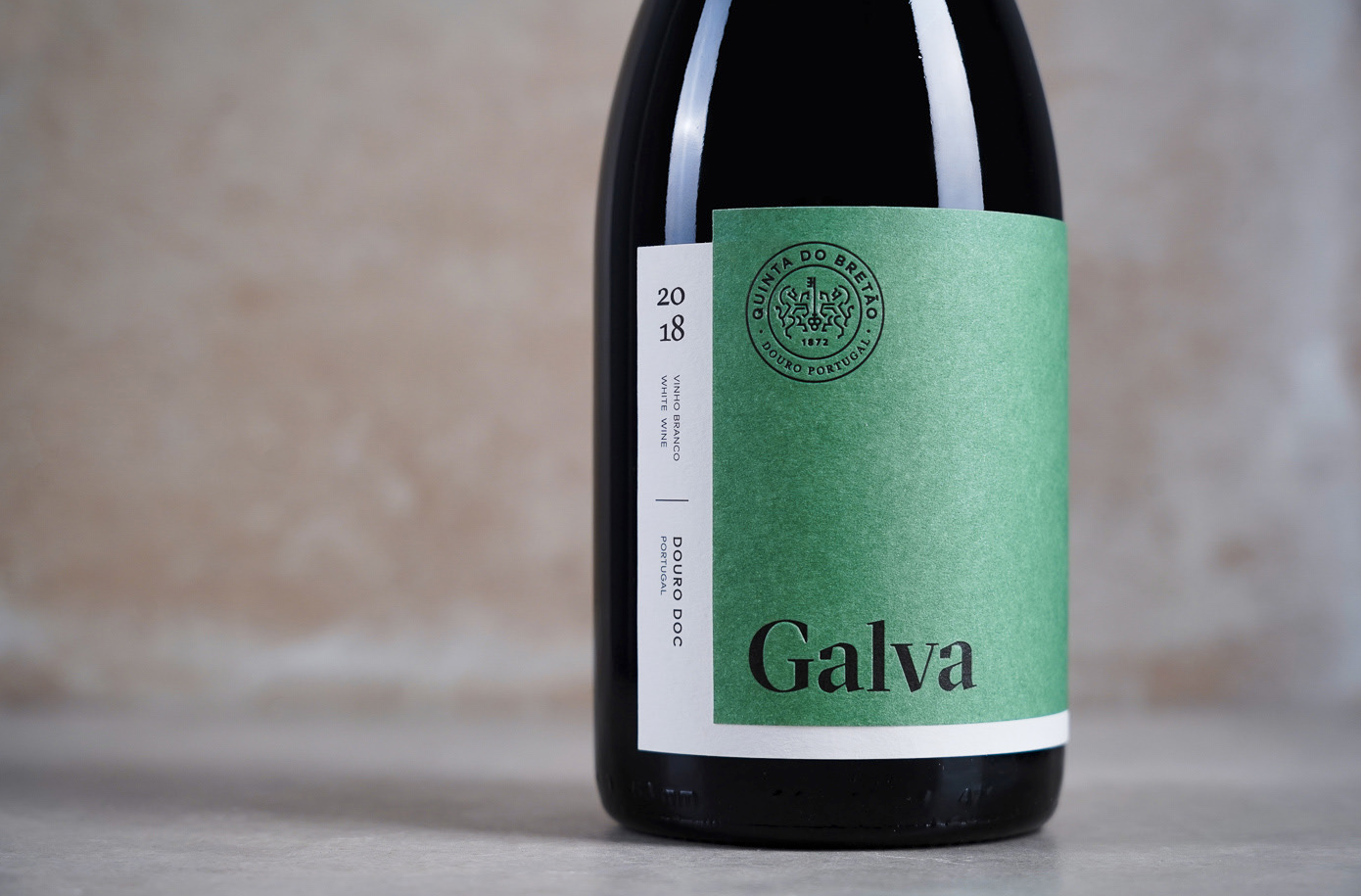
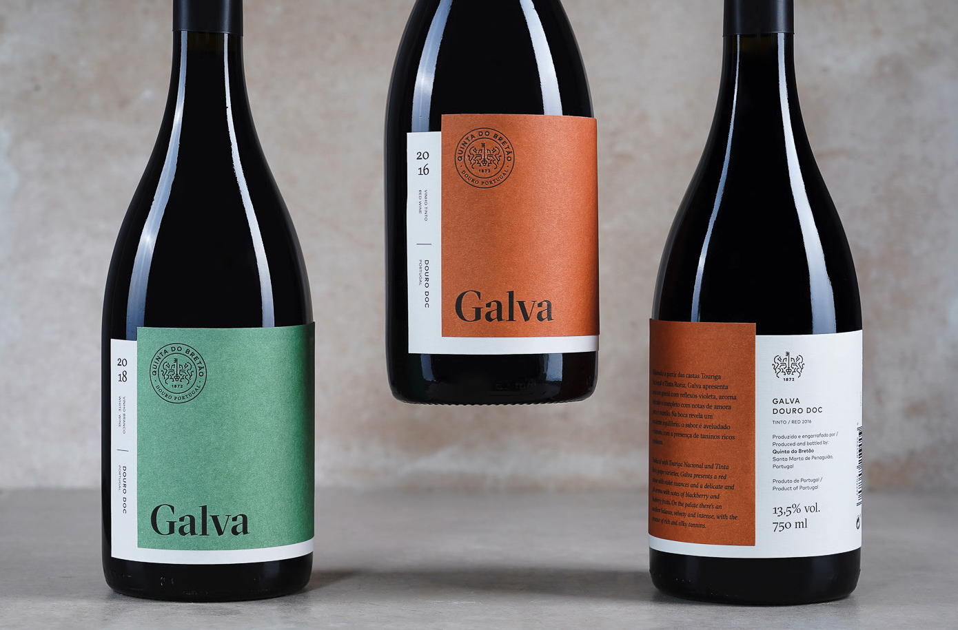
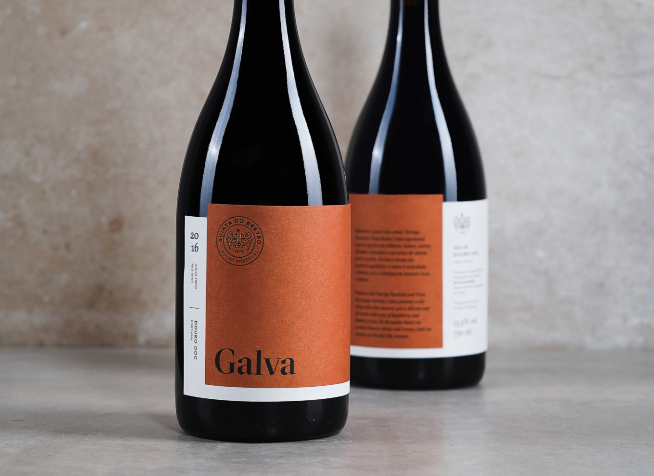
Galva | Vila Real, Portugal
Vinco Studio
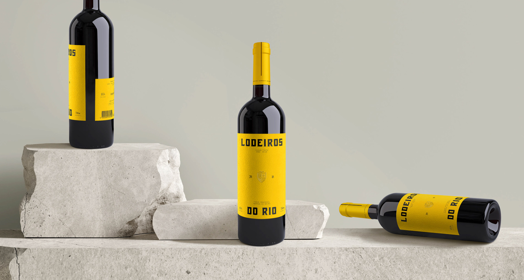
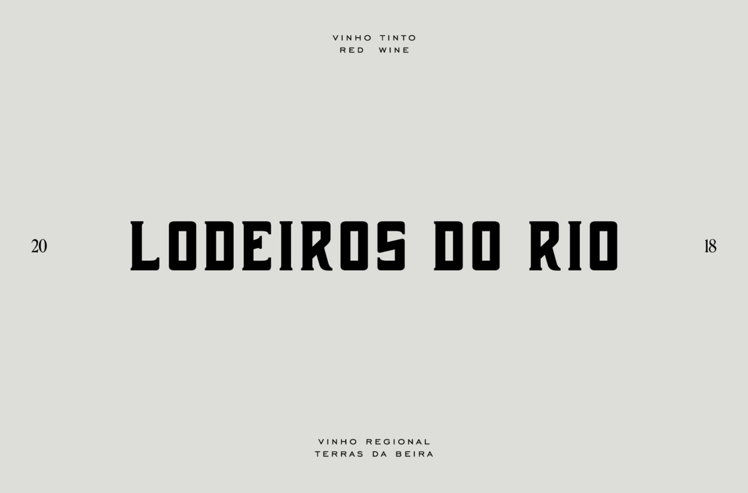
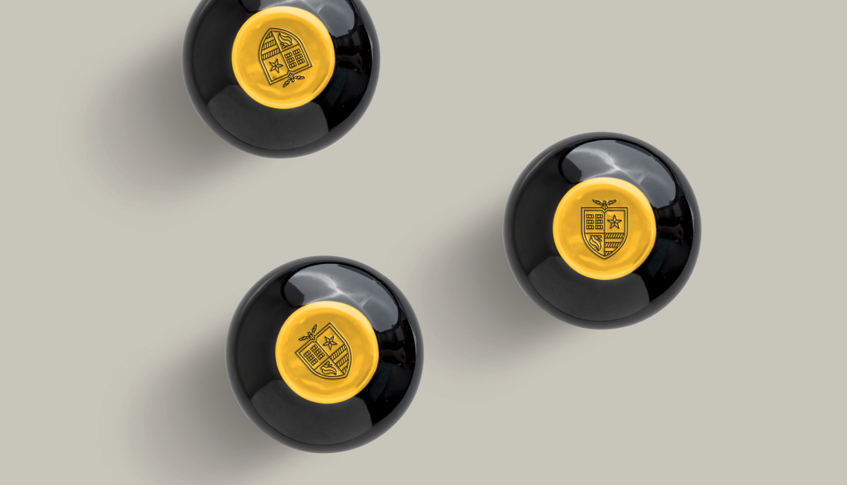
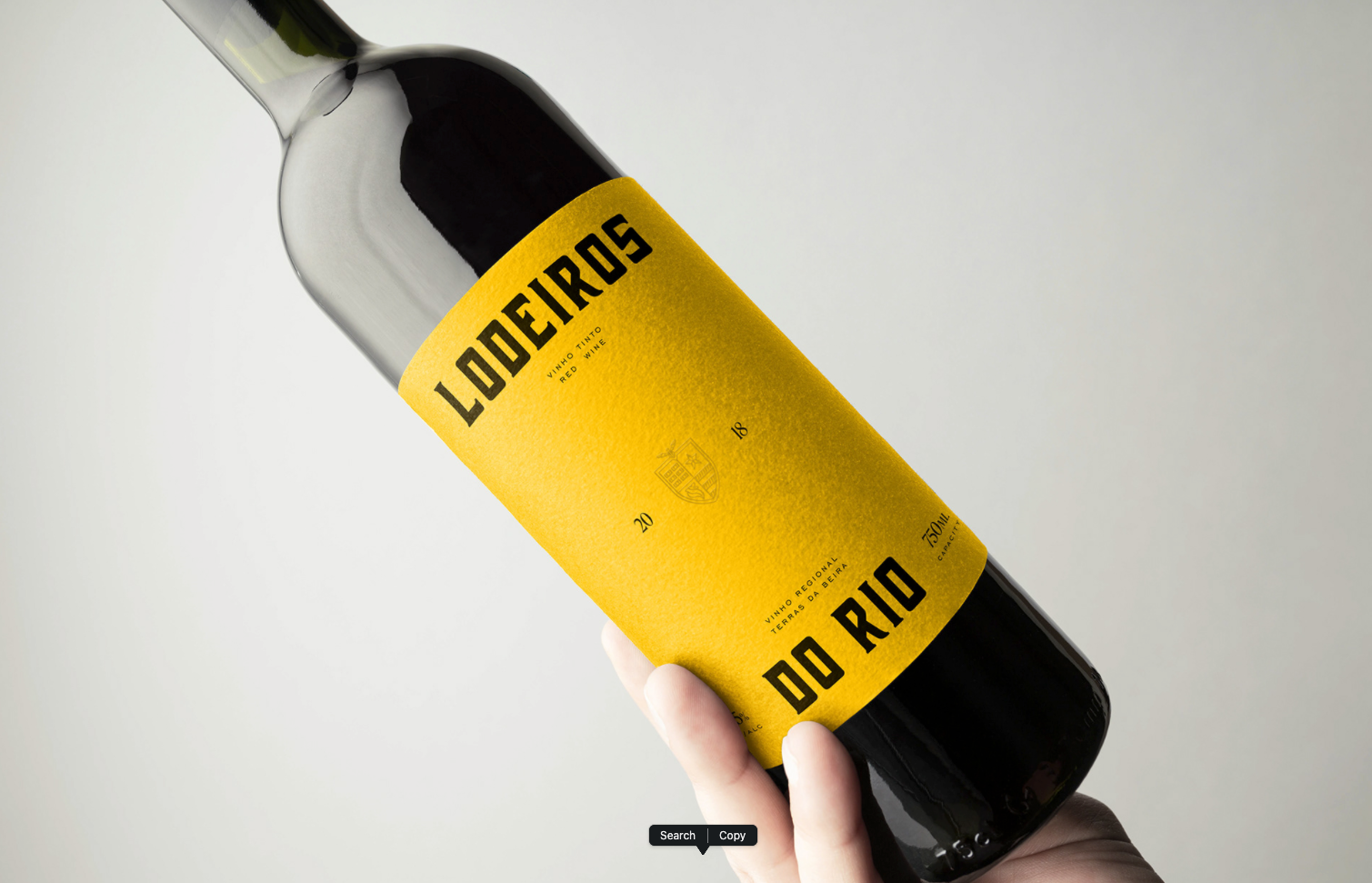
Lodeiros do Rio | Porto, Portugal
327 creative studio
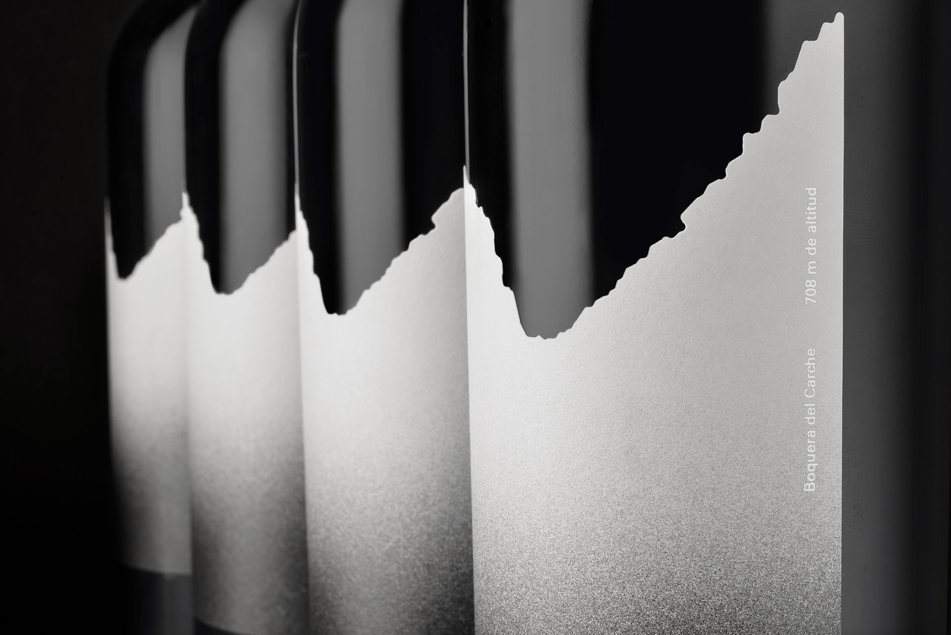
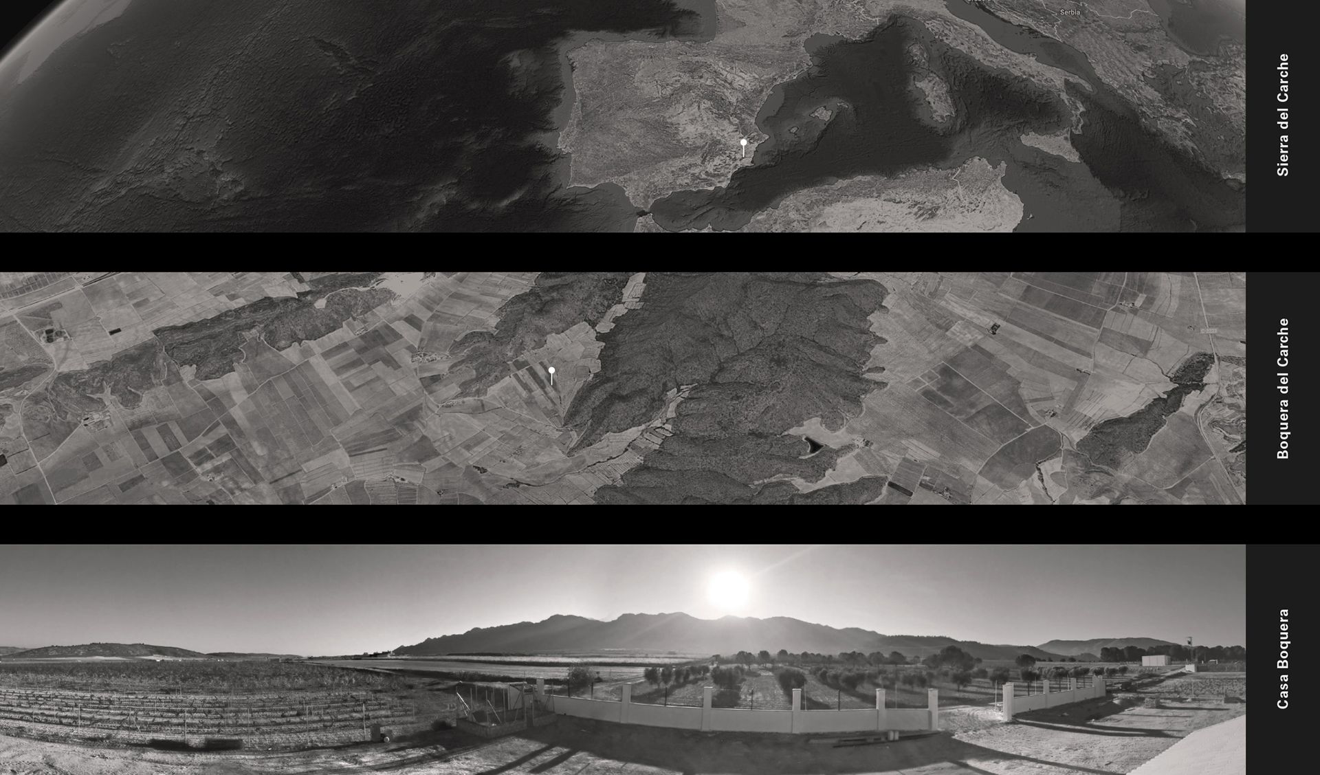
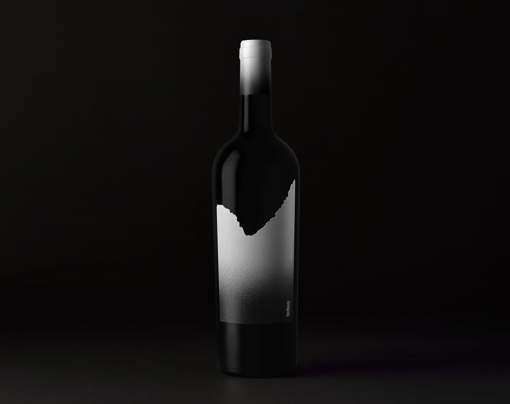
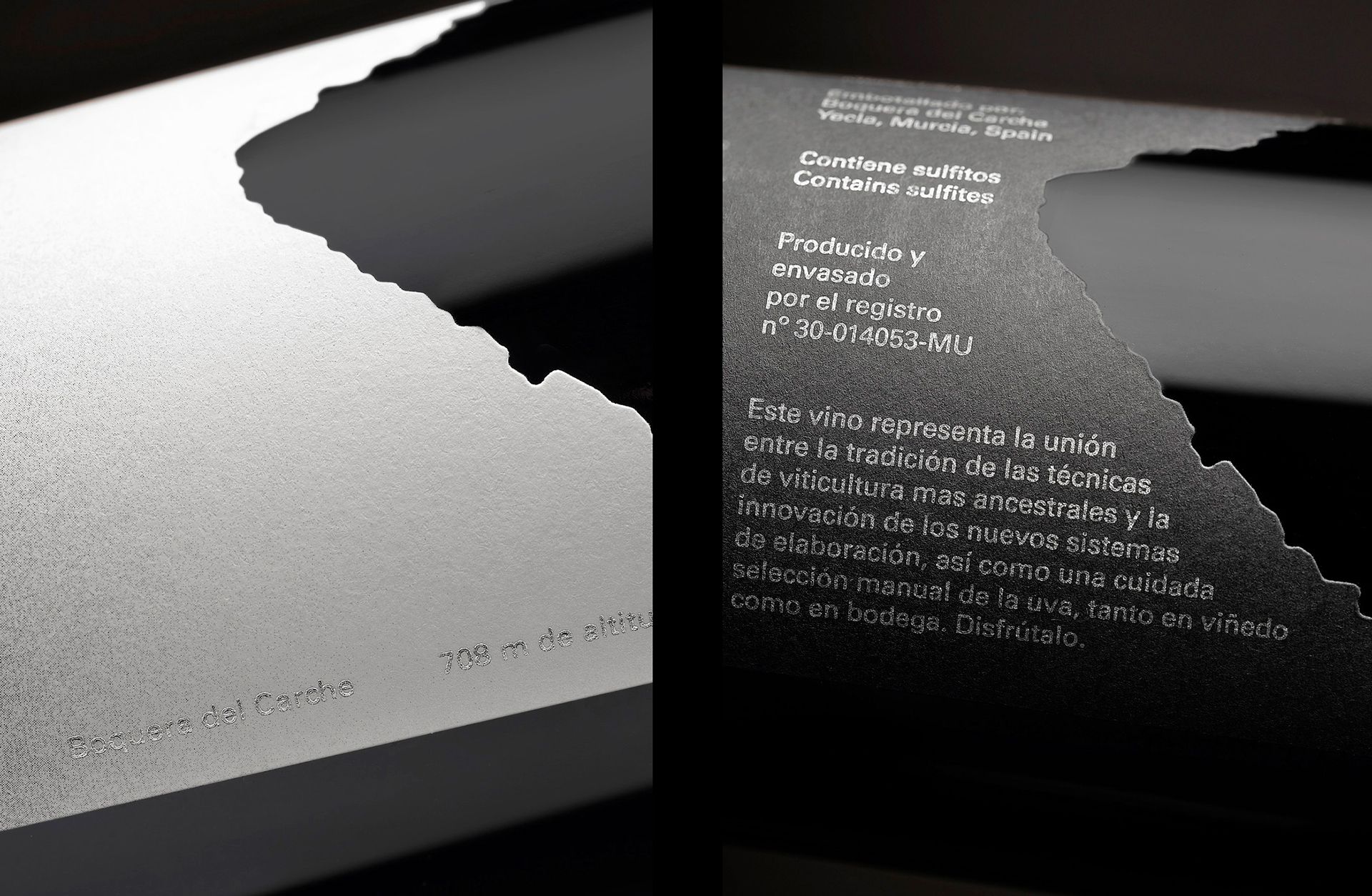
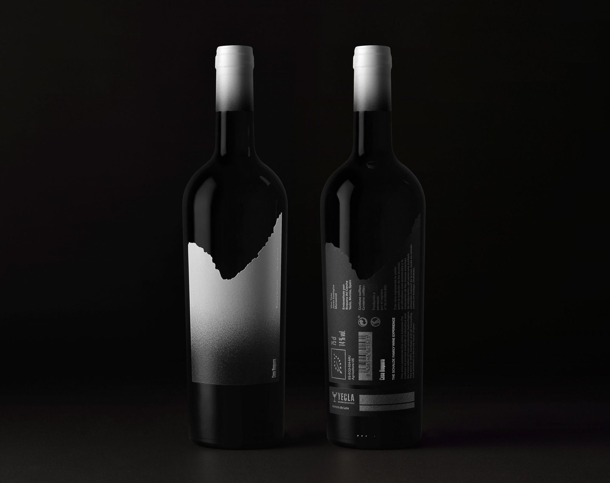
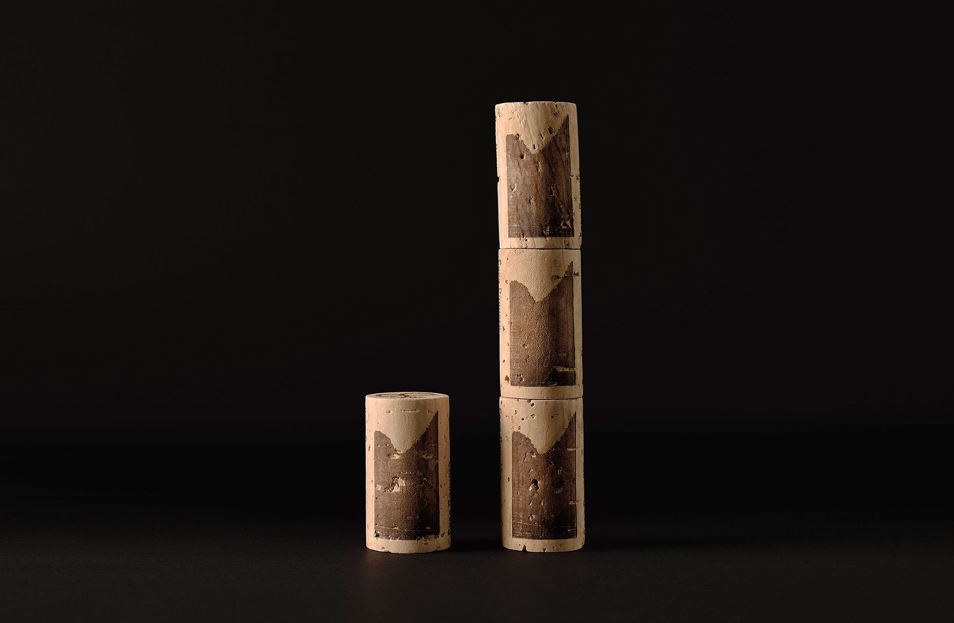
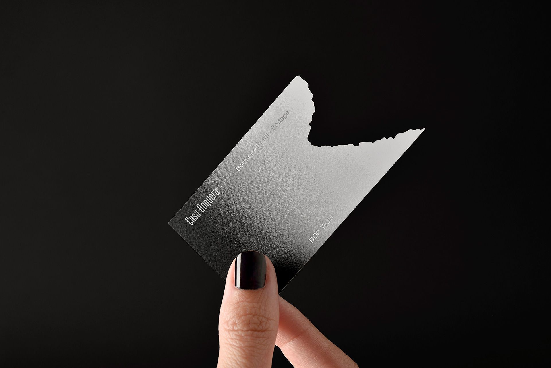
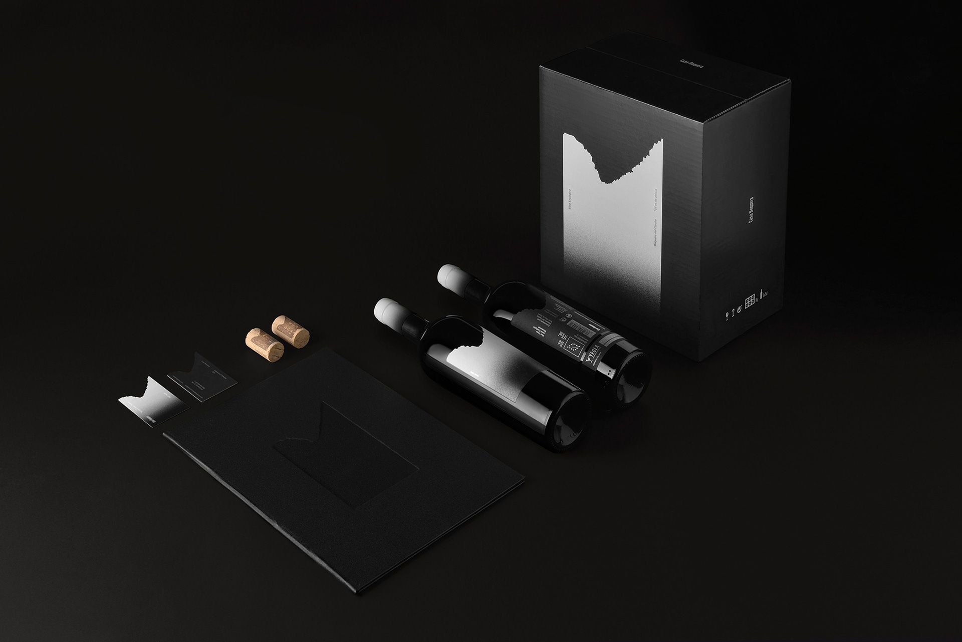
Boquera | Madrid, Spain
M A B A

Live free outdoors! | autosvadkemping.hu
