The building of the Kunsthalle, which is covered in a huge molino, is astonishing in Heroes Square. If we did not see the huge inscription promoting the exhibition of the institution, we would also believe that the neoclassical building was wrapped by Christo himself. However, in addition to the interlocking circular shape, the title of the 2nd National Salon of Applied Arts and Design, “Common Space”, opened on 10 April, can be read from afar.
The exhibition space is full of works by Hungarian designers and industrial artists, where black arrows from a white curtain mark the recommended route. This and the monochrome graphic identity of the exhibition is the work of the Submachine Studio, Ákos Polgárdi and Lili Tóth.
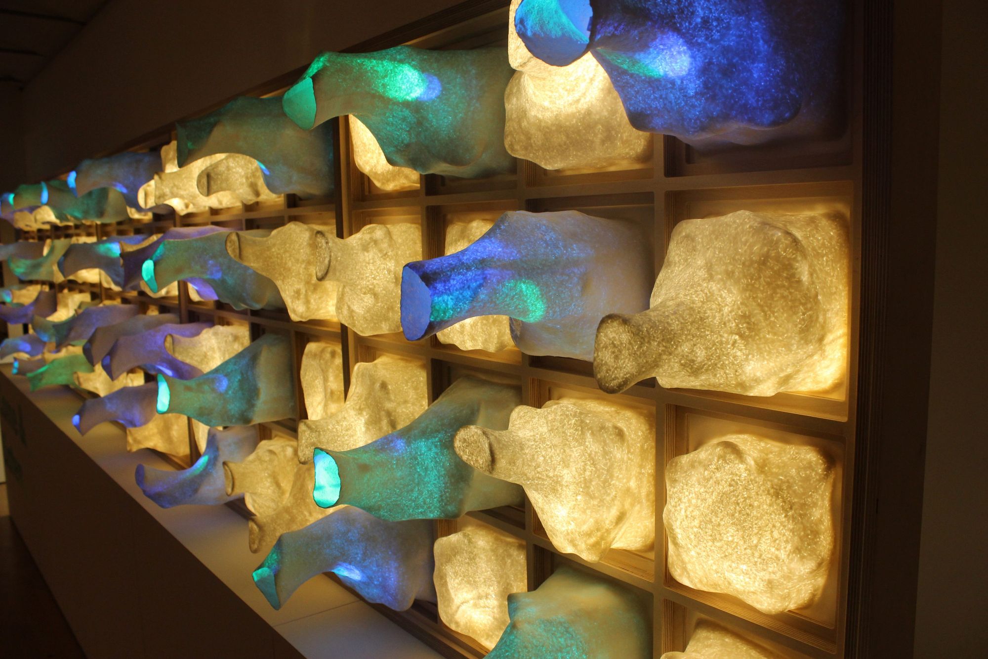
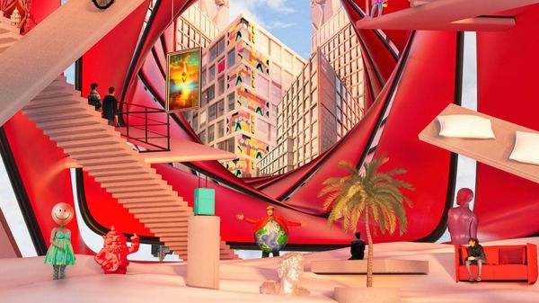
The title of the exhibition, “Common Space” refers to a physical (or spiritual) space such as the Red House, covered with glechoma, by William Morris, the pioneer of the Arts and Crafts movement, from which the concept of applied art itself is derived. According to the curatorial text of art historian András Szilágyi B., the conceptual frameworks and definitions used so far are apparently limited and inadequate to define design and applied art.
For this reason, a different type of approach can be seen during the exhibition: the artifact material is presented by Aristotle’s teachings, sorting through experience. After all, the objects in question are of no value in themselves, they gain their true meaning through human interactions.
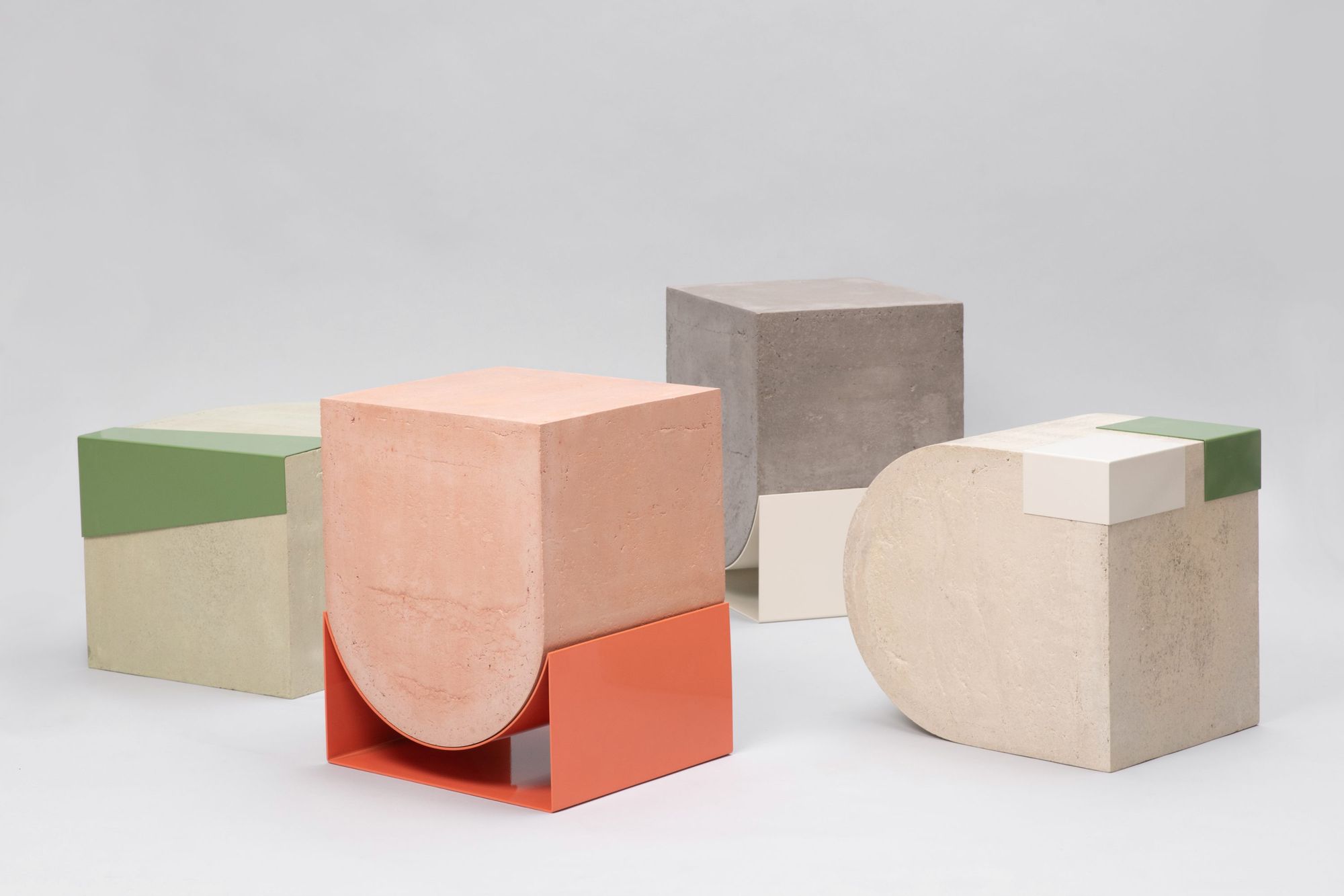
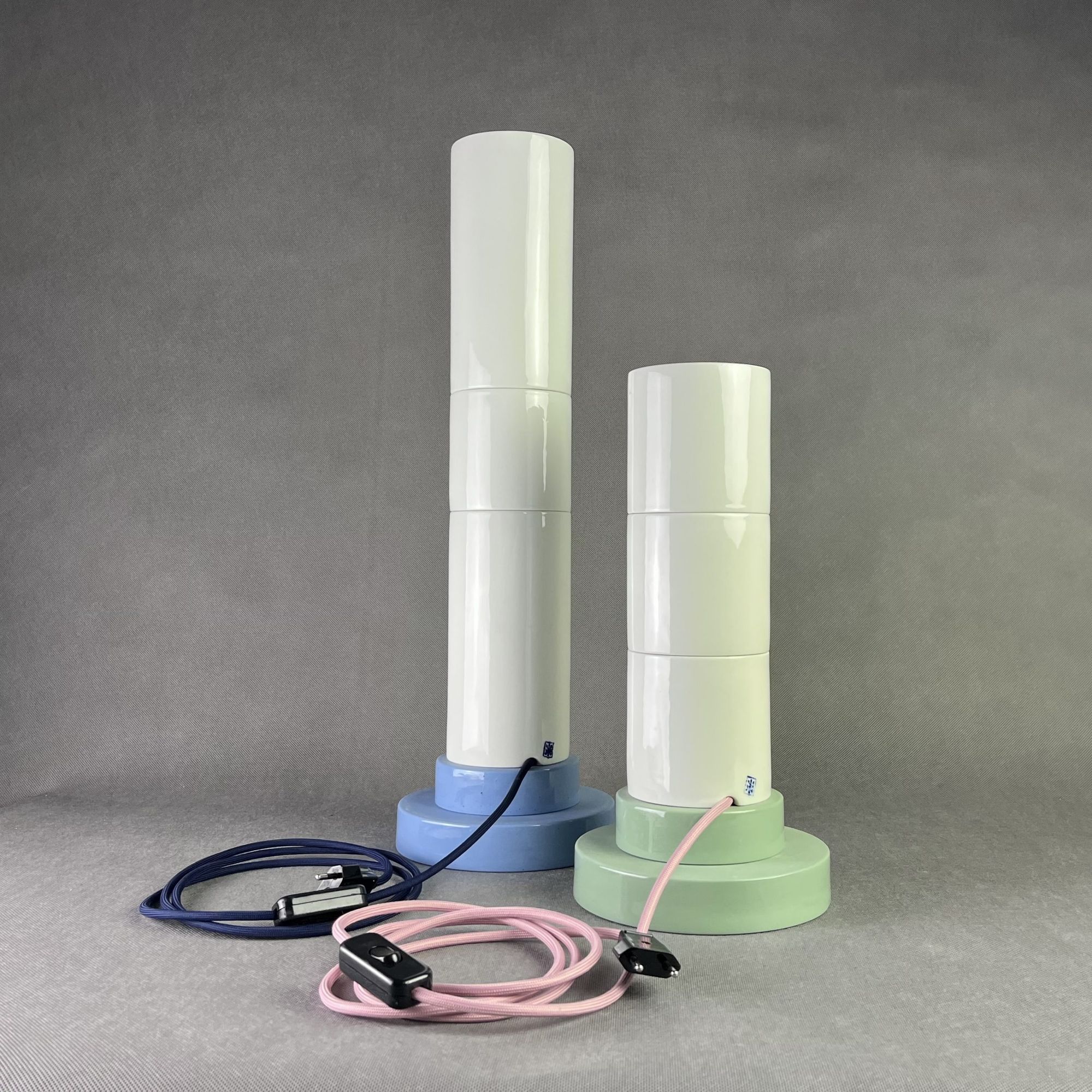
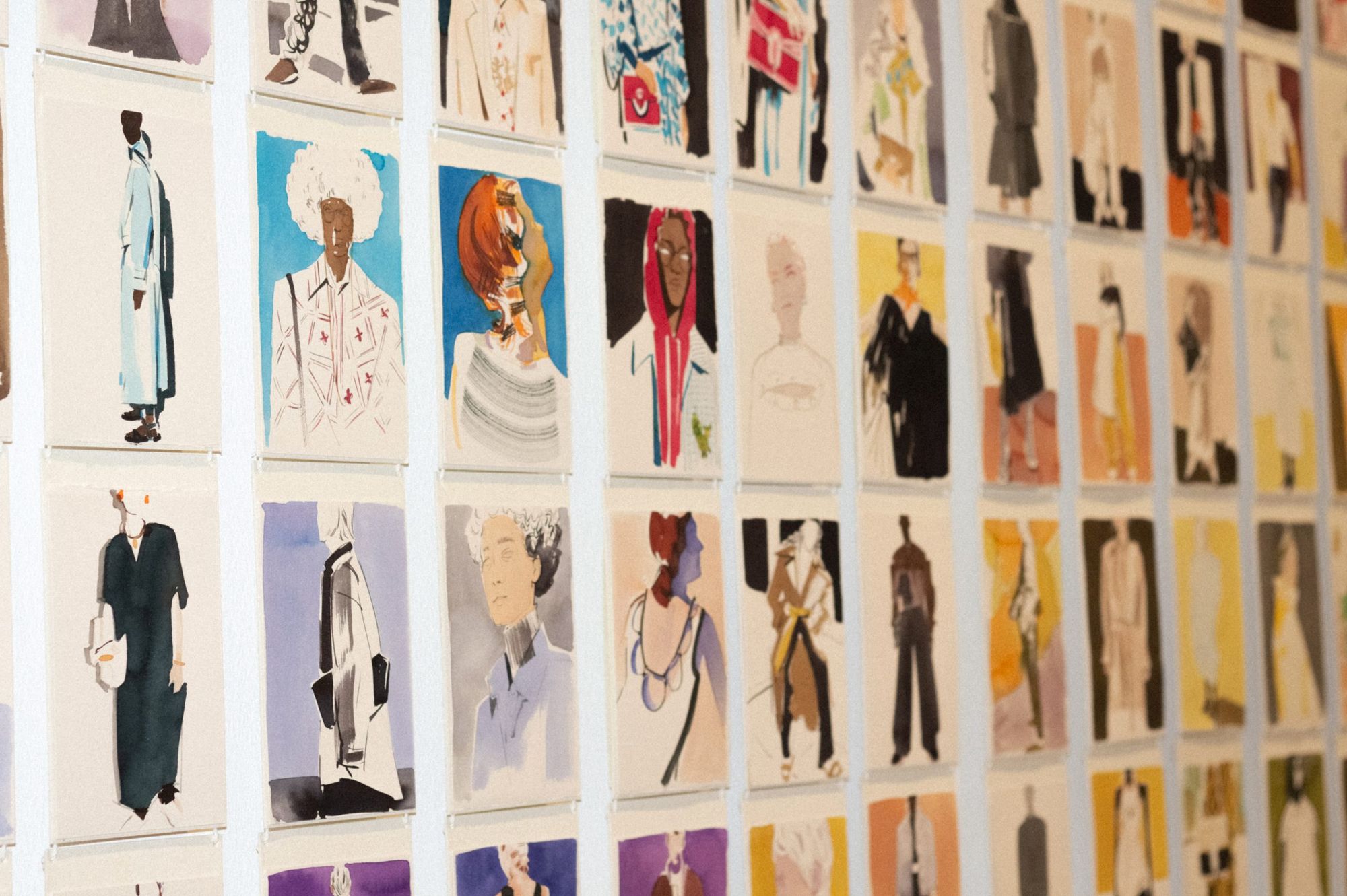
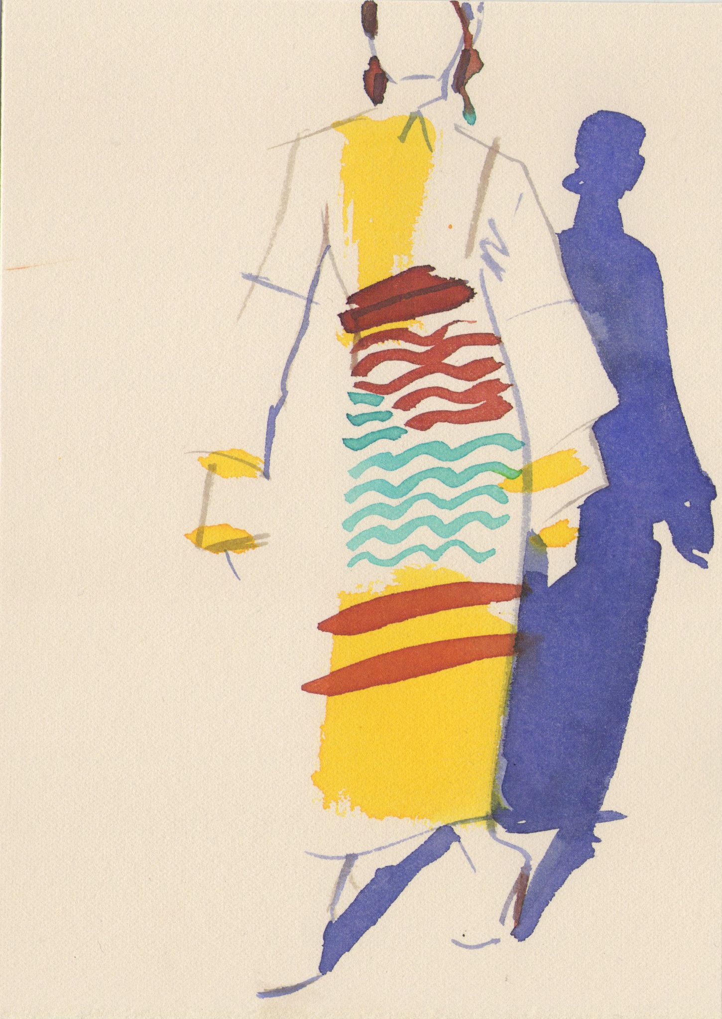
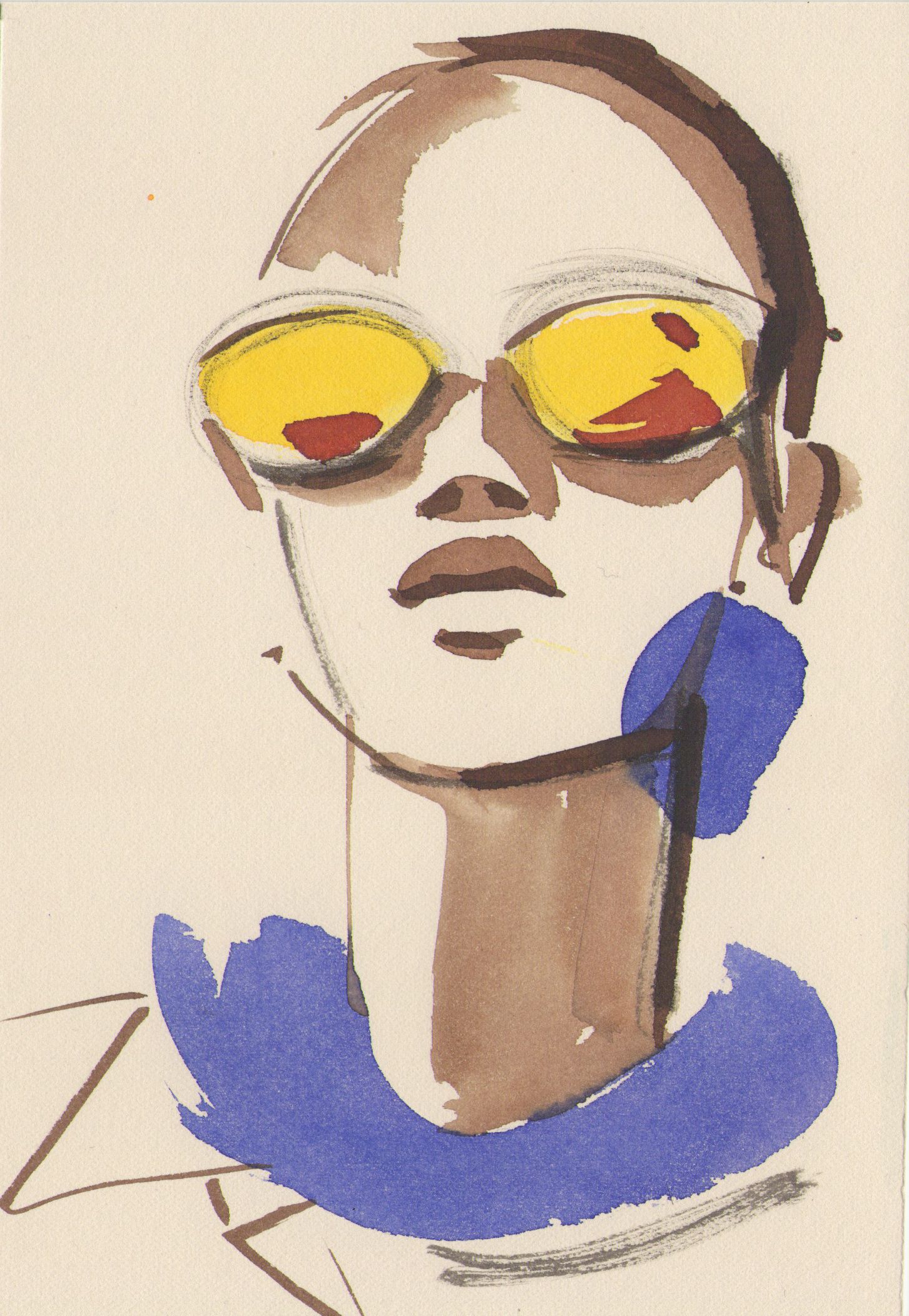
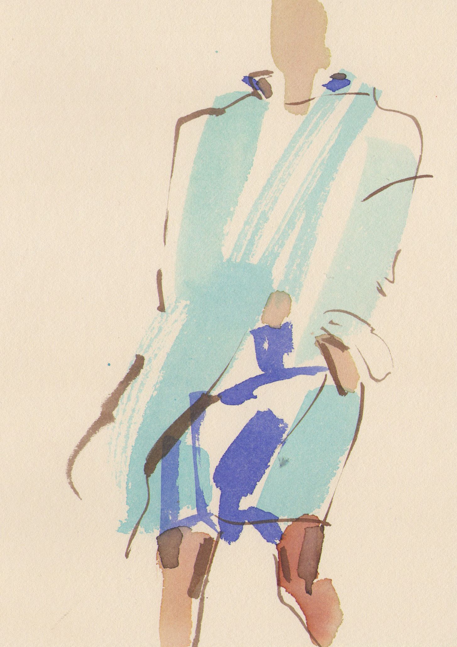
Thus, Aristotle’s ten categories go through the design and applied arts selection, the work of more than three hundred artists grouped by ten branches of art, who would be difficult to list, and among whom there are countless familiar names. We can see Anett Hajdú’s 2021 Postcard Project, which is a collection of 108 postcard-sized illustrations.
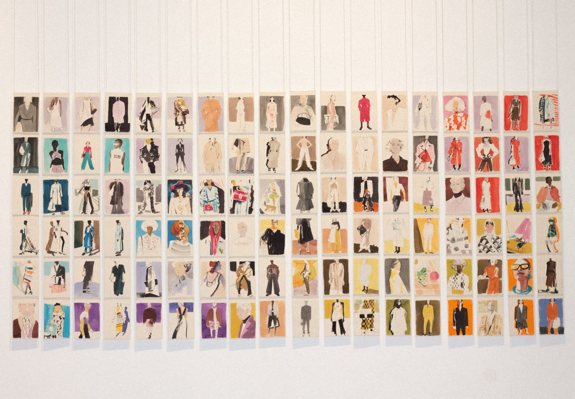
“My goal was to transform the photographic material of several international and Hungarian fashion brands that I find inspiring into illustrations, and a selection of them can now be seen. The Postcard Project fits gently into the fabric of the exhibition, and the clothes, textiles and accessories around it in the space are the medium from which I draw my inspiration as a creator. The small size gave me the opportunity to work on and develop three or four illustrations at the same time. Thus, the relationship between the pieces of the series is much closer, and their elaboration has also developed in relation to each other. As a principle of the arrangement of the pictures, the principle of gradient was used to determine how cold colors, that is, blue, green, purple, and warm colors, that is, yellow, orange and red dominate each other,” Anett told us about the project.

It is rarely the case that we can see the work of so many designers in a given space and time. This gives us a great opportunity to get a glimpse into the contemporary face of Hungarian design and applied arts. The exhibition can be visited in the Kunsthalle until 4 September.
Photos:
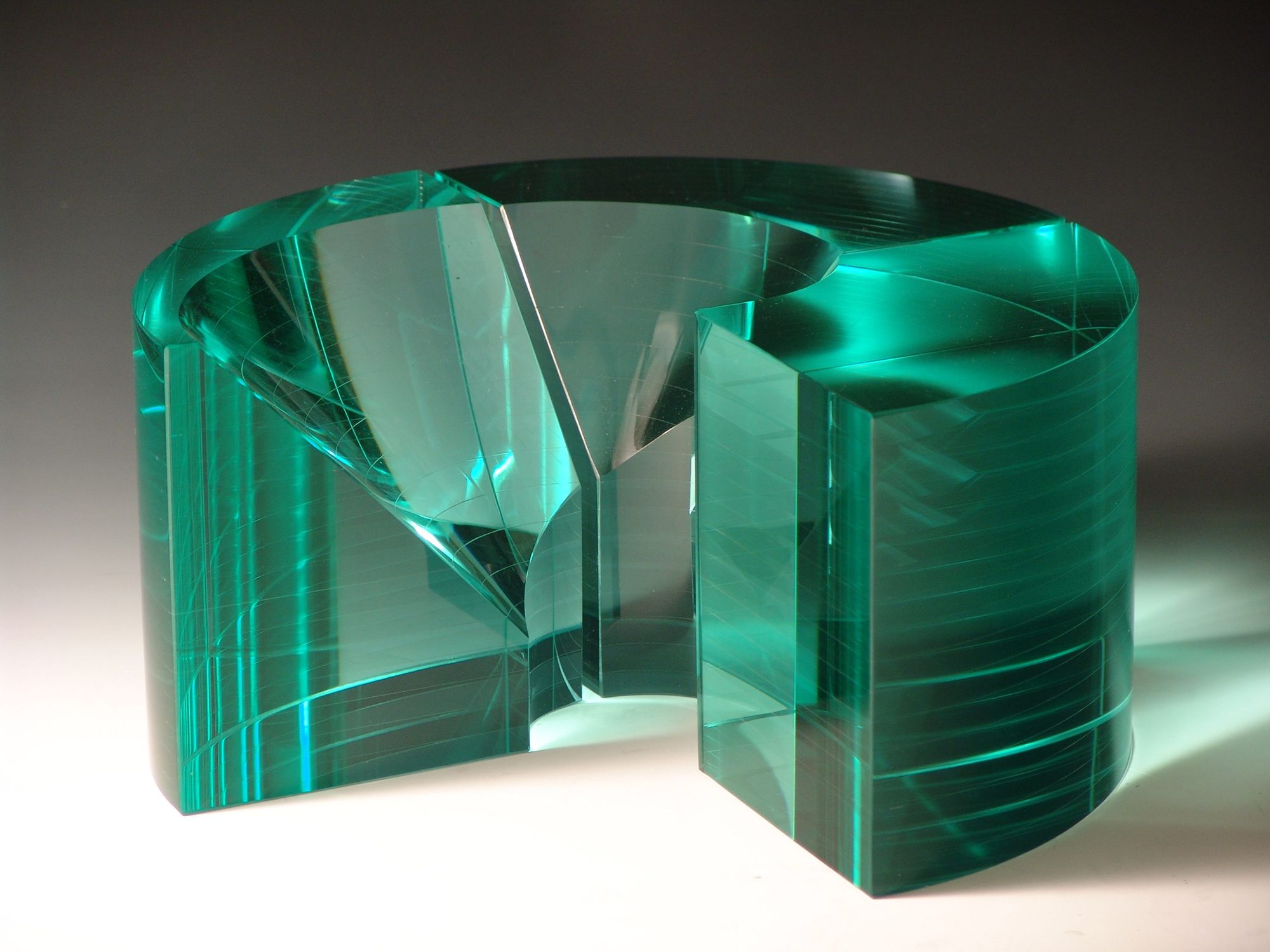
Image 1: Zoltán Bohus, Spatial Spiral, 1977, Photo: Zoltán Bohus
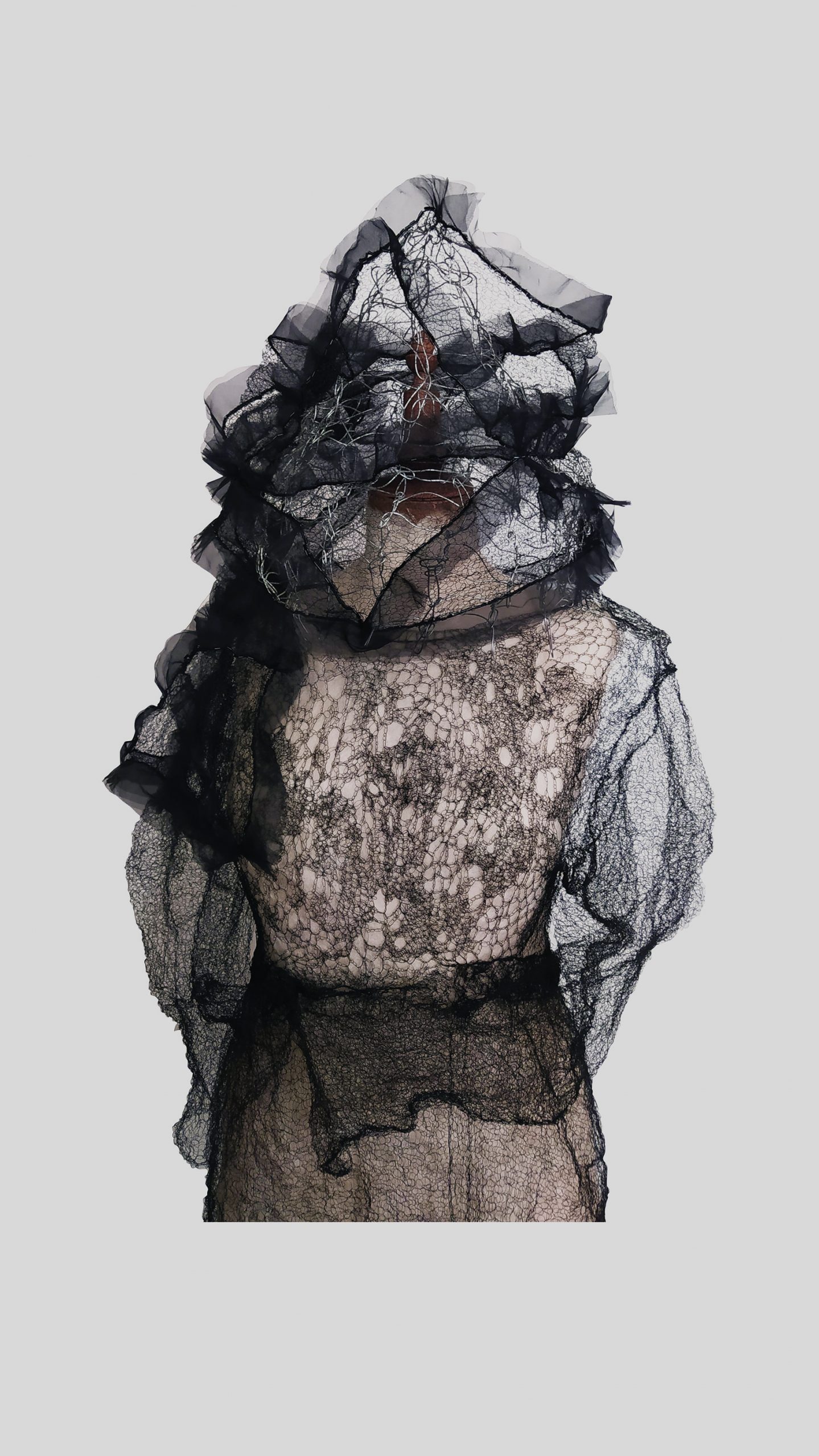
Image 2: Gabriella Kecseti, Grief, 2020, Photo: Zsolt Kecseti
Image 3: Edit Szabó, Interface Soundscapes, 2018–2019, Photo: Amanda Wanner
Image 4: Paper Up! U TURN, 2021, Photo: Milán Rácmolnár
Image 5: Márton József Strohner—Mastro Design, Collection light—Tower lamp I., II., 2021, Photo: Enikő Kontor
Image 6-7, 8-9-10: Anett Hajdú, Postcard Project, 2021, Photo: Anett Hajdú
Kunsthalle Budapest | Web | Facebook | Instagram
Anett Hajdú | Web | Instagram
Instead of urban legends, treat your hair with effective ingredients | ANJA


