


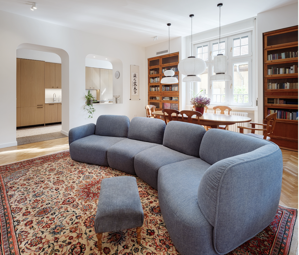
When renovating an Art Nouveau apartment in Buda, GOOD Studio preserved more than just the original parquet flooring, carved timber windows and cast-iron radiators: architectural details uncovered during demolition also found their way into the new layout. The result is a home adapted to contemporary needs, where preserved history and unexpected details come together to shape its character.
Renovating a grand apartment in an Art Nouveau building could easily become an exercise in preserving the trappings of the past. For its project on Nyúl Street in Buda, GOOD Studio took on a more complex task: reorganising the apartment’s labyrinthine layout while retaining the details that give the original space its character and adapting it to contemporary ways of living. Herringbone parquet, dark green timber windows and cast-iron radiators now sit alongside contemporary arches, concealed building services and a few unexpected design solutions.
Surprises Behind the Walls
The original layout of the apartment, located in a locally protected building, no longer suited its new owners’ needs. They wanted a spacious living room, three separate bedrooms and a utility room with a dedicated dog-washing area in place of the partially interconnected rooms. To achieve this, the designers had to fundamentally rethink the arrangement of functions: private spaces were moved to the back of the apartment, while the dining and living areas became a more cohesive communal zone connected to the kitchen. A key consideration was ensuring that the new layout would not override the building’s existing characteristics. “Even though we reversed the functions of the floor plan, we didn’t want to turn the apartment upside down,” the designers explain. The process therefore began with understanding the existing spatial relationships, identifying the elements worth preserving and maintaining an ongoing dialogue with the owners.
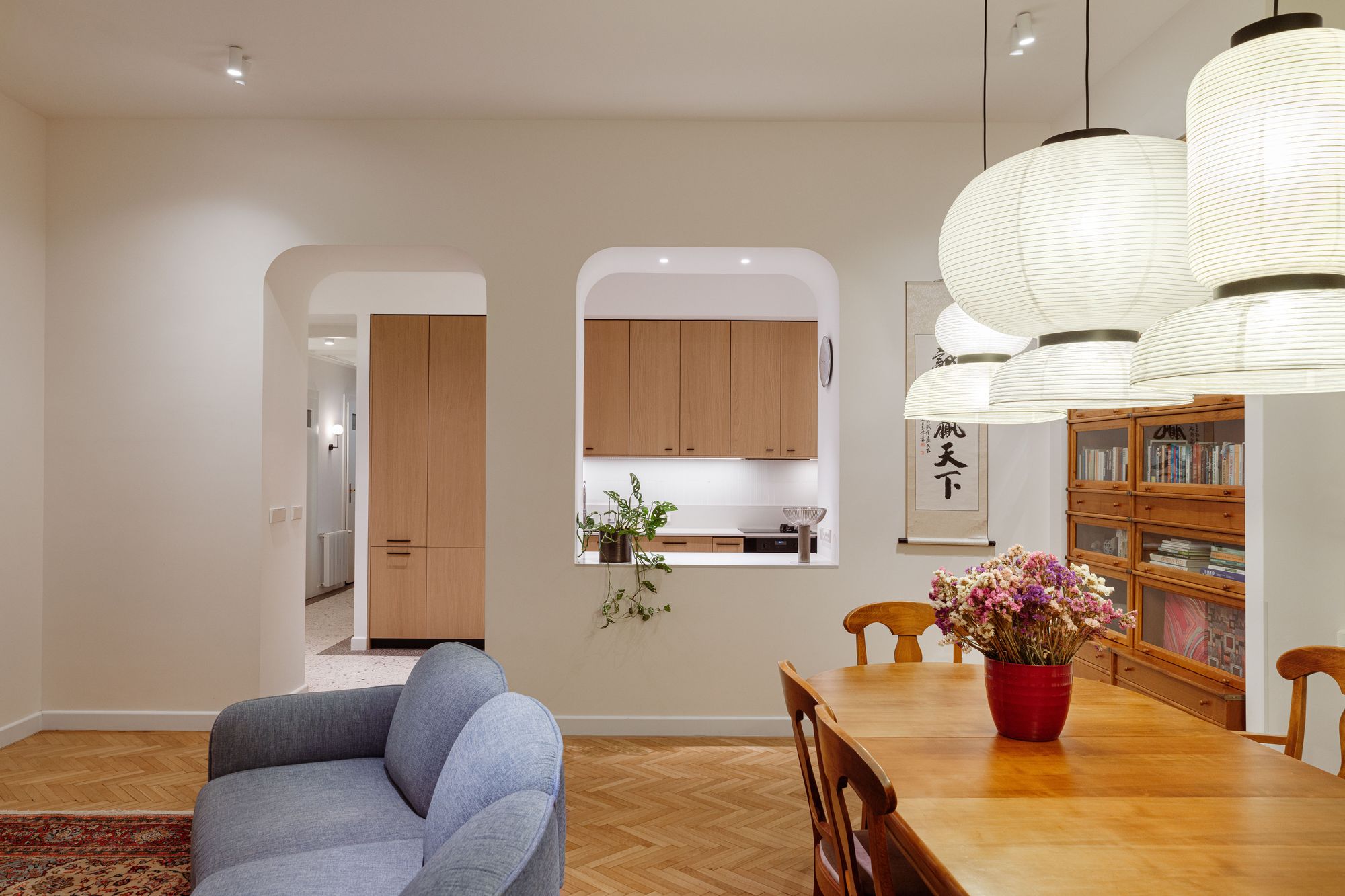
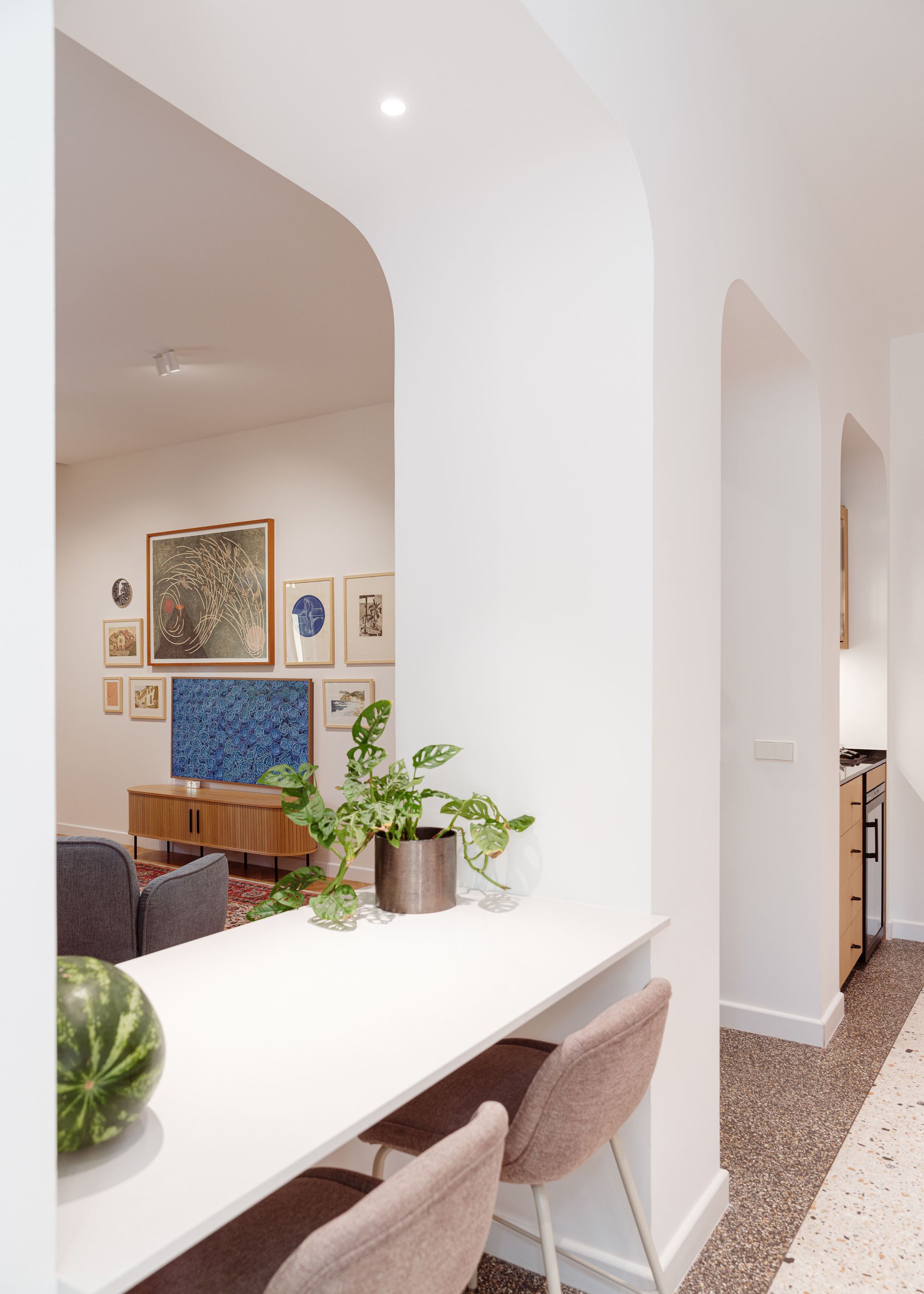
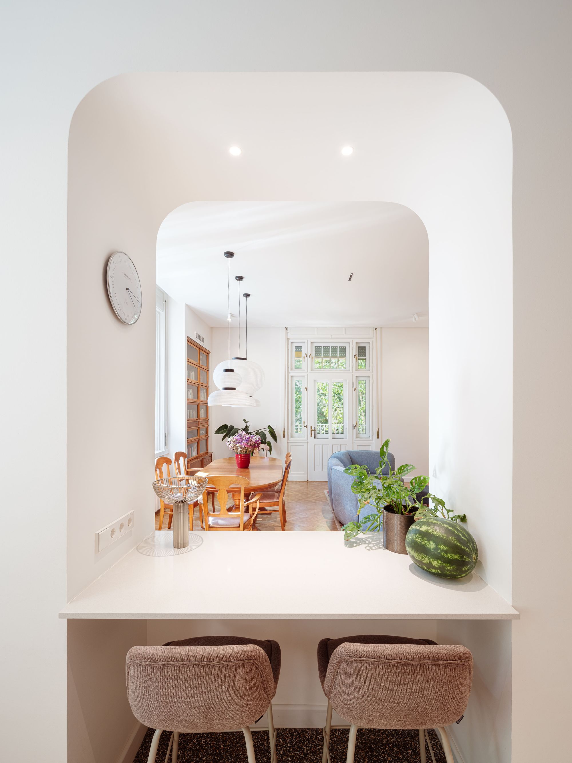
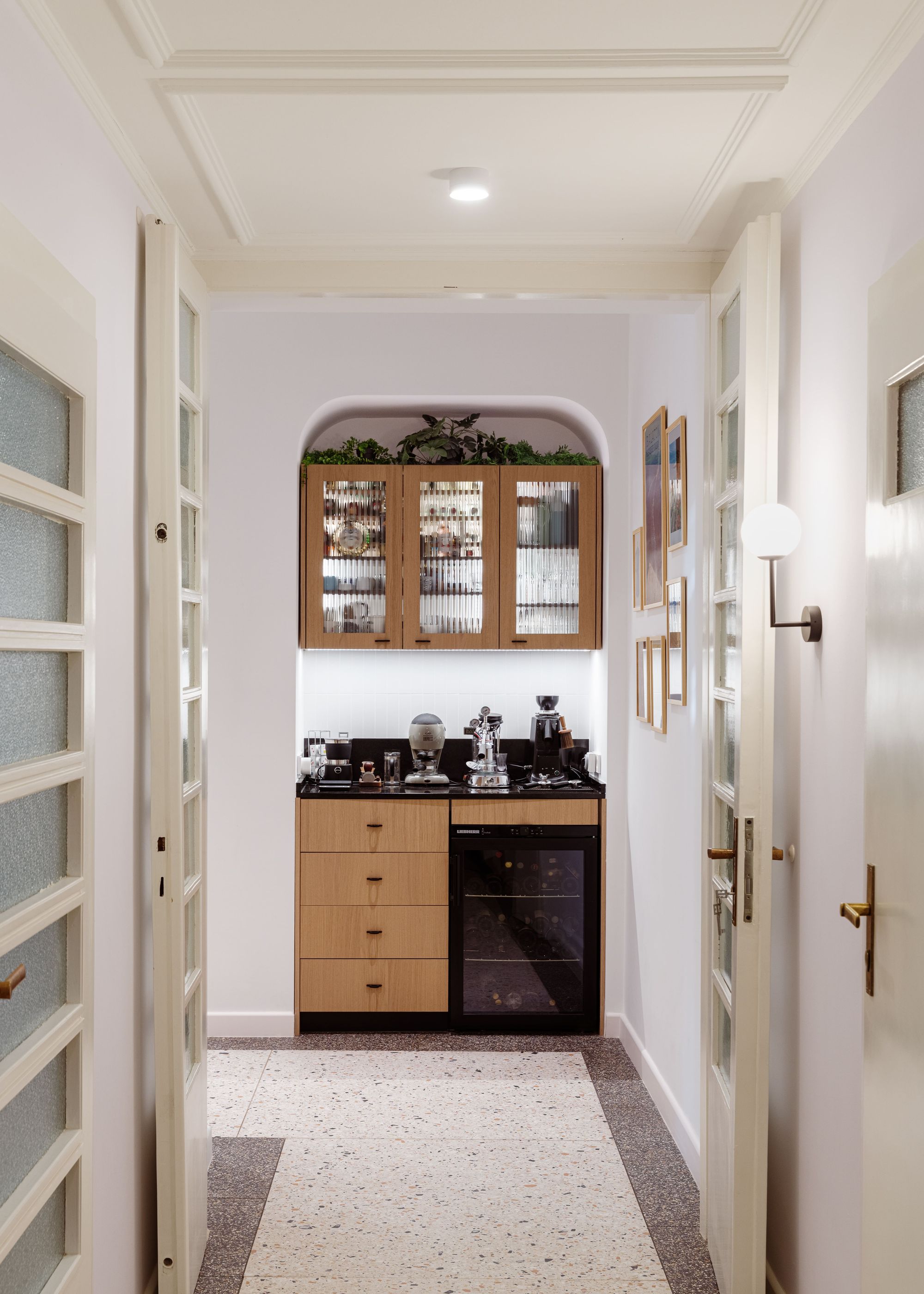
Demolition also revealed details that previous occupants had long forgotten. Behind a built-in wardrobe, for example, the team discovered an old opening, which they transformed into an arched passageway between the kitchen and the combined dining and living area. The rediscovered opening thus became more than an architectural relic: it evolved into one of the key elements of the new layout. The arches went on to become a recurring motif throughout the apartment. Two more arched openings mark the boundary between the dining and living areas, one of them incorporating a dedicated coffee station. The form reappears in the bathroom, where it takes on a more unusual role: the arch frames the bathtub. Its organic lines subtly echo the building’s Art Nouveau character, without turning the new additions into period-style scenery.
Another blocked-up opening was discovered in the pantry. By restoring the former window overlooking the staircase, the designers also opened up the entrance hall towards the circulation area, allowing in more natural light and creating a stronger visual connection. Such discoveries illustrate how renovating an old apartment can do more than make room for new interventions: demolition can also reveal possibilities that were already embedded in the original building.
Layers and Hidden Passages
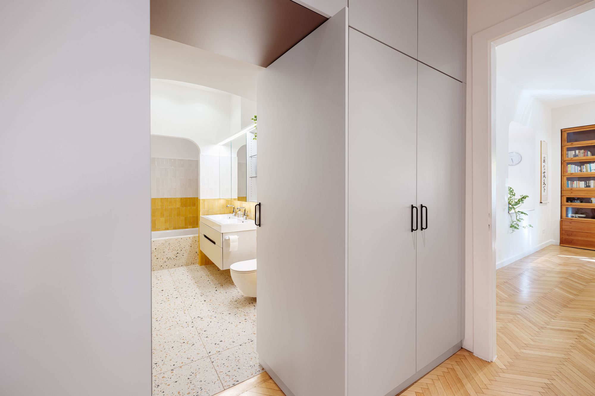
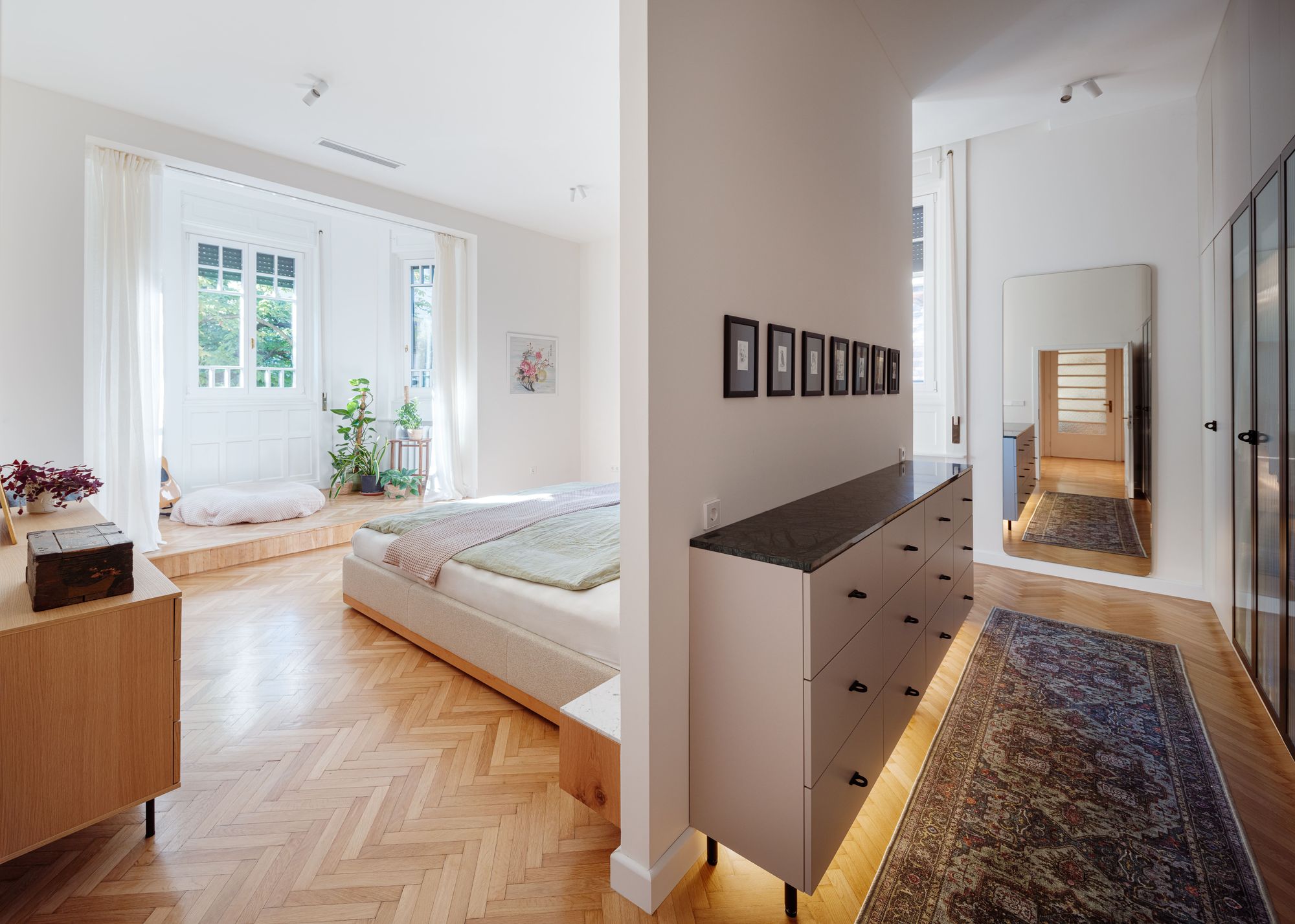
The new layout is held together by a simple, legible spatial organisation. The boundary between communal and private zones follows a straight line, avoiding unnecessary dead space between rooms. The original doors have been retained in the front part of the apartment, while the rooms at the back are separated by new sound-insulating doors. The bathroom entrance is a small spatial trick in its own right: it opens from within the built-in wardrobe, as though another room were concealed behind an ordinary storage unit. The owners have likened the solution to something out of Narnia, and it fits neatly with the apartment’s understated yet playful details. Layered spatial planning also shapes the rearmost bedroom. A custom steel-framed partition separates the sleeping area from the built-in wardrobes, while a raised platform in front of the window can be screened off with a curtain. Conceived as a secluded nook, it has ultimately become, in everyday life, a favourite resting place for the dog. The detail is also a reminder that the way an interior is used does not always follow the scenario laid out in the design: a well-considered space adapts to its occupants’ actual habits.
What Was Worth Keeping
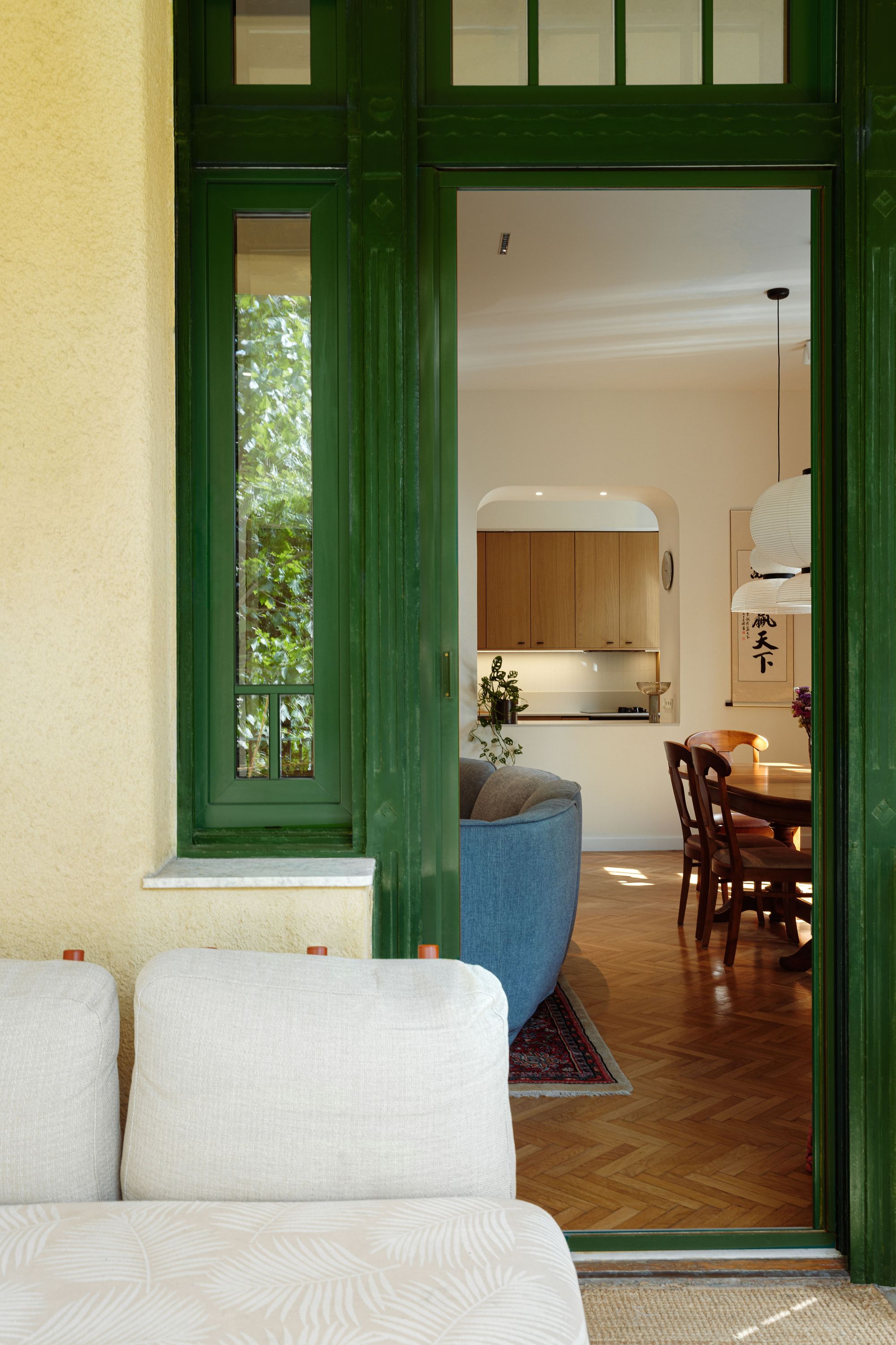
Preserving the apartment’s character came down to a series of small decisions. The dark green carved timber windows were remade based on their original heart-shaped pattern, this time with modern thermal insulation. The herringbone parquet, cast-iron radiators and shutters were also retained. The shutters were refurbished without losing their original functionality: the lower section can still tilt outwards.
Attention extended to less conspicuous details, too. The shutter straps feature an off-white finish instead of the familiar red stripes, and several of the original door handles have been put back into use. The new handles and window fittings are made from untreated brass, which will gradually develop a patina. Over time, the changing surface of the material will help the old and new components blend together, creating a connection that goes beyond their formal similarities. Existing furnishings have also become an integral part of the apartment. Alongside the Persian rug and dining furniture, the old Lingel wardrobe system has been given a new lease of life. It was dismantled into modular units and reassembled, breaking up what had previously been a heavy, continuous surface into smaller elements that better suit the redesigned space.
The renovation also became a personal project for the owners. Inspired by the process, one of them enrolled in an upholstery course and refurbished the old dining chairs by hand. The pouffe designed to complement the new sofa’s curved lines was their final exam piece. The old furniture has therefore remained for more than its aesthetic value: its story has continued to evolve through the renovation itself.
Meanwhile, the building services were completely renewed but deliberately kept in the background. The flat ceiling remains uninterrupted by conspicuous bulkheads, while the ventilation system and kitchen and bathroom extraction are largely concealed and integrated. The modern infrastructure therefore leaves the apartment’s traditional character intact. The owners’ art collection also played an important role in the lighting design. In the main living areas, adjustable double spotlights can be directed individually towards paintings and prints, while accurate colour rendering helps reproduce the artworks’ colours faithfully. The lighting thus serves both the practical needs of the home and the display of the collection.
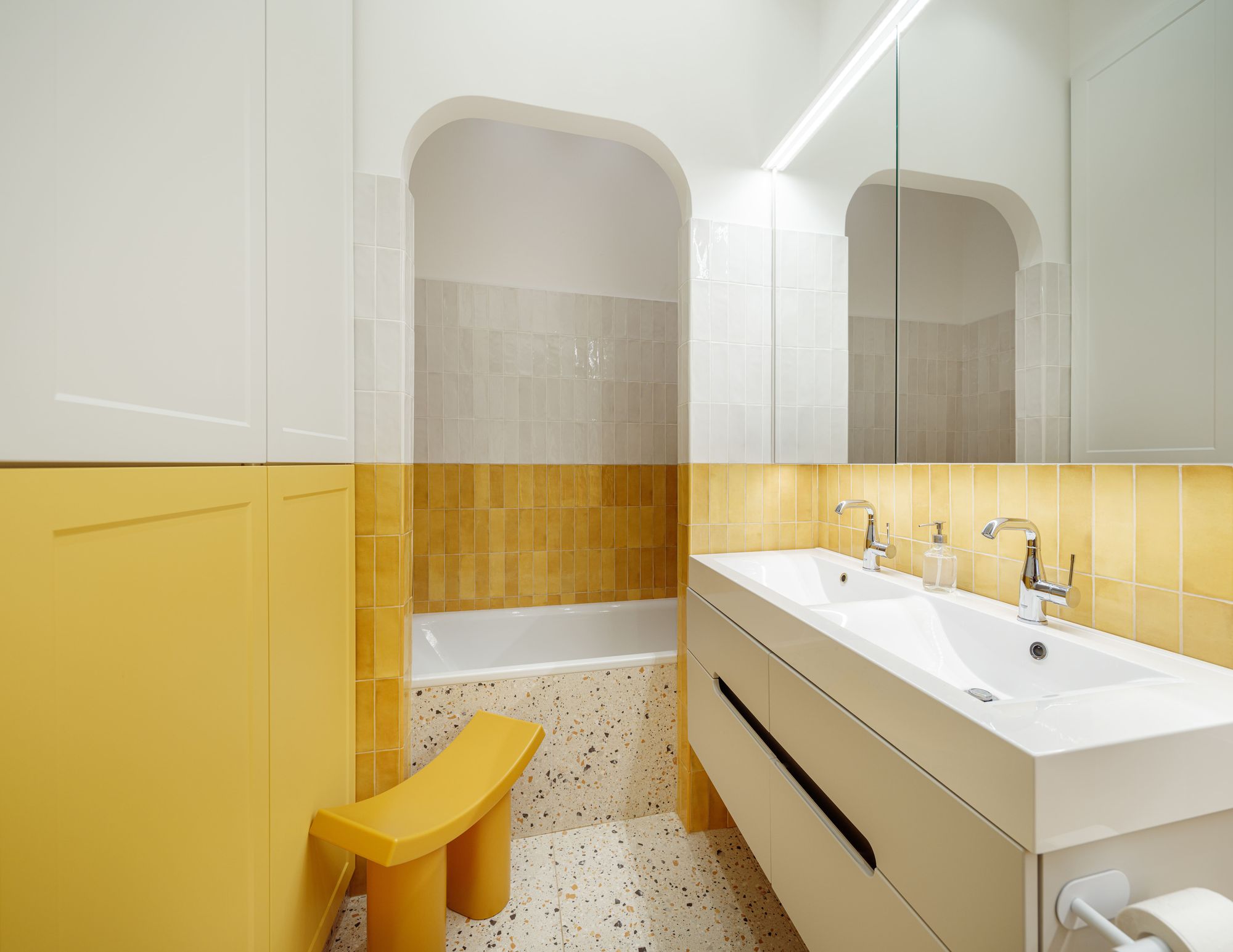
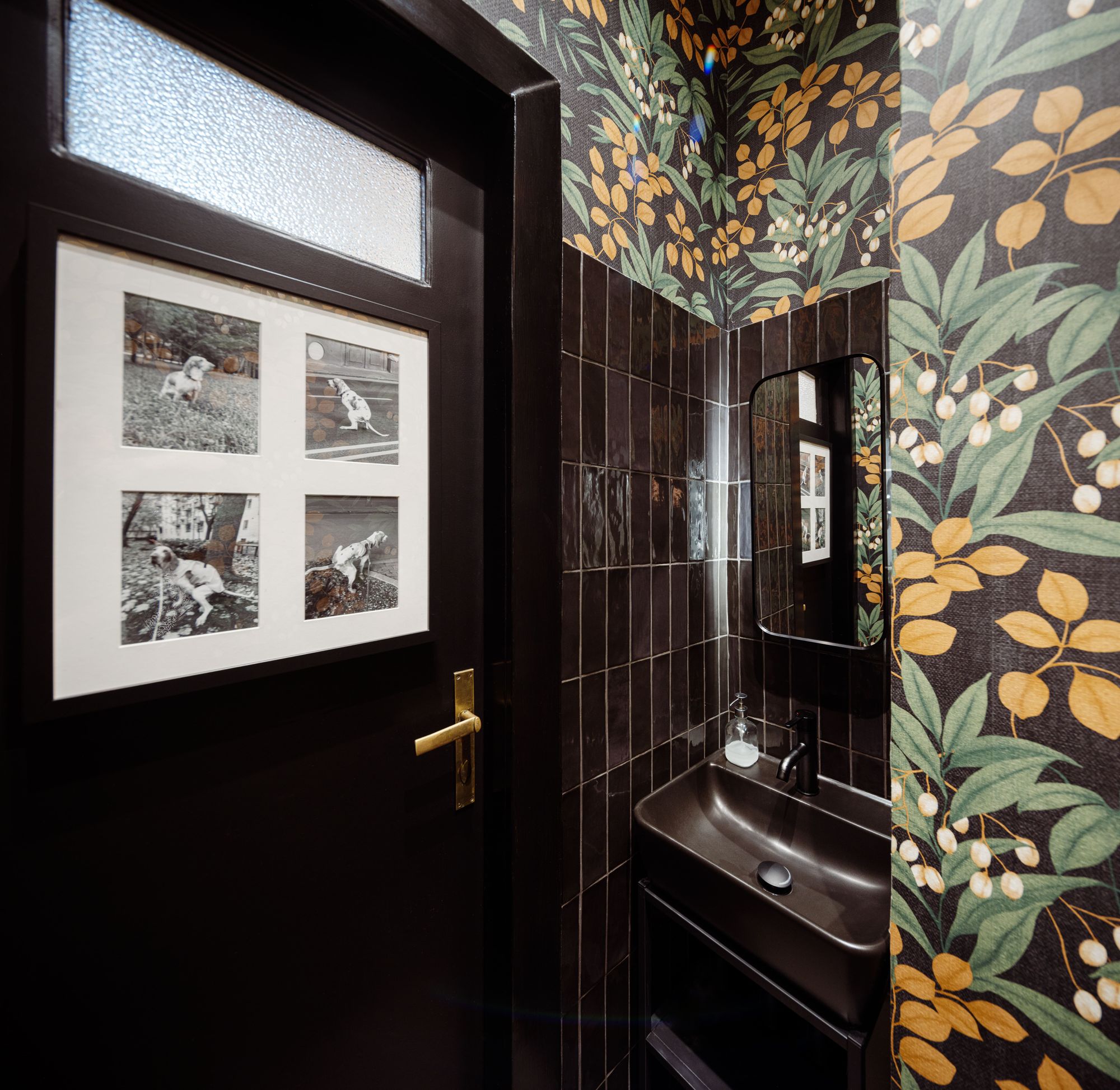
A Sun-Yellow Bathroom and a Black Guest WC
The apartment’s otherwise natural, restrained palette is punctuated by the sun-yellow surfaces of the main bathroom. The colour was the owner’s idea, and its influence extends beyond the bathroom itself: it reappears in the tones of the terrazzo-patterned flooring in the entrance hall and kitchen, as well as in the accessories of the guest WC. The second bathroom takes the opposite approach. With its black tiles, the guest WC stands apart from the rest of the apartment as a dark, assertive colour accent. The idea has an everyday point of departure: the owners enjoy dining out, and the designers drew inspiration from the way restaurant bathrooms often deliberately contrast with the main interior. The black tiles also reference the dark flooring in the building’s staircase, linking the small room to the wider architectural context rather than treating it as an isolated visual statement. Material consistency extends to the finer details of both bathrooms. Instead of plastic edge trims, the corners are finished with specially shaped ceramic pieces. These solutions may not immediately draw the eye, but details like these make the quality of the execution and the thought behind the design tangible.
Timeless Because It Starts with the Place
The apartment was not designed around a passing interior trend. The designers took their cues from the building itself, the owners’ lifestyle and the objects already in place, deliberately avoiding colours, materials and forms likely to date quickly. The result brings refurbished timber windows, old radiators and a contemporary steel partition together naturally, just as concealed building services and gallery-style lighting coexist with traditional parquet flooring.
One of the most interesting lessons of the Nyúl Street apartment is that modernising an old building does not necessarily require a dramatic change of style. Often, better results come from understanding precisely why a space works the way it does, then intervening only where it is genuinely necessary. In GOOD Studio’s approach, preservation and transformation are not separate tasks: the apartment’s contemporary character emerges from the interplay between its new functions and its original details.
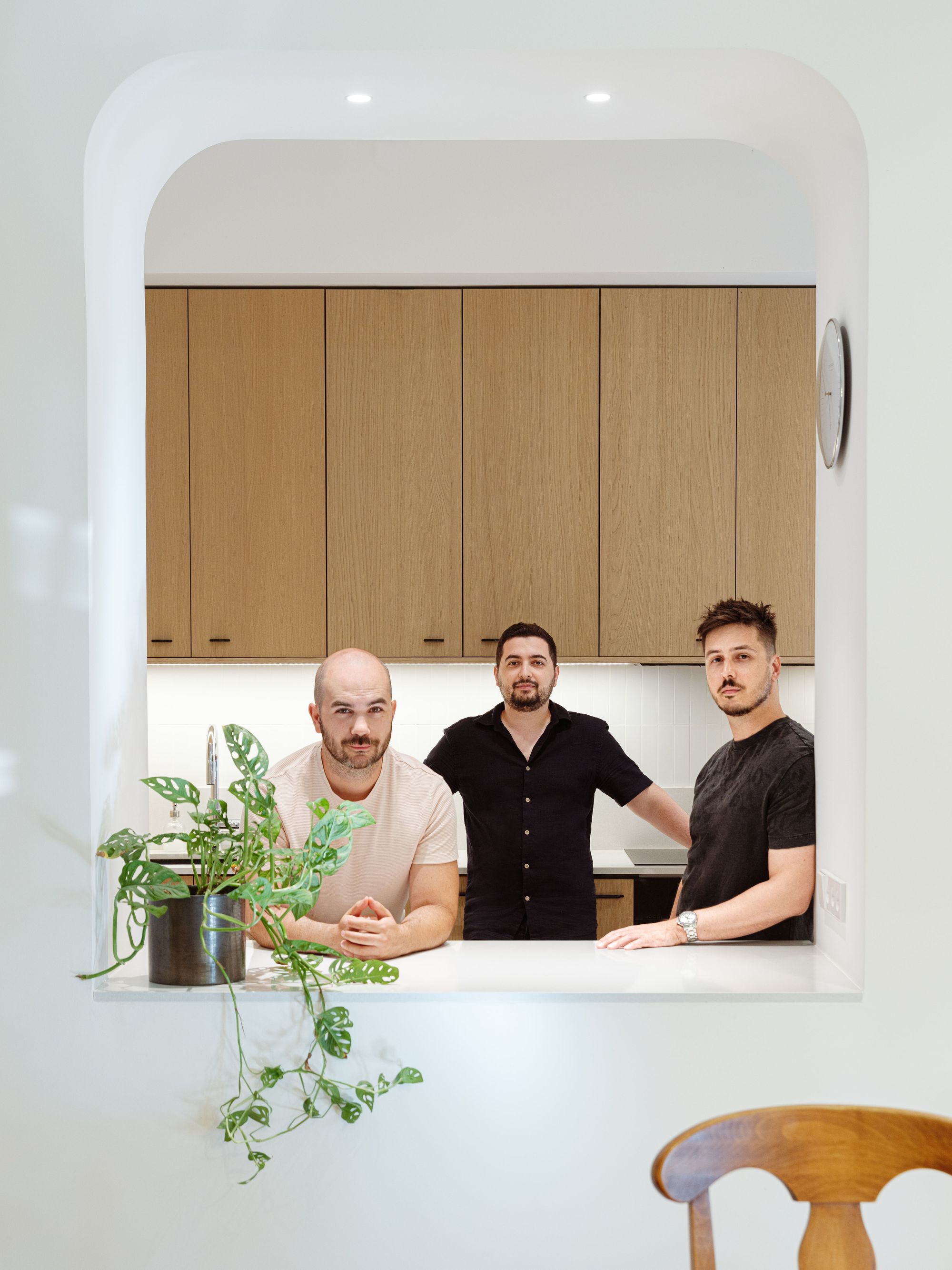
GOOD Studio – Designing from the Specifics
Budapest-based interior design practice GOOD Studio was founded in 2020 by Armaganjan Armen, Csapi Dániel and Székely Dávid, following nearly a decade of working together professionally and a long-standing friendship. The studio designs offices and high-quality homes; its projects include the interior design of the Dürer Office Building and Foodora’s offices.
The question at the heart of the studio’s work is how to make a space function as well as possible. The answer rarely lies in a predetermined style. Instead, it emerges through simple, well-considered gestures, precise spatial relationships and details that give the overall design an unexpected sense of character. Their sources of inspiration range from product design and technological developments to science fiction, Brutalist architecture and hip-hop culture.
Their creative work is supported by a carefully structured design process. Using in-house systems that they continually refine, the team automates routine tasks to leave more time for meaningful design decisions. GOOD Studio sees itself as a workshop where creative thinking, technology and organisation complement one another. Its aim is to create spaces that are timeless without being neutral: clean, understated foundations are always shaped by the specific location, the needs of those who use it and a handful of distinctive, well-judged details.
Fotók: Dániel Dömölky