The German car brand released a new, flat logo and a cleaner, more modern brand identity.
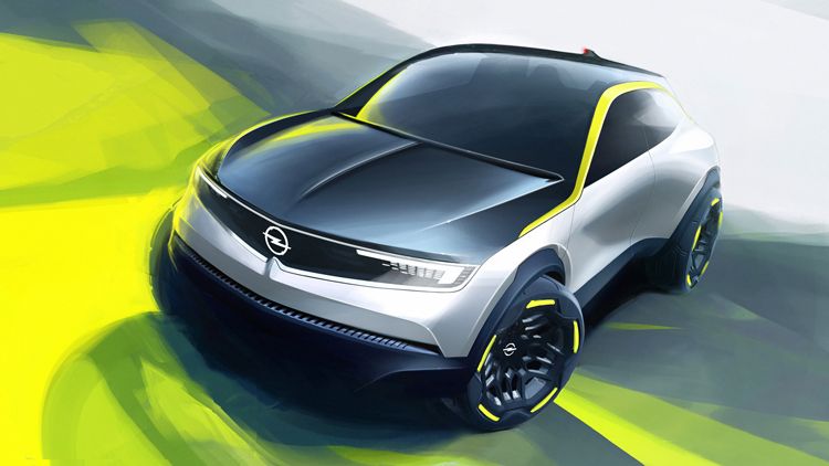
As car manufacturers keep putting more and more effort into developing electric models, all signs point to the fact that a new era of the automotive industry has arrived – and Opel’s fresh brand identity is here to welcome this new age. The flat logo design is nothing new for the brand, but this time they tweaked it a little bit, too: the roundel capturing the lightening bolt became thinner, and with the neon yellow color and the new typeface dubbed Opel Next, the finely drawn lines resulted in an even cleaner and bolder look. The new brand identity echoes the philosophy inspired by modern German culture, described by Opel’s managing director of marketing Xavier Duchemin as “confident, young-minded and inclusive”.


The new identity is a collaboration between Opel and Velocity McCann, while the Opel Next typeface was designed by Monotype.
Source: designweek

New memorial center handed over in Auschwitz

Good people, good places | Big picture of gastronomy


