When the experts of the brand ANITATOTH dreamt up the packaging of their premium quality cosmetics products, their primary goal was to grasp the high quality and mold it into a physical form. They turned to Flying Objects Design Studio to help them reach their goal.
In the case of the visual identity concept of the ANITATOTH cosmetics brand, beauty comes from within: the concentration of top quality, raw and organic ingredients is a given, this is followed by the brilliant physical and visual expression. “We designed our products in a manner to nurture and protect the body for glowing and hydrated skin. It is our mission to offer those passionate about healthy living a product palette that is elegant on the outside and extremely pure on the inside, concentrating as much beneficial impacts as our skin needs. We present all this as part of a transparent, minimalist skincare routine, because when it comes to skincare, we believe less is more,” introduces the brand founder Anita Tóth, whom we asked about packaging design in the followings.
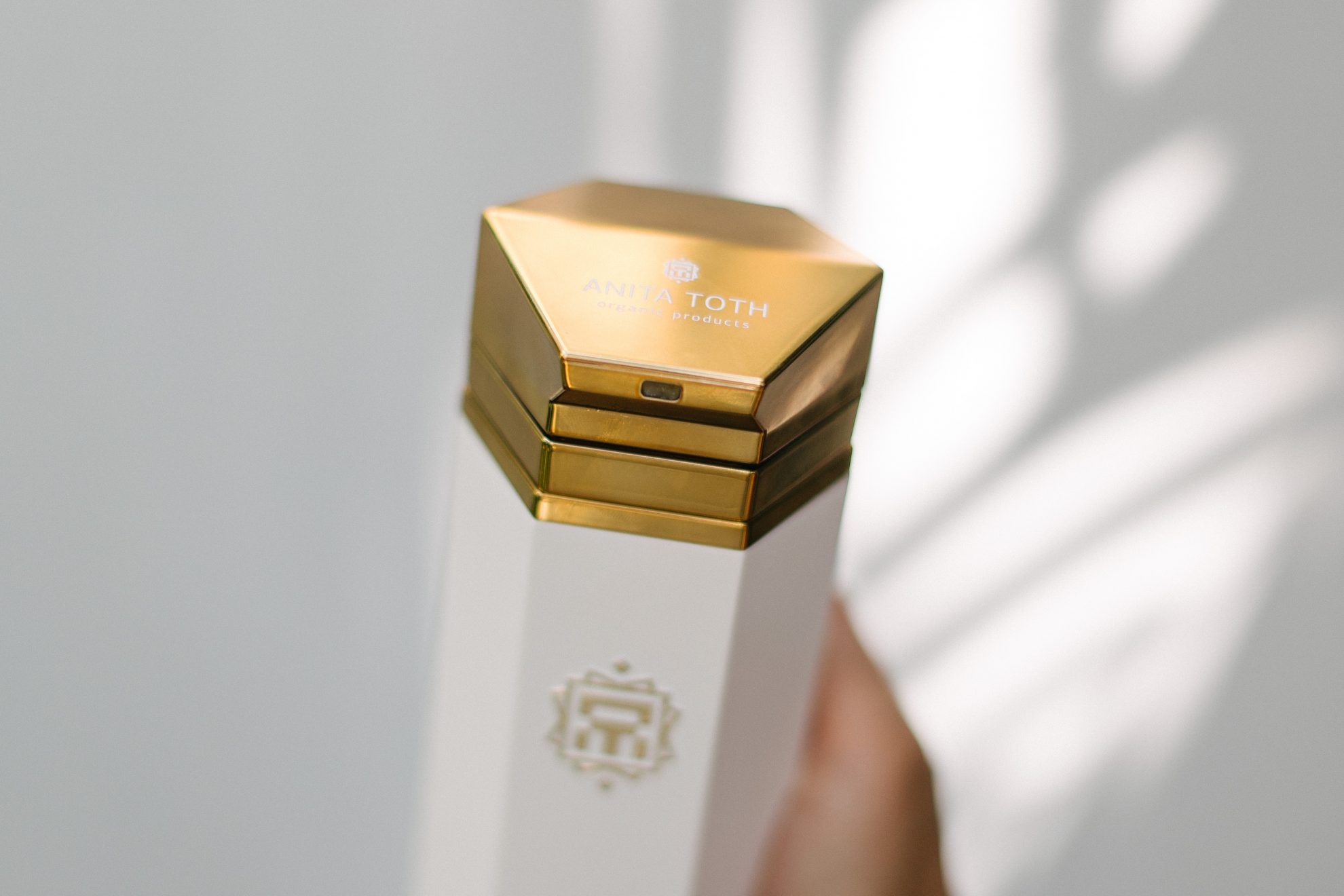
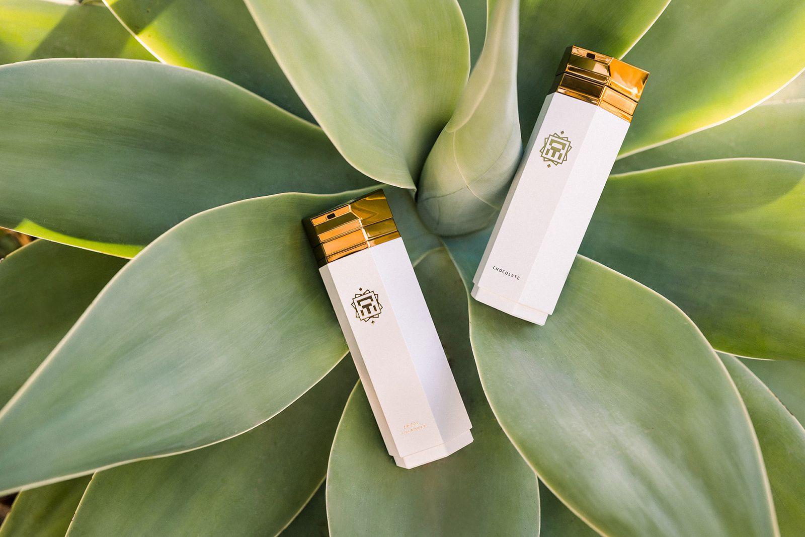
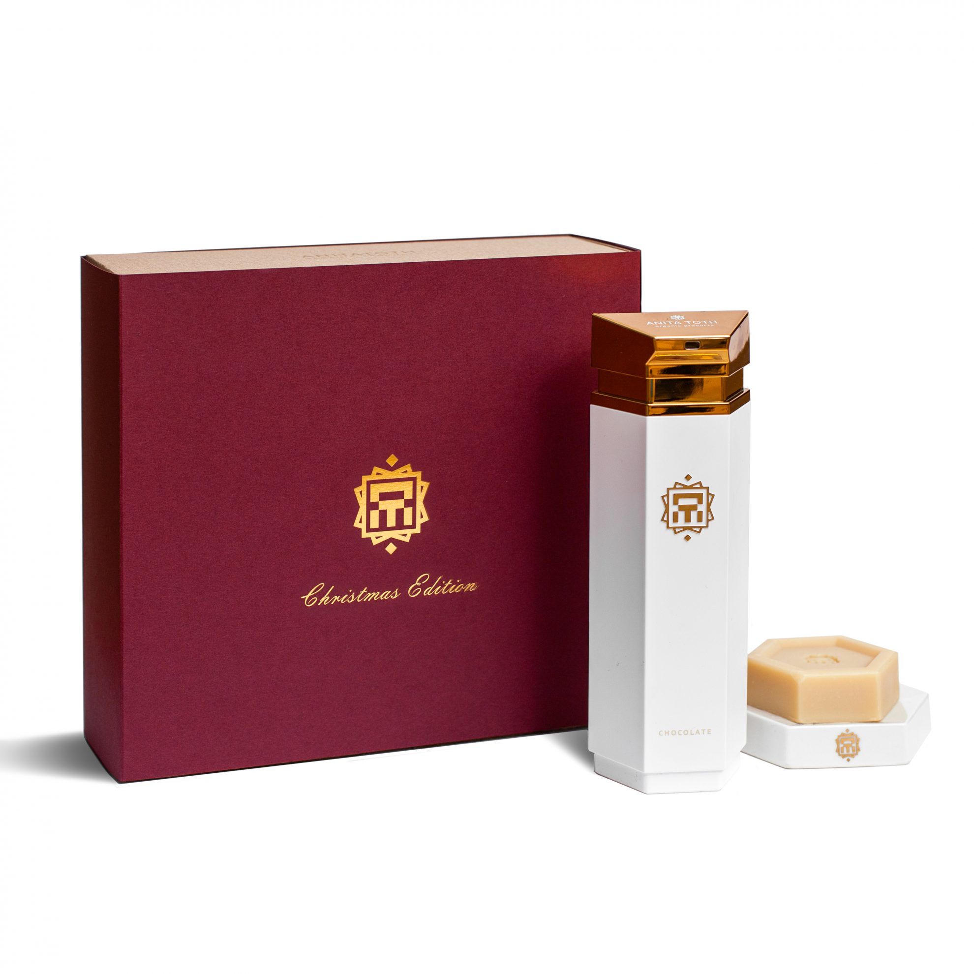
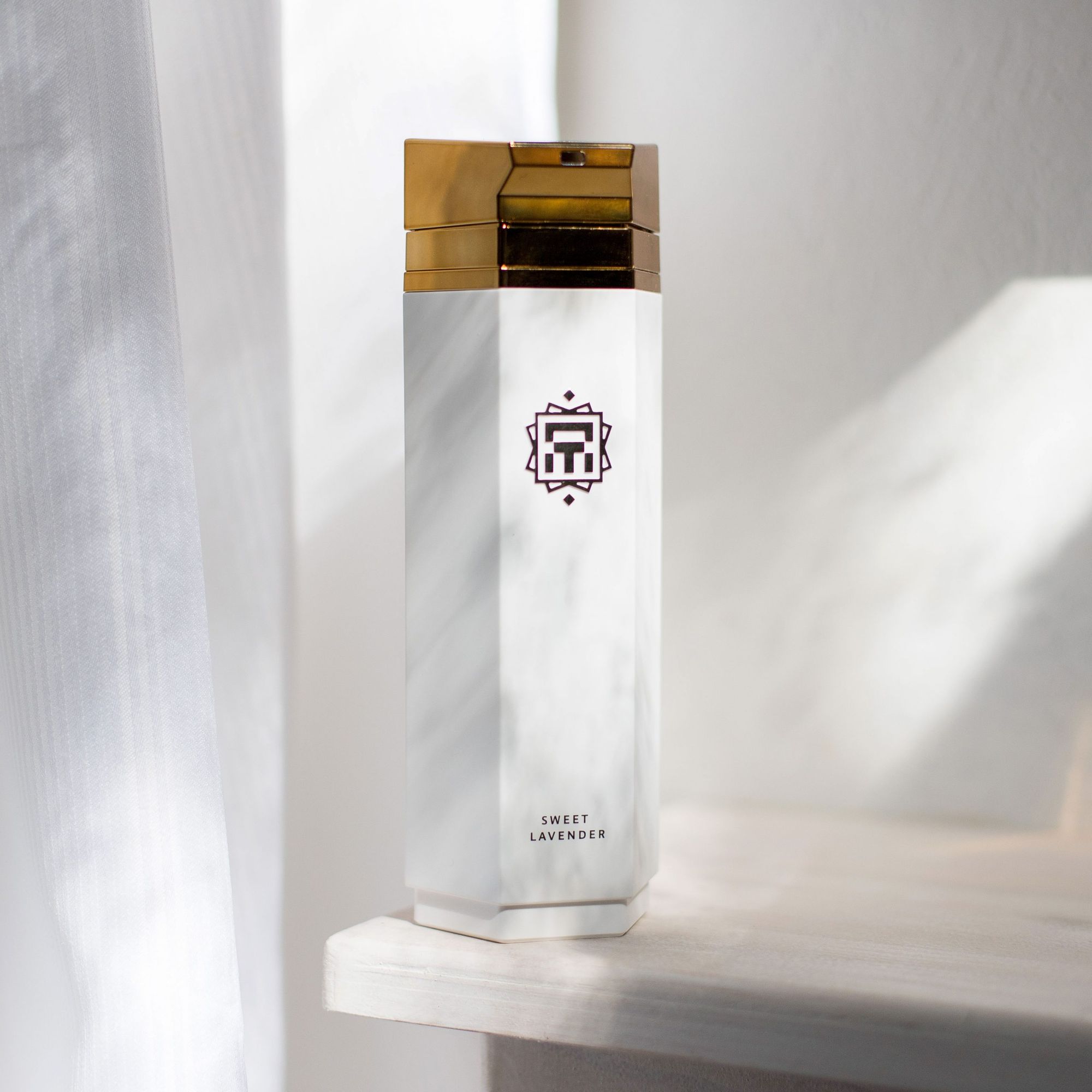
The shapes and colors of the products are emphatically built on these values. When designing the visual identity, as Anita puts it, their goal has been from the very beginning to give this feeling a physical form. “We only add high quality raw butters and oils into our products. We wanted to represent this niche character with the combination of white and gold, too. No matter how banal it may seem, it is still gold that has been called the »king of precious metals« from the very beginning of history. And the glamour of gold is rounded off by the color white representing purity and elegance perfectly.”
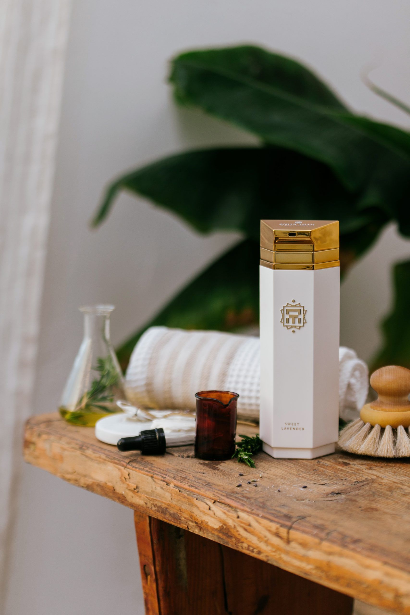
They turned to the team of Flying Objects Design Studio to design the packaging. In addition to the colors, they set the geometric and characteristic lines and the hexagon of the logo—encompassing the six pillars of the philosophy of ANITATOTH—as a guideline to the designers. They wanted to see an object that could become a timeless decorative element of customers’ apartments. The designers got in the swing of this timeless yet not at all ostentatious luxury instantly. “The creativity and work ethic of the youthful team also inspired us: we loved how they presented plans and ideas already at the very beginning that we could fully relate to.”
“Knowing that someone understands and feels the values of the brand and that they can manifest it in the form of shapes, implementation and creativity was exhilarating,”
says Anita about their work together.
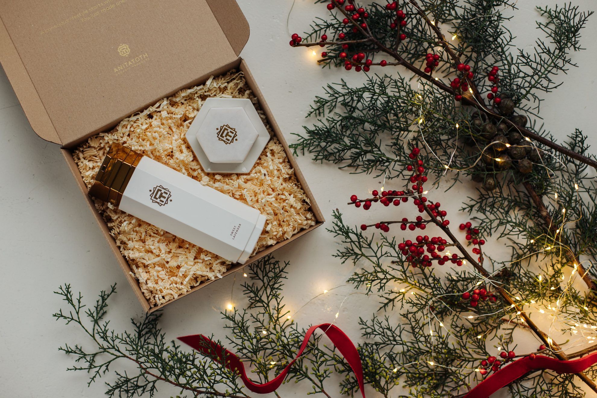
“The packaging and visual identity of AnitaToth Organic Products are the result of a long-term cooperation. As the products are high-end items, it was important for the packaging to also represent this character:
it should encourage us to leave the cosmetics items out on the shelf instead of putting them away in the drawer, to let them decorate our bathrooms,”
says András Húnfalvi, the designer of Flying Objects Design. “The visual identity and the packaging design were created to meet the needs of an exclusive brand. The most important aspect when designing the packaging was to guarantee the quality of the cosmetics products. In the case of the body lotion, we are talking about a unique, airless bottle, the design of which entailed an entire product design process. The hexagonal basic forms and the colors are echoed on the entire product palette, thus forming a unified image,” added András to the description of the design process.
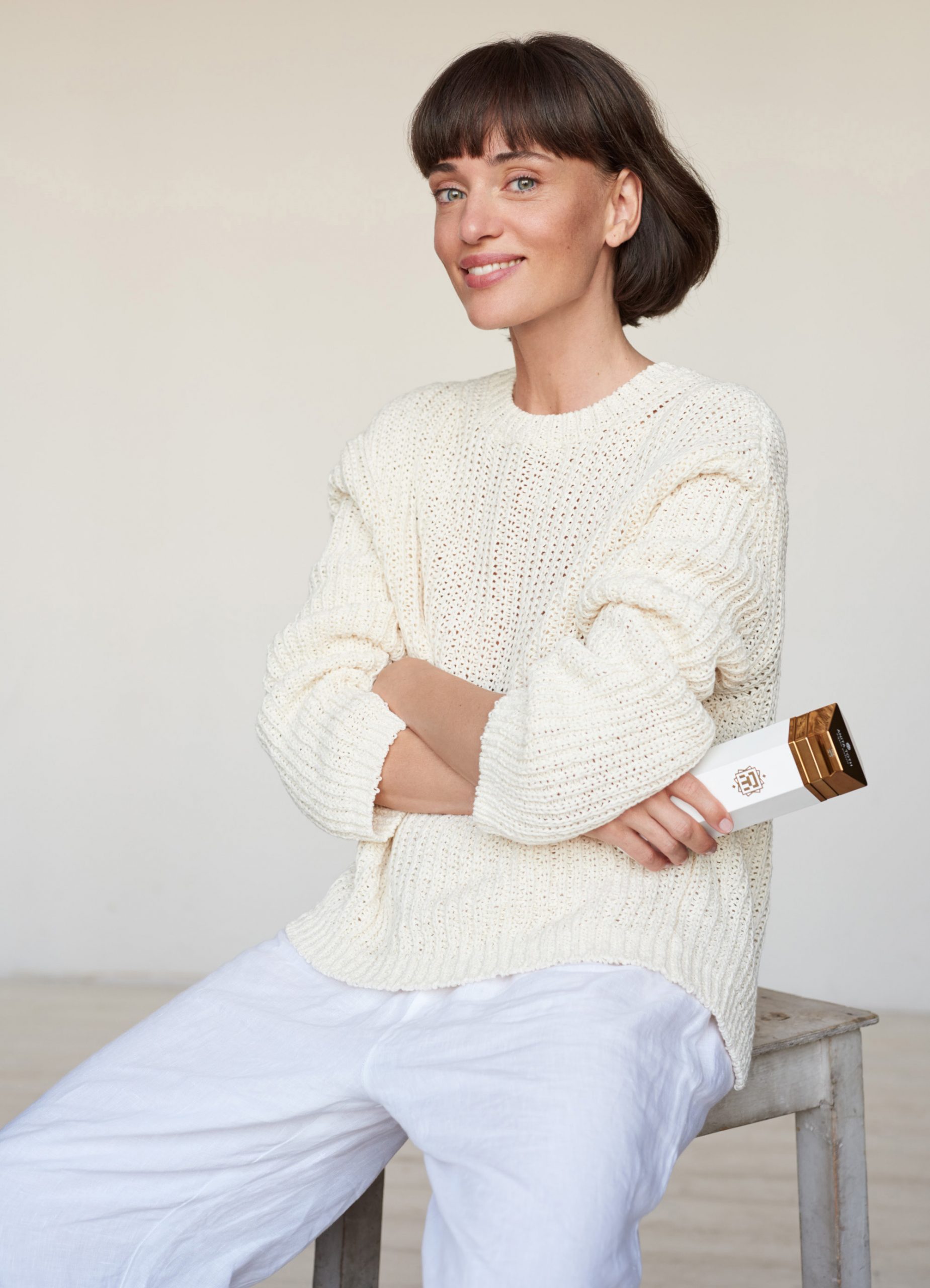
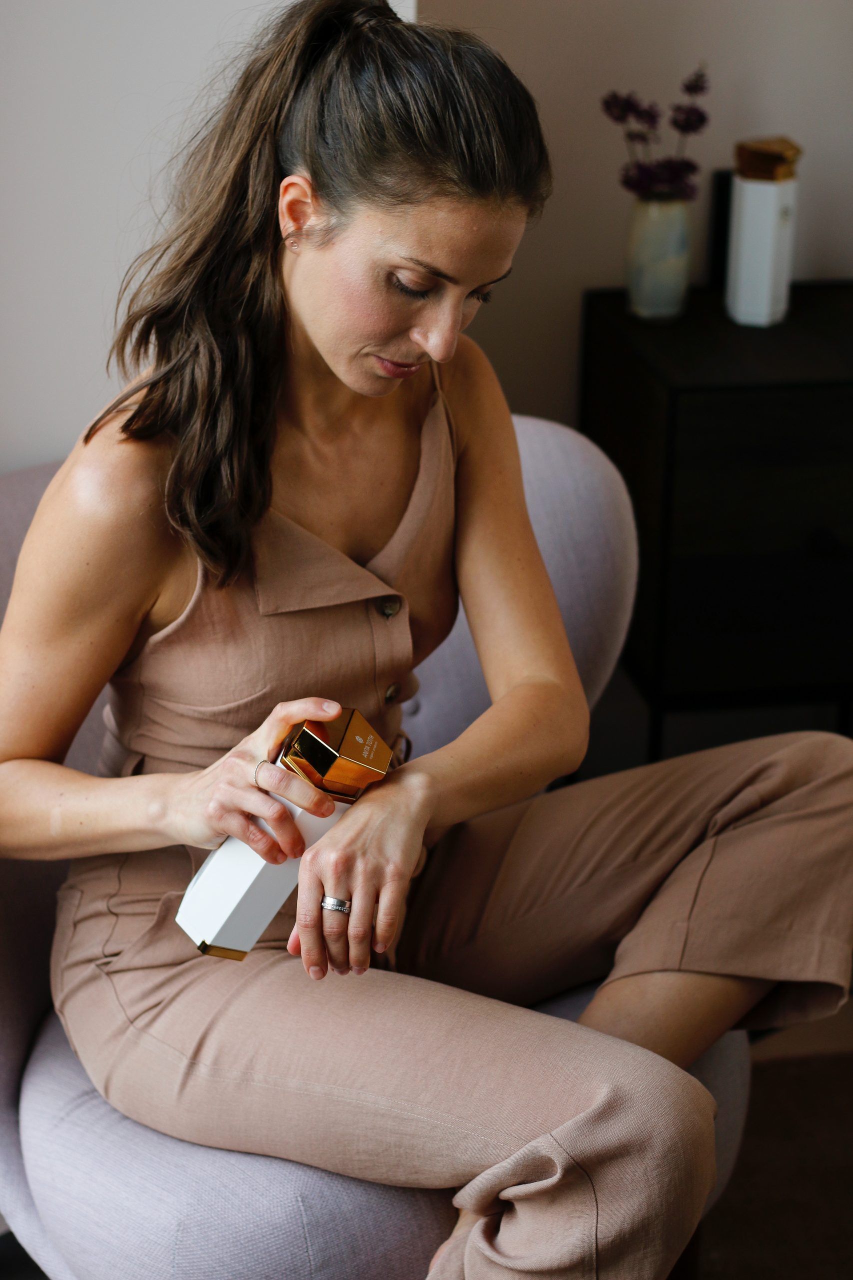
The brand’s visual identity is further accentuated by their choice of ambassador: with her perfect elegance, Nelli Tombor can authentically represent the brand and further enhance its luxurious feeling—as Anita Tóth puts it, “its as if she was born into this ambience”.
The Urban Metabolism | URBANUM
„A mouthful of goodwill” | BeSweet chocolate manufactory