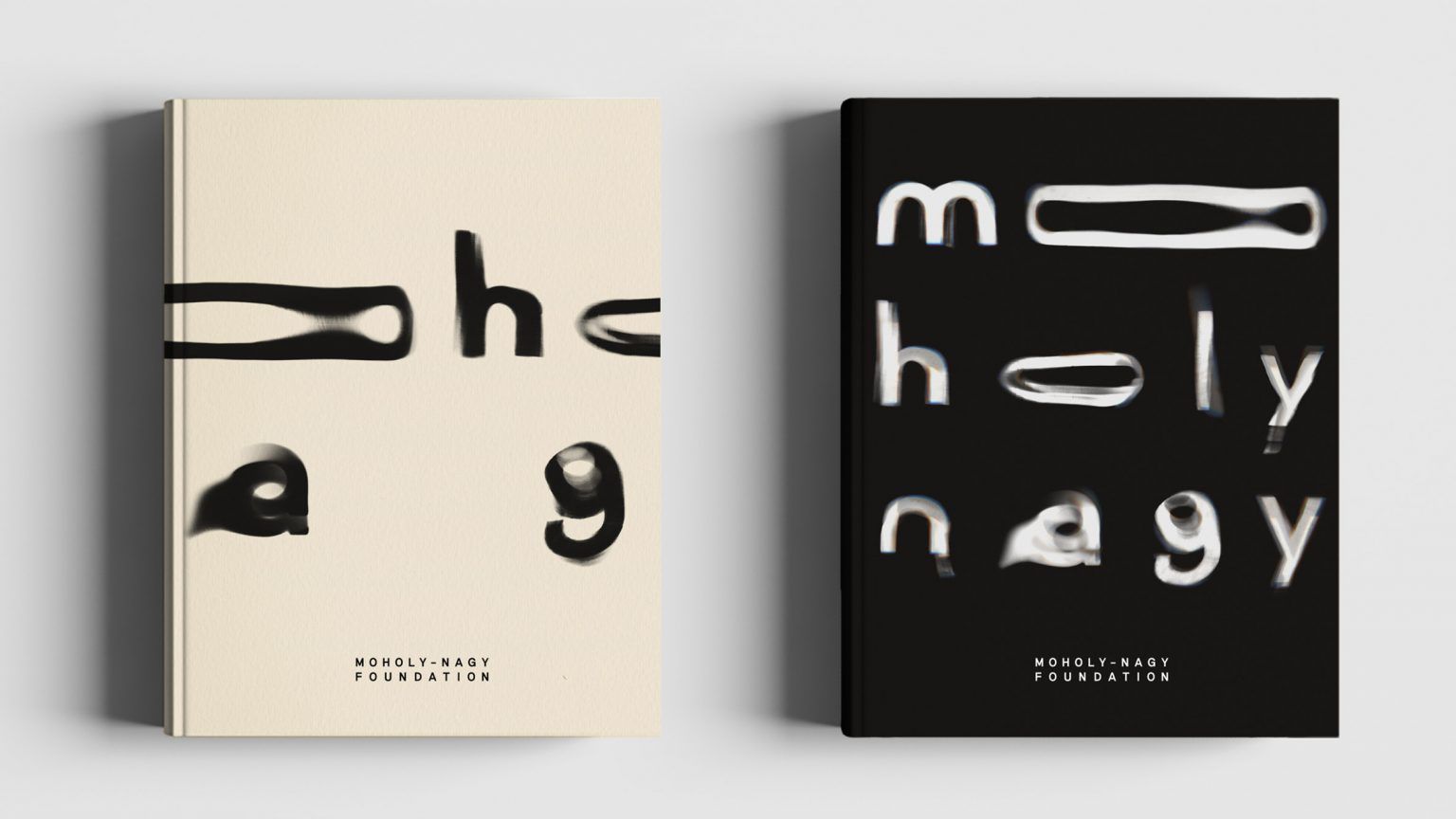
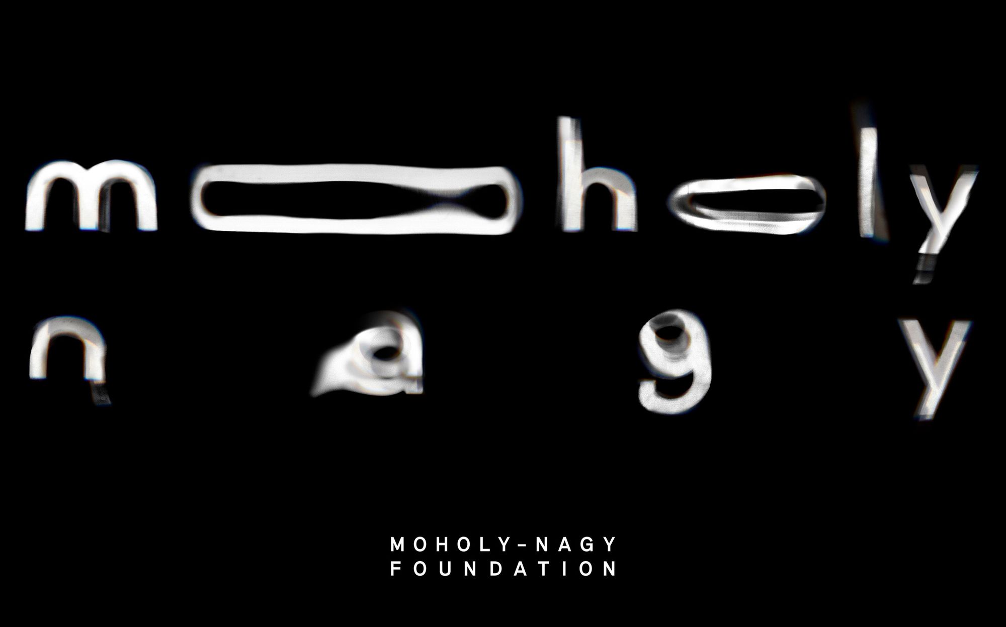
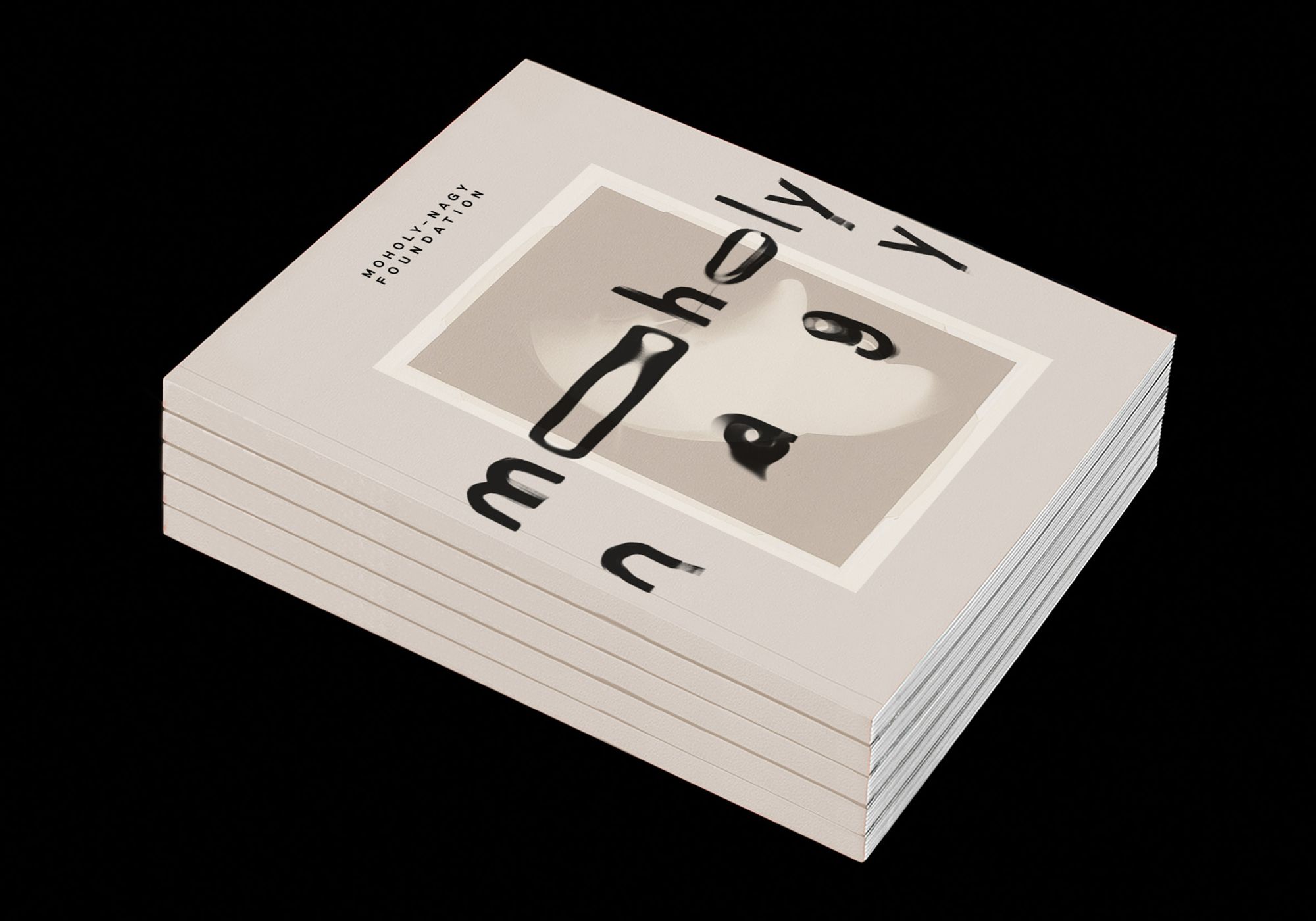
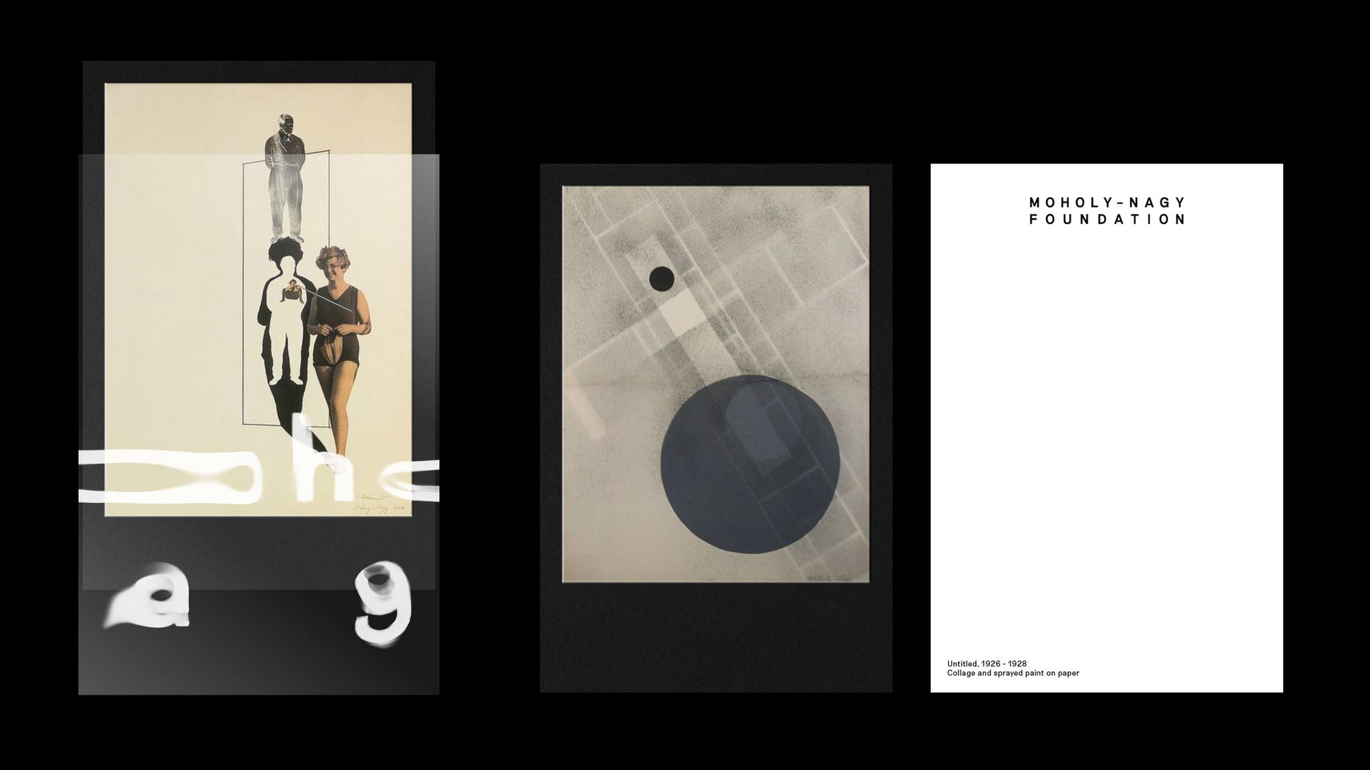
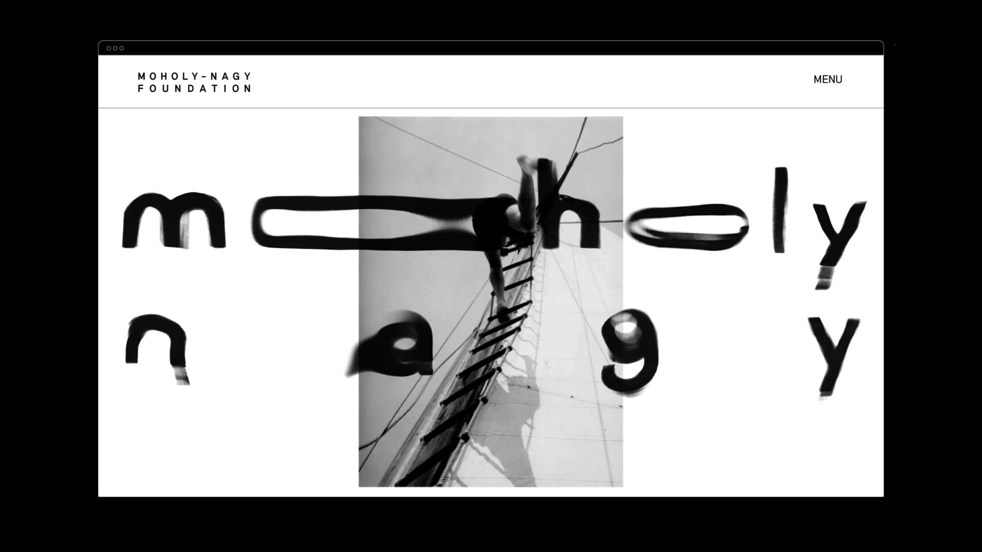
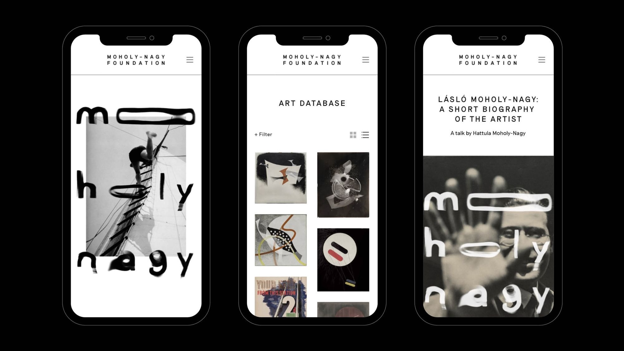
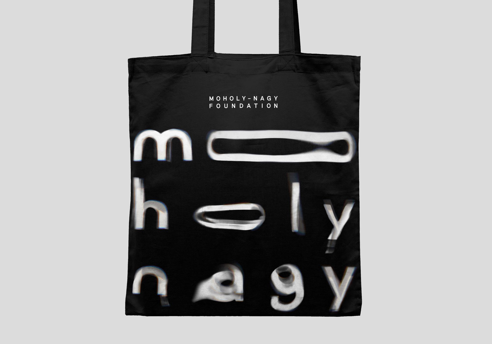
The fresh visual identity of US-based The Moholy-Nagy Foundation designed by Pentagram honors the legacy of the great Bauhaus educator and artist: the new look was inspired by László Moholy-Nagy’s experimental attitude, creative style and methods.
Even though the artist is also known for his paintings, photographs, designs, films and work as an educator, his famous photograms served as the main source of inspiration in designing the new visual identity. Moholy-Nagy saw light as a tool carrying new potentials for visual arts expression, or, in his words, as a new “creative agent.” Pentagram also reached back to this approach when designing the new visual identity: they evoke the work of one of the greatest Bauhaus educators with fluid letterforms giving a sense of movement. The studio used tones of black, white and sand as well as a neo-grotesque font called Riposte by Good Type Foundry—a typeface combining mid-century fonts with contemporary style elements.
Established in 2003 by the artist’s daughter Hattula Moholy-Nagy, The Moholy-Nagy Foundation aims to preserve László Moholy-Nagy’s legacy as well as to share information about his life and works with the general public on the institution’s website and on various events and exhibitions.

The Moholy-Nagy Foundation | Web | Facebook | Instagram
Pentagram | Web | Facebook | Instagram
Source: dezeen
Best of HYPE 2020

Bye-bye 2020! | #stayhomecreative
