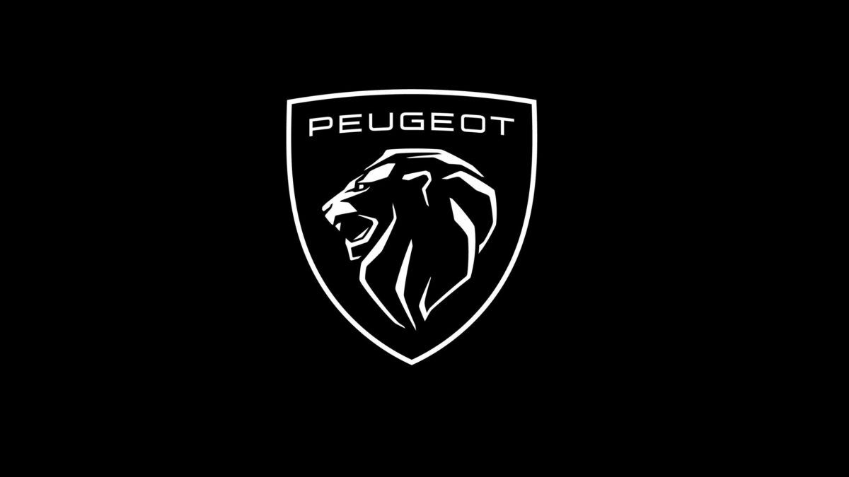
Peugeot is trying to reposition its brand by updating the previous version of their logo.
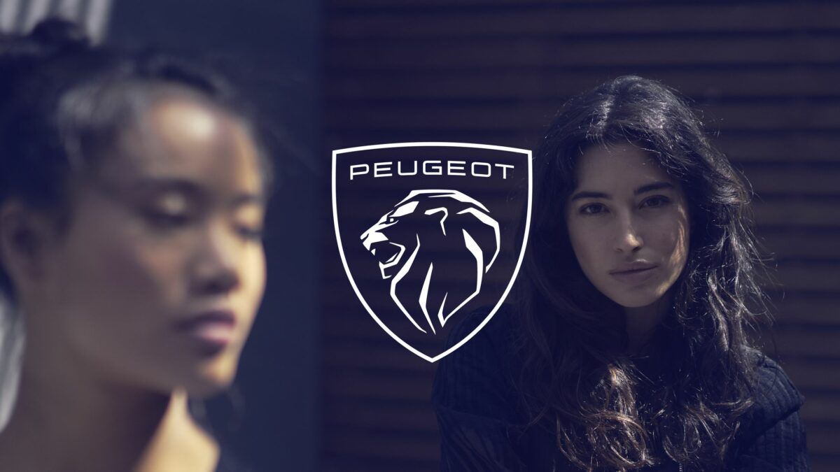
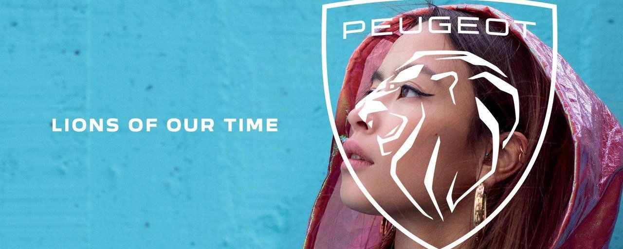
The French carmaker has joined the redesign wave that several other car brands, such as BMW and Opel, have recently gone through. According to Peugeot, their new logo “balances between history and hyper-modernity”; it evokes a previous logo variation while presenting a more modern and elegant style with its design elements, through which they want to upmarket the brand.
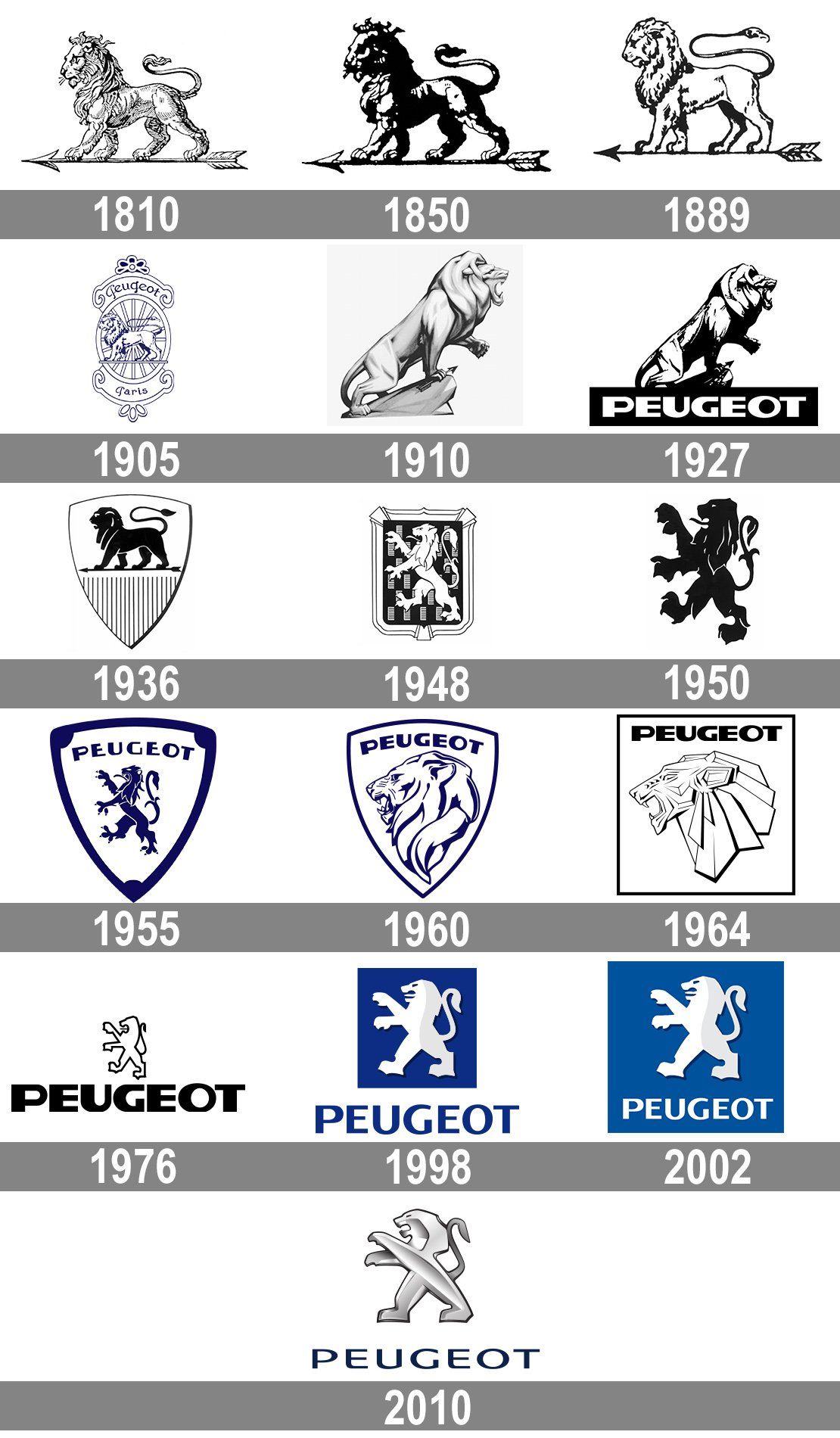
The former logo, which portrayed the lion standing up, has been in use since 2010, and was preceded by several other versions since 1850, the brand’s founding year. The new, eleventh design recalls a logo from the ’60s by depicting the lion’s head in profile on a coat of arms.
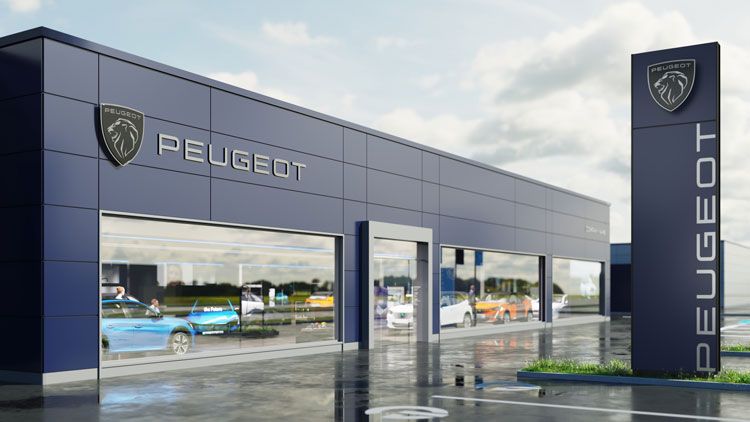
The new logo and identity were designed by the Peugeot Design Lab in collaboration with the company’s global brand design studio. In addition to the online space, we will soon find this fresh look in catalogs and stores as well.

Peugeot | Web | Facebook | Instagram
Source: Designweek, Peugeot
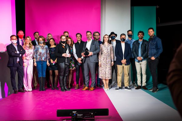
This year's Highlights of Hungary winners were announced

Family home on the riverside | Bogdanova Bureau
