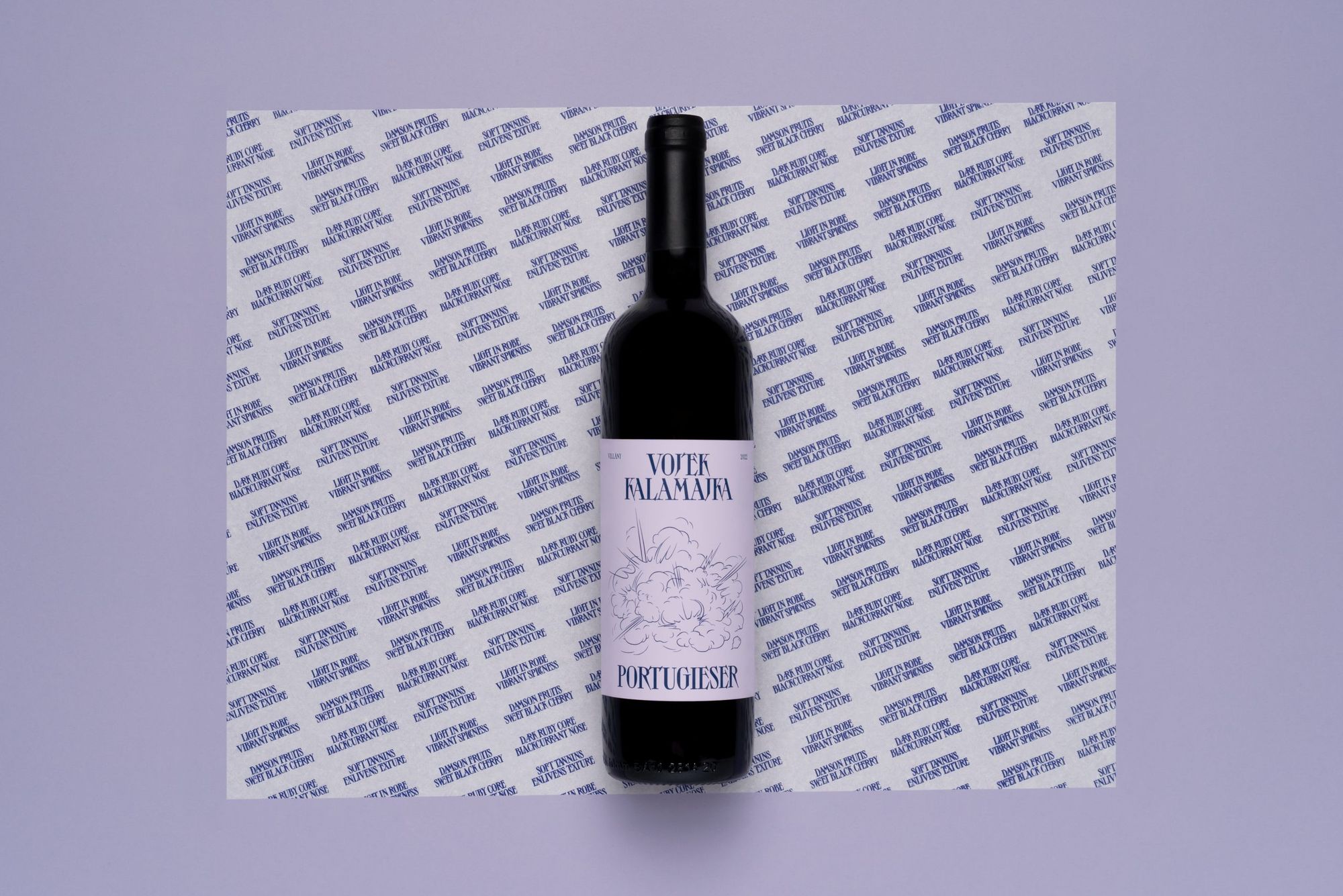
Vojtek Winery is a small family business, where viticulture and winemaking have a decade-long tradition. Their winery is situated at the foot of one of Villány’s most famous vineyards, Jammertal: this is where they produce their wines, mixing traditional and modern winemaking techniques. Their light and dark ruby-colored Portugieser, nicknamed Kalamajka, has earned its place in the box of wine selections of the Edinburgh-based Glug Wine Club, and its label was designed by graphic designer Kira Koroknai. Let’s see!
We’ve earlier featured many of Kira Koroknai’s works in our magazine, such as the brand identity of Mandragóra Restaurant and wine label designs for Unwritten Poem of Tiwári House Winery and Le Tour de Dúzsi of Dúzsi winery. As her portfolio shows, Kira has a passion for wine label design. “I love these projects, as winemaking is a complex and exciting process, and wine is also a great opportunity to express my graphic designer’s vision. I have a wide range of orders from start-up family wineries to large companies that have been operating for decades. The collaborations give me insight into the operation of wineries, wine regions, and I get to know the characteristics of different grape varieties and the mysteries of winemaking. The design of Kalamajka differs from my previous projects in that this wine label not only represents the Vojtek winery, but I also had to consider how to give it a visual identity worthy of promoting Hungarian wine culture,” she explained.
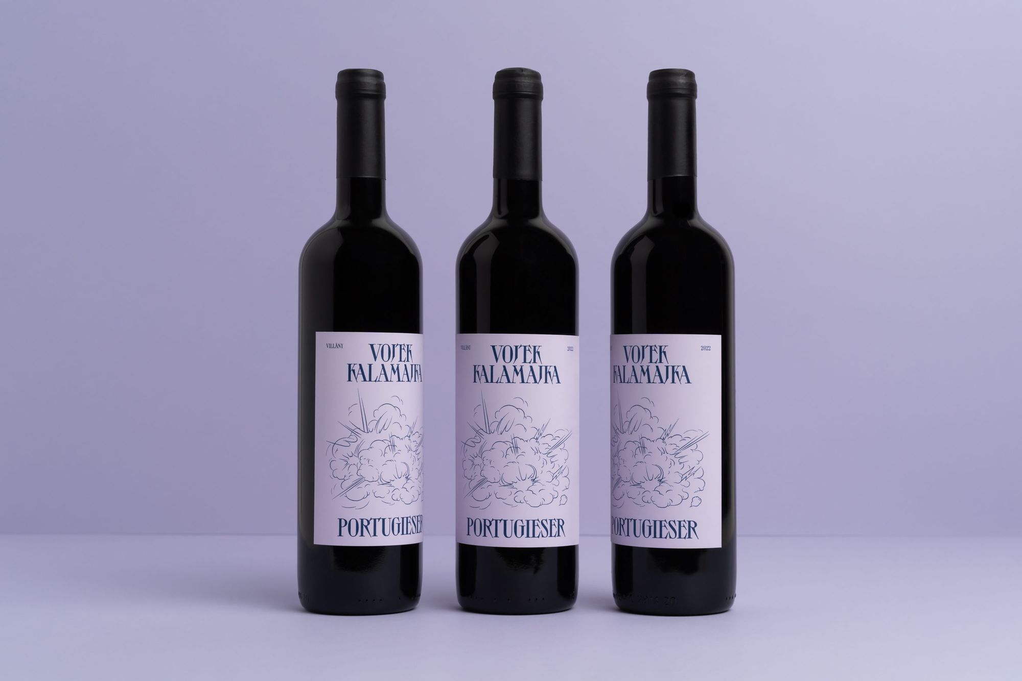
As Kira added, with the changing shopping habits, certain brands do not only have to sell on store shelves but in the online space, as well. “You cannot touch and taste wines online, so customers’ choices are also influenced by the design. Luckily, both winemakers and importers are becoming more and more aware of the importance of new and distinctive designs in order to stand out. In this sense, I experienced an open and trusting attitude towards my decisions as a graphic designer,” she noted.
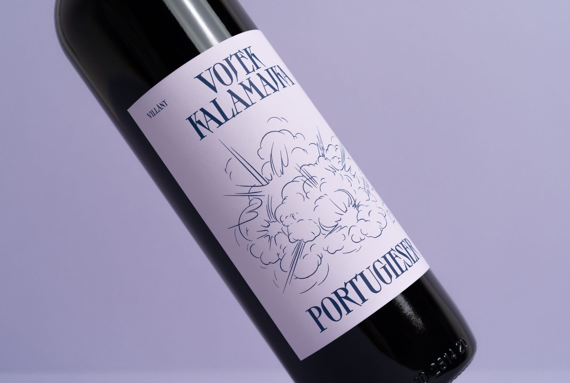
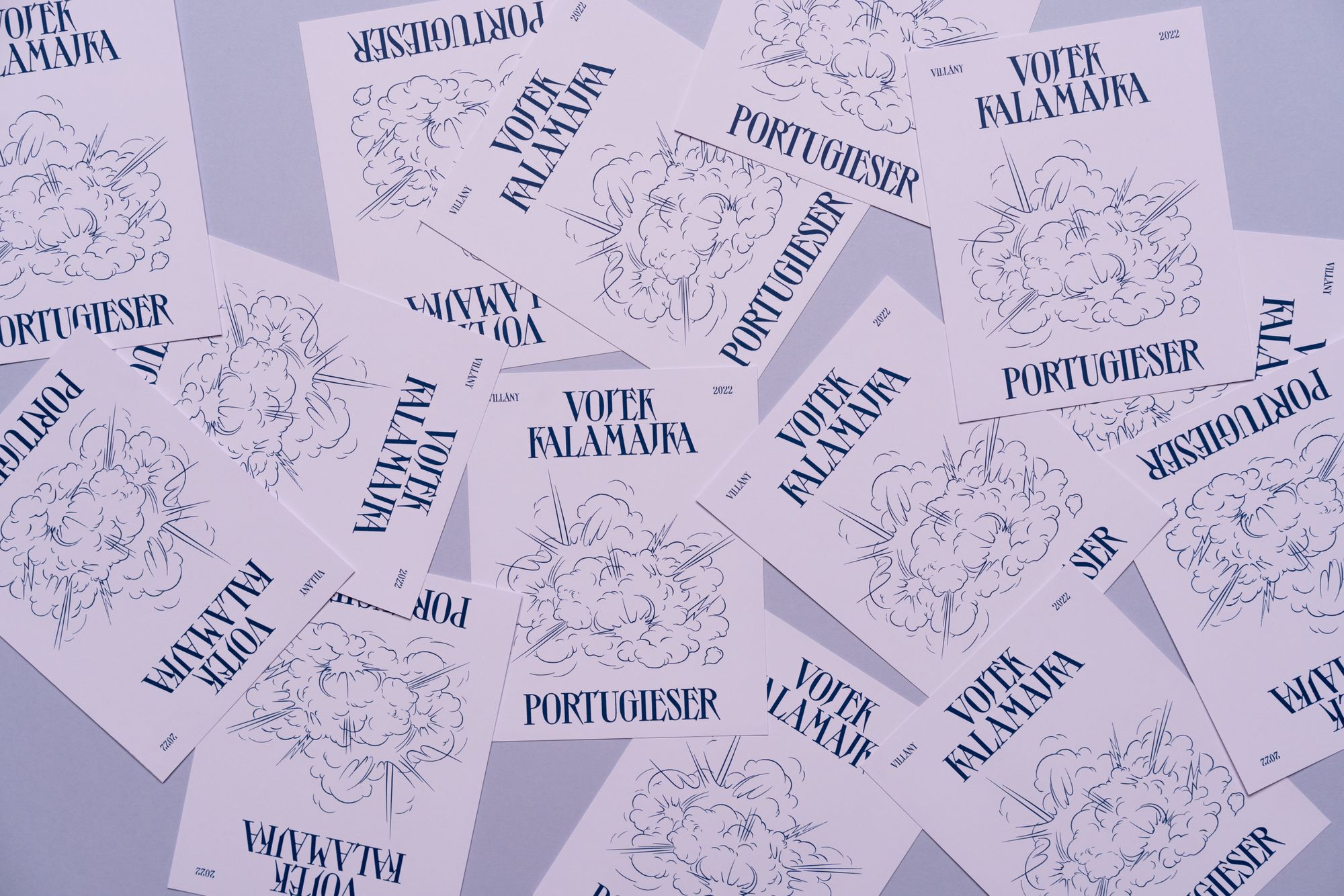
Eventually, the label design was inspired by the name of the wine; emphasizing the meaning of ‘kalamajka’ (meaning ‘mess’ or ‘trouble,’ referred to as ‘Glorious mess’ on Kira Koroknai’s website—the Transl.), Kira created a design based on visual contrasts. “I was able to design completely freely, the only expectation was a modern and exciting result. I wanted to create an eye-catching label that reflected the special name of the wine. I created the dynamic feel for Kalamajka by using highly contrasting visual elements, and the strong typographic features balance the fine, thin lines of the illustration,” Kira explained. And the dark blue and pastel purple shades evoke the fresh, fruity and spicy notes of Portugieser, also known as Blauer Portugieser.
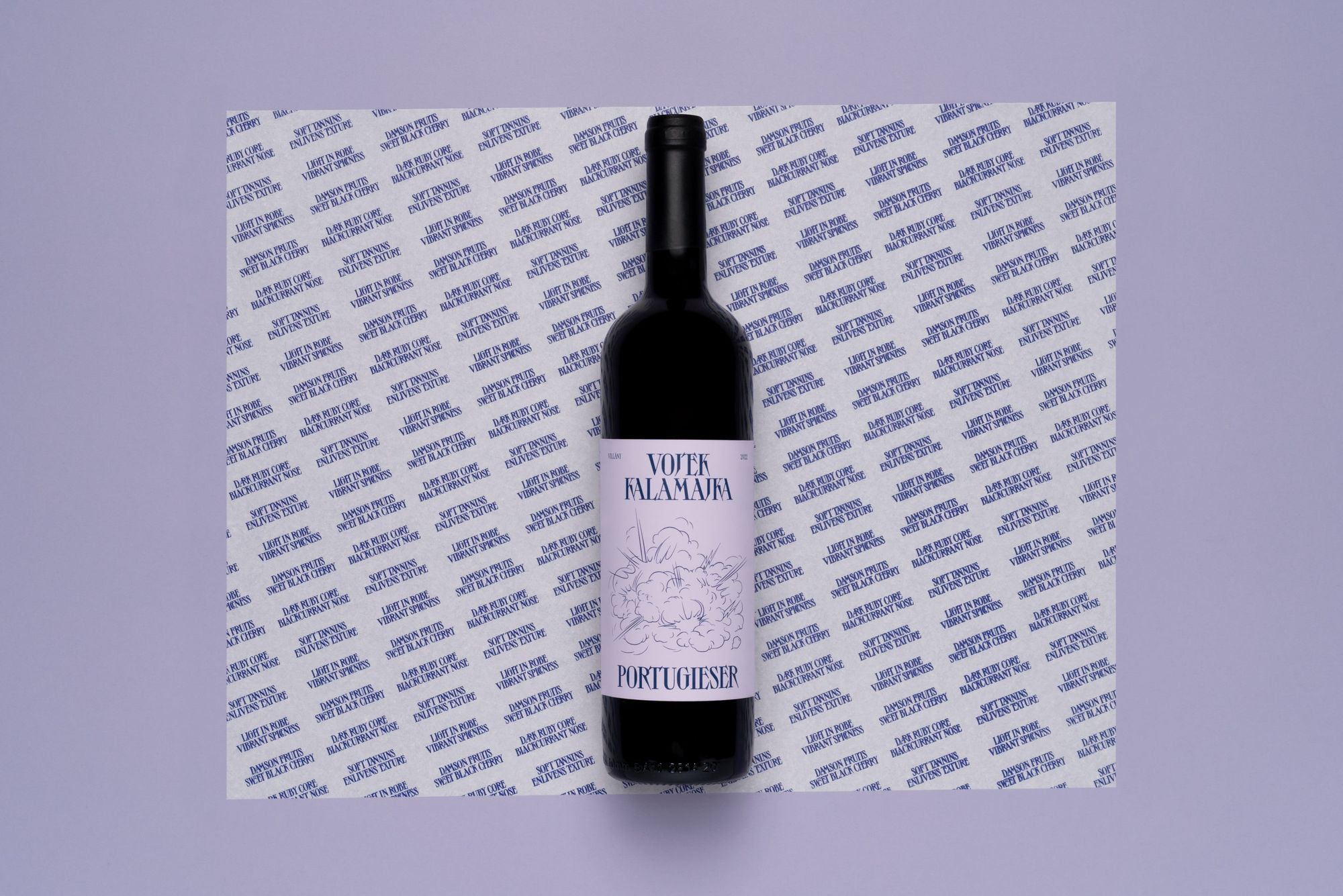

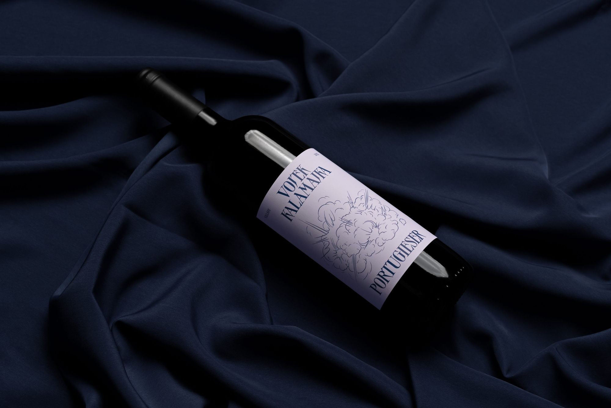
Koroknai Kira | Web | Instagram
Marcell Rév has won an Emmy for Euphoria

Stories of Veszprém and Bakony-Balaton region come to life in the Hello Veszprém-Balaton magazine
