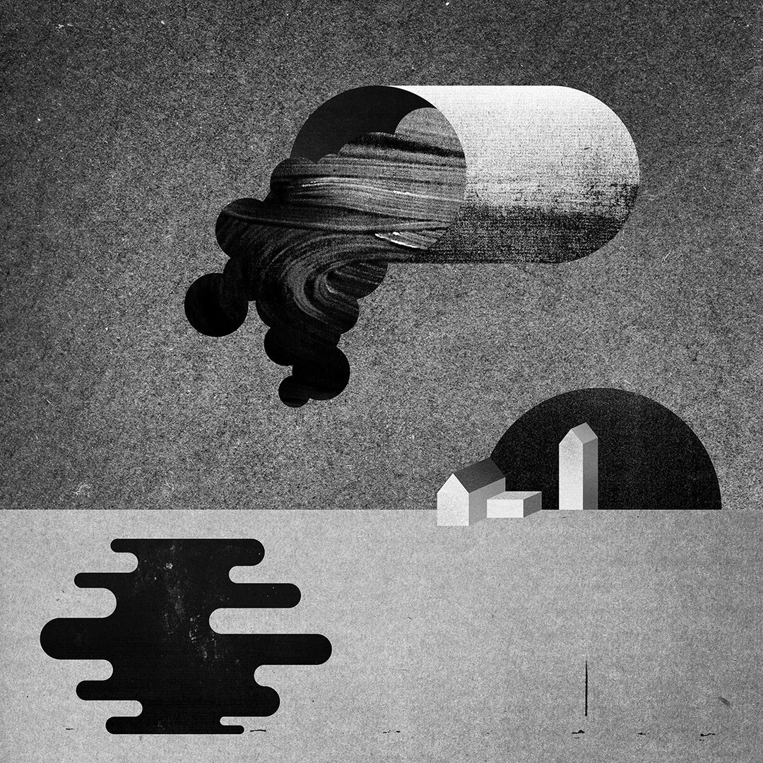
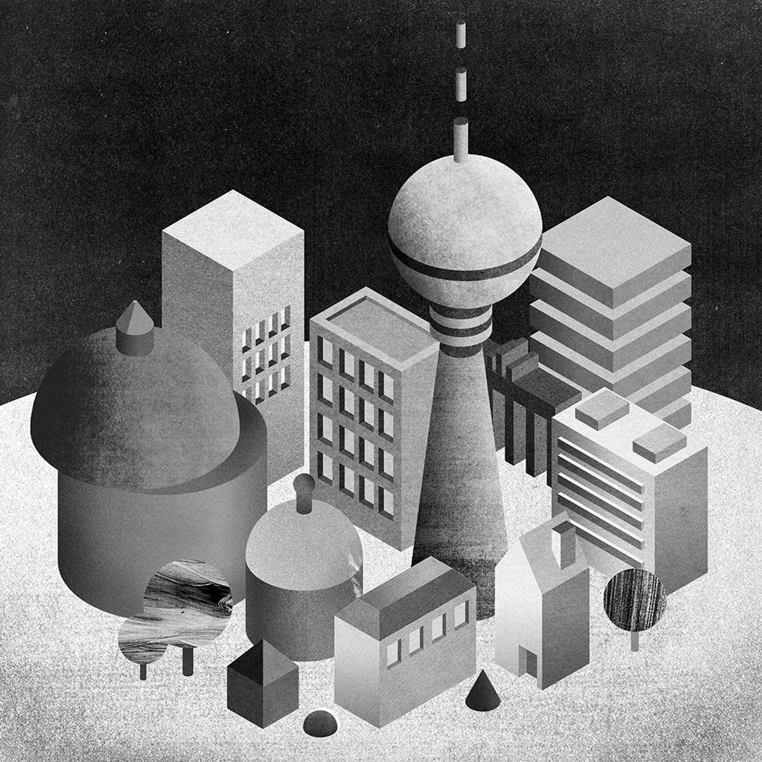
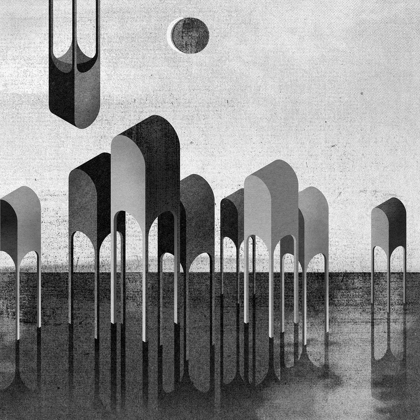
Through the lens of Polish designer Michał Pecko, our built environment turns into a slightly melancholic architectural utopia. The eloquent illustrations boasting a special atmosphere are made by combining analog and digital techniques.
Michał Pecko is living and working in Gdansk, in a windy northern port city in Poland—in a modest modernist block of flats from the 1960s located in the historic city center, which is, at the same time, not devoid of class and tasty architectural details. He completed his studies in Gdansk, at the Academy of Fine Arts, where he returned a few years ago in a new role, as a lecturer at the Faculty of Architecture and Design. And why did he choose the world of graphic design exactly? As Michał puts it, “the life of a designer is never boring. Literally overnight you are faced with new challenges, which, although they have points of contact, are very different from each other. Operating in the graphics industry forces you to continuous development, stimulates both thinking, workshop development and expanding knowledge.” Then he added: “I am lucky to work with wise clients that are aware of the importance of visual language. It is mainly the cultural sector—institutions that sell ideas, not products.”
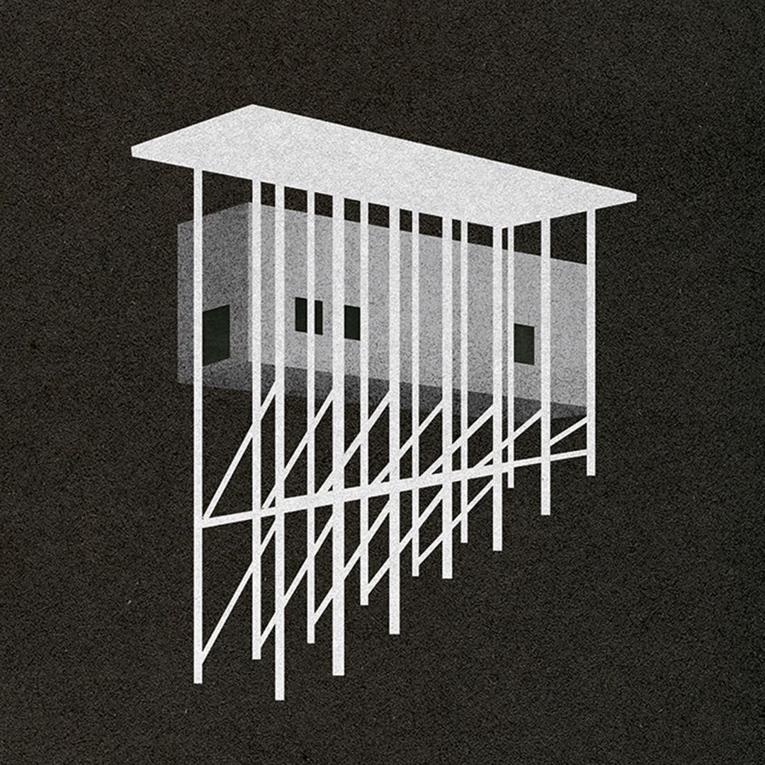
Michał’s works are mostly inspired by architecture: “I love working on projects related to the urban fabric, talking about buildings with pictures,” he pointed out. Illustration gives a big part of his work, but he also likes to work on a variety of projects at the same time. He is very much intrigued by book publishing—as the designer himself pointed out, designing books is a process that includes a lot of things that he finds fascinating. Including building a grid, working with text and generating tensions between typography and images, and finally selecting the materials that will create a physical, haptic object. “I like the idea of objects whose life can be much longer than that of humans,” he added.
In his projects, he strives for simplification and synthesis: he seeks to tell complicated stories with as little visual gestures and means as possible. “I care about creating an atmosphere, I would like my works to stimulate more senses than just eyesight. I try to be an attentive observer, take note of the reality that surrounds me. I believe that illustrations should leave room for the recipient’s imagination, be subject to their interpretations, allow them to look for analogies in experiences gathered in the past and refer to memories,” the designer continued.
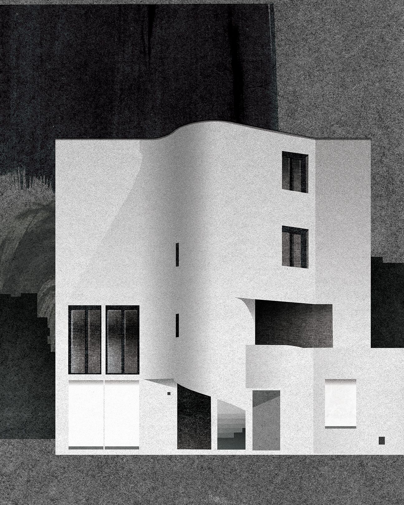
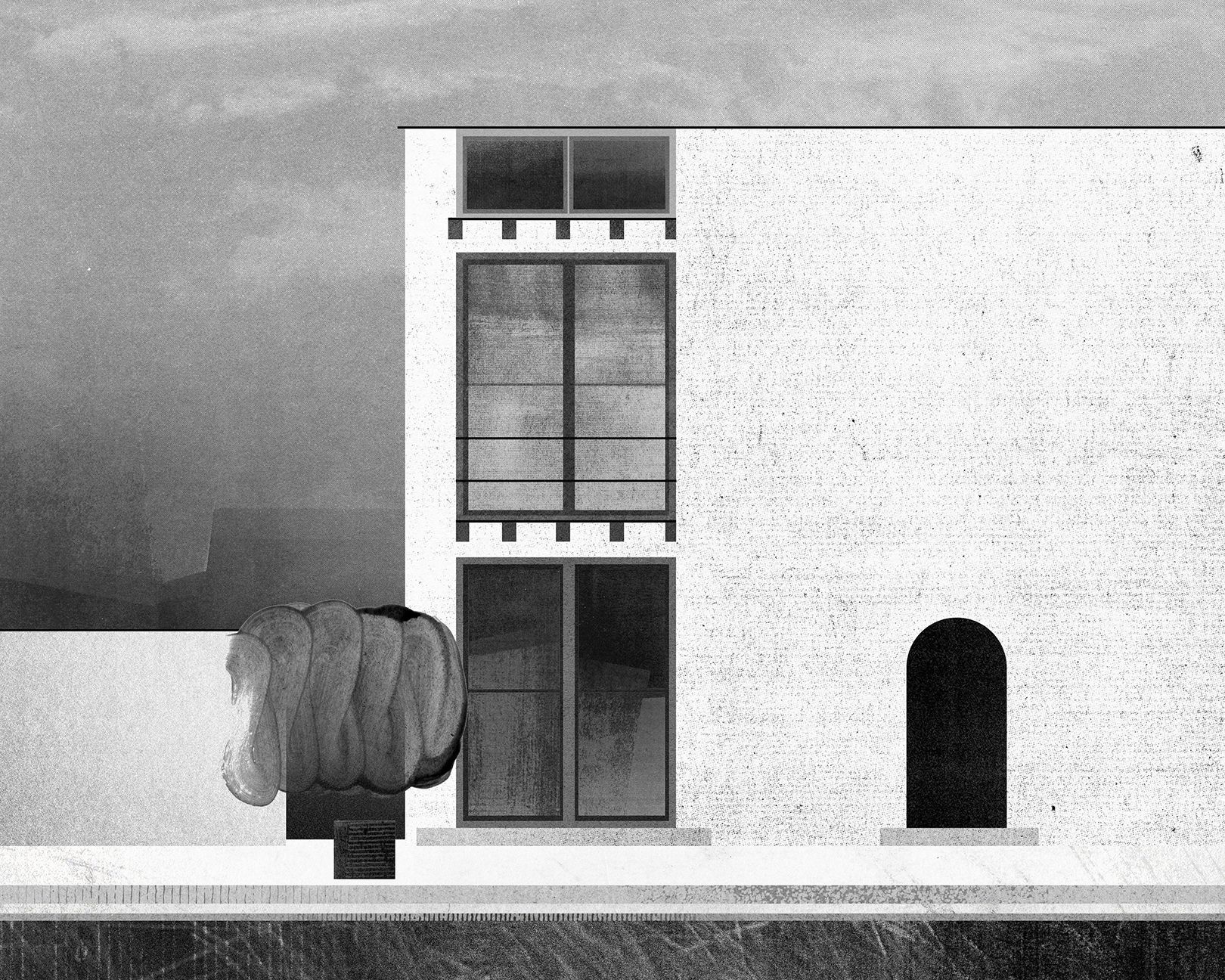
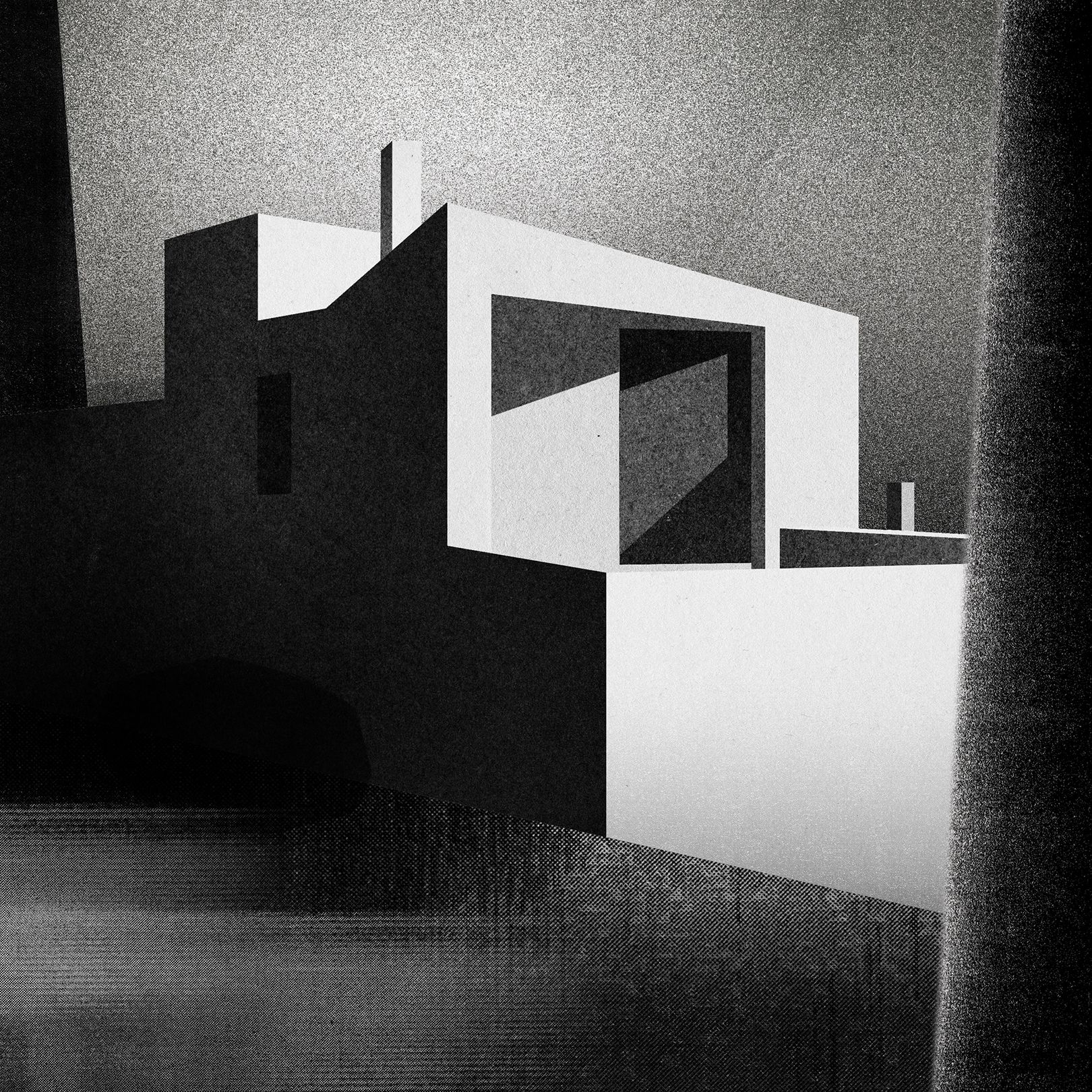
According to Michał, the style always has to be adjusted to the theme, yet his illustrations are always characterized by some sort of a cohesive, uniform power. In his projects featuring architectural spaces, he often displays buildings that fascinate him or are dear to him and sometimes ones he has never visited. “I talk about architecture that interests me, which for some reason I find smart: I certainly do not follow purely aesthetic criteria—architecture does not have to be pretty to be good. It is similar to the city—often spaces that are over-aesthetic are not places where we feel good. My illustrations are in effect my ideas about these places: I work through images, remove human presence, simplify them and make the architectural background the main character,” Michał highlighted.
His illustrations often depict certain elements in futuristic compositions. “I am interested in the topic of utopia in architecture and its dual potential: on the one hand, the promise of a better future, the creation of an ideal world, and, on the other hand, the risk of foreclosure. Utopia is an island: not everyone can fit inside, a brutal world of excluded remains behind the wall. The world of the movie Zeitgeist certainly influences the visuality I use, together with Blade Runner, Mad Max, Stalker, Delicatessen or Gattaca—these most likely had an influence on the atmosphere I create as well,” the designer explained.
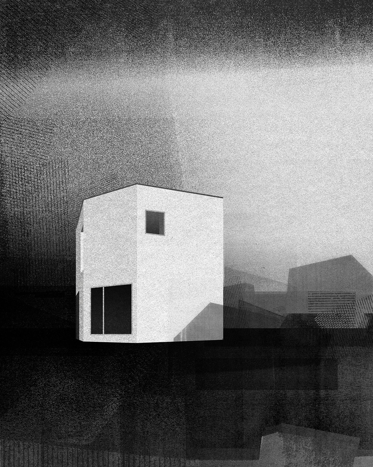
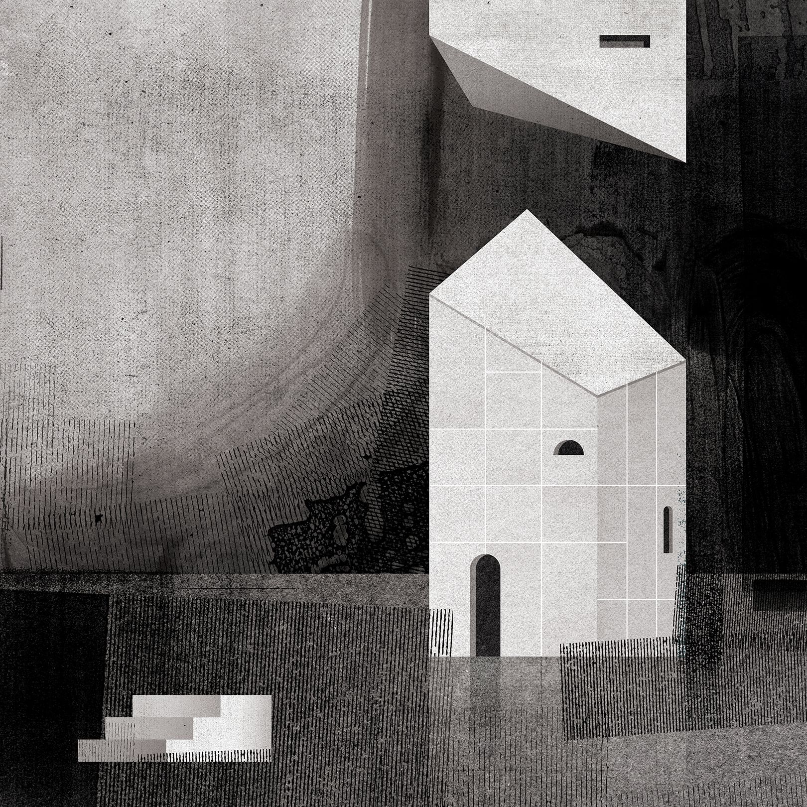
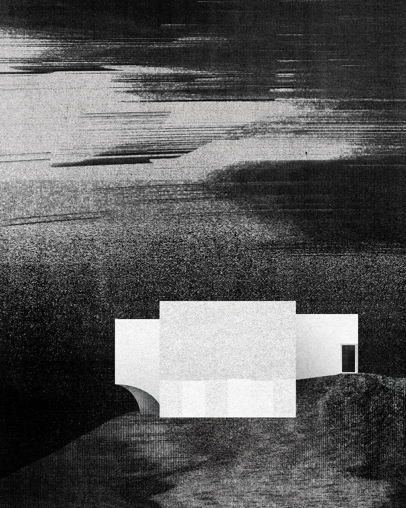
In his projects, Michał prefers to combine various techniques—a few years ago, he came into possession of an old photocopier, with the help of which he started creating simple black and white textures: he often samples them, cuts them, puts them together into collages and combines them with hand and digital drawings. “The process is analog but is carried out in a digital environment. I draw a lot, with a pencil or pen on paper. I fetishize my sketchbook: I never tear pages out of it and I collect notebooks like diaries,” he added.

Michał is currently working on several projects: on a mural covering more than 120 square meters in Warsaw, a richly illustrated travel book about Gdansk, a cookbook and the visual identity of a well-known hipster drink brand. “In the near future I would like to spend more time on my own projects, draw freely as much as I can. I can’t wait for the summer and the moment for the pandemic to go away. I would like to change my surroundings, spend some time in the forest, go to another city for a few weeks. Wander unfamiliar streets. And draw them, of course,” the designer said.
Hungarian-developed Tiny House can even be installed in the middle of the forest

In the magical landscapes of Poland | Słowiński National Park
