In a world of constant change, movement, digital craze, and marketing mayhem, we find ourselves trying to connect to anything holding true value. We seek real craftsmanship while trying to find something personally appealing behind everything we buy. New wave coffee beans, cool totebags and merch, corky kombucha with an interesting design, or a sourdough bread with a different approach… We look for not only information in packaging, but a message and an indicator of the maker of the product. A story, meaning, or something that can connect us to another person (however far they may be) and their craft.
Natural winemakers are known to be game-changers in the industry, not solely because of the way they grow and make, but also their ability to create agile and approachable products for everyone, with every budget. It seems like labels are shifting from collectible brags to a fun approach to communicate. This article was written by Rebeka Győrfi the author of Natúr Magazin, a print magazine about natural wine and culture in Eastern Europe.
The Story of the Label
Label design started out as purely functional to communicate (seemingly) key information about the wine to the consumer. Wine before the 1900s was very rarely “packaged”, only the best vintages made it to bottles (in Hungarian we still use the term “to broach a barrel/cask”, which refers to the fact that alcoholic beverages were sold in barrels to pubs and other establishments, rather than in bottles).
Traditional labels are seemingly easy to read—if you know what to decode! Vintage, grape variety, geographical indication (which of course will tell you a lot about quality, and taste profiles) and so on. With the right knowledge, you can read any labels from big brands to prestigious chateaus around the world (and have a pretty good guess on what you will be getting in your glass).
This linear approach soon turned into a marketing effort and went beyond pure functionality. The trends are ever so changing, and it seems like that (some) people no longer (only) look for tastefully designed, well-labeled bottles. Rather, we are looking to understand not only the juice itself, but the producer and the intention behind the bottle that is in front of us. Wine (the natural kind) seems so simple on the surface. Grapes, fermented. Yet this simplicity carries incredible depths. The amount of work, the intentions, the countless hours of thoughts, caring for the land, individuality and community. How can producers communicate something so complex to consumers overindulged and overloaded on sensory experiences almost 24/7.
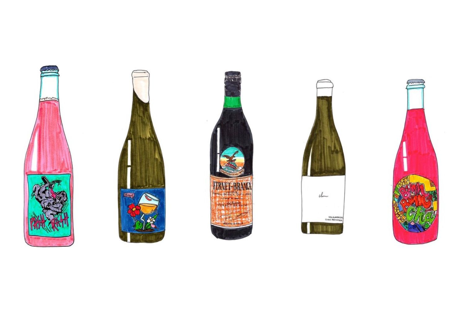
“A lot of natural wine producers are trying to break away from tradition and they want their labels to reflect this. It’s more about expression and experimentation than sticking to conventional formulas and the same goes for the label,” says Anna Vu, graphic designer, artist, and creator of Good Wine Crap Drawing, a series of natural wine drawings. Anna herself has designed labels for many winemakers (who gave her the utmost artistic freedom, and preferred original, hand-drawn art), and she feels that art and expression have taken over the pure functional nature of labels on a bottle.
Let’s not forget that winemakers are still obliged to keep and display certain information on the bottle (often on the back labels) as wine is a regulated product and has to comply with country and regional regulations and alcohol laws.
Between functionality and art
But how do we, wine drinkers, interpret label design? Is this something that will ultimately make or break our wine choices? Are we looking for beauty and art? Should we reject or praise a wine purely based on its looks? Almost 90% of the people who have answered a poll on Natúr Magazin’s Instagram said that label design is crucial for them when choosing a natural wine, however, it does not always affect their opinion about the product or the drinking experience itself. So here is the deal—do we choose a bottle for the art and look for beauty on the inside, to see if the design resonates with the liquid?
If we stay in the online space, we only have a split second to decide whether we like a visual or not – let’s be honest, how many of us spend minutes or even hours looking at the same thing (as we would normally in a museum or even a bottle shop)?
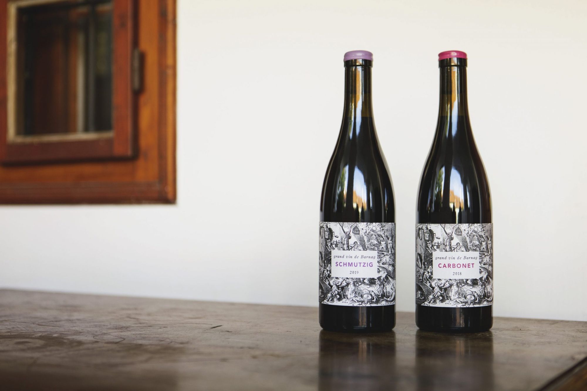
“The visual standard, the baseline, is probably the highest ever, therefore label design is crucial for winemakers. This allows us to be unique, and more importantly, recognizable—which is equally important to a consumer as well as partners, like restaurants or importers, who seek visual aesthetics,” comments Bence Szilágyi, owner & winemaker at Grand Vin de Barnag, a boutique winery from Balaton, Hungary. His labels are a copy of various 16th-century copper engravings representing the 7 deadly sins. The art gives off a serious vibe at first, but when one looks closer, they might discover “obscene” scenes (men vomiting into rivers, naked people drinking wine and rolling around in barrels). The irony of this double “standard” represents what most natural winemakers are trying to do—create a label that catches the eye, makes you look and think, and create something that is powerful enough to make you interested in their approach or story.
“A great label can definitely help to sell more bottles and get consumers reaching for that wine off a shelf, but at the end of the day, if the wine isn’t good, it will still show,” adds Anna.
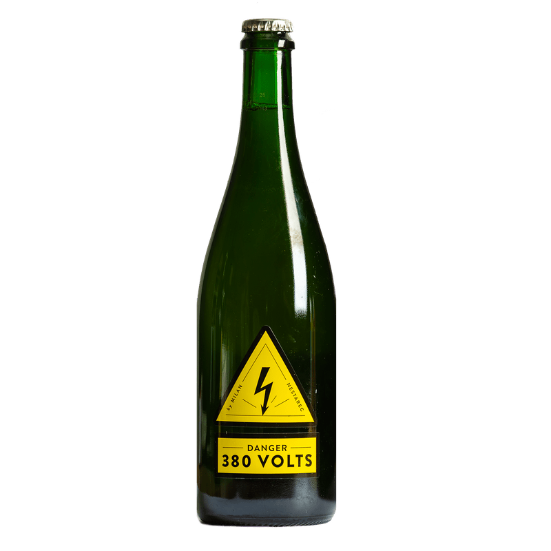
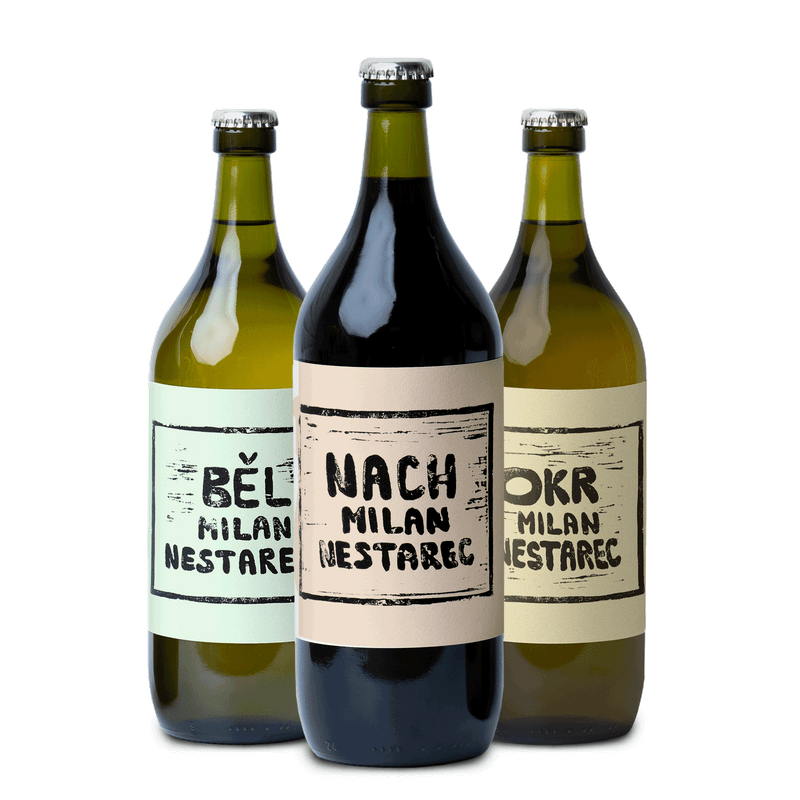
For Milan Nestarec, legendary natural winemaker of the Czech Republic (with many crazy labels under his belt), design holds many dimensions.
“I do enjoy the personal touch it adds to the wines—it often communicates emotions, a story, the winemakers’ passions and friendships. At the same time it’s not the most important component—it’s nice to have fun or beautiful labels but if the wine inside the bottle is disappointing, then I’d said that the winemaker’s focus was misplaced.”
This sentiment is also shared by Lena Mattson, a former buyer at June Wine Bar, in Brooklyn, New York and owner of Neu Neusidler, a premier natural wine spot & restaurant in Burgenland, Austria.
“Labels can make an average product (seem) good across the board (whether it is cereal or wine). We live in an era where aesthetics are being heightened and that’s definitely happening with any product. Natural wine label design is very trendy now as opposed to just being a functional, traditional way to communicate.”
Different designs for different occasions
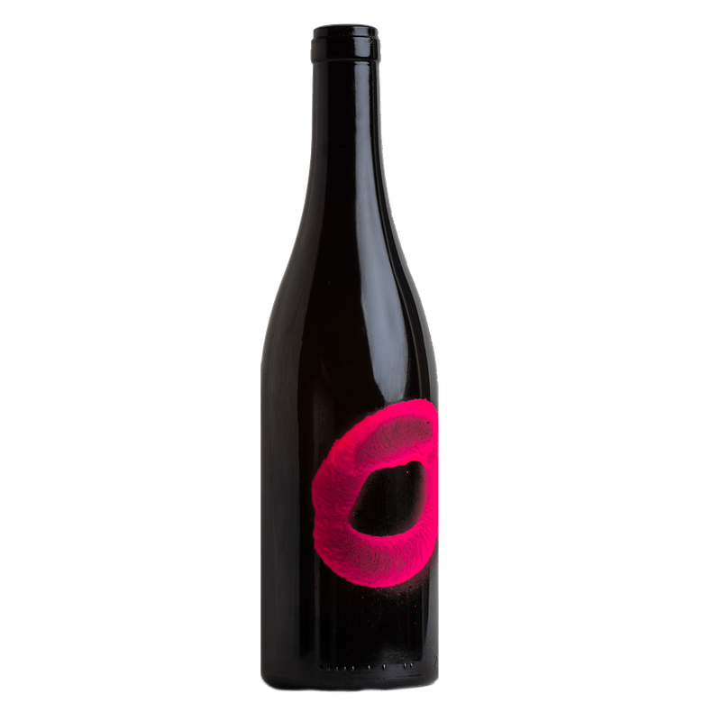
Milan approaches wine label design from many angles. Sometimes it’s the wine that inspires the art (“Danger 380V” was inspired by an actual transformator box sign—a true testimony of the electricity and amazing acidity of the wine), and sometimes it’s a feeling (like the Senza bottle, representing the tacky, 80’s Italian fun disco vibes).
He often chooses to work with various designers, “It’s always about collaborating with people close to my heart, talents whose work, values & creativity I admire. It’s no surprise that I’m working more and more with my wife’s pieces, she’s done the linocuts on Běl, and Barvířka. I really enjoy her vision and it just makes so much sense to have something so authentic and truly us.”
Normally, it is simplicity that speaks volumes. Milan’s top shelf, premium quality wines “only” got a white label, with a name written in a simple font (“GinTonic” or “TRBLMKR”). At times, all you need to know is the essential info (name of the wine and name of the winemaker)—the rest is for you to discover, sense and enjoy.
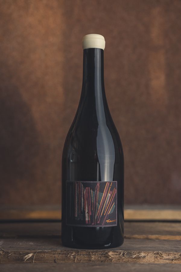
Talking about discovery, the consumer only explores the final product, which of course can age, change, get better, decline and so on over the course of time. This constant change, rhythm and cyclic quality of nature and wine inspired István, owner and winemaker at Bencze Birtok, to approach things differently.
“I was struggling to communicate the vision I had to various graphic designers. It is not anyone’s fault, I don’t think it is something you can grasp from a few meetings.”
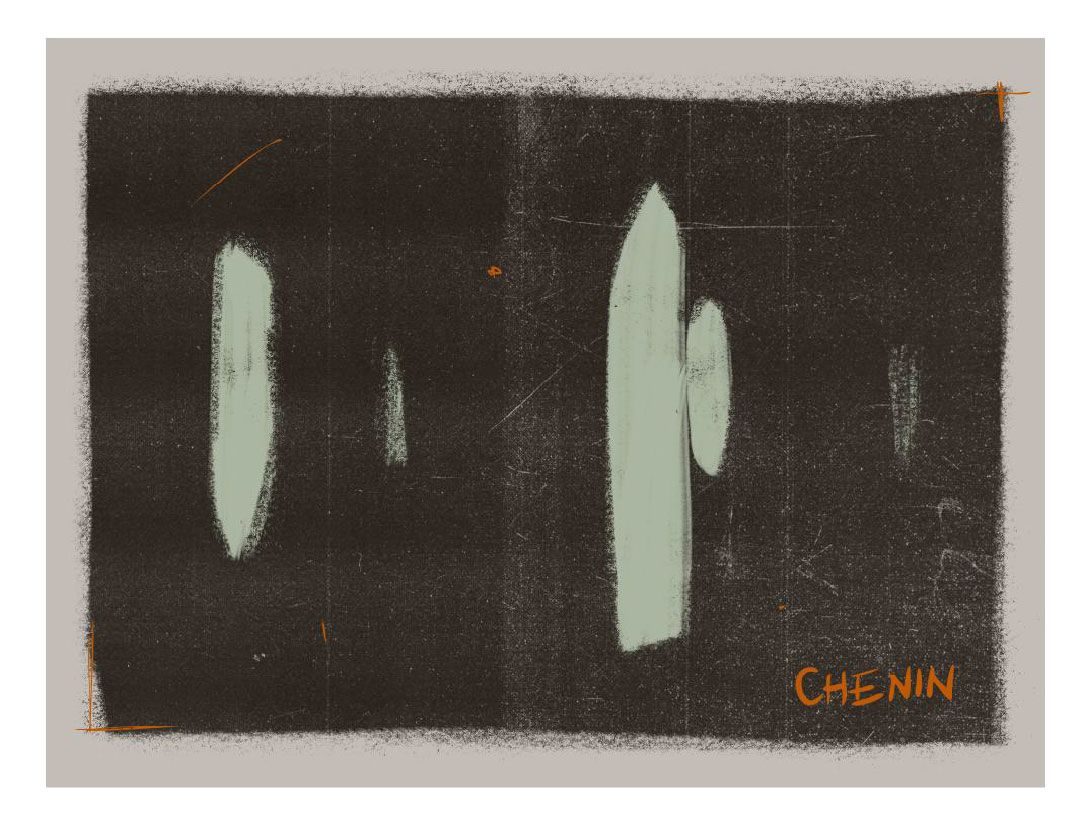
István was mesmerized by Szent-György Hegy, nature, the beauty of the moon and stars, so his first labels were reflecting the constellations and the energy of the place where his wines come from. As time went by, he found himself getting more serious about biodynamic agriculture, and uncompromised winemaking, thus he felt the need to communicate this through the labels.
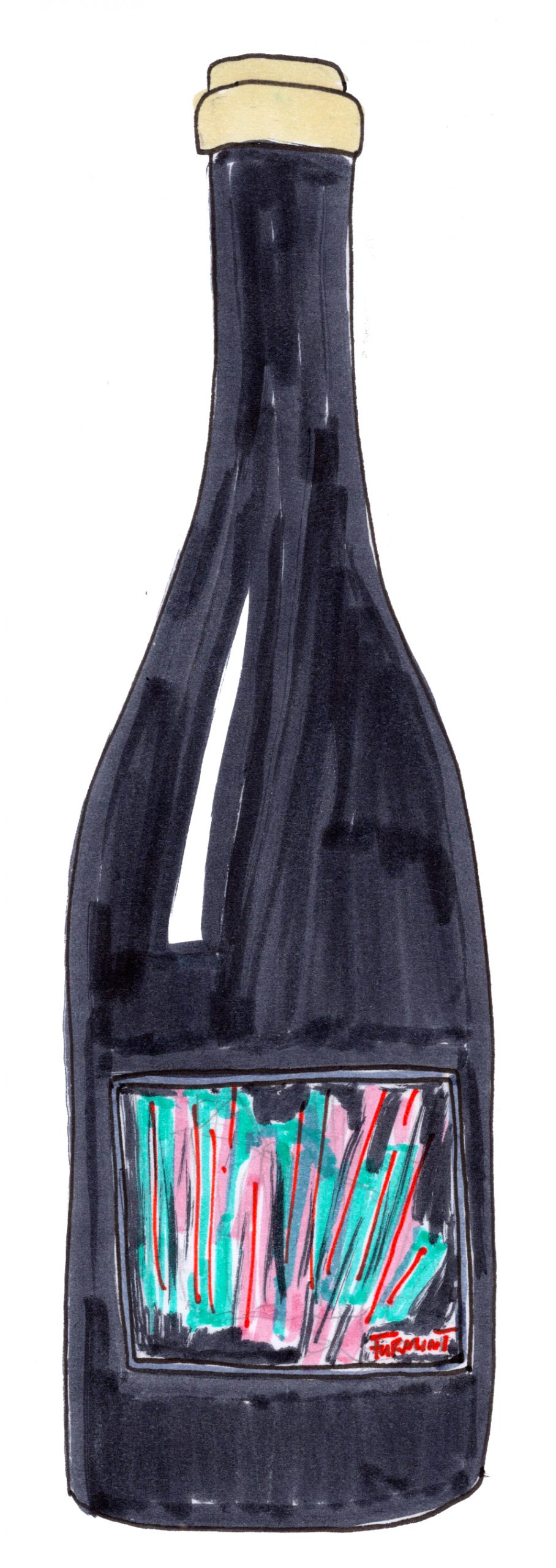
“We put a big focus on cosmic energies in biodynamic agriculture, which can also influence the final product. I found it important to have this represented on the bottles too. I draw my own labels, so I often sit with the fermenting juice, or the wines in different vessels and taste them. I taste and draw from the feeling or the energy it gives me. I imagine colors, lines and frequencies—and this will come through as the art for the labels.”
It seems that sometimes a label holds more power than we can imagine and acts as a micro-communicator from the first moment. You chose the label, but you stayed for the wine.
Crossroads of art
It seems that modern consumers (almost) always want the perfect packaging – fun design (that already points towards a winemaker), great product, and approachable marketing. Is constantly trying to please the consumer and the design hunger hurting natural winemakers in general? Did we start to design labels to break out of traditions or is it really for the Instagram factor now? Is there a barrier between art and design?
“Some wine labels are indeed imaginative now and oftentimes the label actually IS art (like the ones of Austrian icons, Sepp Muster or Christian Tschida),” adds Milan.
For a long time it seemed that wine world collaborations between brands are reserved for the creme de la creme. One of the many examples from recent years is Dom Pérignon realizing their special 2004 vintage with a design by American contemporary artist, Jeff Koons.
A recent piece by Aaron Ayscough, author of Not Drinking Poison, explores the crossroads of art, natural wine, and everything in between. Got Oggau (probably one of the most well-known couples making natural wine) has recently released a chair with Danish designer, Fritz Hansen. “Earlier generations of natural vignerons, conversely, have tended to avoid associating their work with high-end design,” writes Ayscough.
There is a fine line between trying any avenue to sell hard, and creating collaborative projects that reflect not only the winemaker’s product, but also their interests, friendships, and appreciation to craftsmanship outside of their own. With more thoughtful label design and deeper collaborations, these lines of functionality and art can finally close in a little.
This constant flow of visuals and images we live in, is often confusing to choose something just to enjoy it. It is often difficult to step away from comfort, from things we know, or things that please us on an artistic level. Looking behind the label and finding depth is not easy, however, we must try! Our role as consumers is to truly find joy in every and all aspects of a bottle of wine (or really anything else that we purchase) and to raise craftsmanship to a different realm with our support.
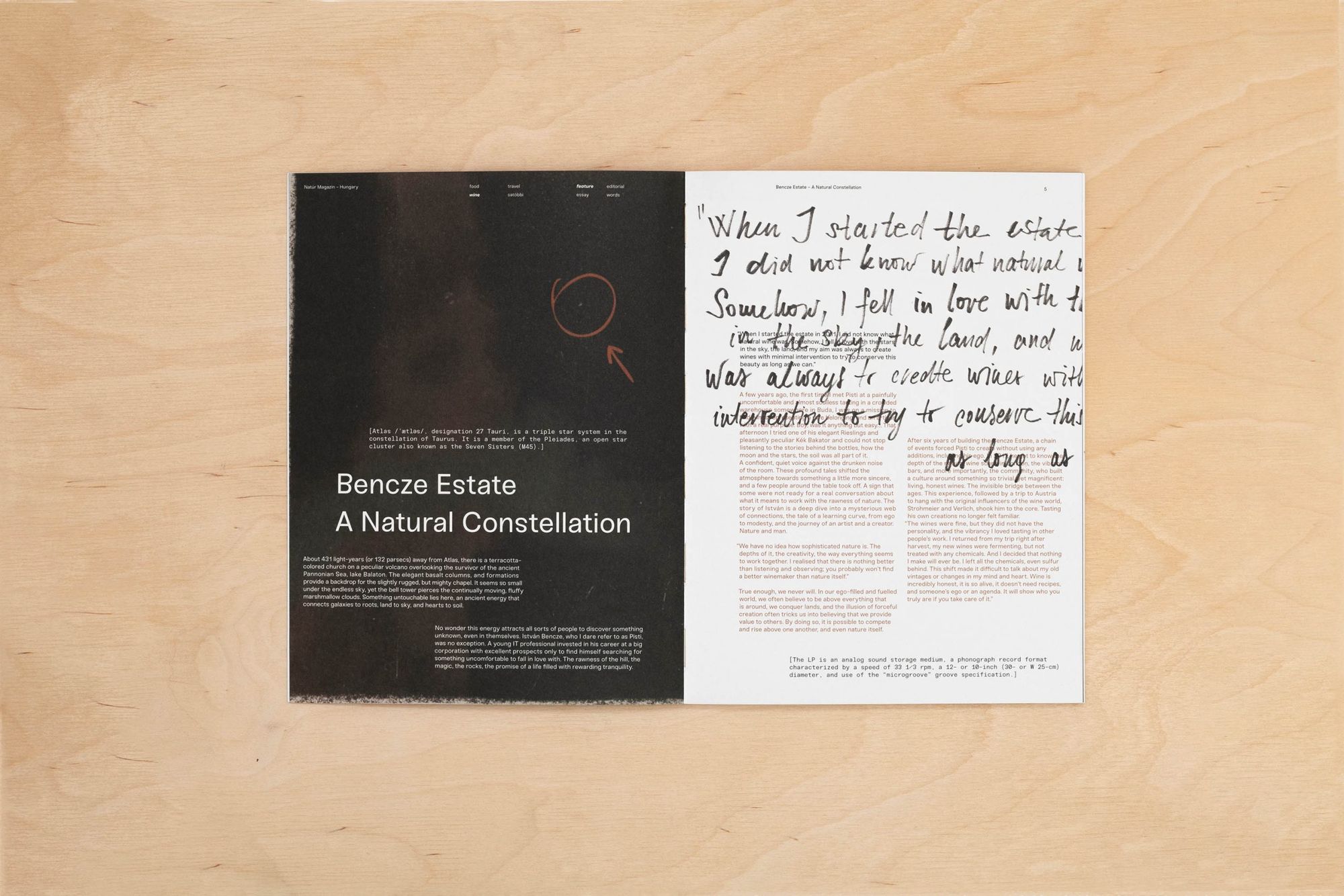
Photo credits:
Grand Vin De Barnag Wine Labels – Grand Vin de Barnag
Danger Wine Bottle – Milan Nastarec
Bencze Birtok Wine Bottle – Exclusively drawn for Natur Magazin by Anna Vu
Bencze Birtok Chenin Blanc Label – Istvan Bencze
Bears and mafia | Secrets and future of Romanian forests
Highlights of Hungary award winners
