


From glossy bubbles and utopian gradients to flat corporate figures and back again, digital aesthetics follow the same nostalgic cycles as fashion. As Gen Z rediscovers the optimistic visual language of the early internet, styles like Frutiger Aero are resurfacing – revealing how design trends are shaped not only by technology, but also by cultural moods, political climates, and our shifting ideas about the future.
Author: Stanislav Andranovits
Fashion is cyclical, and these cycles typically last around 20–30 years. We are drawn to revisiting the styles and experiences of our childhood and youth; they carry a particular warmth and a desire to relive those moments. As the 1990s trend gradually wanes, the early 2000s are coming into focus. Generation Z, born roughly between 1995 and 2012, is increasingly nostalgic for the Y2K aesthetic – an Internet-era style defined by the products, fashions, and designs of the late 1990s and early 2000s.
The aesthetics of a shiny digital future
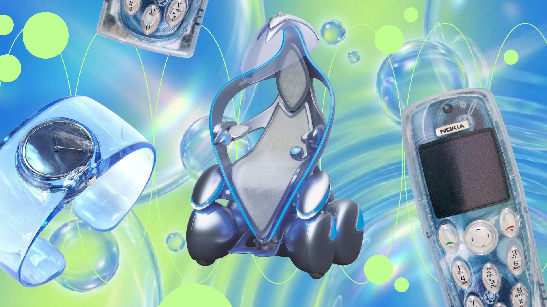
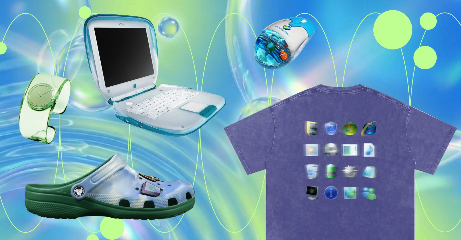
Even major corporations seem to sense this shift. If you have an iPhone and have updated to iOS 26, you may have noticed that app icons now appear more three-dimensional. Buttons, navigation panels, tab bars, and menus have become rounder, with surfaces that reflect light like glass or drops of water – a subtle nod to the past. It appears that the era of minimalist design is giving way to the bold, volumetric style of the 2000s. We instantly recognize this aesthetic, yet few know its proper name: Frutiger Aero. It is defined by vibrant colors, three-dimensional graphics, and glossy textures. Throughout the 2000s, new technologies inspired optimism, and 3D graphics were becoming more impressive by the day. The defining features of that era included bright colors dominated by blues and greens; glossy, dimensional designs featuring water, bubble, and grass effects; and realistic, highly detailed icons rich in visual depth. It was a blend of technology and nature, evoking a sense of a utopian future. Apple was an early adopter, introducing glossy, textured interfaces in the late 2000s and continuing this approach through the iPhone interface up to iOS 6. Frutiger Aero also influenced gaming consoles such as the PlayStation 3 and Xbox 360, while Windows Vista and Windows 7 helped solidify its visual identity. The style even spread to interior design, particularly in offices featuring glass panels, bright accent colors such as blue, green, and orange, and furniture reminiscent of translucent candy.
Future visions in the 2000s
One of the most striking examples often associated with the Frutiger Aero aesthetic is the Nokia Morph. This visionary concept device was developed by the Nokia Research Center in collaboration with the University of Cambridge to explore the future applications of nanotechnology in mobile design. The Morph featured a flexible, transparent, self-cleaning body capable of changing shape – shifting from a conventional phone into a wearable bracelet or folding into different configurations depending on the user’s needs. Although it never reached commercial production, the project introduced forward-looking ideas such as solar charging, dirt-repellent surfaces, and ultra-durable, nature-inspired materials. Several of these once-speculative concepts are now beginning to materialize in contemporary devices, particularly in the rise of foldable smartphones. The automotive industry was not far behind. In 2003, at the Tokyo Motor Show, Toyota unveiled its new concept vehicle, the Toyota i-Unit. The Toyota i-Unit is a single-seater electric vehicle that sits at the intersection of car, scooter, and robot. The concept featured a soft futurism: a semi-transparent body, rounded shapes, and high-tech details. The i-Unit reflects the early-2000s belief in “smart” technologies and experimental design, when urban mobility was imagined as an integral part of the personal experience. Interestingly, in 1998, the Russian company Lada developed a concept car called the Lada Rapan. The vehicle was presented in Rome in 1998 but failed to generate the expected interest from either the public or major Russian companies, whose support Lada had largely counted on to promote a potential production model. It seems that Lada’s designers were looking too far into the future, and society was not yet ready for such a style. The early 2000s were a relatively calm period; the future seemed to promise limitless possibilities, and Frutiger Aero fit perfectly into that era.
The era of minimalism and corporate aesthetics
However, as is often the case, everything eventually grows tiresome - there is only one step from love to hate. The aesthetic remained mainstream for a long time, but then companies almost simultaneously abandoned Frutiger Aero. Public sentiment shifted toward a more restrained and simplified design language. This transition affected everything from clothing to apartment interiors. The glamour of the 2000s gave way to muted tones in fashion, while Scandinavian-style interiors became a dominant trend. In advertising, announcements, and website design, Flat Design began to be used more and more frequently. Unlike Frutiger Aero, which emphasized realism, Flat Design focuses on simplification and abstraction.
The Corporate Memphis style gained particular popularity. Corporate Memphis is a corporate illustration style characterized by flat shapes, a bright color palette, and abstract characters with disproportionate bodies (long arms and legs, small heads) lacking individual features. Corporations widely embraced this style in the late 2010s amid a growing emphasis on inclusivity and anti-racism. Its use of generalized characters “without age or nationality” enabled companies to avoid visual exclusion, stereotypes, and potential cultural friction when addressing a global audience. The minimalist approach also removed naturalistic elements, favoring calmer and more subdued color palettes. In this way, the aesthetic aligned closely with DEI (diversity, equity, and inclusion) practices, which were becoming increasingly institutionalized across corporate and academic environments. The peak of DEI came in the late 2010s – particularly between 2020 and 2022 – when American corporations, universities, and public institutions significantly expanded and formalized diversity and inclusion initiatives. A major catalyst was the resurgence of the Black Lives Matter (BLM) movement in 2020, which prompted many organizations to take explicit public positions on racial justice and equity. At the same time, DEI became deeply entangled in U.S. political polarization, receiving strong support from Democratic leaders while facing mounting criticism from Republican lawmakers and conservative groups. Initially, the first backlash against the perceived blandness of flat design came from Generation Z.
Can the glossy future return?
The hashtag #frutigeraero on TikTok gained significant attention at the end of 2023 and continued to grow rapidly throughout 2024, riding a wave of nostalgia for mid-2000s digital design aesthetics. Despite its eccentricity, Frutiger Aero conveys a sense of calm and coziness, even inspiring music playlists dedicated to the aesthetic. It came to be seen as a reminder of a time when the future seemed bright and the threats society would face in the 2020s were either less apparent or perceived as easily surmountable. Later, the political environment further accelerated the decline of Corporate Memphis. After beginning his second term in 2025, Donald Trump issued executive orders, including “Ending Radical and Wasteful Government DEI Programs and Preferencing,” directing federal agencies to dismantle DEI offices, positions, and initiatives. These measures also revoked earlier federal directives promoting DEI, including those introduced under the Biden administration. As DEI became increasingly politicized, the visual language associated with it - including Corporate Memphis - gradually lost institutional support and cultural momentum. The revival of early-2000s aesthetics is only beginning. It remains to be seen how far and for how long it will return, and to what extent it will influence mainstream design. One thing is clear: people have grown tired of the sterile corporate style - and if nostalgia for it resurfaces, it will likely take decades. Apple, as a flagship company exploring this revival, may lead the way, and it is intriguing to imagine which other companies might follow, bringing a splash of early-2000s optimism back into our digital lives.