In the spring of 2022, on the 150th anniversary of the founding of the institution, the Museum of Ethnography will open in a new location and building. The change of location is also the catalyst for the change of era. In this context, the museum wants to open up to contemporary trends and create an international standard, making the ethnographic heritage alive and embedded in our everyday lives. However, designing big changes and the visuals associated with them is a delicate task. Especially when it comes to an institution where the past was dominant, not the future. That’s what we are looking into now!
For director, Lajos Kemecsi, it was of paramount importance that value preservation and innovation go hand in hand in connection with the new visual identity, and that international branding should not be separated from the museum’s roots. The renewed identity of Victoria & Albert in London, the Asian Art Museum in San Francisco and the Hungarian Museum of Transport served as examples to follow. About a year ago, therefore, a graphic design competition was announced, which did not end up with a winner, as the jury did not find any of the entries to be one-to-one integrable. Unusually, five graphic designers, Nóra Demeczky and Enikő Dér, known from De form, and members of the Explicit studio, Hunor Kátay, Szilárd Kovács and Sebestyén Németh, were asked to take part in a long-term joint project with the museum. The brand identity thus became not a selected work of a single design studio, but a comprehensive and long-term teamwork that brought together different perspectives to one platform.
We asked the designers about the joint work. “The Museum of Ethnography is not just a new project for us, it has been, without exaggeration, one of our favorite partners in recent years. We have already been lucky to participate in several of their programs as designers, including the …Open Museum… publication and a website, the brand identity of the program series entitled Tiger in a Museum or the recent exhibition Invisible Spectra at the Pannonhalma Archabbey. That’s why we felt it was very important to take part in their 2020 logo design call. Although the competition was unsuccessful, we believe that all the energy invested was worth it, because, without it, this long collaboration with the design team known from Explicit Studio and the museum staff would not have been possible,” told us Nóra and Enikő. “Repositioning the renewed identity of the Museum of Ethnography was not only a noble task but also an incredibly exciting challenge professionally, as we collaborated with another design team for a common goal. This kind of cooperation, which is rare at the national level, offers a lot of development opportunities for all of us, as well as increases the legitimacy of the emerging visual language. We have developed a system that can visually communicate the elusive concept of ethnography. The visual identity, which relies on an abstract design, opens up space for individual thoughts in the recipients. The joint work, and the fact that the staff of the Museum was also open to creating such an identity, proves how so many different designers can think creatively together with museum professionals,” added Hunor, Szilárd and Sebestyén.
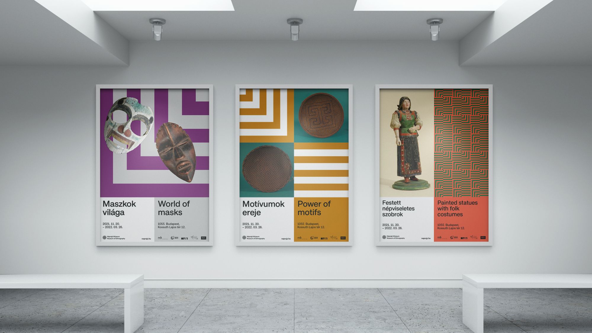
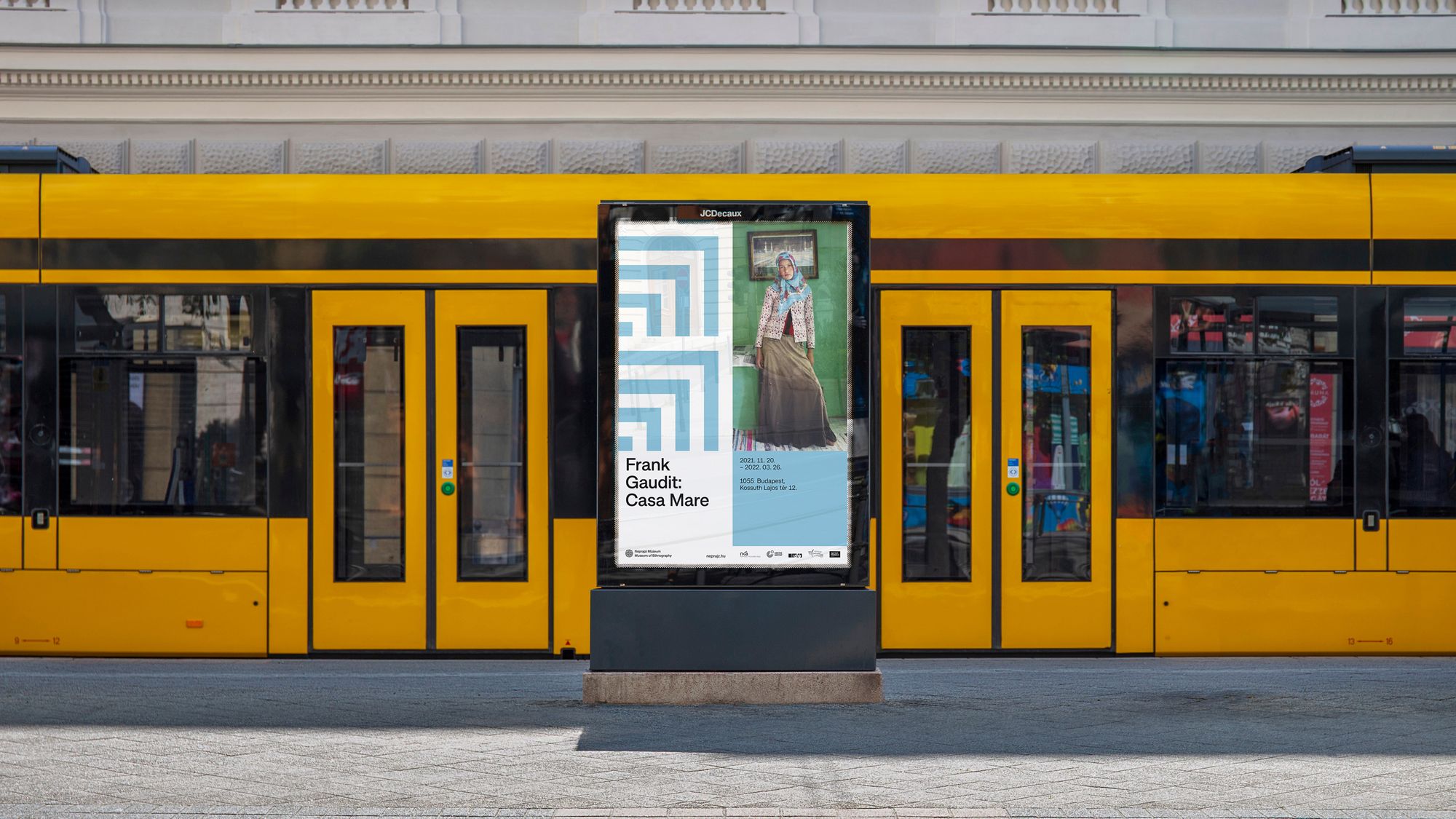
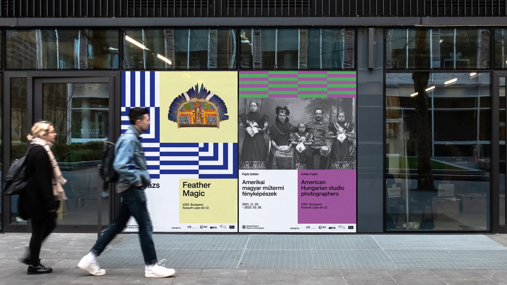
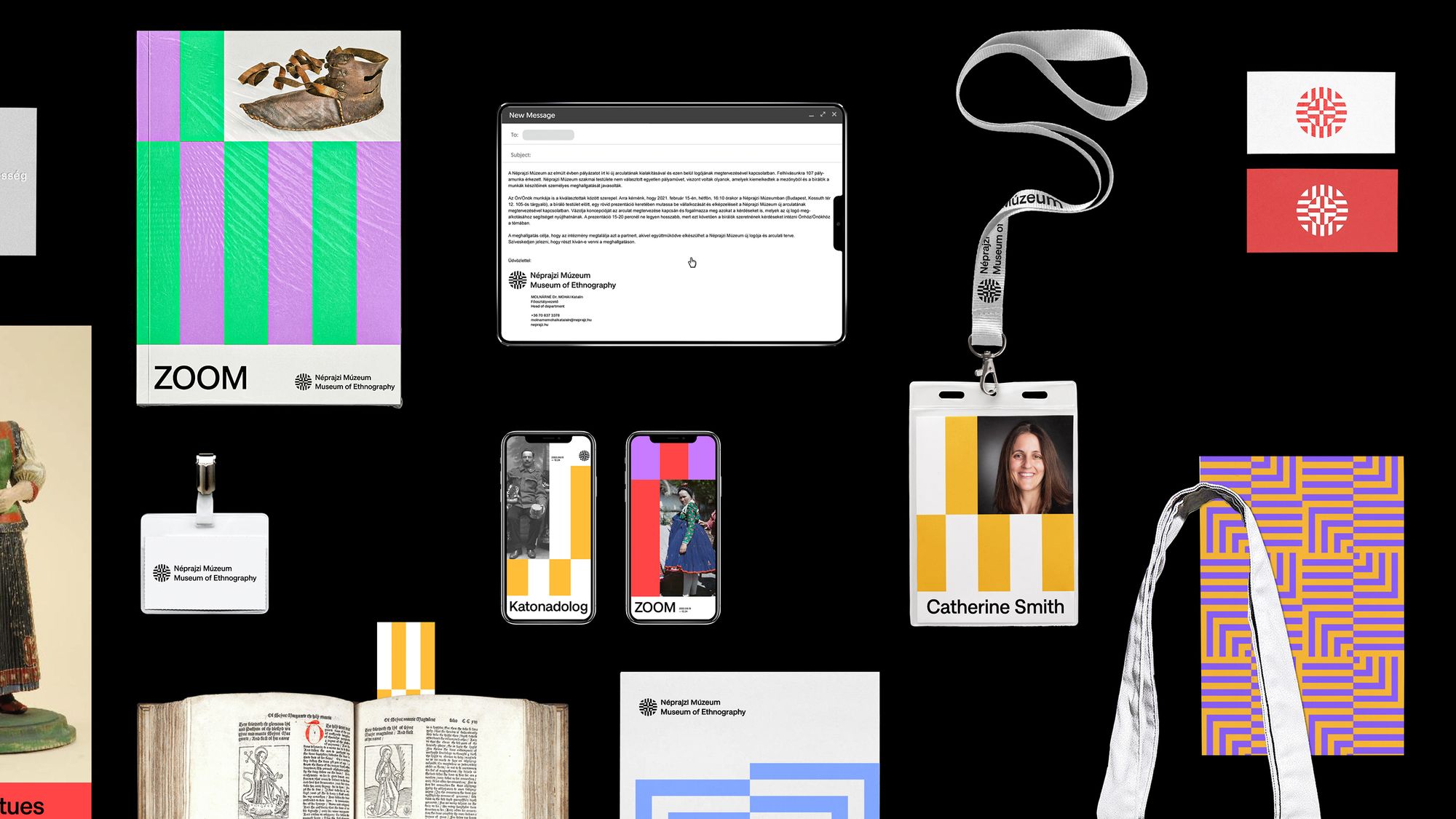
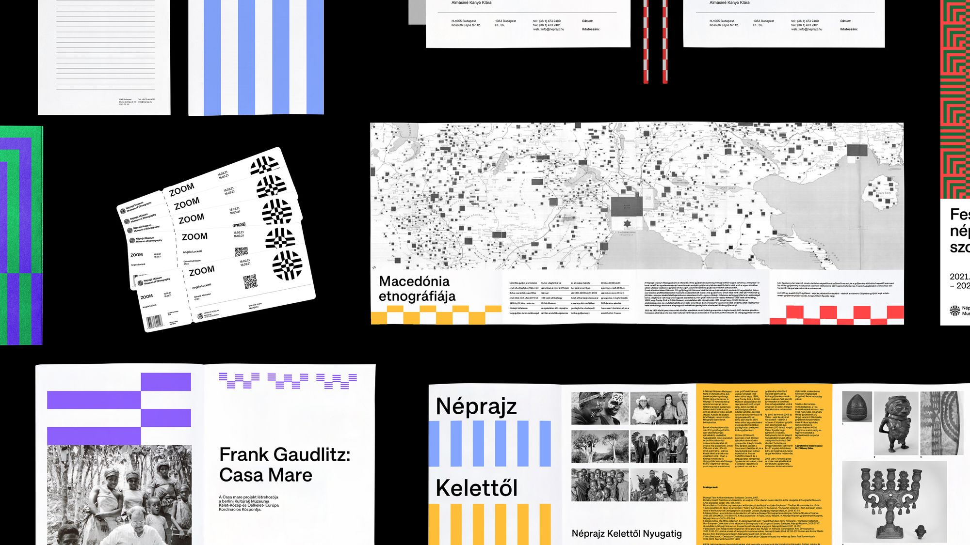
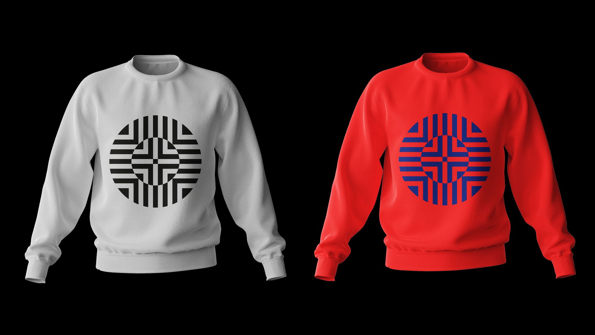
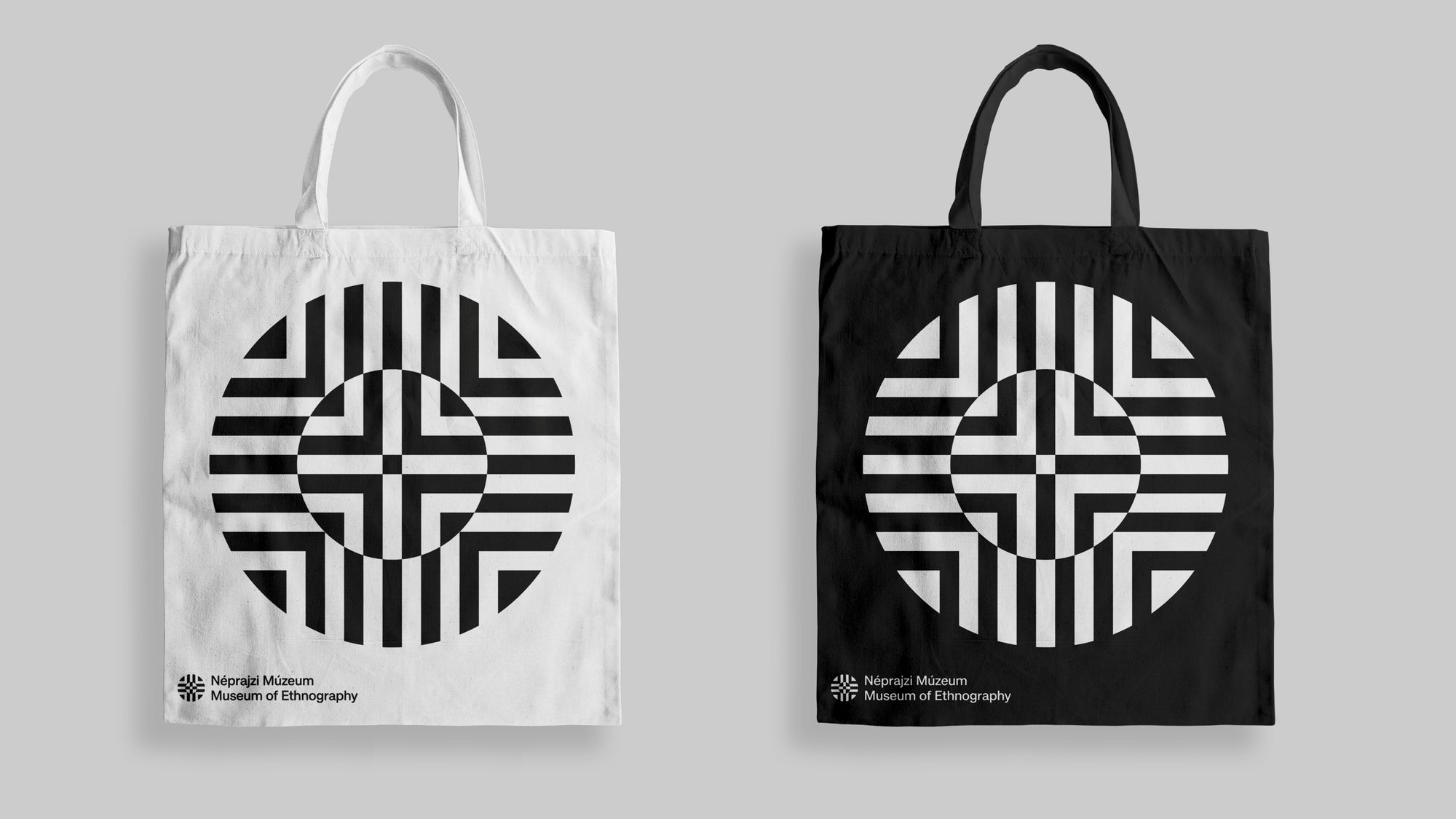
The concept was to create a set of patterns that could be relevant across cultures and around the world. This is how they chose universal stripes. They created an organically connected visual system where striped surfaces, in different shapes and color variations, appear with bold color pairings. Another key aspect of the visual identity change was bilingualism, which appears not only on the logo but also on the posters in the form of double-split compositions. For the texts, a classic and simple font type was chosen from the Approach font family.
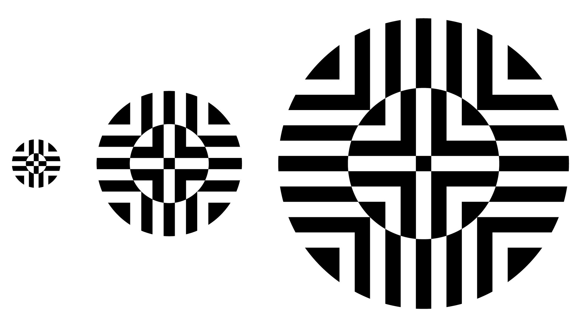
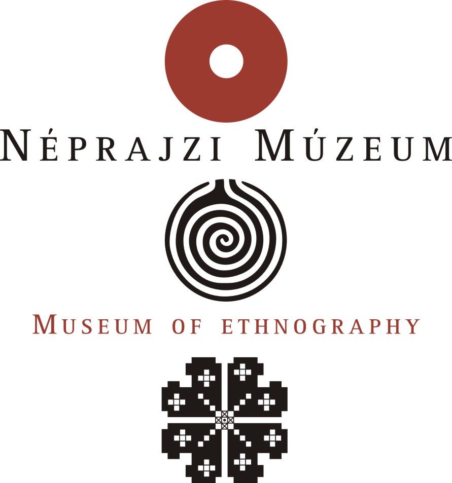
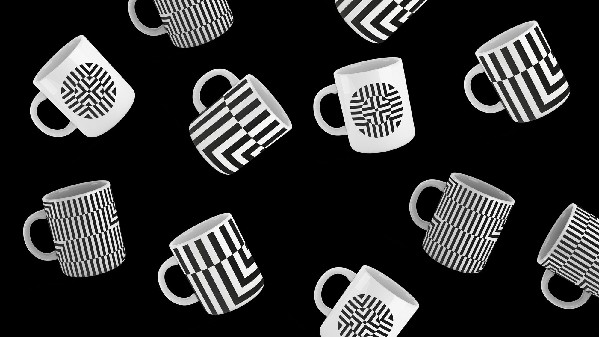
The most sensitive point is clearly the new logo. During the design process, the logo designed by the Munkácsy Prize winner Gábor Gerhes, used for twenty years, was replaced. Not only the public but also the staff of the institution insisted on this, so the designers did not want to erase this legacy without a trace. The new logo was mushed together from the three old elements, trying to capture the essential details of the previous symbols, creating a timeless and unified visual sign. The system of the pattern merges into one from the four compass points, thus referring to the openness and the diverse world of motifs in the Hungarian and international collection of objects of the museum. Technically, a so-called responsive logo has been born, the different versions of which can flexibly adapt to different online and offline interfaces.
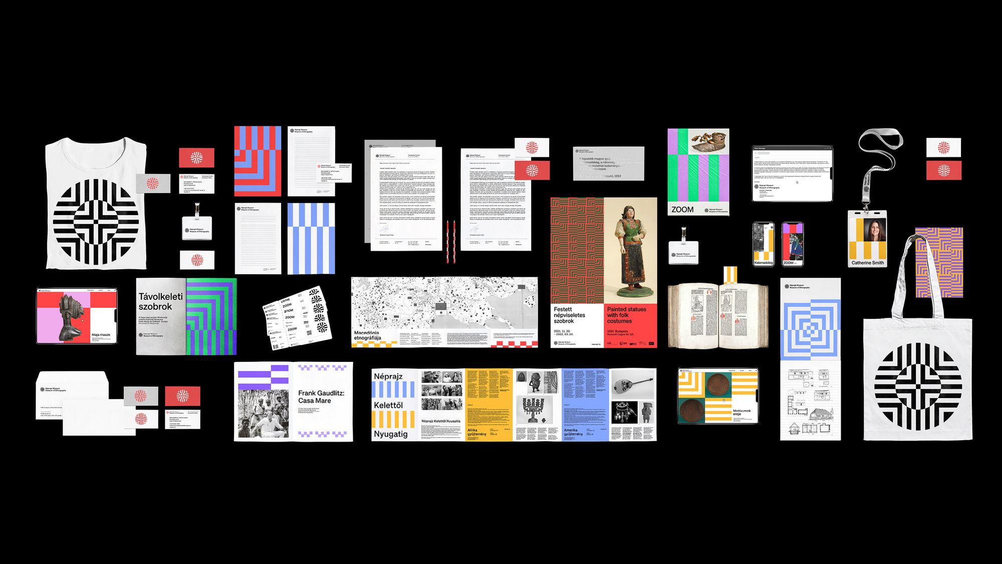
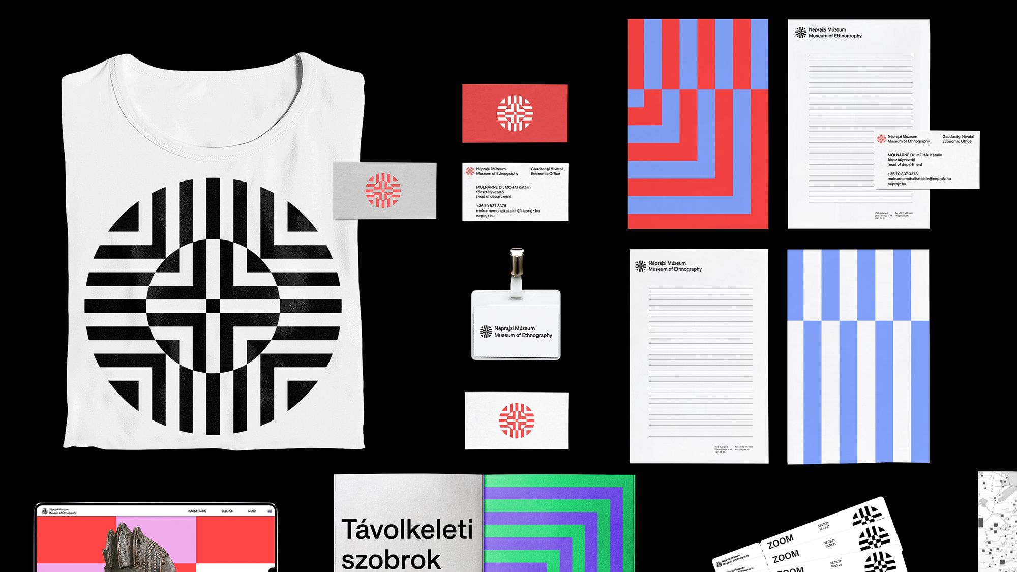
Dynamic, modern and eye-catching: the new brand identity is clearly about broadening the perspective of the institution. Personally, the only thing I regret is why, in addition to the simple white-and-black logo, the color version didn’t come from a bolder pairing of the poster’s and brochure’s colors. While I understand that the designers wanted to reflect on Gábor Gerhes’ logo in white and red. However, the change was not well received by the audience yet, moreover, it was rather provoking. Among other things, they doubt how much the new visuality reflects on ethnography (but rather on op-art) and criticize that the logo has lost its personal character compared to the old. Even if the opinion of the professionals is not unanimously positive, many people saw the value in it. “I was surprised that the identity of the Museum of Ethnography is finally no longer a historicizing visuality, but is trying to approach from a new perspective. It is an international visual language. The job of the designer is not to serve the public taste, but to take and expand the boundaries of the profession, even if many don’t like it. A visual identity does not illustrate, but expresses and communicates,” said graphic designer Gábor Palotai on an online platform about the topic. At our request, Ákos Polgárdi, a graphic designer, expressed a similar opinion: “I take the—admittedly elitist—view that an institutional brand identity (especially in the case of cultural institutions) must not only take into account the relevant design and content requirements, but also enrich and promote the visual culture of the community involved. For my part, I see that the visual identity meets the design criteria (scalability, mutability, recognizability, etc.) and is also in line with the expected content that the museum wants to communicate about itself (and which it will hopefully become). But I think it’s at least as important that it will be a better feeling to walk the streets of Budapest if the same posters will advertise the exhibitions of the Museum of Ethnography as the ones we saw in the brand identity presentation. It is especially hopeful that there are big, state (!) institutions in Hungary that dare to think progressively about themselves, treat their audiences as adults (assuming some flexibility about them), and trust the professional judgment of the designers who work with them. (The process of creating an identity is a great example of how counterproductive an open call is for this type of task).”
The question, then, is whether rowing into international waters, the museum’s advanced direction, and the associated visual identity will really be able to expand the audience, or will it attract new target groups, while losing the old ones?

It’s good if it’s weird: the era of playful pottery—Interview with Malwina Konopacka
Favorite interiors of the week_87
