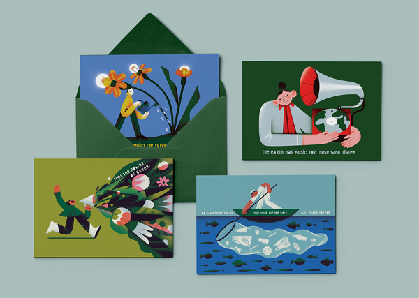
Analog techniques and inspiration from nature combined with the fields of architecture and graphic design, where the approach of slow design not only intertwines with the creative processes but also with the creators’ everyday lives. We visited the studio of Anett Virág and Tamás Boldi Hoffmann.
Anett is the architect, while Boldi is the graphic designer in the team. When and why did you decide to merge these seemingly distant fields and work as a designer duo?
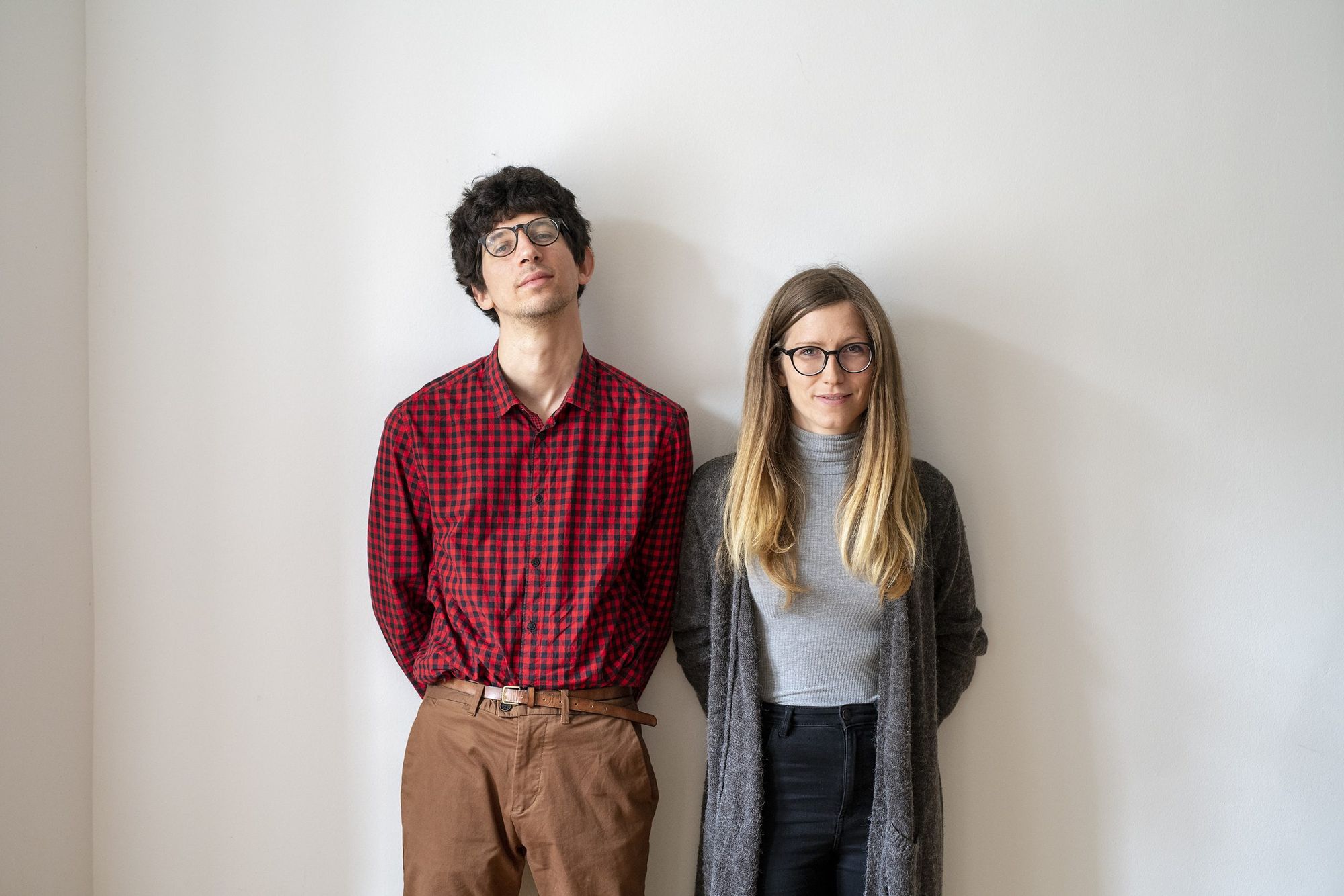
Tamás Boldi Hoffmann: Dunakanyar Press is a love project from every aspect. Anett and I have been together for almost ten years now. During this time, we have always turned to the work of the other with great interest and enthusiasm, and we have often used each other’s works and creative methods as inspiration. We launched a joint brand and studio so that we could make our dreams come true together, by supporting and encouraging each other.
Anett Virág: The fusion of the two fields is actually not uncommon at all. This relationship can appear in the initial phase of a project, for example, in an architectural design contest project, but in the documentation or publication of a completed building, too. Over the past years, we have participated in several projects where this also manifested in a more nuanced manner: we learned how architecture and graphic design could complement each other.
In addition to defining your creative approach, the name Dunakanyar Press is also closely linked to Boldi’s diploma project. Could you tell us a little more about this?
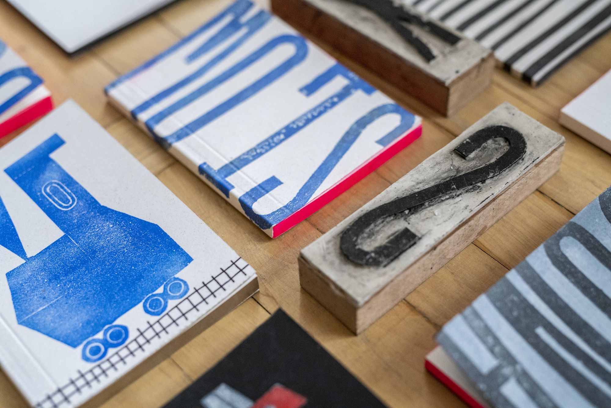
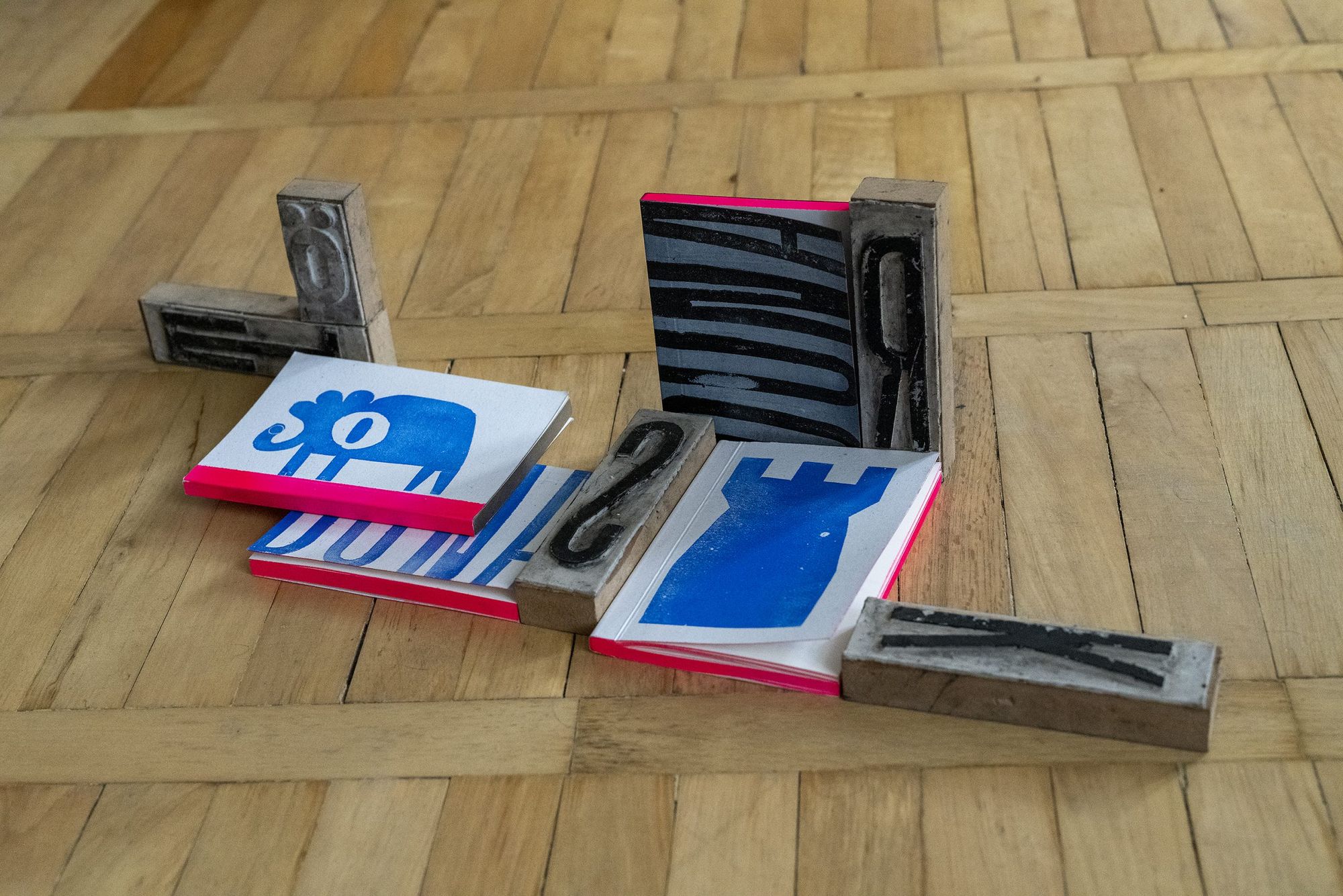
T. B. H.: The name Dunakanyar Press did actually come from my diploma project, which started out from my other calling besides graphic design: free music. This is essentially an intuitive musical attitude that is free from conventions. In the project, I created a uniform visual identity for the events of the free music movement in the Danube Bend: its goal was to create a graphic design apparatus that lacks digital platforms. The core of the set was provided by a hand-made font and a related printing device, which I named the Dunakanyar (Danube Bend) press.
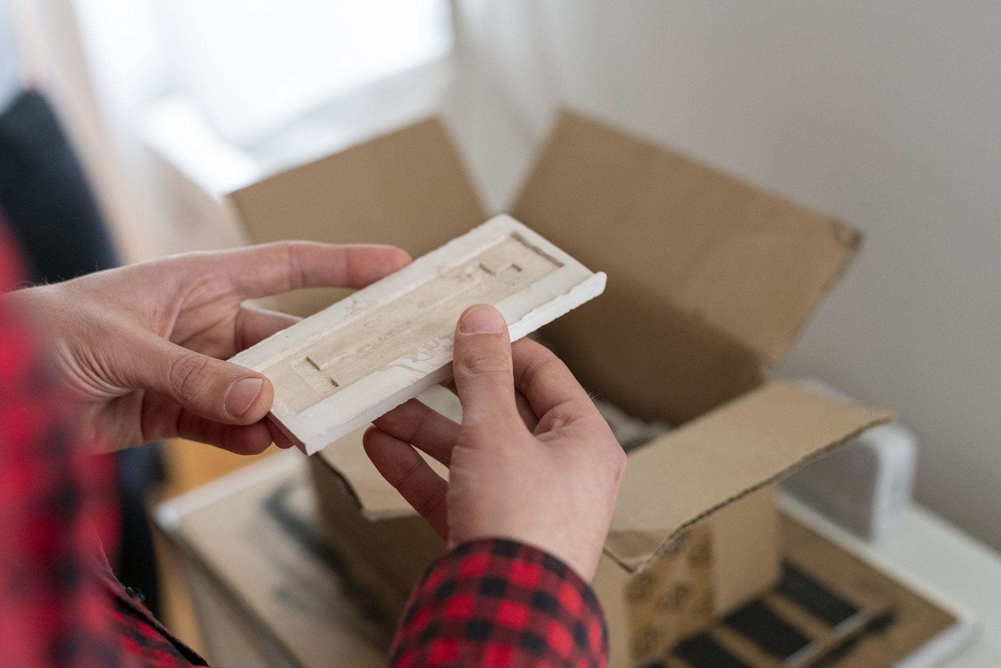
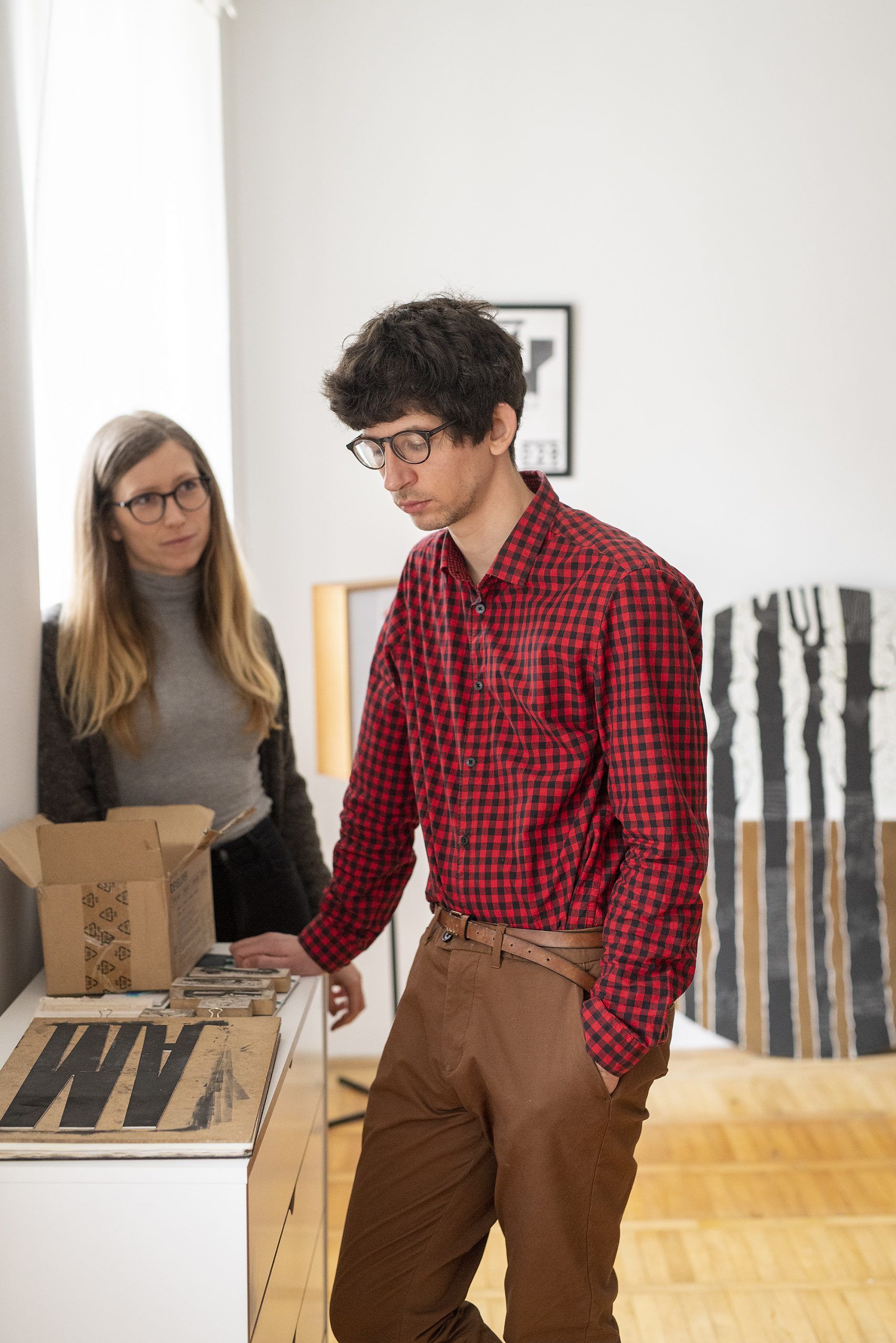
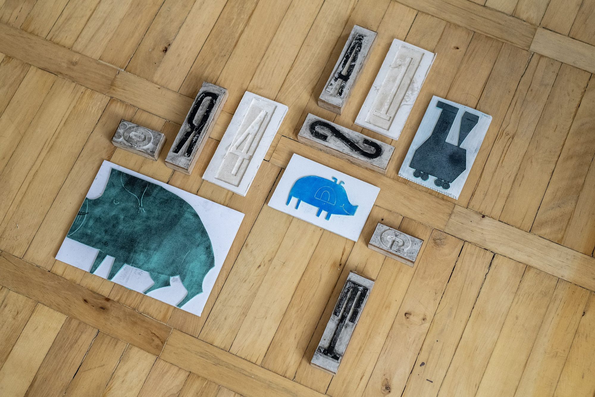
This was the first project of mine in which the approach of slow design played a pronounced role. In addition to forming a vague impression of a perspective and the name, I also got to know typography better in the framework of this project, which I still pursue actively to this day. I multiplied the hand drawn characters with cold casting, and the final letter compositions were made with letterpress printing. The boots appearing in the name and the logo is an allusion to this technique, combined with some rural romance. So it’s safe to say that my diploma project laid down the foundations for Dunakanyar Press studio in several aspects.
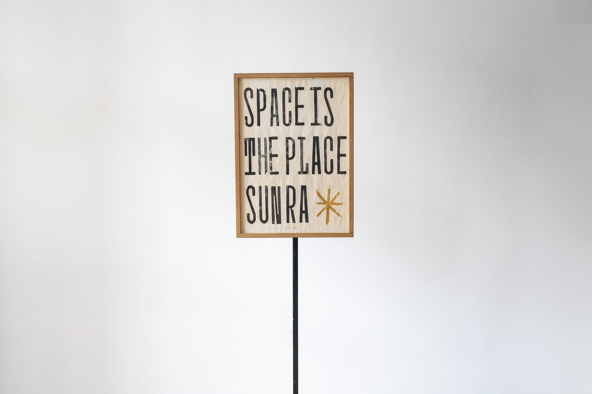
A.V.: This artisan approach has been with us for a long time. Boldi’s father is a locksmith, while mine is a carpenter: both of them helped a lot in creating the mentioned printing device and the lightbox forming part of the installation. And the time spent in their workshops further enhanced our desire to pursue some sort of craft activity in one way or another.
The Danube Bend also forms an integral part of your identity: both of you were born here, you live and work here, and being close to nature also plays a central role in your creative attitude. How, in what other fields does slow design manifest itself in your everyday life?
A.V.: The Danube Bend has been a significant influence on our lives since our childhood: there are a unique atmosphere and pace here. We go out in the nature whenever we can and we hike a lot. These hikes are not only about recreation, we also integrate the experiences gathered here into our projects: to always keep the intervention at the minimum extent and to make it respond to its own natural environment sensitively are important aspects in architectural design. Unfortunately this intention can only prevail in smaller scale projects that give room for experimentation, but we always try to use it as a guiding point.
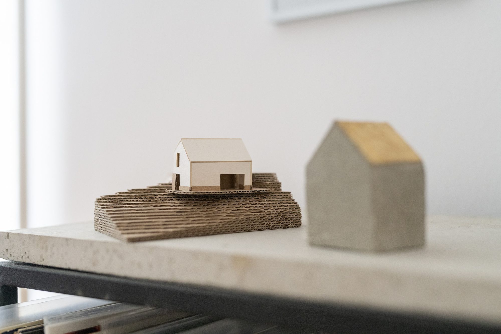
T. B. H.: The “slow” design method is gaining more and more relevance in the fields of both architecture and graphic design. This attitude has also spread to our living spaces and our objects: our custom manufactured furniture and ceramics utensils as well as the wicker lampshades on the walls of our rooms are prominent examples of this. Our projects are usually somewhere between applied and autonomous art, including my sketchbooks, for example, which display unique, hand-printed graphics inspired by the Danube Bend on their covers. The booklets also aim to draw attention to preserving the treasures of the Danube Bend. It is becoming a more and more popular destination among tourists, which significantly increased the environmental pressure on the area.
As you’ve mentioned it, the world of architecture and graphic design always merge or complement each other in your projects. This aspiration is perhaps the most emphatic in the project of the Szőnyi Art Camp in Zebegény. What personal connection do you have to the art school and what were your roles in the project?
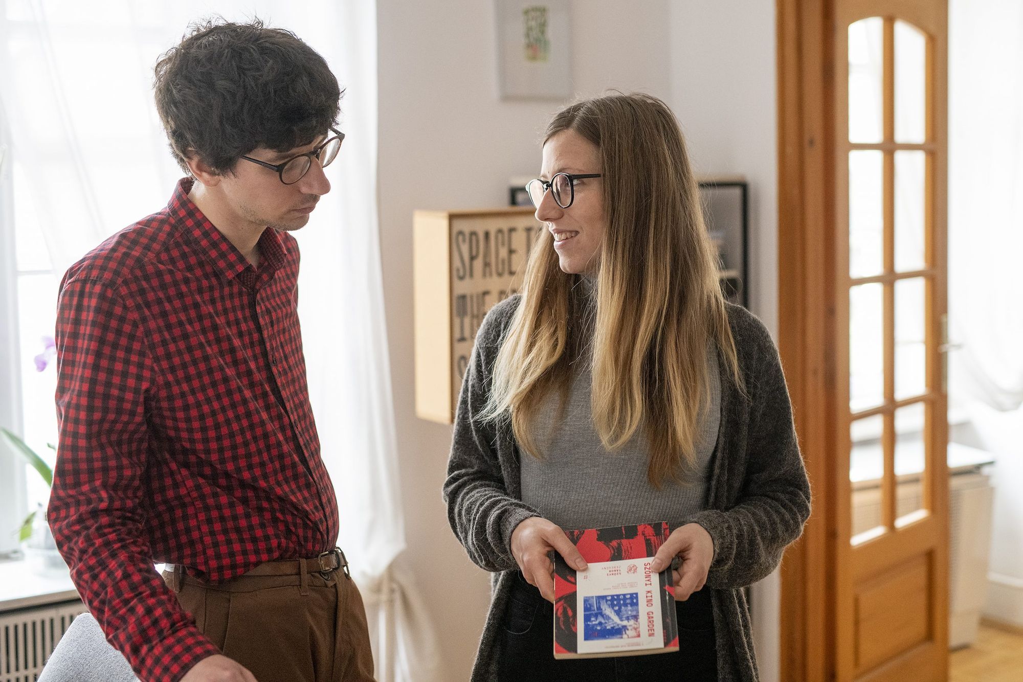
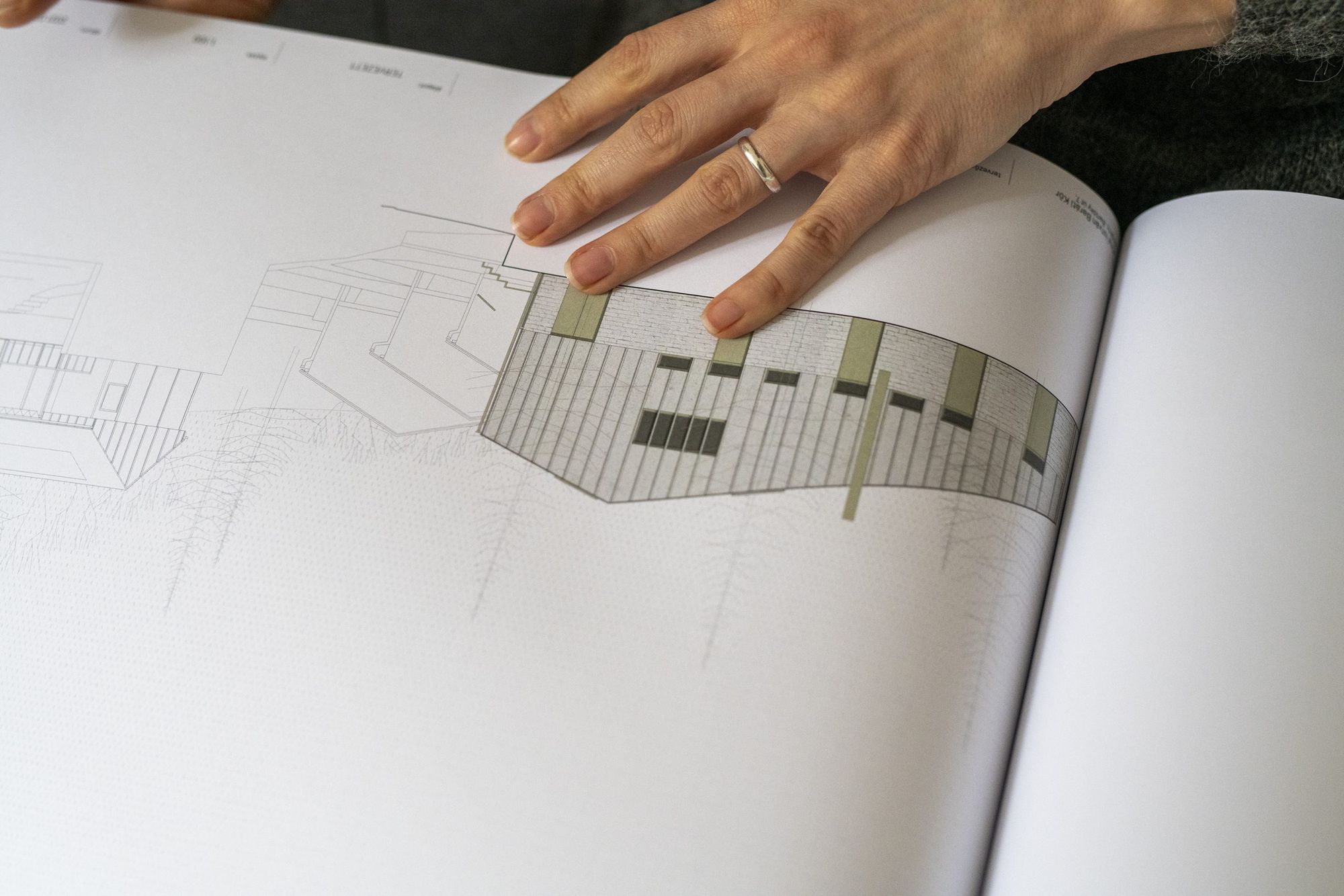
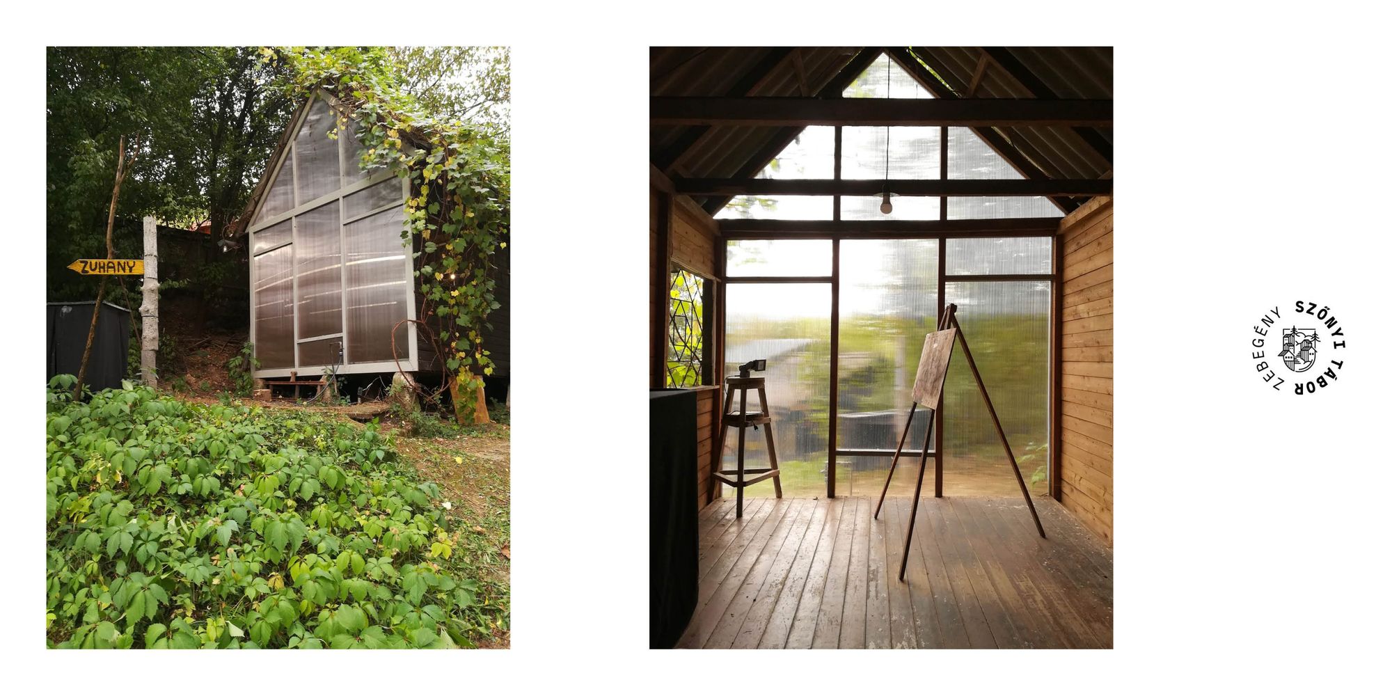
A.V.: The Szőnyi Art Camp in Zebegény plays an important role in both of our lives—we learned about the art school representing and conveying a multidisciplinary approach as students, but today we participate in its life as organizers, association members, volunteers and friends. Boldi is in charge of the camp’s visual identity, and I work on the renovation plans of the main building and its area. Currently the area has structures designed for summer use only. As a first step of their rehabilitation, I have examined the operation of various art centers and determined the goals with their help: all in all we strive to create an art center that provides all-year-long operation and a residency program to its users.
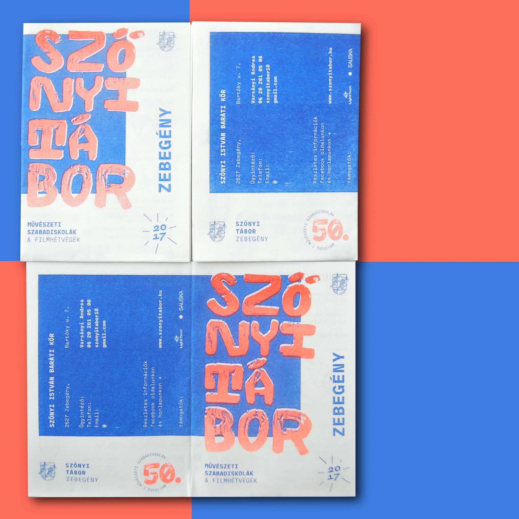
T. B. H.: I have great memories about the creation of the graphic concept even looking back from many years, as inspiration from the natural environment was already of key importance to me back then. I started out from what I saw there: the motifs appearing on the logo and the campaign visual identities were based on the cabins of the camp and the forest. The team of the Szőnyi Art Camp gave a free hand to me regarding the design of the promotional materials, so I can experiment with the visual content freely each year.
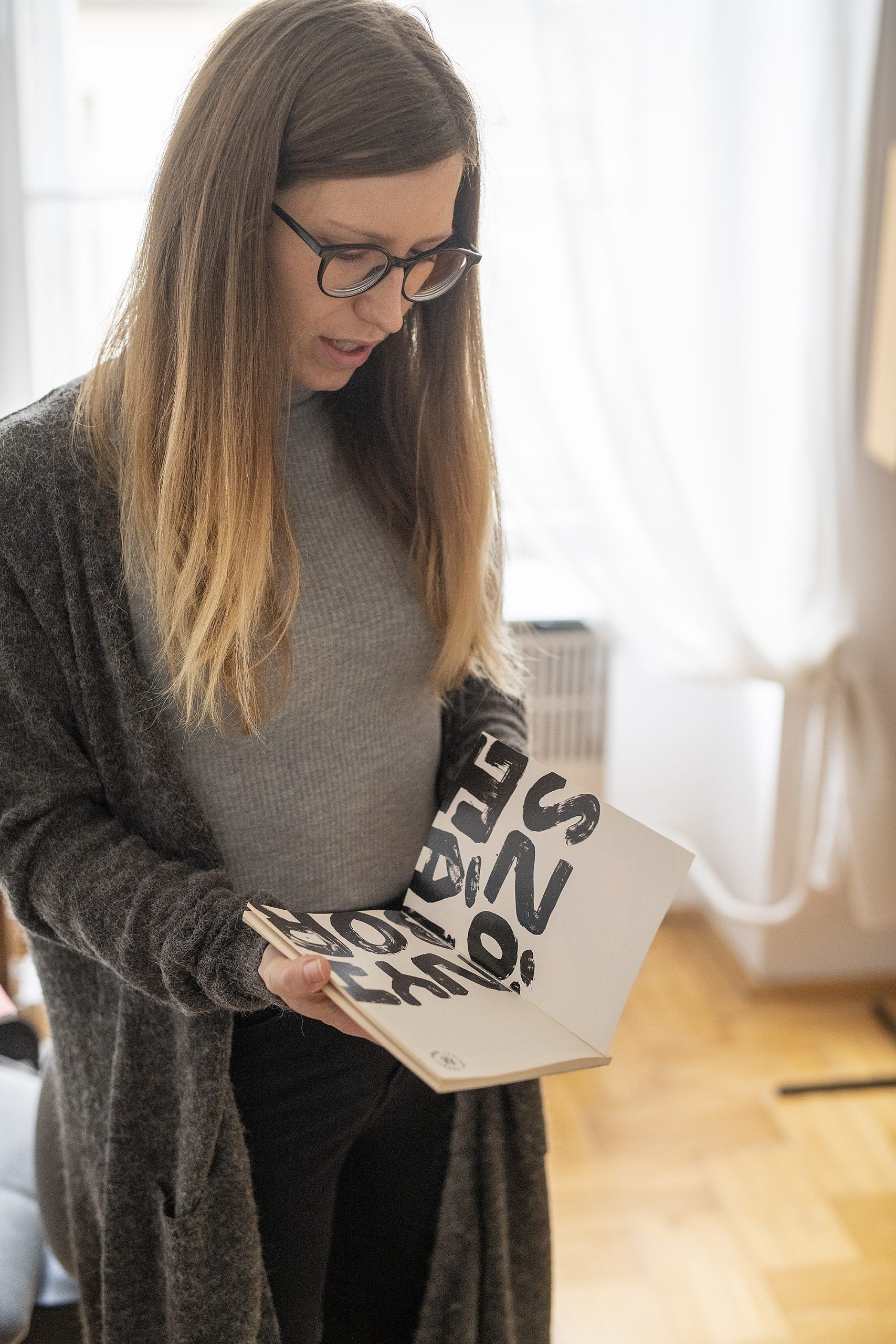
In her doctoral research, Anett examines the relationship between painting and architecture, which is once again closely related to the Szőnyi Art Camp.
A.V.: I found my topic through examining the cultural embeddedness of the Szőnyi art colony. This is how I got to know its intellectual heritage, the work of István Szőnyi and the plein air painting method he applied. I became intrigued in how the intensive presence of painting could influence architectural design and how the relationship of these two branches can be interpreted today. As here we are not talking about a large artistic constellation characteristic of historic ages, I looked for a parallel in another form. In the selected examples, the fusion mostly manifests in the creative intention: the preservation of the atmosphere, simple, ordinary themes and a harmonious relationship with nature. Practically everything that reflects slow design principles to me.
What other projects would you highlight in which the two fields you represent have nicely complemented each other?
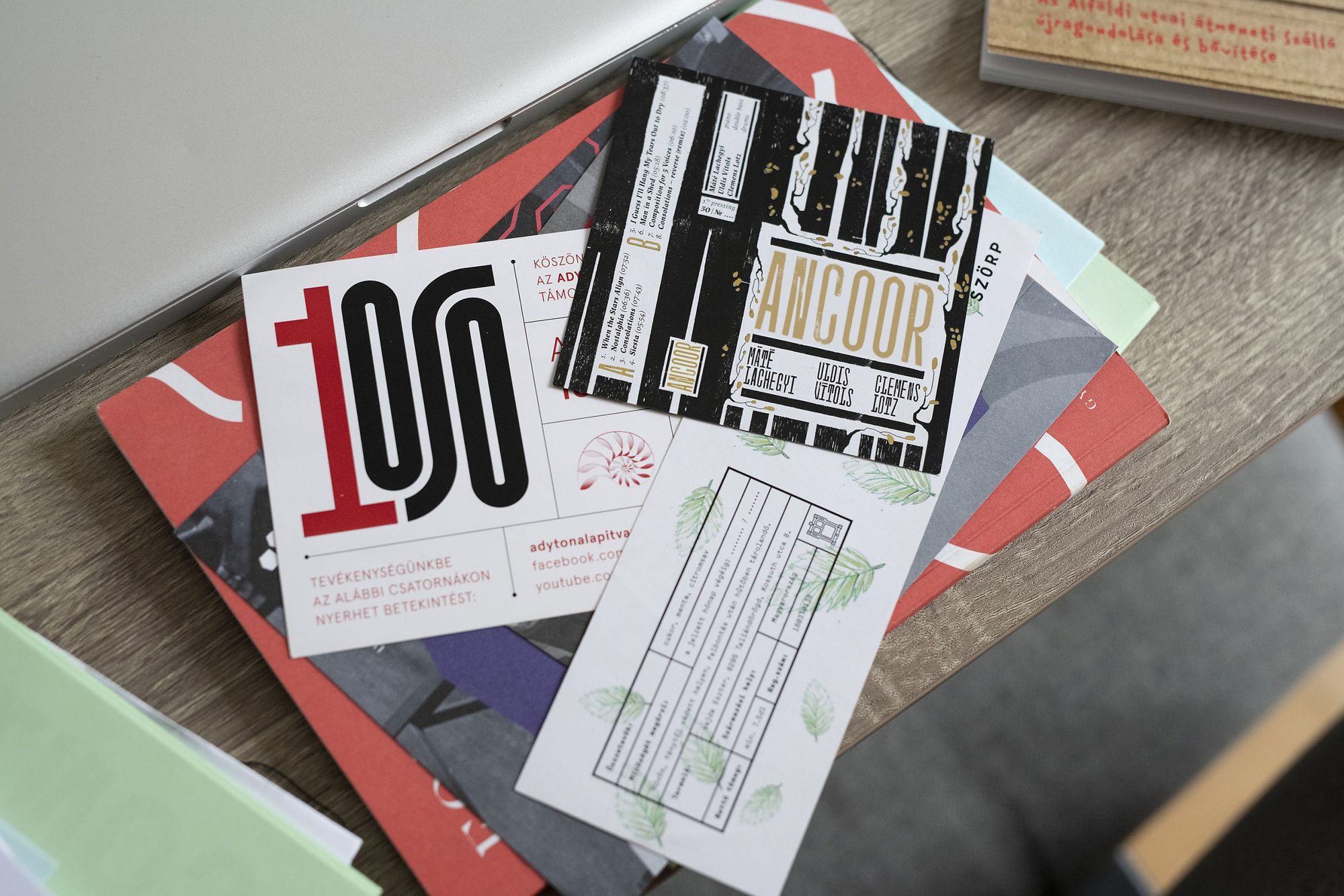
A.V.: As a doctoral student I regularly participate in organizing university programs, and I often involve Boldi in designing their graphic appearance. We have designed mini guidebooks for architectural tours, promotional materials for the lectures of the doctoral school and also a publication related to a student design contest. Our creative fusion not only manifests in joint design tasks: we regularly ask for each other’s opinion in the case of independent projects, too.
What will you focus on in the future? What is your next project as a designer duo?
T. B. H.: Anett is currently teaching at the Department of Residential Building Design at the Faculty of Architecture of the Budapest University of Technology and Economics. Teaching is an exciting terrain to me, too: it’s been an old dream of ours to pursue visual education together. Our studio is in Kismaros, where in the future we’d like to hold workshops for both kids and adults.
A.V.: We are also working on designing an exhibition and our next joint project will be a huge milestone in our relationship: our wedding in the summer.
Photos: Balázs Csizik
Floating shelters for flood-affected areas | Andrés & José
The first garments made of mushroom-based vegan leather | Stella McCartney
