In the middle of the nineties, José Tábori-Simon, aka Simon Says was an active player of the music sector as the singer-songwriter of the band Fanzine, in addition to his graphics studies at the university of visual arts. After publishing a few albums, their band finally broke up in 2000, but the majority of the members continued their careers in different groups. Since then, José has been working as a graphic designer and publication designer while also pursuing his interest in music: he has been designing album covers for Amber Smith for almost twenty years. Interview!
The earliest work you’ve done for Amber Smith posted on your Instagram was made in 2003. Is this how long you have been working with them?
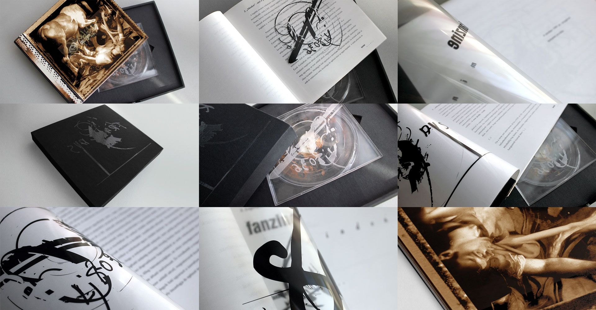
If I remember correctly, the first cover was made for their album ‘Nincs szükség ránk’ released in 2001. Until 1999, Amber Smith founder Imre Poniklo and I played together in the band Fanzine, (for which I designed the covers, too). The visual identity designed for the album ‘Minden” released in 1999 was my diploma project on the university of visual arts. Then we stopped playing music together in 2000, but I have been designing Amber Smith’s album covers ever since.
Is there a sort of continuity in the album covers you created for them in the past twenty years? Or are you rather inspired by the given album and its message? How does the design process go with each album?
I was given a free hand in designing from the very beginning. I usually ask for the songs and the lyrics from Imre before the release, but many times I have pre-concepts already based on the title. At the end, of course, it is always the given music that inspires me.
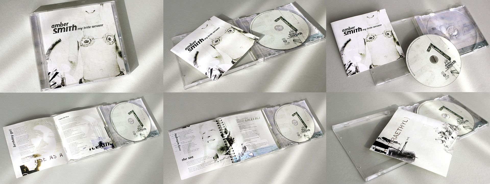
For example, ‘My Little Servant’ released in 2003 has a little girl wearing a crocheted bikini on its cover. I scanned the photograph from an old textile-focused magazine from the eighties titled ‘Fürge Ujjak’, which gained a completely new meaning with the title.
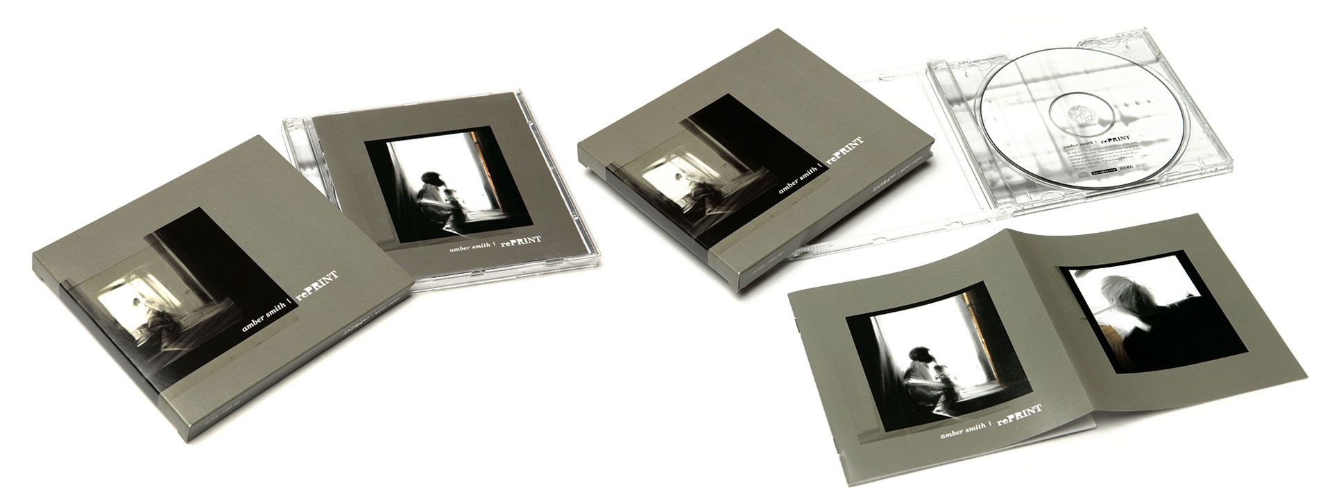
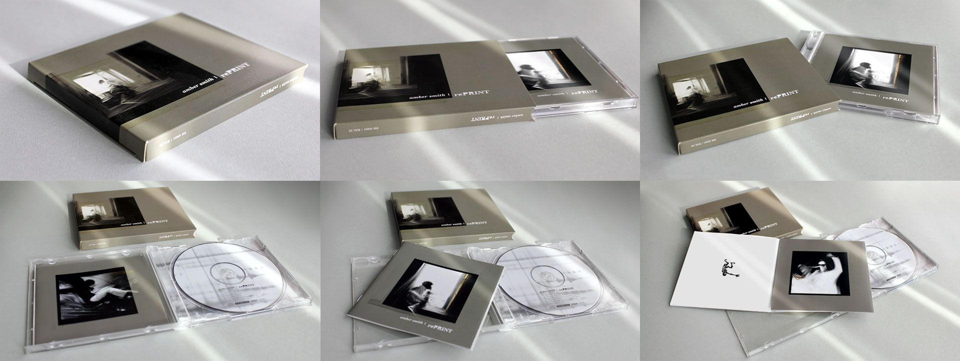
In the case of ‘rePrint’ released in 2006, I was certain based on the title that the I would go with a photocopied, battered visual world, but then once I had listened to the songs, I chose a more sophisticated visuality. I used repainted photographs in a more elegant version, and the CD was placed into an extra paper case, too, to make it even more book-like.You can check the design process here.
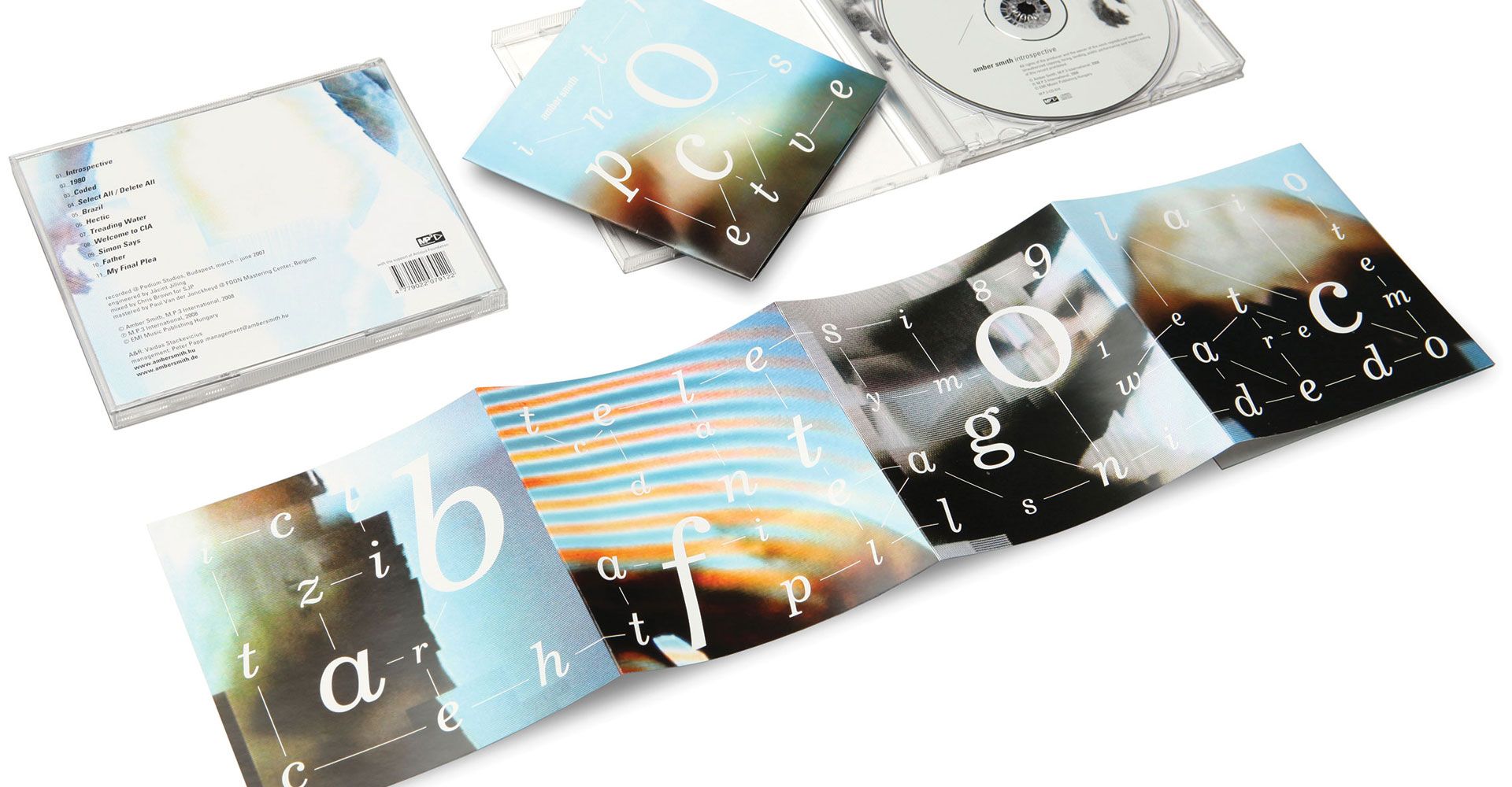
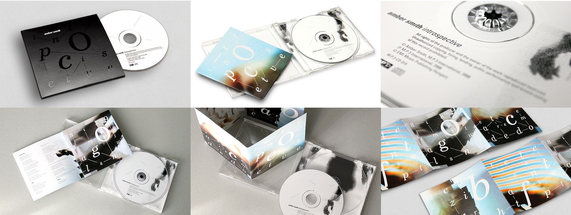
‘Introspective’ was a concept album dropped in 2008, where the instrumentation placed a great emphasis on analogue keyboards compared to the previous guitar sound. I had already developed the typographical game operating as a code system for the single leading up to the album, which I completed in the foldout-booklet of the album, and which I then complemented with digitally damaged photographs made of human body parts.
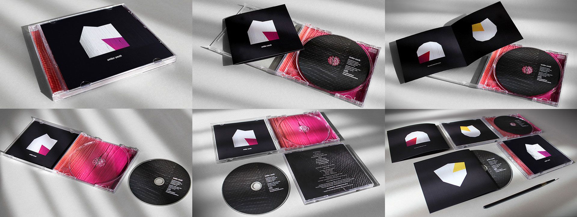
In 2012, for their untitled album I created a series of paintings – in this case, for example, I was inspired by ‘Square-1’, a song also released as a single: I painted Square-1 cubes of various positions on canvas with acryl, in constructivist style.
Their album ‘Modern’, released in 2015, turned out to be quite eclectic, so I applied a sort of montage technique here: I collected a bunch of Korean and English newspapers, and I created new compositions out of the cut outs for every single song.
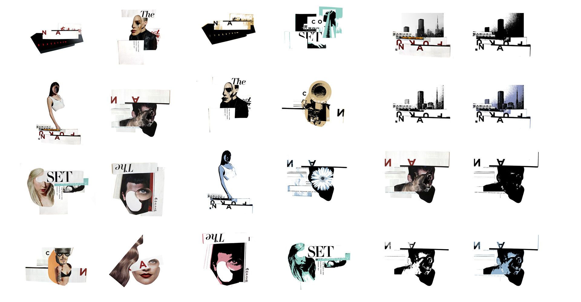
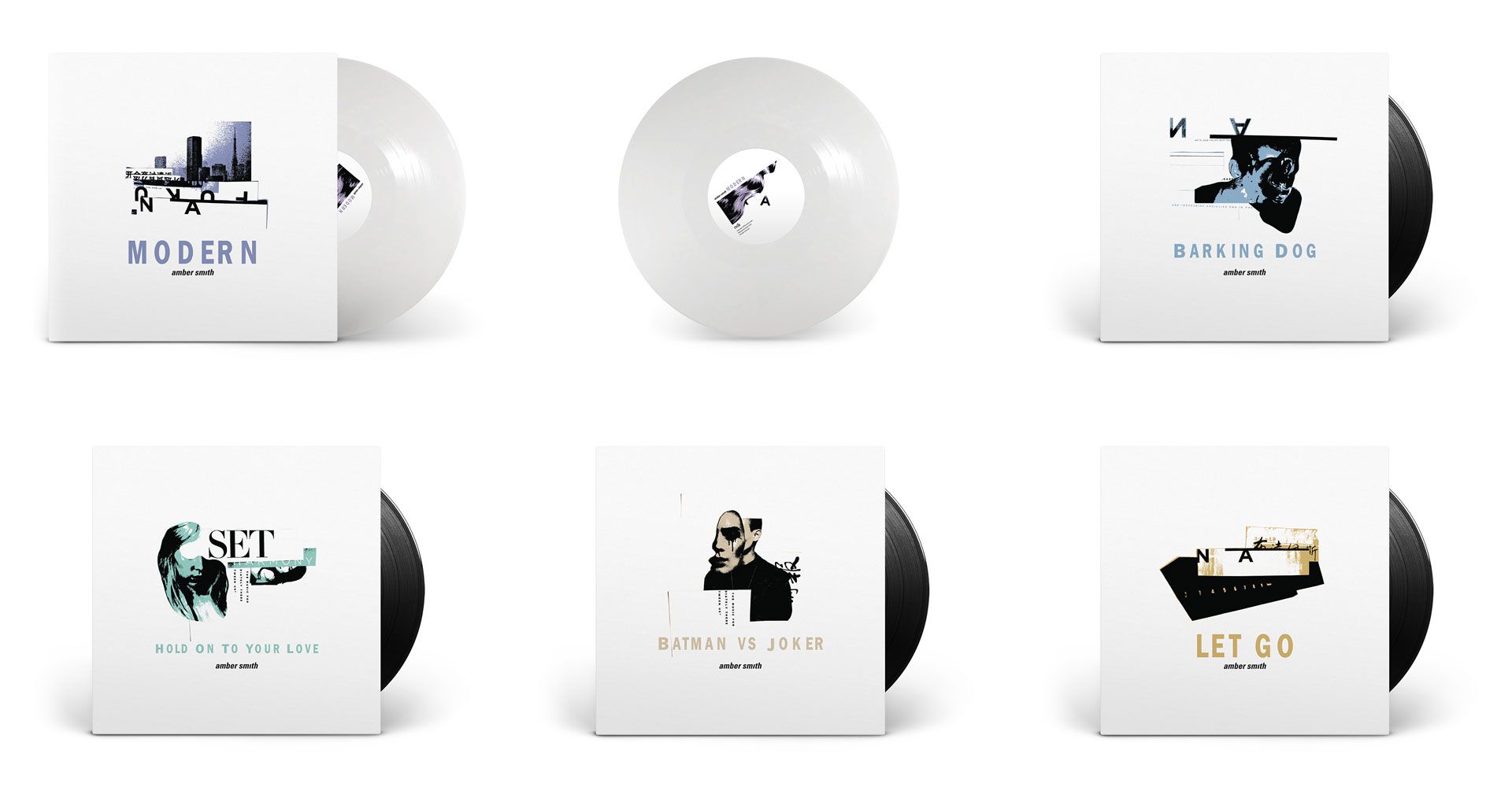

How did this all happen in the case of the band’s latest album ‘Record’ released this spring?
This cover was made in a quite unconventional manner. During spring, right in the middle of the lockdown, the band decided not to postpone its release. We did everything online, I listened to the demos and we brainstormed via Messenger. The songs instantly made me think of the visuality related to the guitar music made typically in the eighties and the early nineties, which I happen to know well due to my age. It made me think of the era when I was immensely influenced by the free cinema movement of the English new wave I rediscovered at the time. And when hearing the title ‘Record’, I immediately thought of Tony Richardson’s movie ‘The Loneliness of the Long Distance Runner’ made in the sixties. In spite of the first concept plans, finally I left out the references, but I hid a good number of elements of the symbol system of the movie. Those who know this film will find these for sure. The final designs combine uncomposed analog image excerpts found randomly and illustrating looking back in time, moderate, pale colors, documenting scribbles and today’s modern layout.


You have been working as a graphic designer and publication designer on the field of music for long years. You also worked for magazines including Wan2, Recorder or Phenom’enon. How dominant is music in your everydays?
In addition to design and visual arts, contemporary music is very important in my life. I actively played music until 2000, we made records, we had gigs, so I also had a taste of this world from the other side. And since I have my own graphics studio, I always try to steer the jobs in a way allowing me to work on music productions and media related to music. For example, designing and creating a music magazine is great because in addition to getting a basic knowledge in music history, it also keeps you updated in terms of the latest musicians and trends.
Vinyl is evergreen, what’s more, it seems the team of French we are rewind will also revive old cassette players inspired by “Stranger Things” and “The Guardians of the Galaxy”. What is your favorite music carrier?
For practical reasons, I listen to streamed music today, but as a designer I am very happy that vinyls are still a thing, and even that it seems they have been going through a renaissance over the years, not to mention the special edition box sets.
What music-related projects designed by others have a great impact on you? Do you have favorite album covers?
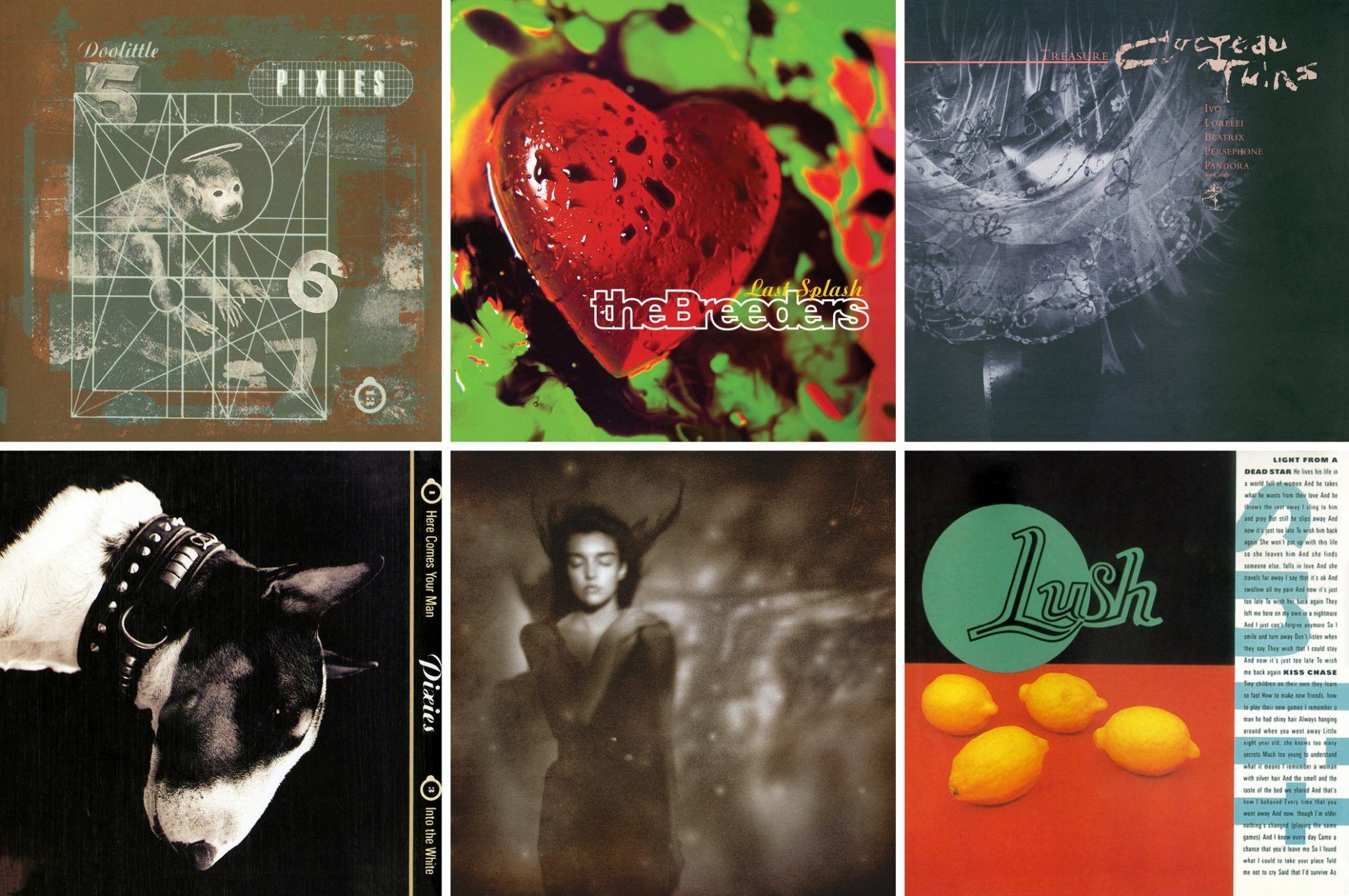
In terms of album covers, my biggest favorite is Vaughan Oliver, who passed away recently. He designed gorgeous covers for independent record label 4AD in the eighties and nineties. Moreover, I watched an interview with Stanley Donwood in the past few days, on the YouTube channel of Penguin Books UK. Those who know the visual world of Radiohead will know who I am talking about and how big of a genius this guy is. Out of the younger designers, I like the works of Non-Format very much, but I also find the videos and album covers of Jesse Kanda working with Björk and Arca fascinating.
What are you working on currently?
Luckily it seems that after the several-months’ halt due to the Covid-19, everything starts to get back to normal again at my clients, too, so I keep managing their visual identities. We also started to update our own projects – development works have been up and running for the last couple of months at ArtHungry and Phenom’enon magazine, too. I can’t say more at the moment, but if all goes well, we are facing an exciting period.
Simon Says | Web | Facebook | Instagram | ArtHungry | Behance

A robotic lawn mower powered by artificial intelligence | Toadi
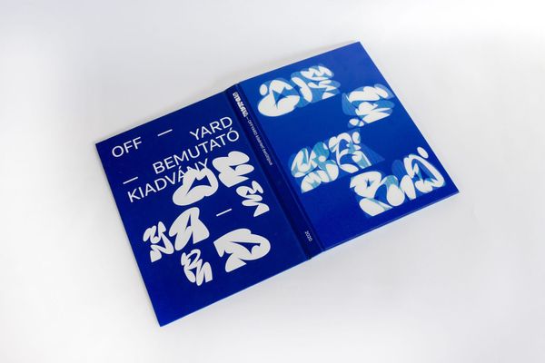
Graffiti-inspired font | OFFYARD
