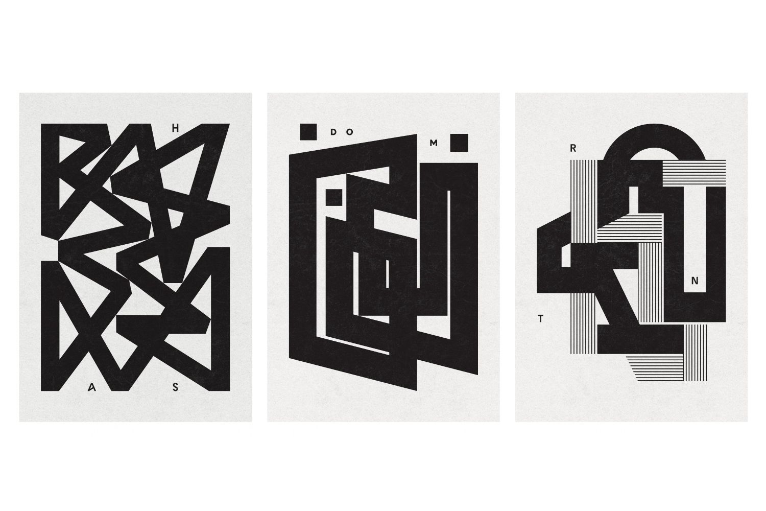
How would a Brutalist building or sculpture look if they were to take shape as letters? This is exactly what Polish designer Przemek Bizoń’s so-called ”type impressions” attempt to do: a sincere effort to turn typography into an art form.
After studying graphic design at the Academy of Fine Arts in Krakow, Przemek Bizoń set up his own agency, Bisoñ studio, in 2018. When he is not branding cultural events or publications, he transforms his own environment into typographic artworks. He collects his abstract, black-and-white creations on his Instagram page moreless.type: the starting point of the project itself is, as Przemek puts it, “the letter placed in a specific context.”
His type experiments are inspired by, among other things, important figures and masterpieces of architecture and art. The first in his series, for example, is based on a monument to the famous Polish sculptor Władysław Hasior called Organy. Przemek transforms the first three letters of the sculptor’s surname into an abstract, experimental typographic work that echoes the characteristic, striking silhouette of Hasior’s monument. The same abstract idea prevails in Przemek’s latest HUTA work, inspired by the rhythmicity of a building in Wrocław. The dynamic and rhythmic beauty of the brutalist shapes is also highlighted in RNT, which Przemek describes as “a pure moreless.type!”
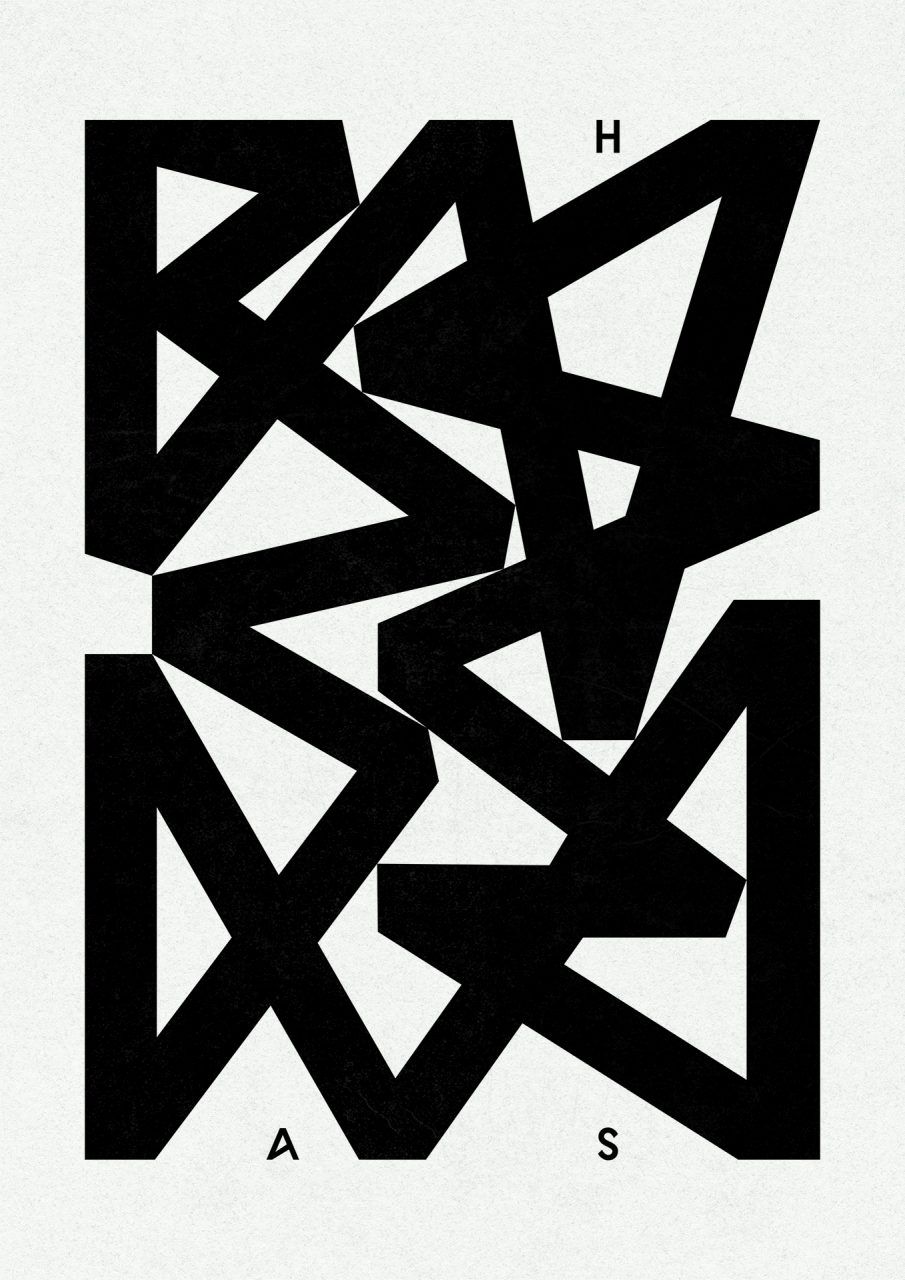
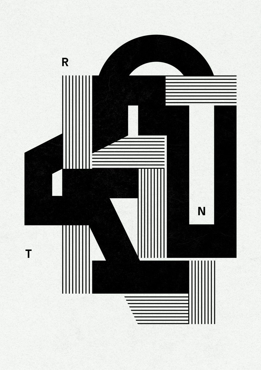
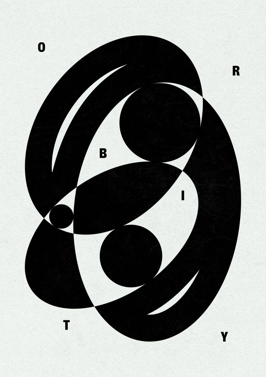
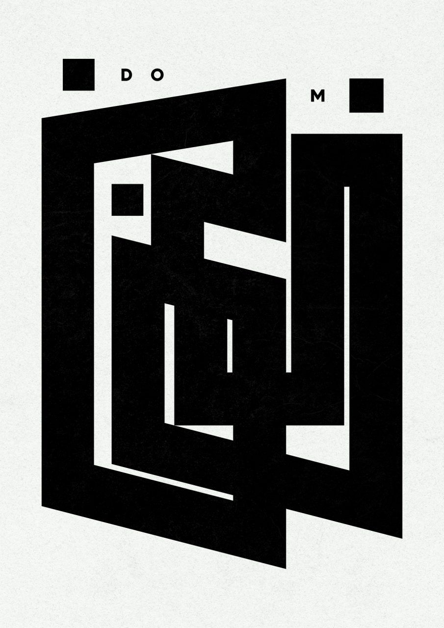
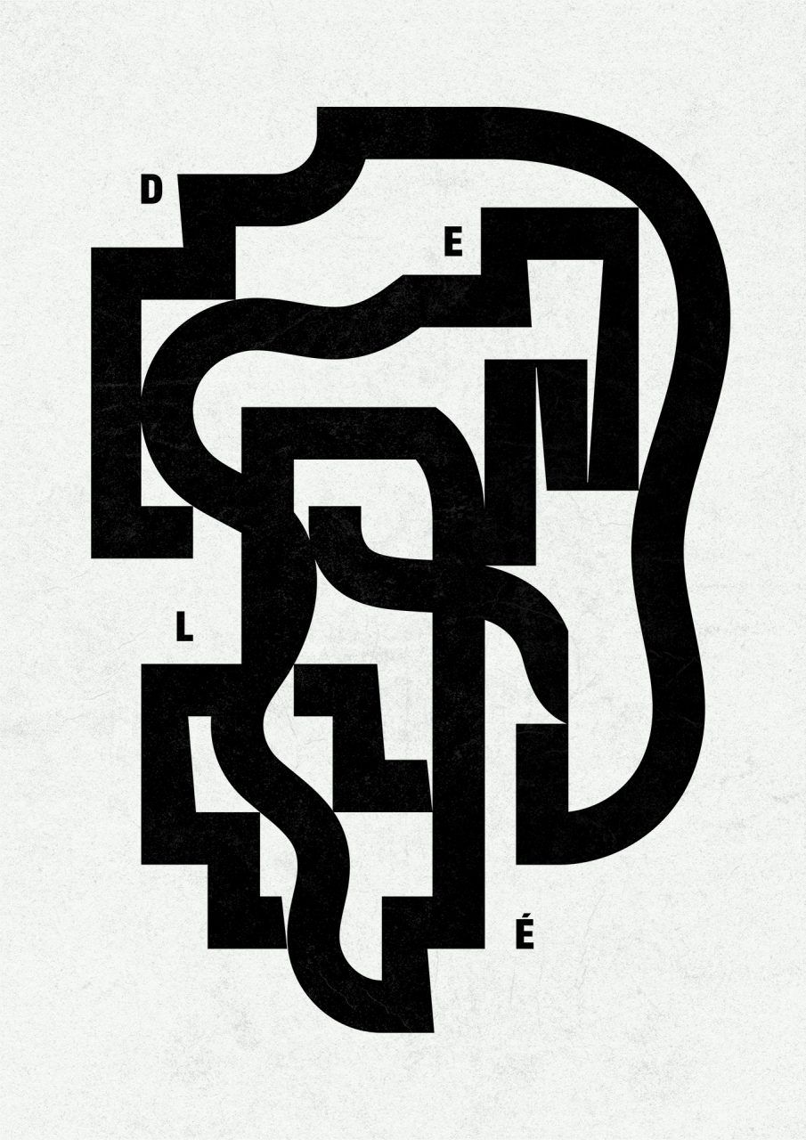
Since moreless.type is still a young project, Przemek would like to turn many more letters into artwork and maybe show them in an exhibition in the near future. In the meantime, digital prints of each work are available for purchase on the moreless.type Instagram page or on the Drool Art online platform.
moreless.type | Behance | Instagram
Bisoñ studio | Web | Facebook | Instagram
Przemek Bizoń | Behance
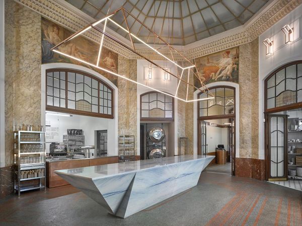
Everyday food in a luxurious setting—this is what a steak kitchen and butcher shop looks like, transformed from a bank

Our region shows adjustability in changing circumstances | Economist about the effects of Russian-Ukrainian war
