We came across Radoslav Panev’s characteristic prints infused with dark humor a few weeks ago. The Bulgarian graphic designer updates his Instagram feed with new prints every day since the beginning of January, and we already found our favorites amongst them.
Bulgarian graphic designer Radoslav Panev’s statement that printed posters are not dead, at best they transformed resonates with us deeply. We have also covered the fresh and exciting representatives of the genre in several articles: we presented the PosterLad brand owned by Vratislav Pecka, we collected the most fascinating prints in a previous part of our HIGHLIGHTS series, and our all time favorites also include the movie prints of Concepción Studios from overseas.
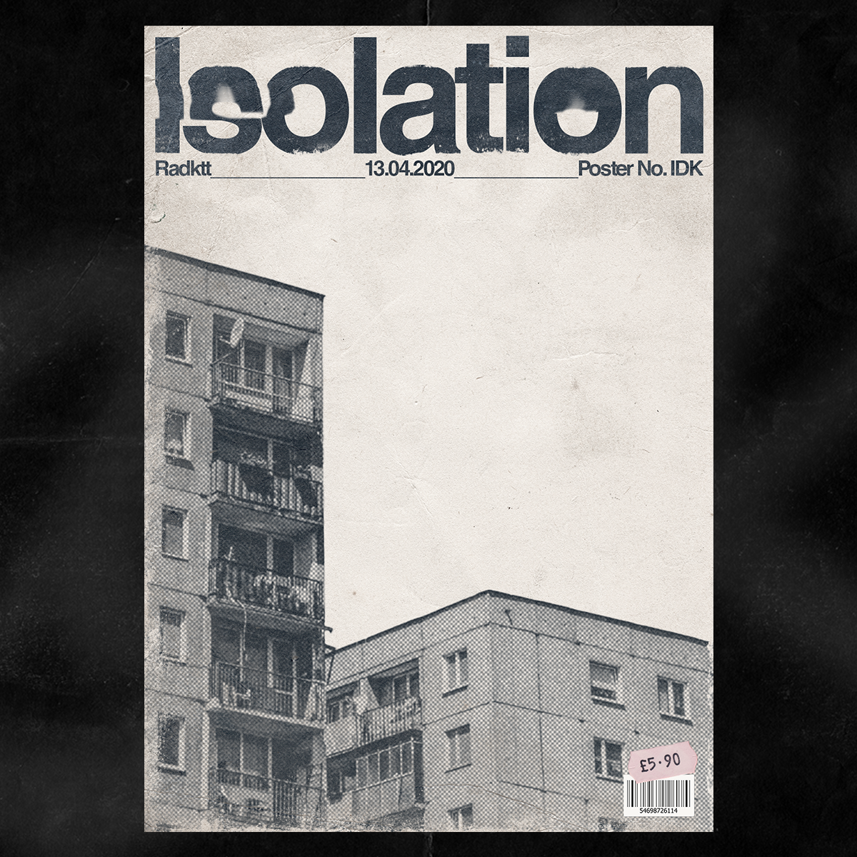
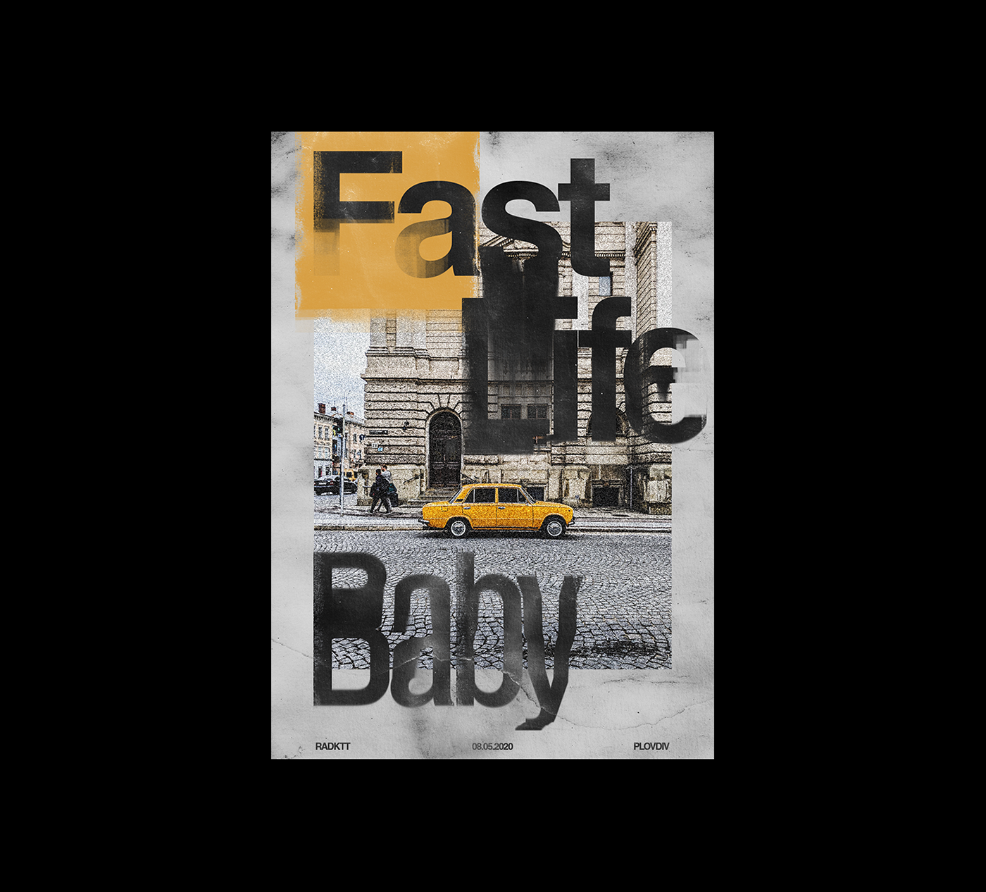
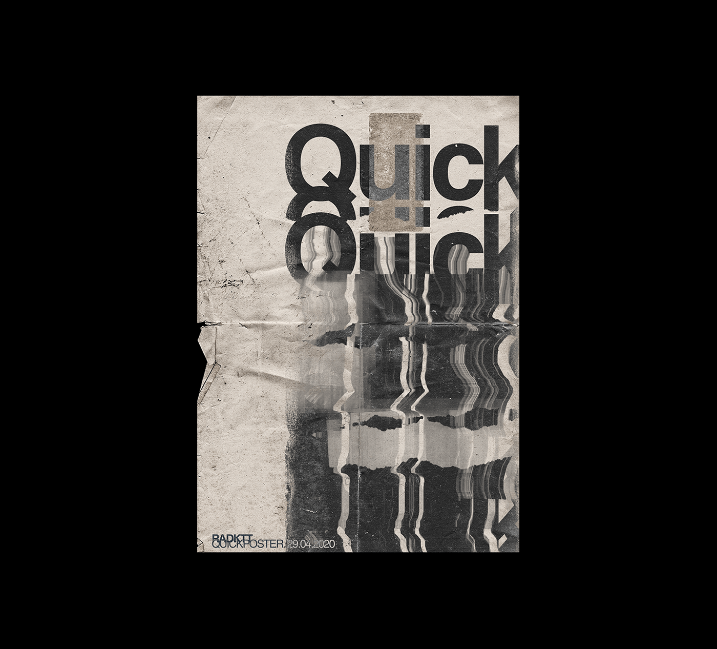
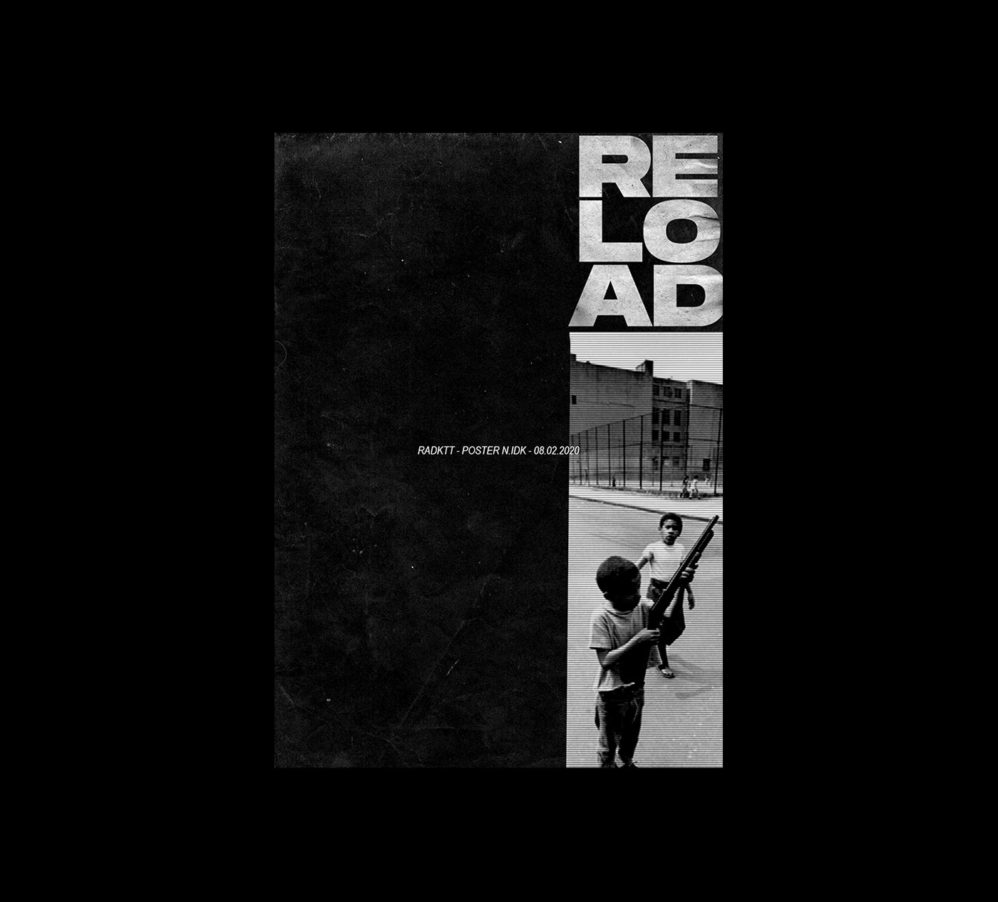
This line will now be enriched by Radoslav Panev’s radktt Instagram account, with prints giving life to the characteristic visual world of the Eastern Bloc accompanied by exciting and bold signs, and many times infused with humor.
The designer himself was raised in a panel housing estate, and according to him, it was not only the milieu at home, but the few years spent in the UK as an adult that influenced him when designing the posters. His greatest source of inspiration is, however, the visual world of Ray Gun magazine, and within that, the era when Chris Ashworth was the art director of the same. The American magazine had a total of 70 issues between 1992 and 2000, and featured countless alternative music icons on its covers from Iggy Pop to Nine Inch Nails.
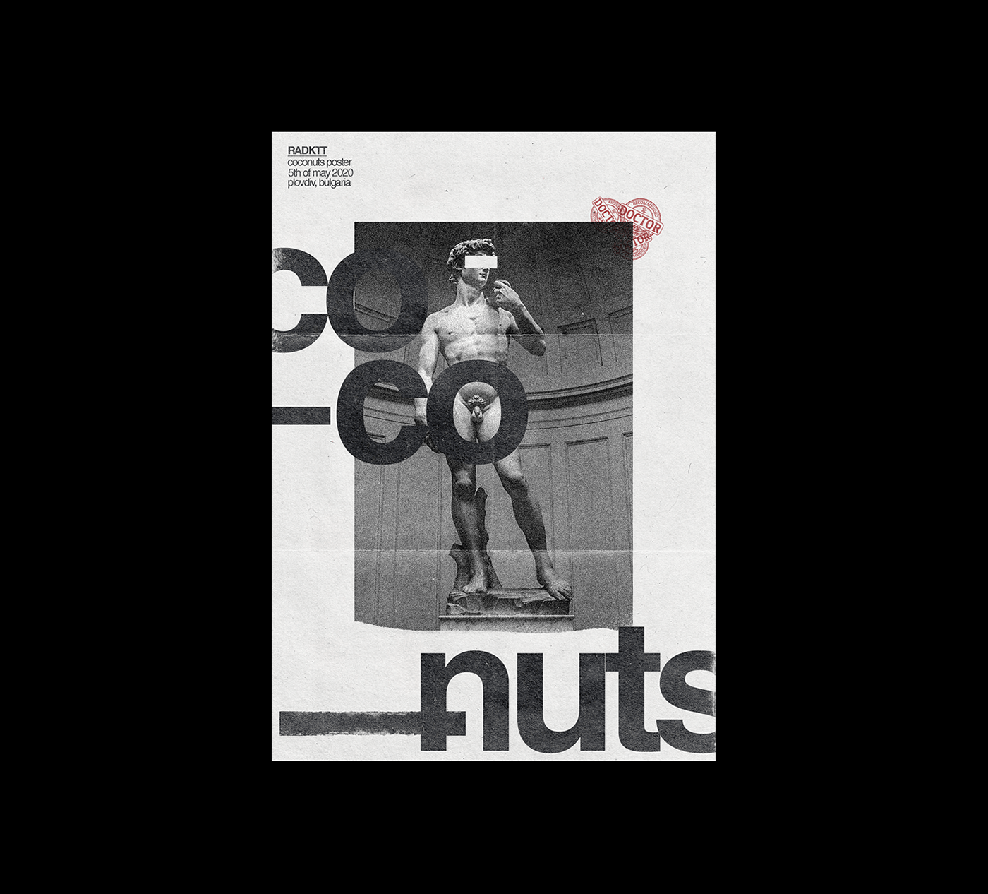
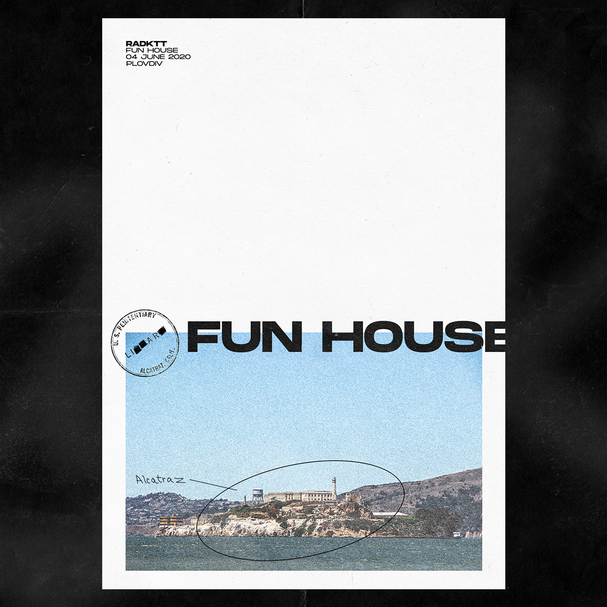
In addition to Chris Ashworth, the works of Roy Cranston and Xtian Miller also known for this typography prints inspired Radoslav when creating his own posters: in his interpretation, typography moves on its own, many times appears in a distorted manner, it does not only support the visual message but the sign itself is the message, the punch line, the gag, may it be a funny saying or a sarcastic self-contradiction.
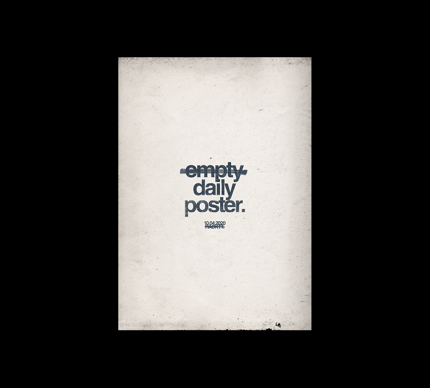
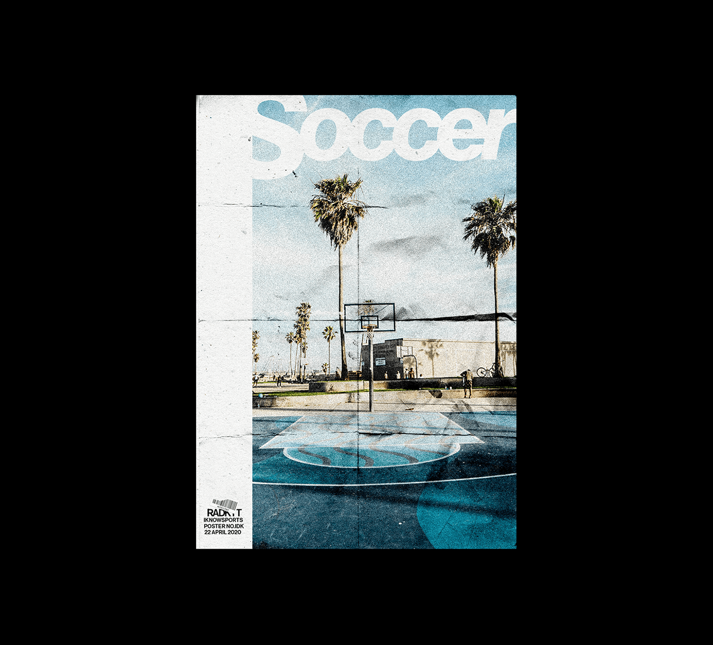
The collage-like prints made digitally (with the help of Photoshop and Illustrator) carry countless features that are characteristic of traditionally printed posters and which are at the same time the tangible evidence of human mark-making. Radoslav loves to experiment day by day to create exciting compositions, by combining fascinating textures, colors and signs with each other – he plans to continue creating his prints until the end of December, so it’s worth following him on Instagram by all means.


Czech design in the Costa Rican jungle_03
Furniture collection made of palm oil | Nataša Perković