Experimental visual language without unnecessary elements: the projects of Slovakian design studio Andrej & Andrej are made appealing and unique by raw and bold solutions, odd and unusual ideas and their progressive visual world. We interviewed founders Andrej Barčák and Andrej Čanecký.
The story of the artist duo with the same first name goes back a long way. Both of them come from artistic families, so it was kind of a given that they would find a vocation on a similar field – they met at the entrance exam of art high school for the first time and their paths also crossed during their university studies.
“We have always worked together on various projects, we asked for each other’s opinion and helped each other in completing the tasks for the university, too. In addition to our studies, we also worked together in a studio and an advertising agency for three years – we already had common projects around that time. Things started to come together, and as we enjoyed our own projects much more than our tasks at the workplace, we decided to found design studio Andrej & Andrej” – the designers told us.
Even though they always prefer to start ideation and concept creation with thinking and brainstorming together, both of them have their strengths: one of them is more talented in typography, font creation, illustrations and video making, while the other is more confident on the field of publications, books, visual identities and web design. This way they complement each other really well.
In their work, it is essential for them to feel challenged by the given projects. “It is important that we always find something in the project that motivates us – be it an interesting person we have to collaborate with, or the product itself influencing the society” – the designers highlighted.
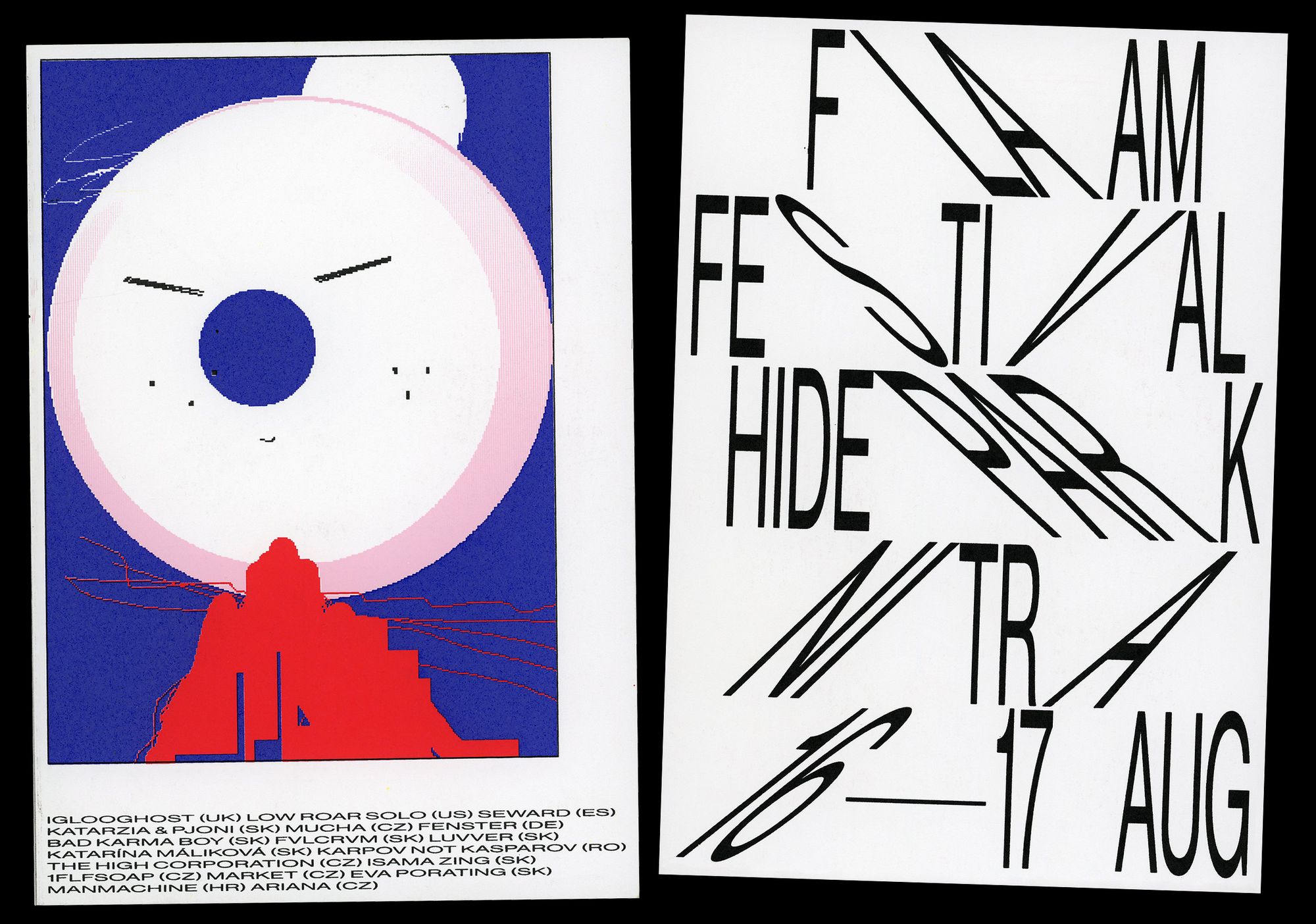
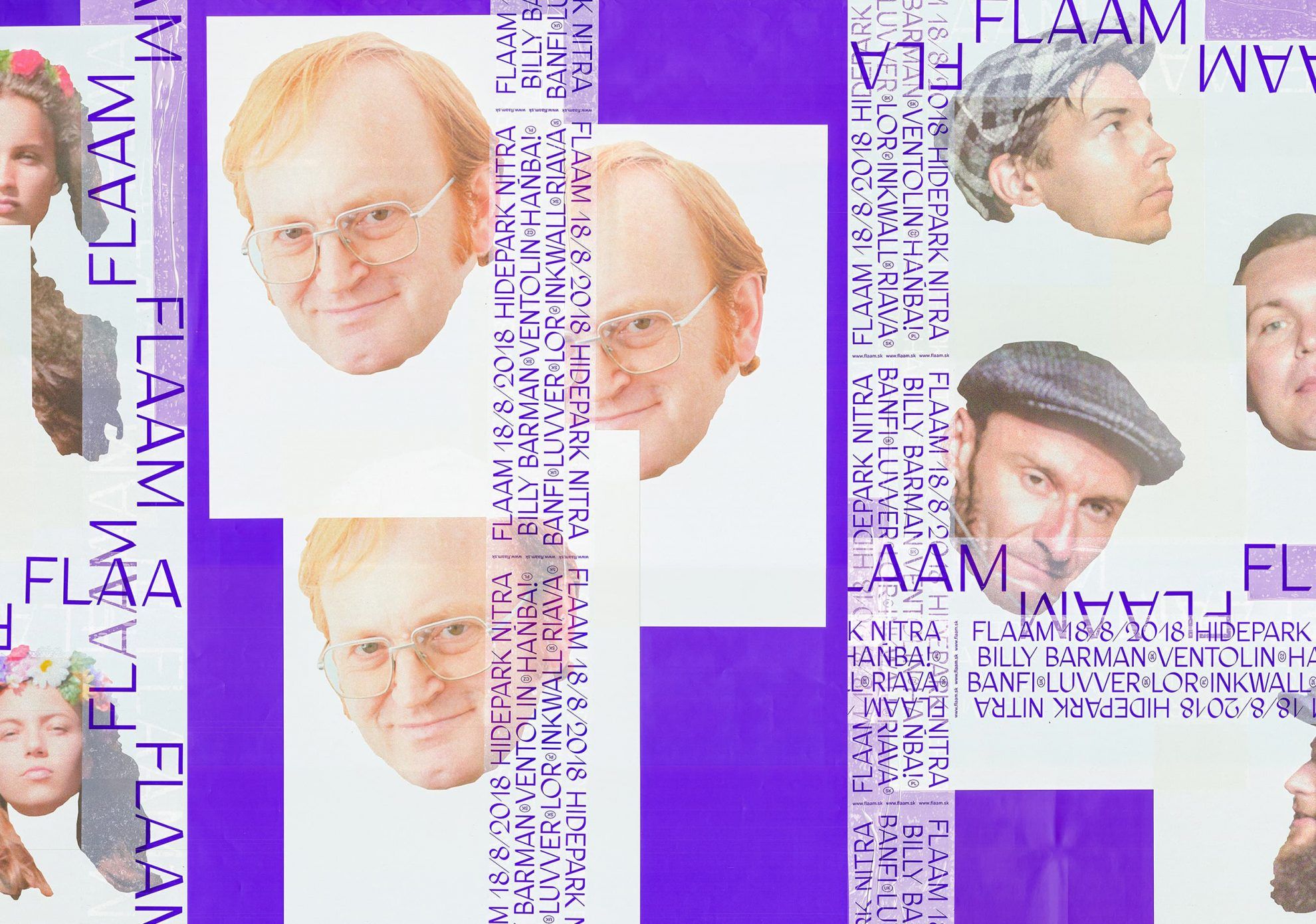
One of their projects of the kind is the visual identity designed for Flaam boutique music festival organized in the city of Nitra, on which they have been working together for five years.
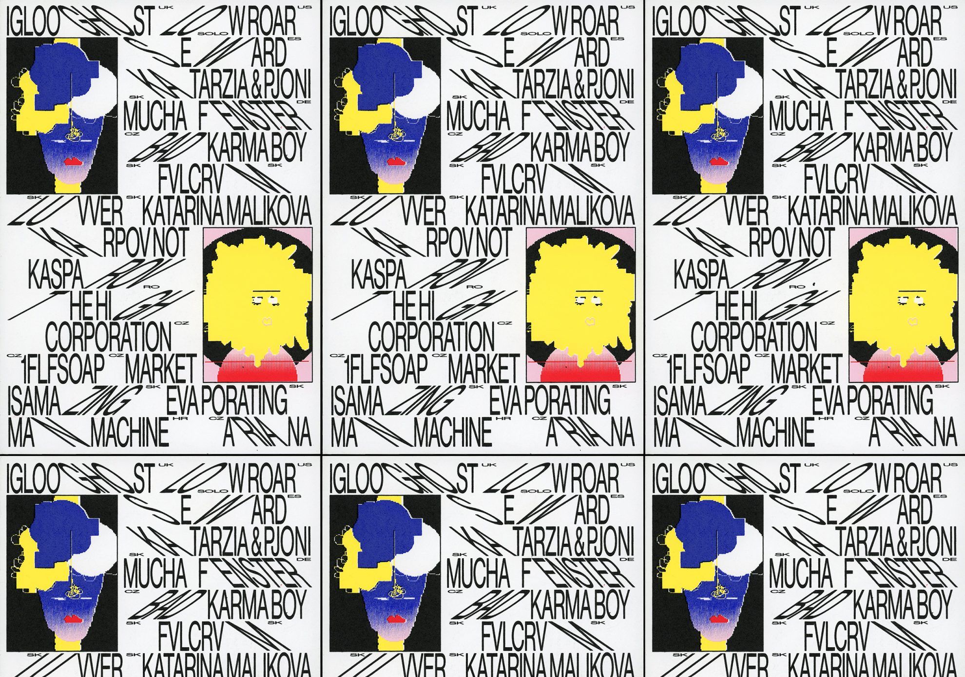
“In the case of Flaam, it is always about what we can do that big festivals cannot” – they added. “We reinvented the gifts promoting the event in this spirit for example, by printing the names of the visitors on the back of the T-shirts. We replaced the initials of the names with the letter F, to make it GDPR compliant. Another example: we switched the festival tickets for scratch cards, with which visitors can win additional tickets or a drink” –they continued. They have also enriched the appearance of the event with several other exciting and unusual solutions, including the creation of the avatar-like illustration series displaying the 22 performers serving as the main visual element of the 2019 event.

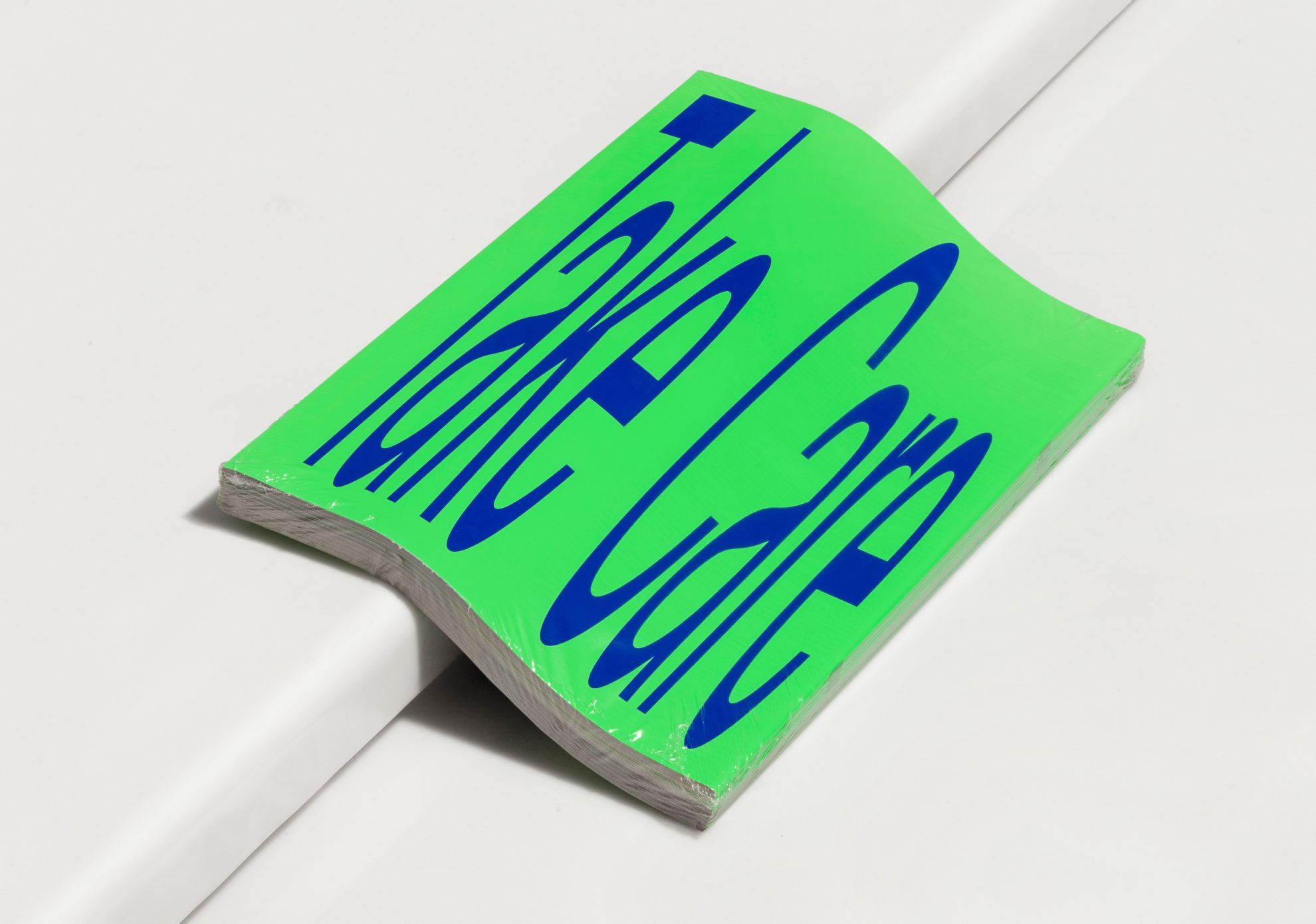
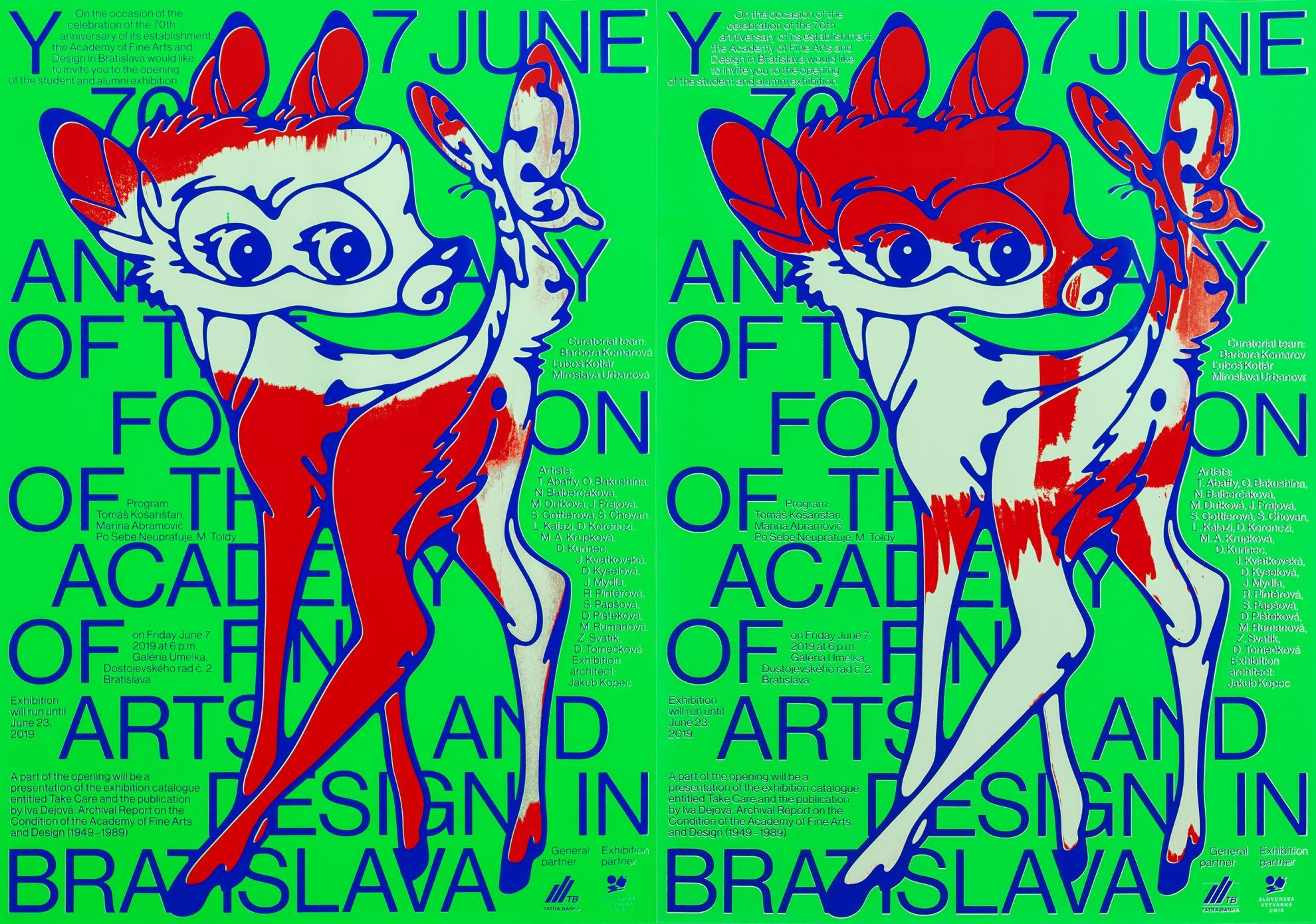
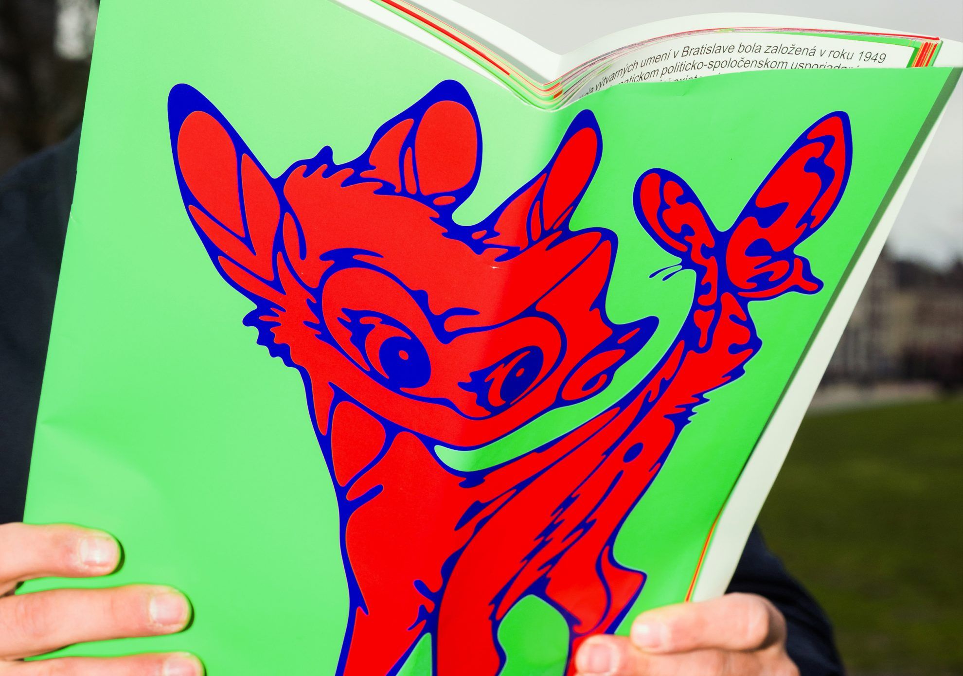
Their unusual approach can also be seen in one of their latest projects, the visual identity designed for the Academy of Fine Arts and Design in Bratislava, which is completely the result of chance, according to the two Andrejs. To celebrate the 70th anniversary of the foundation of the institution, the university wanted to publish a publication presenting its history, and commissioned the two creators to complete the project. However, it came to light during designing the book that the institution does not have an individual visual identity at all. After this revelation, Andrej and Andrej decided to create one for the university.
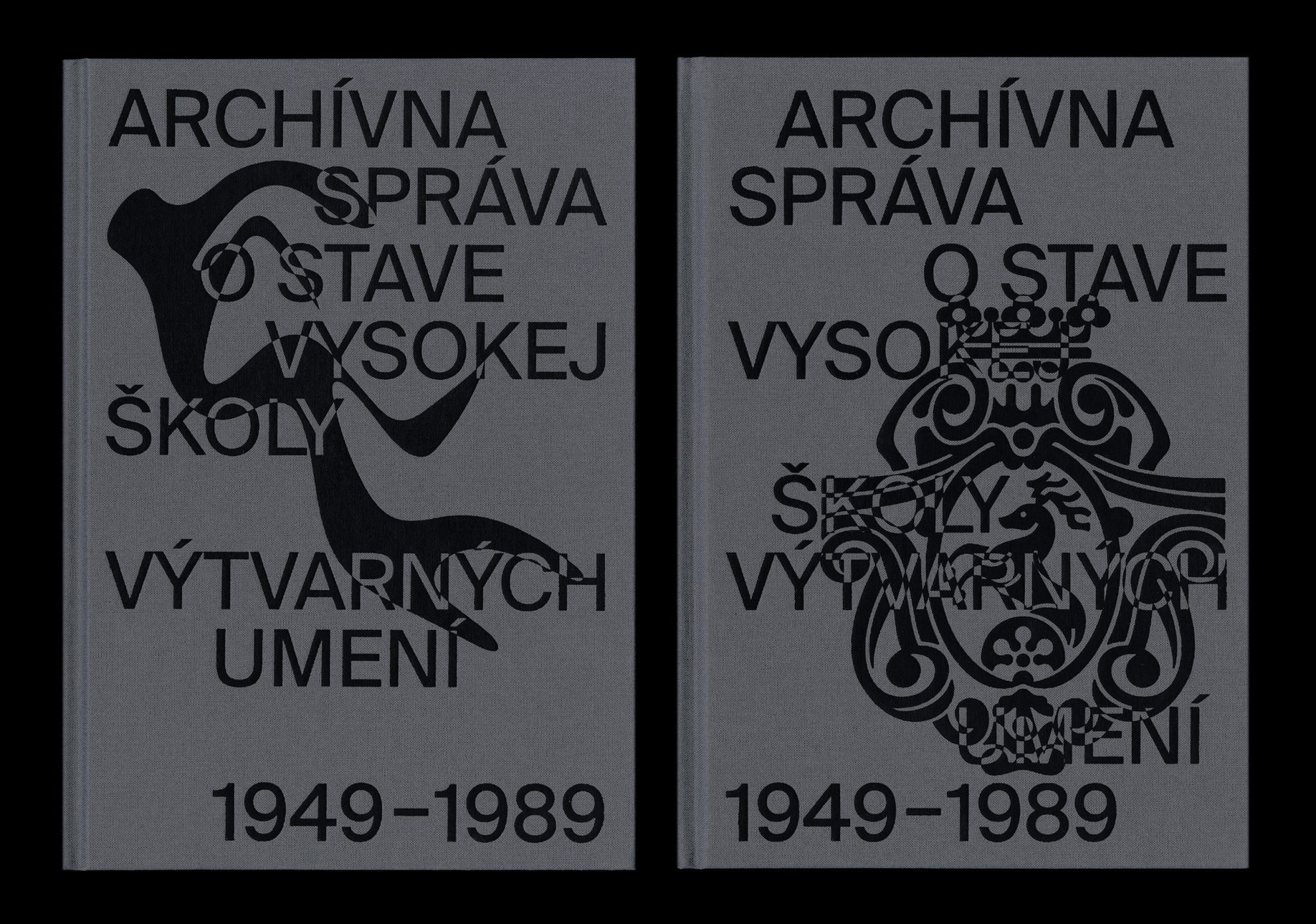
They used a deer motif of historical significance as the basis of the logo, which is also the family symbol of one of the early patrons of the university. In the course of the design process, they adapted this symbol for the different historical eras, which then underwent a lot of modification and alteration until it reached its final, simplified form.
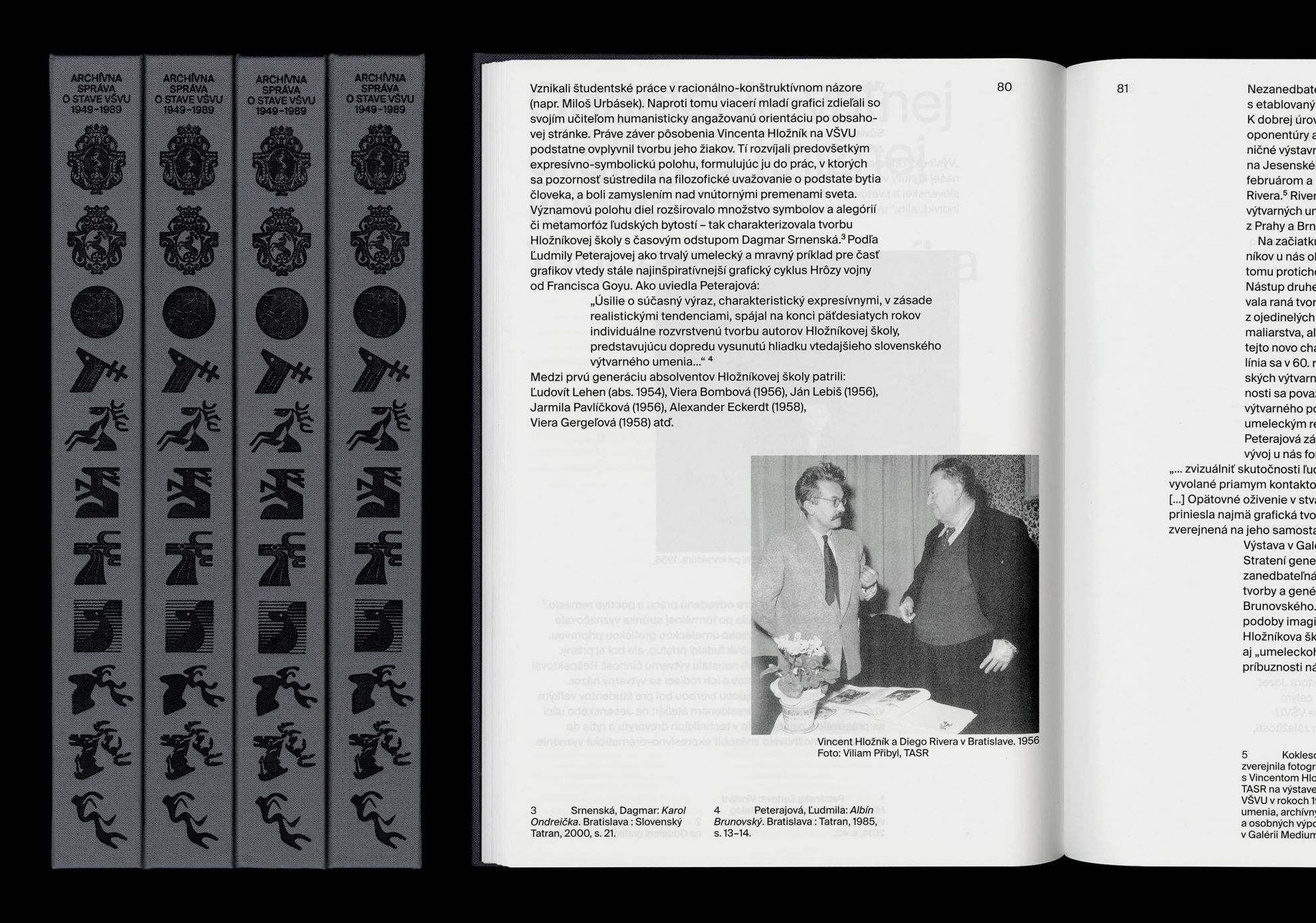
“We inserted the logo versions created this way onto archive photos of the book, as well as on mugs, posters, the official stamp of the university and the cover of certificates. This way, we essentially created the visual identity reaching across the history of the university, and created a completely new basis for future works. Luckily this mystifying approach received a warm welcome and now we are working on the further elements of the visual identity: a unique font and a new website” – they added.
If you are interested in the unusual and experimental visual solutions of Andrej & Andrej, follow their exciting projects on their Instagram profile!
Sustainable water taxi on the Danube
Laposa’s new poster inspired by The Busy World of Richard Scarry