We would never, not even in our wildest dreams thought that there will be a time when we will be raving about a TV tower in our V4 selection. It seems that the “Prague rocket” made its way to our bucket list, just like we wouldn’t say no to the minimal chair of Herrmann & Coufal, if we ever had the chance. And, finally, the iconic Baťa shoe brand is also on the table!
Herrmann & Coufal
Herrmann & Coufal call themselves a creative studio: the two designers, Matěj Coufal and Eduard Herrmann met at UMPRUM in Prague (Academy of Arts – the ed.), then applied jointly for a tender, which led straight to them founding a studio together.
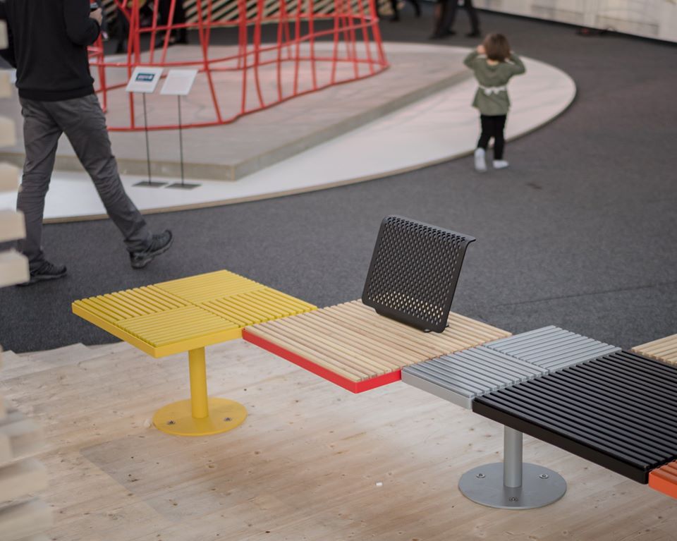
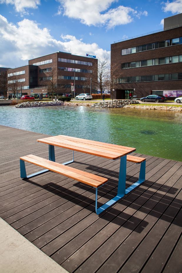
May it be indoor furniture or furniture to be used in public spaces, they always take a conscious approach to design: we find contractors and clients in their portfolio such as mmcité manufacturing street furniture or the Czech Master & Master manufacturing and selling design furniture. The former manufactures the metal-framed outdoor picnic table called ’Rautster’ and the modular ’Pixel’ bench system, which is made by using the residue wood materials of the furniture industry.
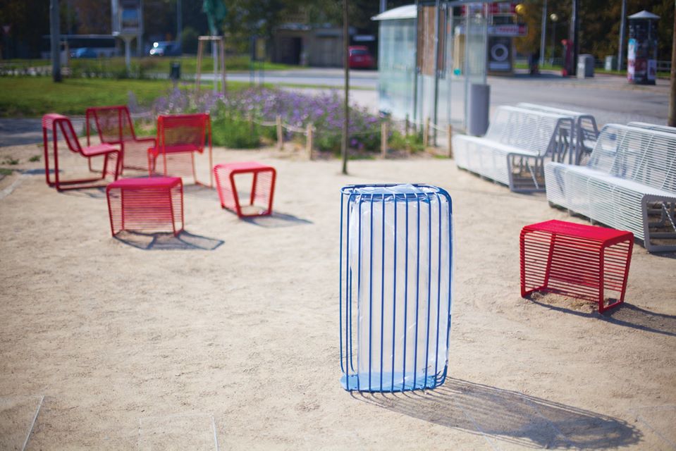
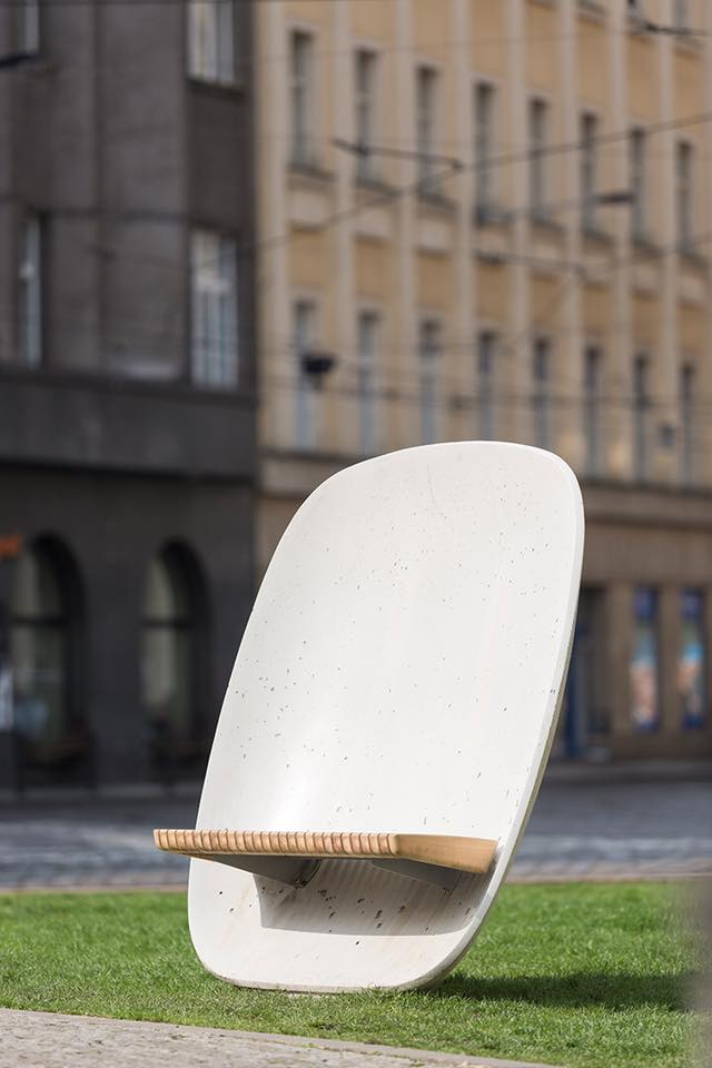
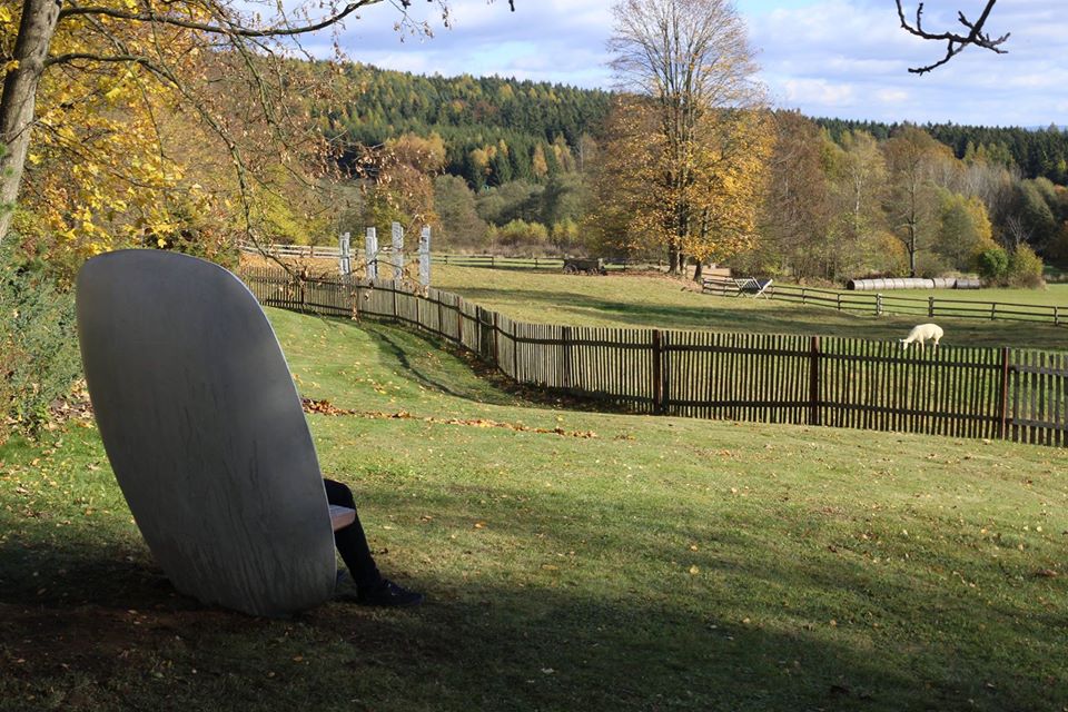
Our personal favorites include the ’Tlesk’waste container which would easily hold its own in any Western-European city, and the specially formed ‘Satellite’ street furniture. The latter searches to answer the question of how one can find a safe spot or a still point in a busy metropolitan environment with the help of a piece of street furniture. The shape of ‘Satellite’ makes us think of a shell: the giant concrete backrest makes us feel safe, while with the design of the wooden seating surface, the designers managed to make us want to try this piece of furniture. It could be ideal for those wanting to have a calm conversation in the noisy rush of the city. We would love to test it!
There are some examples in their workshop when the guys themselves create a piece of furniture: the ‘Gong’ lamp is a good example for this, which was made in the spirit of minimalist design that is so typical of the designers. We could also mention the extremely plain, wooden ‘Kimchi’ chair or the hanger called ‘TeePee’.
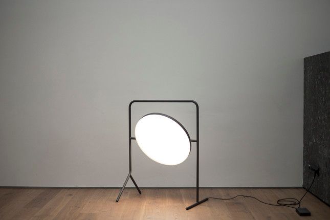
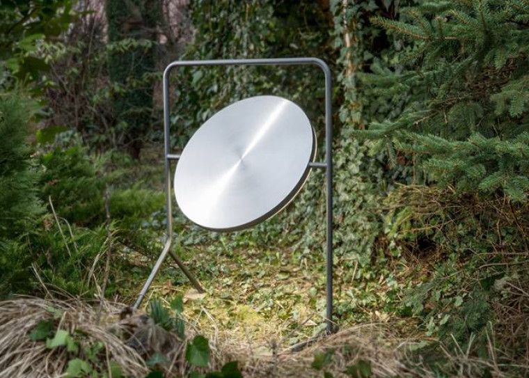
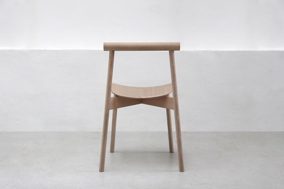
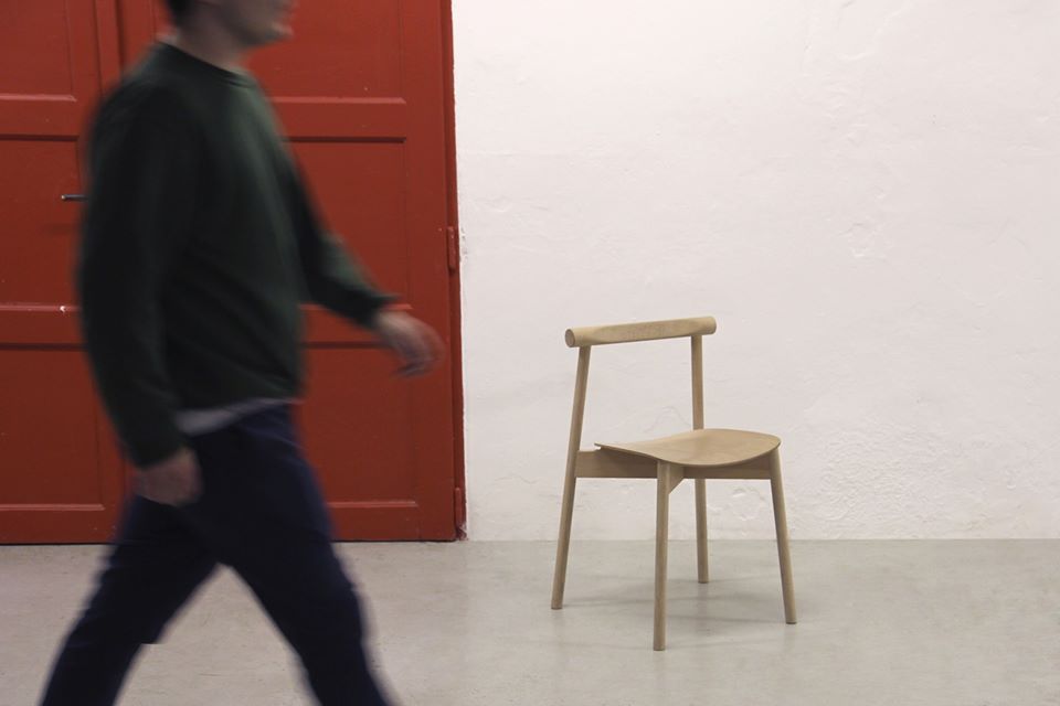
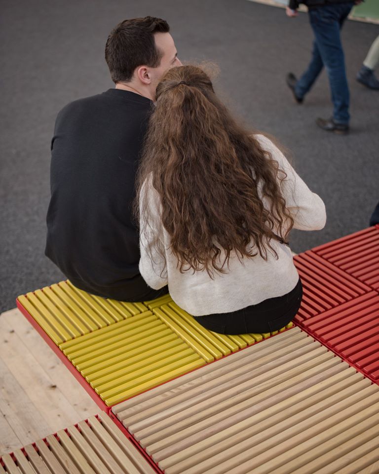
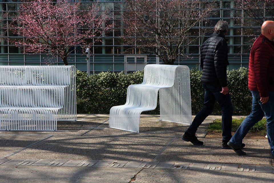
Most recently, the city of Strasbourg contacted the designer duo (and the designers of EU member states) to design street furniture to be placed near the European Parliament. The answer of Herrmann&Coufal was ‘Steps’, which symbolizes connection with its stair-like design.
Baťa – then & now
We have introduced quite some young Czech brands, but we haven’t talked much about the iconic Baťa shoes. In the first part of our article series, we have already mentioned the name of Tomáš Baťa, but up until now, we haven’t realized what a global success story the Baťa shoe brand, established in 1894, grew out to be.
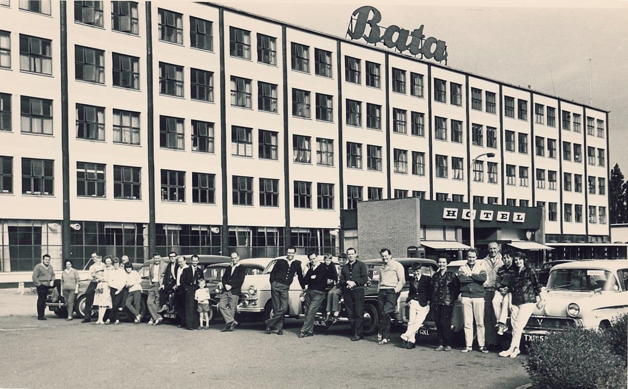
Production started in the city of Zlín in the Czech Republic. Owing to the modern machinery, they manufactured 2200 pairs of shoes a day in 1905, and they produced 60 000 pairs per day by 1929. What was good for the Czech was not that good for the neighboring countries: even the companies in Hungary feared the monopoly status of Baťa, and the daily press used the name of the brand as dirty word. The son of the founder, Tomáš Ján Baťa took over the factory, who emigrated to Canada in 1939 and thus laid down the basis for the international reputation of the brand. They gave several iconic models to the world: the best sales figures were generated by their rubber nose sneaker, they came up with linen shoes similar to Converse in the 1970s, and even Robin Williams posed in their flipflop on the cover of The New York Times in 1999.
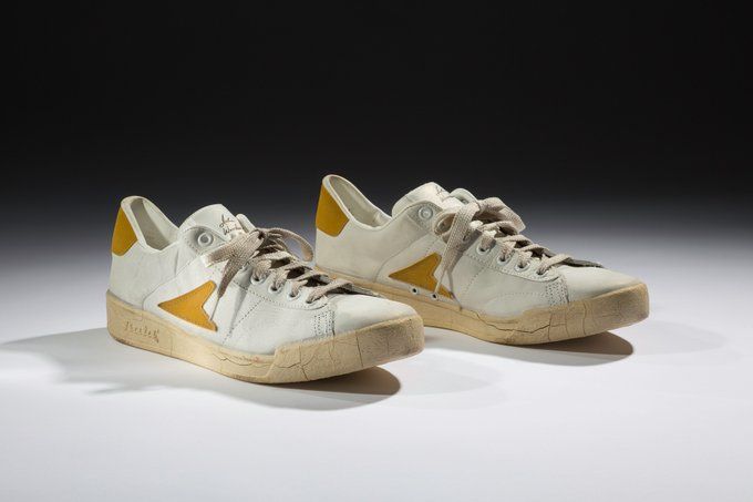
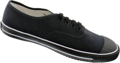
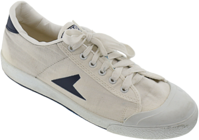
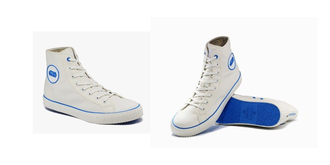
Baťa is still a dominant player of the market today, and it seems the current management also realized the potential of young talents: they announced the Bata Young Designers’ Challenge first for students of Czech and, later on, foreign universities. Three designers won at the last competition in 2019 – one of them is Czech designer Natálie Nepovímová, who designed a supercool sneaker we could not pass by quietly either.
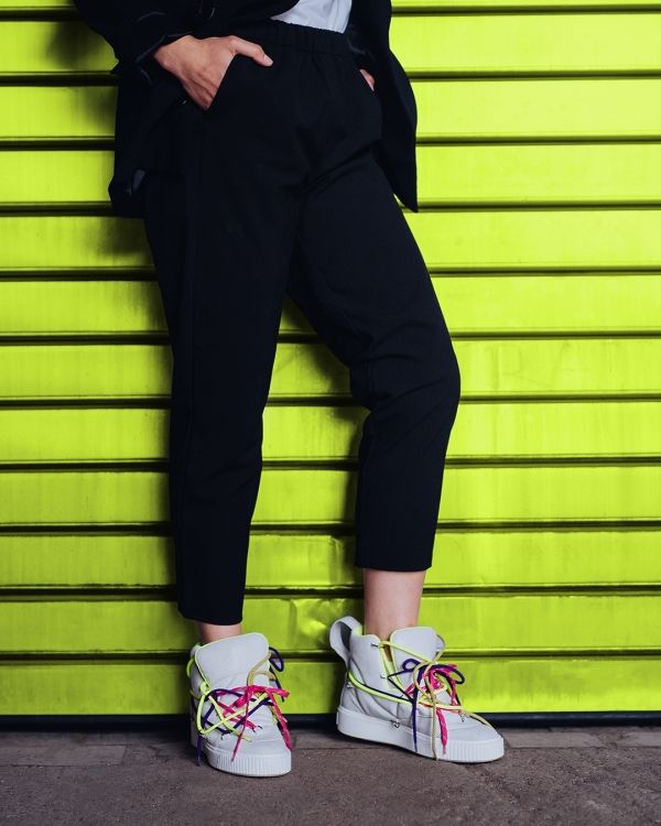
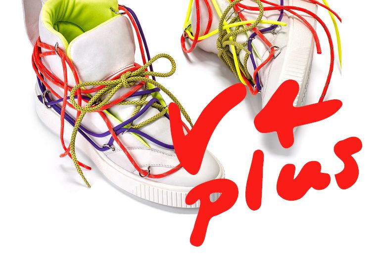
The metal mountings placed on the snow-white trainers called Nu: On make it possible to vary the different colorful shoelaces as we like it, this way creating a completely unique aesthetic appearance. The sneakers designed by the Czech designer encompass the triple unit of quality-comfort-innovation of which Baťa is a big believer, too. The trueness of the competition of the Czech brand is also verified by the fact that the winning applications don’t remain on the level of prototype: they are placed into production.
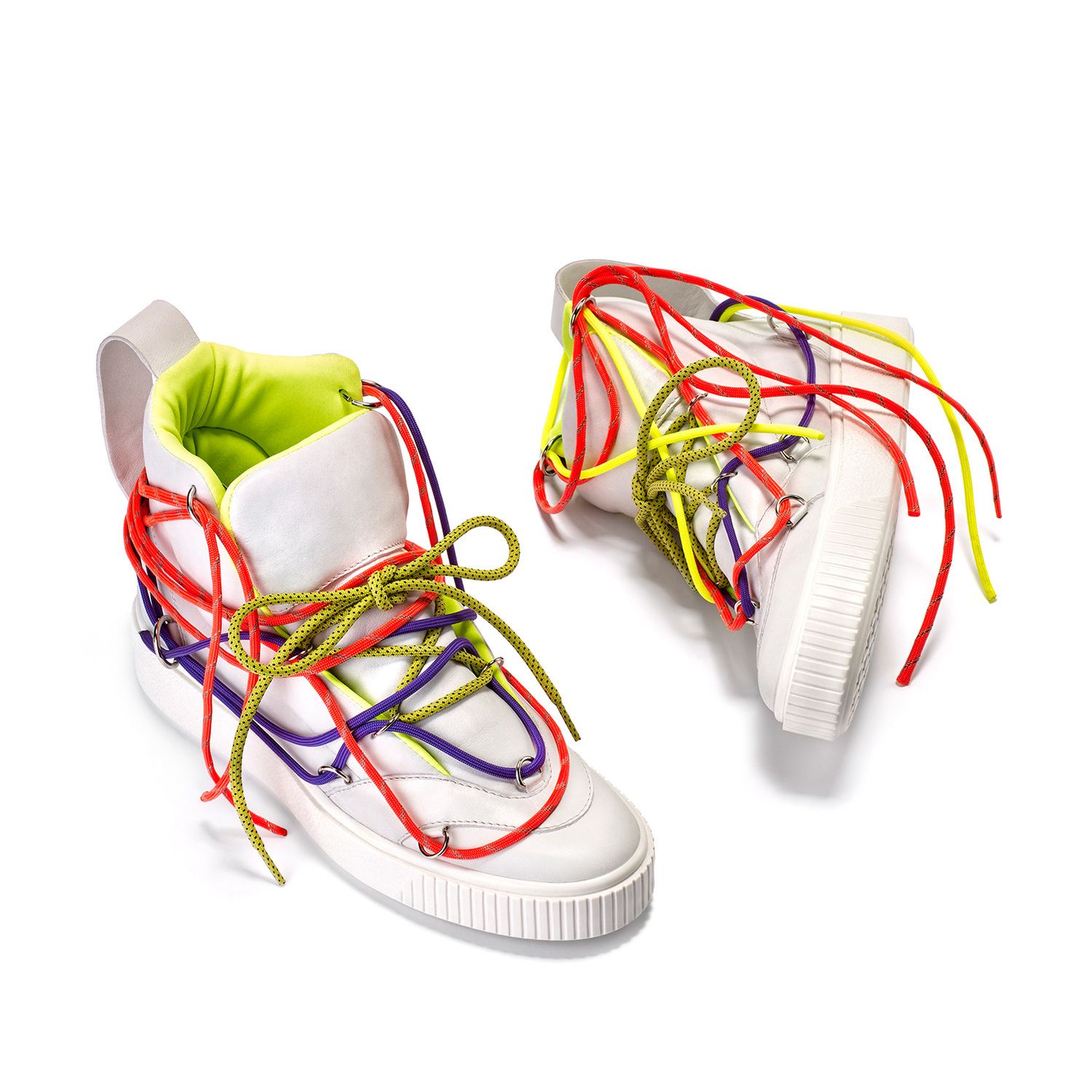
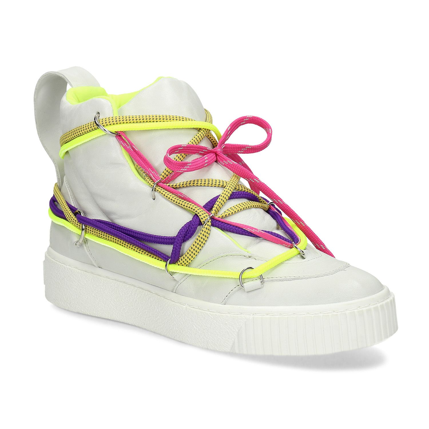
Anyone who feels like it, can now purchase their own brand new sneakers in the online store.
Toman Design Studio
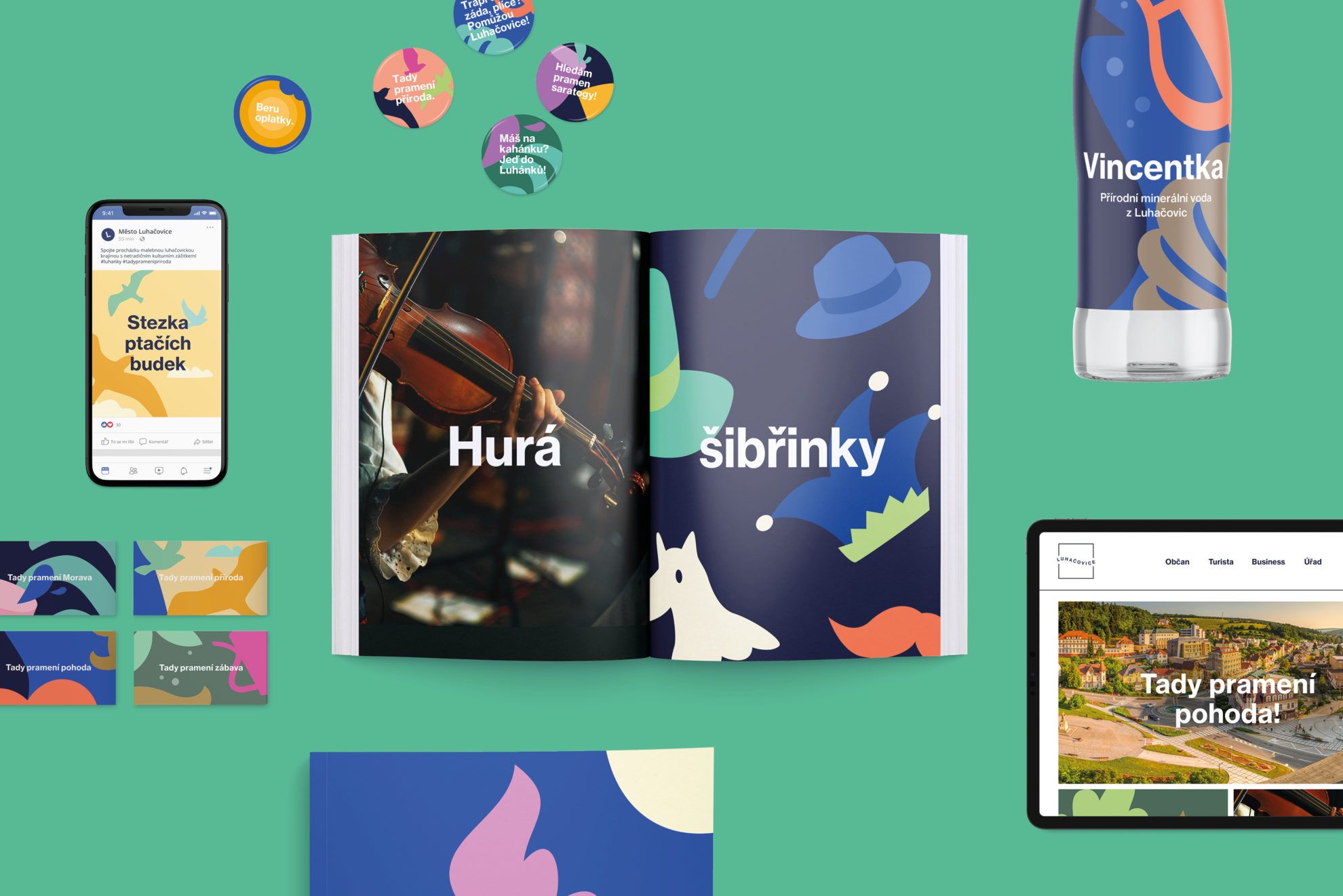
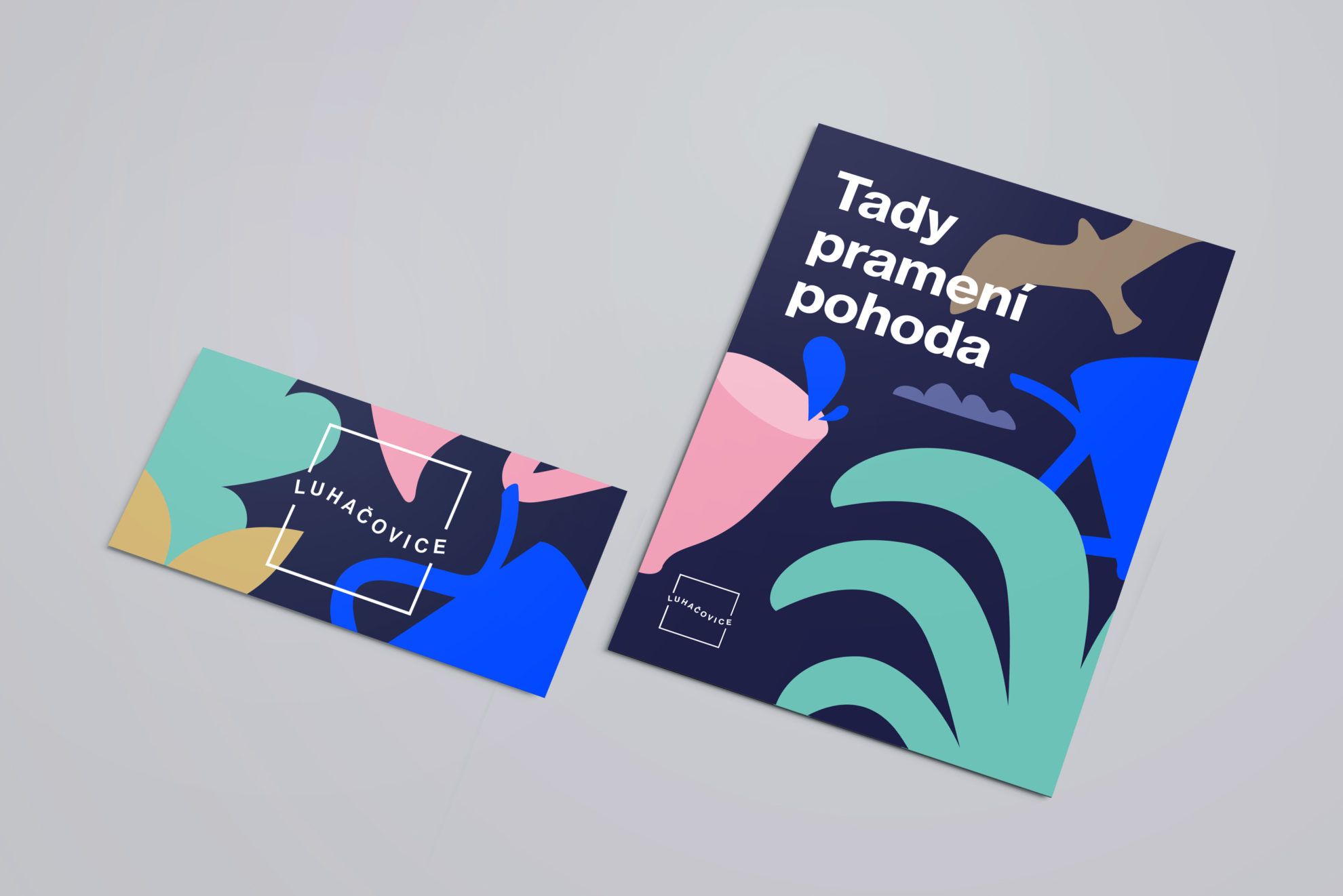
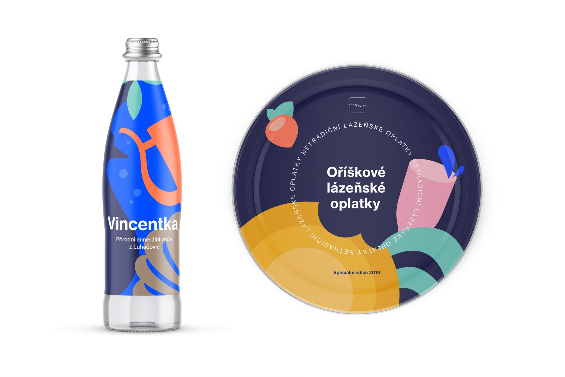
Toman Design Studio started its journey in 2005, in London: at the time, it started as the sole proprietorship of Jiří Toman, and then several others joined the team: first Barbora Toman Tylová, Jiří’s wife as art director, then Lukáš Müller and Tibor Vizi as lead designers. They have diverse activities, as in addition to image, packaging and publication design, they also work with visual identity – last fall, they won the image design tender of the Czech city of Luhačovice with their colorful and illustrative work. They tuned the visual language of the city known for its thermal spa to blue-salmon-pistachio green and dark blue Pantone colors, and left off every stereotype illustration that a spa town could make us think of. Check out the image film!
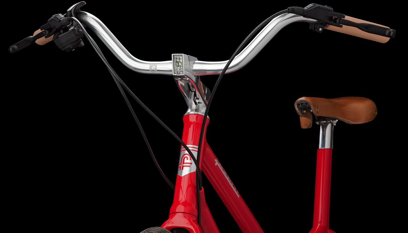
Toman Design Studio should also pop up in our minds when we think about one of the most renowned Czech bicycle brands, the Favorit. Several bikes rolled off the bicycle factory established in 1953 that we would be willing to accept, may it be city bikes or racing bikes. To only mention their coolest piece: with their AVIATOR model, Favorit won the ID Design Award and the Red Dot Design Award in 2016. The task of Toman Design was to refresh the brand’s logo: they started designing carefully, and the output was a new, yet familiar and nostalgic logo.
In terms of publications, the monography of the Czech graphic artist – typographer Oldřich Hlavsa (1909-1995) must be mentioned, which proved to be a gap-filling venture in the life of the studio: the volume was born as a result of serious research under the hands of Barbora Toman Tylová. The 592-page long book enriched with 2000 reproductions and weighing almost 4 kilos provides a powerful presentation of the work of Hlavsa.
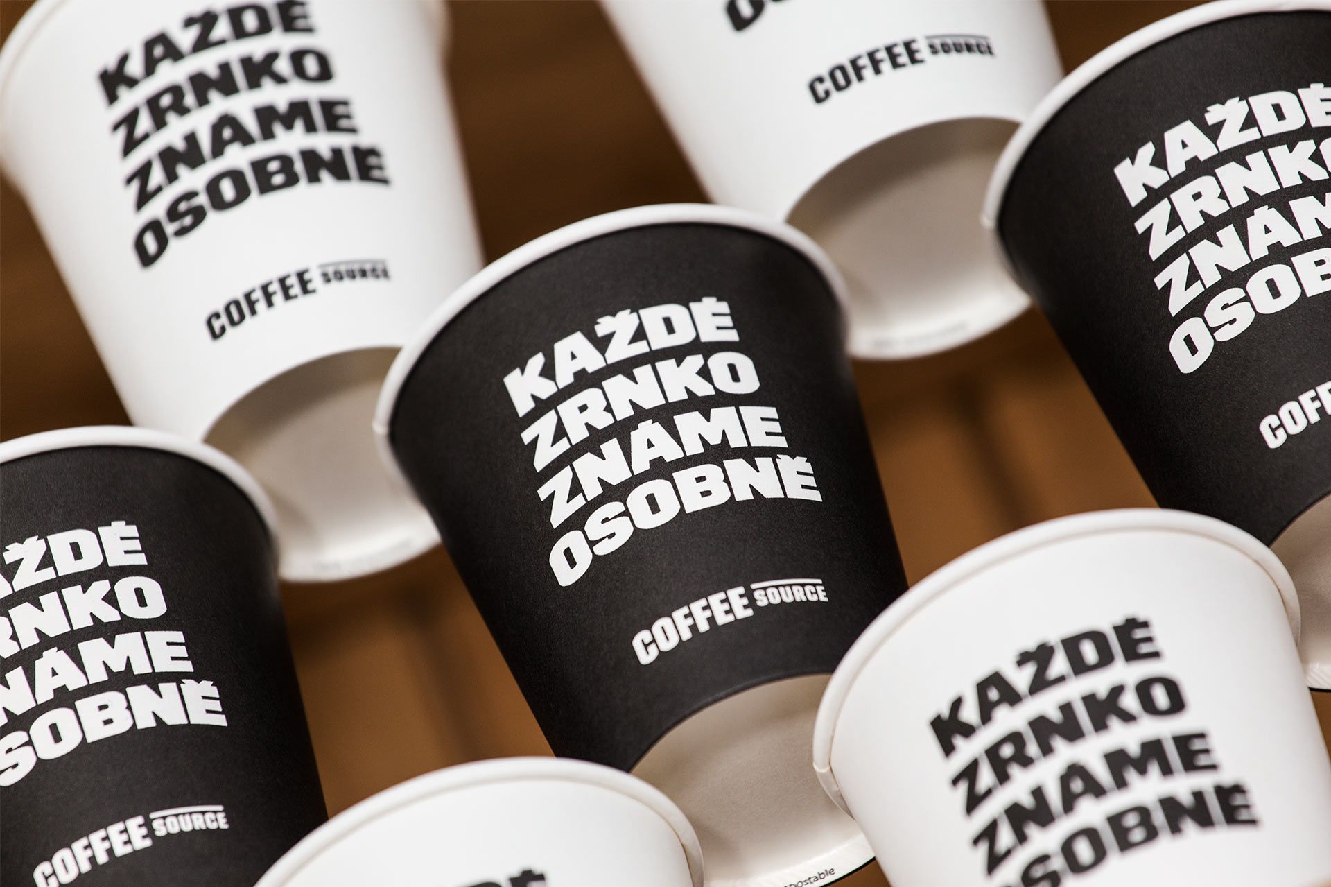
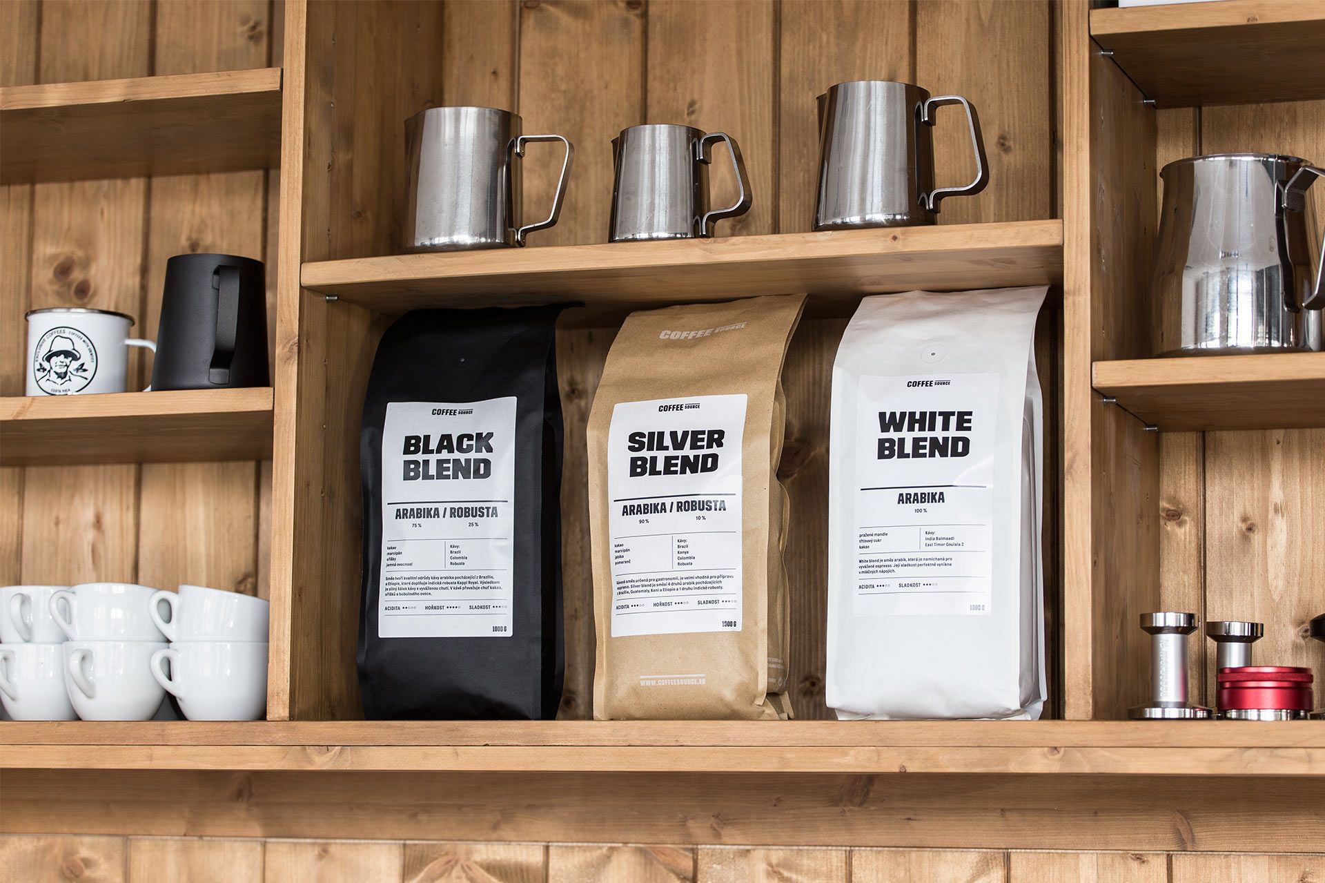
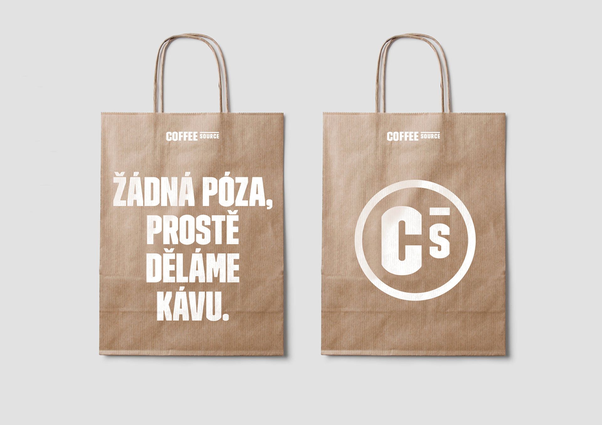
Another thing we love from the team of Toman Design is the image of Coffee Source coffee roaster and café. Here, they used the characteristic TRIM POSTER font for the signs and it also became a dominant element of the image. Coffee Source will sure be included in the map of coffee fans and design lovers: those truly committed can target the Prague-based roaster, and those who only long for a cup of nice new-wave coffee can also find them at two locations in Prague and also in Brno.
Žižkov TV tower
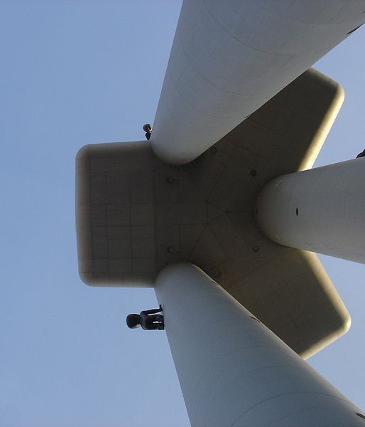
What could a TV tower offer us? At the first sight, we would not think much of these types of buildings – other than they are quite tall –, however, Žižkov TV tower in Prague surprised even us. The 216 meter long high-tech miracle resembling a rocket was built between 1985 and 1992 based on the designs of Václav Aulický. And although the Australian Virtualtourist website called it the second ugliest building in the world, we would urge every single person who visits Prague to stop by at the TV tower, as many parts of the building is accessible to tourists.
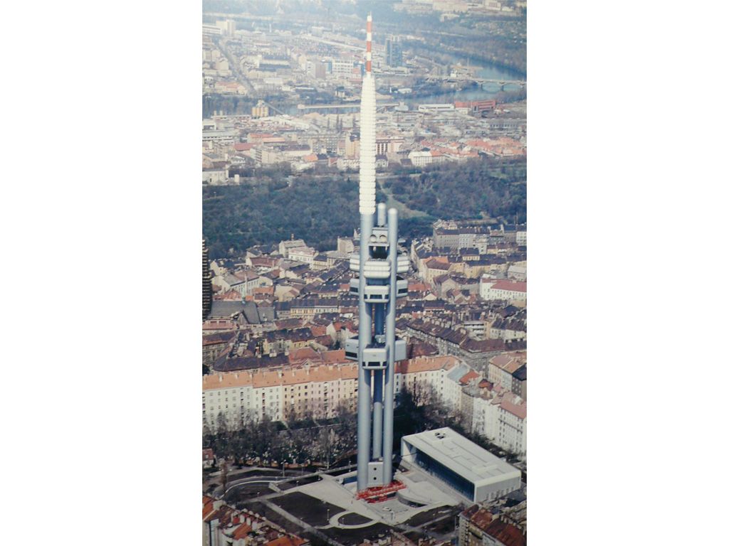
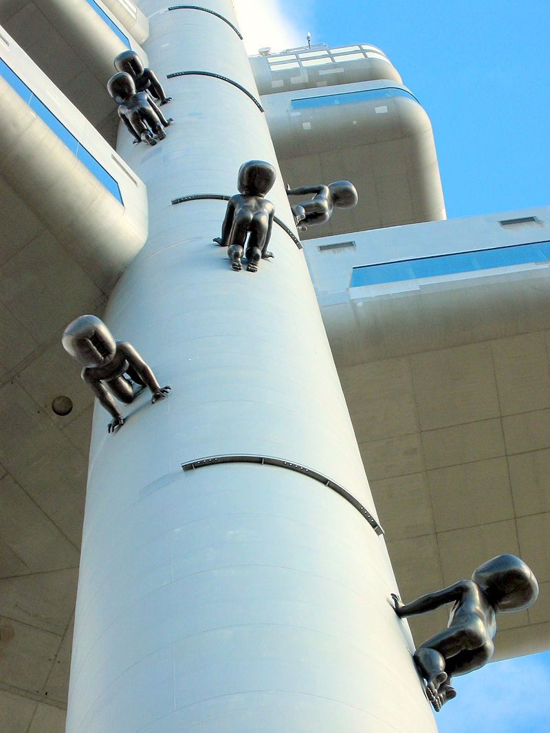
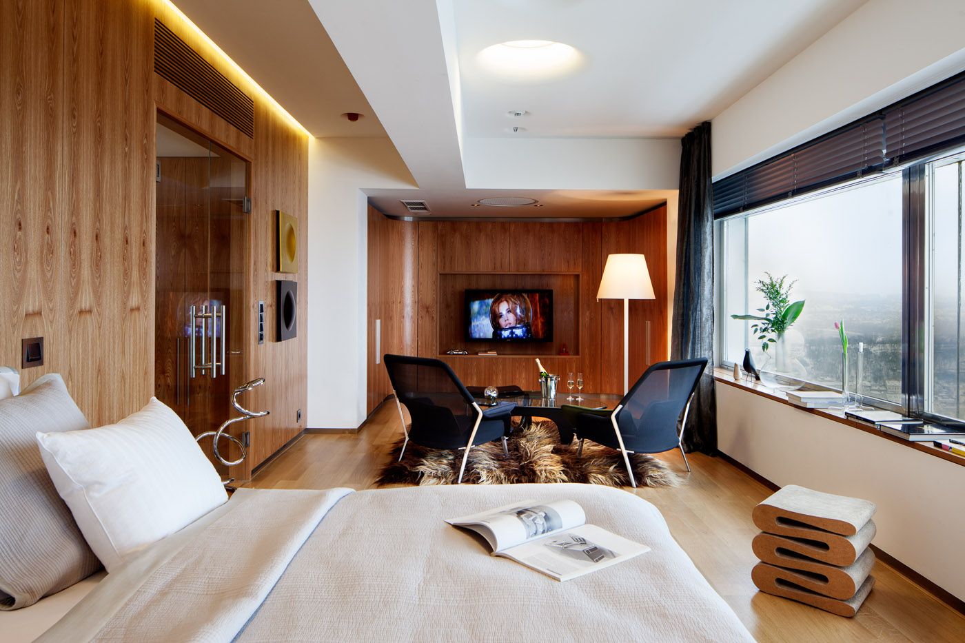
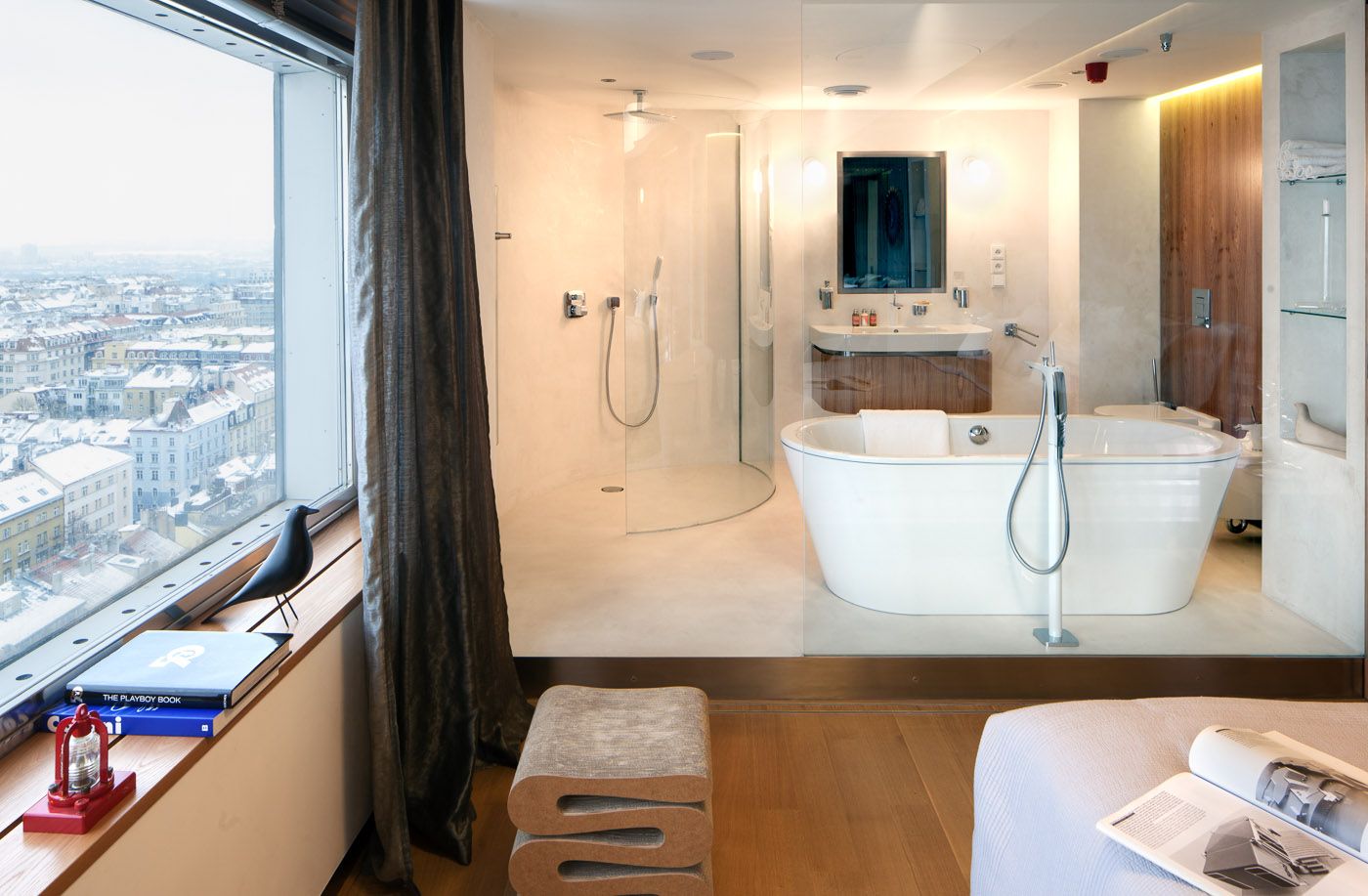
The 93 meter high viewpoint offers a spectacular view, but you can also eat a nice meal in the restaurant with 180 person capacity if you fancy, or you can also spend a night at the hotel room located at 70 meters height. Those who are not very fond of height can also find something to their liking: the naked baby statues crawling on all four by Czech artist David Černý can be seen on the facade, which form part of the decoration of the tower since 2001.
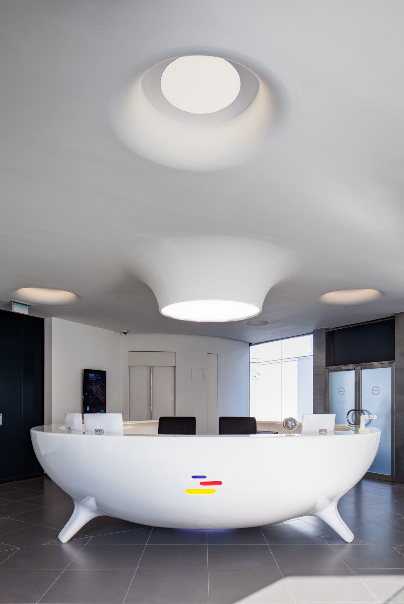
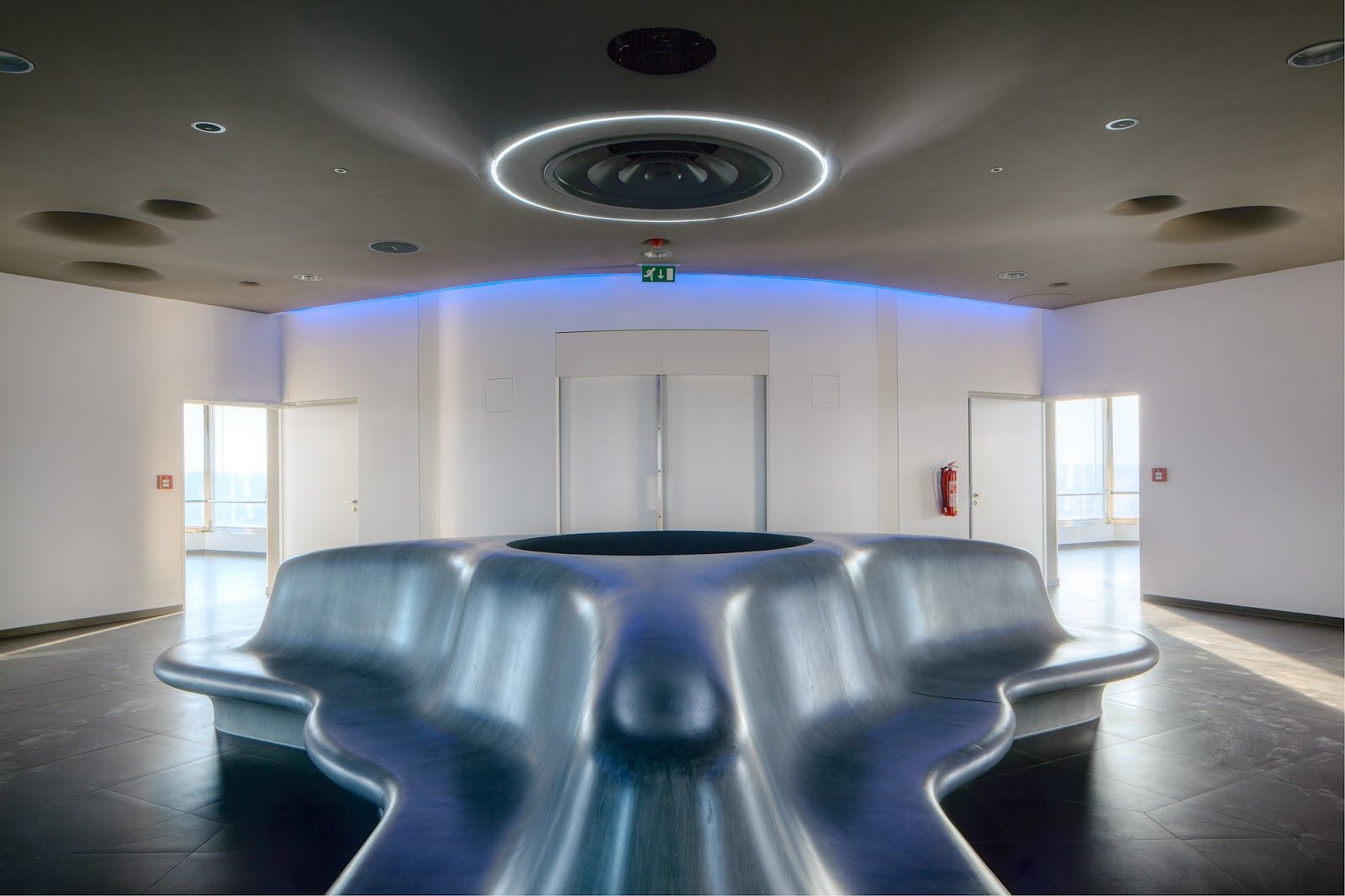
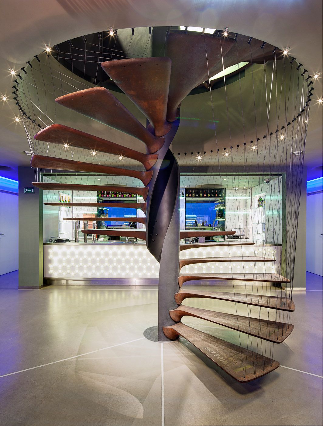
The fact that the building has such a high-tech interior is owing to the team of Atelier SAD, who were responsible for the reconstruction works carried out between 2009 and 2012. Futuristic spaces await us in the utopist TV tower. In terms of choice of materials, metal-wood-glass surfaces dominate the place.
Looking at the snow-white surfaces, lamps built in the ceiling, the concierge desk standing on odd little legs, and the benches located in the hallways, we feel like we are part of a science-fiction movie.
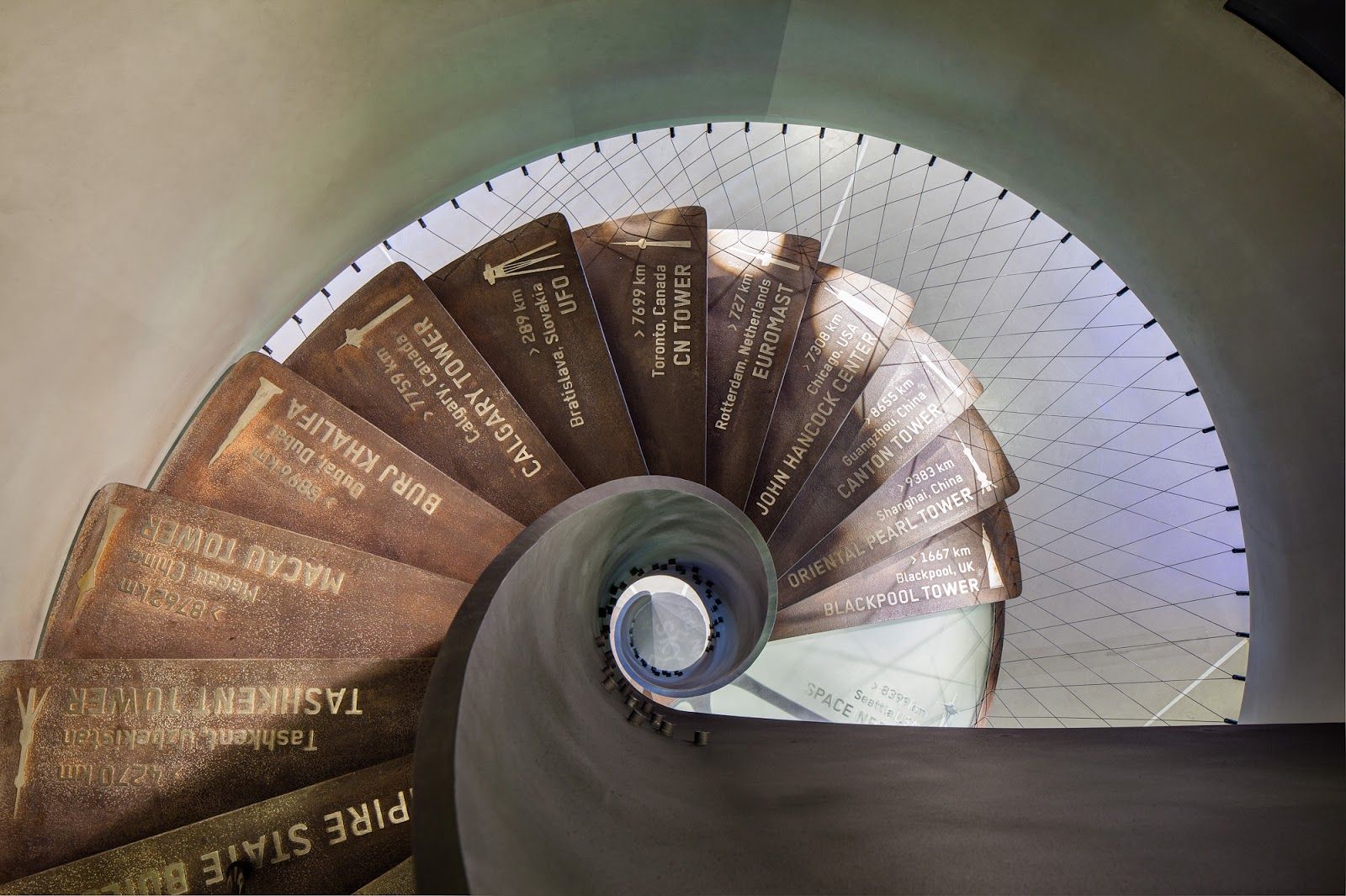
The cast-iron spiral stair (in spite of the chosen material) creates a feeling of lightness, and one can see the different tower buildings rising up in the sky in various points of the world.
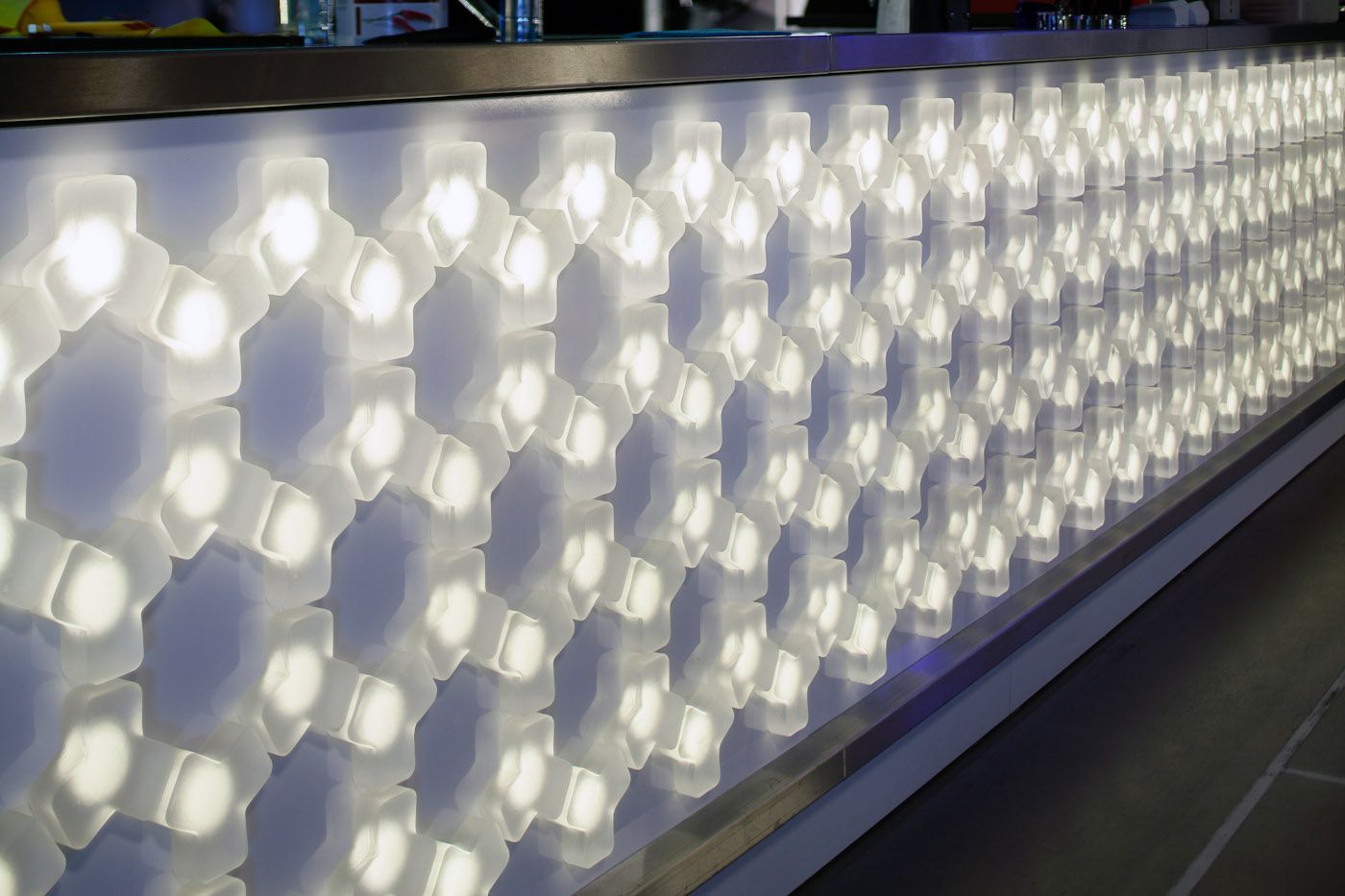
The forms of certain elements of the TV tower recur on the surfaces of the bar. The furnishings and a large part of furniture was chosen from the selection of Vitra.
Natural wood wall surfaces receive more emphasis in the hotel room, and the soft rug makes the luxury suite more homey. The guests can enjoy the extraordinary panorama from the bathroom equipped with both a shower and a bath tub.
Little Greta
The Little Greta agency has gained a foothold not only in Prague but also in Munich, London and New York, yet, in spite of the expansion of the team, they could preserve the homely atmosphere. They have worked with several breweries in their home country: in the case of the Primátor brand, they had to concert the packaging of 15 types of beers, for which they were awarded the Red Dot Design prize. We like the campaign video they have put together for Primátor very much. Artisan brewery (nowadays repeated ad nauseum) shows a completely different face through the lens of Little Greta: the creators present the process of beer-making on a series of pictures without mystique and hype, from the production of hops until fermentation, in a way that we can feel the humility towards nature and the profession all the way through.
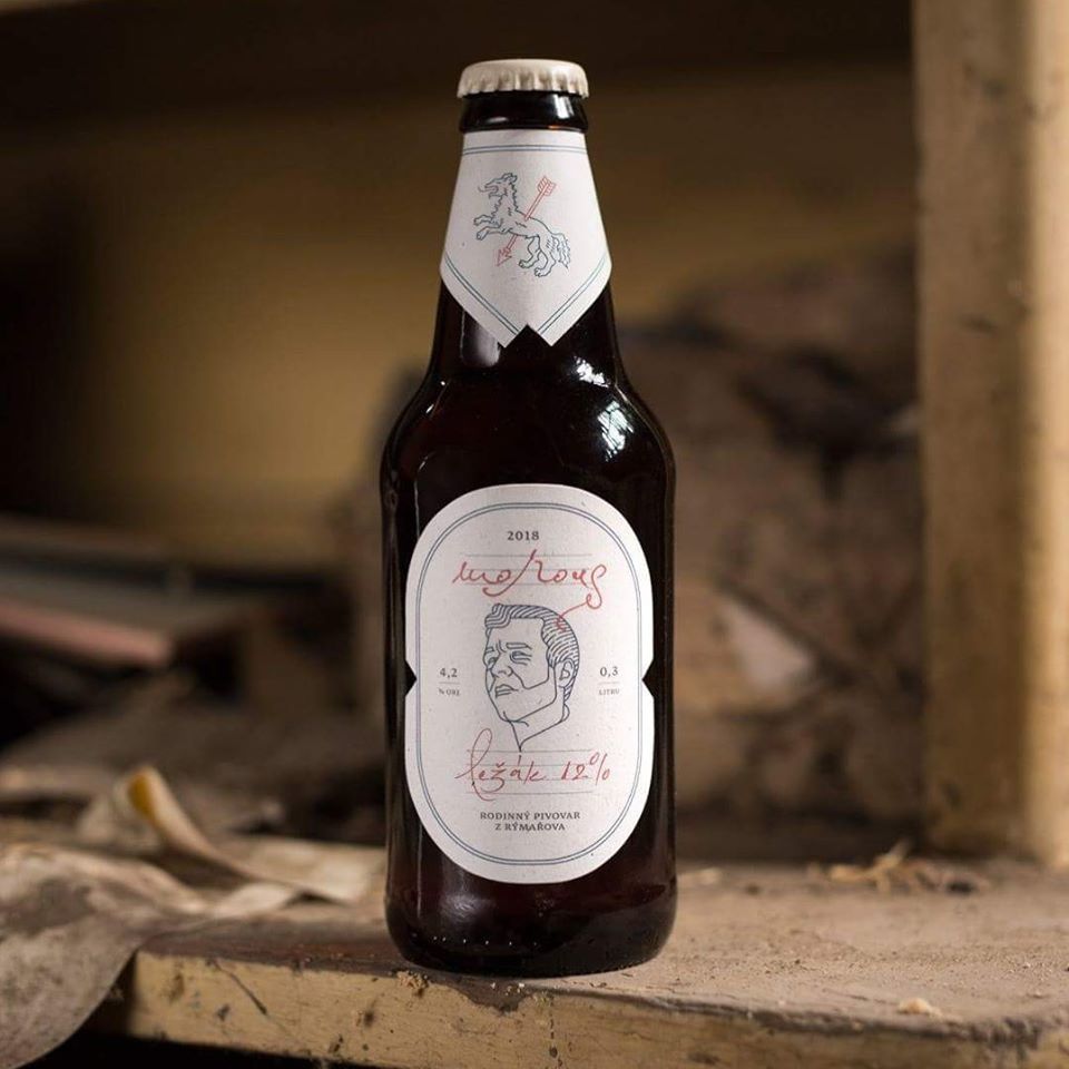
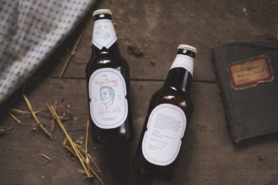
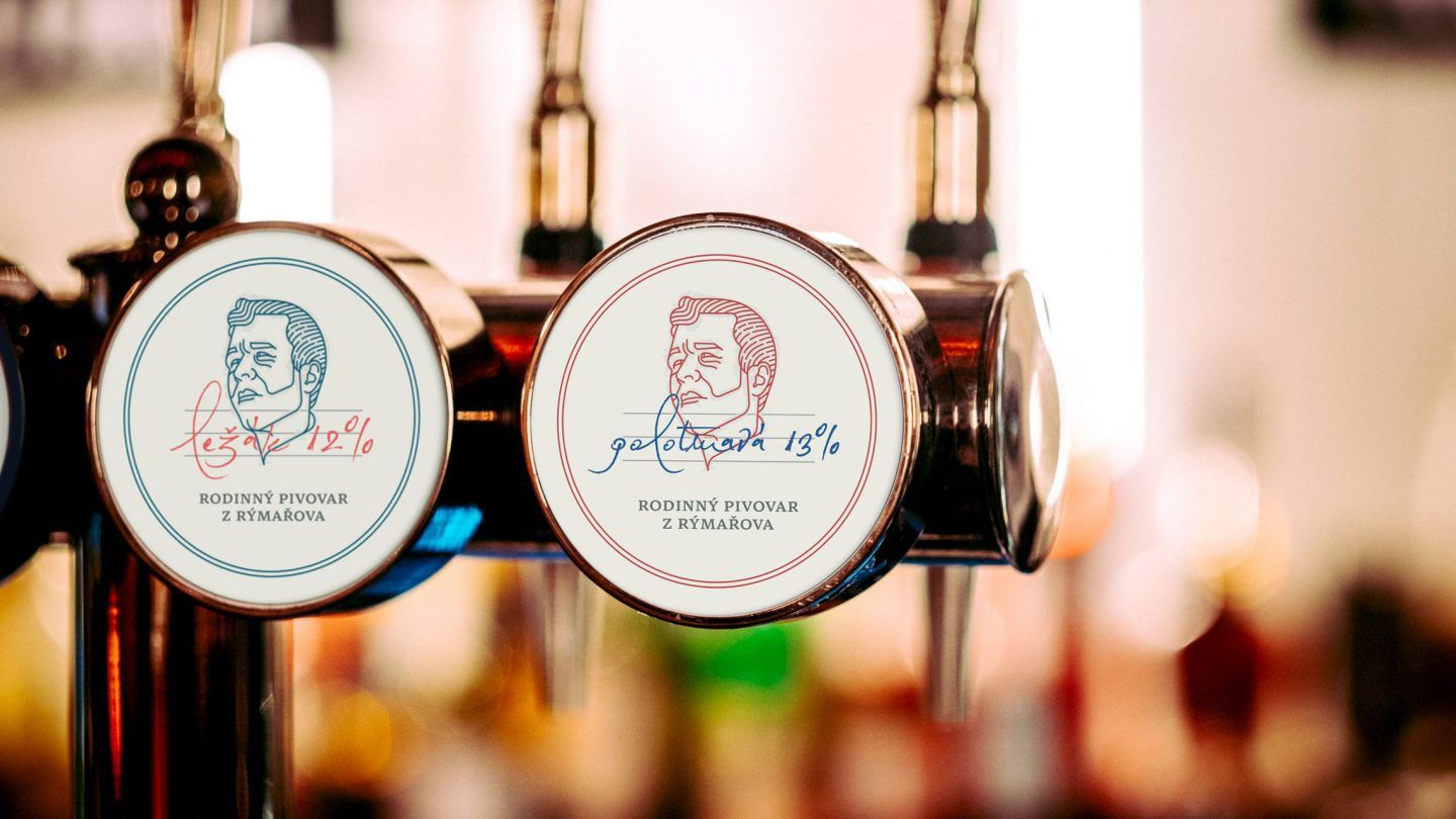
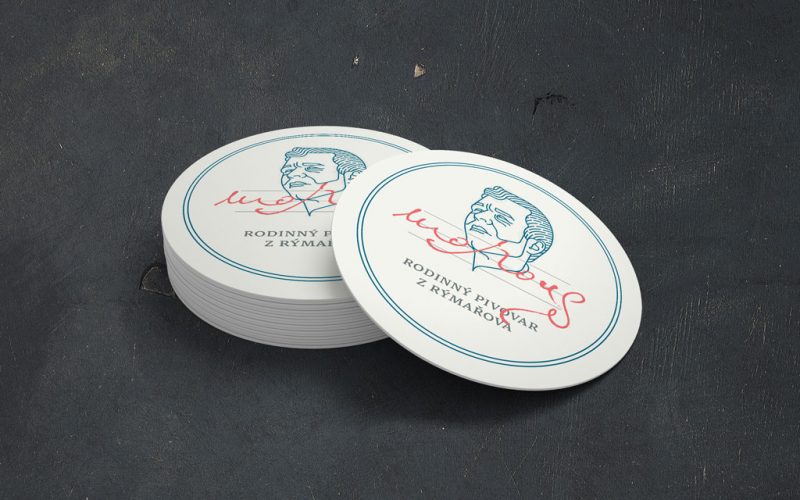
Another beer-related project that we are fond of is the visual identity of the Morous family brewery. The request to design a visual identity for the company came from the city of Rýmařov situated near the German border. The artisan nature is echoed in the pale label tuned to moderate colors: the meandering handwriting makes it feel like the brewmaster created the beverage expressly for us. The heraldic animal of the town, the wolf is also displayed on the neck of the beer bottle.
Another thing they made and we love is their latest project, which has got much more to do with the city of Zlín than the beers mentioned before. The team of Little Greta implemented the temporary exhibition titled ’Rozum versus cit: Zlínský průmyslový design 1918–1958’ (‘Sense versus sentiment’) showcased at Galerie Zlin with their collaborating partner, the VRCOT brand.
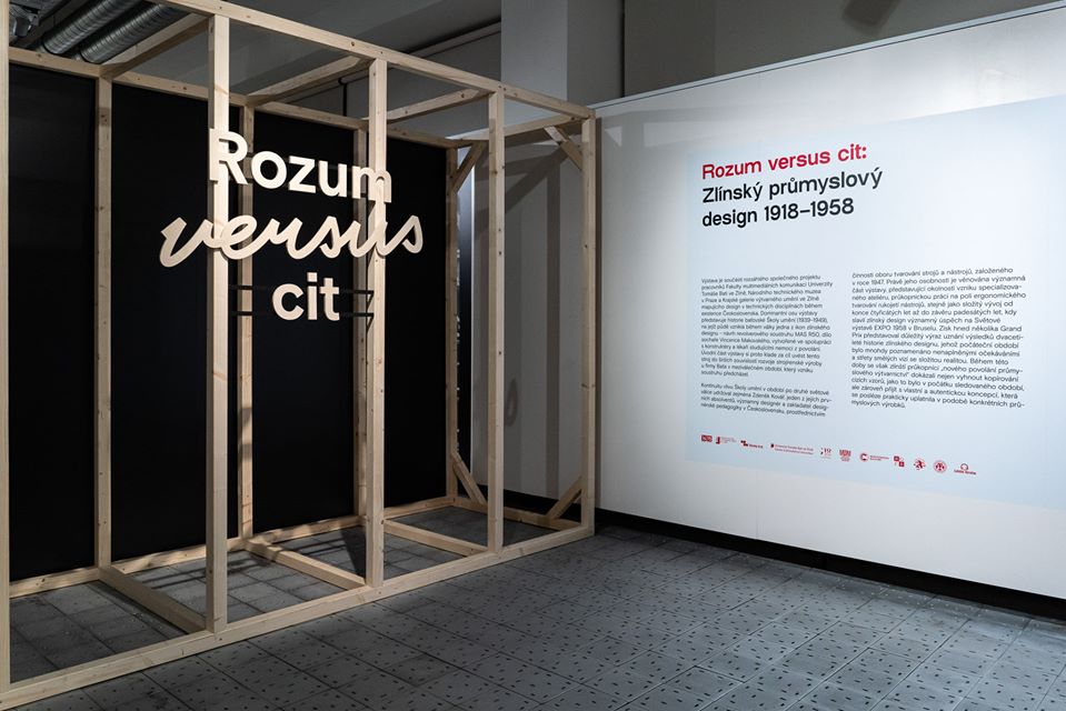
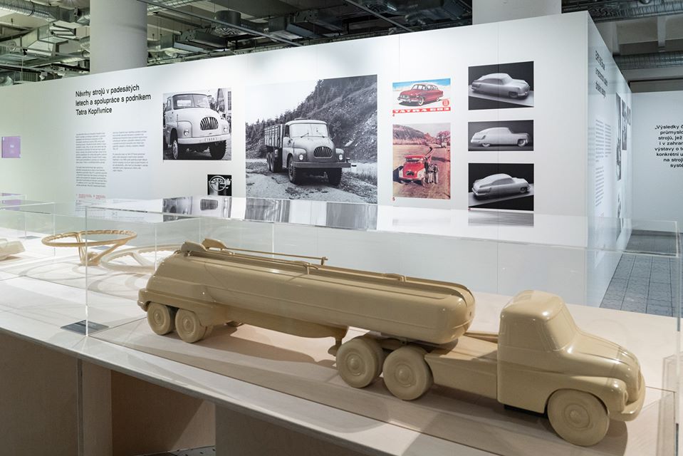
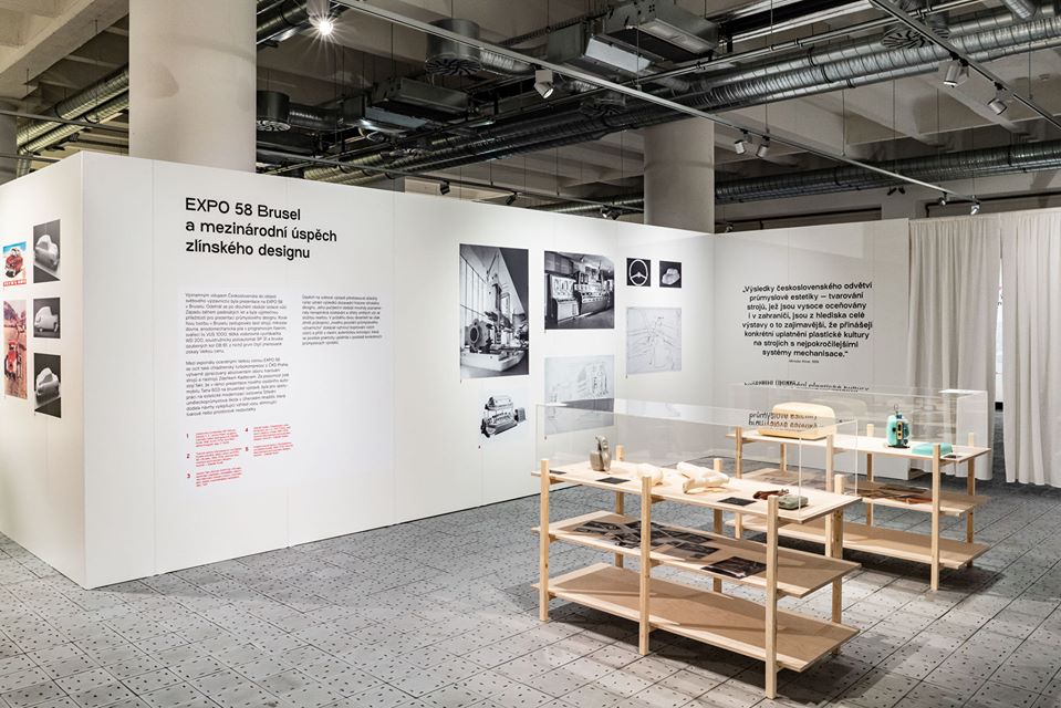
The exhibition, which is open until March 1, presents the history of industrial design between 1918 and 1958, with the city of Zlín in the focus. The team of Little Greta was responsible for creating the concept of the exhibition, while VRCOT was primarily in charge of incorporating the AR (augmented reality) and VR (virtual reality) contents into the show.
In our biweekly series, we present the Czech, Slovakian and Polish brands and design spots that we consider worthy of being placed on our mental design map. It is a guide for those looking for something other than usual tourist sights.

Green Bucket List in HANNABI way
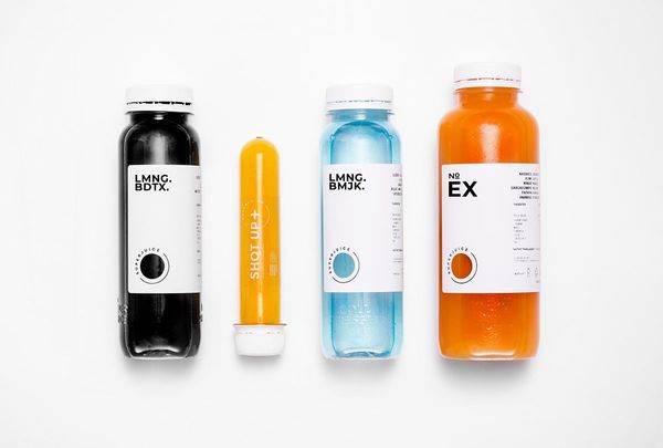
Juices from the lab | The image of SUPERJUICE
