Vivid colors, bold shapes and natural, locally sourced ingredients in one: Polish brand O!Meega calls the attention to healthy eating with its joyfully colored and playful label designs. The expressive brand visual identity was designed by Martyna Wędzicka-Obuchowicz.
Martyna Wędzicka-Obuchowicz is a graphic designer and art director living and working in Gdańsk. Her works are characterized by the use of strong contrasts, geometric shapes and distortion, accompanied by a bold color palette. “I’m not afraid of using odd colors,” Martyna claims.
The very same designer’s attitude can be observed in the latest packaging designs of Polish food brand O!Meega using natural ingredients. “As an alternative to mass production, O!Meega promotes Polish local products. This attitude is very close to me, too, and as a designer I also care about supporting small businesses,” Martyna told us.
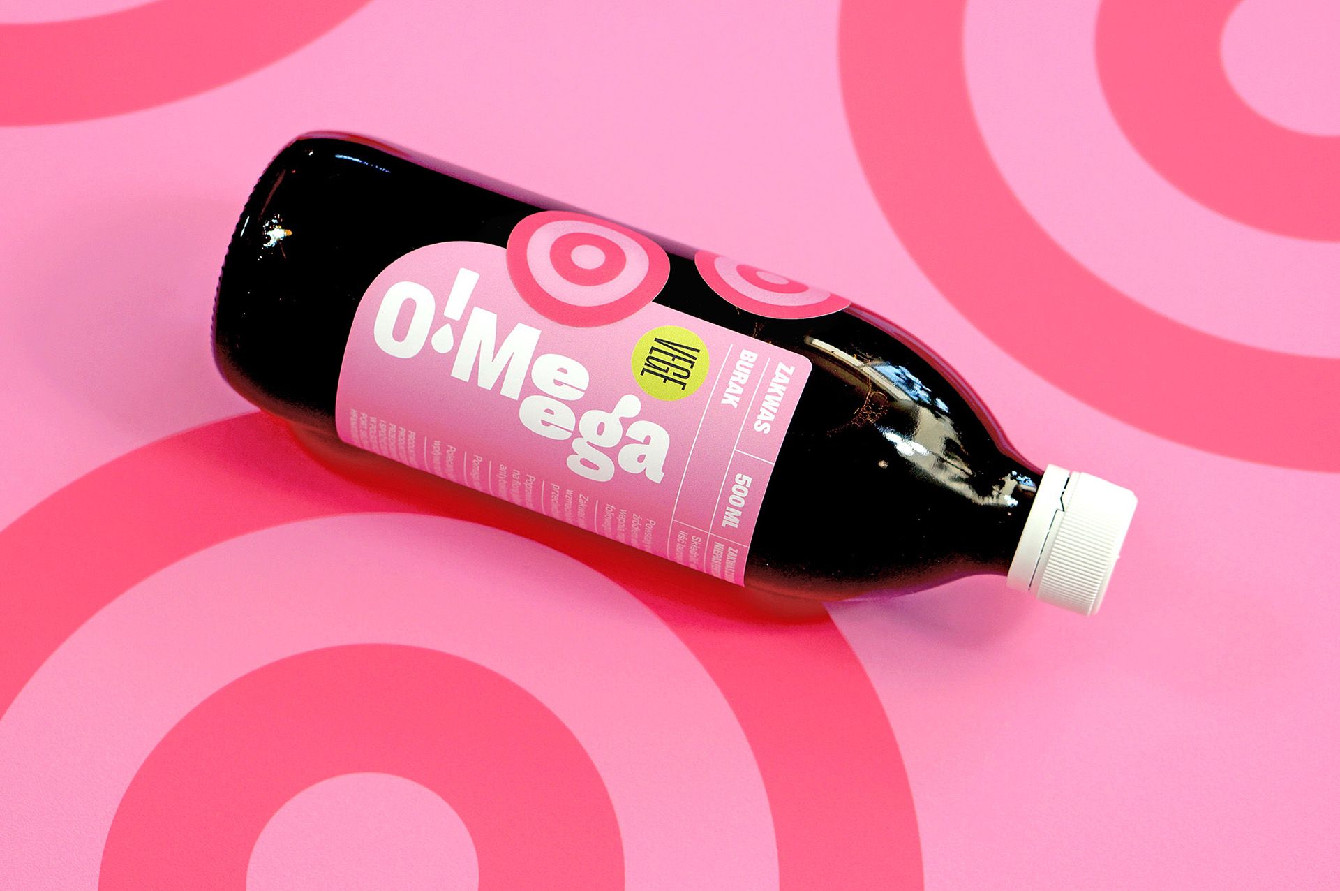
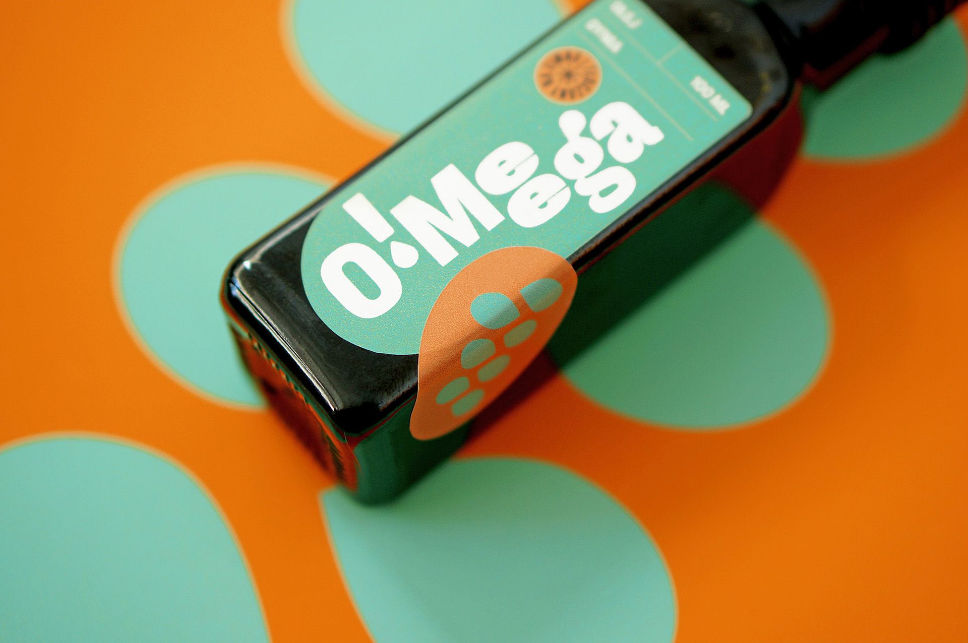
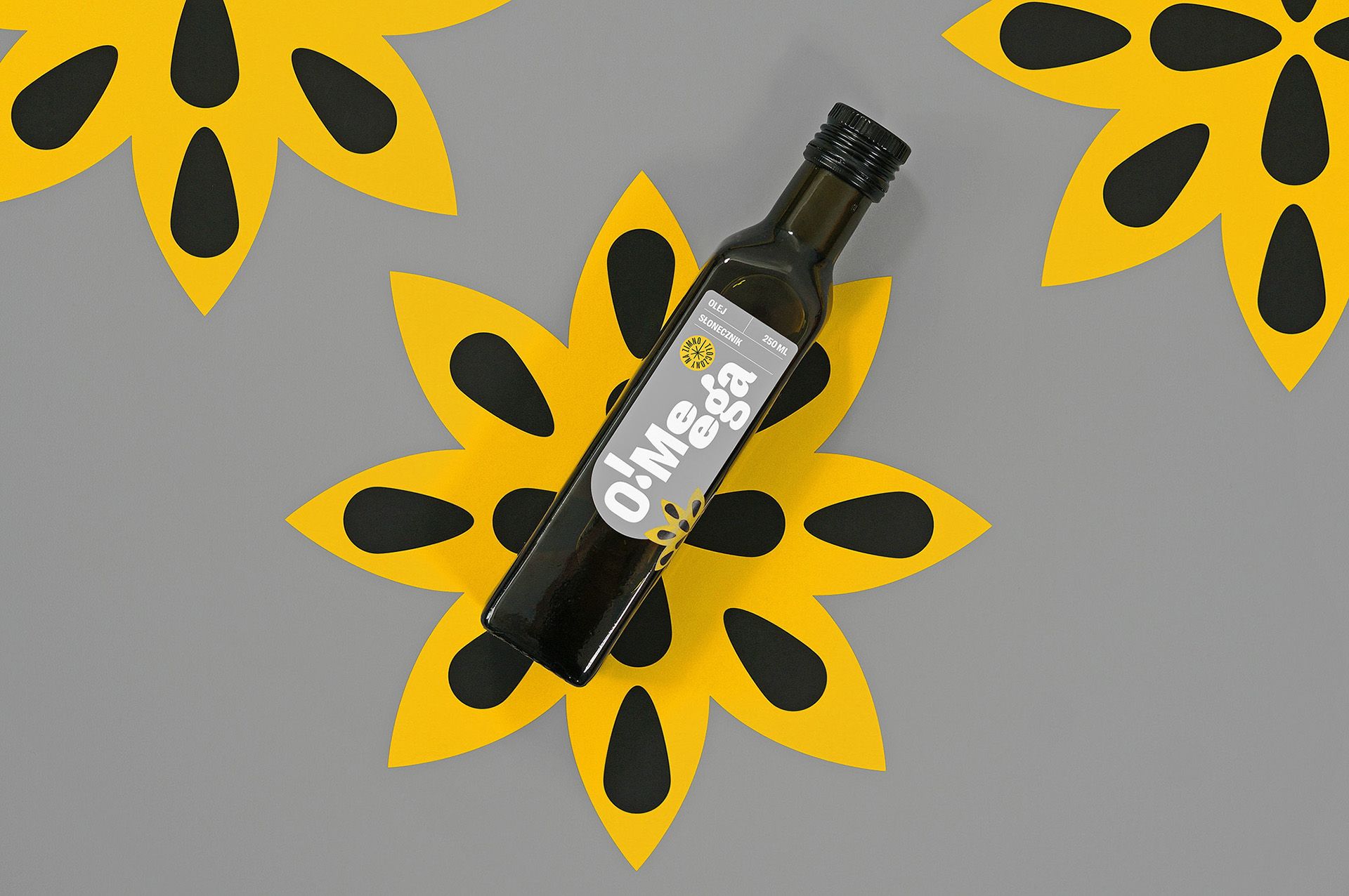
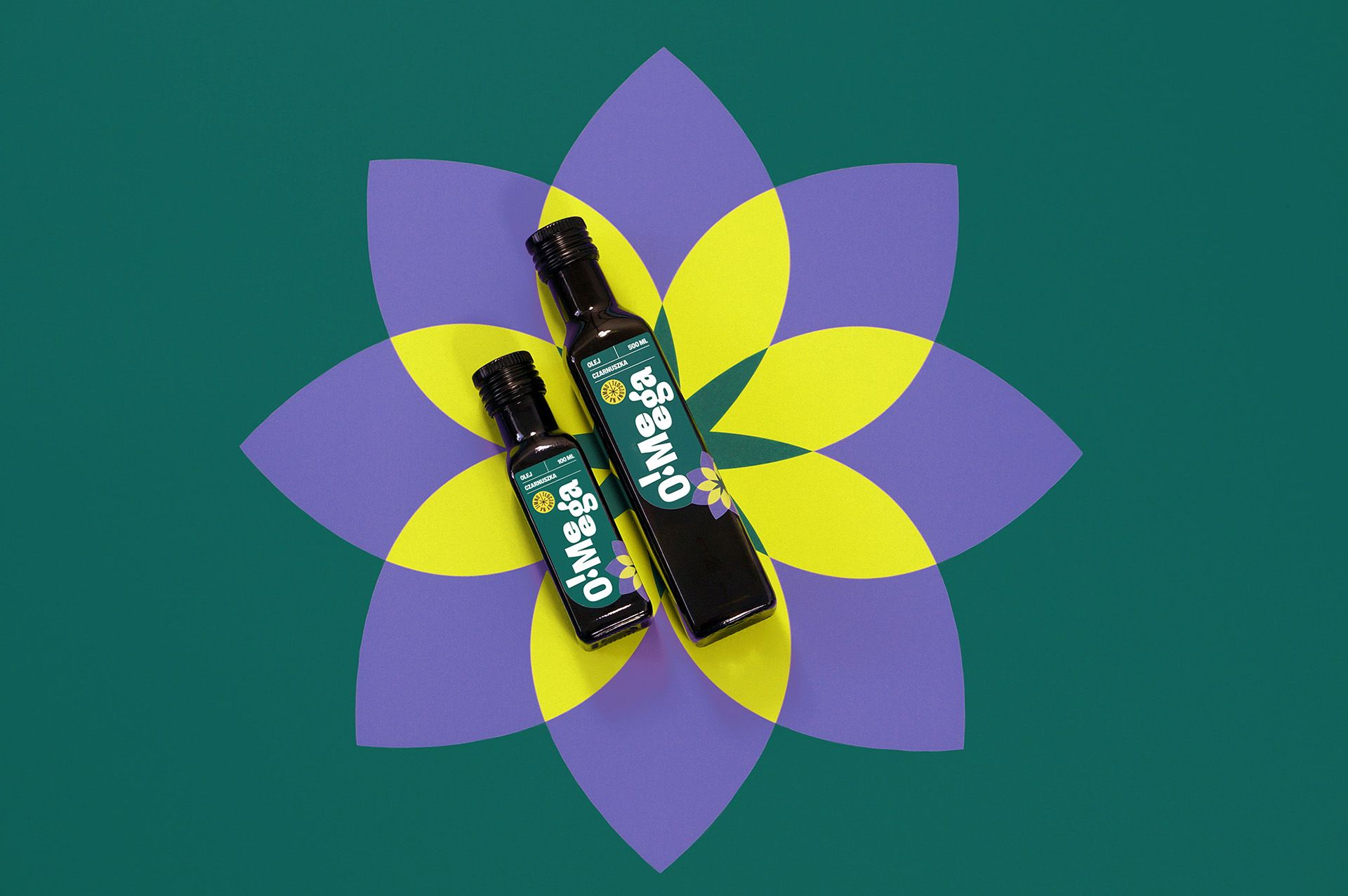
Organic products often receive natural, neutral or transparent packaging. On the contrary, O!Meega works with vibrant colors, plays with shapes and raises our attention.
“I wanted a brand representing such important values to stand out from the competition and be noticeable on the shelf also from a distance,” the designer added.
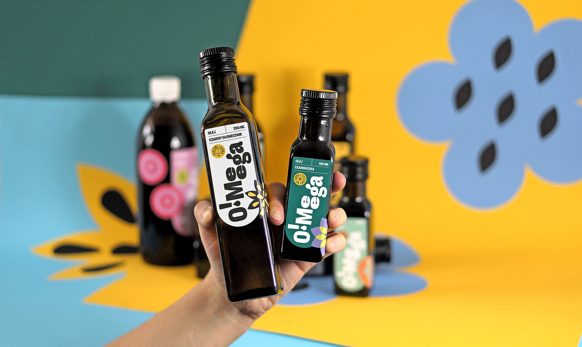
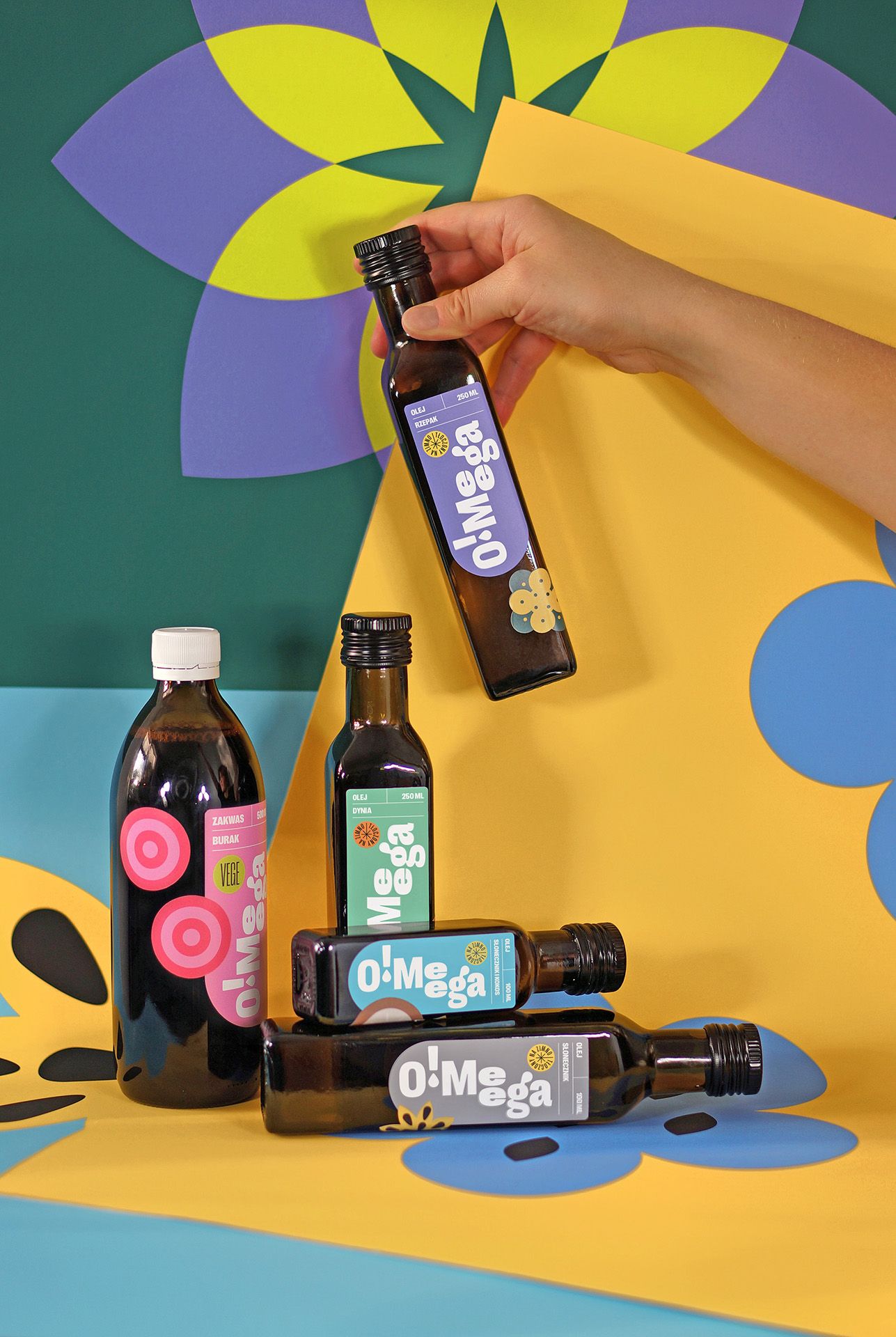
O!Meega debuted with oils made of locally produced grains and vegetables including black seed, sunflower, rapeseed and linseed oil. The abstract forms and vibrant tones appearing on the packaging are associations of the given ingredients.
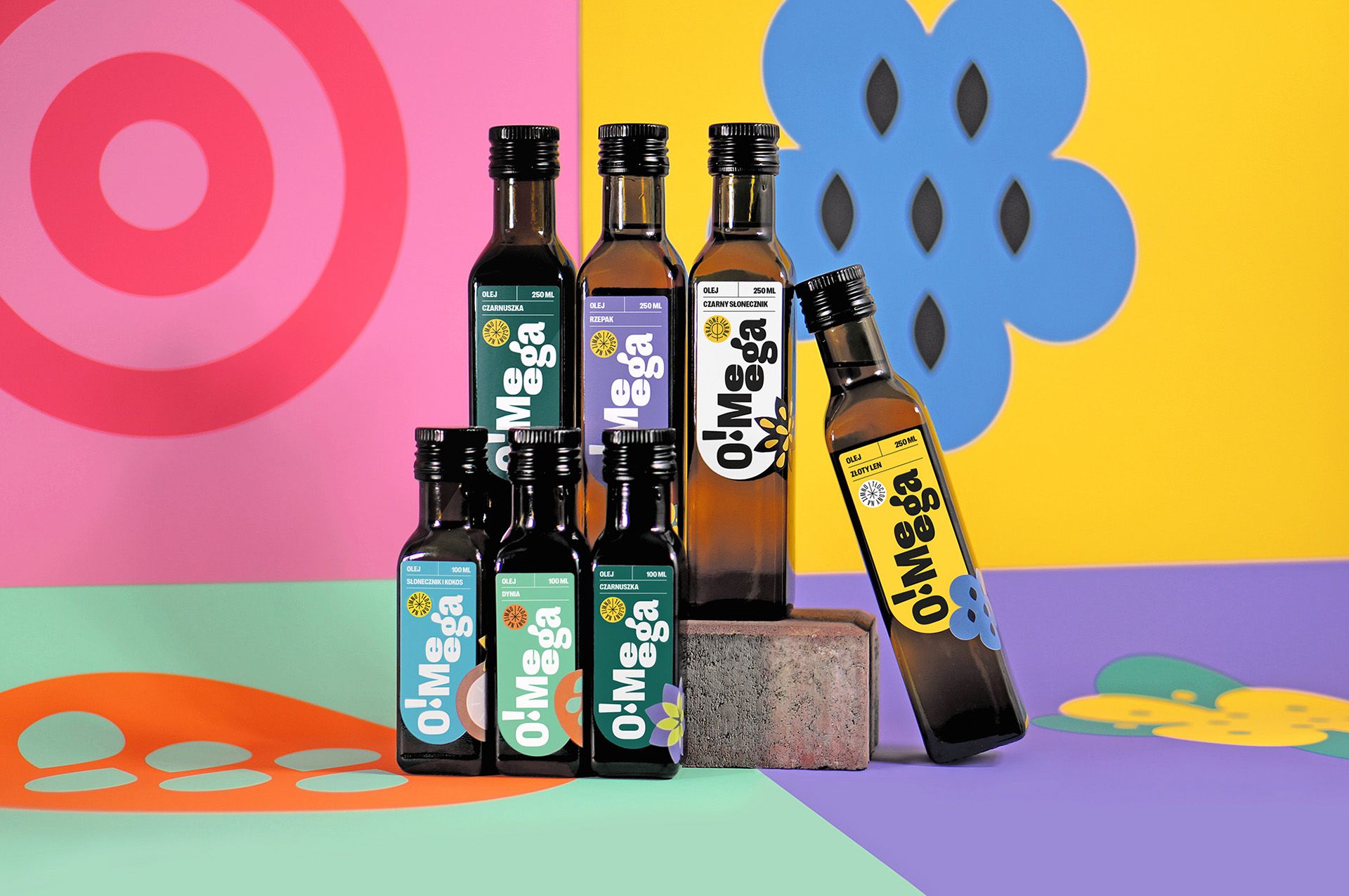
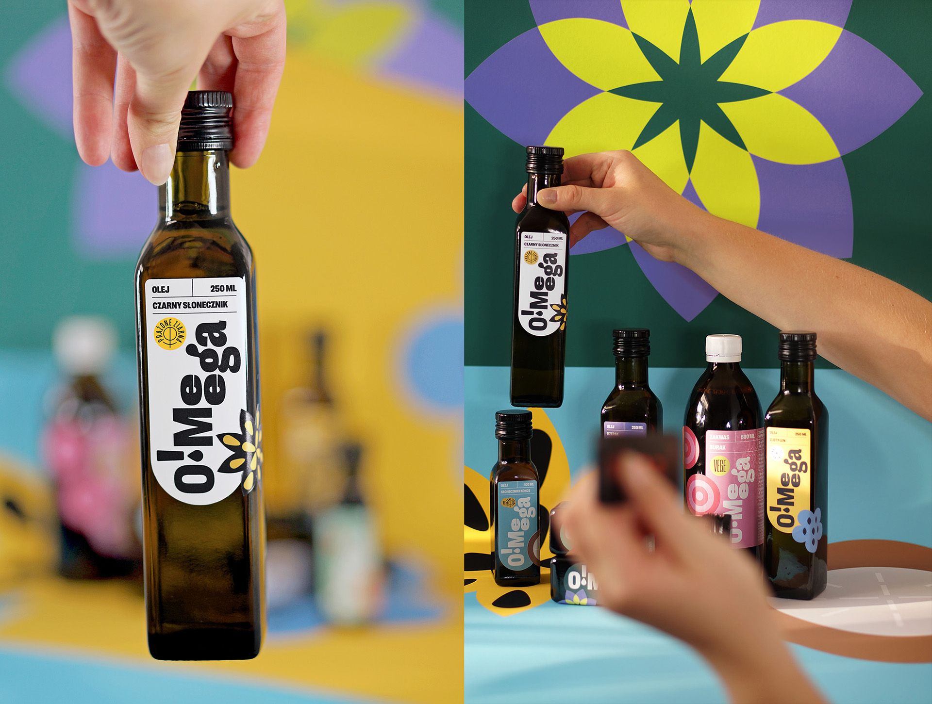
In addition to the various oils, the brand plans to launch a new product line: customers will soon be able to grab O!Meega’s beetroot leaven, too.
The products of the Polish bio brand are currently only available in Poland, in local stores.
Martyna Wędzicka-Obuchowicz | Web | Facebook | Instagram | Behance
O!Meega | Facebook | Instagram

Amphibious catamaran with innovative solutions | Pagurus
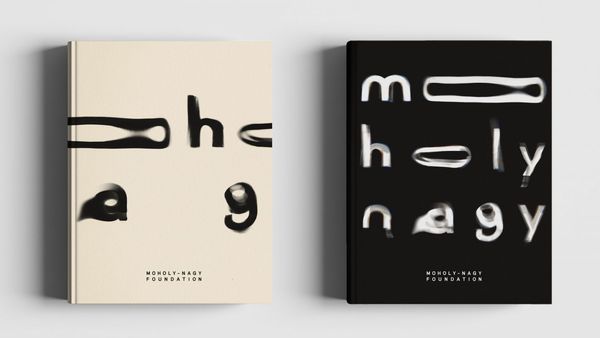
Pentagram designs new visual identity for The Moholy-Nagy Foundation