“We must own up to what we think” | Exiter Diary
Dots, patches, stripes, straightforward messages, in black and white. Dóri Mészáros thinks of her brand, Exiter Diary as the fusion of a graphic design studio and a designer brand. We have discovered the brand a few weeks ago, and given that we are huge paper freaks, we jumped on the cool notebooks and notepads immediately. Interview!
“My name is Dóri, I am a graphic designer, paper-stationery addict, and graphomaniac obsessed with notes” – this is how you introduce yourself on the website of Exiter Diary. You also reveal here that the idea of the brand has been lingering on your mind for years. How and when did Exiter Diary start? Where does the name come from?
Yes, this is absolutely true. I note everything down almost compulsively, many times I can only think if I write it down on paper and see the line of thought with my eyes. I devised the concept of Exiter Diary before my university years, 5 years ago. I was deeply inspired by the American Julie Ann Art, which is a one-person brand – it is now running under the name Unblushing. I started scribbling patterns like this at that time, but my ideas were quite primitive and rambling back then. This was the first time I was told that “this was stupid.” I thought about it a lot, then it settled in me after a while, and I decided to do it anyway.
The name came from one of my university projects: I had to design a calendar aiming to organize the chaos of our everydays. I created a pun from the word Exit. This became my diary “showing the exit”. When I started launching my brand after university, I thought about the best name a lot, but I kept being drawn to Exiter.
What was the biggest challenge you had to face when you decided to launch your own brand?
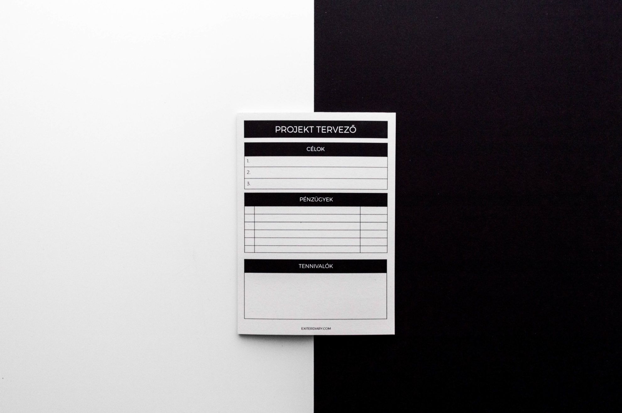
Almost everything. The first challenge was arranging the legal and business part. How do I become an entrepreneur? What do I have to do to make it happen? How will I have an online store? GDPR? I had to do a lot of research and ask for advice in these issues.
The other part was the procurement of products. I contacted plenty of printing houses and small companies, I always tried to proceed and decide along the principles of Exiter. My biggest problem is communication, which still requires plenty of conscious organization even today. The way I present my products, my working morale and my thoughts. How often do I post something? Whom do I address? I think these form the foundation of everything, and I try to dedicate much time to it so that everyone can resonate with what I represent a bit.
What is there to know about the products of Exiter Diary? Can you tell us a bit about designing and the implementation processes?
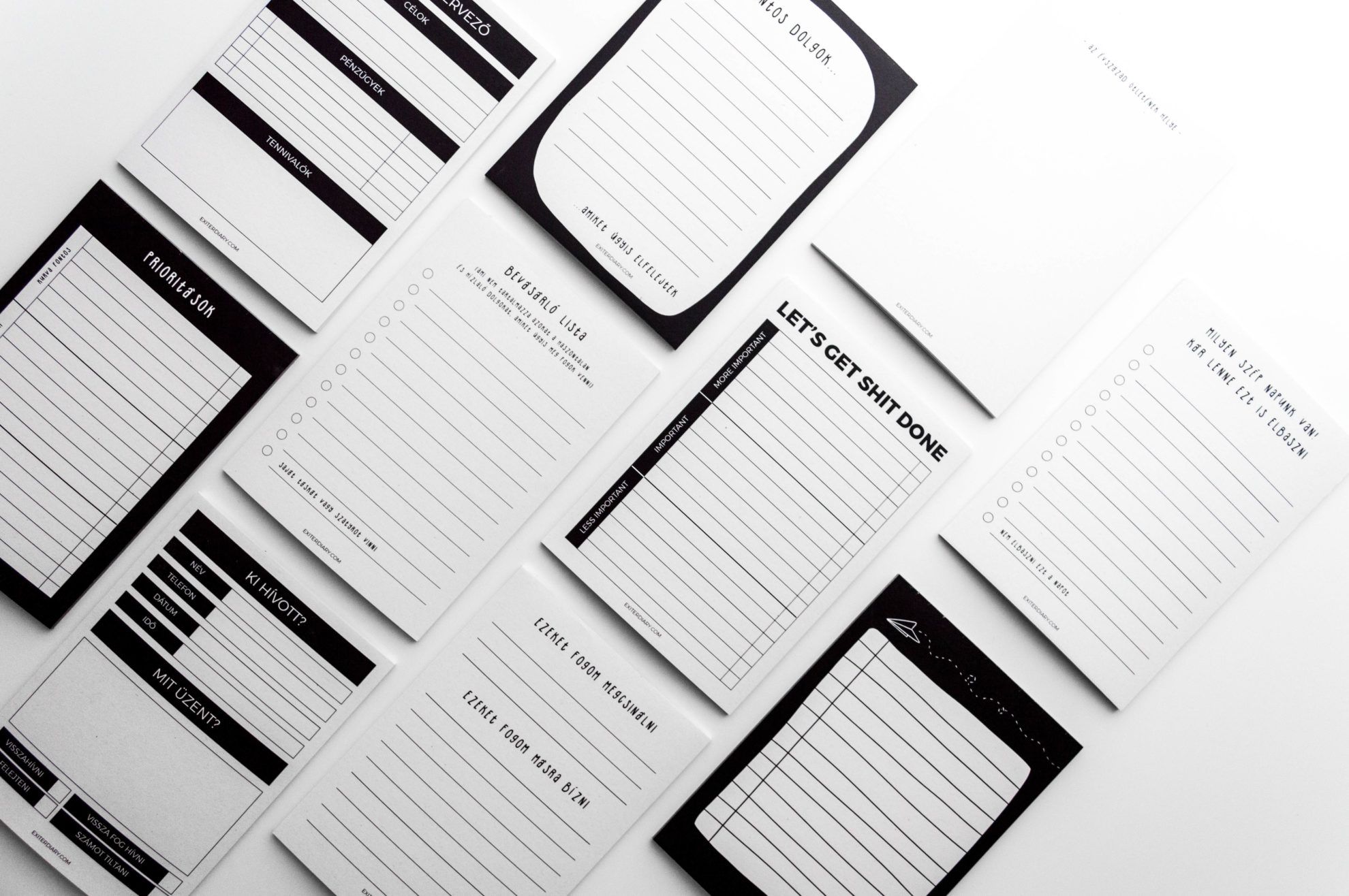
I built up Exiter along fairly simple principles. As I work with paper, my products are made of recycled paper to the largest extent possible. Of course there are unavoidable components, but I try to keep these at minimum. The products are made in Hungary, I work with partners that I know work in the SME sector, too. My canvas bags, for example, are screen printed manually in a small workshop, in a limited number. These principles include the avoidance of packagings, which is a twofold issue, as the products are fragile, but I like the texture of paper so much that I would hate to package it into cellophane.
The design process starts with me drawing a relevant issue on paper, something that interests me, and then I let the thought linger on in my head for a bit. After a while I look at it again and by then the design will have already conceived in my head. After this, I usually design it digitally, I create a proof. I request the price quotations from my tried-and-true partners by using the imagined materials. When I have found the perfect one, I order the first few pieces. I don’t work with large quantities at first, because many times the pieces I prefer the best don’t become the favorites of others, and vice versa: the pieces I don’t have high hopes for become bestsellers. Further peculiarities of the Exiter products is that the fonts displayed on them (except for one) are also designed by me.
I have a favorite American paper brand, Emily McDowell: the works are characterized by colorful and graphics infused with unique black humor. These messages on her products are funny and honest at the same time. Something similar takes place in the case of your products, too, for example in the case of notepads. Do I sense this correctly? What is the message you would like to convey to your customers through your works?
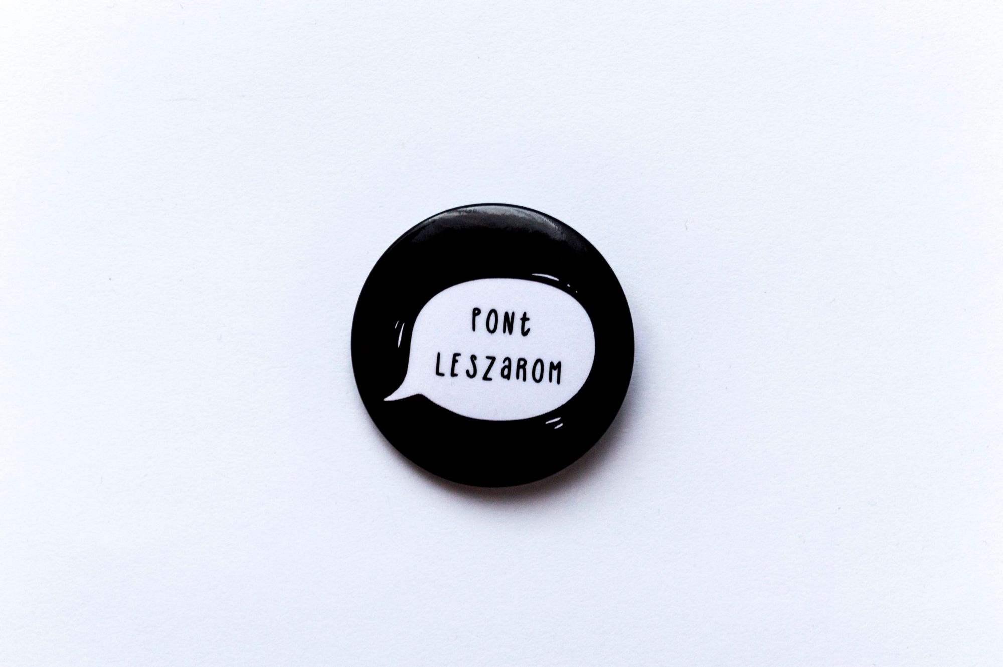
I didn’t hear about it before, so I checked it out quickly. Those who know me in person know that I say things like that in person, too, I see the world in an honest and outright manner. First I was scared that people will not like it or that they will consider me a jerk, but everyone loves these ones the most. My message in my creative profile and in Exiter is that we must own up to what we think. If I have a shitty day, then I have a shitty day. If I’m fed up, I’m fed up. If I am hurt, no one should tell me to stop feeling bad. I used to back off just to please others, and many times I was too adaptive. I would like it if people dared to be themselves more.
What feedback do you receive from your customers? What is your bestseller so far?
There are people who literally go nuts when they get to my counter (smiles). One of my favorite moments is when I saw people smiling and poking each other saying “Look, this is you!”. This is the greatest feedback. There is a lot of laughter at my place, that’s for sure, many people compliment me and yes I have some regulars. The bestseller was the notepad on the heading of which I wrote “What a nice day we have! It would be a waste to fuck this one up, too.” A lot of people told me this was their life.
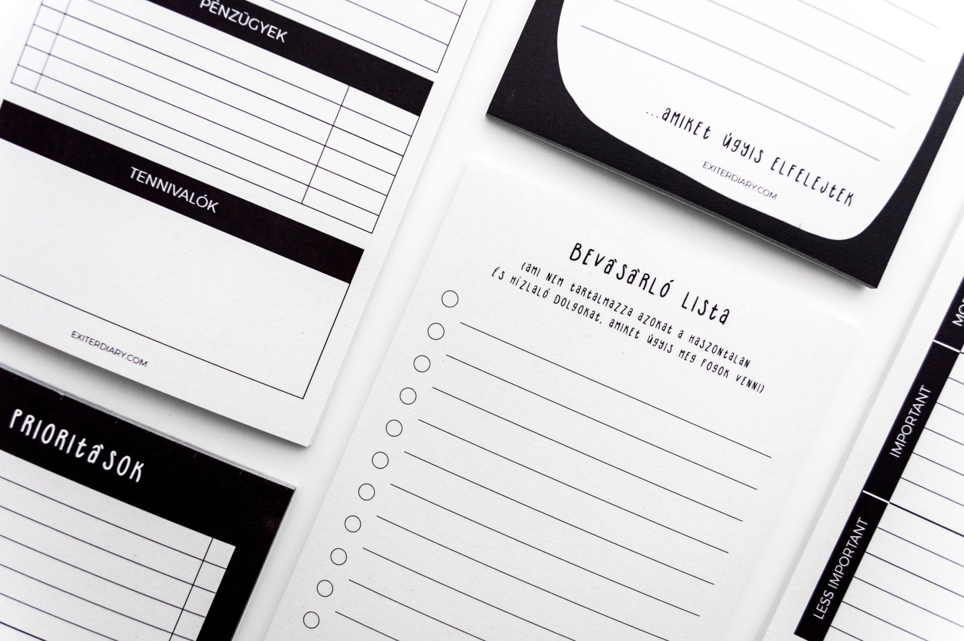
Your current selection is dominated by plain yet exciting black and white patterns (dots, stripes, patches, etc.). Is it possible that your next collection will be more colorful, or will you stay on this monochrome, graphic line? What novelties can we expect?
The color of the products catches the eyes of many, this also manifests the settling down of the past one year for me. I am disturbed by colors, I feel that the too harsh things create noise around me. I feel good amongst these colors. I only had one “colorful” product: there was a pink patch in the background of my bike pin, but I felt that even that was too much. I am sure that there won’t be any more colors in Exiter (smiles). Currently I work hard to launch some “side branches” within the brand: if you have a given product palette, I think you have to pay attention to ensure that the new products are not too different from the existing ones. It’s not a secret that one of the new directions will be Exiter Baby, which will include paper and (hopefully) textile products related to childbearing. In addition, two planners and journal-like products are already 90% ready. To be honest I have plenty of ideas, and I always realize these according to my current mood and trends.
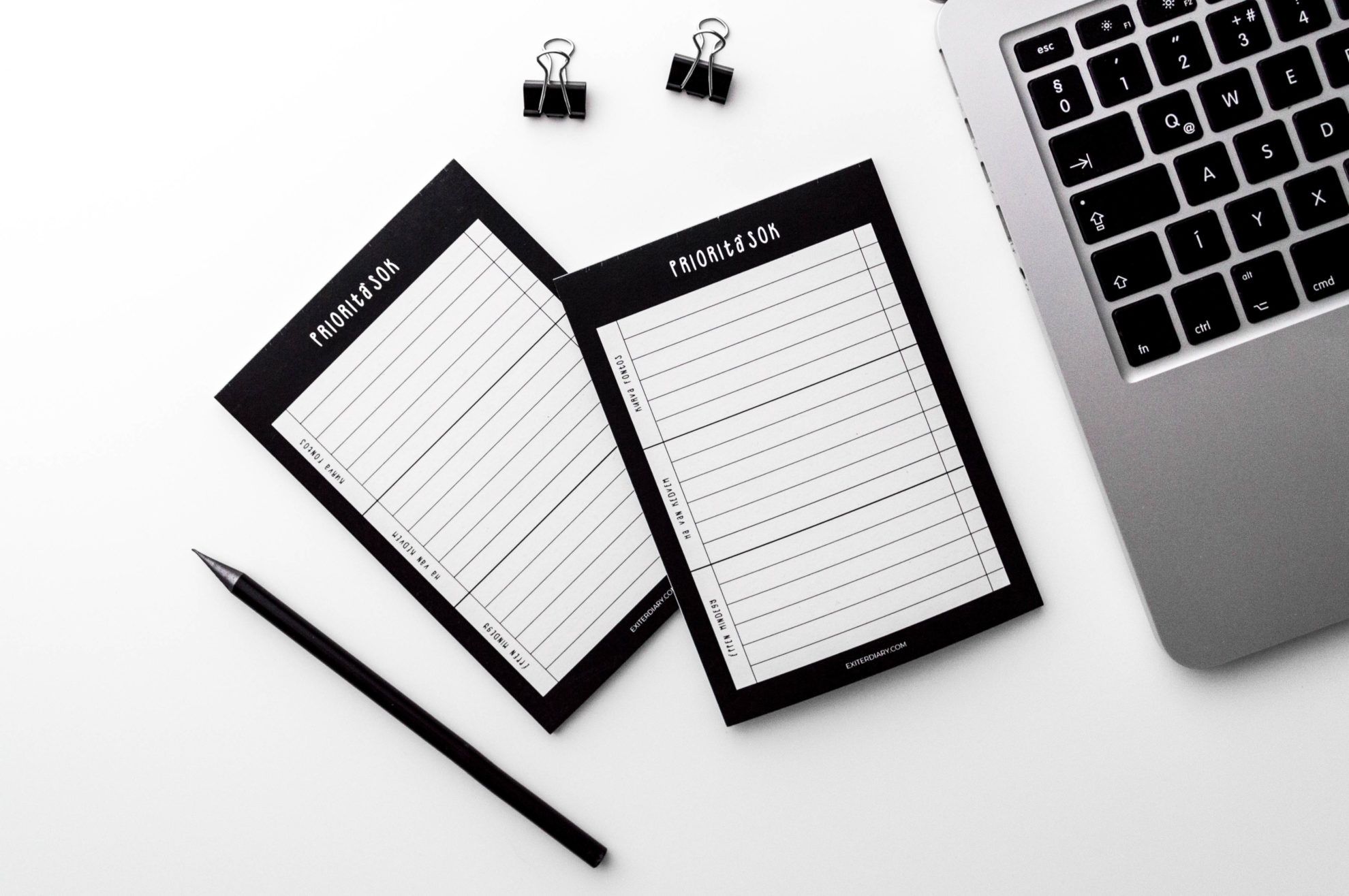
It might be a strange question, but I have to ask: the resemblance between the paper products of Exiter Diary and Malinovka is almost uncanny. Do you think the Hungarian market will tolerate two very similar paper products? Or is this virtually insignificant, as the style that you both create in is already considered a trend in the paper-stationery universe? Have you experienced any inconveniences in this regard?
This is not a strange question at all. And guess what, no one has ever asked me that before, so I have never experienced any inconveniences in this context (smiles). I think every creator is unique, and we can have a hundred different angles on even a single square. I like Malinovka quite much myself – for example, I take my notes related to social media into this year’s Malinovka Planbook – but I don’t think that we represent a similar flow. Exiter is a brand enriched with sometimes vulgar, straightforward black humor. I think it’s quite different from the nice and plain atmosphere of Malinovka. I think there is enough room for plenty of us, especially since we are all different, we convey different atmospheres and different messages. And black and white is an evergreen trend, and I am especially happy that more and more people feel and follow this!

Stijn Hoekstra | Cinematic Ukraine

Is globalization infected?


