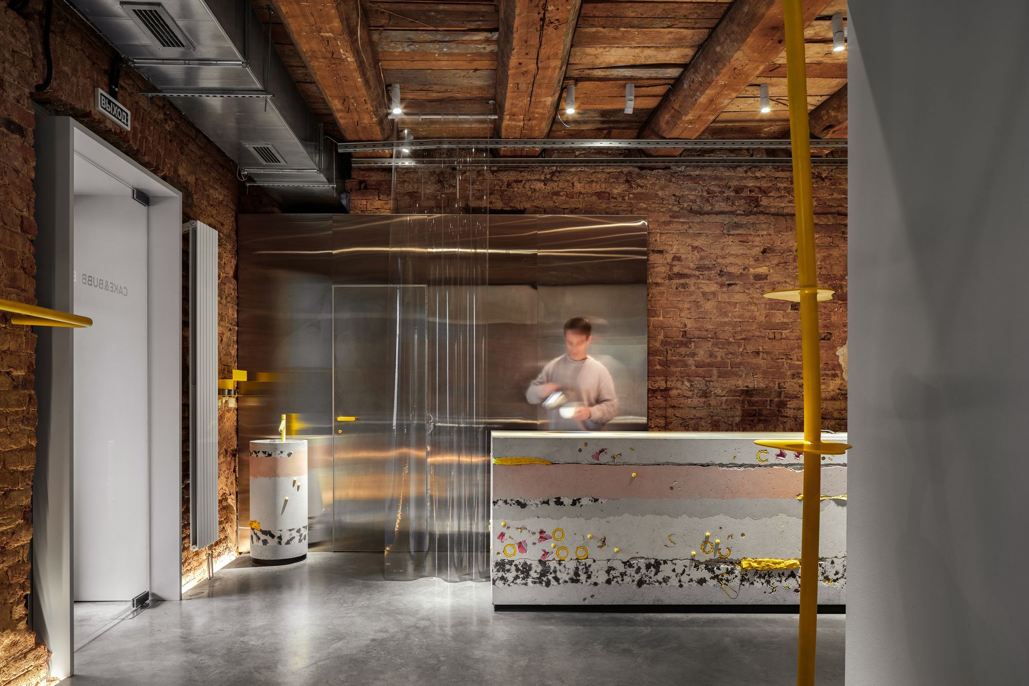
If you’re looking for stunning interiors, DA bureau won’t let you down. The architectural studio, made up of young professionals, has completed around 250 projects in the fields of architecture and interior design over the last 8 years. Their innovative thinking is a key feature, which means they are not afraid to challenge the norm—location, materials, or professional solutions—as we saw in their latest design. Come and experience it with us!
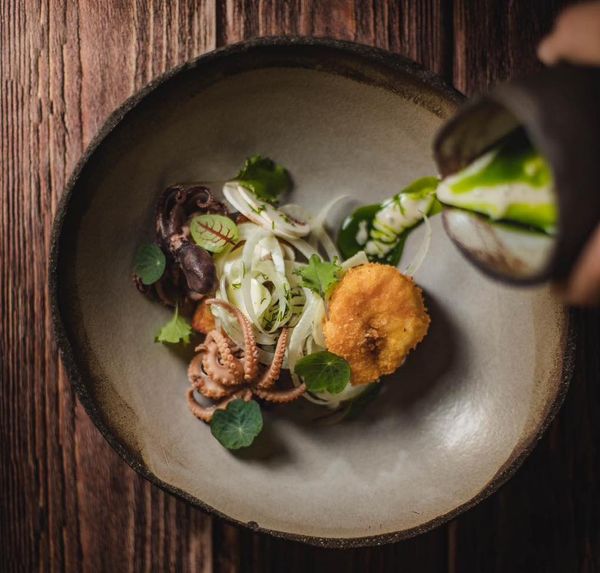
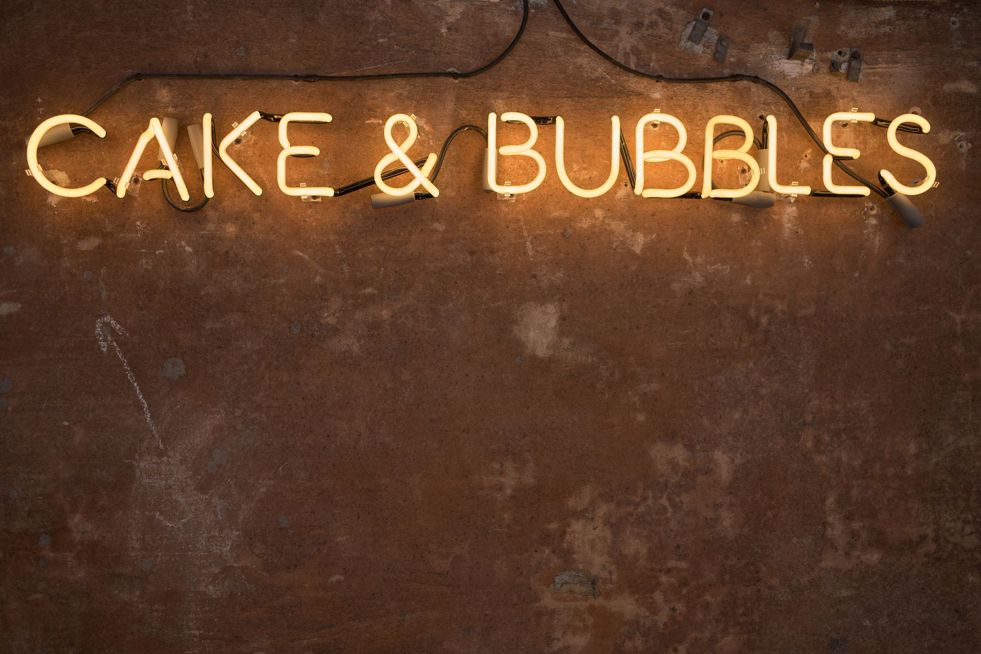
DA bureau’s new project was the interior reconstruction of a gastro bar, Cake&Bubbles, located within the walls of The Third Place castle. The culinary haven offers light but delicious breakfasts and desserts, with a choice of sparkling wine—while in the evening it’s the perfect place for a nightcap and some snacks. And such a unique concept requires a truly special visual experience, which the architectural firm has dreamed up using an unusual combination of materials.
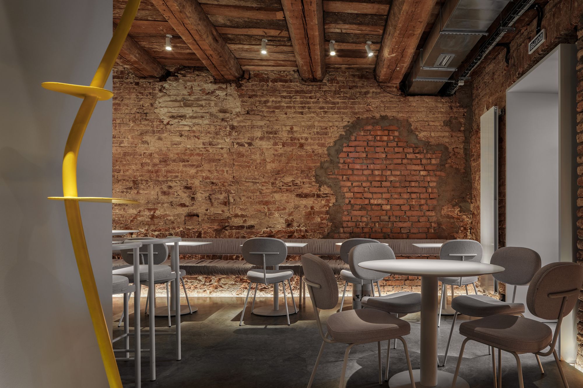
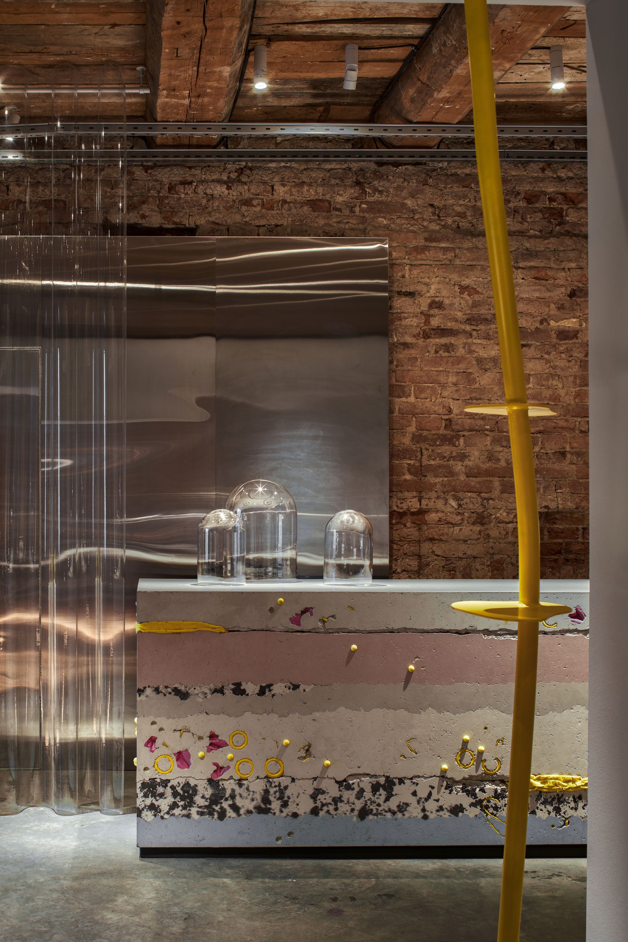
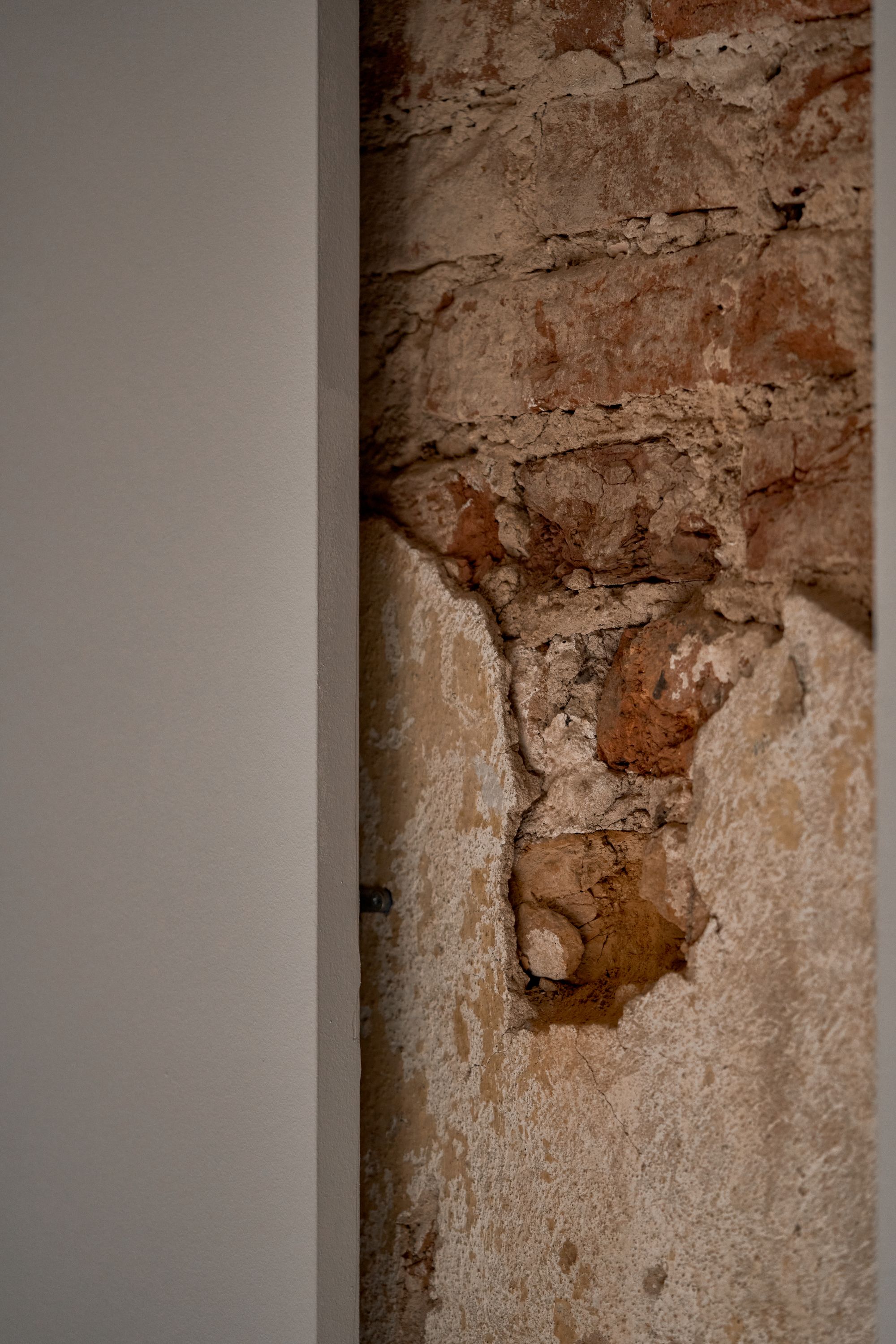
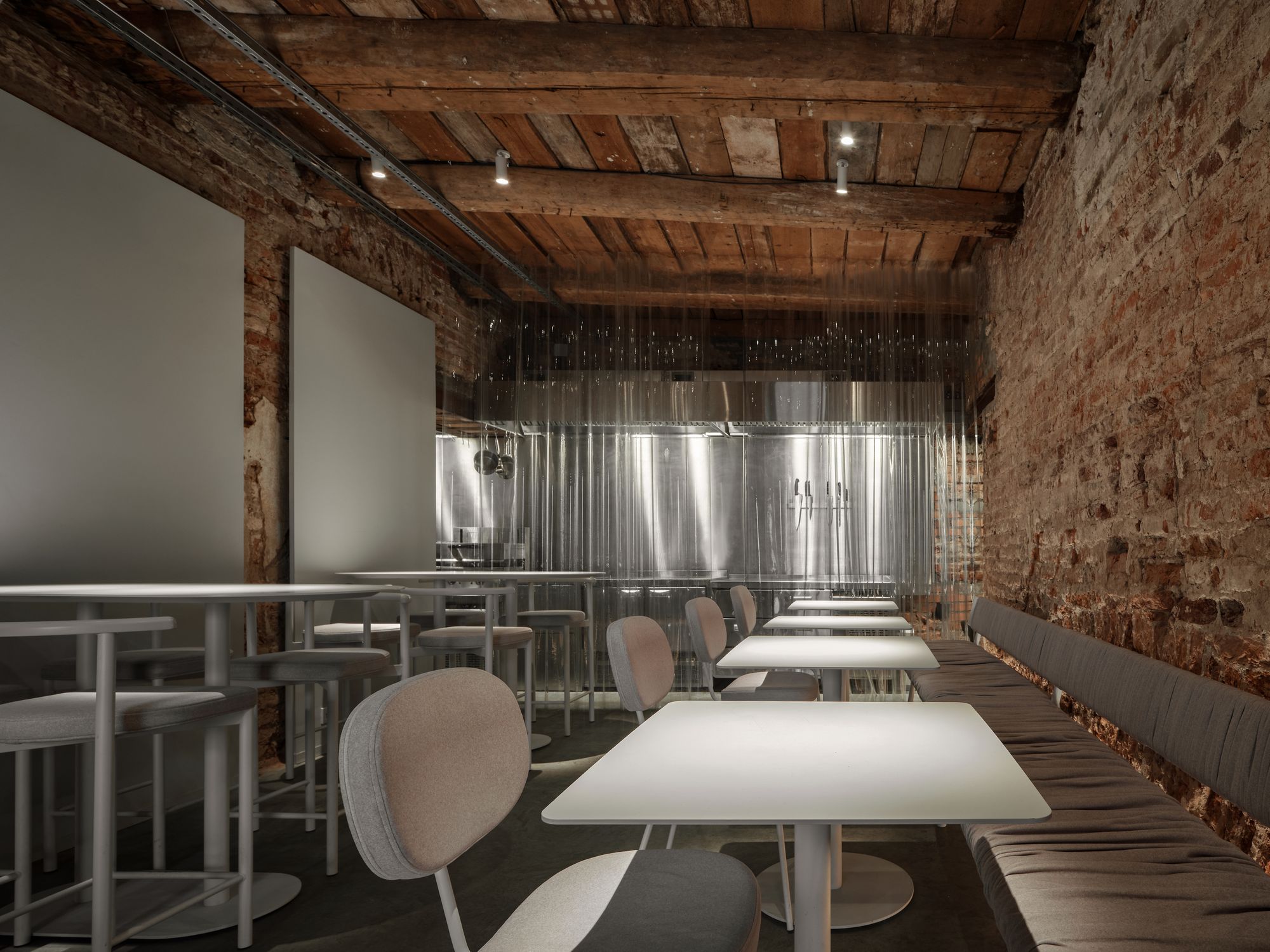
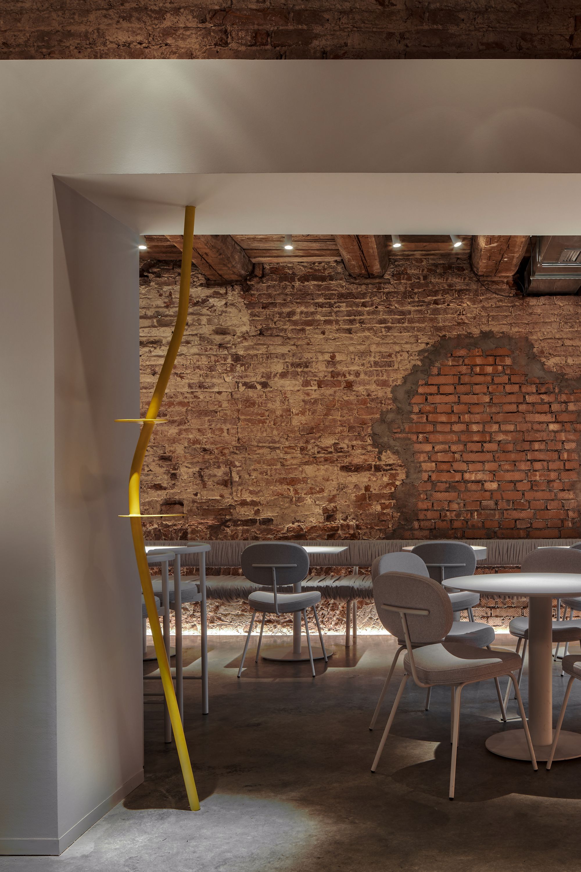
The starting point was to retain the original walls of the room, which define the space’s character while acting as a perfect canvas for the new elements. The contours of the room are reinforced by the wooden beamed ceiling, which survives from the 19th century and establishes the aesthetics of the space’s ethos. The minimal restoration of the walls has been refined with simple partitions that also enhance the interior’s distinctiveness. To enhance the untouched effect, every detail is designed with a minimalist approach, resulting in an overall cocktail that is both rustic and modern, in keeping with the identity of the place.
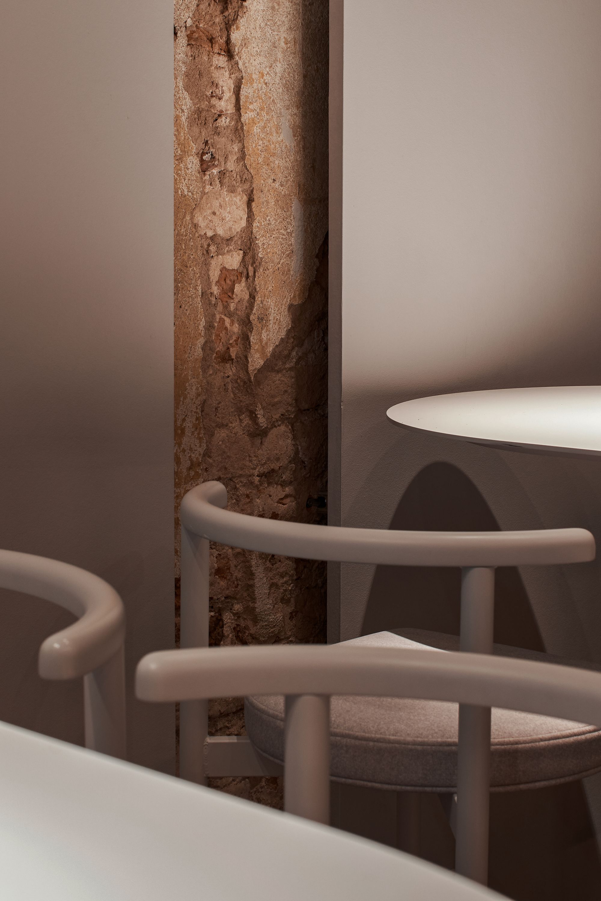
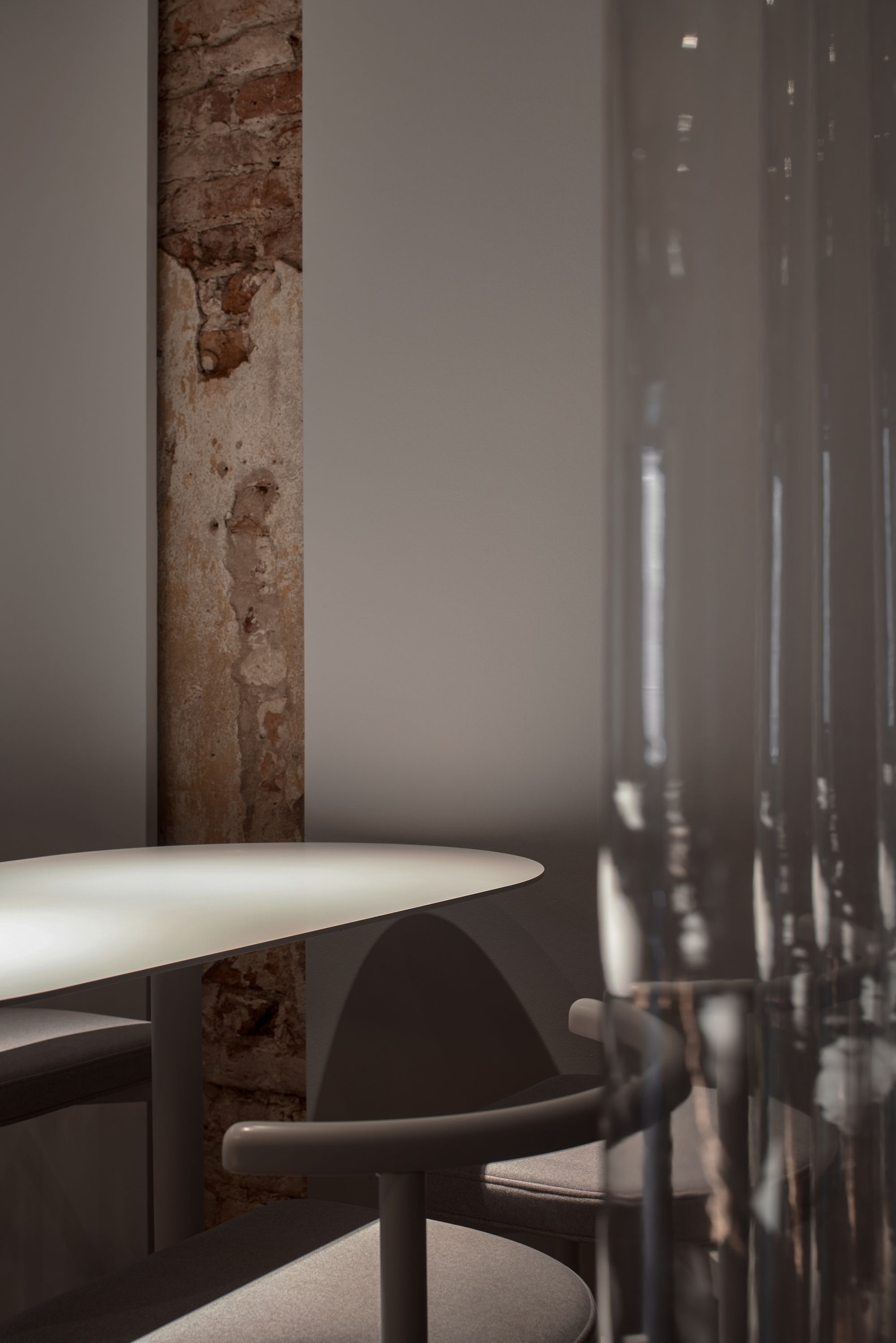
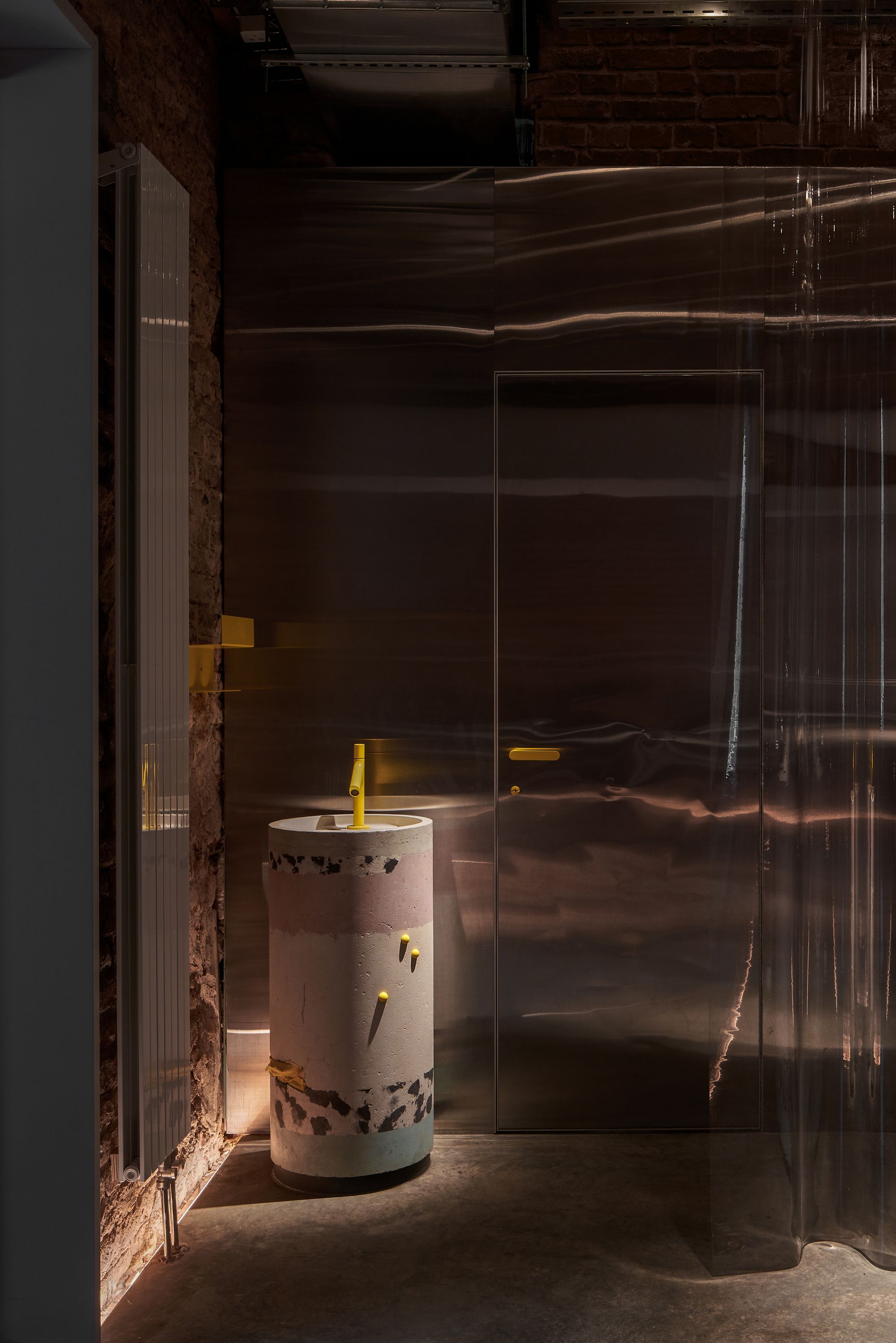
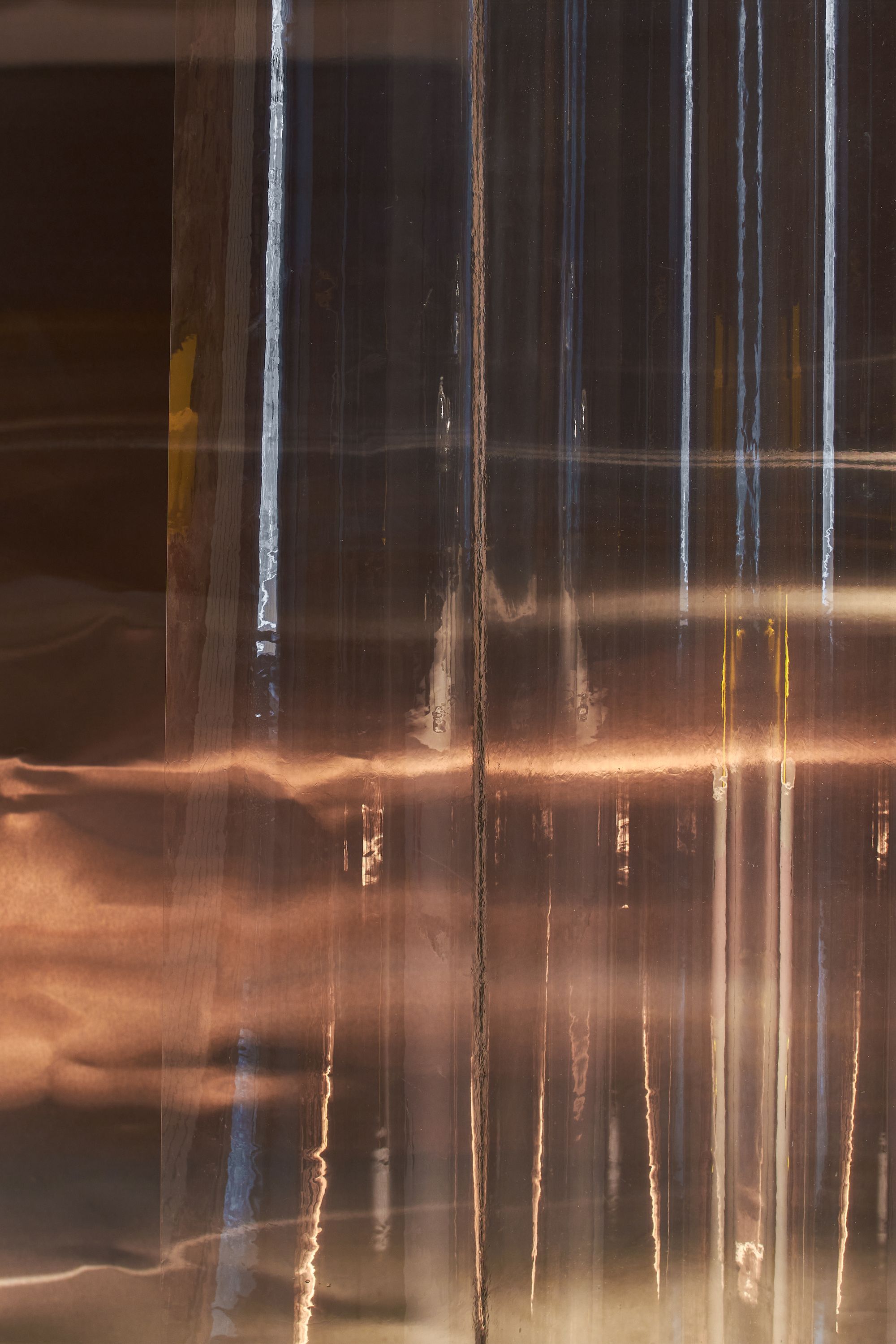
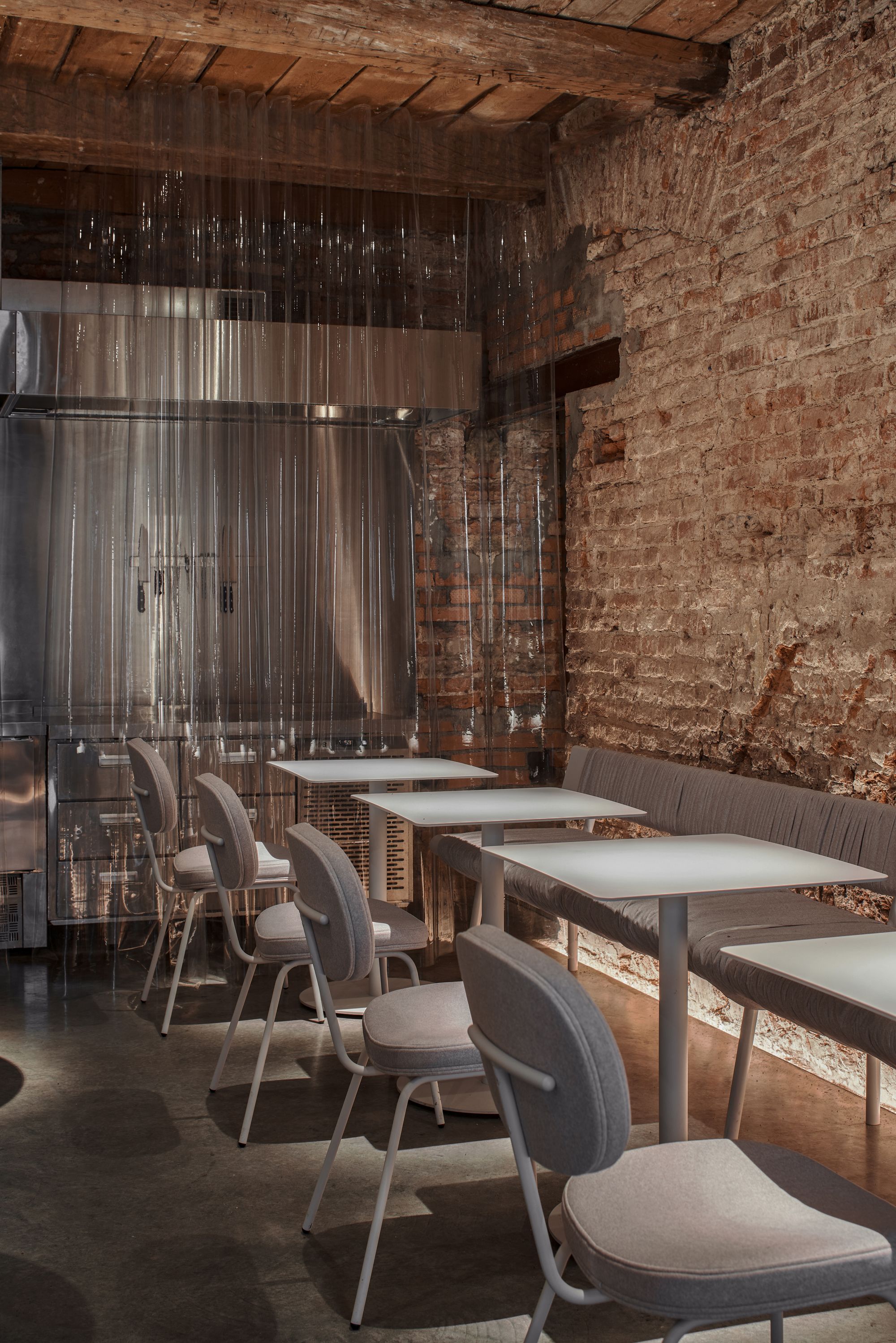
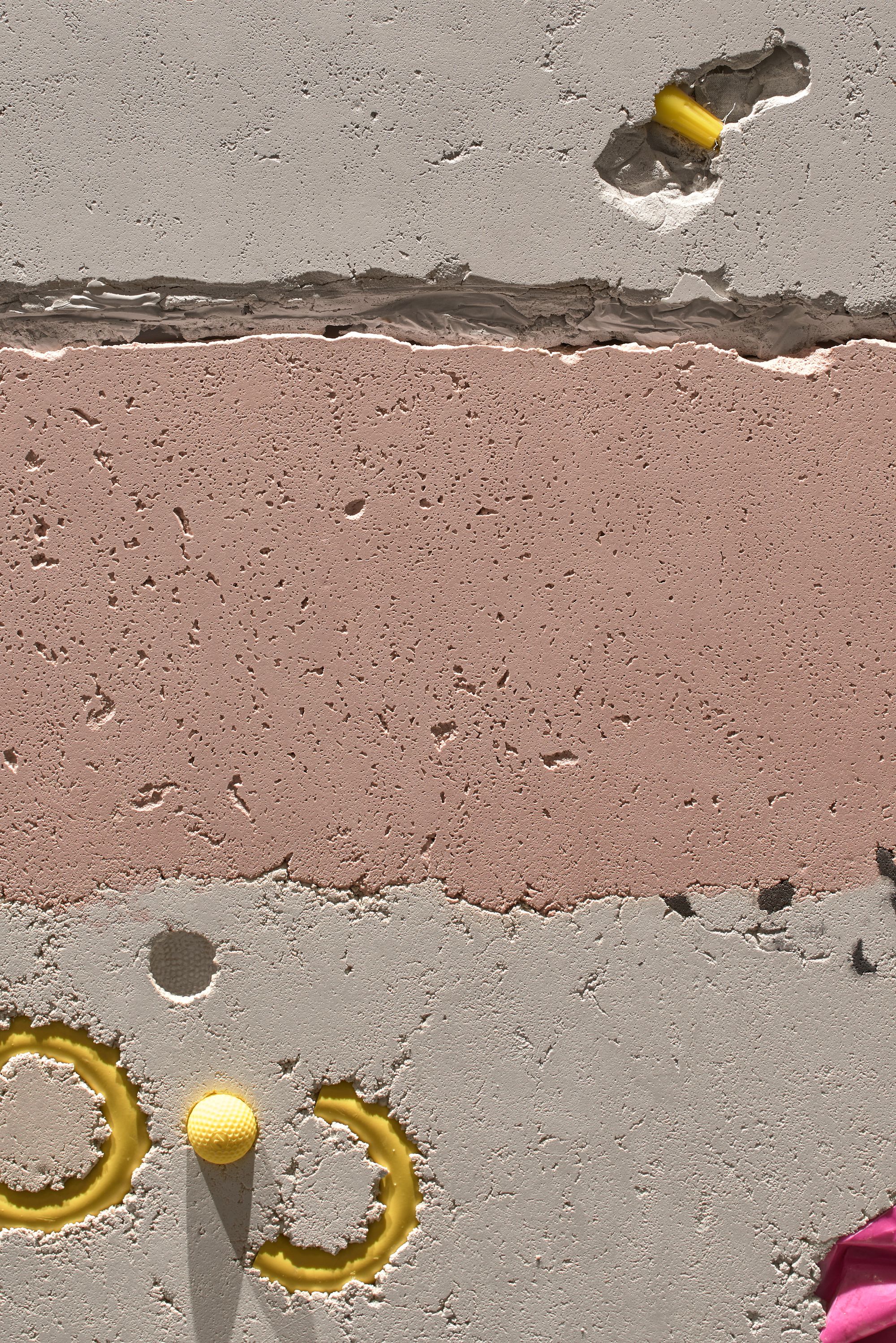
Contrast is the secret to a casually elegant look. The play of contrasts spices up the space’s image: the simple furniture in a centuries-old setting, the unexpected appearance of materials, and the wood–metal interaction could suggest dissonance, yet it shows a perfect coexistence. The most interesting details are perhaps the tiny artifacts molded in concrete mortar, whose overall effect is reminiscent of cakes and layer pastries, and the name of the gastro bar is also strongly revealed in this symbol. However, the creative use of materials doesn’t end there. Due to lack of space, all the technological needs are limited to a single area, with the kitchen being an extension of this, leaving an open space. It visually unites the catering and the reception area and, as a bonus, it gives you the impression of being welcomed into one’s own home. A plastic strip curtain divides the space, adding a touch of mystery to an already interesting interior.
Designers: Anna Lvovskaia, Boris Lvovskiy, Fedor Goreglyad, Maria Romanova, Daria Rogozhina
Photos: Sergey Melnikov
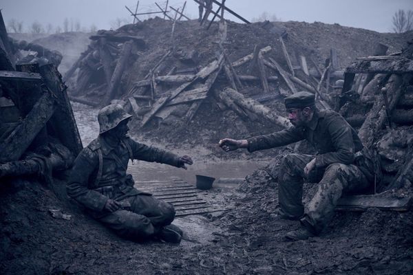
BAFTA awards Czech sound engineer
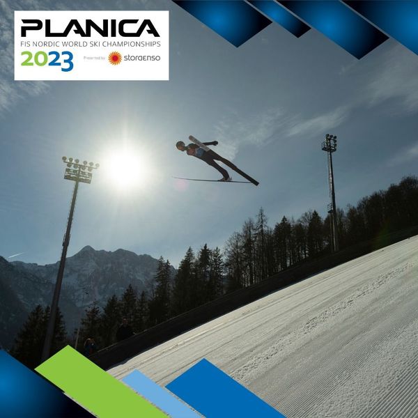
Nordic World Ski Championships start today in Planica, Slovenia
