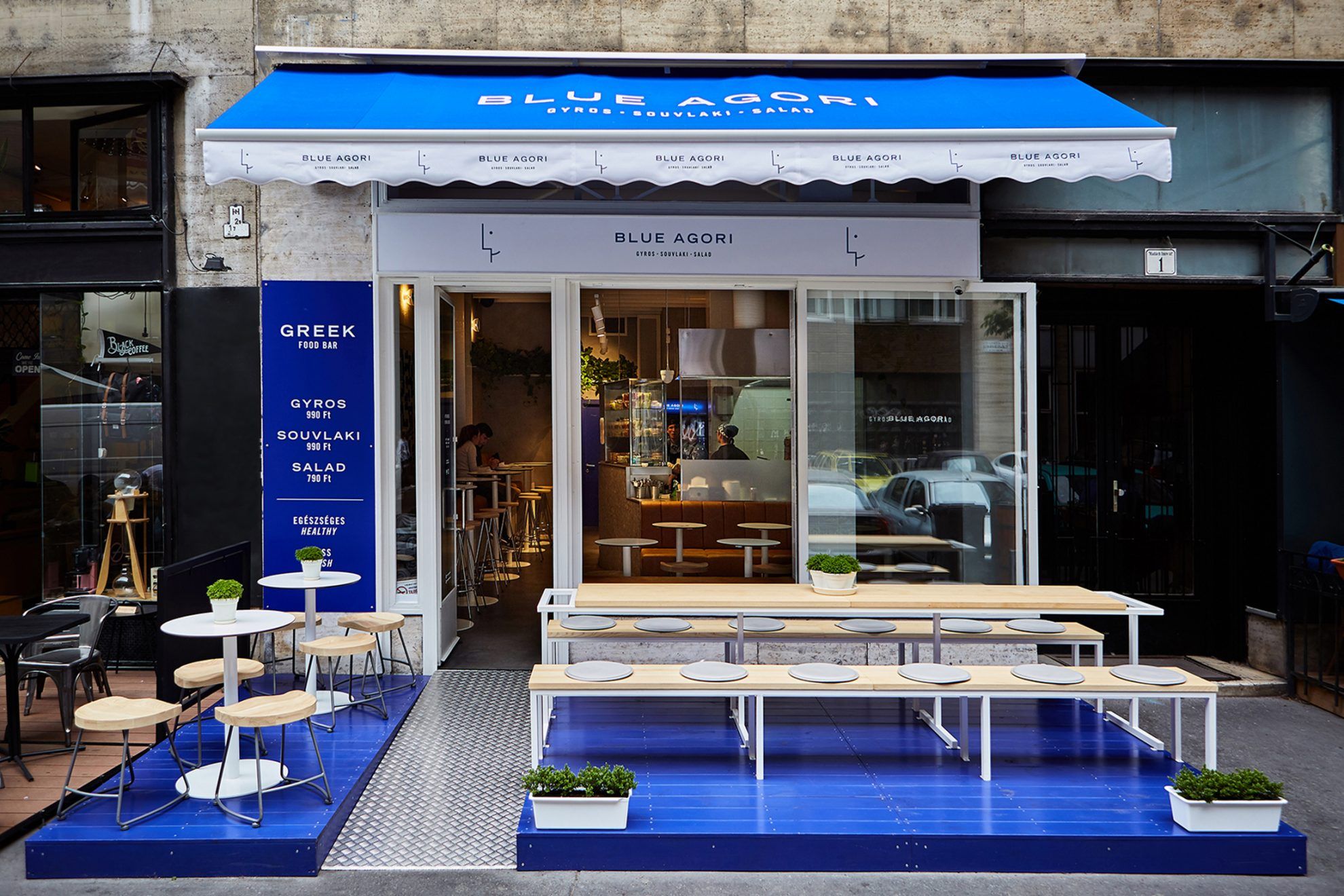
Traditional meals served with a slight twist and distinct graphics, or a new take on Greek street food: Blue Agori, the popular restaurant in Budapest has already opened a second unit, and the third one is also on its way. We not only love the restaurant for its unique flavors, but also for its one-of-a-kind visuality, designed by David Barath Design.
Blue Agori wanted to stand out from its competitors from the very beginning: its concept breaks with the usual Greek fast food stereotypes both in terms of gastronomy and visuality. This aspiration already shows in their choice of name: instead of the names of Greek deities or other well-known Greek words, the restaurant received the name blue agori, meaning blue boy.
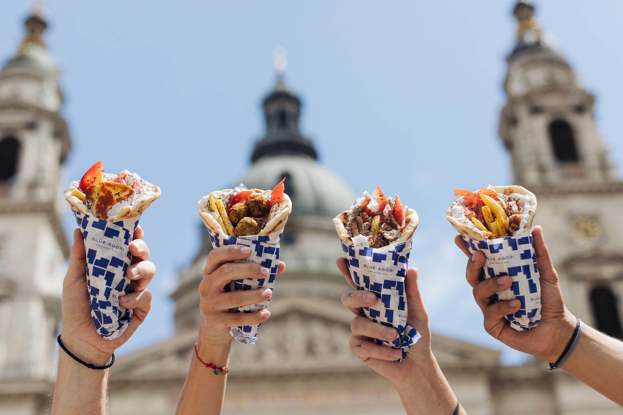
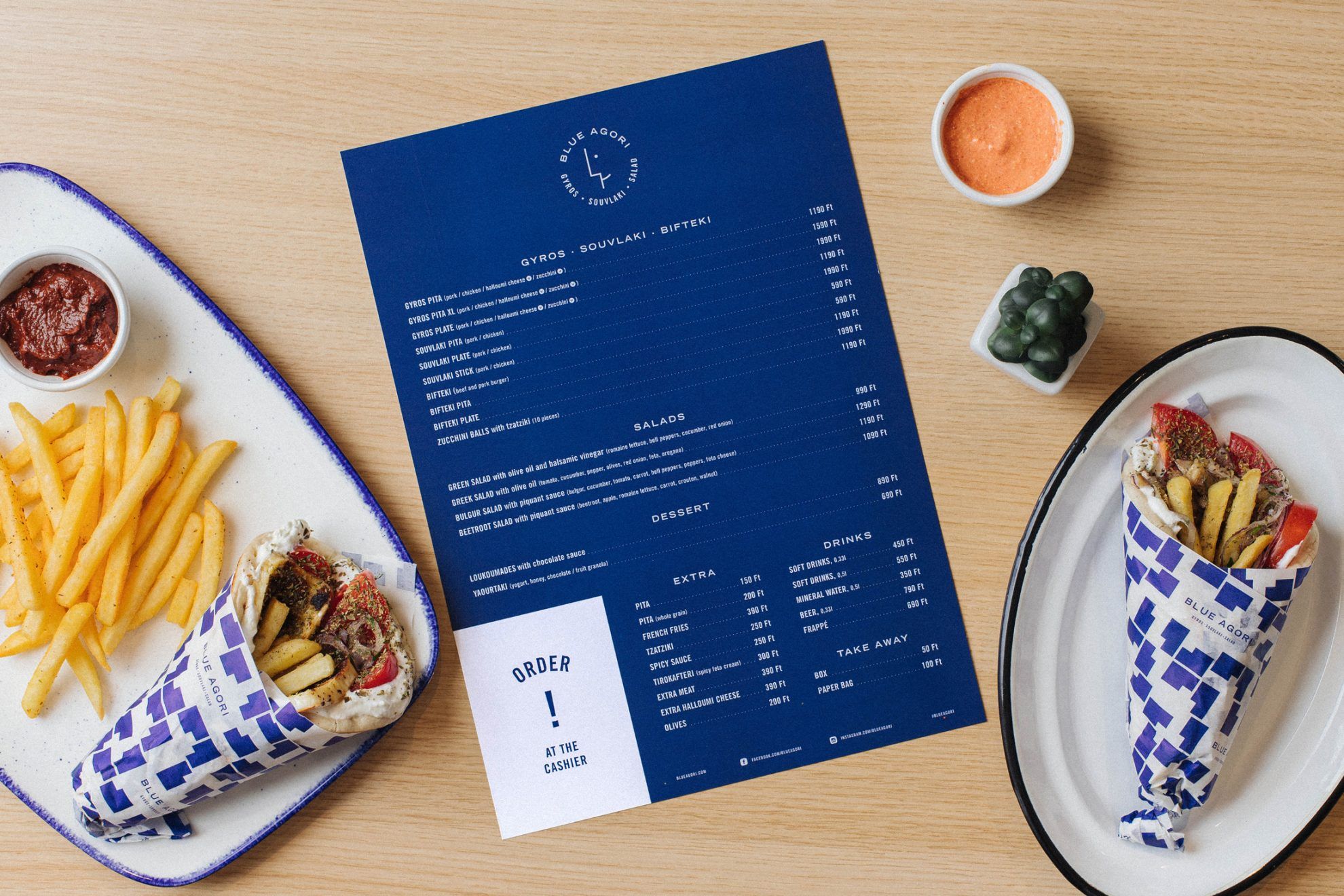
When creating the repertoire of the restaurant, the team went all the way to Greece to find the best ingredients and recipes. Thus the menu offers healthy, light versions of traditional meals made of quality ingredients: for example you can order gyros pita or as a plate, with spicy fries, or with extra halloumi cheese. The menu also features a souvlaki plate, Greek salad and other must-haves, such as olives and tirokafteri, a spicy feta cream – to only mention a few examples.

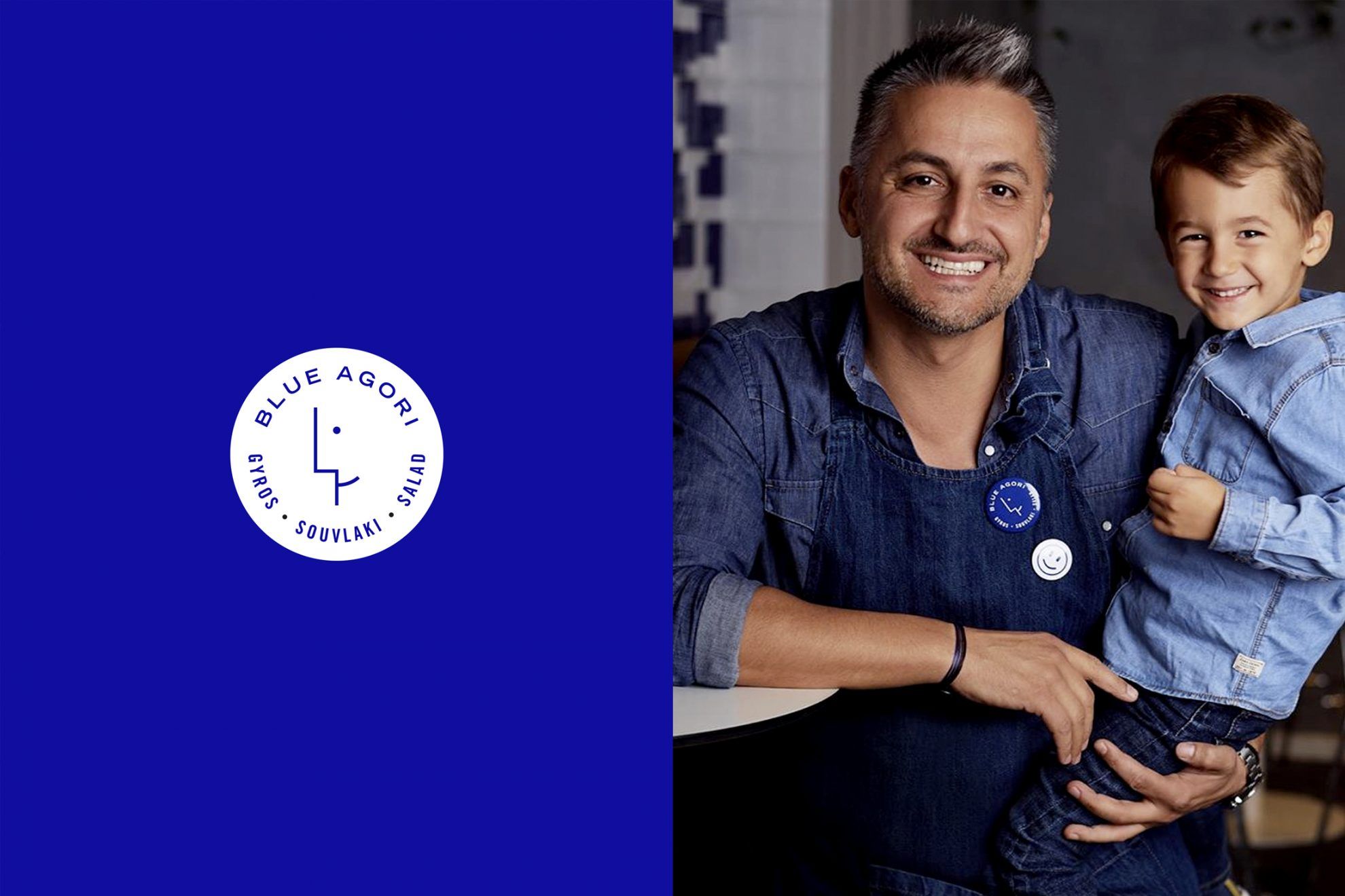
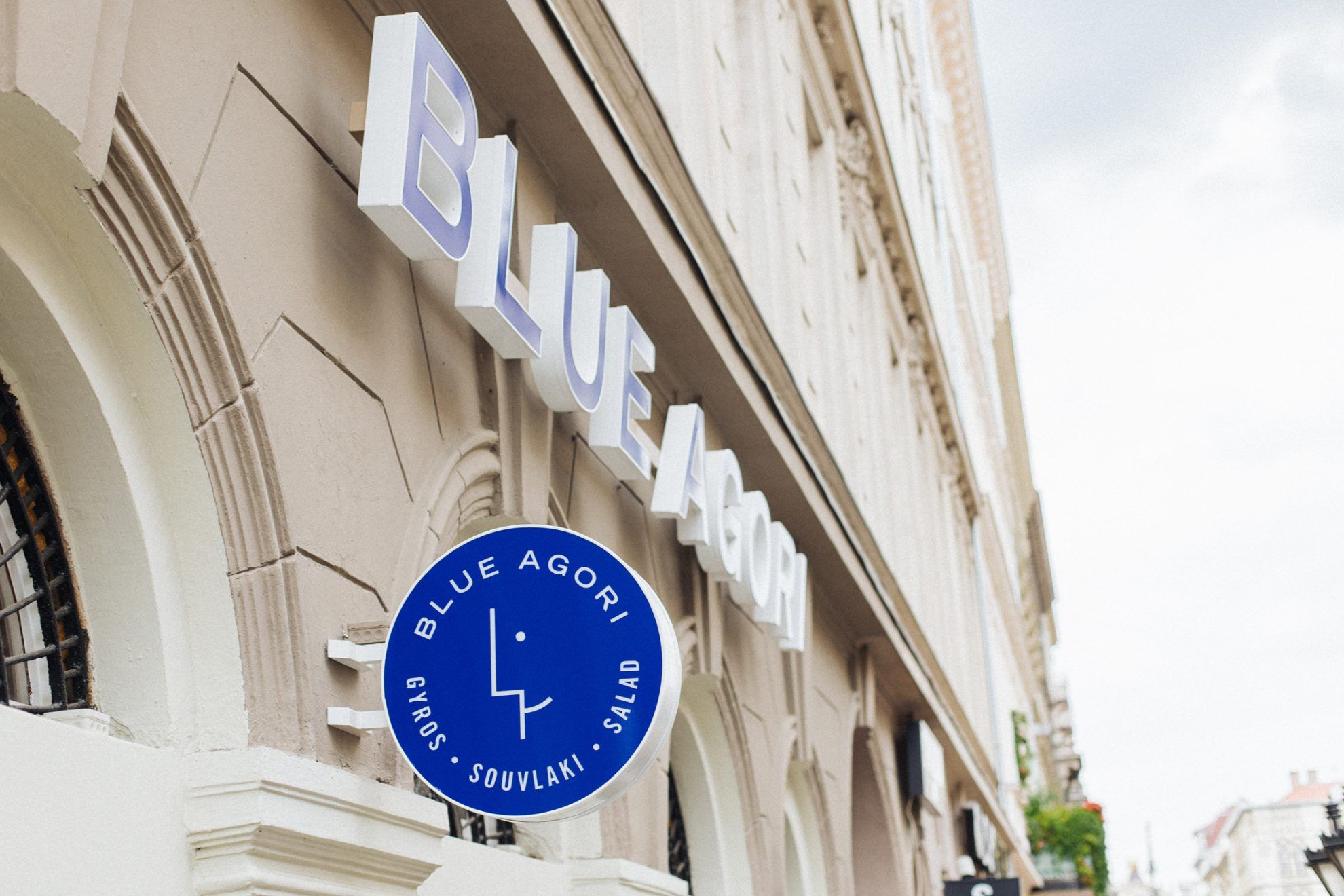
The Blue Agori is not only fresh, modern and urban in terms of its flavors, giving a symbolic nod to Greece: the combination of traditions and a fresh spirit also echoes in the visual identity, branding and interior of the restaurant. The appearance of the restaurant is made recognizable by a visual world built on the color blue, with a simplified Greek portrait as the central element – thus alluding to the fact that one of the owners, Stavros Koranis is also Greek. The portrait appearing in the logo is displayed in the various elements of the visual identity in diverse manners, sometimes abstracted even further.
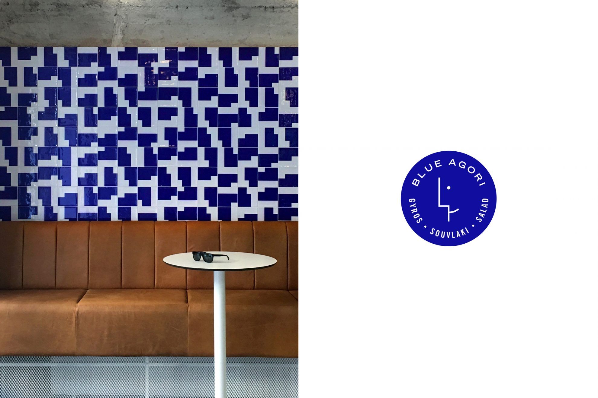
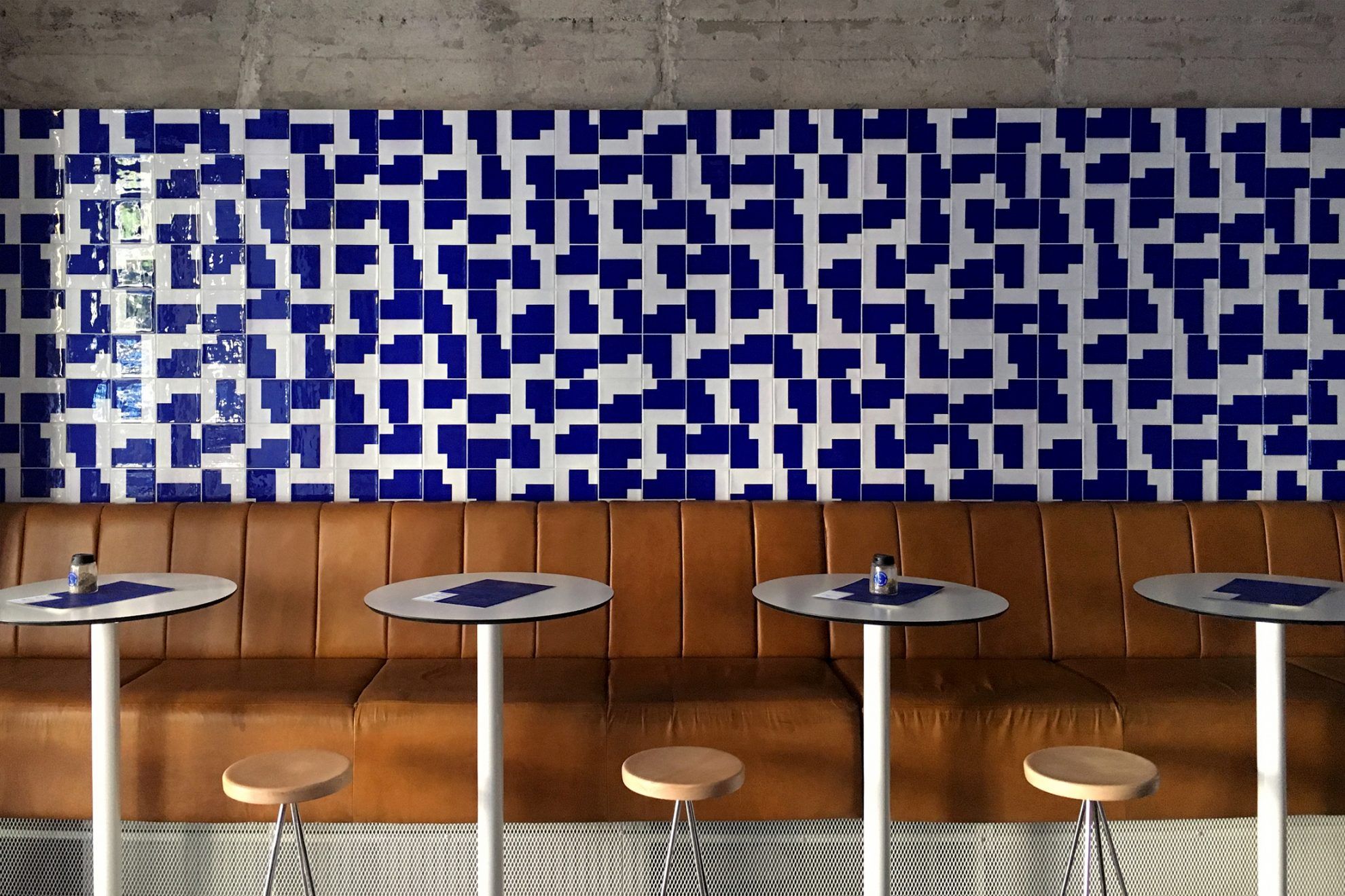
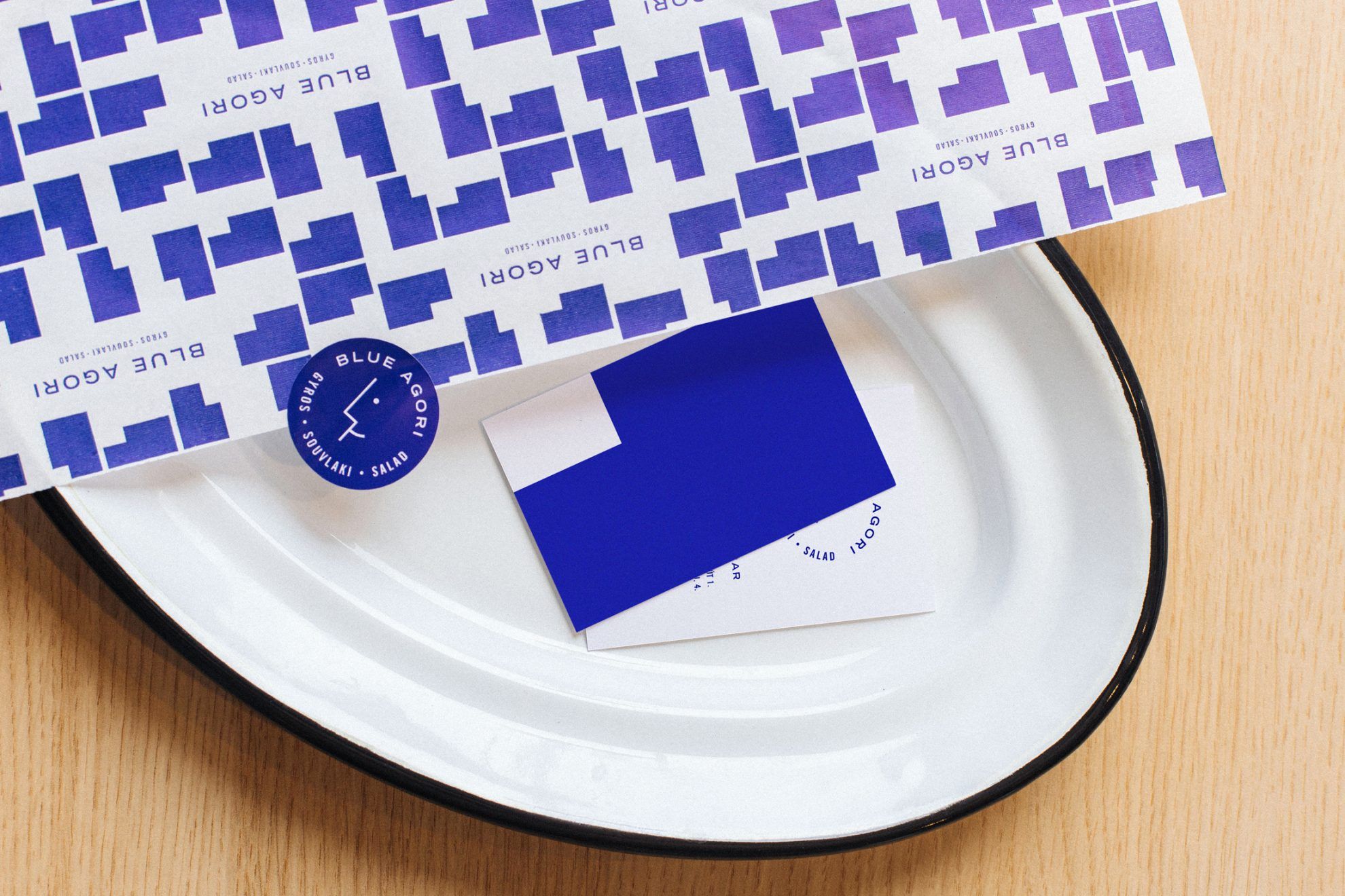
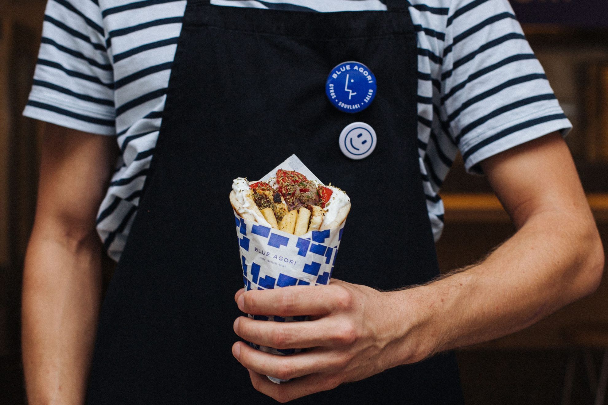
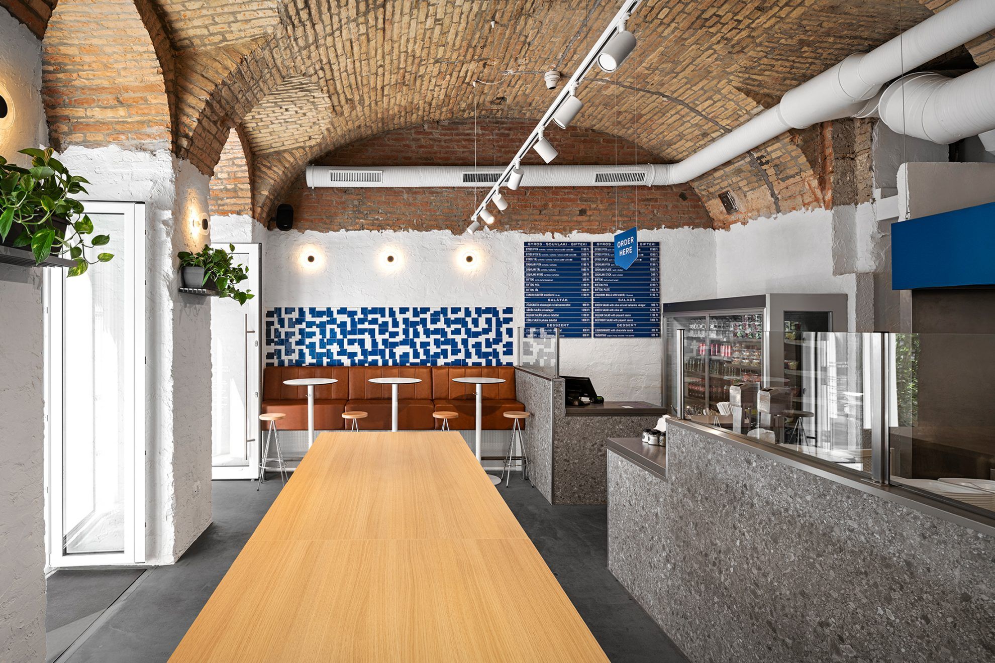
In addition to the menu, the business card and the packaging, the most emphatic element is the custom-made, tiled wall created in the interior, made in line with the ideas of the designer, Dávid Baráth, by multiplying and rotating the main element of the visual identity to form a pattern. The pattern created by multiplying and rotating the blue profile also appears on the packaging materials, thus the food made for takeaway promotes the Blue Agori brand as a sort of mobile advertising space in downtown Budapest.
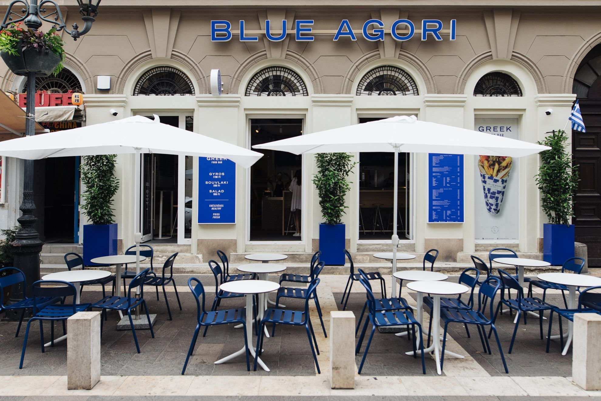
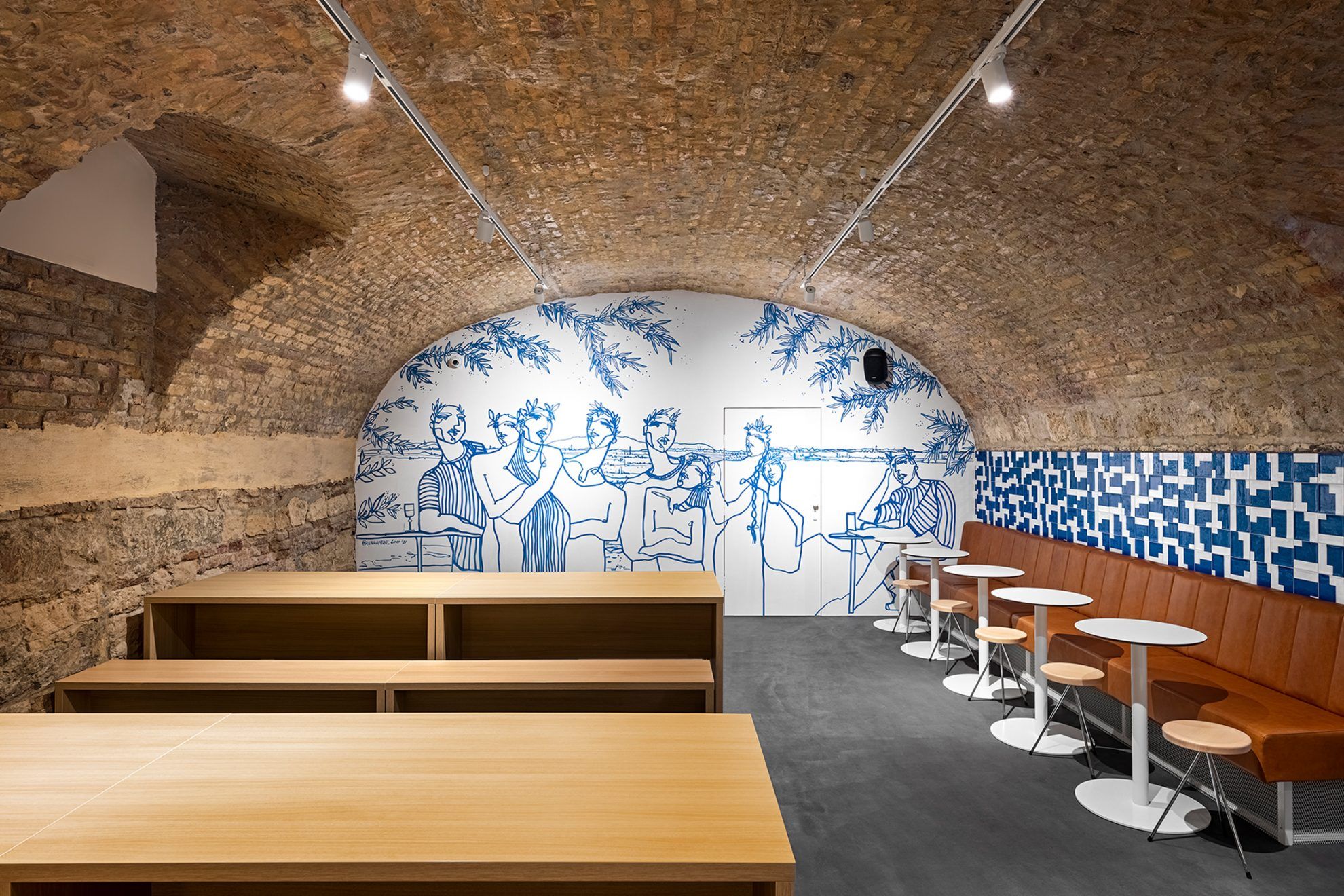
After the success of the first unit in Madách tér, they created and opened the second Blue Agori in Hercegprímás utca with an expanded menu, on larger premises. The first floor of the restaurant is dominated by industrial materials and surfaces including concrete, wood and leather, completed by the iconic tiled wall in several places, while the ground floor welcomes guests with a simpler, easier and more laidback vibe. Here the central element of the interior is a mural, with which, as also told by Dávid Baráth, “the goal was to lighten up Blue Agori’s strong, bold, abstract and geometric world. As Blue Agori means blue boy, we thought we would display a group of people dining in a Mediterranean atmosphere, also alluding to the scenes seen on antique Greek amphoras. We wanted to bring these antique, figurative scenes into the restaurant in a more modern spirit.”
With Dávid as the art director and based on his instructions, the painting was made by Anna Oláh, the founder-designer of the Anna Amélie clothing brand. “Anna, who herself has many ties to Greece, understood what we wanted immediately and created a drawing that reflects Blue Agori’s spirit and mentality perfectly” – Dávid highlighted.
The good news for the fans of more unusual Greek meals is that the restaurants’ owner team is already thinking about creating a third unit, this time in Buda, in front of the new Széllkapu park, where they would welcome guests with new dishes and design solutions. Until then, make sure you pop by Madách tér or Hercegprímás utca, and give their delicacies a try!
Blue Agori | Web | Facebook | Instagram
David Barath Design | Web | Facebook | Instagram
Source: David Barath Design
Weekend house romance reinvented | Studio Bunyik
Edinas paper’s creations on the main street of Košice
