When we think of a healthcare facility, what pops into mind is not necessarily the friendly and welcoming attributes. Between the often gray, old, cold walls, it’s hard to focus on healing. Yet a carefully planned renovation that places a strong emphasis on aesthetics can create community spaces where doctors, nurses and patients alike can feel comfortable.
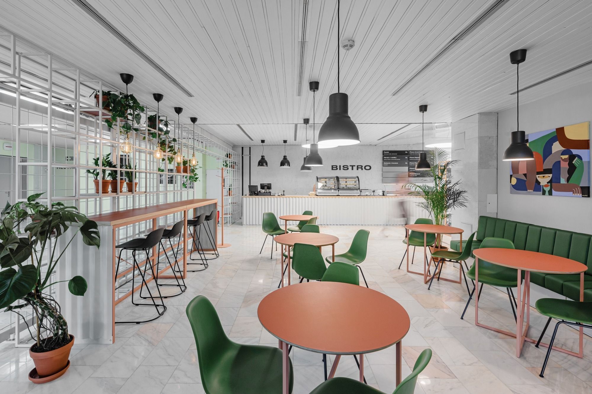
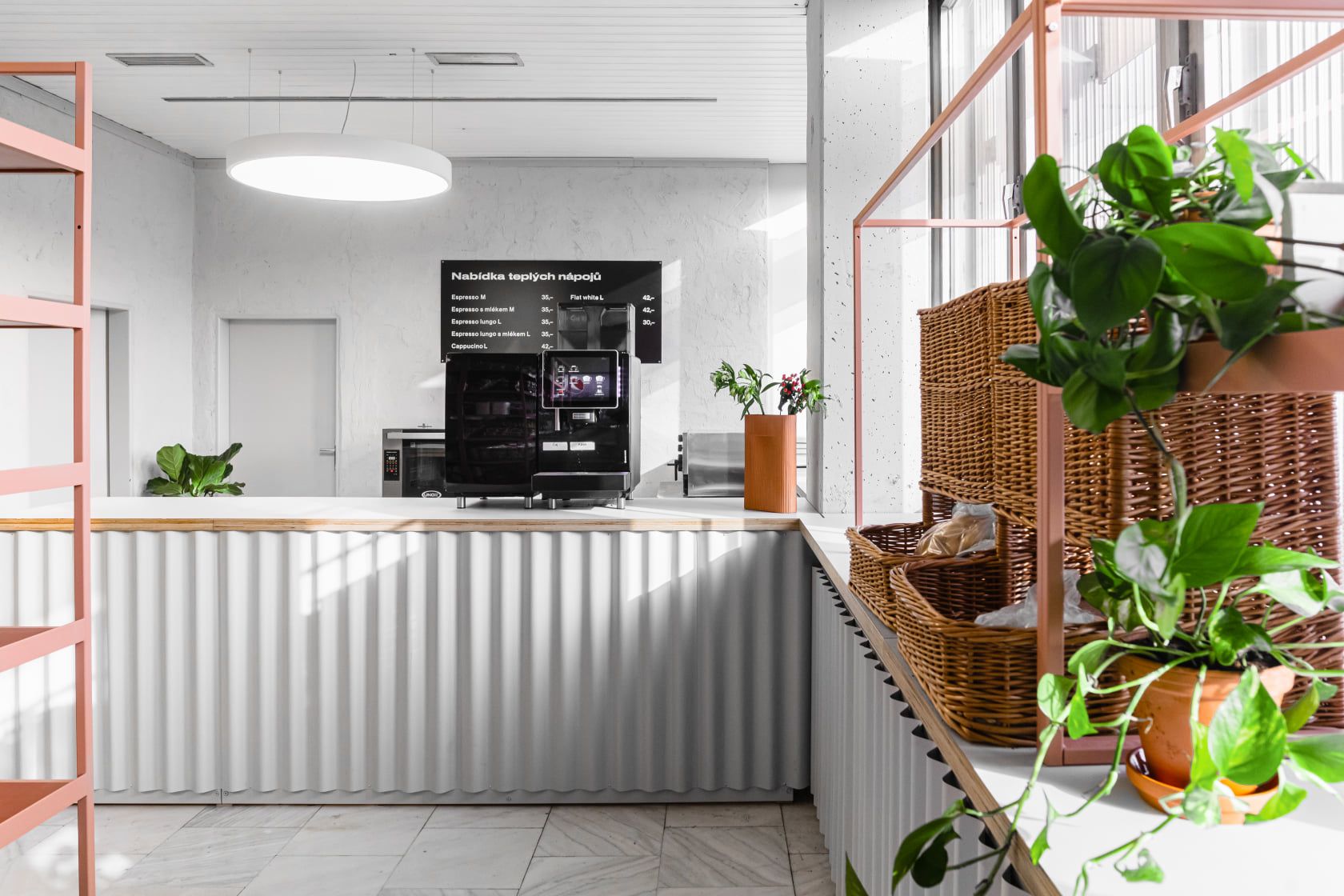
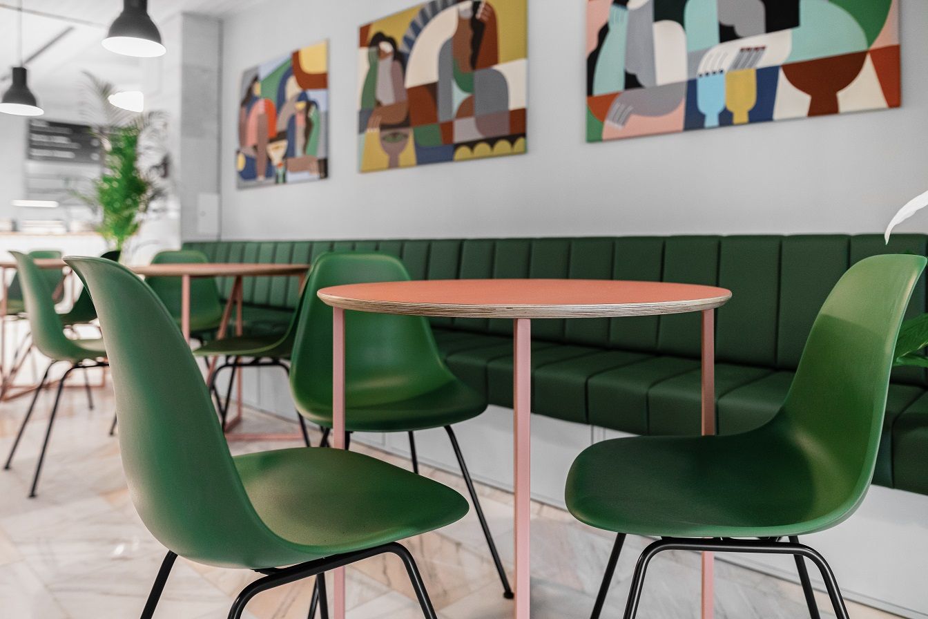
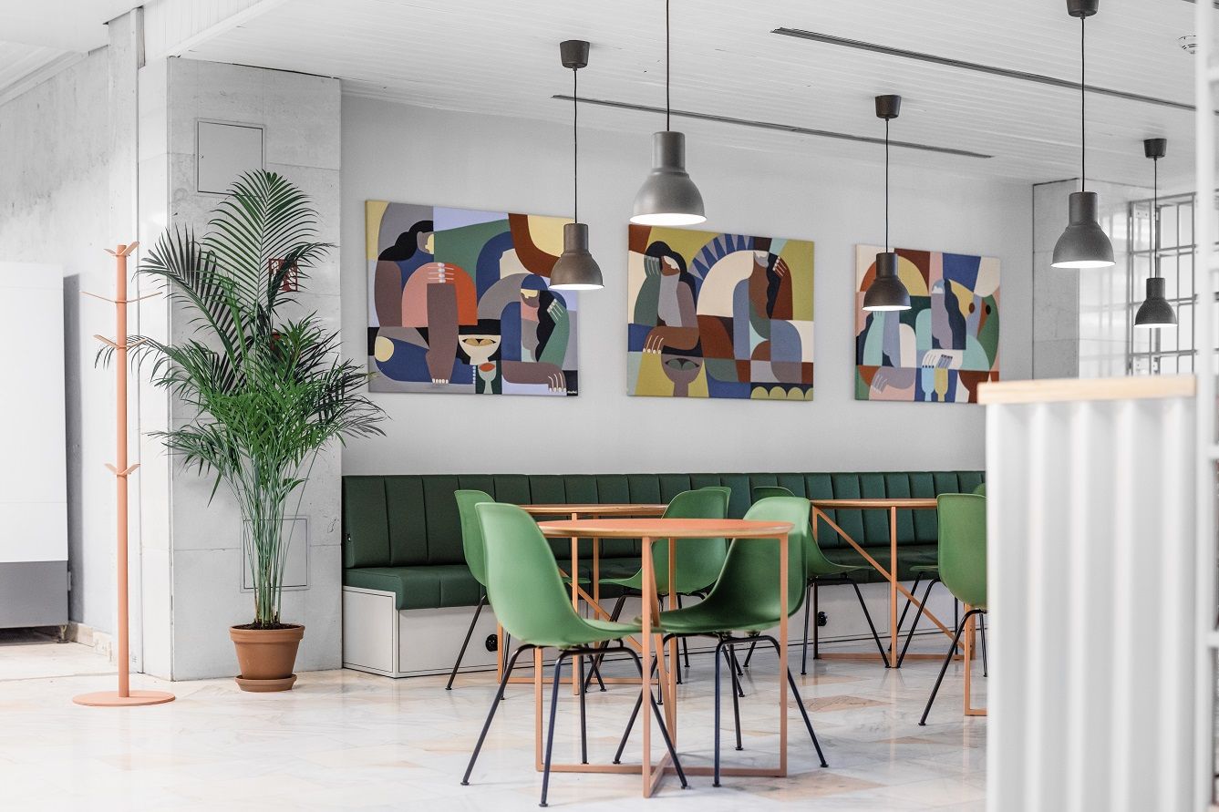
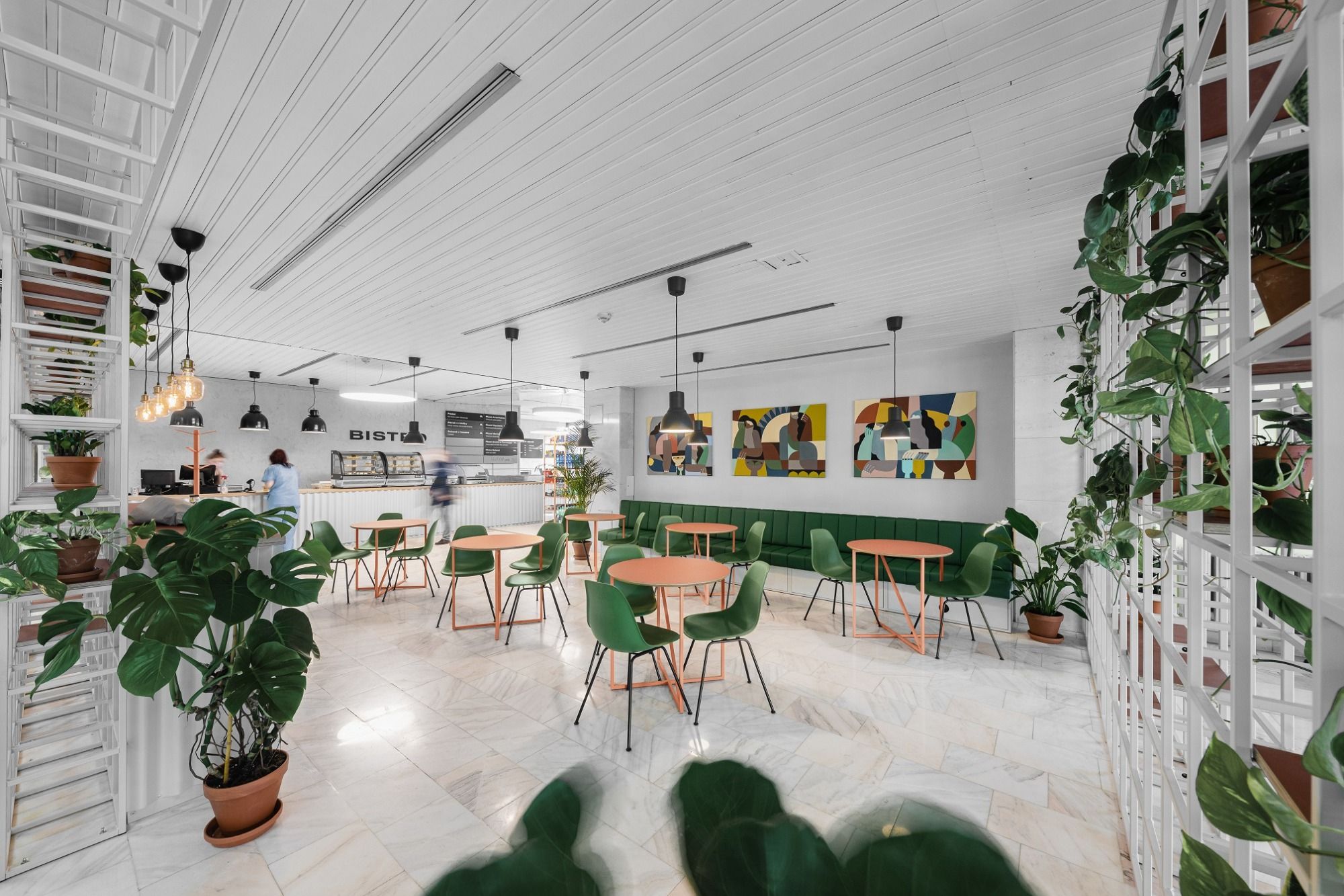
This was also the case with the Bohunice Hospital in Brno, built under socialism, where the professional team of architect Ondřej Saida was entrusted with the task of reimagining the bistro. Simple materials such as the metal used to make the shelves or the corrugated iron sheets covering the counter were used to transform the originally bleak and monotonous dining room. With the removal of the partition walls and the coverings, a minimalist and simple interior has been created, with green armchairs and peach-colored tables as important components. There is also a strong emphasis on plants as decorative elements, which can be found in almost every corner. The pastel color palette is perfectly complemented by the work of the Czech painter Martina Musilová. Images evoking exotic landscapes fill the room with freshness. Because functionality is a primary consideration in a hospital project, the bistro is separated from the hallway by glass panels that can be moved along a rail. This practical solution ensures accessibility for all visitors.
Photos: Oldrich Hrb
Ondřej Saida | Web | Facebook | Instagram
Martina Musilová | Web | Facebook | Instagram
Source: Czehdesign

Digitalization will change all industries | Interview with BCG Chairman Hans Paul-Bürkner

Join and donate for a good cause!
