Anna Farkas aka Anagraphic started to design and realize her childhood dream, Anaptár, a special informative poster calendar based on data visualization eleven years ago. As a way of proving its uniqueness, the calendar indicating the alteration of sunrises and the distance between the Earth and the Moon, amongst others, won a Red Dot award in the category of communication in 2015 – and did not stop just there. Word travelled fast about the novel and extremely unique circular calendar, and so it is no wonder that Anna has gained returning customers from many countries over the years – a total of 36 versions were made of Anaptár recognized with several professional awards broken down to 13 cities of the world, in five languages since 2009. On top, Anna’s DLA dissertation successfully defended this year titled ‘Anaptár, művészet és tudomány metszéspontja’ (Anaptár, Intersection of Art and Science) won another award, and not just any award: it became the Best of the Best in Red Dot’s brands & communication design category.
“I don’t want to sound too emotional, but the all this has such a beautiful span – I imagined something, which we then implemented, I have been working on it for years giving it all I have, and then there is a little success, and then we add something else to it, something deeper, which gives another momentum to the story, and it’s all topped off with an award like this” – reviews Anna Farkas quickly the past eleven years. Perhaps we are not exaggerating if we say that this project is just as whole as the shape of the calendar. And the 18 and half years of the entire lunar cycle have not even passed yet…
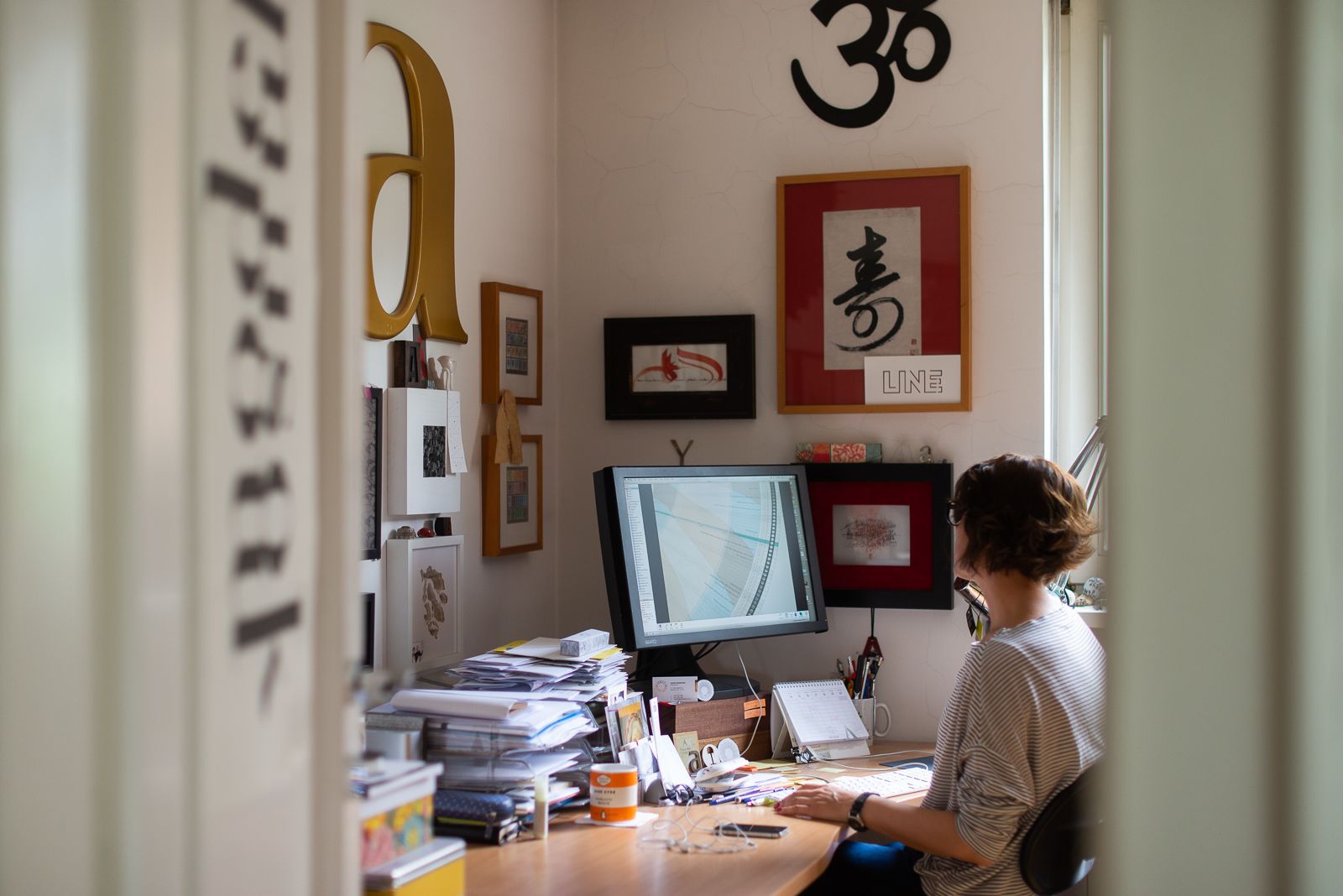
We interviewed Anna Farkas on a Wednesday afternoon while sipping coffee under the Starry Light lamp created together with her husband, Miklós Batisz, about this important recognition by also discussing the most important stages in relation to Anaptár.
From book of hours to her own sky
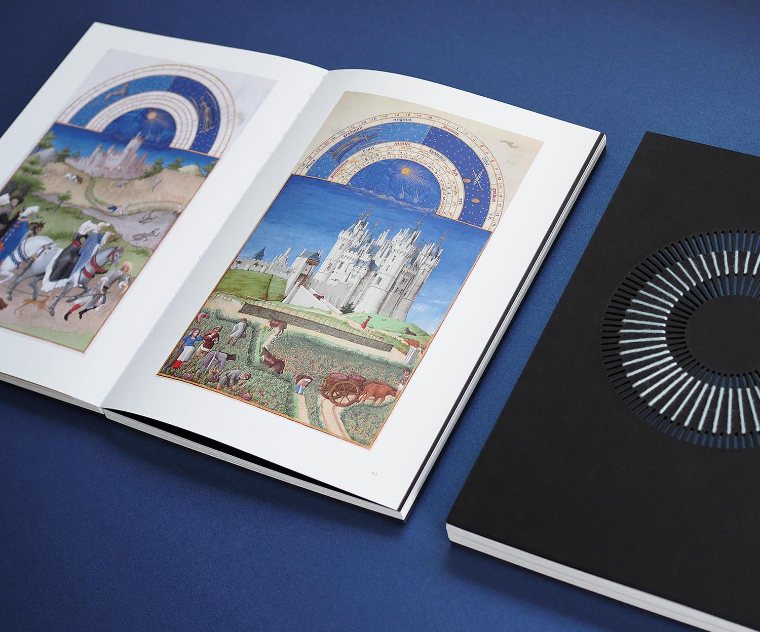
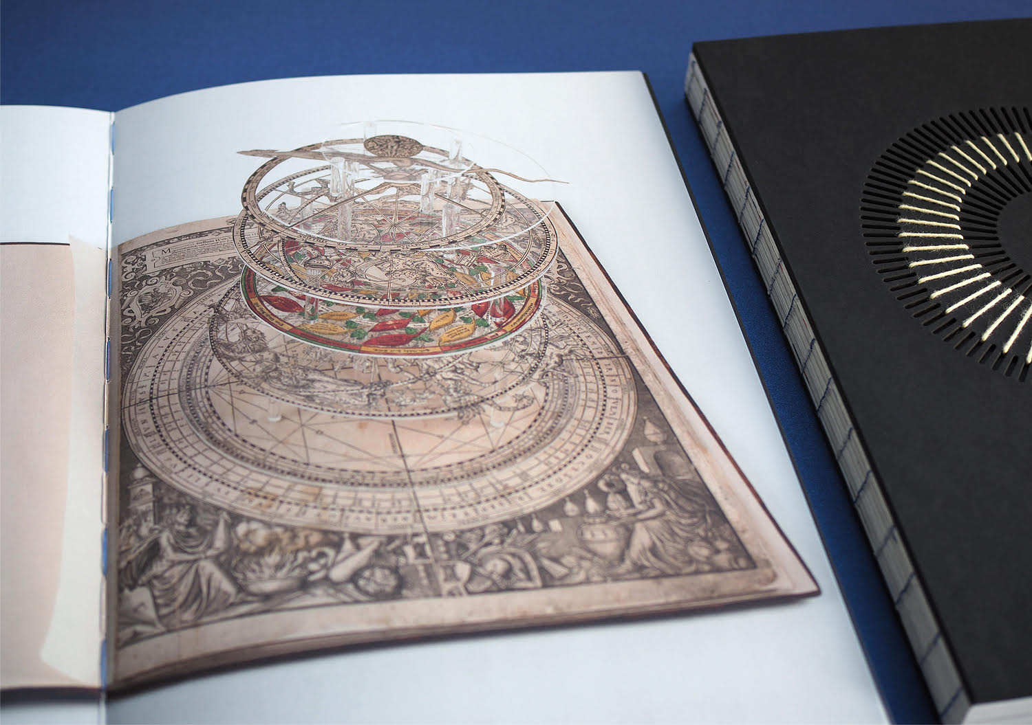
When she was a child, her family used to live in a detached house with a garden, and Anna snuck out many times during the night to watch the stars and listen to the crickets chirping. This was a dominant experience for her, which was further enhanced by the book of hours of the Limbourg brothers, the most prominent miniators of the era (a prayer book decorated with biblical scenes, the images of saints, plants and animals – the Ed.). “My mother got this book from Italy, and it really caught my attention. I could look at the images in it for hours – the swimming guys, the little monsters and of course the illustration of the months. The latter really stuck with me. Most probably the hemispherical calendar depictions placed on the top of each page displaying the months I discovered here inspired me to create Anaptár. This visual expression started the development of the unique depiction of the lunar cycle data in a spherical shape” – Anna told us.
The graphic designer has always imagined the year as a circle, she does not view the passage of time in a linear manner. It was this and the unique and continuously changing, cyclical movement of the Moon that encouraged her to dive deep into the scientific understanding of the issue.
Anaptár 2009
Eleven years ago finally she felt it was time to realize this old dream of hers. The work was preceded by several months of extremely thorough research. In the absence of Hungarian literature on the topic, Anna had to look up everything in a foreign language, and it was also difficult to find the sites that described the processes in a relatively comprehensive manner (not only for scientists). However, all the search led to good results: when she converted the data obtained – with the help of Miklós Batisz –, the whole system started to come together. “Being a visual person, this is how I understood the movement of the lunar cycle, which does not only consist of the light phases, but the cyclical movement of the distance between Earth and Moon and the Moon’s culmination changes, too. The entire lunar cycle consists of these three factors, repeating itself in approx. every 18 and half years” – Anna adds.
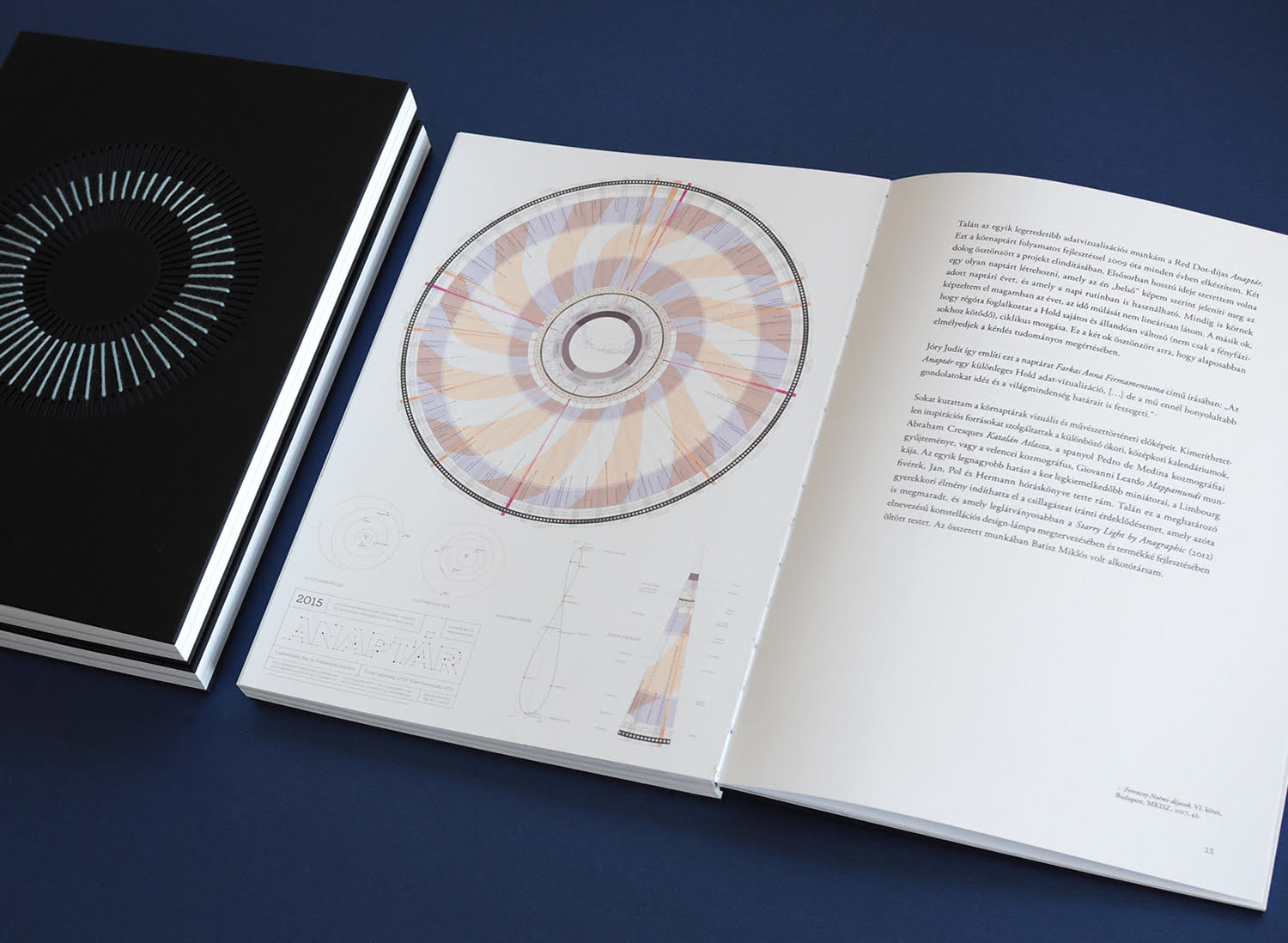
As one can also read in the doctoral dissertation: Anaptár is a unique, informative poster calendar; it’s much more than a traditional calendar. In addition to the enumerating of days, it contains many other important information, such as indicating the movement of planets on the sky via a novel display of lunar and solar data. Owing to the radial arrangement, it encompasses the giant volumes of data used into a visually spectacular, complex yet easy-to-understand system. Thanks to the infographic mapping of lunar and solar data requiring exceptional meticulousness, Anaptár provides visual sensation even for beholders who would not pore over the details.
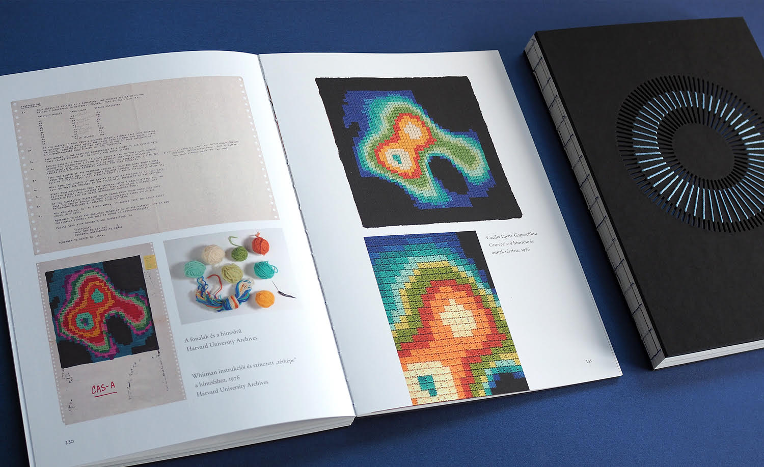
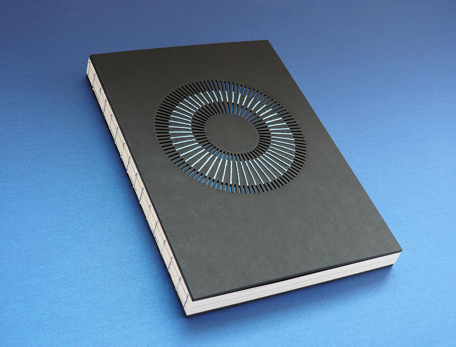
A cover embroidered with days and nights
When Anna started the doctoral school of the University of Fine Arts, she already knew she would write her thesis on Anaptár; as a matter of fact this was mainly why she started the course. “The fact that Anaptár won a Red Dot award in 2015 provided feedback that it was indeed a novelty and a unique creation – by the way, no similar data visualization has been made regarding lunar data ever since. On top, the calendar has been subject to continuous interest abroad, too, and this also confirmed that it has potential, so I decided to explore and examine its scientific background and the related artistic implications. This was when I applied for the DLA course” – Anna told us.
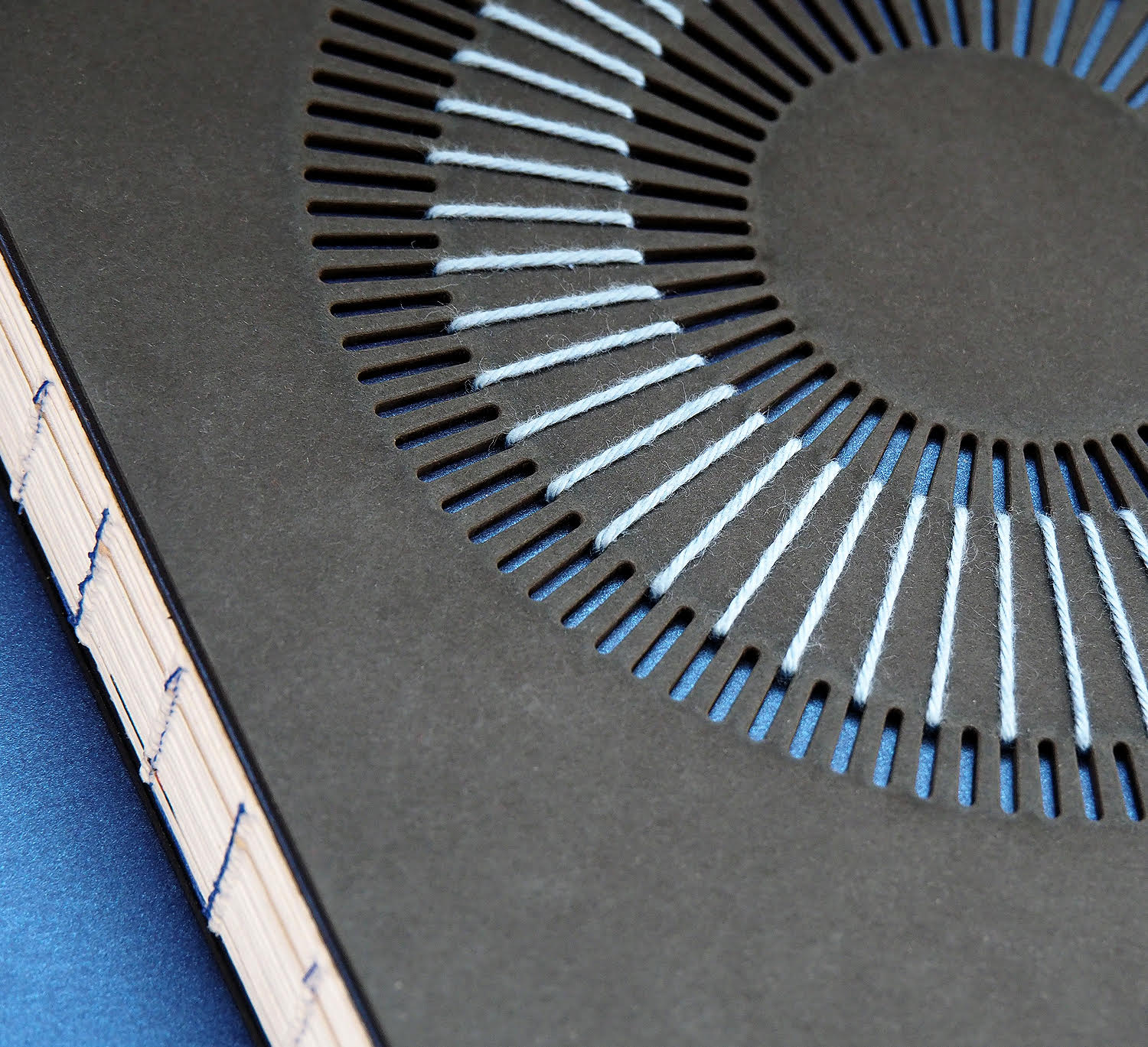
The master dissertation Anna has already defended since then successfully was showcased at the exhibition titled Farkas Anna firmamentuma (Anna Farkas’ firmamentum (the Latin expression means sky – the Ed.) back in 2019 in Hegyvidék Gallery. “To be honest, even though I wanted to create the 3D time spiral of the calendars after the 18 and half years of the entire lunar cycle has passed, finally we created it for this exhibition – it was fantastic to see that it can, indeed, be built together and how exciting it is” – the graphic designer told us. The special cover of the doctoral dissertation was already showcased at this exhibition, inspired by the supernova embroidery of one of the most famous astronomers, Cecilia Payne. Anna took an excerpt from Anaptár – she embroidered the length of days and nights on the stamped cardboards, on the covers of all six copies.
Best of the Best
According to Anna, the fact that she submitted her doctoral thesis to this year’s Red Dot was almost by chance. She was not sure at all whether she was a possible winner, so she was extremely happy when she received the email stating she has won. “At first I looked at it on my phone, and I showed it to Miki. I only realized the attachment a little bit later. I was over the moon when I saw that not only did it win, but it became Best of the Best. Especially considering that this was not a made-to-order job, but a true love project” – Anna explained.
Even though the thesis was not translated to English, so the jury could only examine the volume in Hungarian language, based on the English briefs submitted, they also awarded the scientific thoroughness of the work, in addition to the special design. Red Dot will announce the results officially in October. Whether it will be held remains to be seen due to the second wave of the coronavirus epidemic. “I would be quite happy to walk on the red carpet to receive my award” – Anna adds.
Even though she promised Miklós Batisz that she wouldn’t start a new project after her doctoral thesis, she is already working on next year’s Anaptár, and this will probably remain so in the next seven and half years, until that 18 and half years comprising the entire lunar cycle will come to an end in 2027 – towards wholeness.
Concept to reality | Epic Creations

Prague’s public transport receives a new visual identity | superlative.works