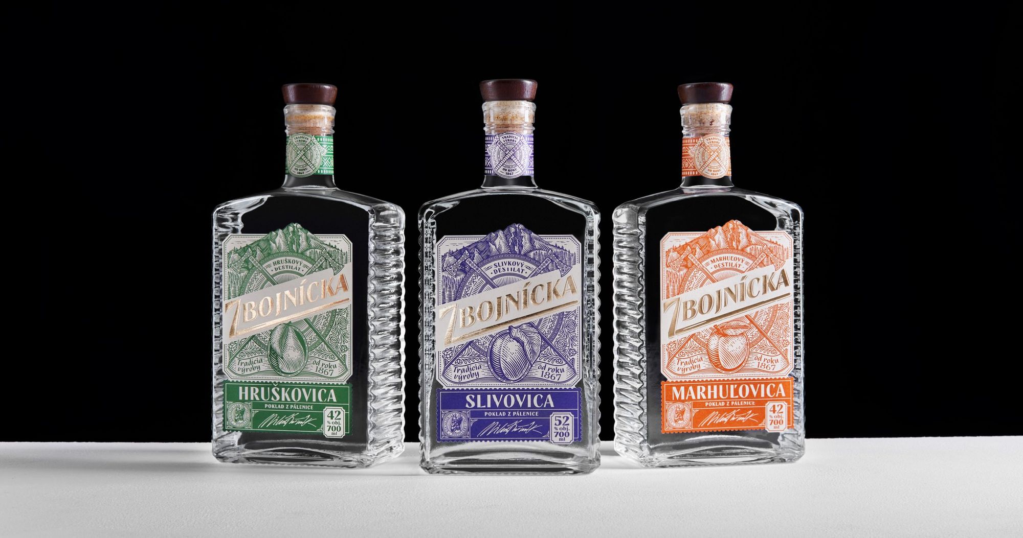
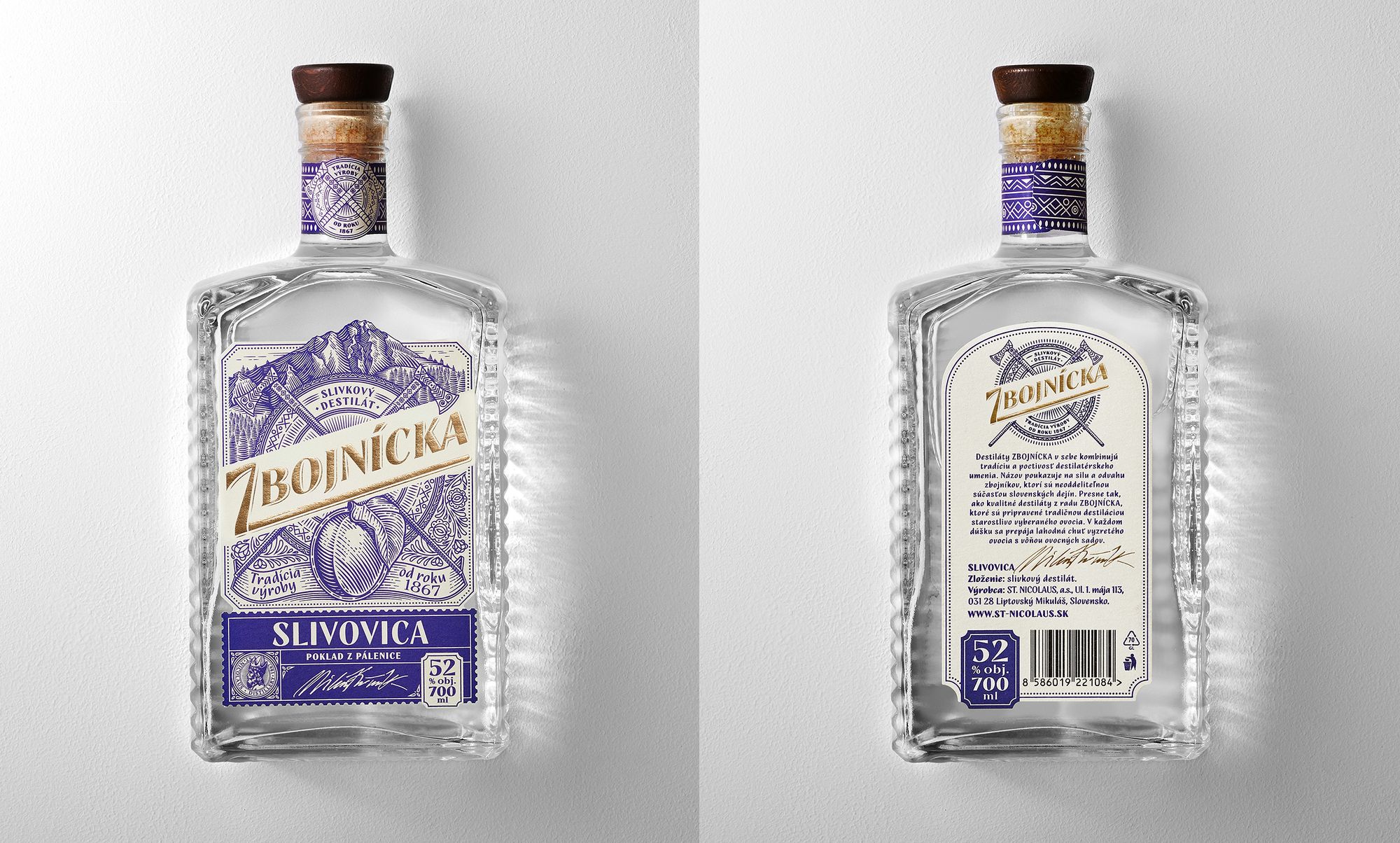
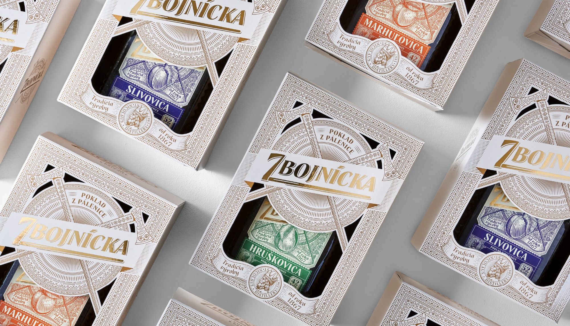
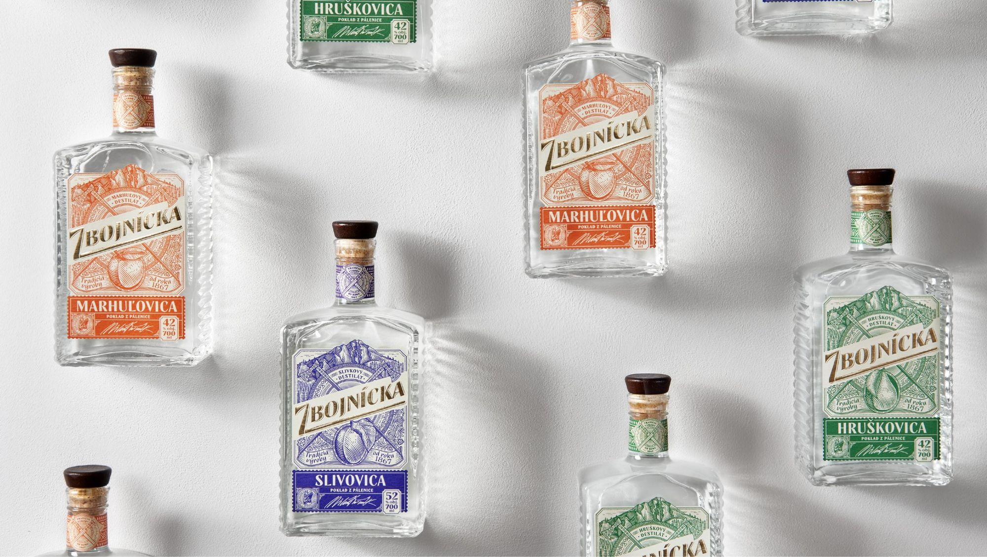
Here’s a Slovak fruit distillate, which sports visual elements that not only give the drink a special character but also showcase Slovak culture and tradition. The distinctive label was created by the Czech design studio AMOTH.
The visual appearance of similar products usually focuses on the main component of the distillate, accompanied by some distinguishing typographic elements, but the AMOTH studio has decided to approach this theme a little differently and build a visual story around the brand name, Zbojnícka.
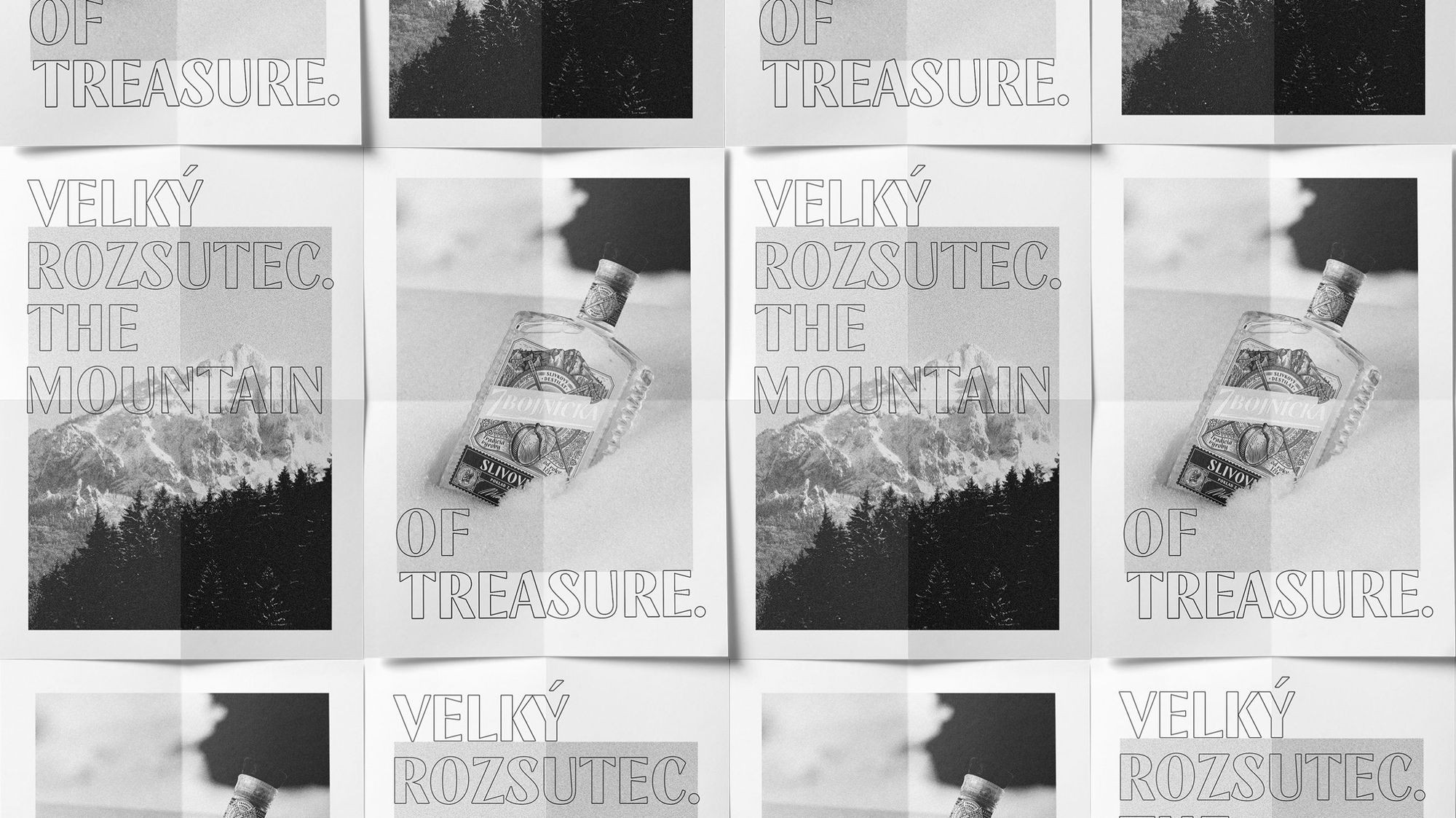
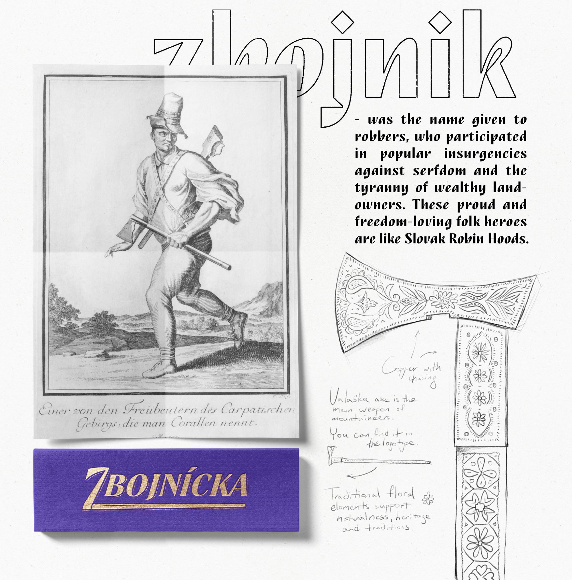
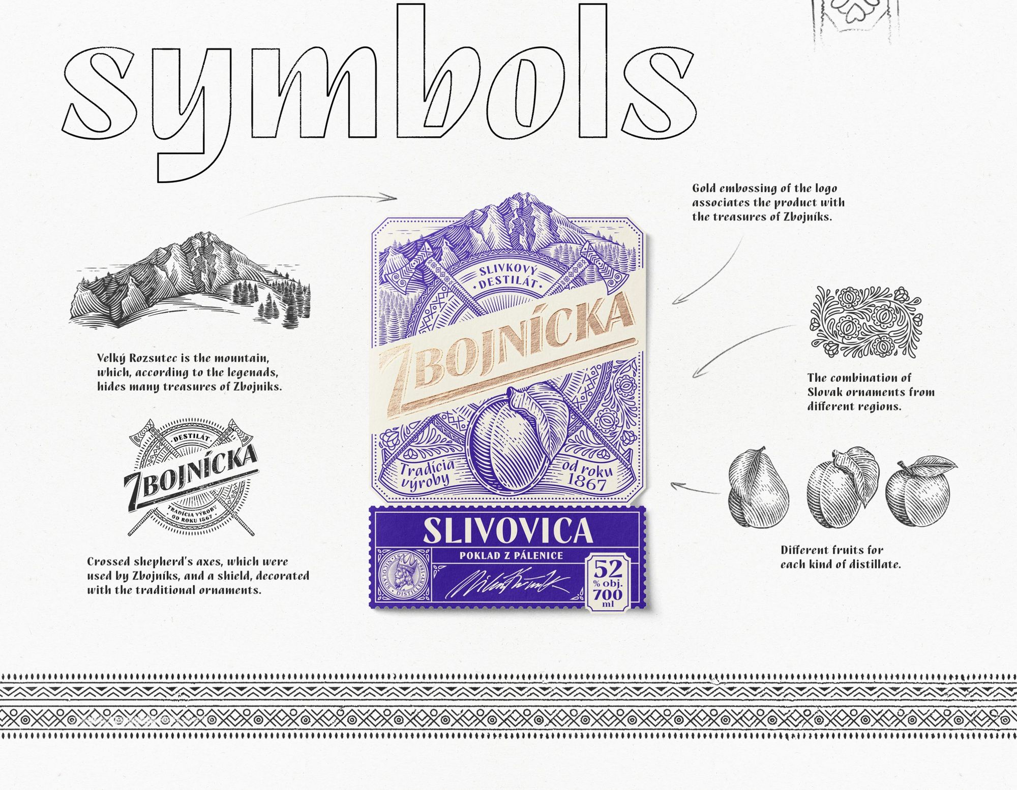
Zbojnícka is derived from the term zbojník (meaning outlaw): this name was used for robbers who took part in the serfs’ uprisings against the tyranny of wealthy landowners—they were the Robin Hoods of medieval Slovakia. Tradition holds that the zbojník operated in the Mála Fatra mountain range and hid many treasures on the Veľký Rozsutec mountain: many people set out in search of these treasures, but no one ever found them. The zbojník preferred not only gold but also a good drink—this idea gave the starting point of the label’s concept.
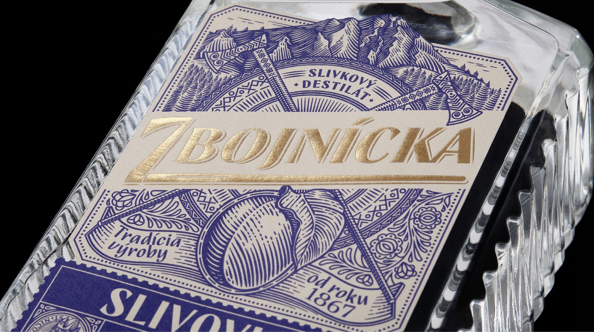
What symbols are featured on the label? The historic style was achieved by using an engraving-like illustration: these are Slovak decorative elements; the middle of the label depicts a pair of crossed axes and a shield decorated with symbols typical of the Mála Fatra region. This set of elements symbolizes the nature of the zbojník: their bellicose attitude, their fighting skills and the protection of their treasures. The design is made complete with the outlines of the Veľký Rozsutec mountain at the top of the label. As a label material, they chose a soft-textured, matte cream paper to highlight the natural and homemade qualities of the product, while they highlighted the brand name with gold embossing.

Photos: Sabino Studio
AMOTH | Behance

BIG's plan to make undersea mining more environmentally friendly

Artist duo | Hézag Studio


