When we think of the Víziváros district of Buda, contemporary architecture probably isn’t among the first things that pop up in our minds. We rather think of the brick building of the market in Batthyány Square, the domes of Király Bath and the plethora of tiny cafes in the friendly streets than a prominent representative of contemporary architecture—yet this part of the city gives home to more buildings of the kind than we’d think actually. Last Friday we explored Víziváros and now we’ll tell you all about it!
After a one-and-a-half-year-long hiatus, the Contemporary Architecture Center (KÉK) has once again announced an urban walk: with the small group of ten, we could meet a new side of Budapest’s Víziváros. In the course of the two-and-a-half-hour-long walk, we didn’t only admire contemporary buildings, of course. We took a closer look at the two-story baroque buildings of Fő Street, which are also important from a commercial perspective, and we did the same with the building of Hotel Regnum Residence (architect: Tamás Perényi.) It was interesting to see how the old and recent past stand next to each other, or, on the contrary: how self-serving architectural design can be, disregarding (or not understanding) the architectural heritage of past eras.
We set out on our journey from a worthy starting point: the statue of Samu Pecz, the architect who designed the neighboring church. The wondrous church erected at Szilágyi Dezső Square in neo-gothic style—the second largest among the reformed churches in Budapest—is a prominent example of the brick architecture otherwise characterizing the Víziváros district. The sunshine glittering on the glazed Zsolnay roof tiles amazed us once again while our tour guide talked about the turbulent centuries of the district.


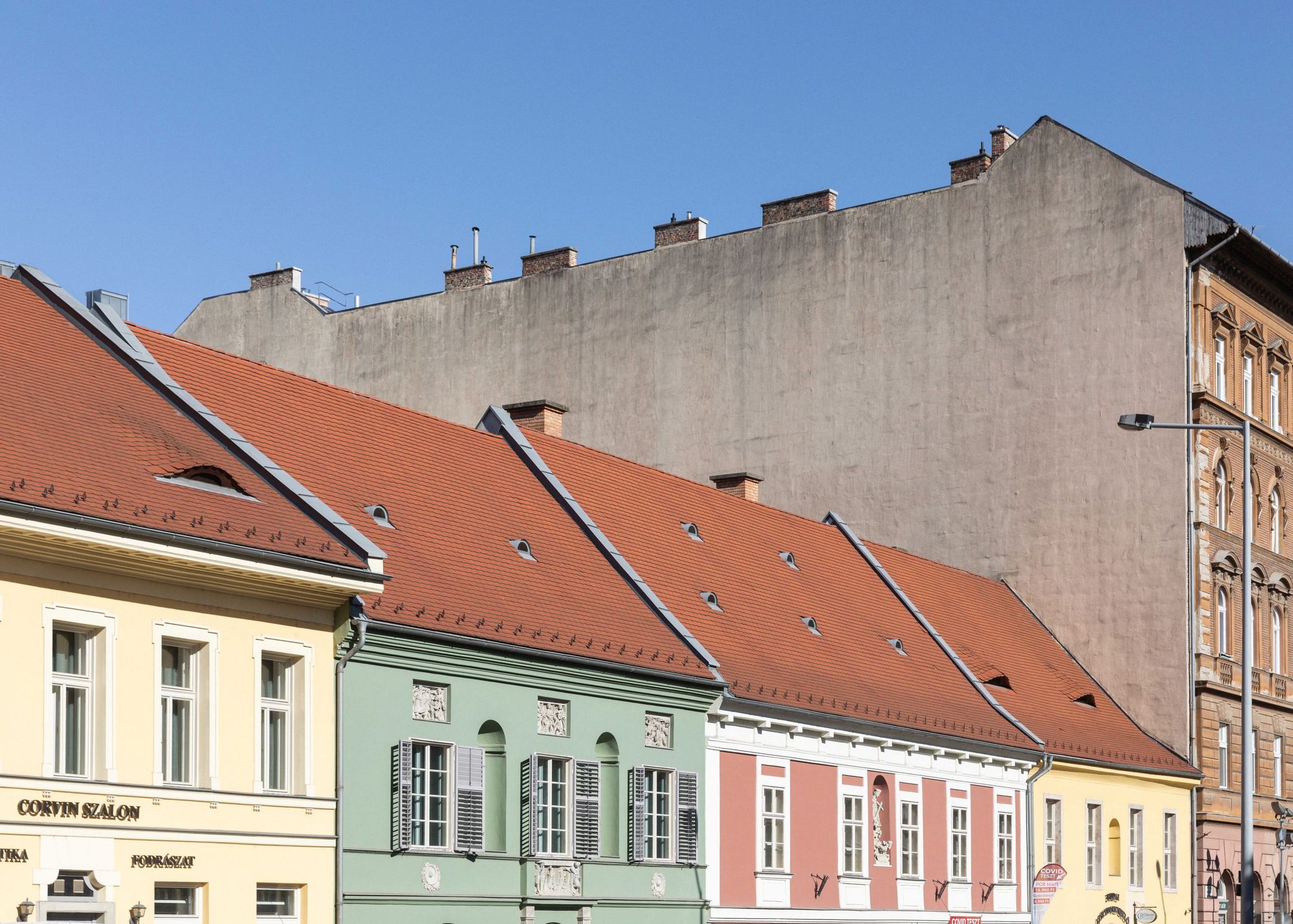
In addition to the bombings of 1945, the area was not spared by the siege of Buda and the fights in 1848 either: thus resulting many vacant plots awaiting developments after the hardships—this is one of the reasons why this part of the city could become so exciting and diverse. Certain sections of Fő Street are wider than others: this is where smaller and larger squares were formed, including Batthyány Square, Corvin Square and Szilágyi Dezső Square, while the windows of baroque houses opening outwards also proved to be practical for selling goods. We stopped at Corvin Square for a short time, to admire the colorful, sun-bathed houses.
We approached Donáti Street on the stairs starting at the bottom of Szalag Street: this stairway actually runs in the middle of the Corvinus Palace designed by Péter Reimholz, and seeing the division of the building and the tiny cafes with open doors, we felt a little bit as if we were walking in a Mediterranean city.
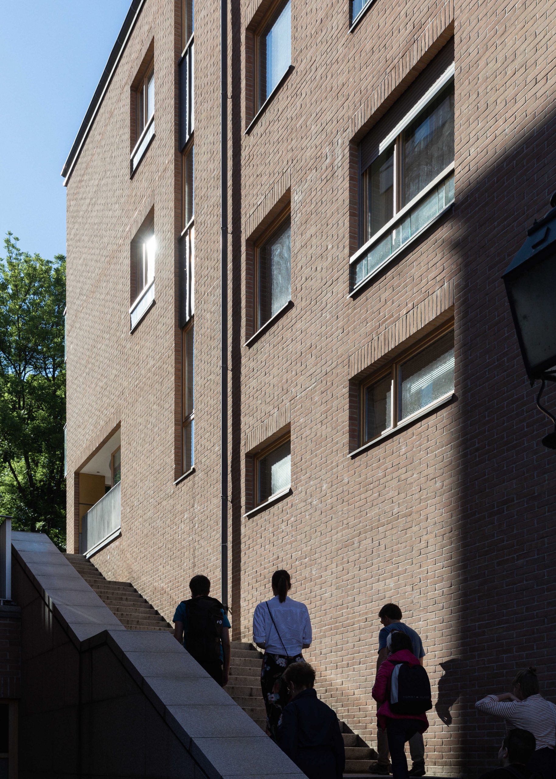
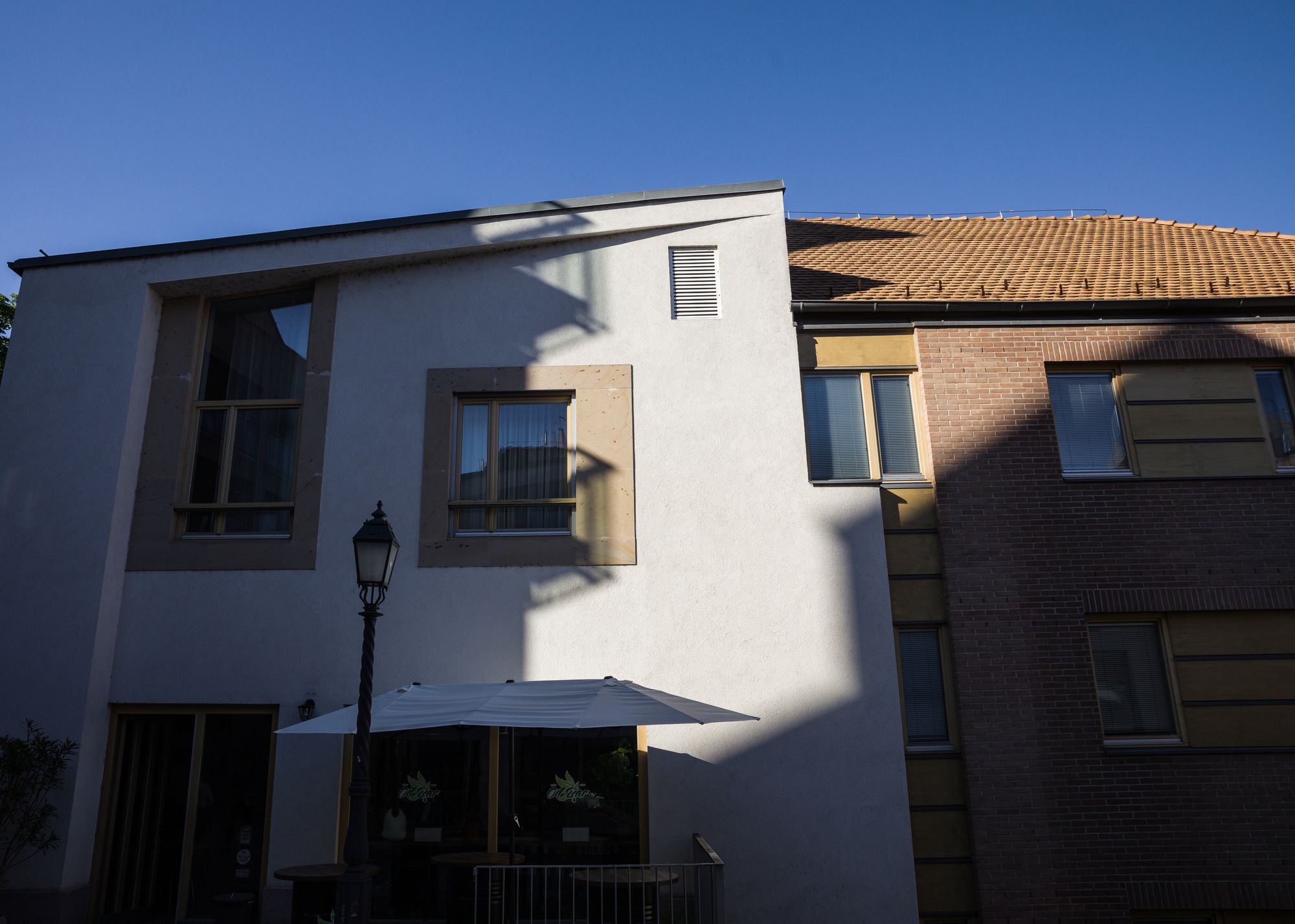
A few minutes later, we once again stopped in front of a Reimholz building (to be more correct, this building was actually designed by Reimholz and his wife Zsófia Csomay together). Built in the early 2000s, the Raoul Wallenberg Guests House was the very first representative of the contemporary brick architecture spreading in Víziváros. The building respects the historical context and environment: its door resembles those of the former wineries in the side of the Buda Castle, with a modern twist. Despite being a multi-story building, thanks to the retracted facade, mass formation and choice of materials, it still doesn’t weigh the street down.

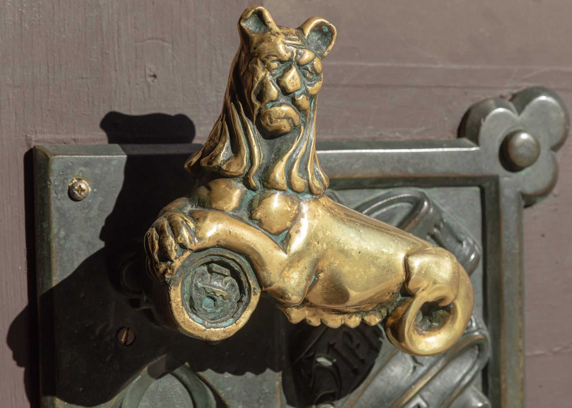
Our next stop was Toldy Ferenc High School, which many tend to associate with Hogwarts School of Witchcraft and Wizardry known from the Harry Potter universe—and we must admit, they aren’t far from the truth. The brick building was designed by János Petschnig, a huge fan of the neo-Gothic. The institution served as a boy’s school originally and there are several urban legends related to it, including the “shoot of noon” (déllövés in Hungarian), when they signaled 12 o’clock by firing a mortar. The high school is worth a tour in itself, but this time we only examined its contemporary gym. Passing through the portal of the high school, stroking the lion-shaped handle, we arrived to the patio of the school through the basement corridor, and from here we got to the “recessed” gym by taking a few stairs.



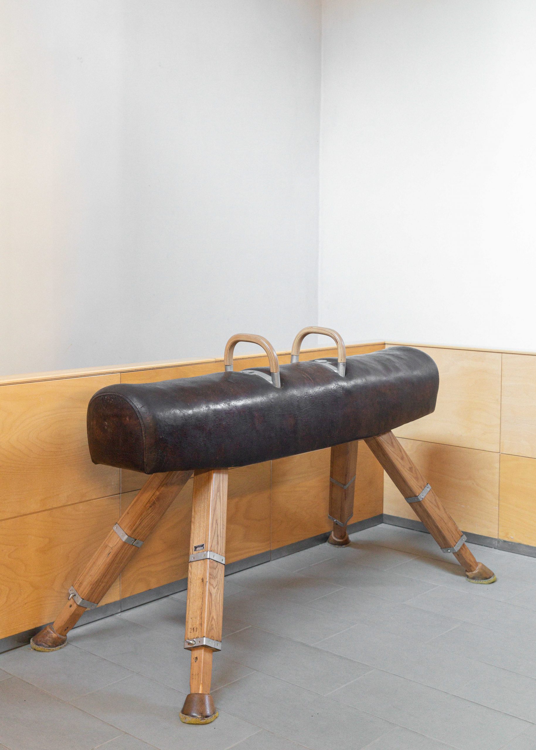
It’s interesting that the architects (László Földes and others) did not build in the regular manner, from bottom to top, but opted for sinking the scene of sports under ground level: natural light is provided by the shed roof in this case, which is a roof solution mainly applied in the case of industrial plants. Inside, in addition to brick, wood and exposed concrete also appear as emphatic materials. This is actually one of the touchstones of contemporary architecture: showing the material as it is, hiding nothing.

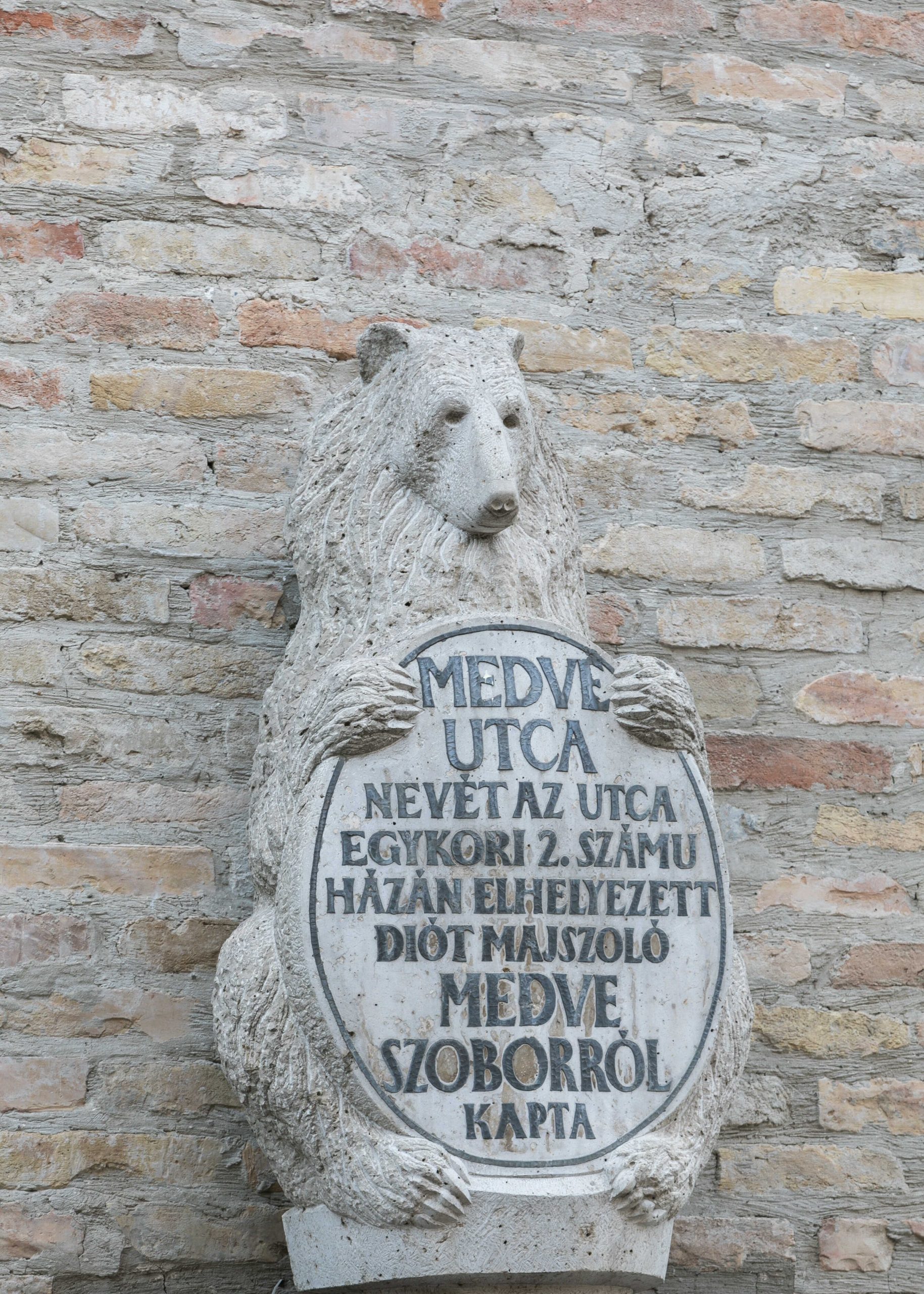
A few stops later, in Medve Street (after taking a picture of the placidly standing bear statue), we see the almost exact opposite of Toldy’s gym. The gym erected as an expansion of the Csík Ferenc Elementary and High School was made based on the plans of Ferenc Cságoly (építész stúdió): the gym was placed on the first floor, and it even had a tower accompanying it (on the one hand, the latter alludes to the church towers and old mosques characterizing the district, and is of the same height as the school’s ridge—even though this can hardly be seen from the street).
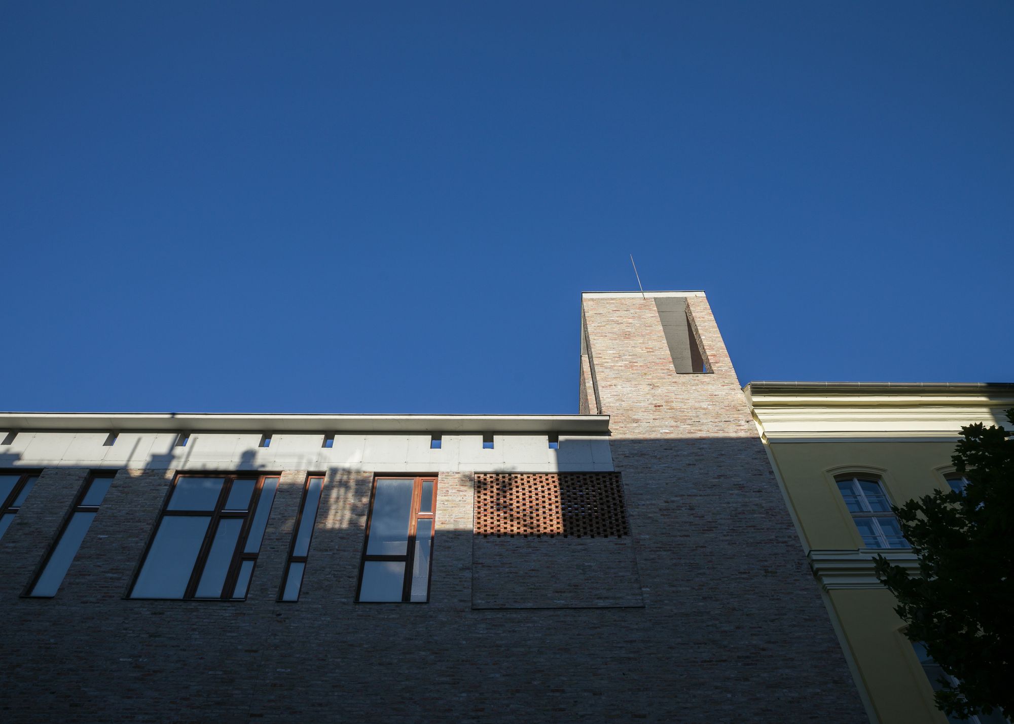
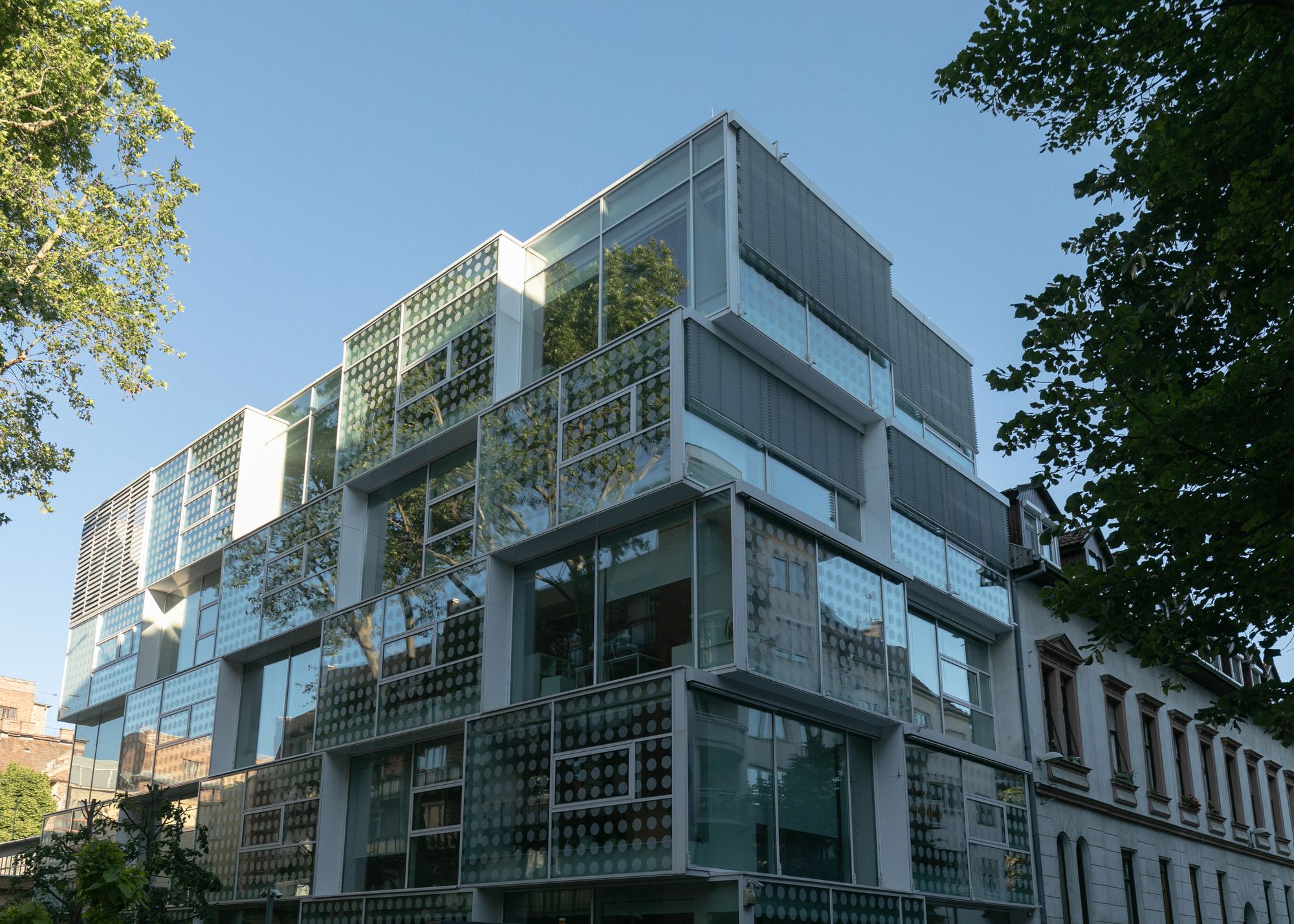
The least fitting house in the course of the walking tour is perhaps the “dotted” Geometria office building designed by 3H Architecture Studio. As opposed to the cheekiness of office buildings, this block handed over in 2013 strives to follow the geometry and architectural rhythm of the neighboring clinker brick house, with the difference that glass received the emphasis here. The architects also made sure that the airiness of the brick building’s courtyard remained so even with the construction of the office block. There’s no need to look for the driveway to the underground garage: there’s a car lift in operation here, with a grassed roof.

On the section of Kandó Kálmán Street–Királyfürdő Street–Gyorskocsi Street, we stopped for a minute in front of several contemporary buildings: the hand-made Norwegian bricks of Hotel Regnum Residence next to the cozy terrace of Ganz Pub as well as its glass and painted steel surfaces radiate harmony together, whileTamás Tornay’s office block of “Swiss cleanliness” is anything but ostentatious (the only flaw we discovered was the unfitting “Cafe” sign on the ground floor window, but this his hardly the architect’s fault).


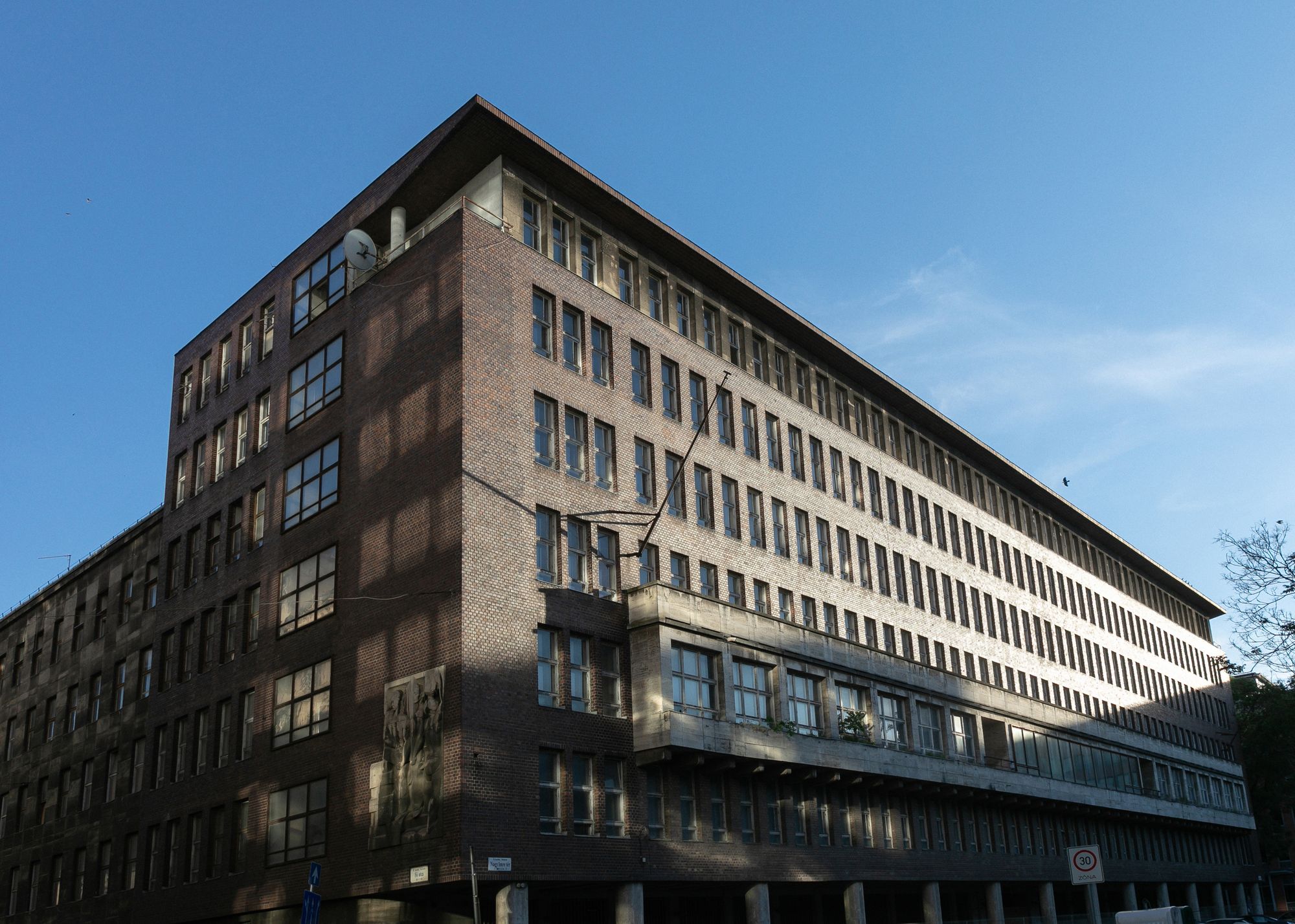
We ended our walking tour at Nagy Imre Square, where we stopped before the former headquarters of the Hungarian Royal Industrial Material Office designed by István Janáky Sr. The stumpy, and—only at first sight—boring brick building was perceived as a markedly modern and progressive structure already at its handover in 1942: this was one of the first modern office blocks. Unfortunately it has been standing as an abandoned house at the square for a long time, even though one can even discover renaissance elements in its architecture (emphatic cornice, raised main floor). As a way of saying goodbye, we took a look at the late modern point block handed over in 1948.


From now on, KÉK’s team will hold urban history walking tours each week: check their official website or follow their social media accounts for details of upcoming events!
Contemporary Architecture Center | Web | Facebook | Instagram
Photos: Balázs Mohai

Portable air purifier | Airtomo
A nearly seventy-year-old electric vehicle goes under the hammer
