“The Danube Bend is not just a place, the same way Pálinka is not just a drink. It’s a feeling of life, an atmosphere”—are the thoughts of Lunczer Pálinka House, a pálinka brand and family business. With a helping hand from Graphasel design studio, this idea is reflected not only in the flavors of Lunczer pálinka (a traditional fruit spirit or brandy in Eastern and Central Europe with Hungarian origins—the Transl.) but also in the brand’s new, elegant packaging.
The story of Lunczer Pálinka House began in 2014, when the brewery of the family-owned business was established in the Danube bend. The brand’s repertoire includes almost 20 different pálinka distillates, but their constantly developing product range now also includes gin and vodka. The raw materials for each product are mainly sourced from the region’s spring waters, grains, herbs and fruits, while the distillates are made with continuous experimentation, expertise and combining traditional and modern technology.
This passion and dedication also had a strong influence on the Graphasel design team. “When several generations create a brand together—combining the experience of an older generation with a youthful drive—it’s truly inspiring. The belief in their product as well as their perfectionism concerning the raw materials used is a sure recipe for success. Passing on home-grown and local values is what makes this business special, but it’s safe to say that Árpi Lunczer’s extremely experimental distillery equipment is also essential to the perfect end result. What we added to Lunczer’s uniqueness is elegance, an element that separates the brand from the mainstream packaging of domestic pálinka brands” emphasized László Ördögh, co-founder of Graphasel design studio.
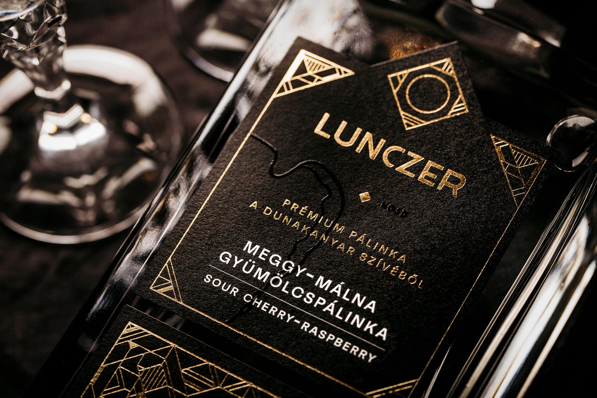
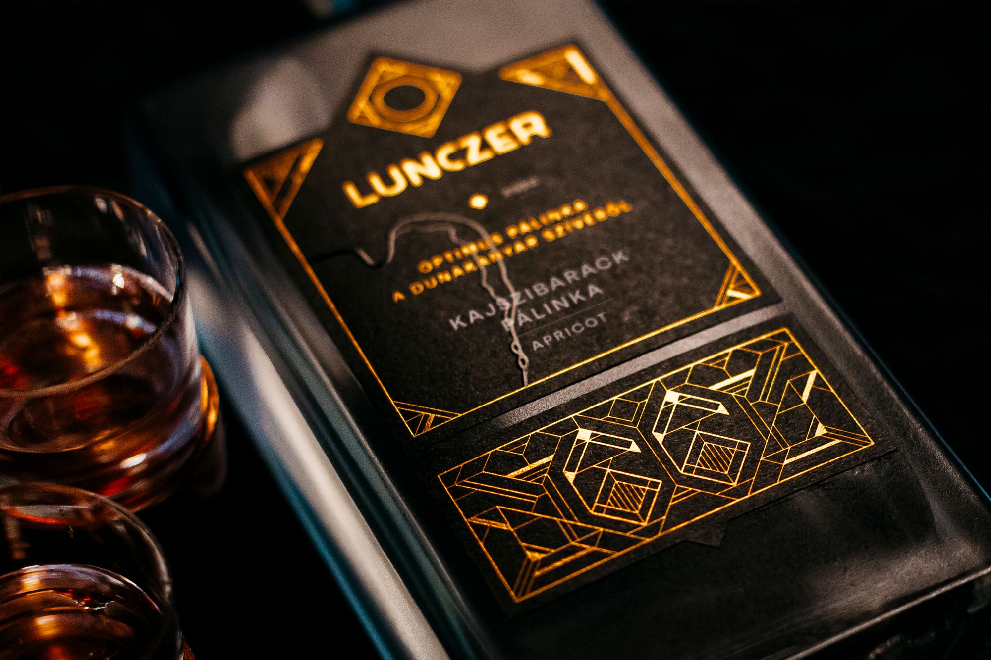
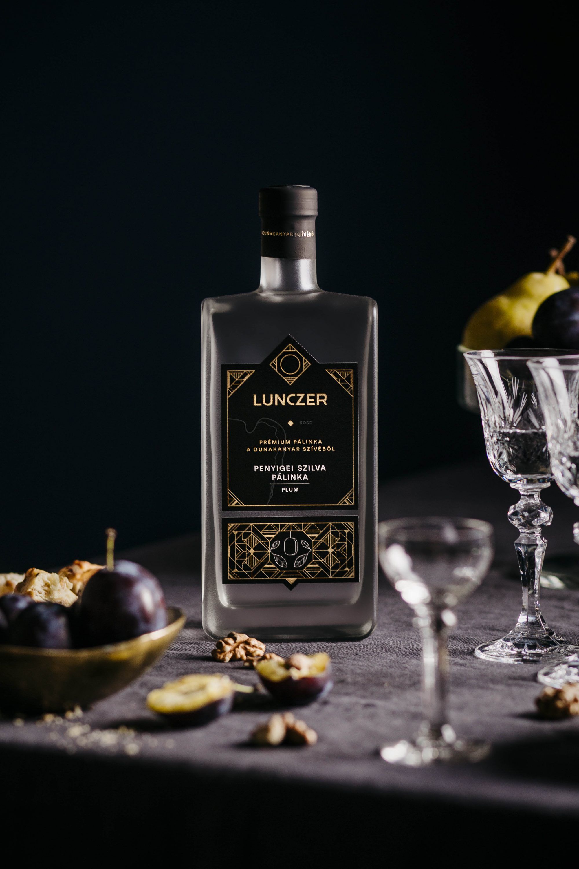
The work process was preceded by many face-to-face meetings and discussions after which the brand values were defined, with keywords—professional, sophisticated, extravagant, elegant and creative—shaping the visual concept of the new label designs. As a result, the elegance of the brand and the engineering design in relation to the production process is finally represented by art deco geometric elements arranged on a strict grid. Based on this framework, the new square logo was born, in which five abstract symbols are grouped together. These symbols are as follows: water, symbolizing the Danube; soil, symbolizing agricultural land; fire, which represents the technology used in the distillation process; air, symbolizing the special microclimate of the Danube Bend; and lastly, the circle in the center of the logo is the Spirit itself, which refers to the soul of the creators.
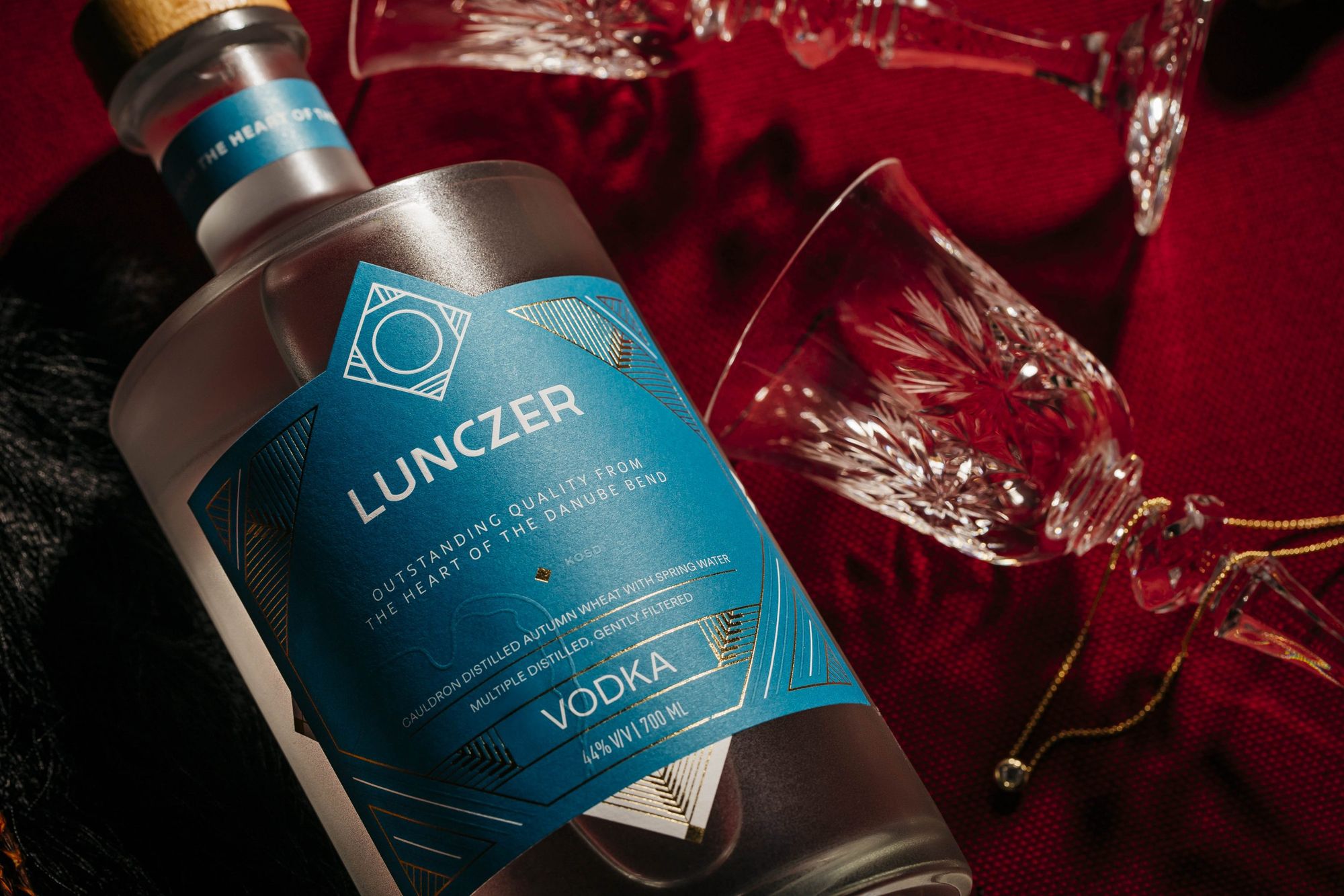
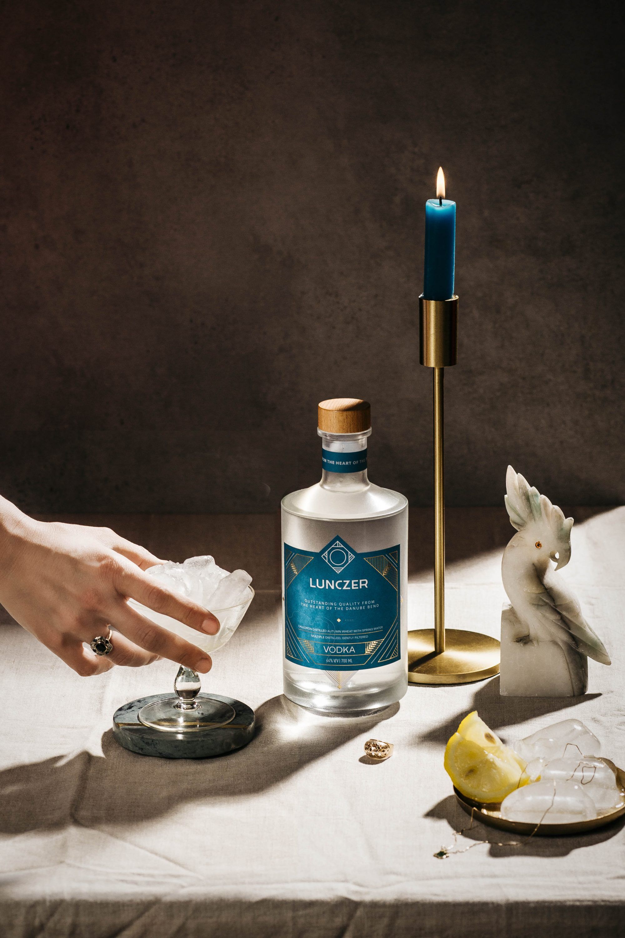
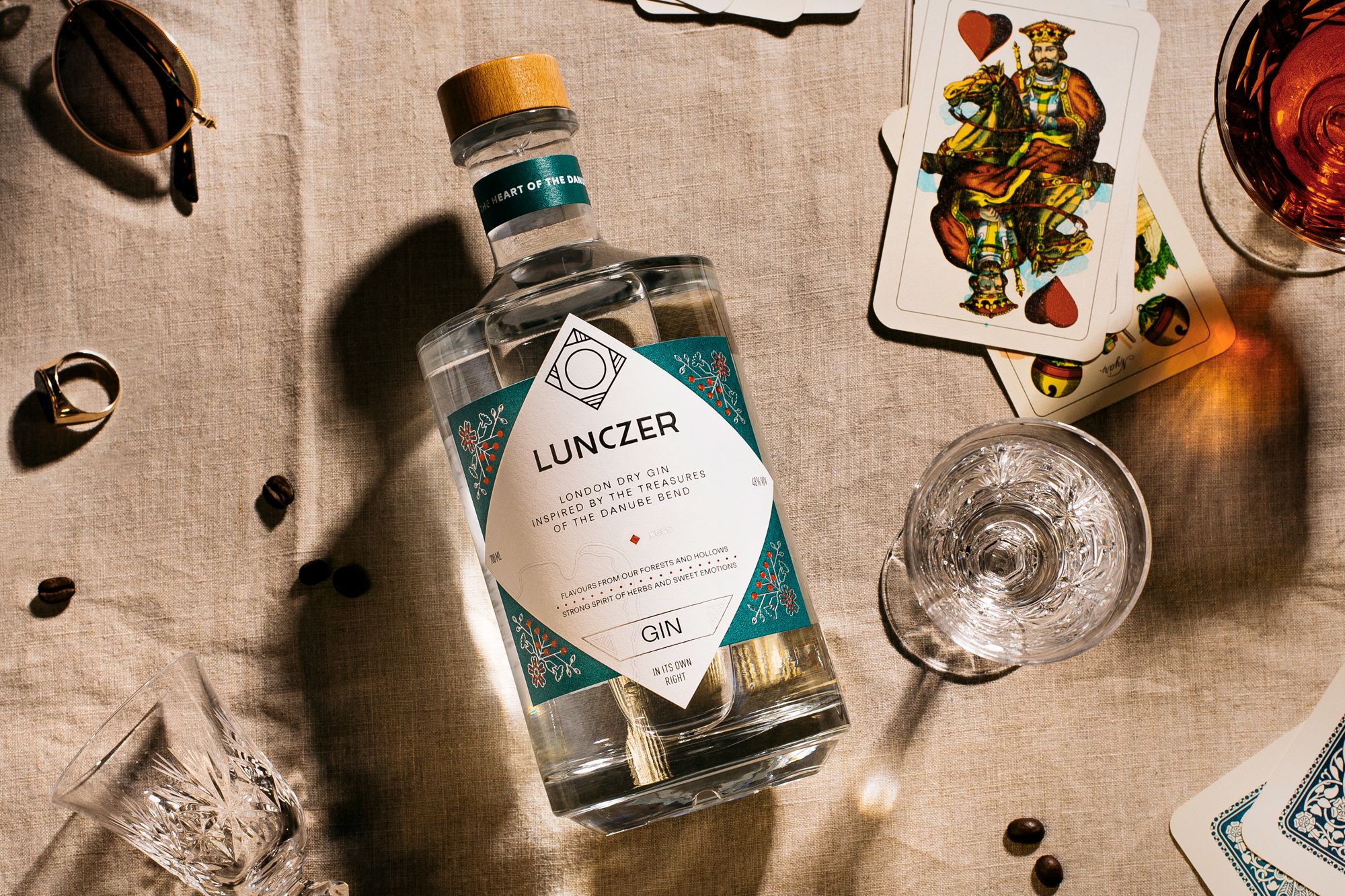
“Although we built the foundation of our products on a strict geometric grid, we didn’t perceive it as a constraint, but more so used it as a system to align to. For pálinka, the 45° system was applied on a small scale at the level of the motifs, while for the gin and vodka we applied an enlarged version. To make sure the design didn’t become repetitive, the graphic mode had to be relaxed in the details, which made the end result lovable. For the colors, we kept the labels in black to maintain continuity with the previous label family, while the dominant colors of the gin and vodka labels were inspired by the colors of raw materials found in nature” explains László.
Graphic Designer: Dorka Perneczki
Brand Designer: Nóra Katona
Art Director: László Ördögh
Photos: Alexandra Heim
Graphasel Design Studio | Web | Facebook | Instagram
Lunczer | Web | Facebook | Instagram
Turning a grain silo into a micro-house
