Clean yet detailed design and carefully selected, matching tones: elegant lines are mixed with figurative forms in the portfolio of Budapest-based Studio Ant Works, thus resulting in simple and fresh solutions. We interviewed Dia Ghyczy, the founder of the studio, who also pursues her artistic ambitions under the name of Phosphor Prints in addition to her applied graphic design projects. Interview!
Tell us a little about the beginning: where did you start from and when did you decide that you wanted to establish Ant Works?
I decided after five or six years of freelancing that I didn’t want to work under my own name as an applied graphic designer, but as the founder of Studio Ant Works. The reason behind this decision was that this way I can take on more complex tasks, because they don’t think of me as a one-person graphic designer, but as a member of a team. It is my goal to be commissioned not only with visual identity projects, but also with designing websites, online stores and animation movies. I work with additional qualified and competent freelancers on every task.

Dani Máté is also a member of Studio Ant Works’ team. When did Dani join, and how do you divide the tasks within the team – what are your strengths and what do you like to work on the most?
Dani and I have been working together for more than four years. He was still a graphic design student at the University of Fine Arts when he joined. I was looking for an intern, and I found him the most competent out of the applicants. Since then he graduated and started doctorate school, too, once again at the University of Fine Arts. He has been working with me since the beginnings of Ant Works. He has a strong fine art-inspired way of thinking, which comes very much in handy at the ideation phase of the projects. In addition, he for sure has a more engineer-like attitude than me, the various typographies are his strengths. I feel more confident on the field of illustrations/manual drawings, and clients contact me with new projects, so prepping the design phase is my task, too.
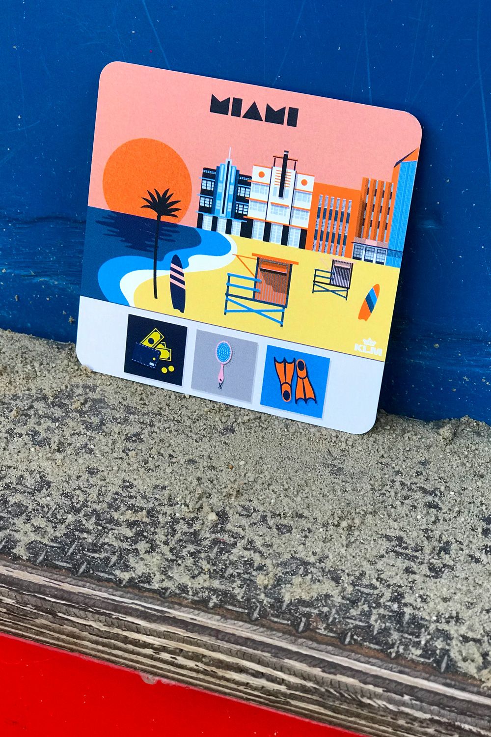
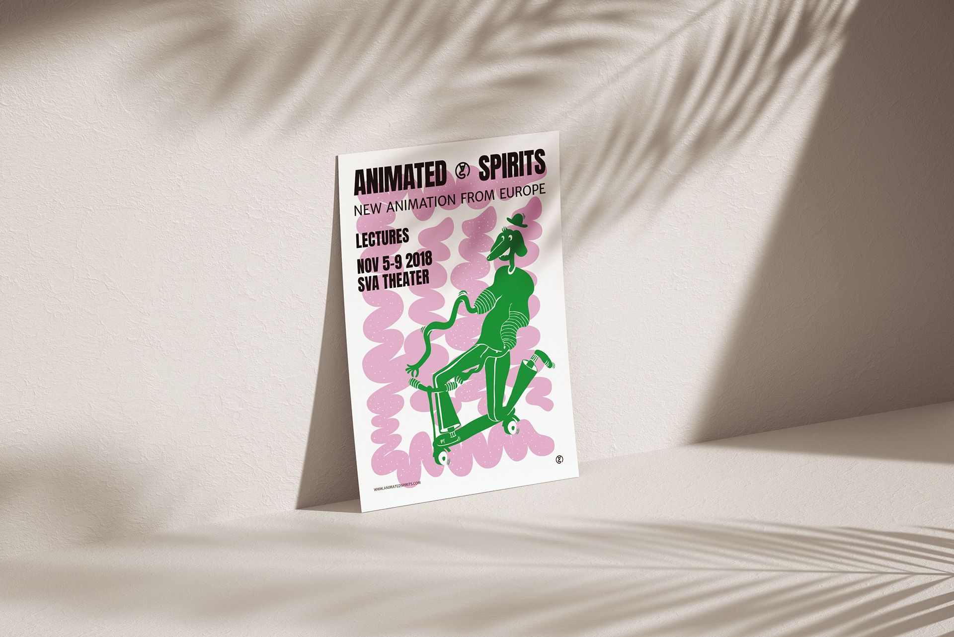
Your studio typically work on the branding of starting businesses, from choice of name to the various forms of their visual identity. What projects inspire you the most?
Yes, I find the beginning of things very exciting, when we get to be a part of the realization of someone’s dream. This is good because the majority of clients are very enthusiastic, and so it’s a easier to work with them, and we don’t have to adjust to something already existing, but we get to create something new, almost without limits. What’s perhaps a bit sad in this process is that some of the projects we work on don’t survive the early challenges, but luckily there are positive examples, too.
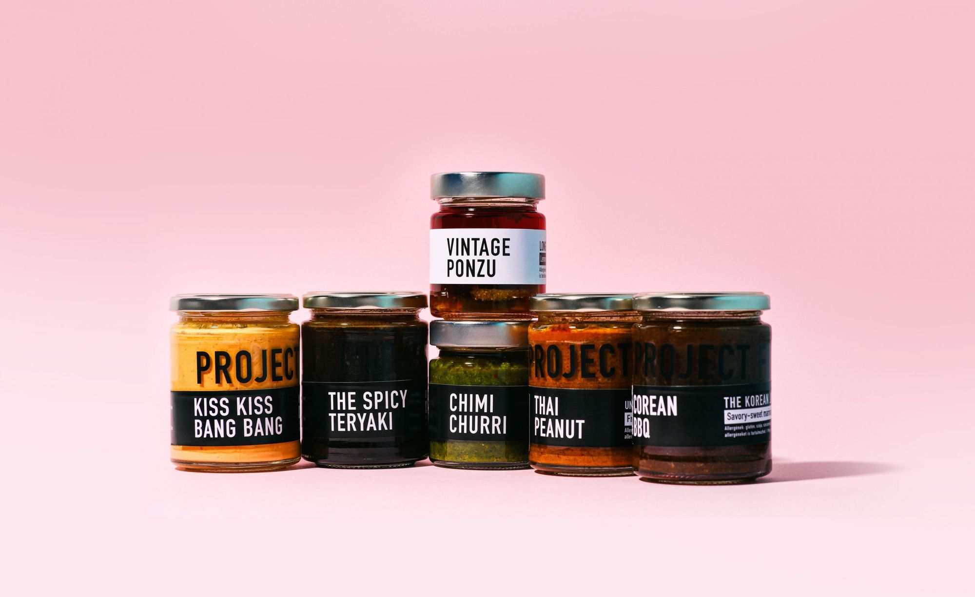
Including the brand Mártogatós, for example, which grew into something pretty amazing, and has become a serious company over a few years by building their brand smartly. First we designed their logo, and continued with many others since then, including their online store, packaging and tremendous visual identity elements. Another good example is the Édes Város cake online store.
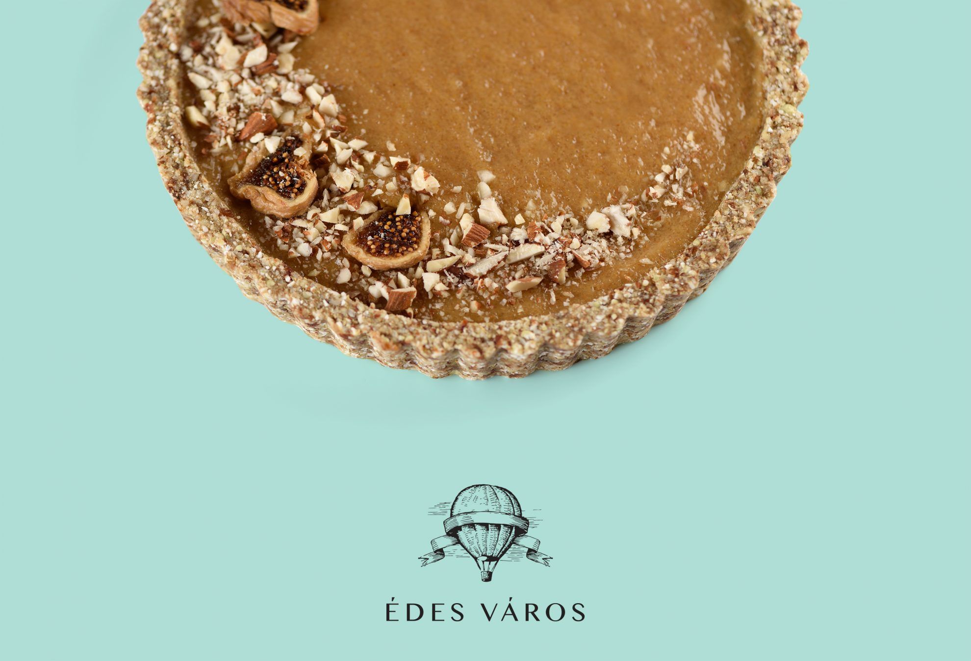
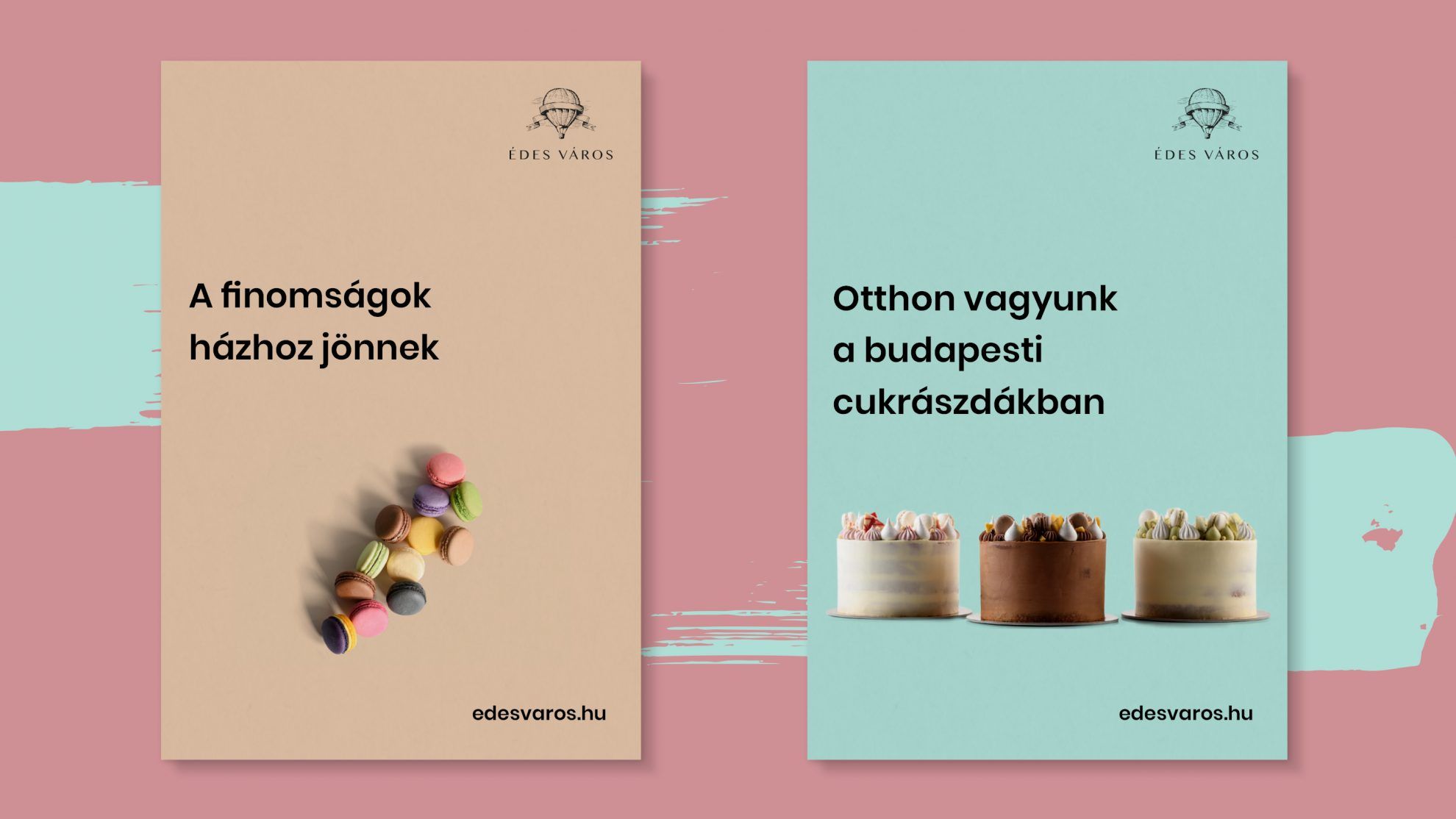
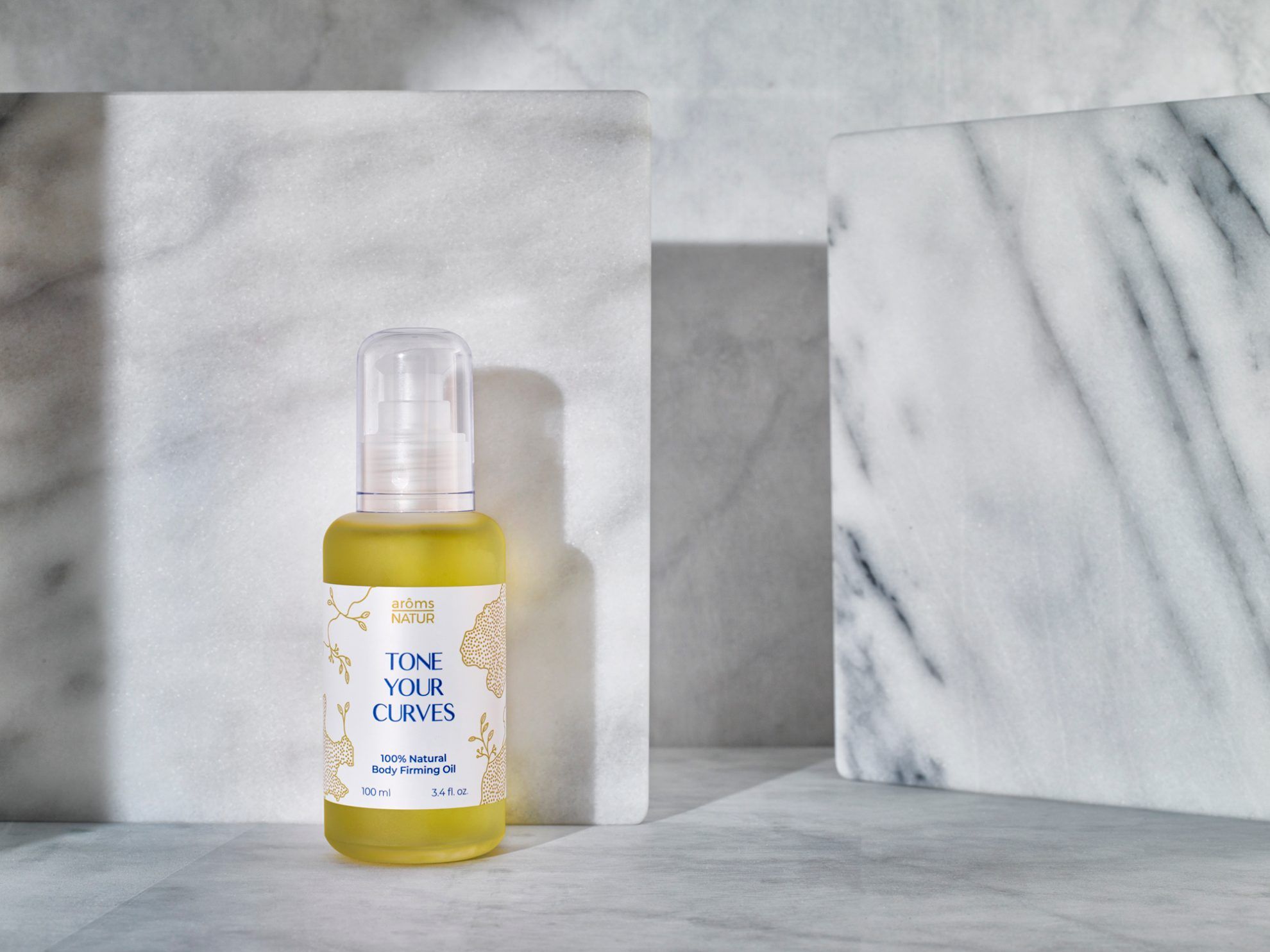
It’s harder to follow up our foreign projects: we have made packaging designs for a New York-based cosmetics product family and a visual identity to a café in Teheran.
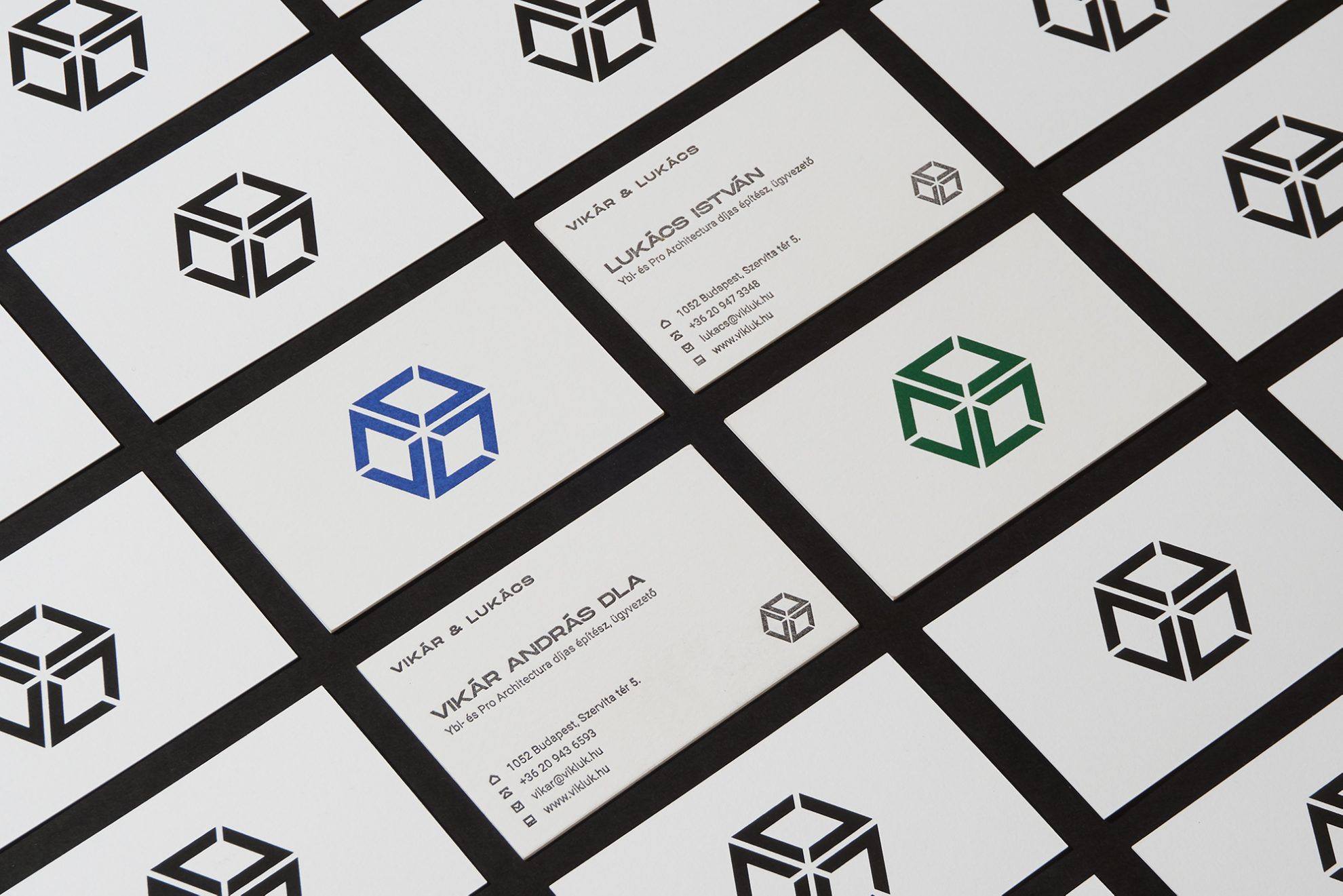
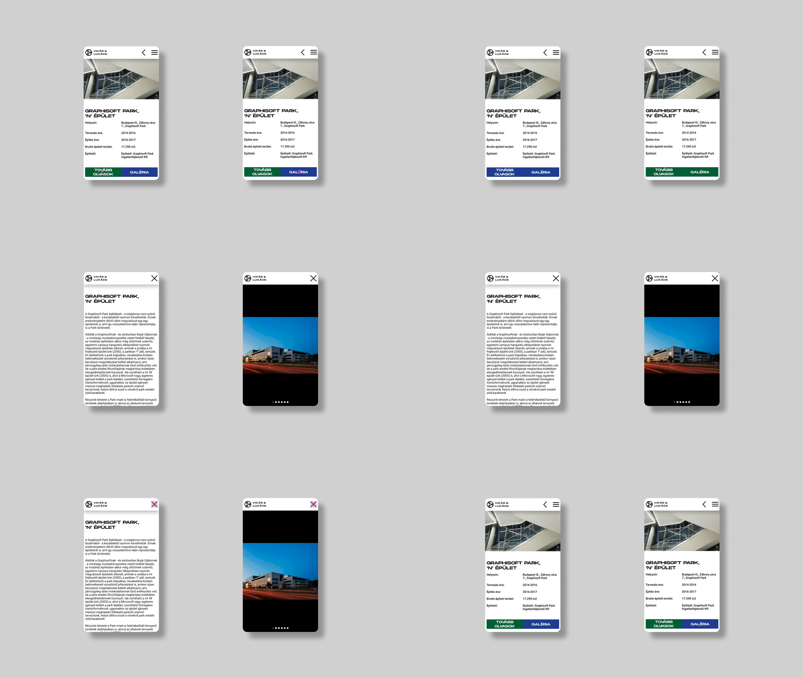
In the past period, more and more directors, DOPs, photographers and stylists contact us to design portfolio websites for them: this can be just as inspiring, as it is completely different from branding, while still bearing some similarities.
In addition to branding, web design and packaging design, you also work with publication design. Including, for example, your designs made for the English version of Elek Benedek’s Házasodik a daru (Mr Crane Takes a Wife). From whom did you receive the enquiry and what was your task exactly?
I was contacted by translator Márk Baczoni, who is the great-great-grandson of Elek Benedek. For him, this book is of great importance, he wants to publish the stories in London. Being familiar with our works, he gave us a free hand both in terms of style and design, which felt really good. We will also create a series out of this: Márk translated several stories, and each will get its own book, with its own color – there will be a separate color assigned to each story.
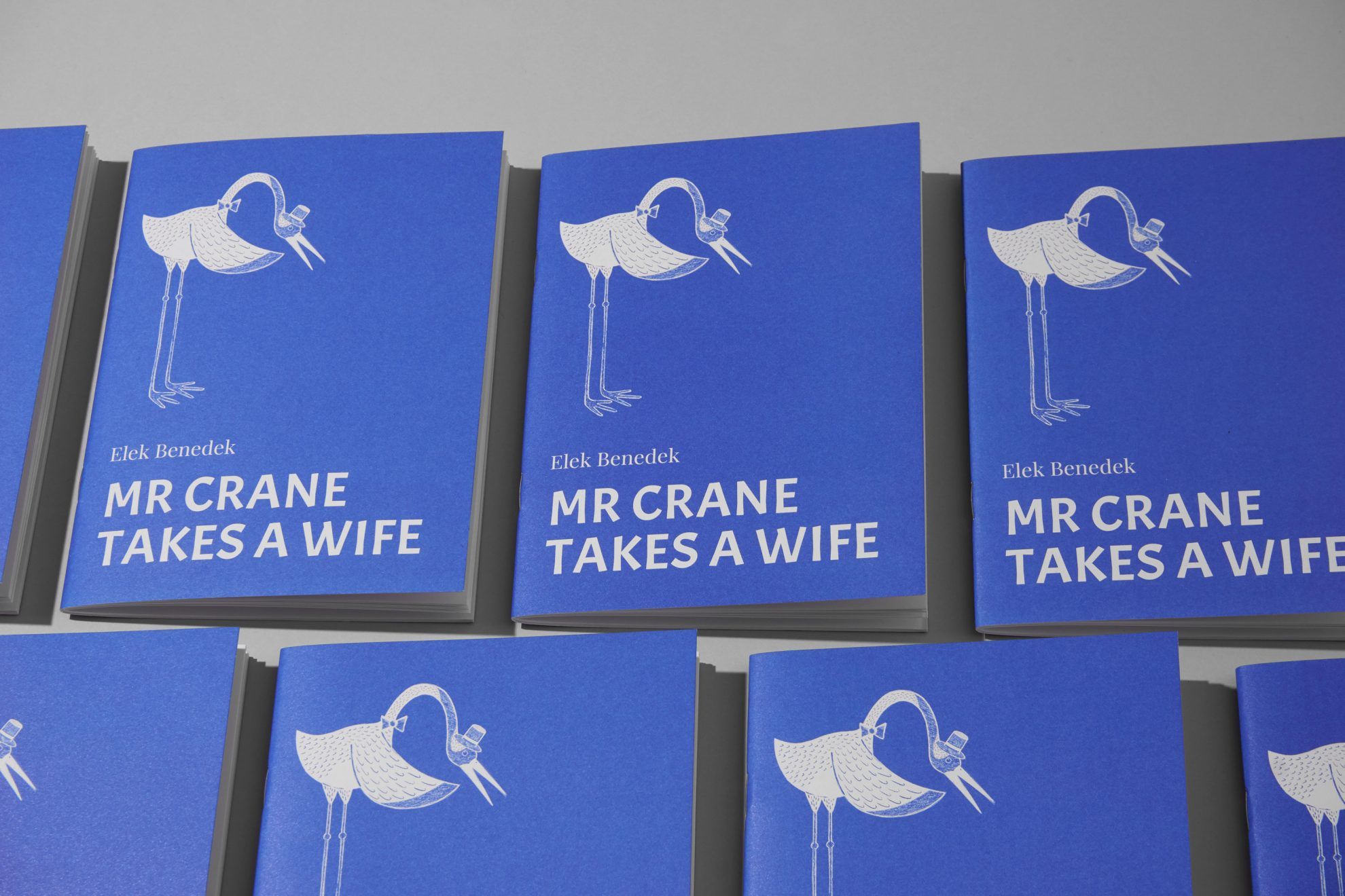
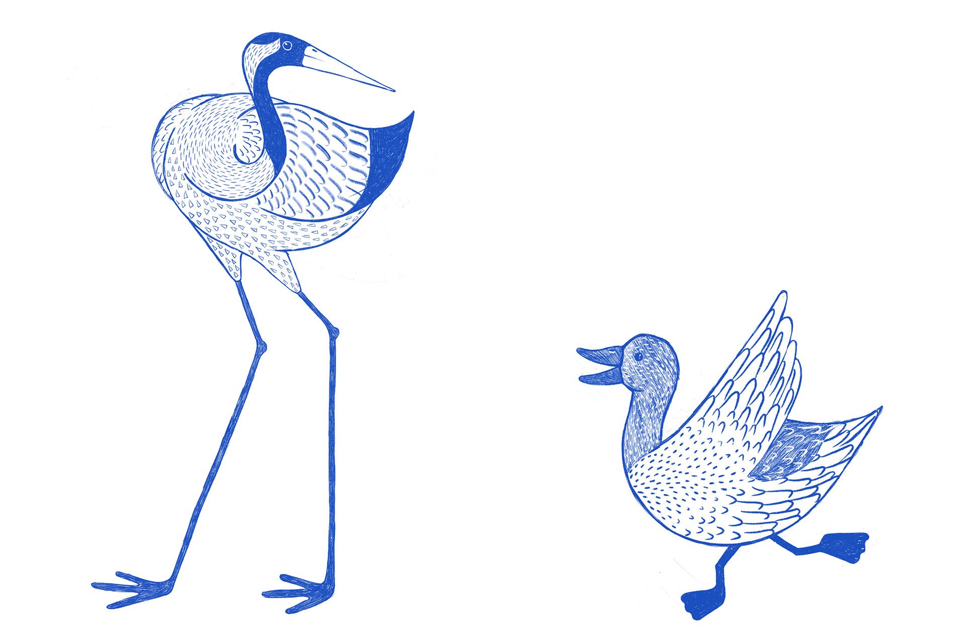
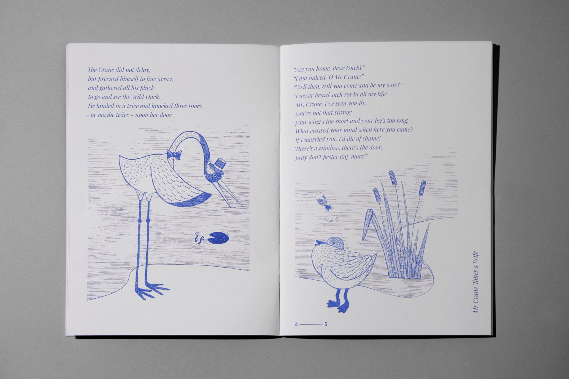
In addition to Ant Works, you also create numbered posters and wall decorations with risograph technique under the name Phosphor Prints. Here you give more room to your artistic self-expression. How would you describe your visual world, for what purpose was Phosphor Prints called to life?
Phosphor Prints’ humble goal is to compete with IKEA posters. I was always saddened to see prints purchased in IKEA in people’s homes. Obviously one of the reasons for someone having an IKEA print is that they wanted to have affordable decoration, but we all know this is a mass product; but we also know that if one wants something unique, it has its price. This is where the idea of selling unique, numbered prints made with cost-effective riso printing came from. The name comes from the vibrant colors resulting from this technique, which was, by the way, an idea conceived by my friend Bori Nagy. The topics of the posters are mainly based on my own personal experiences, and the illustrations mix the lifelike scenes with my fantasy world.
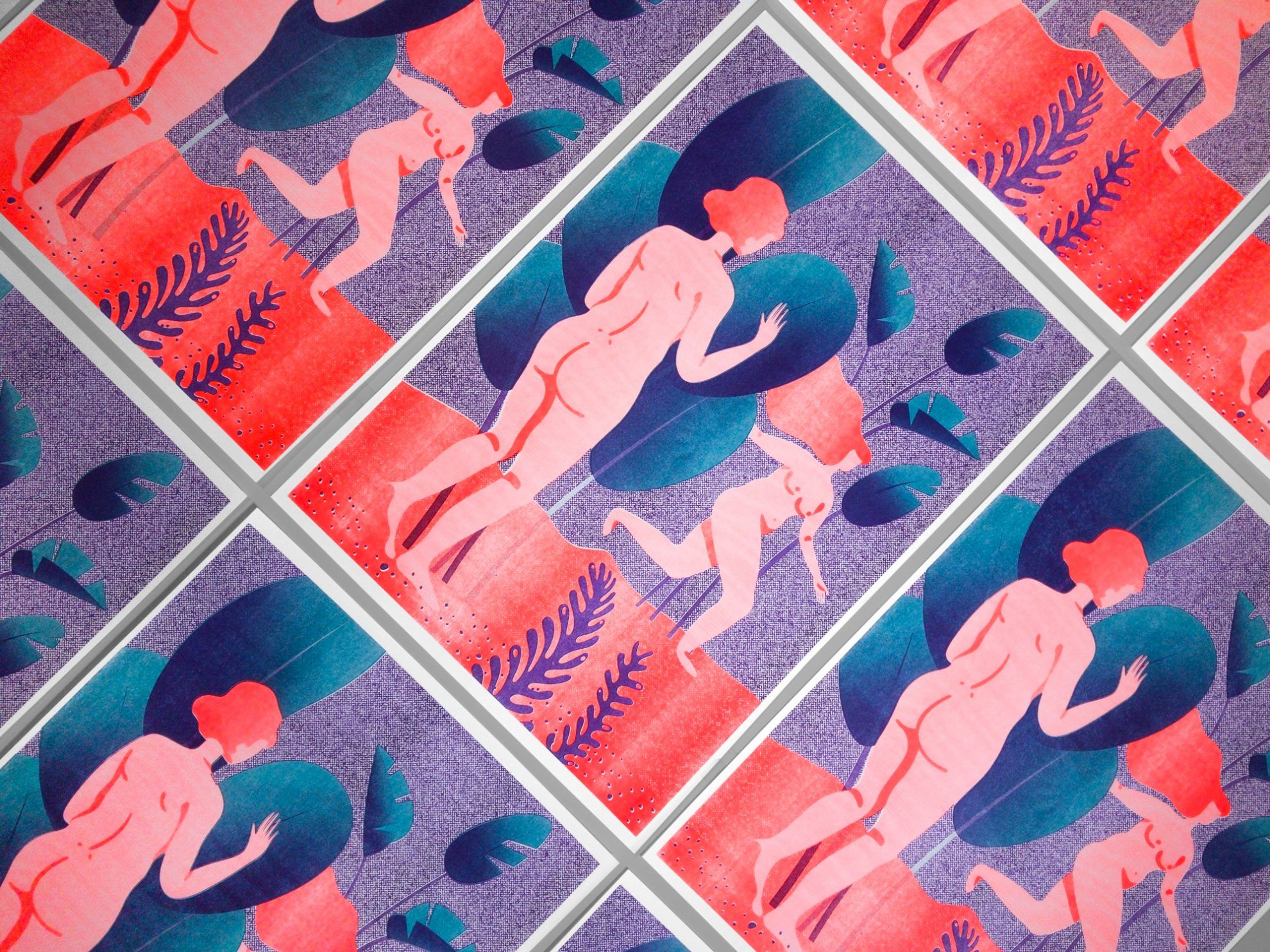
We have designed five series so far, and printed twenty copies of each print, with five images within a series. This means five hundred posters altogether, out of which approximately three hundred have been purchased already, and a third of it from abroad.
You always favor your most recent project the most. What projects are you working on currently, what should we know about them?
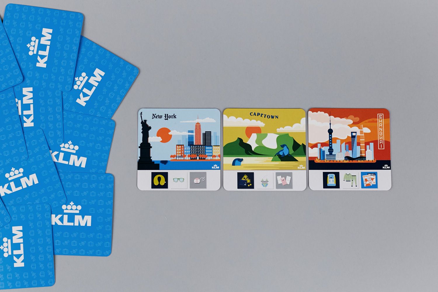
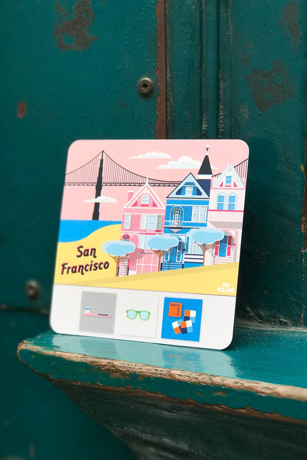
It’s not that I favor them the most, but I’m definitely the most enthusiastic about them. Currently we work on the visual identity of a new restaurant, on the website of a DOP and a director duo, and the packaging of a cosmetics product family, but we also design things for Google.
Studio Ant Works | Web | Facebook | Instagram
Phosphor Prints | Facebook | Instagram
Rainbow enclosed in a symbolic circle | Atelier Štěpán
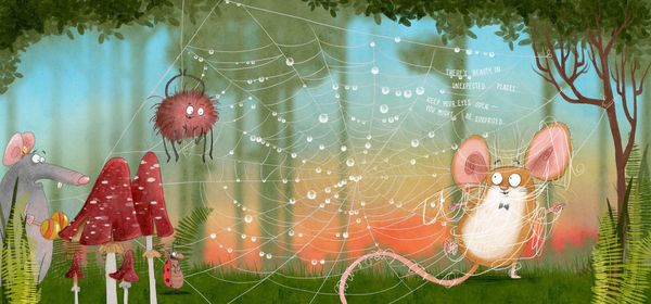
Zsuzsanna Bátori illustrated Dan Brown’s book for children
