We have recently come across the image of the Ukrainian NORBA brand. The image of the business designing and manufacturing comfortable sportswear was designed by Kiev-based Orchidea Agency. Check out what else they’ve got!
Orchidea is a big believer of responsible branding, and they usually work with visually exciting brands that believe in sustainability, too. The studio offering brand image and branding services was founded by Lera Shaposhnikova, who is also the creative director of the company. We should always remember that branding does not equal brand image, as the former is more about a mindset and a strategy and the interaction of complex processes, which do not only result in a product to be sold as an output but a separate entity, a brand.
According to Shaposhnikova, it’s important that the brand itself be viable, but if the “visual” presentation is tasteless, it will only be able to address people who don’t have a good taste. The three important pillars of their partnerships are consultation, design and support. Delicate feminine energies can be sensed in their projects, so it does not come as a surprise that they could work great with NORBA, too.

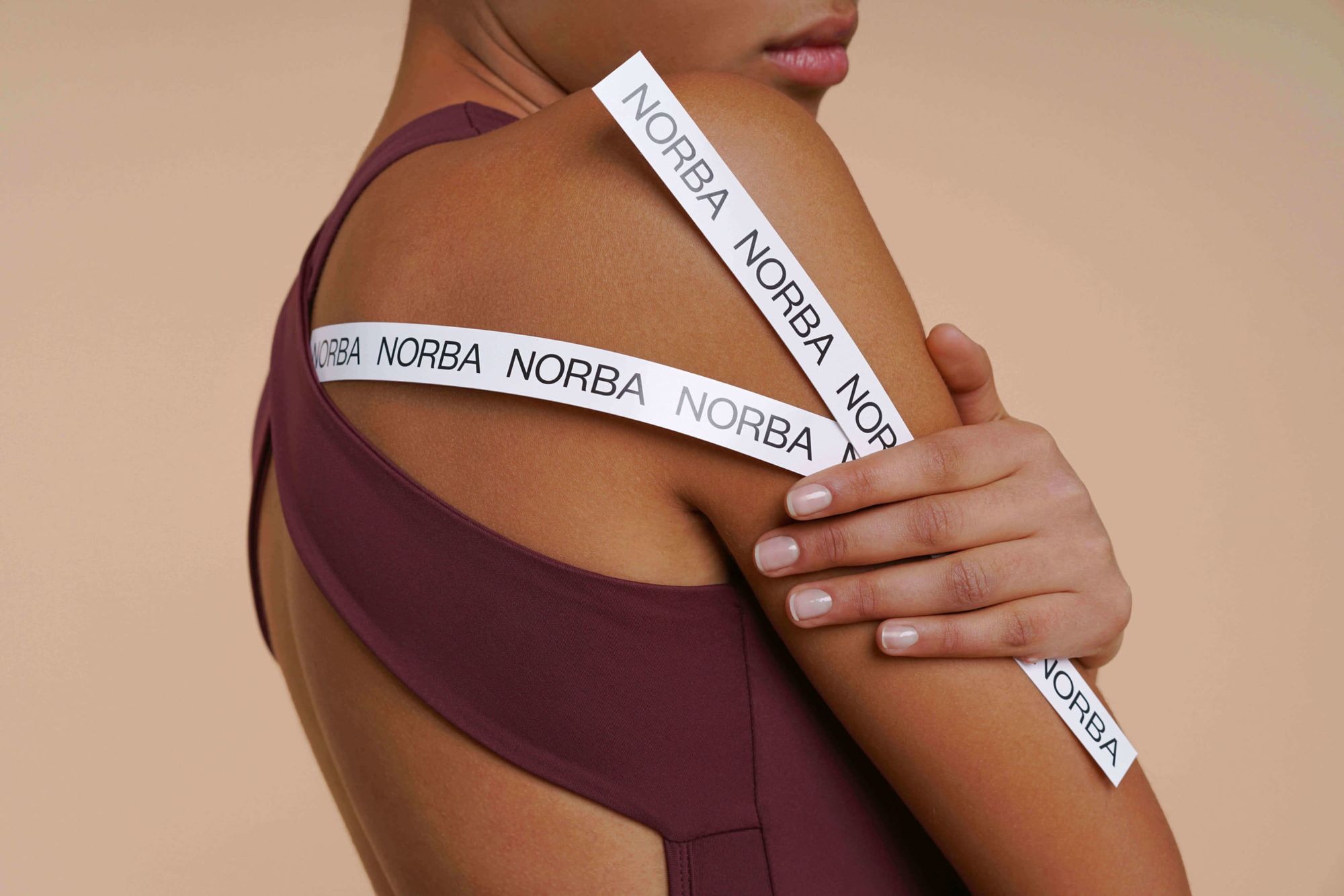
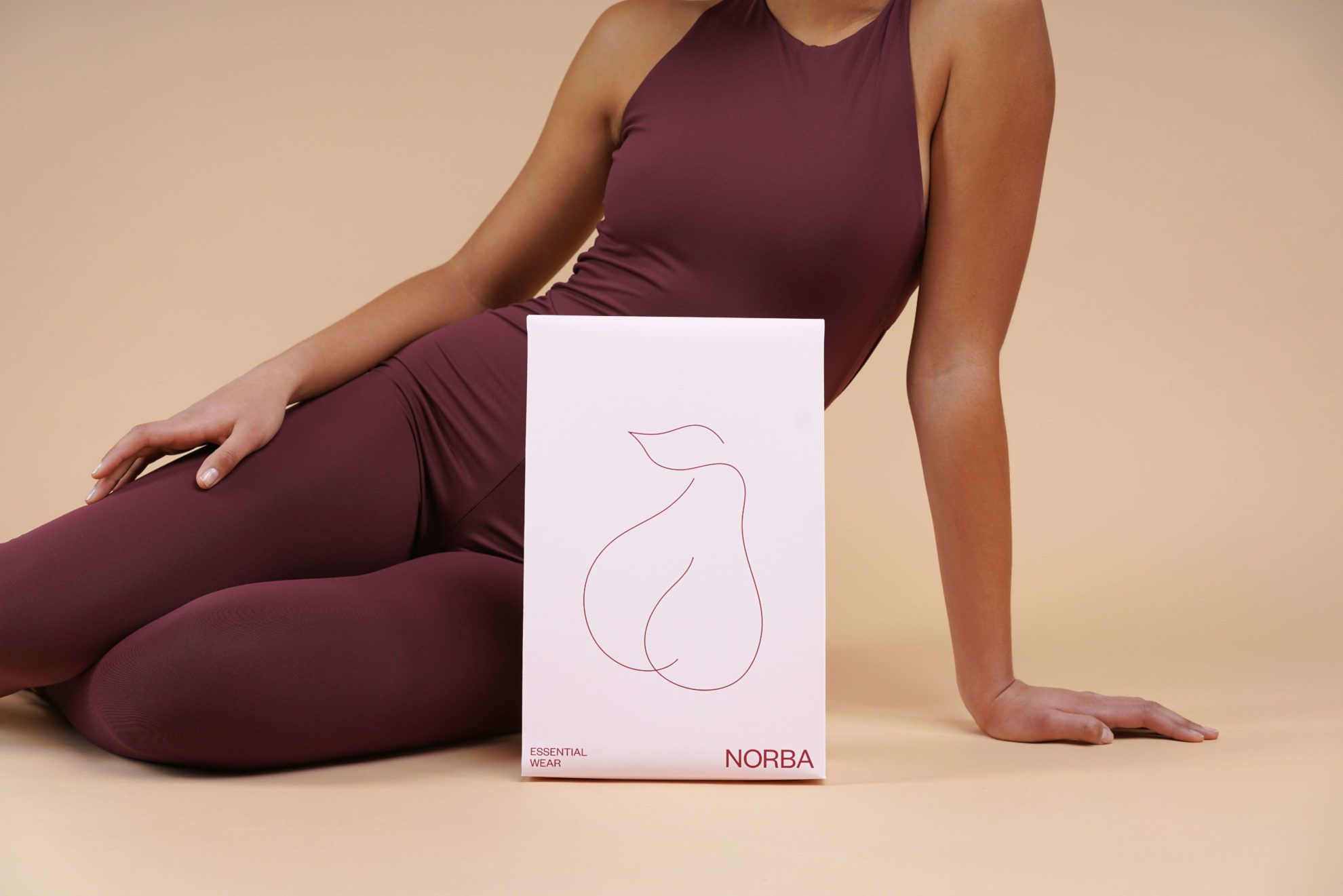
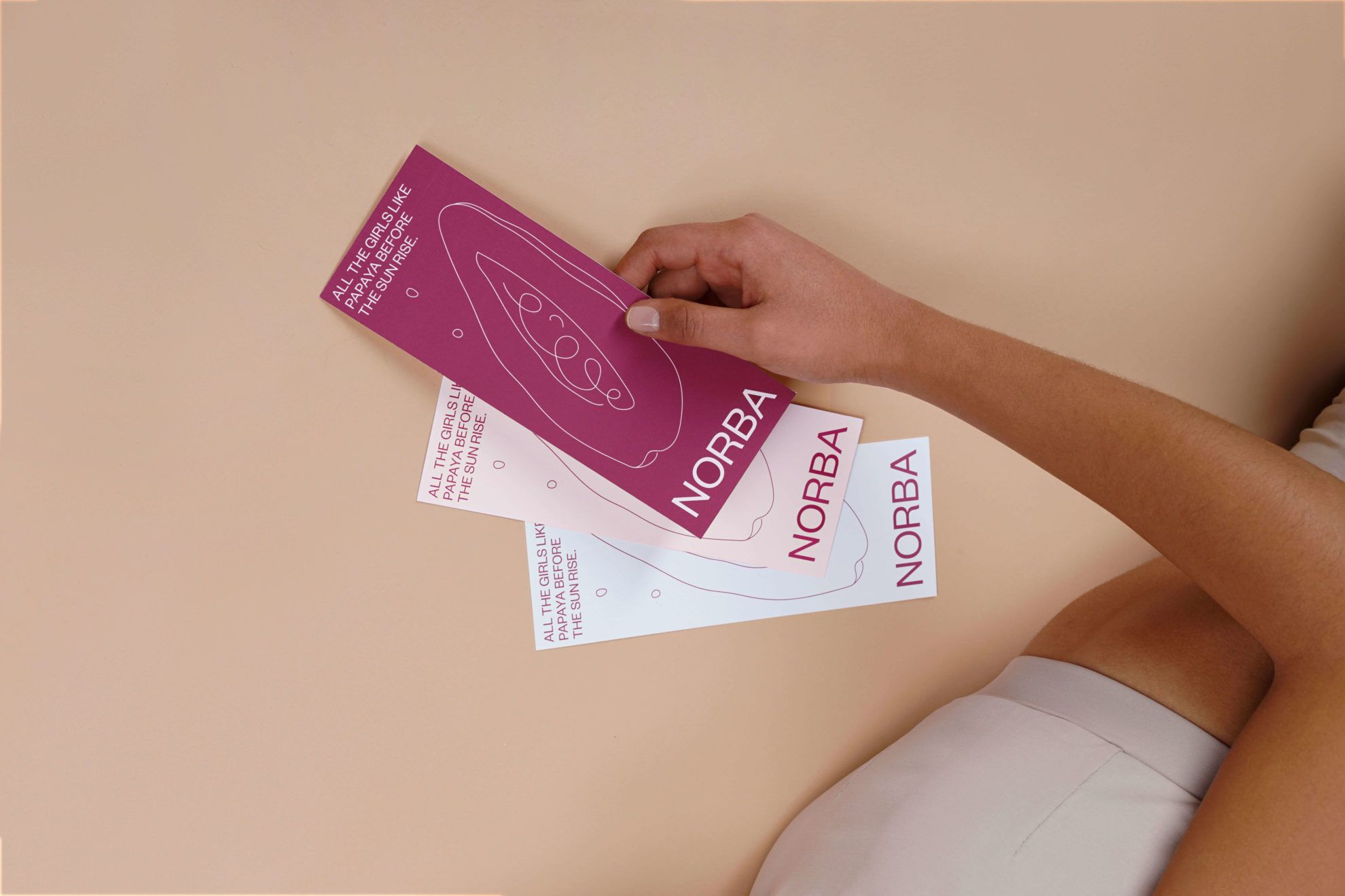
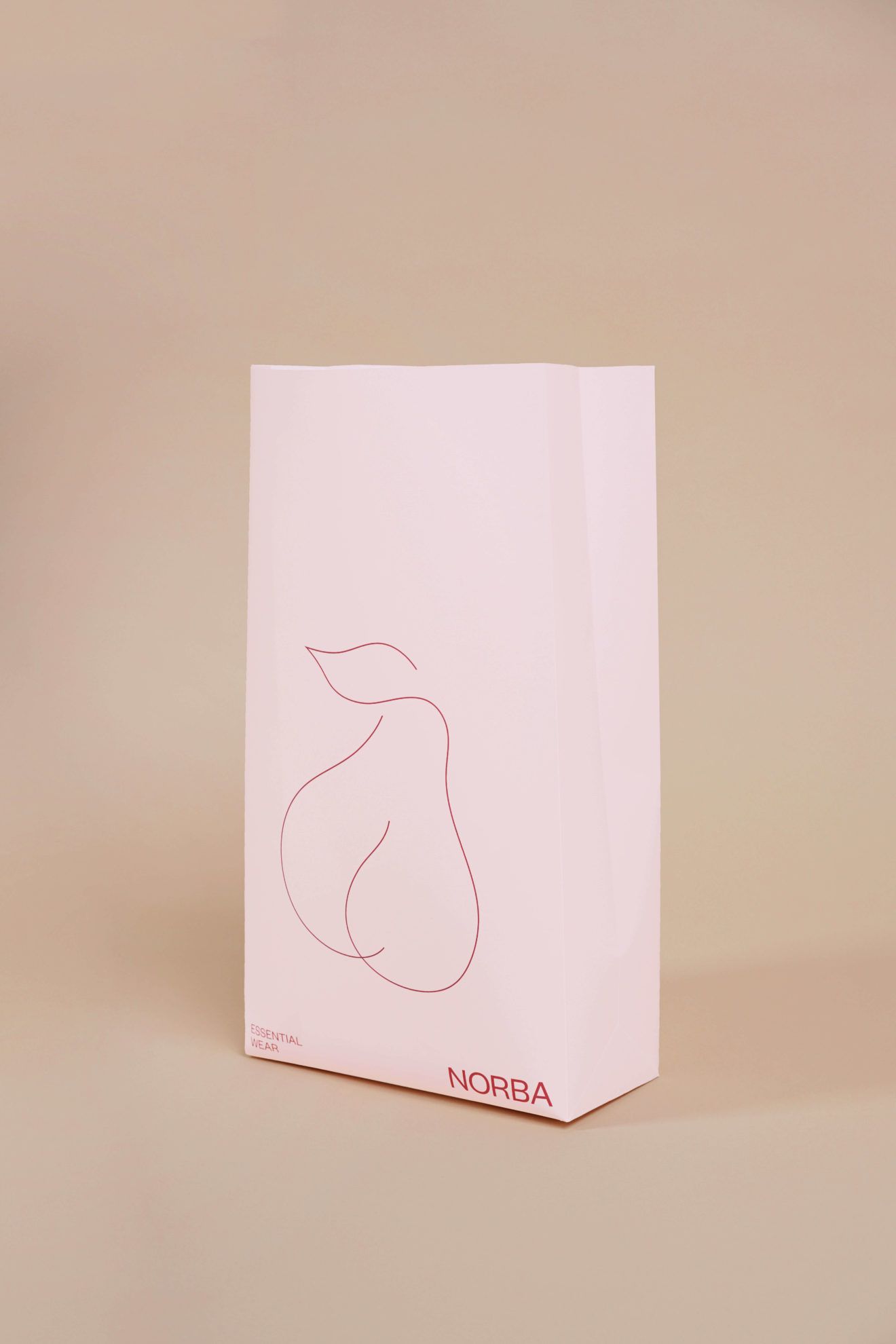
The comfortable sports wear brand was launched by two sisters in 2018, with the aim of designing universal pieces that can provide comfort to their wearer all day long. NORBA does not only favor fitness ladies, on the contrary. Women of any body type can feel good in these elastic and aesthetic clothing pieces, and this message can also be decoded from the image elements of the brand. They use a simple and straightforward font, the image of the calligraphic fruit displayed in the logo and the moderate brand colors suggest confidence towards the female buyers.
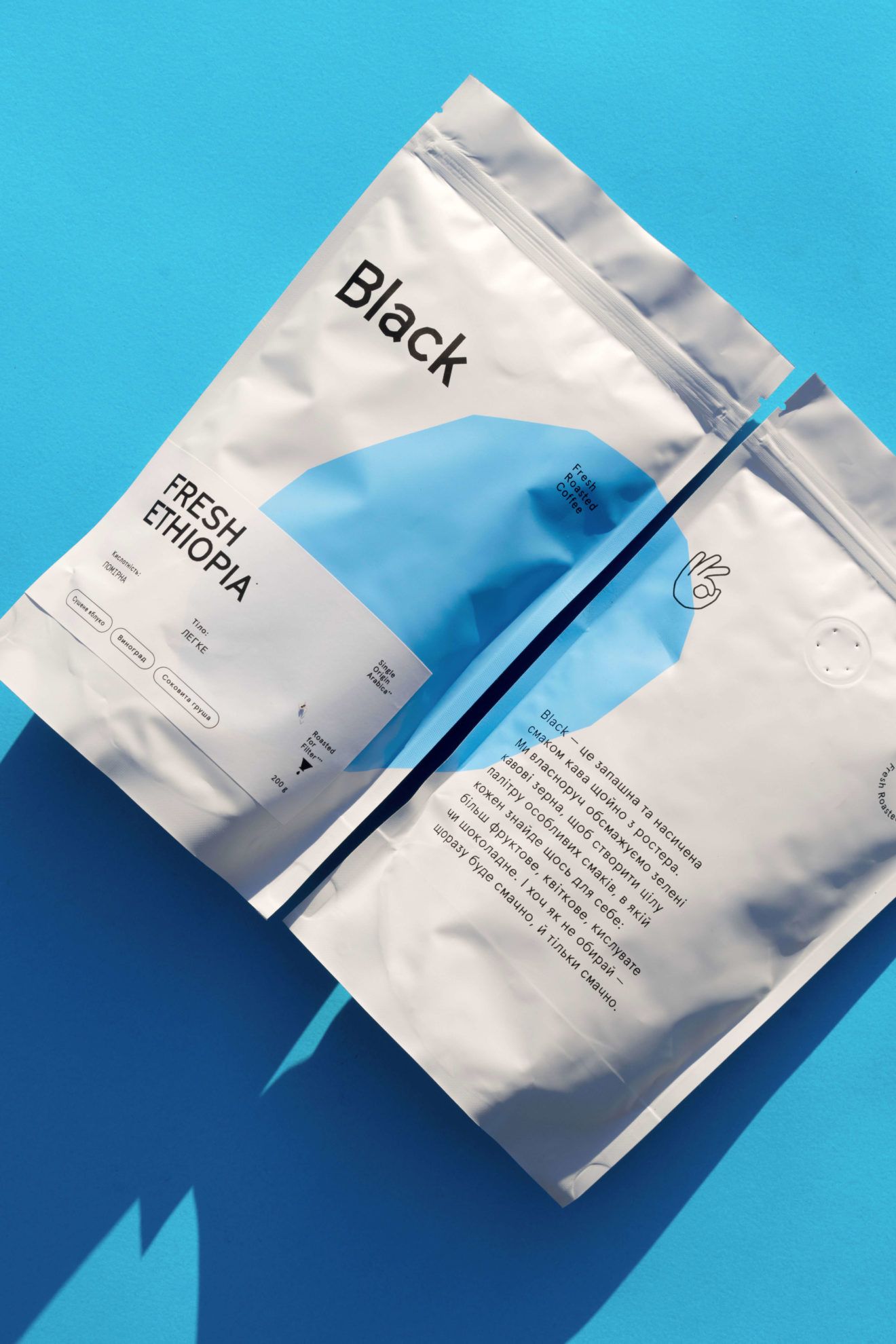
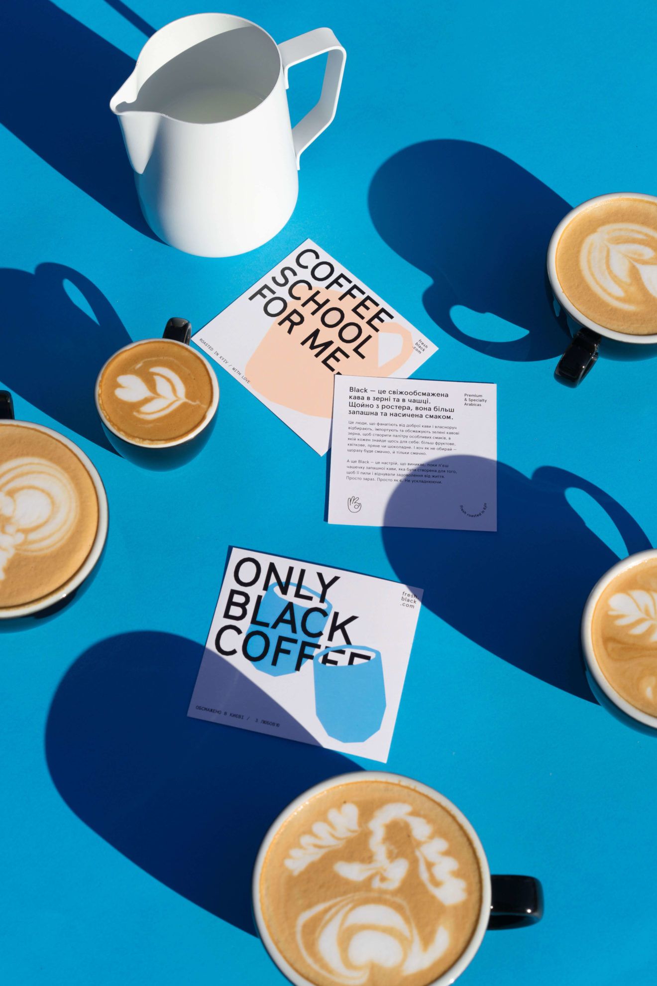
Another client of theirs is BLACK coffee roastery, for whom they designed identity system and packagings, too. Lera and her team wanted to give a fresh and stylish outlook to the brand, which calls the attention of coffee lovers with its simplicity. They designed different packagings for the different types of coffee: finally the white, azure and peach shades became dominant.

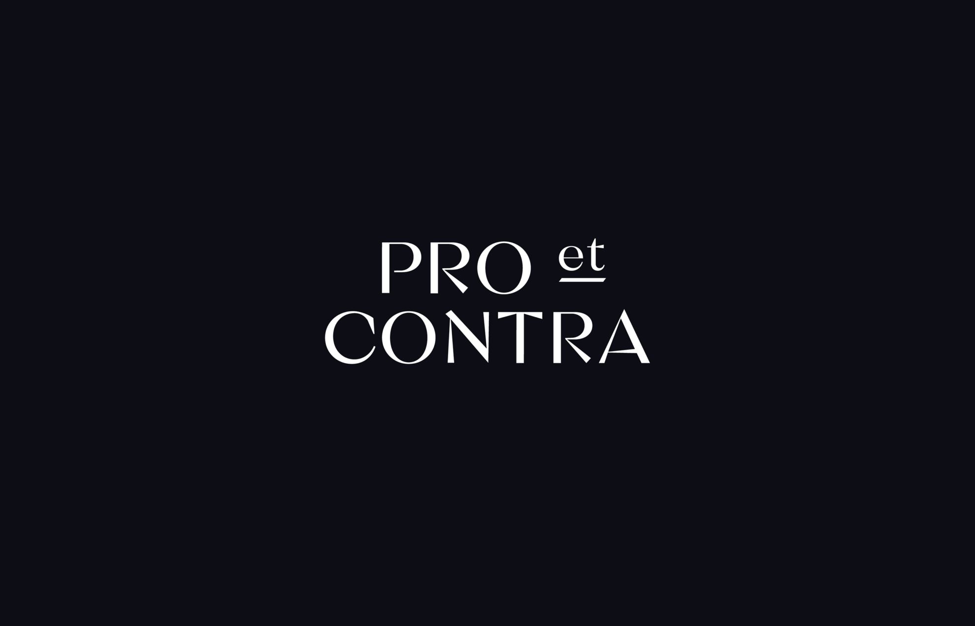
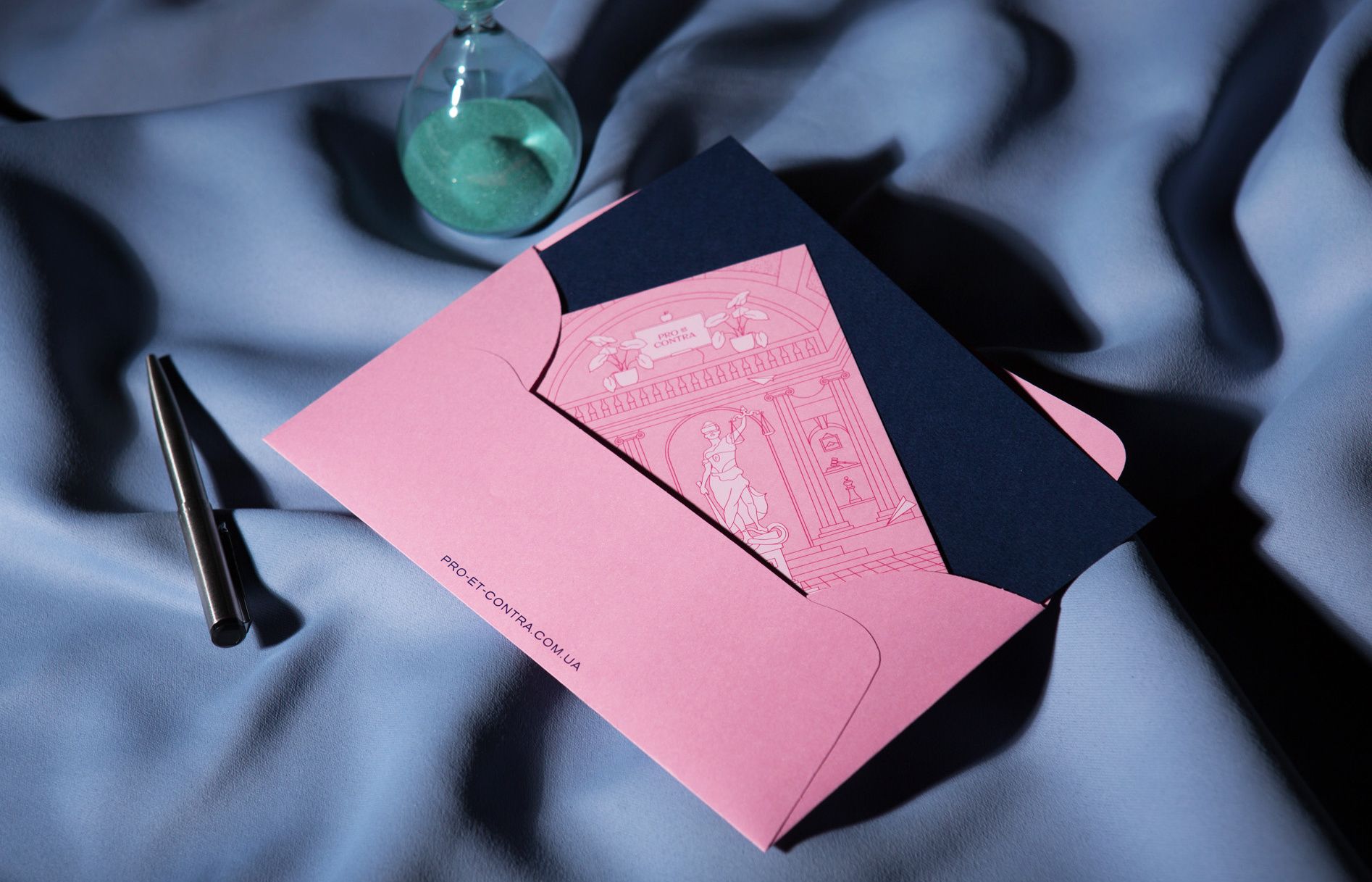
Probably the loudest amongst their projects is the image designed for Pro-et-Contra law office, where baby pink and dark blue shades engage in a conversation with each other. This humorous and aesthetic appearance might be unconventional amongst law offices, but who said lawyers can only be boring, stuck-up people? The image designed by Orchidea is friendly and conveys sufficient openness, while it is also elegant, just like it should be.

Carpathia | Nicholas J R White
Color is the basis of everything | Szilvia Farkasdy's fabrics