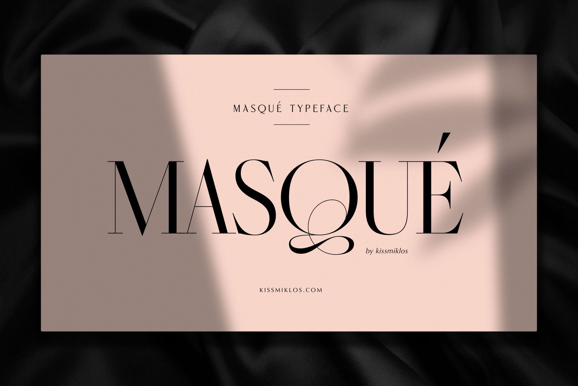
Strong contrasts and French elegance in a typeface: to the delight of typography fans, here’s the new characteristic kissmiklos typeface, the Masqué.
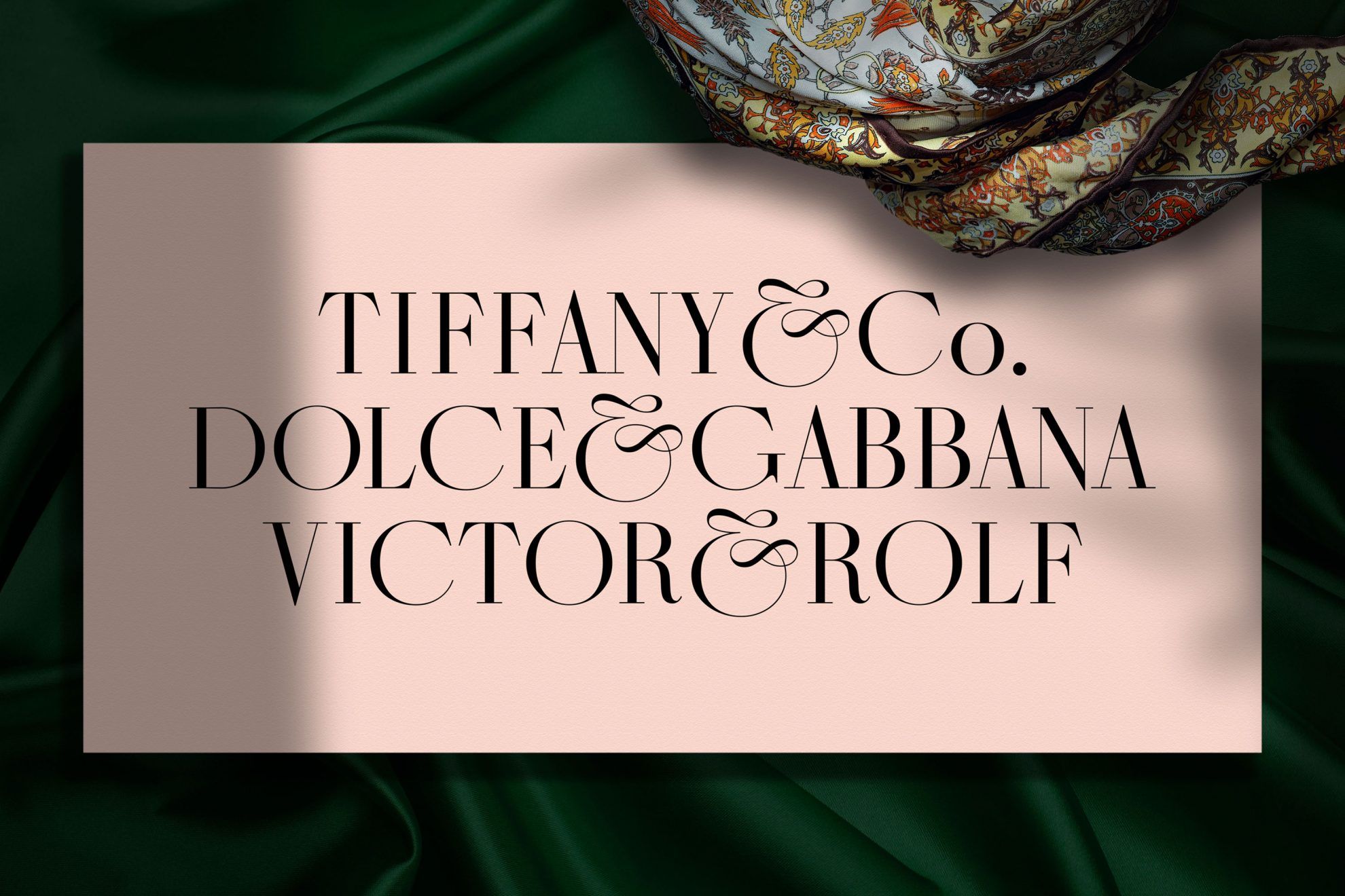
The unique Masqué typeface was inspired by the iconic Didot font named after the famous French printer and type founder Didot family. Even though Miklós Kiss has already designed unique characters before, this is the first time he created an entire typeface. “In the past years, I received many enquiries and messages from various designers as to where the fonts used for my ligature font games or logotypes can be downloaded – this is why I started designing fonts” –Miklós told us.
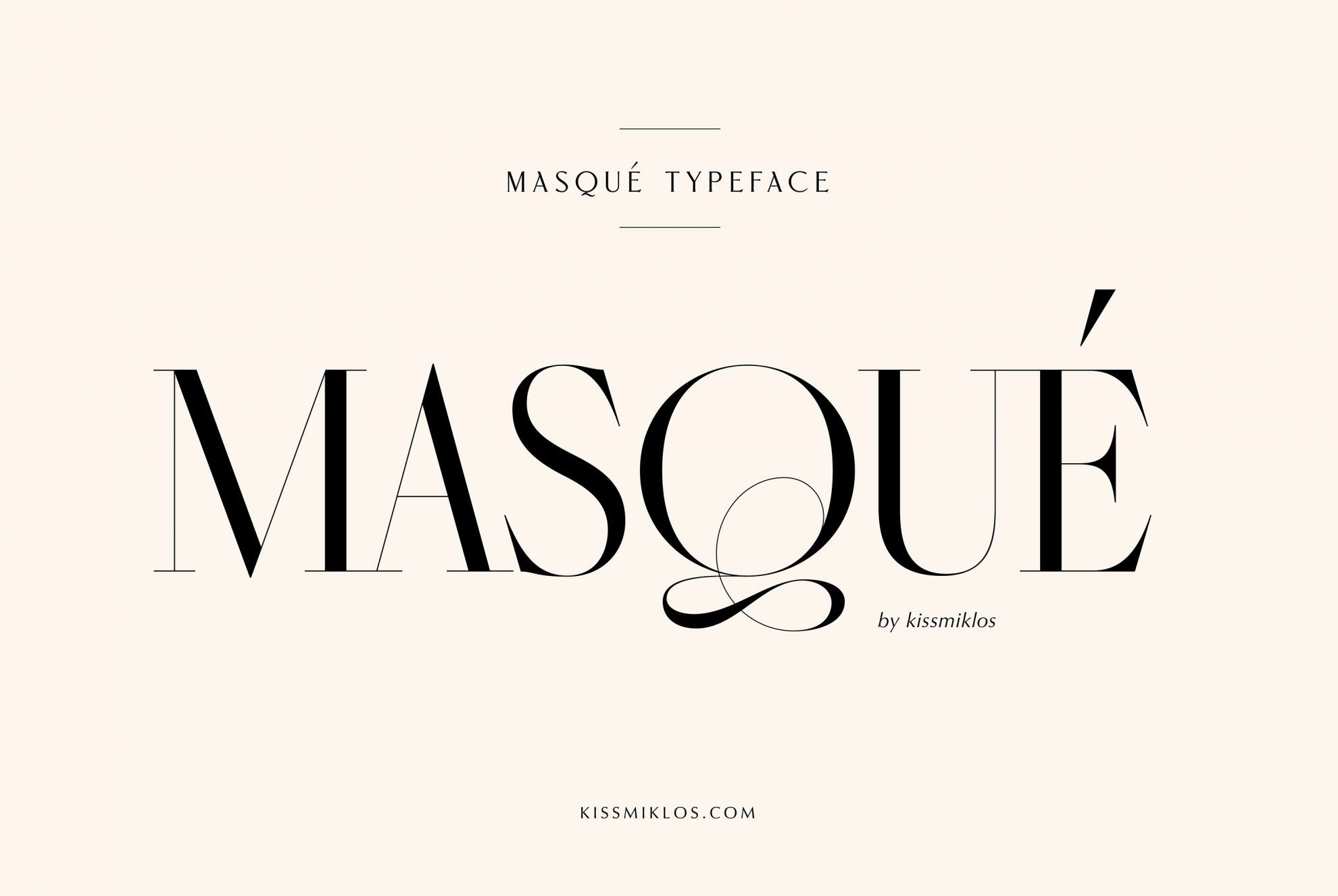
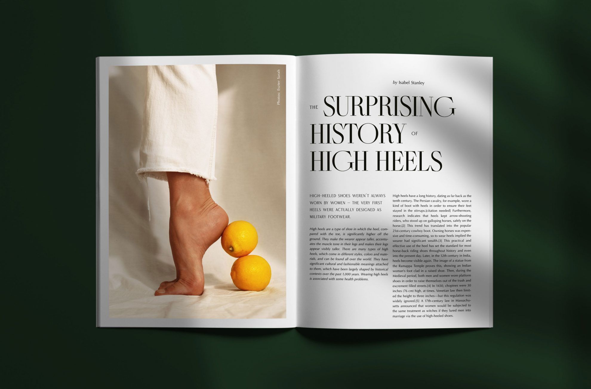
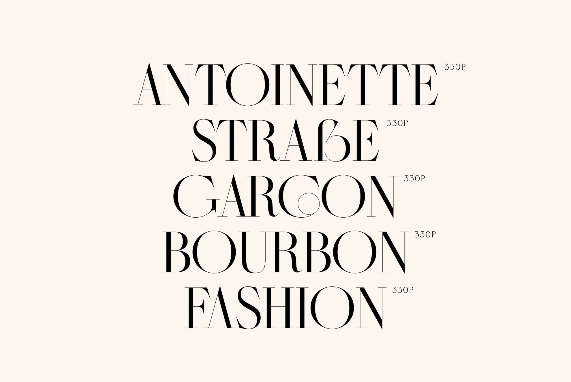
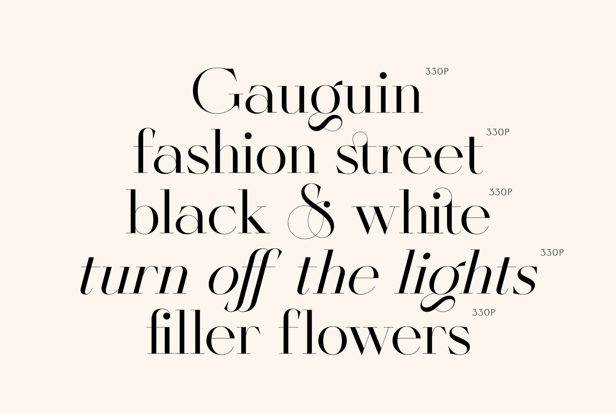
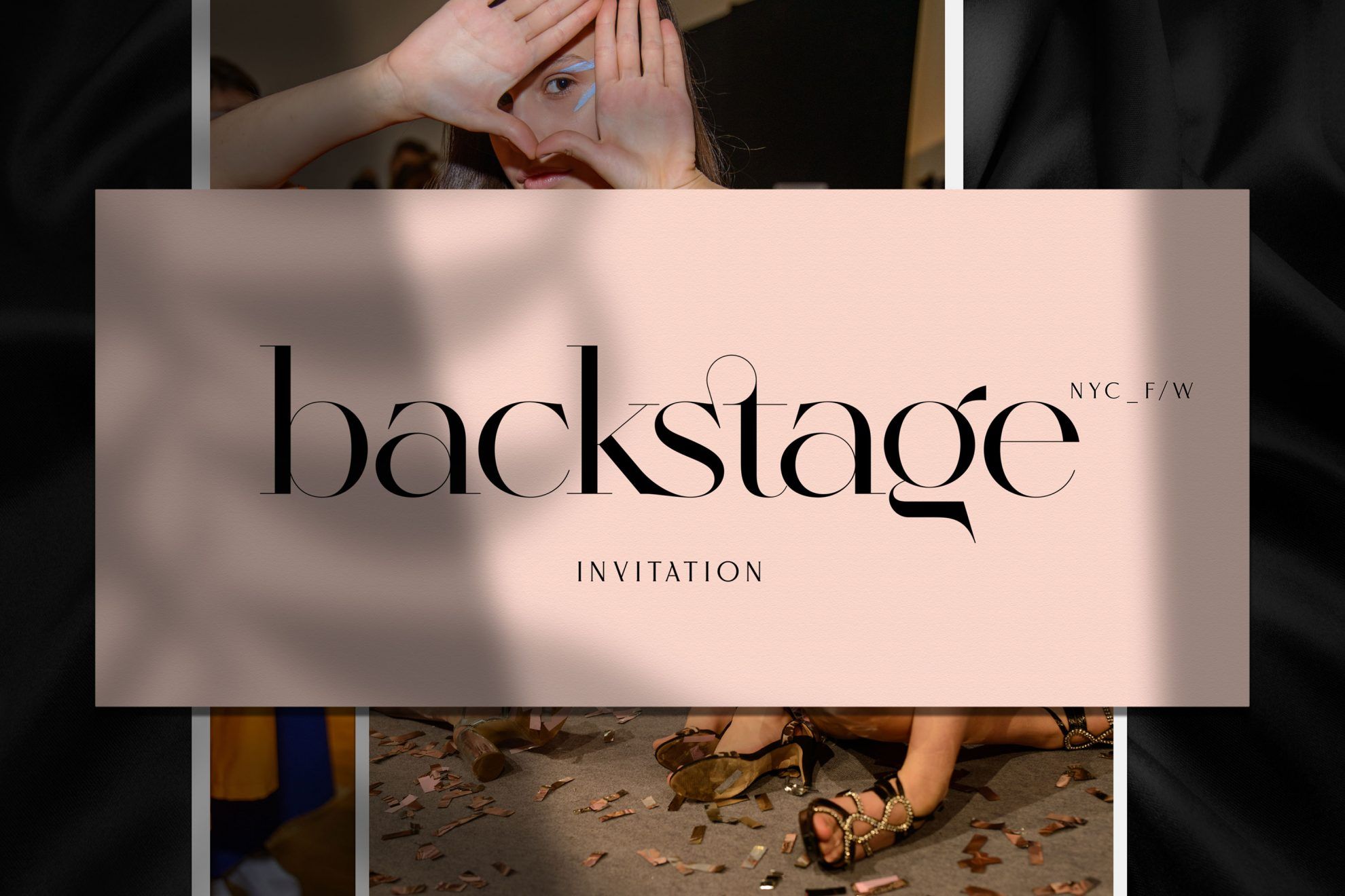
The sophisticated aesthetics as well as strong artistic and conceptual attitude so characteristic of the designer’s works can once again be observed in Masqué’s design: the fonts become characteristic and recognizable with the help of arched, airy and elegant ligatures.
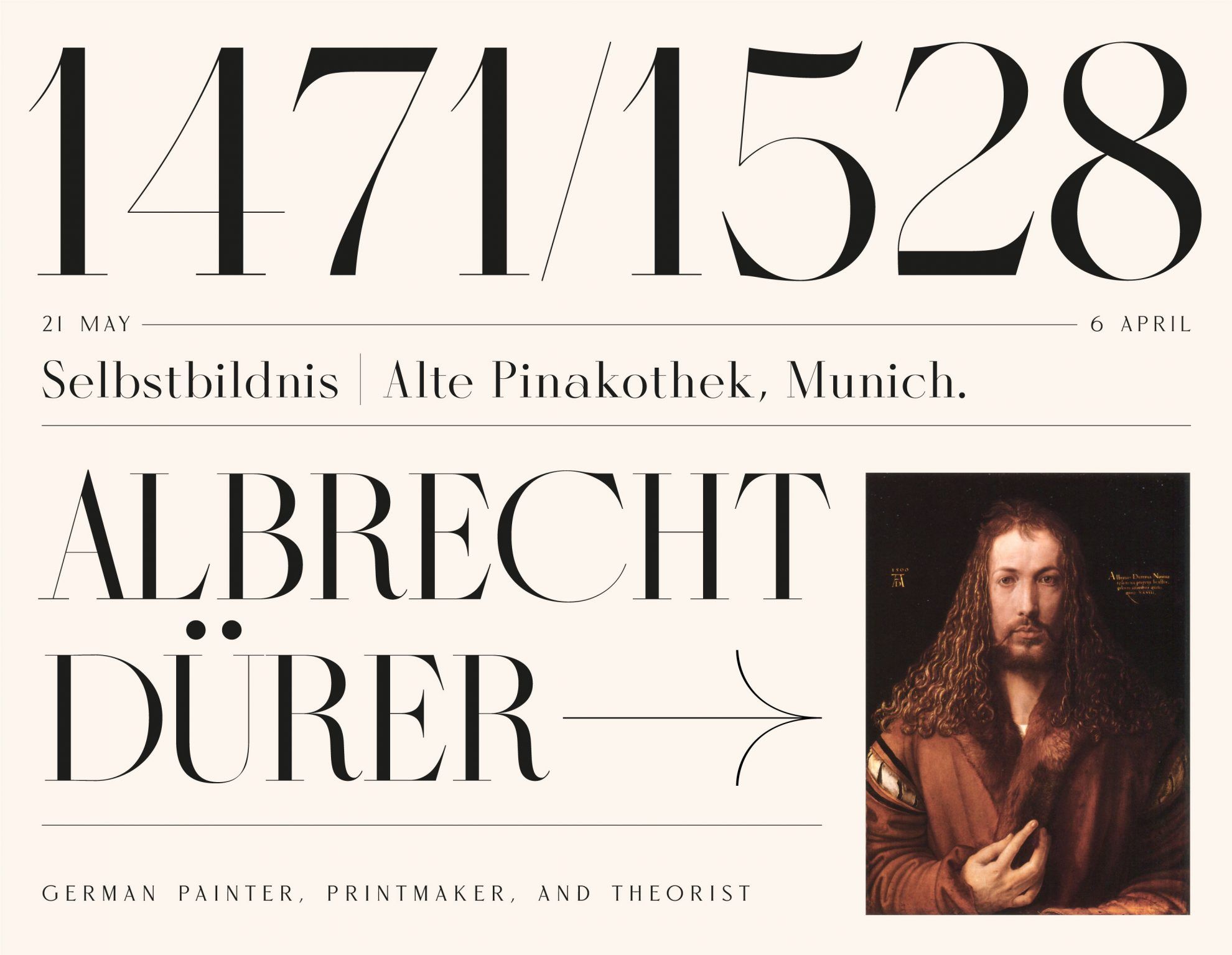
“Masqué is a hairline typeface, and so the larger the size we use the better it looks: it’s perfect for titles, headlines, shorter texts and juggling with fonts. It is also suitable for logos, but it needs some boldening” – the designer explained.
Additional peculiarities of the typeface includes the numerous variations available for the given characters, allowing users to experiment with several versions of the sign of the ampersand (&), for instance.
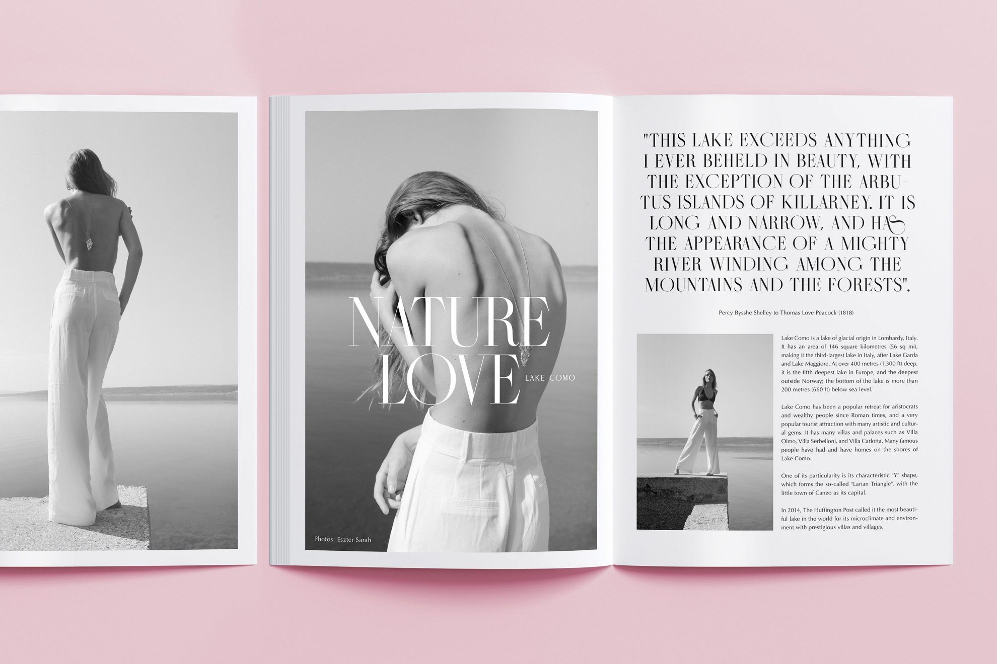
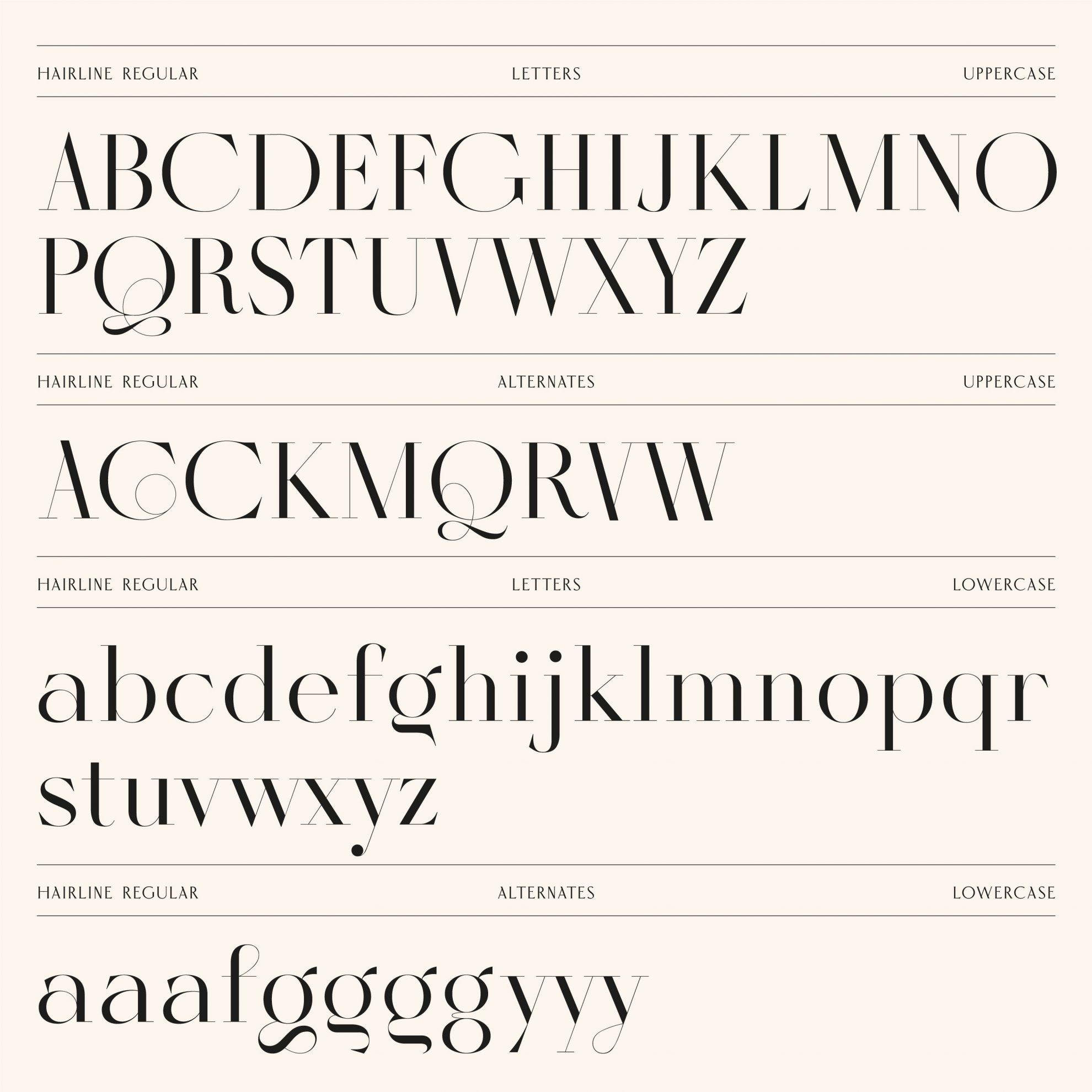
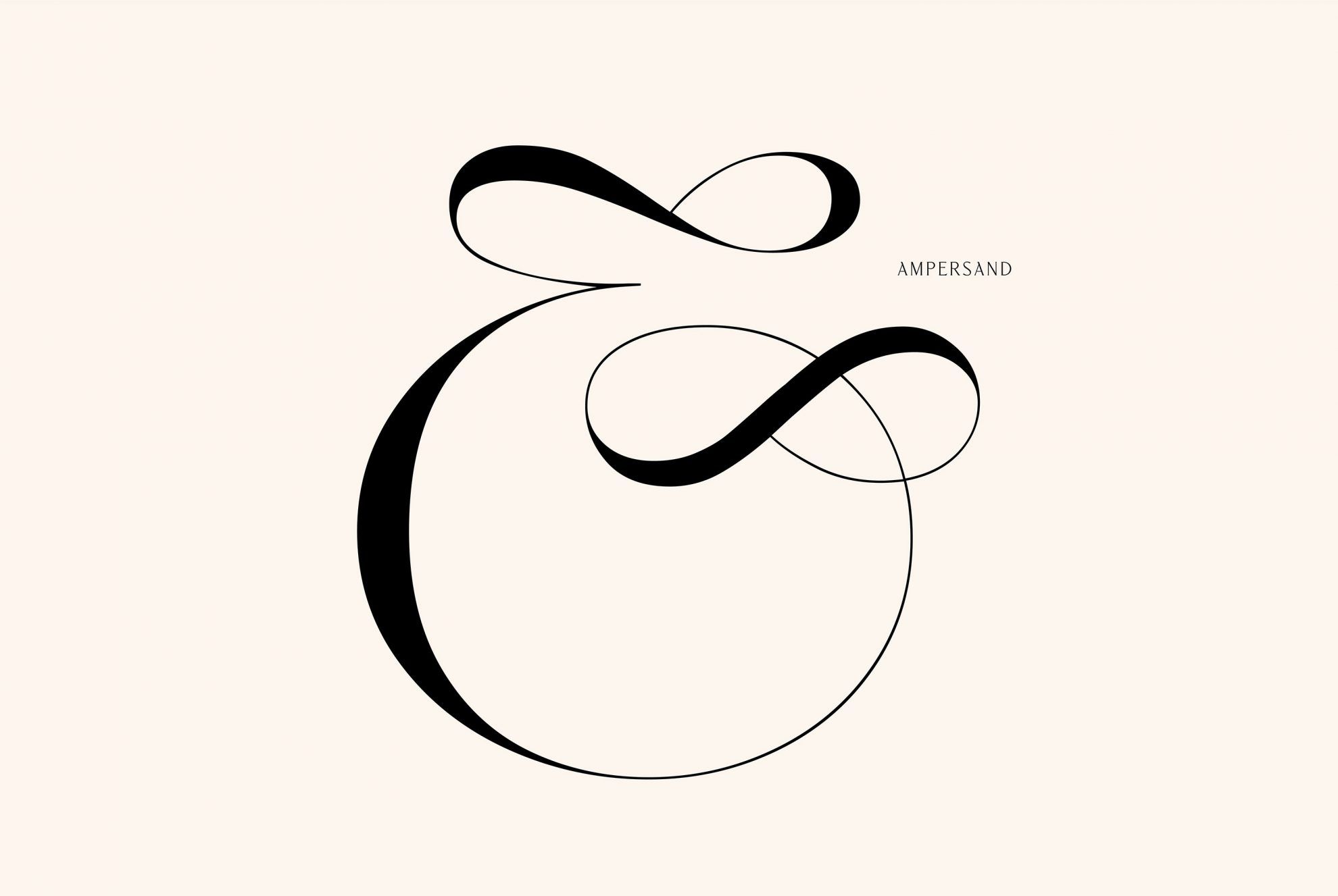
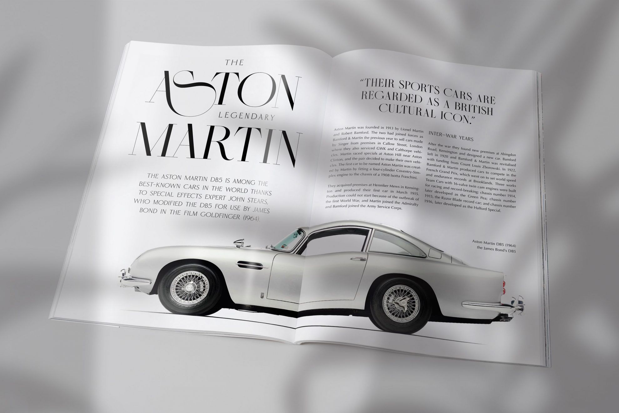
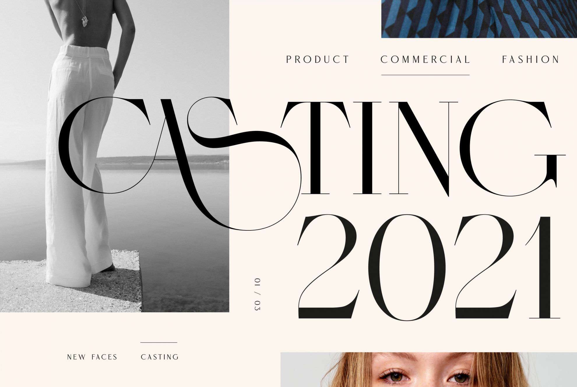
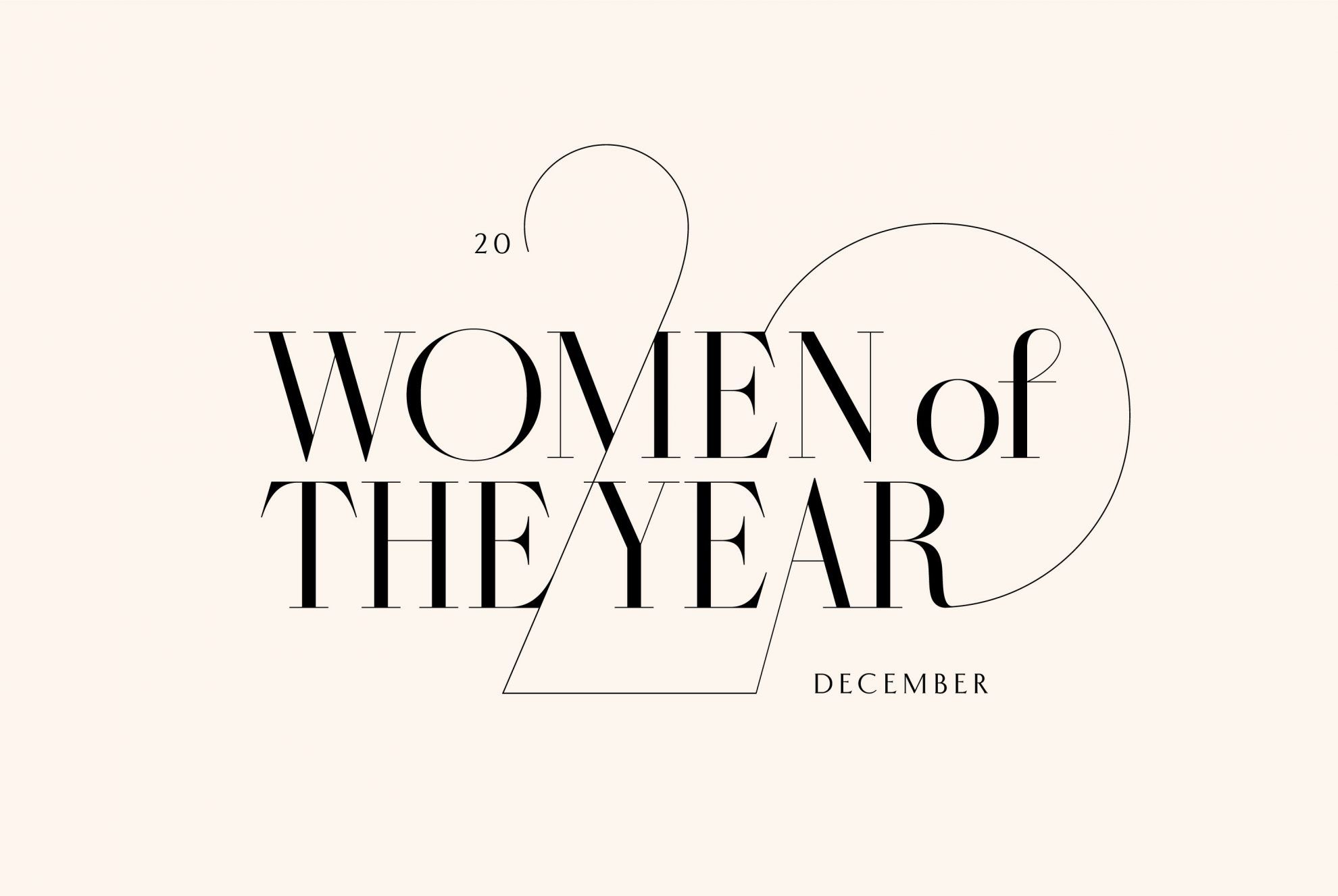

If you would like to give it a try, you can order the Masqué typeface from Miklós Kiss’s website. The good news for font fans is that Miklós has also released his latest typeface, the Veronési, and the designer also plans to drop a third typeface in January 2021.
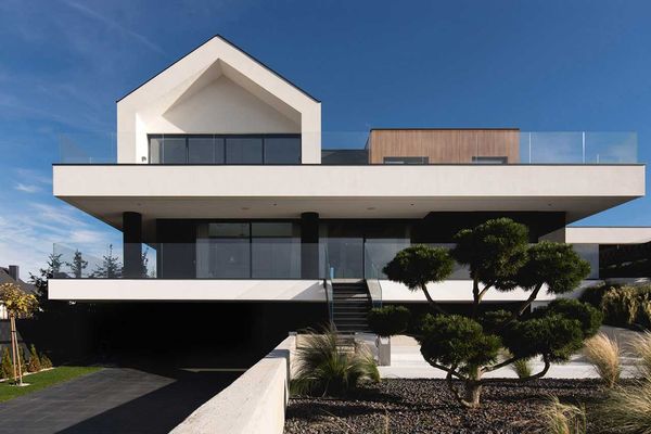
Polish family house built based on LEGO principles
Interior design studio este’r partners unveils new furniture collection
