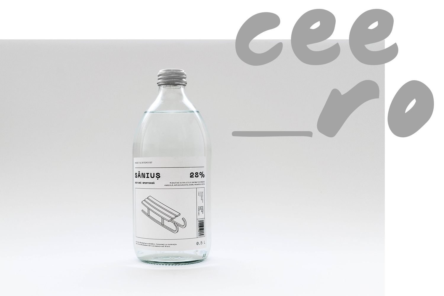
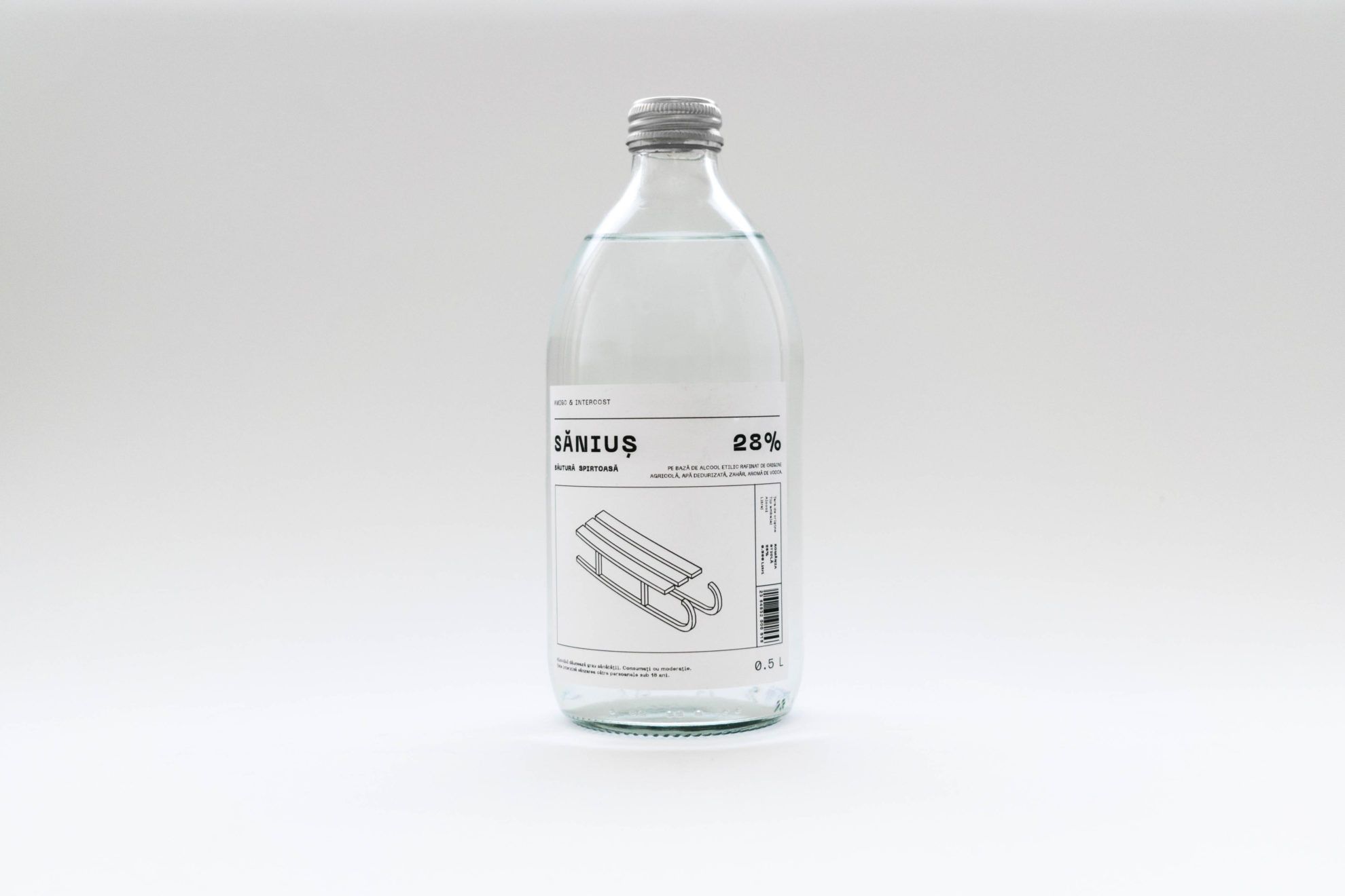
The Săniuş (means: sleighing) is the local alcoholic beverage of a Transylvanian manufactory, which is mainly popular amongst young people owing to its budget-friendliness. Sebestyén Boér reimagined the packaging of the vodka with due humor and simplicity, in which characteristics alluding to the region can also be observed. The visual identity is only fiction yet, but we hope we can see it on the shelves on the stores soon.
Interview!
Why did you reimagine the package design of Săniuş? Why did you choose this one exactly?
This is a bit hard to explain to people who don’t have a kind of internal knowledge, but I will try to do it. I was born in Sepsiszentgyörgy, but I went to university in Oradea, to Partium Christian University. I live in a region both corners of which I know very well geographically, literally: I have a specific image of this world, and through that, I also have an insight on the broader region. There are many differences between Partium and Trei Scaune, but there are also common points, especially from the point of mentality. As a matter of fact, this is the true Eastern Europe, close to the “Balkan”, and we have a different attitude to some things: with a certain thick self-irony and gallows humor. This also includes that one succeeds from a small budget for some reason; it is especially easy to experience this as a student.
The drink I have chosen targets this layer, but it offers more than simply being cheap. It also carries some kind of feeling: one sleighs (in Romanian: „s-a dus la săniuș”), and is right on the slope, but it is not that bad of a slope – worst comes to worst, if they already had something to drink, they may fall on their heads, but then they dust themselves off and laugh. So that we can understand this a bit more, one has to know a little Romanian. Here is the „Săniuţa” name, for example, which means a little sleigh. Romanian language likes to use the diminutive suffix, which is also linked to the fact that this region is a more jovial and more humane world, these things don’t have a fang here, or if they do, we pull it out with how we talk and how we think about them. This is why, for example, this Săniuș can be an emblematic drink in Transylvania, because this gives life to or embodies this feeling somehow.
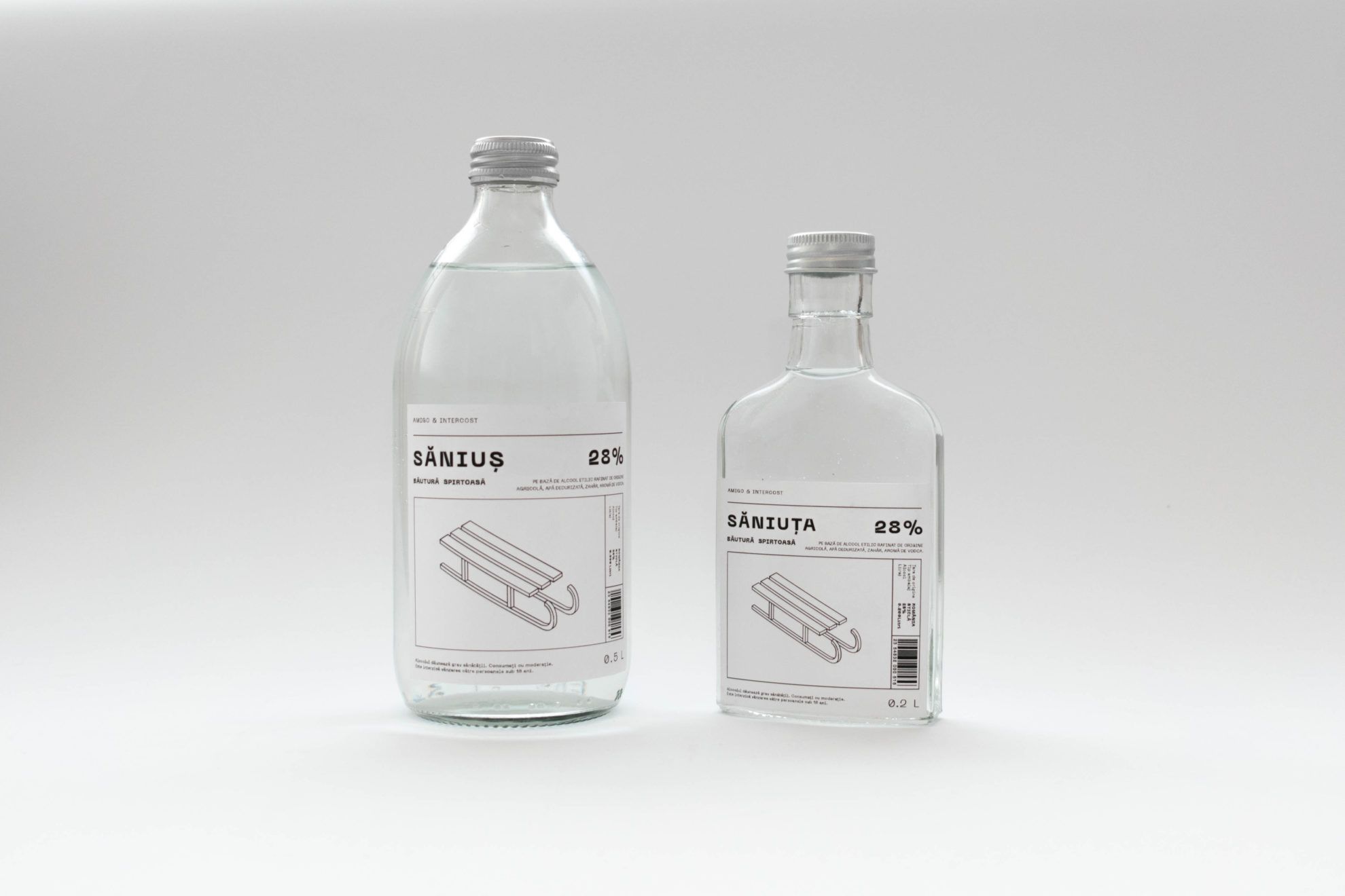
The reimagined visual identity is adjusted to current trends: it has a minimalist and plain design, complemented by black and white line drawings. The symbols and stories displayed on the labels are not a coincidence either. What was your basic concept?
My primary goal was to create a package design that can be implemented in the most cost-efficient way with regard to the price and target audience of the product, which also complies with professional requirements from the perspective of graphic design. The minimalist black and white visual world was the result of all this, the spirit of which is given by the irony and humor displayed with graphical means.
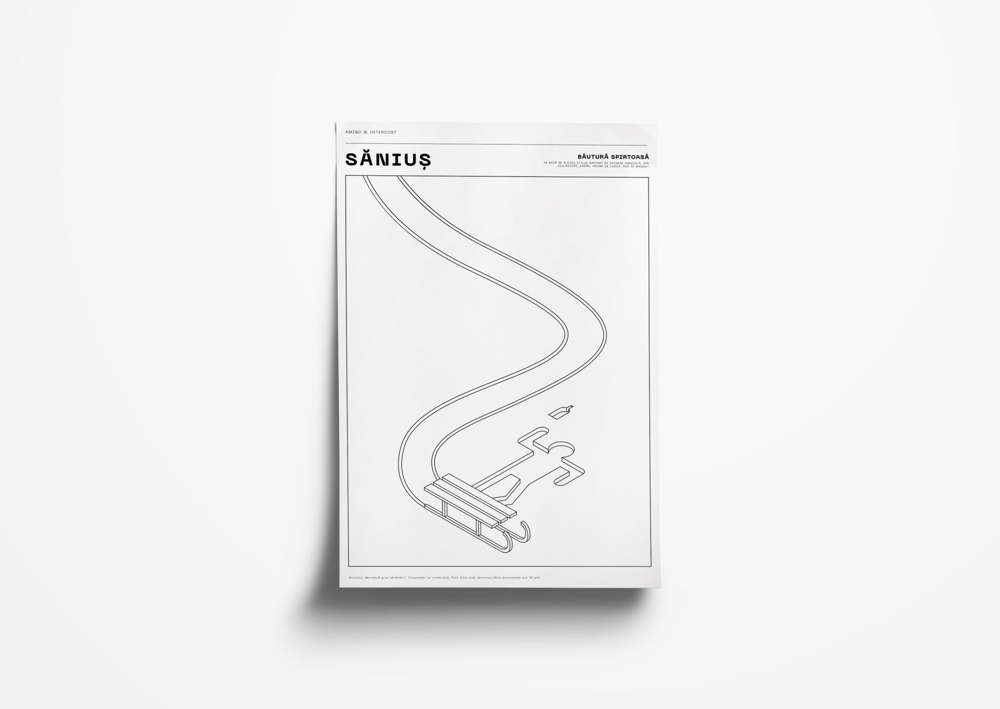
In addition to the fact that the used colors and shapes have a certain modern freshness, I think this black and white (but mostly white) simplicity is also in harmony with the content of the project, but not only by giving something back from that white winter world that is invoked by sleighing in the first hand. On top of that, minimalism shows something of the essence of the genre represented by Săniuș: this is our “sleigh” drink, which is actually not a vodka, but a typical local spirit, one of the excellent examples of „băutură spirtoasă”. „Băutură spirtoasă”simply means alcoholic beverage. Alcohol and water. It is what it is. Another, perhaps even better example for this is V33, even the name of which is not overcomplicated: “V” means “volum”, that is volume. So there is a drink with 33(volume)% alcohol content, which is simply called a drink of 33(volume)% alcohol content. It’s completely authentic. Black and white. No reason to overthink it.
So the redesign to be complete, you also came up with an imaginary debut, which is connected to a popular local winter event, the Fools’ Olympics organized in Harghita-Băi. What is your concept and how did you come up with the idea?
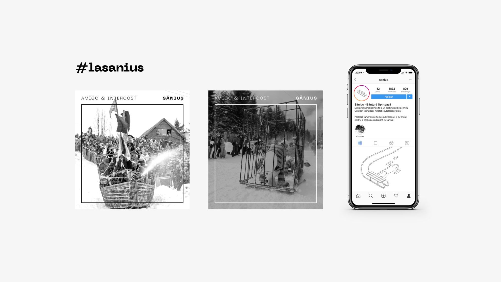
Every product, the best and (in this case) the worst has to get to consumers, to the target audience. This is easier if we can add it to something that is popular to begin with, and attracts the people who could be interested in our product – for example, to a series of events of several years of traditions, Fools’ Olympics, which has been recommended to me by the professional leader of the project, Csongor Szigeti. This is an event at which the participants slide down the ski slope of Harghita-Băi on various comic and many times grotesque DIY “sleighs”. It all came quite natural. A freshly local and jolly event featuring sleighs and a freshly local and jolly sleigh-y spirit. The same world, and the same feeling: that we can laugh at ourselves.
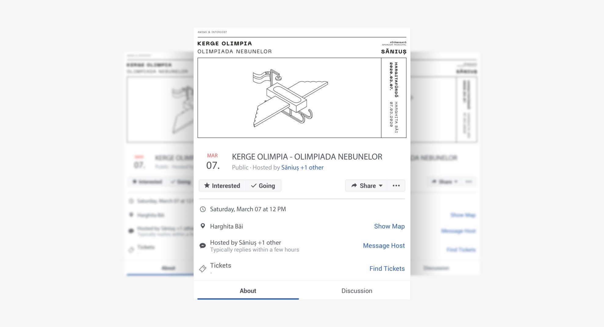
As social media communication is indispensable today, I came up with an Instagram contest, where the followers of the site could compete by sharing photos displaying uniquely designed sleighs for a bathtub of Săniuș. I also tried to adjust the how of this to local circumstances: this is why a little Transylvanian flag was added to the tuned-up winged bath tub used as the cover photo of the Facebook event, and this is why I insisted on the expressions of Romanian press language that are hard to translate in the case of the Romanian description (see: „distracție nemaipomenită”, literally: „a kind of entertainment that has never been before”).
The image is also complemented by the label design of the smaller package Săniuţa beverage (meaning: little sleigh – the Ed.) of the Săniuş main product, and three types of fruit-flavored versions in disposable carton – for those who prefer their vodka mixed with something. To emphasize the popular and humorous tone, Sebestyén also planned further merchandise elements: a matchbox, a paper bag and a flask.
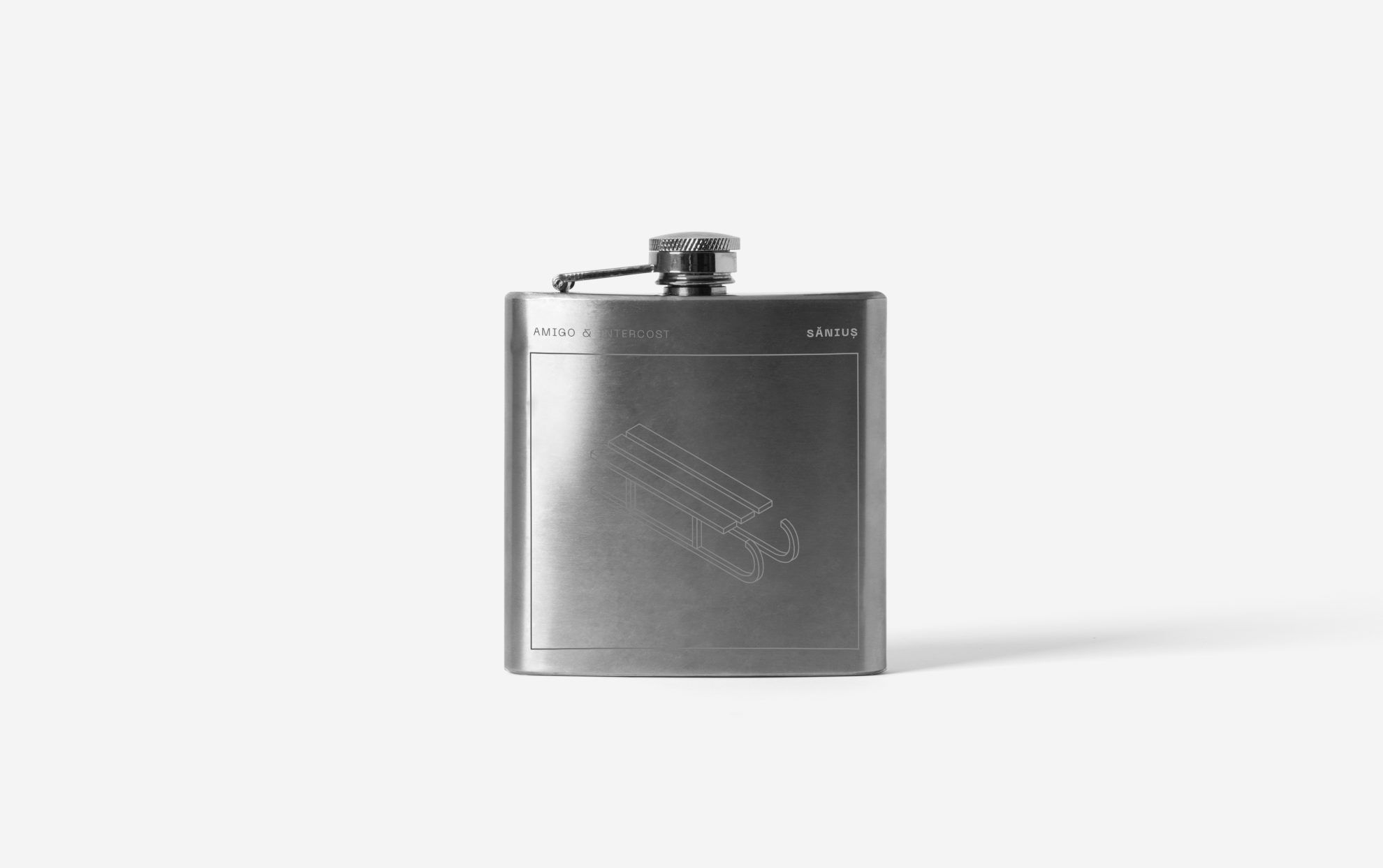

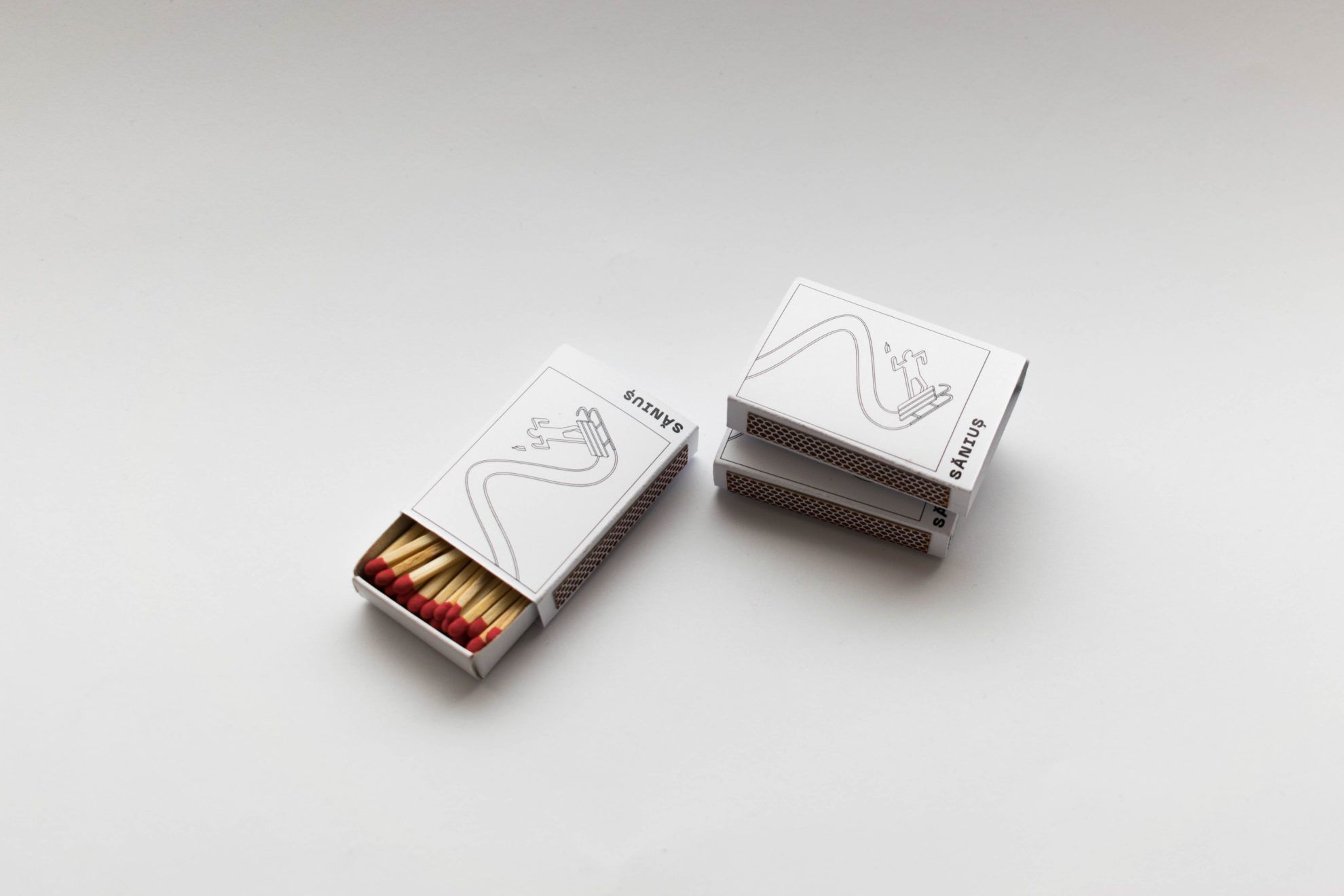
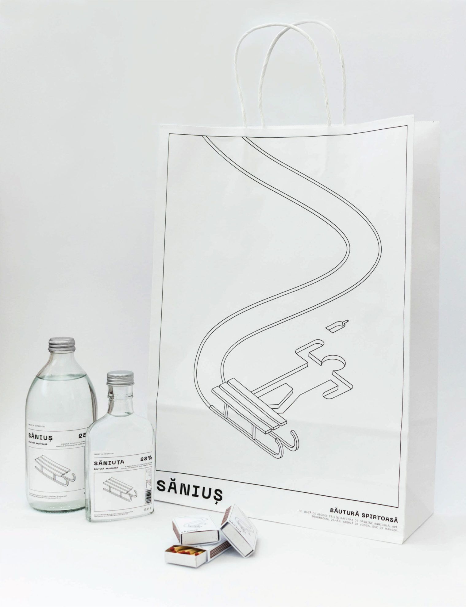
The package design was created under the professional direction of Gábor Csongor Szigeti, in the Creative Graphic Design course of the Faculty of Media and Design of Eszterházy Károly University in Eger.
The CEE RO series presents the work of emerging artists and designers living and working in Romania amongst the countries of the Central-Eastern European region, focusing on the values of the local and progressive design culture.
“Fledglings” | Olympic champions on movie screen
