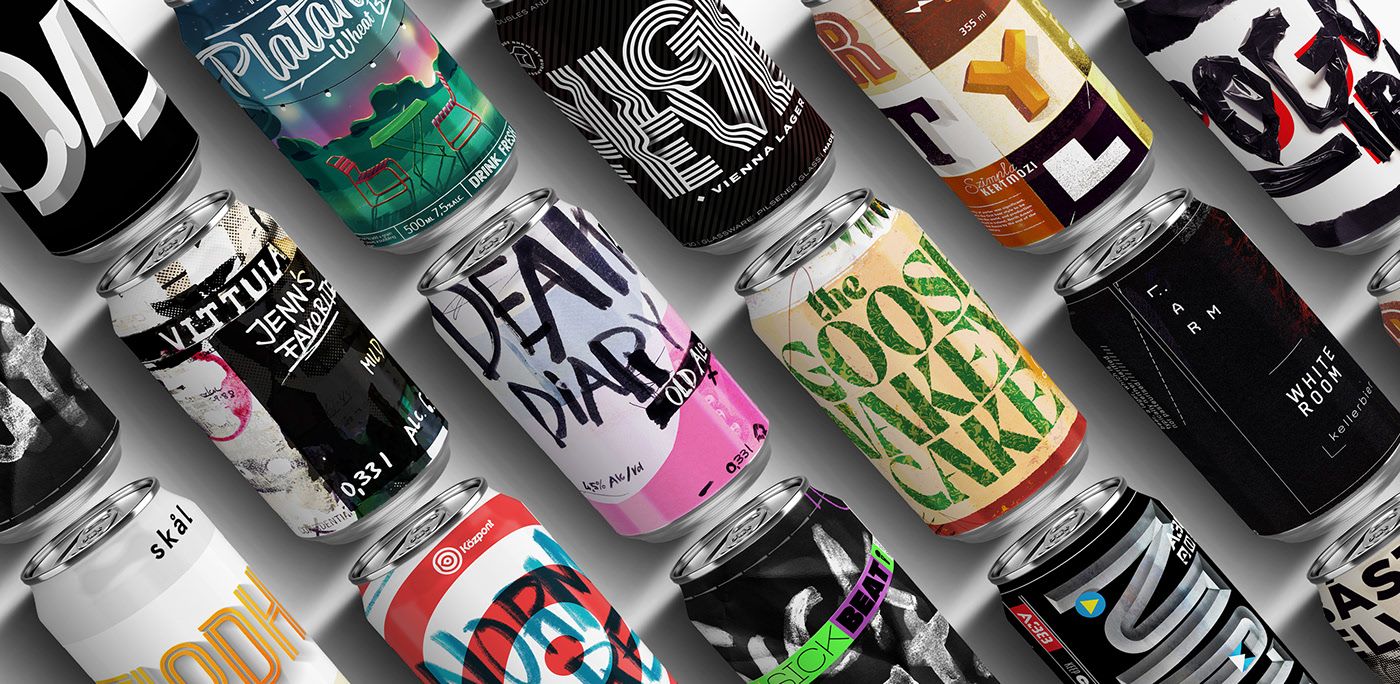
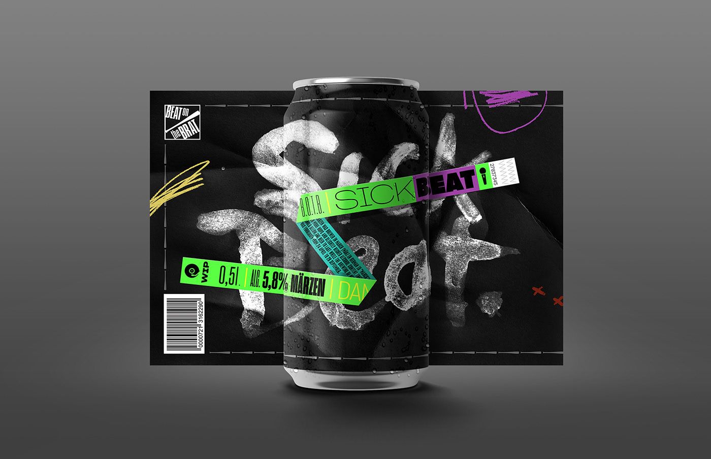
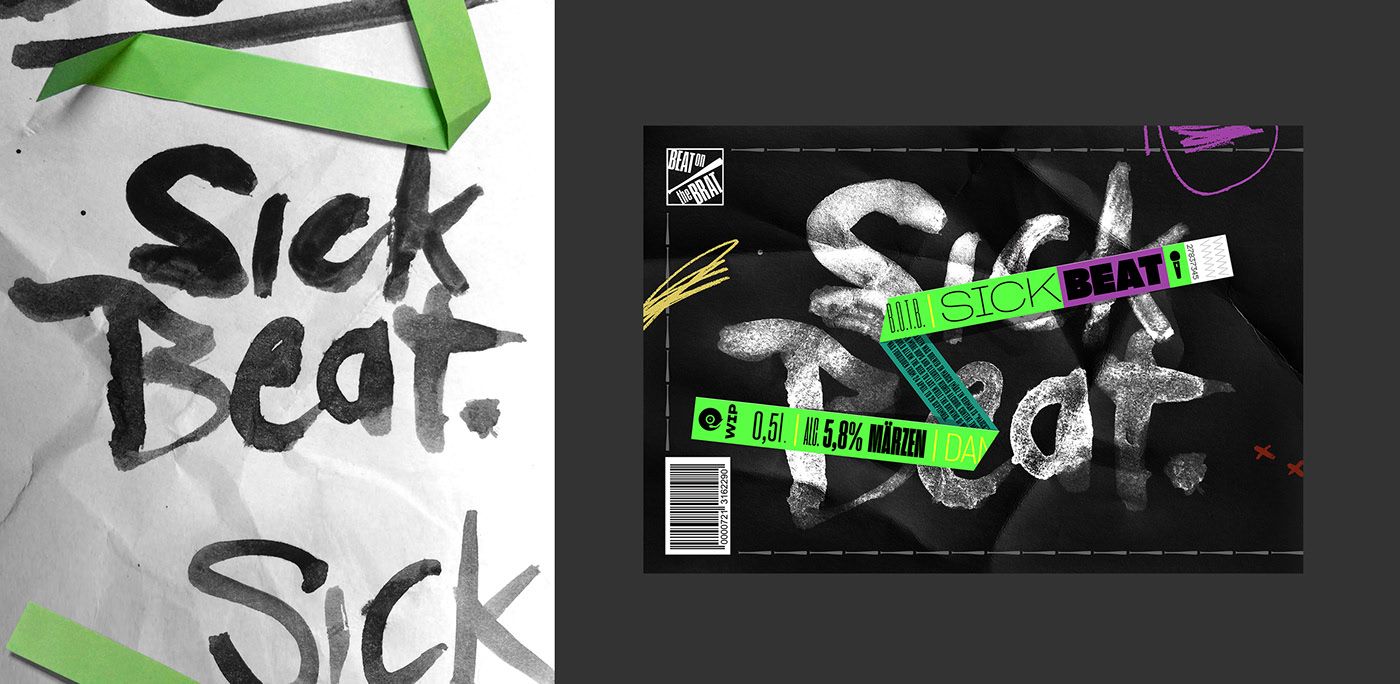
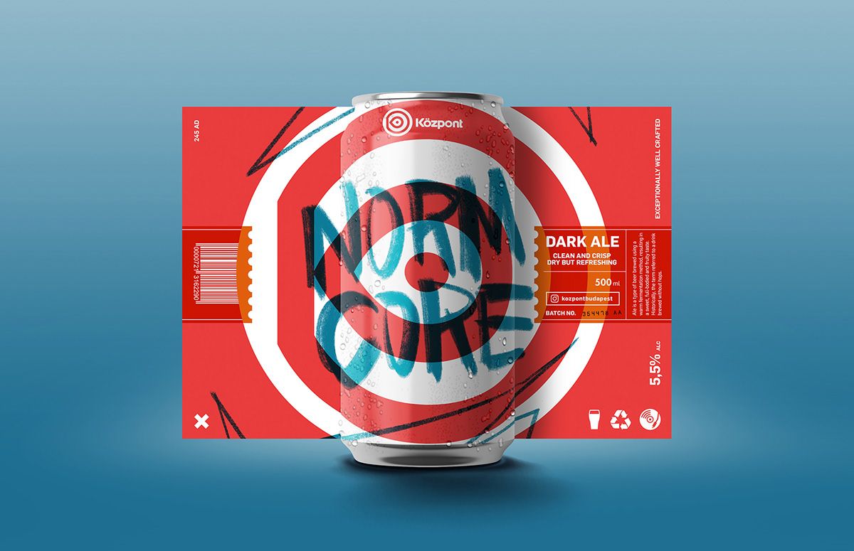
Everyone has a good story about a party place or pub in Budapest. Good parties, friends’ gatherings, celebrations or something unexpected and funny. Just like a familiar scent or some cool music, these places also make us reminisce about good memories and we are attached to them. But of course not only us, but A38, Telep and Béla all have their unique stories, characters and personalities. Graphic designer Péter Csuth recently entertained the idea of what it would be like if these iconic places made their own beers, and then he also came up with their respective labels. Budapest Label Tour – 14 places, 14 beers.
Where did the idea of starting the project came from? Why beer?
I wanted to do a graphic design project with which many people could identify, in which they would find their memories, their habits – to which many people can relate. Budapest is the city of pubs, ruin pubs and drinkers, and so it was kind of self-evident to start on this field.
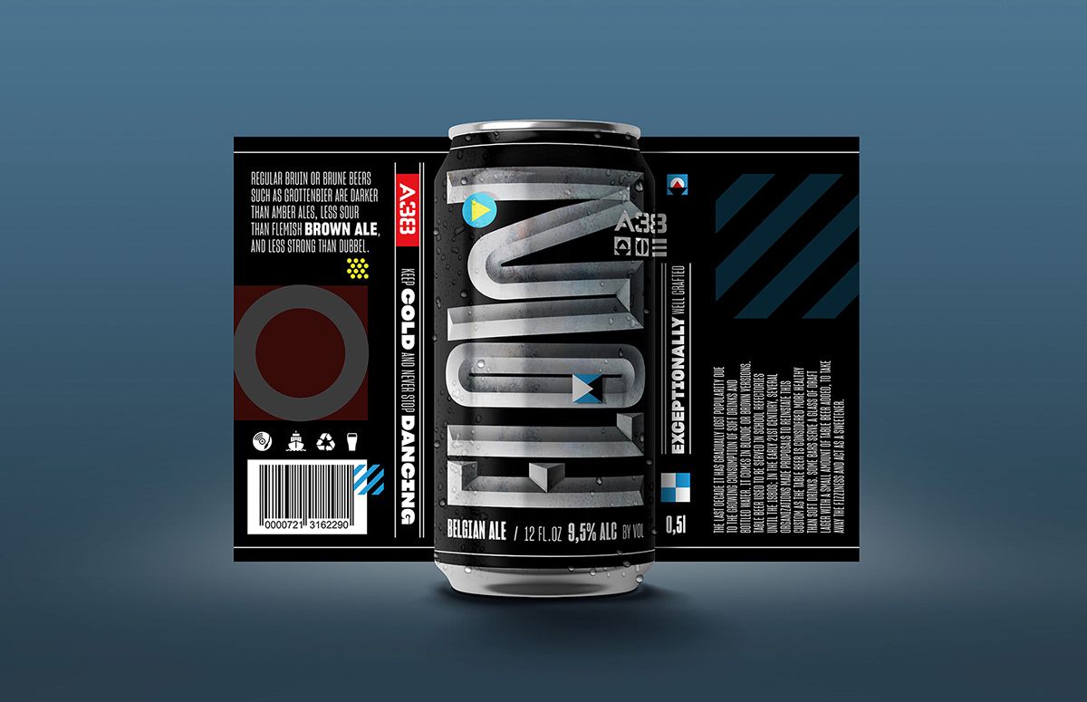
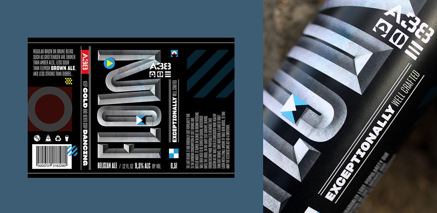
The atmosphere and visual solutions of the given locations recur splendidly on the fictitious beer labels. What factors did you consider during designing?
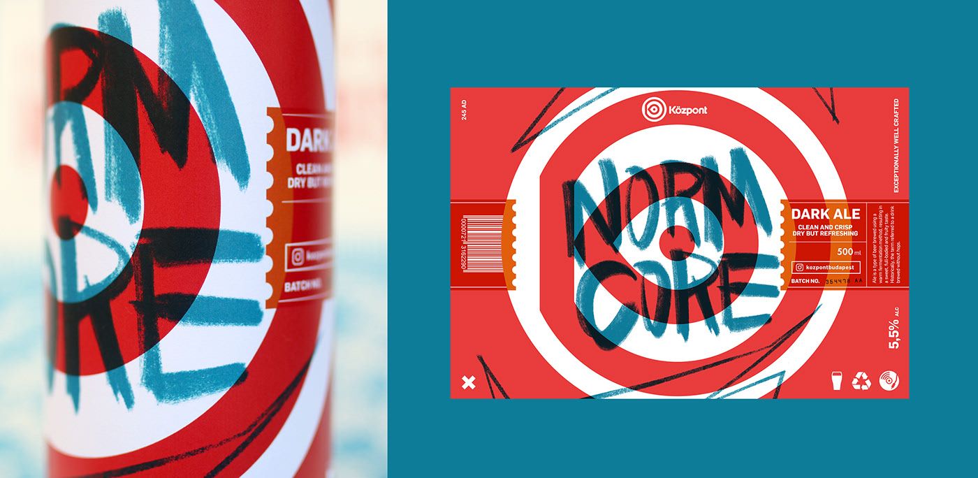
I imagined that if this project were a real one, what would be the cornerstones, important information that would have to be included on a label for sure. Considering all these, I ended up thinking that obviously the name and type of the beer as well as a fine print part (ingredients, manufacturer, etc.), and a barcode are must-have items. Another important element was to incorporate the elements of the visual identity of the place in the graphics, too. If I think about it, every place is the same: they have a door through which you can enter, you can order your beer at the counter, there are chairs, you can sit down, there is music, blah-blah-blah… But then what are those unique traits that distinguish one from the others? These were the ones I wanted to capture on the labels.
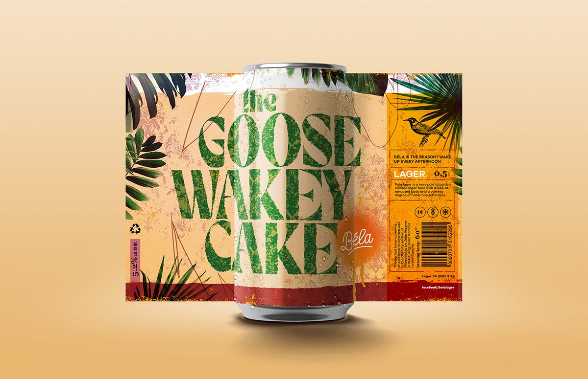
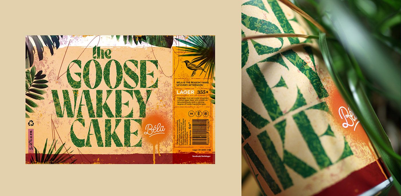
In the course of Budapest Label Tour, you designed fictitious beer labels for A38, Beat on the Brat, Béla, Doboz, Dürer Kert, Dzzs, Kertem, Központ, Klub Vittula, LÄRM, Skal, Neked Csak Dezső, Szimpla Kert and Telep. Why did you choose these 14 places? I understand they are rather from the Pest side – is this significant?
I asked around my friends about the possible places, and then I choose from their ideas. Of course I tried to choose ones that represent a sort of defined style. Unfortunately many important stops were left out, so I plan to continue my project by all means.
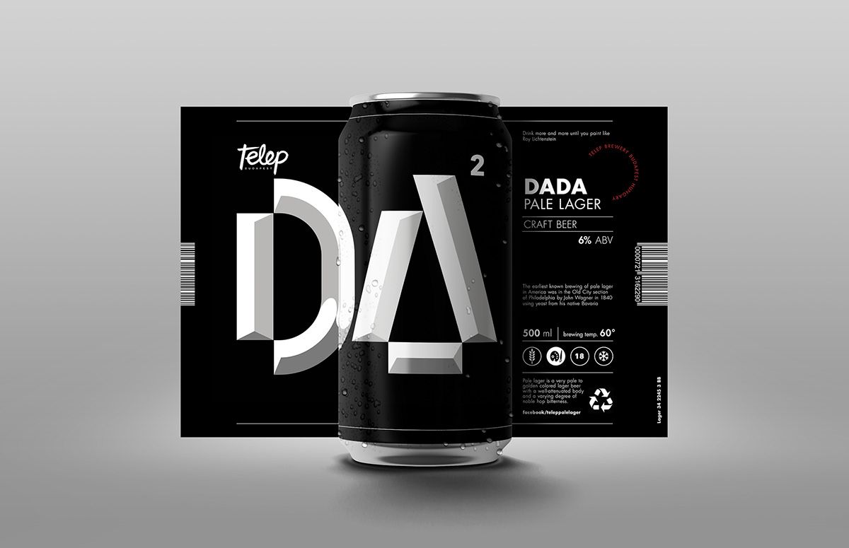
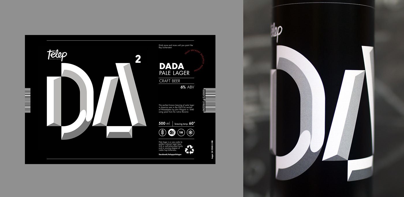
What is your opinion about the unique labels of today’s artisan beers? To what extent is this project an answer to this question?
I didn’t want to reform the Hungarian beer label market, but I’m not saying I don’t see any further potential on this field. A label is a goof carrier containing information, but these can be displayed in a thousand ways. In this project, I was mainly inspired by the American beer label market. Illustrative, minimalistic, abstract, full crazy – all at the same time! I feel that in Hungary, we don’t really like to leave our comfort zones (with notable exceptions) and we still somehow follow the rule that beer labels must look like they did 20 years ago, disregarding all creativity. Perhaps that should change. I think what matters is to make people want to take them from the shelves.
Is Budapest Label Tour quite different than your usual projects? Or is it rather a good combination of them?
I think it combines them well. I like to create diverse graphics, yet all my works are infused with a unique, one-of-a-kind style. I also like experimenting with typography, and using letters as elements of illustration. I like to infuse various styles, and combine manual techniques with digital ones: Wacom drawings with the vectors of Illustrator. By the way, in this case, creating the umpteenth label I felt the same thing I did while creating my diploma project at university, where I designed a unique poster for film directors – playfulness appeals to me!
And this shows quite vividly in your portfolio, too. We especially like your rusted, painted letters made of wood. What are you working on currently?
I am working on multiple smaller and larger projects concurrently at the moment. Soon a few portrait drawings of mine will be published in a magazine in London, the graphic world of a winery is being built continuously, and I am working on a few logos for some people and companies working on various fields. In my free time, I explore Cinema 4D, I make mock-ups and yes, I make letters out of wood.
You can check out the entire Budapest Label Tour project by clicking on this URL.
Art Deco Bucharest
Hungarian. Fresh. Independent. | PólóNeked
