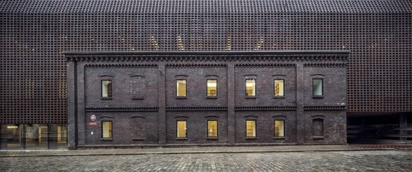
Budapesti Városarculati Nonprofit Kft. (BVA) announced the call for the further development and supplementation of its existing visual identity in spring 2020. More than forty applications were submitted to the call, including the project of Elevate, ultimately winning the competition. We asked the founders, Zoltán Horváth and Paris Noble about the professional path of the Győr-based studio and the characteristic design of the new, unified umbrella visual identity.
Your first large scale project was the visual identity of your own skateboard brand, DANK Skates. The boards are quite cool to this day, yet you still think of this project as a failure. Later on you founded Elevate and today you are working on the new visual identity of the Hungarian capital. Can you tell us a bit about the path that has led you here?
Building a brand requires years of consequent work. We started DANK with great enthusiasm and serious goals, and at the same time we received more and more enquiries from people who didn’t want skateboards, but visual identities. One gradually replaced the other.
The path that led us to the visual identity of Budapest was a hard yet quick two and a half years for us. It’s like we are sitting on a rocket. We never would’ve thought that we would be able to work on such a large scale project in such a short time. The first bigger step was our collaboration with Brain Bar – we started to “grow up” during the project and think of Elevate as a real organization. Getting to know the channel of The Futur was a similarly important milestone; we learnt an awful lot from them in terms of business. As a matter of fact they were the ones who inspired us to become a strategy-focused design agency. We studied many books recommended by them, and we got to know Fabian Geyrhalter‘s Los Angeles based brand strategist through them, too, with whom we have a very good relationship ever since.
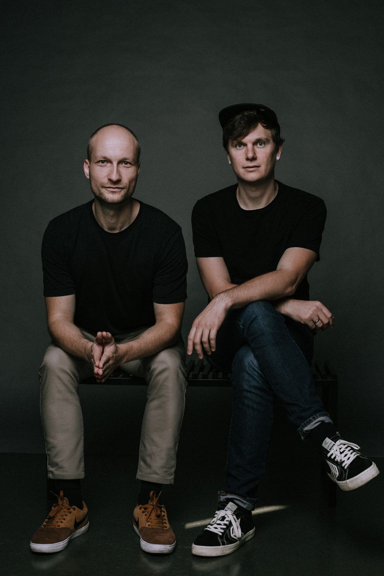
In 2019, we started to focus more on the business objectives of clients and the strategies of brands. We started to hold problem-defining and resolving workshops, we incorporated the processes of design thinking, service design and design sprint into our daily operation. This was followed by Budapest’s visual identity call, in the course of which the professional jury ended up choosing our work as the winner to our greatest joy. Our work with BVA has not stopped since, the development of the city’s visual identity is still in progress.
How did you prepare for this call? What kind of research preceded the work and what values did you use as a basis?
The call came with an extremely thorough brief, which provided the specific framework within which we had to keep our proposal. For this reason, we primarily examined the organizations of the municipality, to learn what elements the new visual identity system wishes to unify. It was an important aspect during the design process that we only refresh the existing Budapest image to the extent absolutely necessary, and the substantive part was developing the new umbrella visual identity. Due to the diversity of organizations, our goal was to create a free system that still provides unity. We were also motivated by the fact that as a result of the Covid-19 epidemic, the majority of our ongoing projects were suspended, and so we could dedicate our capacity fully to Budapest. During the almost thirty days of designing, we dedicated hundreds of hours to the project.
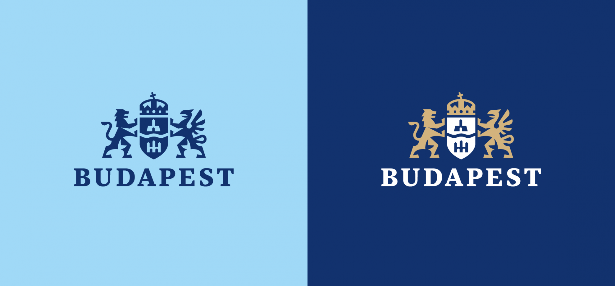
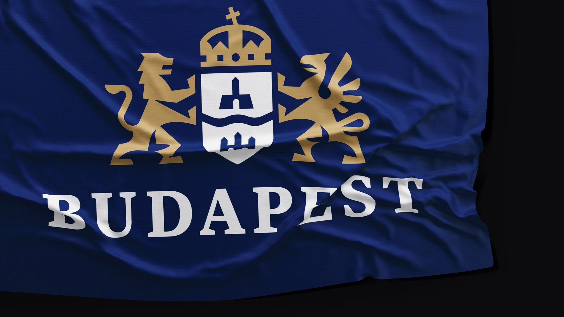
Budapest received a new visual identity in 2016, and the logo of the capital was also refreshed at that time. Was the repeated refreshment of the logo a special requirement, or did you adjust it to the simpler design of the framework system expressly?
Refreshing the existing visual identity was not a criteria in the call, however, it was justified and necessary in order to be able to achieve the goals set by the capital. It was also an important aspect for the new emblem to be able to be adapted both in the online and offline space, regardless of platform. What we did was a subtle yet firm update. We also invited Richárd Kelemen to participate in the process – he is one of the best Hungarian graphic designers, who has also joined our team since then. Richárd is extremely precise, he understands and knowns the rules of traditional emblems, would never deliver a product that he is not 100% satisfied with, and he also expresses his opinion – which is particularly great as at Elevate, we consider dialogue based on professional basis, and, when needed, exchanging dissenting viewpoints extremely important.
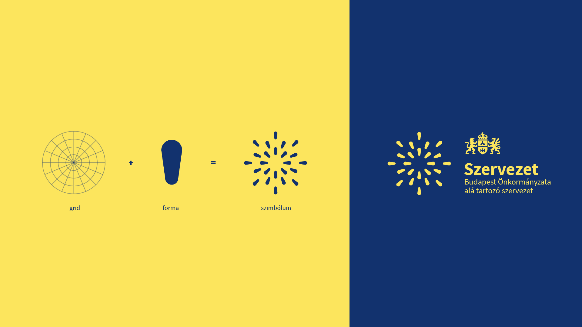
Your winning umbrella visual identity builds on the current brand with characteristic design elements and by applying a central grid, thus providing a unified appearance to the fifty companies belonging to the Municipality of Budapest. And where did the idea of the grid come from? What was your inspiration for the shapes appearing in the grid?
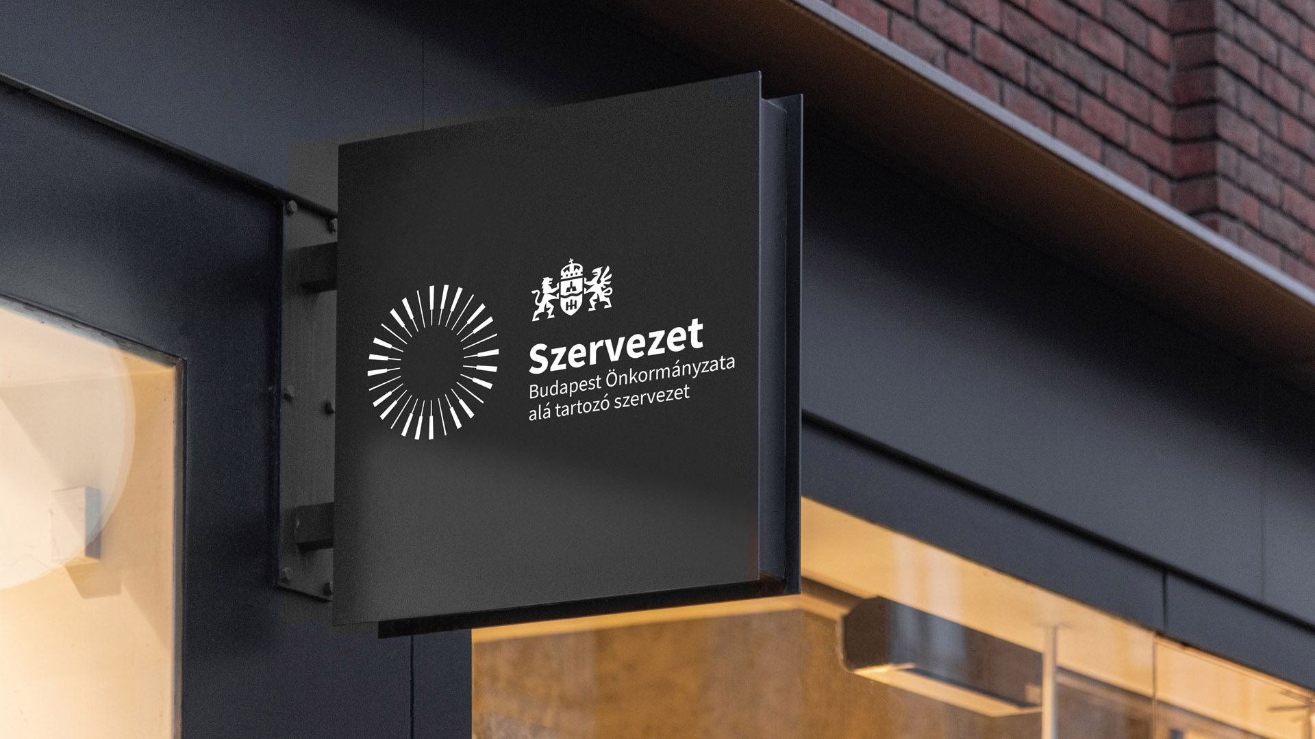
We found a poster on the website of the city, presenting the measures of the new administration. This provided a clear outline of the future of Budapest to us, which we wanted to present in our concept in a manner that the design does not hinder the communication of the identity of the various organizations, on the contrary: it rather promotes the same. This is how the idea of the central grid came to us, in which one can discover the importance of equality, sustainability and open, innovative thinking. As to the shapes appearing in the grid: the basis is always provided by the values of the given organization, which we try to express with the help of the various associations.
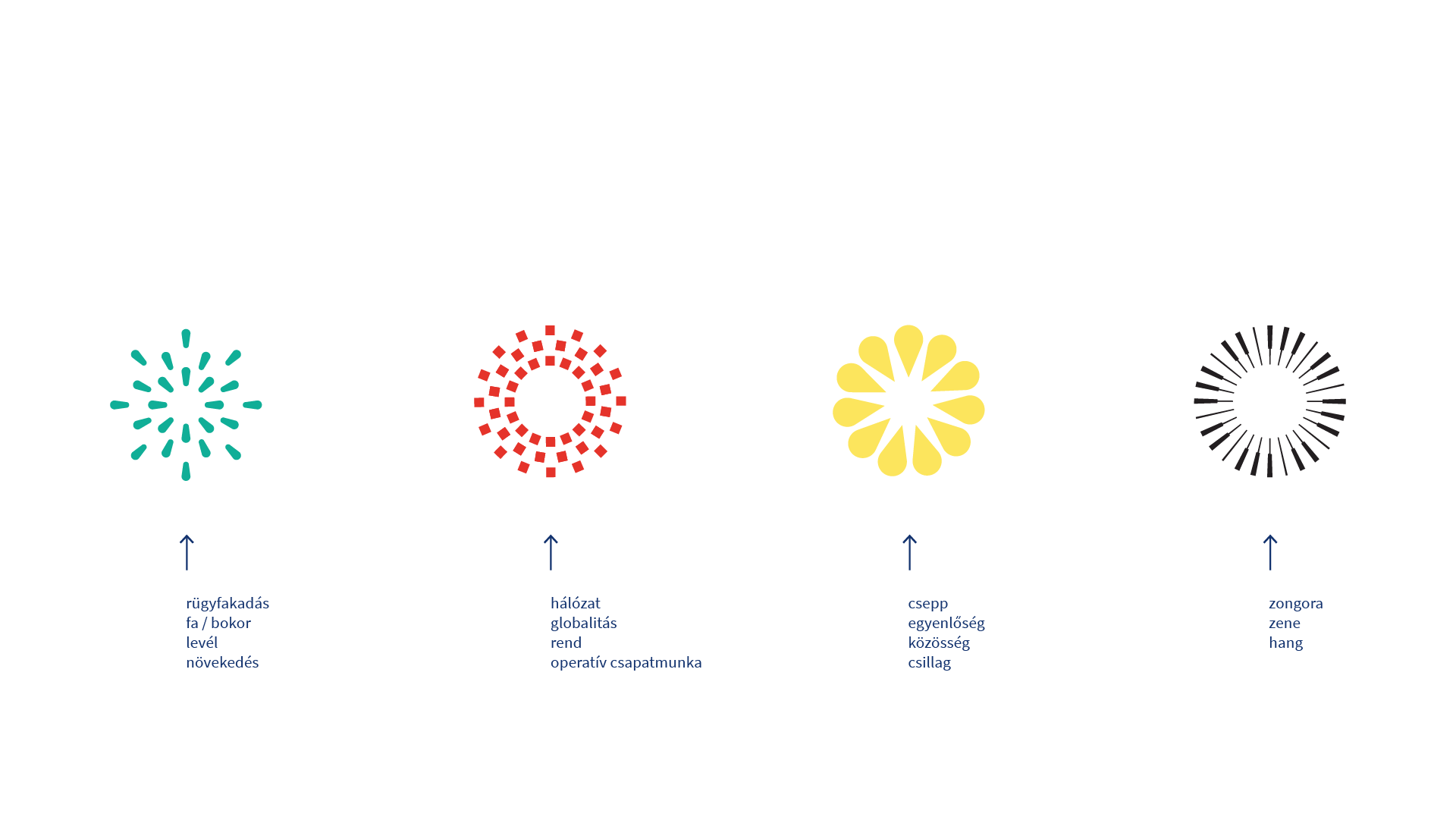
The idea of creating a special logo generator also came up during the design process.
Yes, we were thinking about creating a system that would allow for the development of a program. The point was not to implement it, but as a matter of fact this attitude helped us create a clean, clear and consequent set of rules.
Unifying the fifty companies belonging to the capital must have been a challenging task. How did you make sure that the products are unique while also keeping them schematic?
This was the hardest part – creating unity, by emphasizing uniqueness. On top, in the case of the more than fifty companies, there are also vast differences in terms of scale and function, too. Let’s look at FKF (Fővárosi Közterület-fenntartó Zártkörűen Működő Nonprofit Részvénytársaság, the company managing the public spaces of the capital – the Ed.) and Cseppkő Kindergarten. While the FKF is responsible for an operative team work encompassing the entire city with large vehicles, waste and waste management, the latter is in charge of taking care of and educating children in a small community, with dancing around, eating cake and drinking hot cocoa. The system has to have all these entities in a single framework to allow for the observation of these differences.
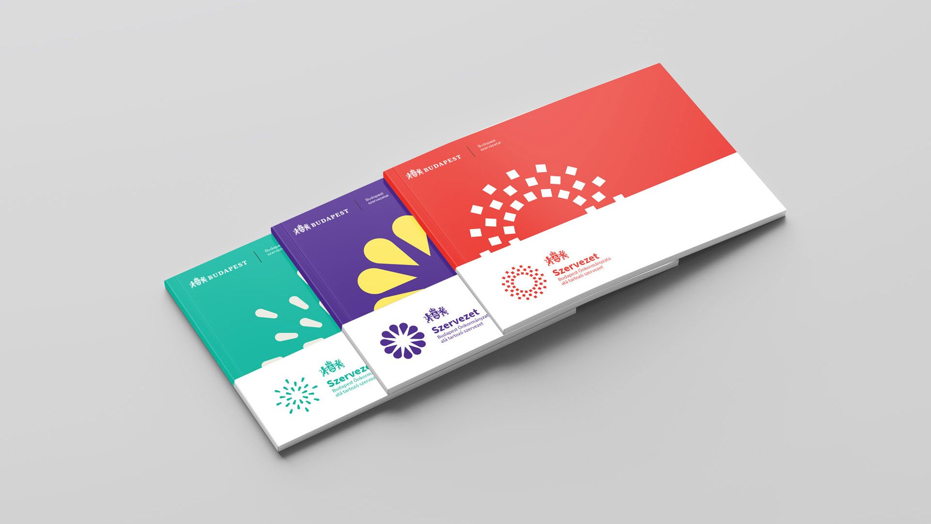
How will the planned framework system serve all the organization belonging to the municipality?
We would like to organize a dedicated workshop for the companies of the municipality that are ready for a new visual identity in the near future, in the course of which we will develop a brand platform starting from their values and building on their business strategy and appearance. Together with the new umbrella visual identity system, this would result in a unified brand communication that could be true to the given companies both in terms of message and looks. All in all the graphical framework only provides an opportunity, uniqueness and identifiability is always coded in the character of the organizations.
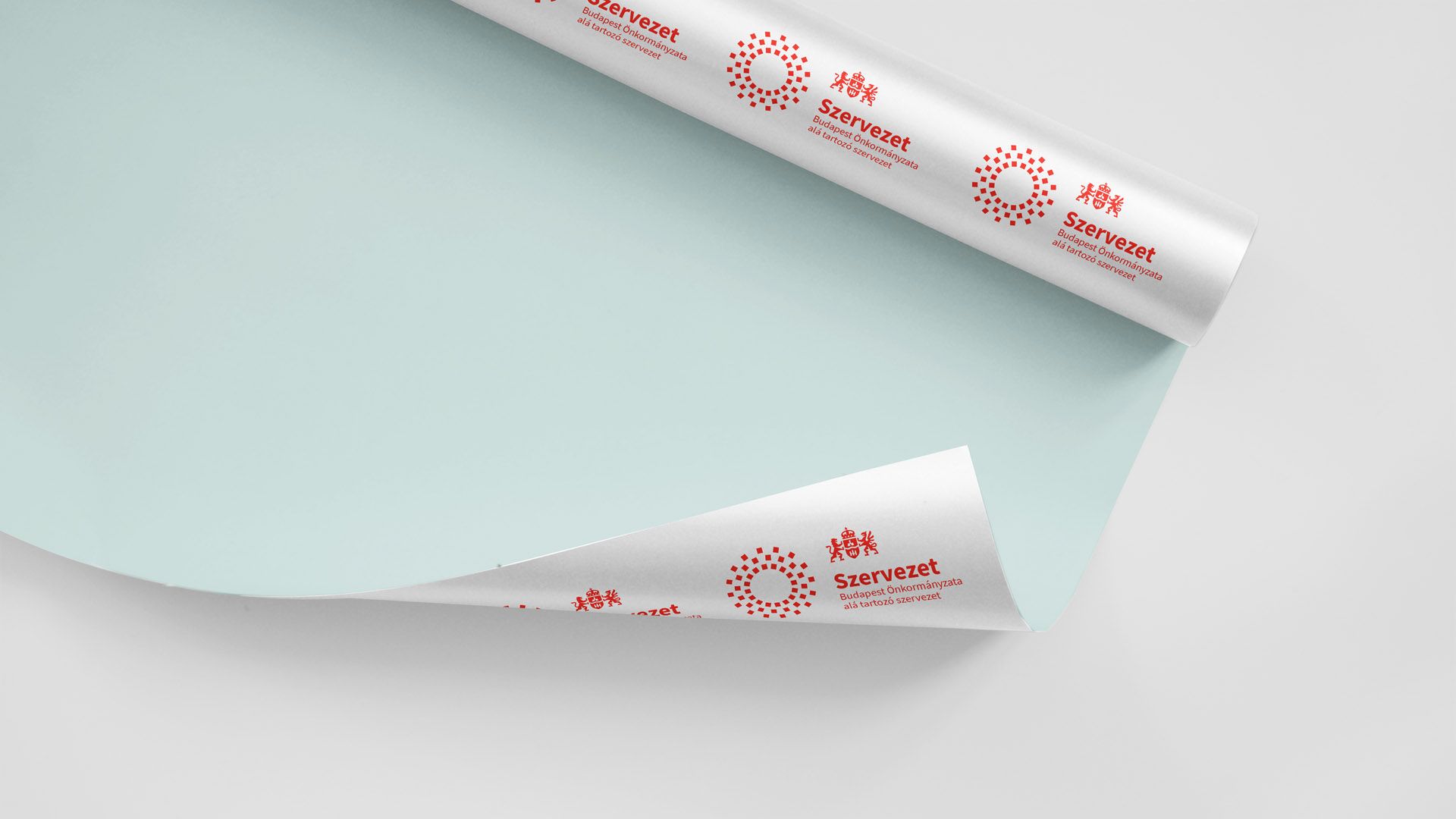
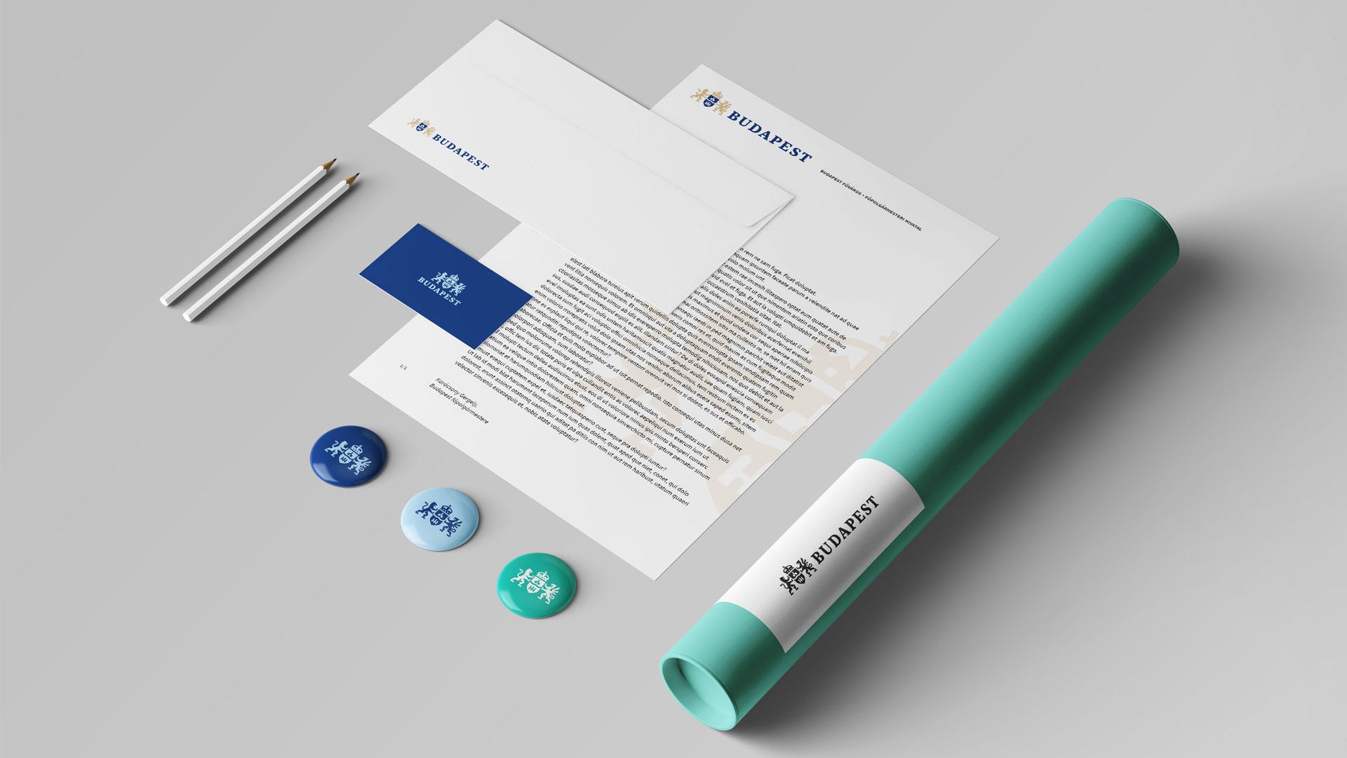
Your visual identity also focuses on the future – it can be further used and developed in a cost-effective manner, and thus provides a baseline in the long term. You also created the identity manual of the new visual identity recently, and all further elements will be designed in accordance with the same. How difficult is it to let go of such a complex project?
We strived to create an identity manual that is as clear as possible, which does not limit the possibilities of those working with it, but inspires and urges them to bring out the best possible outcome from our system.
In what schedule will the new visual identity be introduced? When and where can we see it first in the capital?
The system is all ready to be launched. The visual identities of several entities are in progress, but unfortunately we can’t share more about this.
What are you working after closing this project, or in parallel to the same? What are your plans for the future?
A few projects related to services development are currently in progress. We create one of them for the municipality of Győr, and we are already near the finish line, and we are also working on the services, business plan and long-term strategy of a co-working office. Of course we have some old clients too, with whom we have been working together for long years, including Lombiq Technologies and Hastlayer developed by them, turning .NET programs into hardware.
In the future, we would like to participate in as many projects related to the visual identity of cities as possible, and would love to share our experience gathered in relation to Budapest’s visual identity with the broadest possible audience. It brings a great advantage if a city administration is aware of the importance of a well-communicating visual identity, as essentially this is the channel through which the city can reach and connect with its citizens, at the same time it also addresses tourists through this, whom it wants to convince that this a place worth visiting.
Elevate | Web | Facebook | Instagram

Stylish, strong and electric: meet Mercedes-Benz’s eScooter

Anjuna Ice Pops packaging wins Red Dot award
