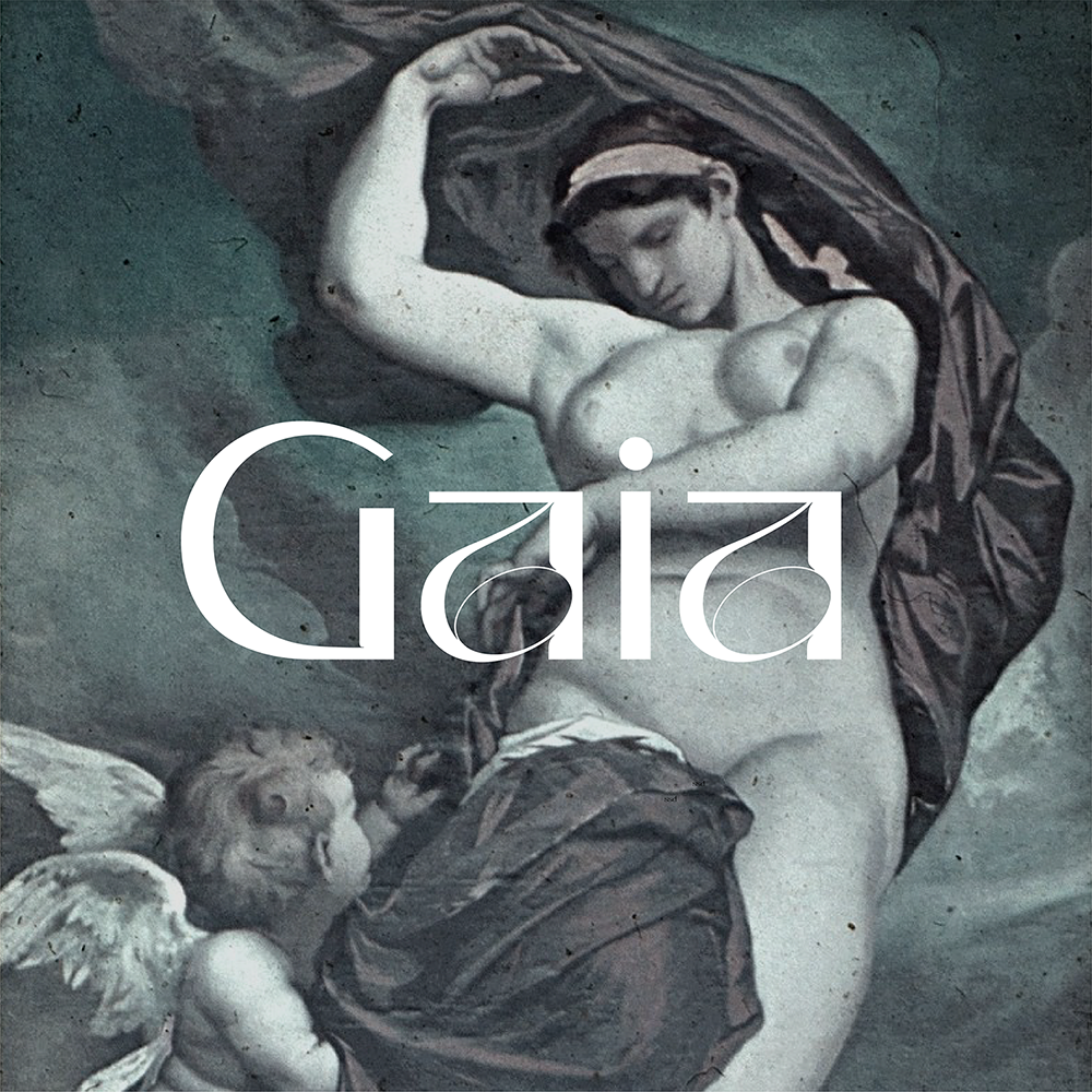
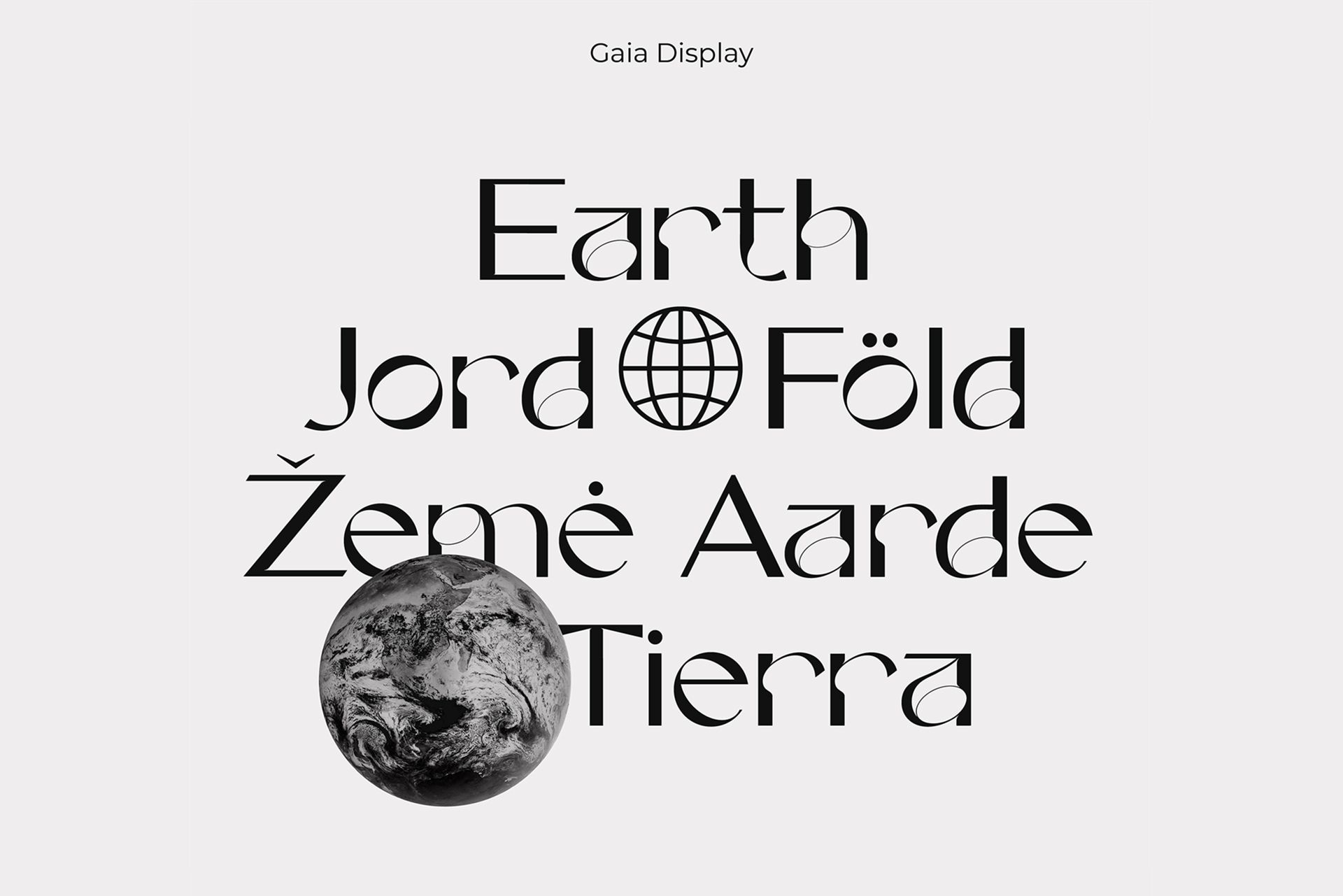
A strong, high-contrast, yet feminine sans serif font, combined with quite unconventional elements. We present you the Gaia Display typeface!
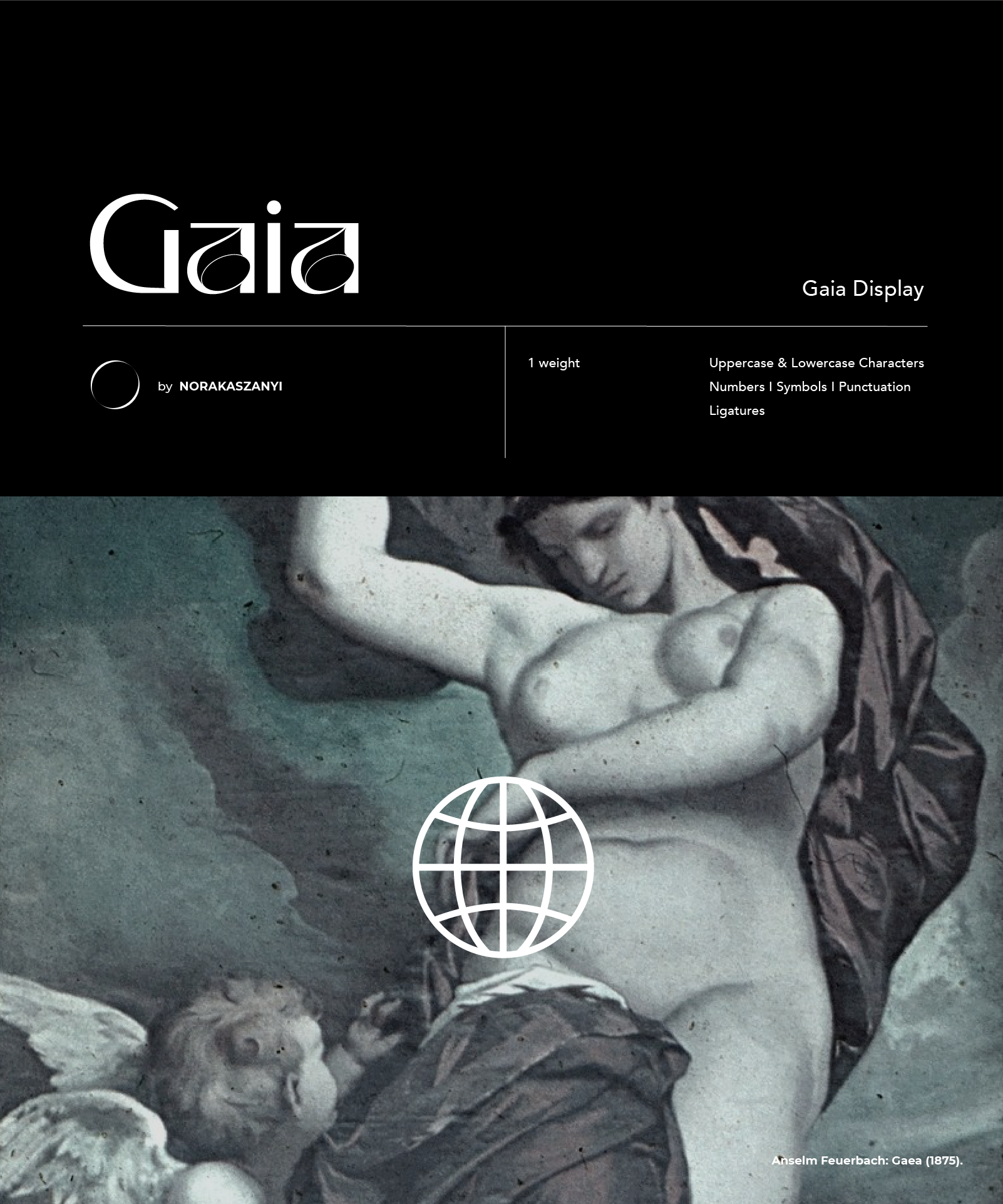
Working as a graphic designer, Nóra Kaszanyi’s love for fonts is self-evident; once she got a taste of the basics of font design, she realized it was a field she wanted to try her hand at. What’s peculiar about display fonts is that they have more characteristic design elements which make them primarily suitable for being used in larger sizes, in titles, headers or in shorter texts, thus providing more opportunities for experimenting. “The visual expression of modern elegance is the closest to me, which I like to combine with playful elements” – Nóra told us. This sentence also defines the character of the fonts accurately.
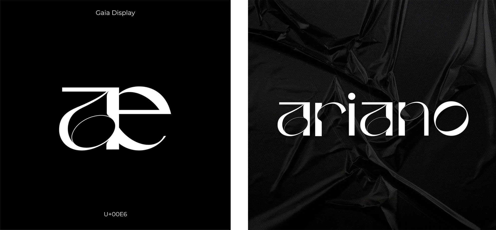
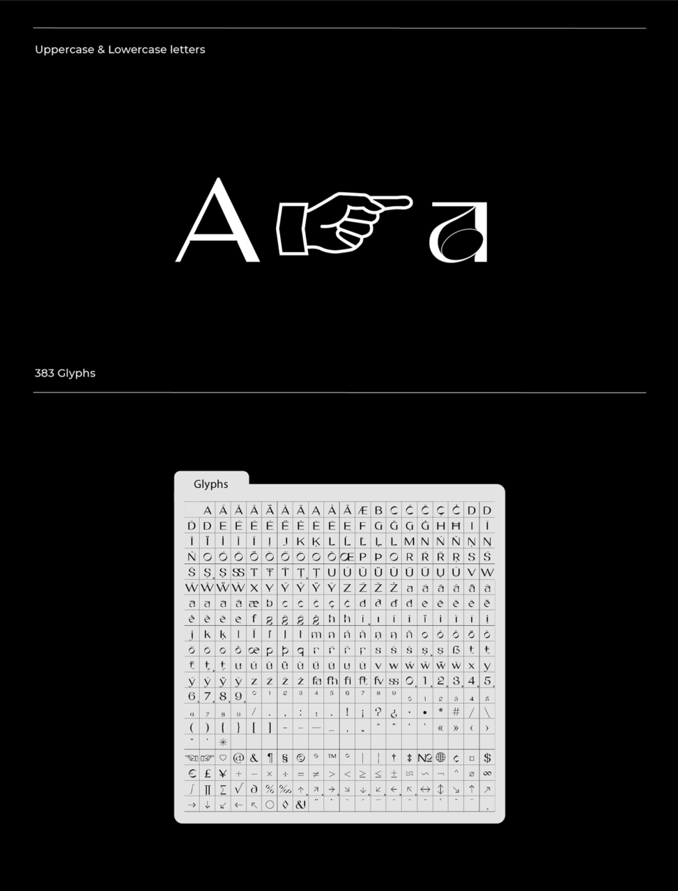
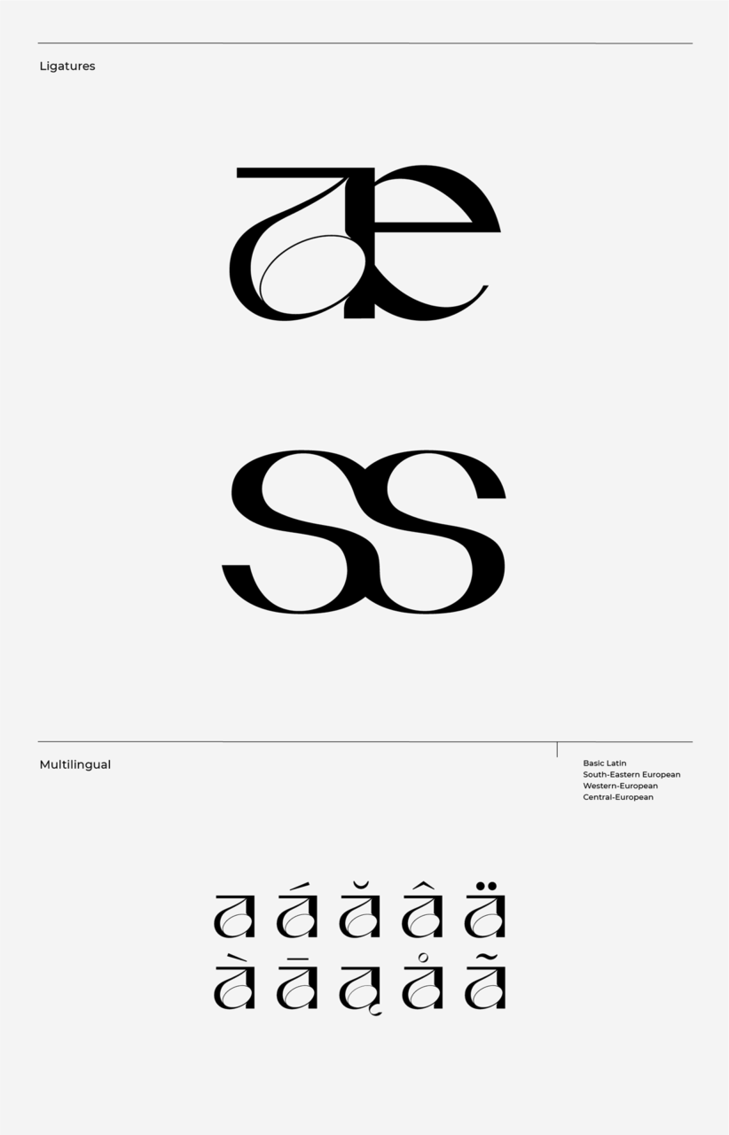
The development of the typeface started with sketching the letter “a”. Later on, she complemented it with very fine lines and dominant shapes.
“If I had to choose a character that represents the font best in terms of form, the letter “a” would be my choice undoubtedly. This is what I consider the most dominant element, which ultimately gave rise to all the other characters” – Nóra highlighted.
The feminine font was given the name Gaia (the goddess of the Earth in Greek mythology), which is a faithful expression of its forms and shapes.
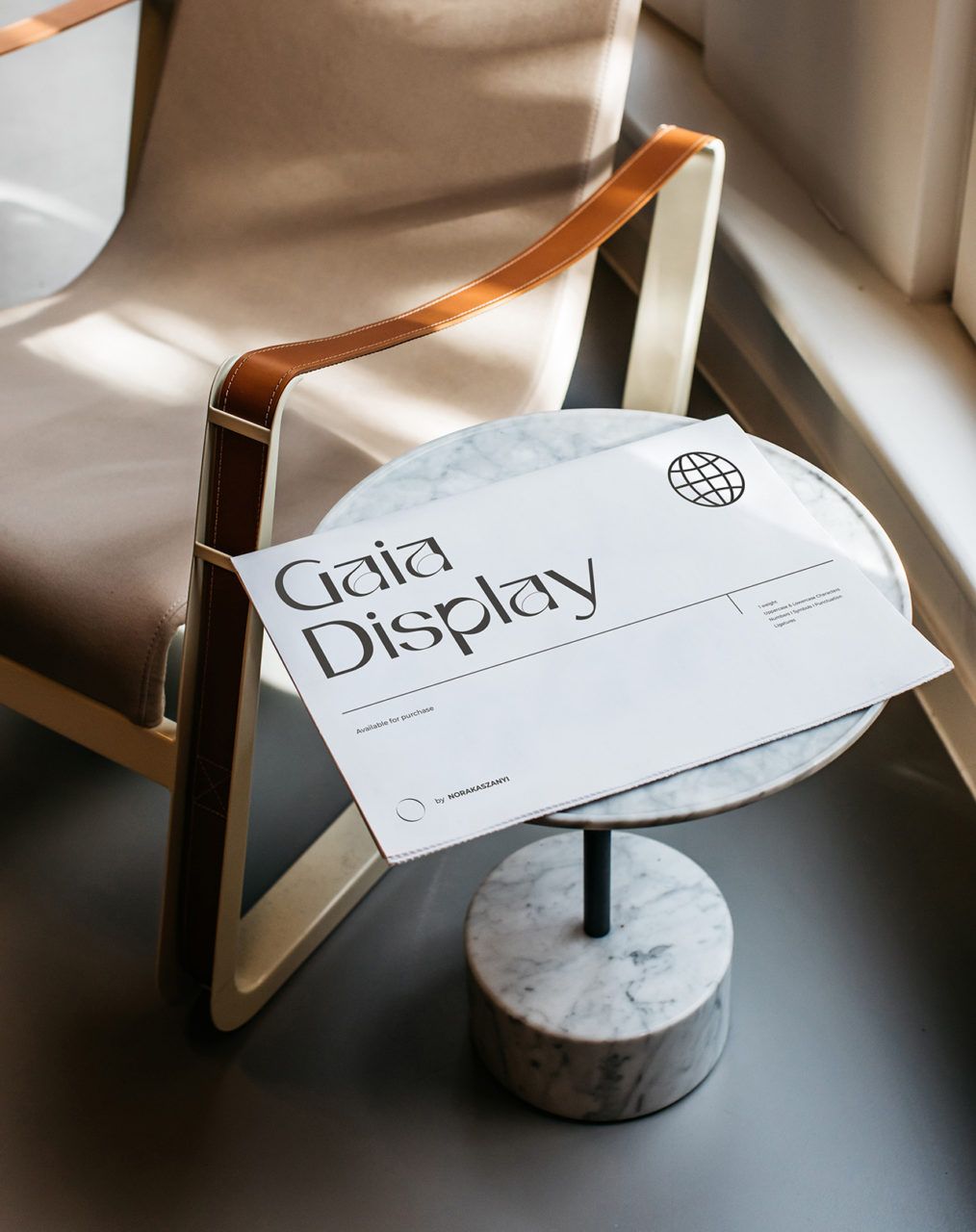
Another peculiarity is that Nóra created the Gaia Display typeface originally to balance her very strict and rigid graphic design jobs as a sort of self-serving project, but it took a more serious turn pretty quickly. After it also caught the attention of type design platform Femme type, the designer focused on perfecting the typeface, leveraging being locked in during the quarantine.
If you would like to give it a try, you can purchase the Gaia font on Nóra’s website.
Nóra Kaszanyi | Web | Facebook | Instagram | Behance
Nóra Kaszanyi primarily focuses on designing visual identities, publications, online visual interfaces and packagings.Her work is characterized by the combination of applied graphic design and her own artistic self-expression. Her prime projects include the visual identities designed for tacTiles, an educational aid designed for the blind, for the Armel Opera Festival jubilee book and for cold-pressed juice manufactory SUPERJUICE .
HYPE’s online store has officially launched!
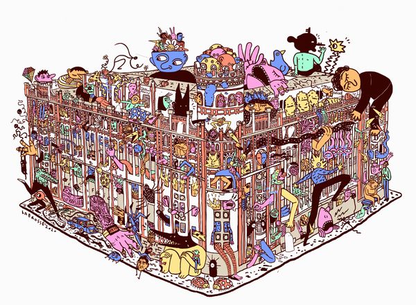
Budapest by Labrosse | The Postal Palace in Buda