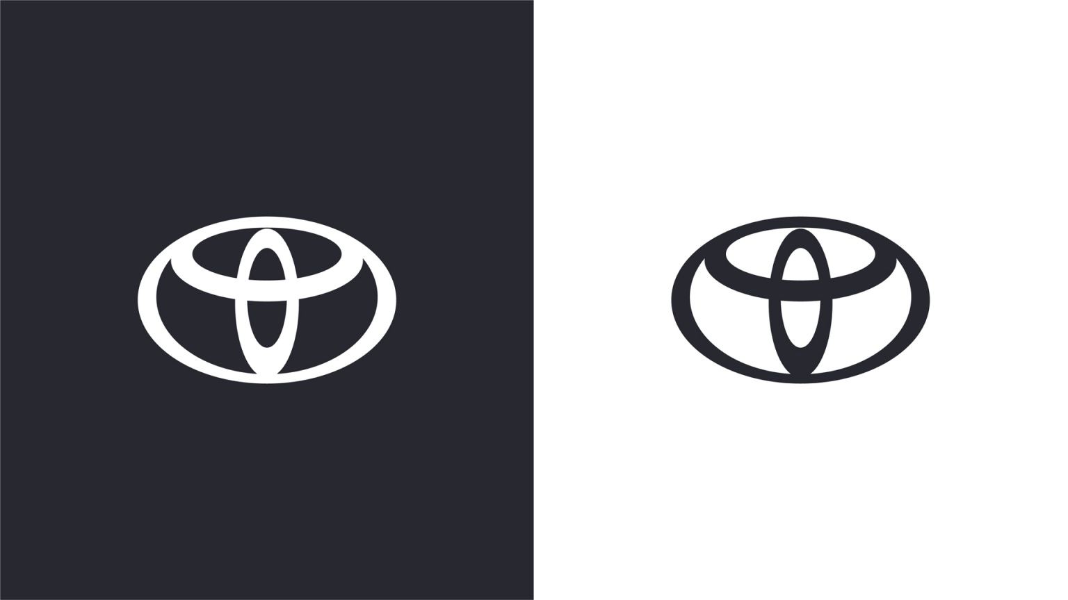
Following the lead of several other car manufacturers, including BMW and Nissan, Toyota has now rebranded its logo and switched to a flat design.
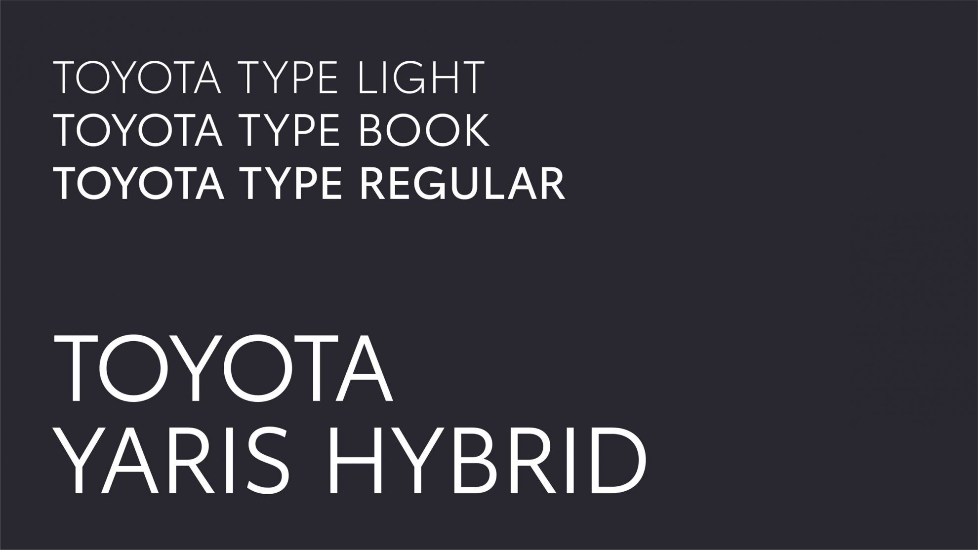
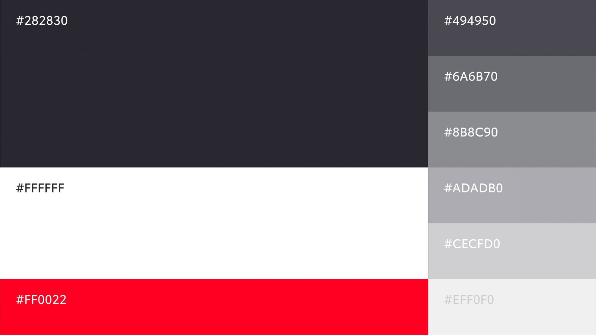
Toyota breaks off with the previous 3D logo and debuts a much cleaner version. In addition to the logo, the entire visual identity also underwent a complete rebranding. The new visual identity was created by The&Partnership. According to the design brief, their design had to be forward-thinking, had to prioritize mobile display and grant the company a more “premium” feel.

Even though for a long time, car brands only transformed the shiny silver logos on the nose of the car into an image form, more and more manufacturers realize today that 2D solutions are a much better match for digital platforms. The brand hasn’t changed its logo since 2005, so it was a much needed update.
Toyota will introduce the new logo – without the TOYOTA wordmark – on the European market.
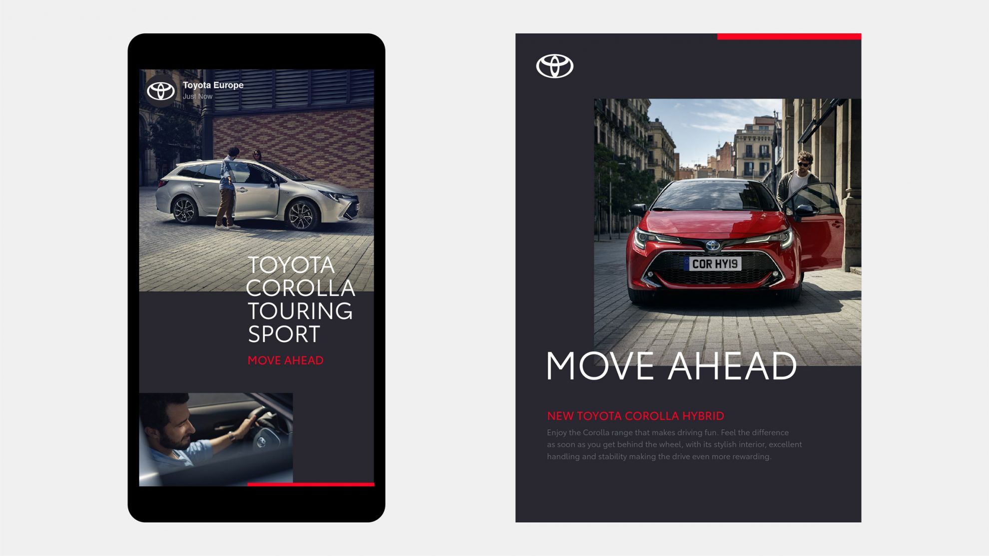
Source: dezeen.com

Design cabin, for an affordable price | Meet Hello Wood Kabinka!

27 - My Last Day at Home | Flóra Anna Buda’s latest short film
