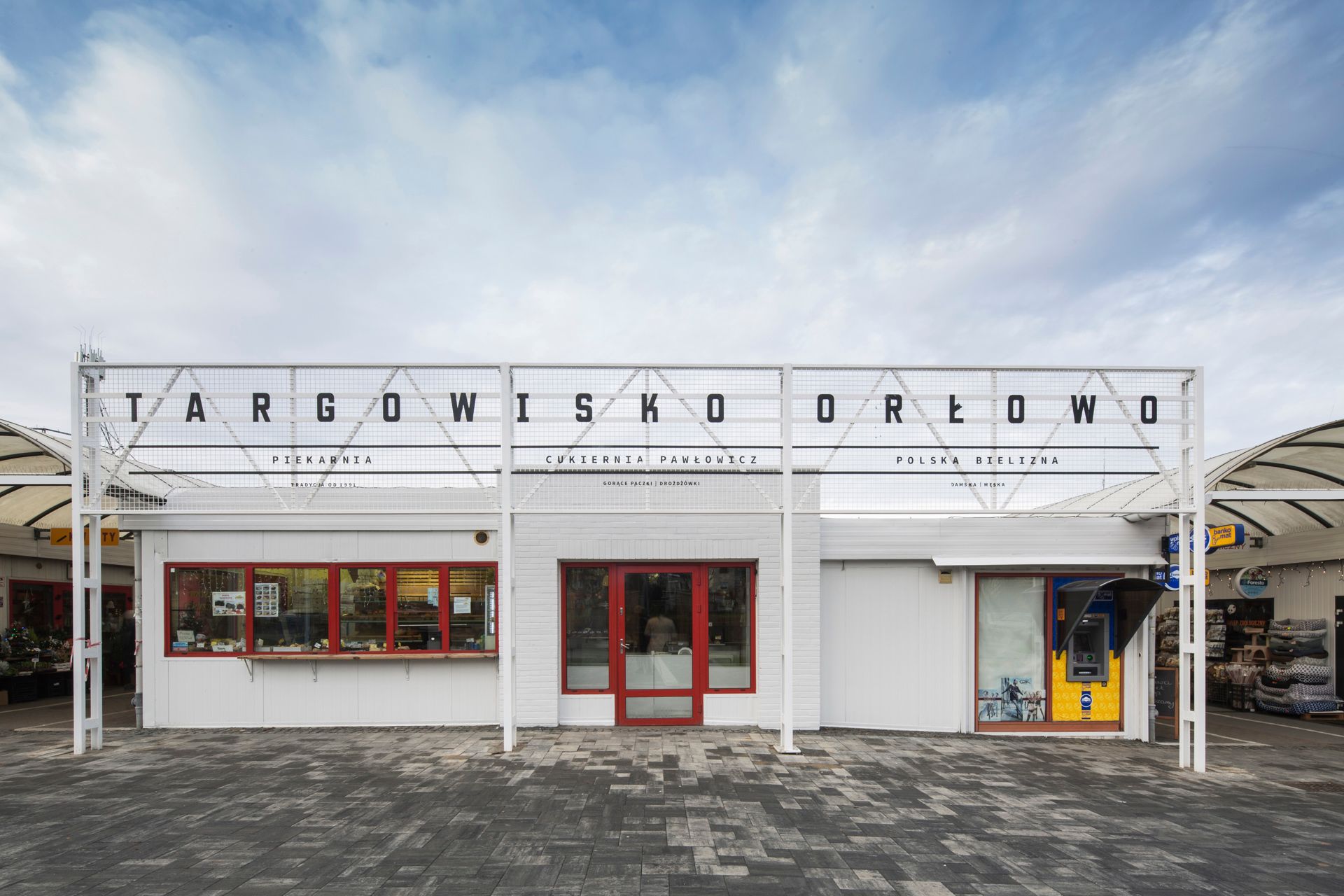
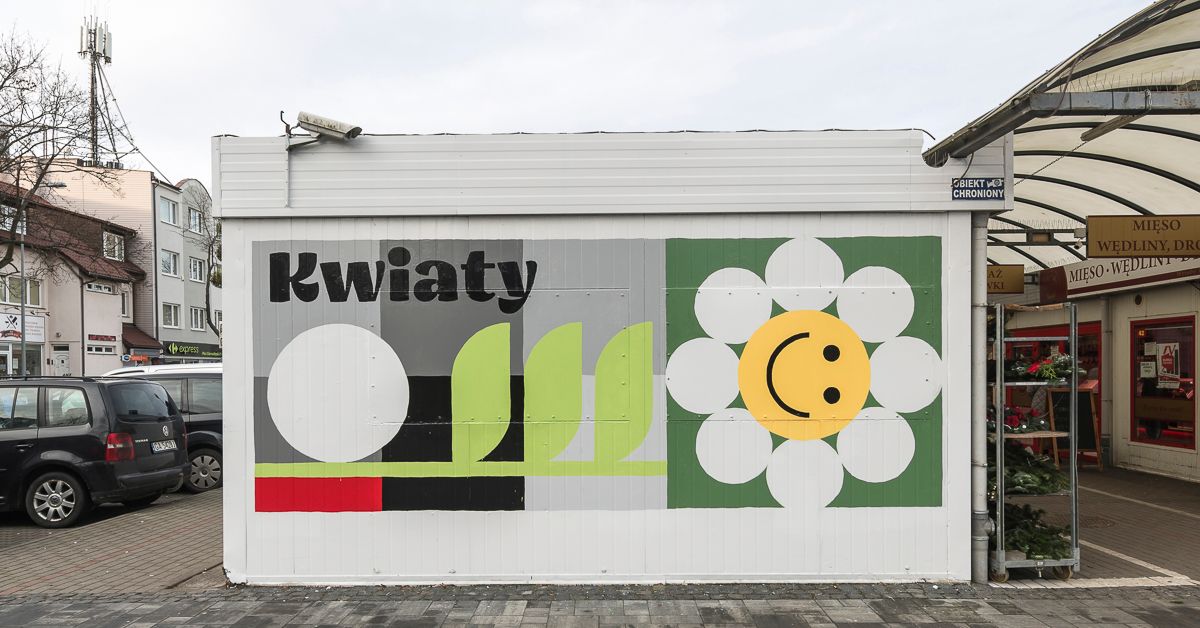
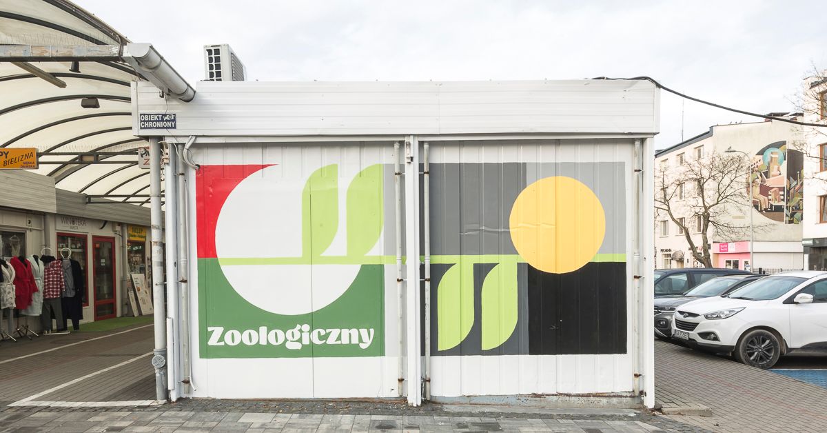
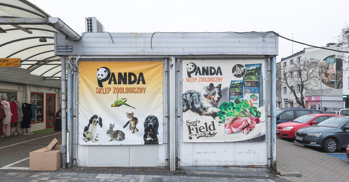
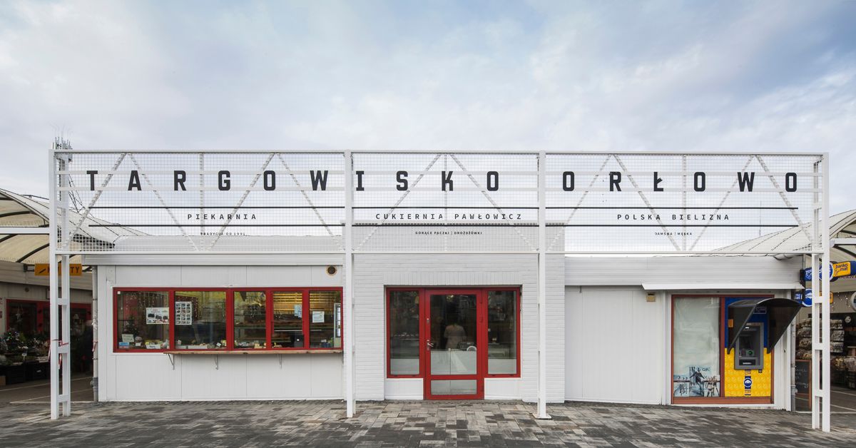
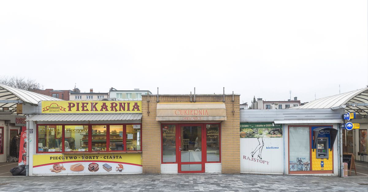
Polish Traffic Design has proved that a marketplace can also have a uniform visuality: Orłowo market in Gdynia’s Górnośląski Square received a new, clean look.
Traffic Design was founded in 2011, their activity is driven by their commitment to the city, art, aesthetics and the society. The team is made up of creatives, sociologists and communication experts working on various fields. Their projects revolve around our urban living spaces and human-centered solutions: “we play with public spaces”, as it is also highlighted by their motto. One of their important initiatives is their project dubbed Re: design, in which they reinvent signboards of small companies and the aesthetic of urban streets at the same time.
Thanks to the team, amongst many other places, Orłowo has also gone through a significant visual transformation. As also manifested by their previous works, the new visual identity of the marketplace in Gdynia once again builds on minimalist, subdued colors and design.
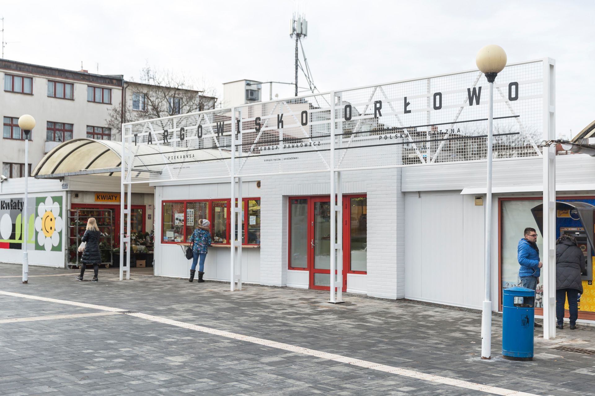
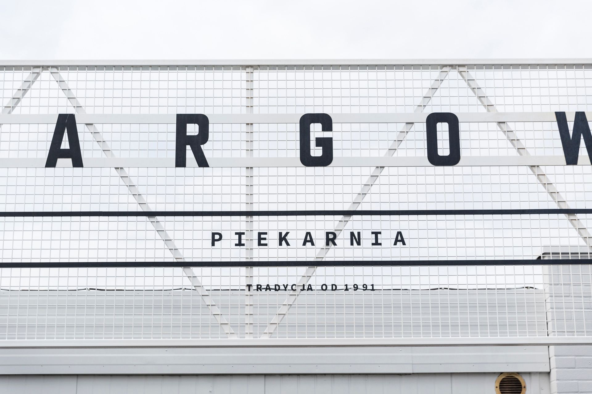
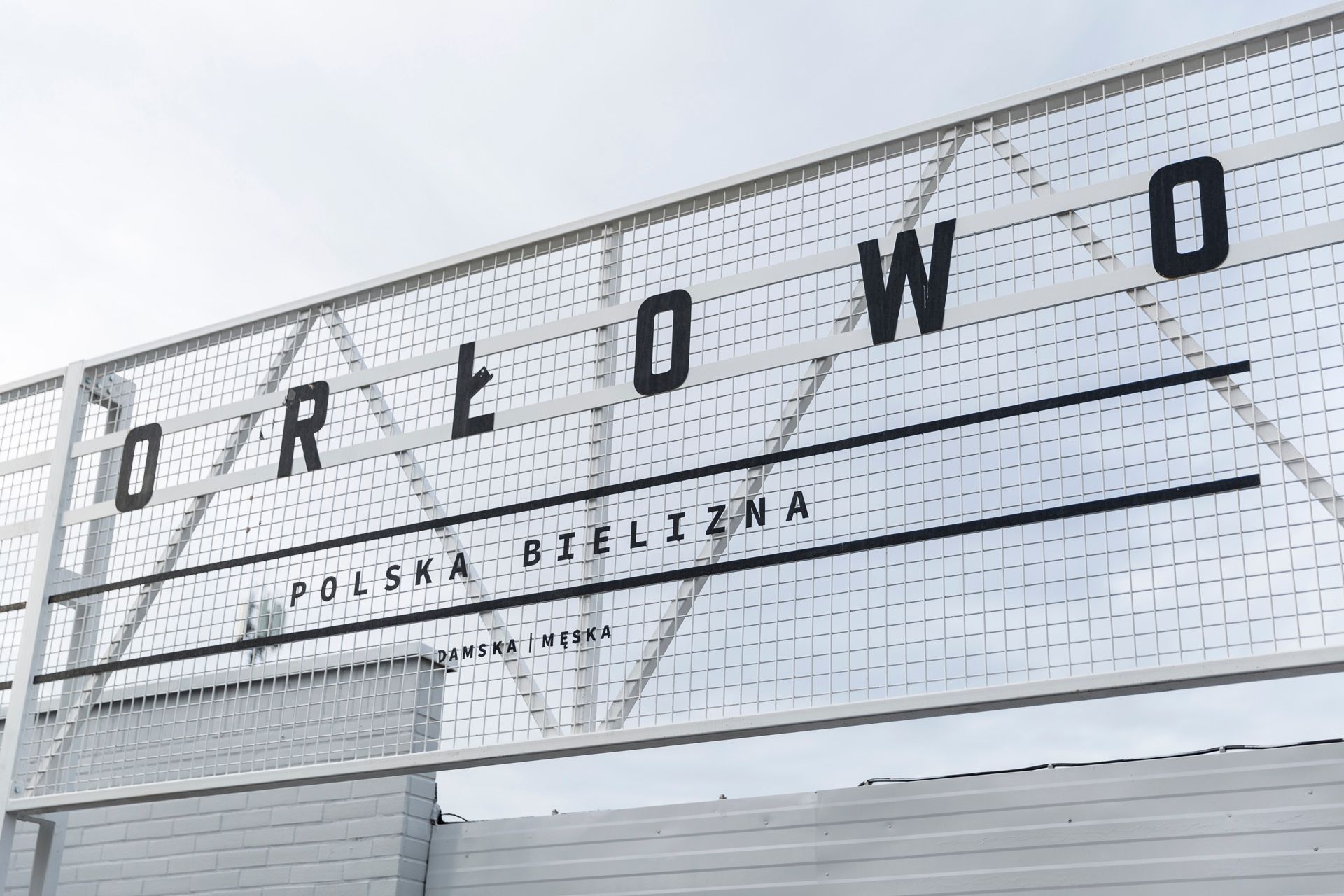
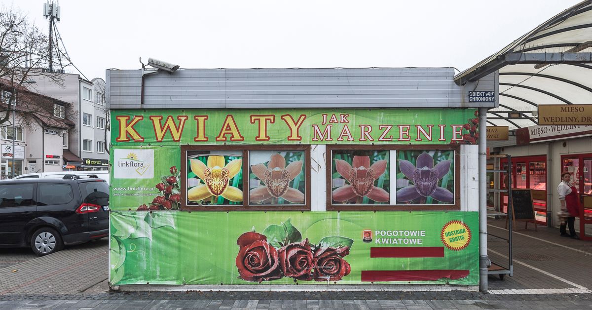
The large and colorful advertisements were replaced by murals using geometric patterns, and a new central board identifying the market was also installed near the entrance. The team of designers also created a guide for vendors, which helps small businesses create boards matching the new visual identity.
“The basic principle of the project was to minimize the visual noise taking over the marketplace and to improve the overall aesthetic of one of Gdynia’s most frequented shopping venues,” Traffic Design highlighted.
Check out the before and after photos below:
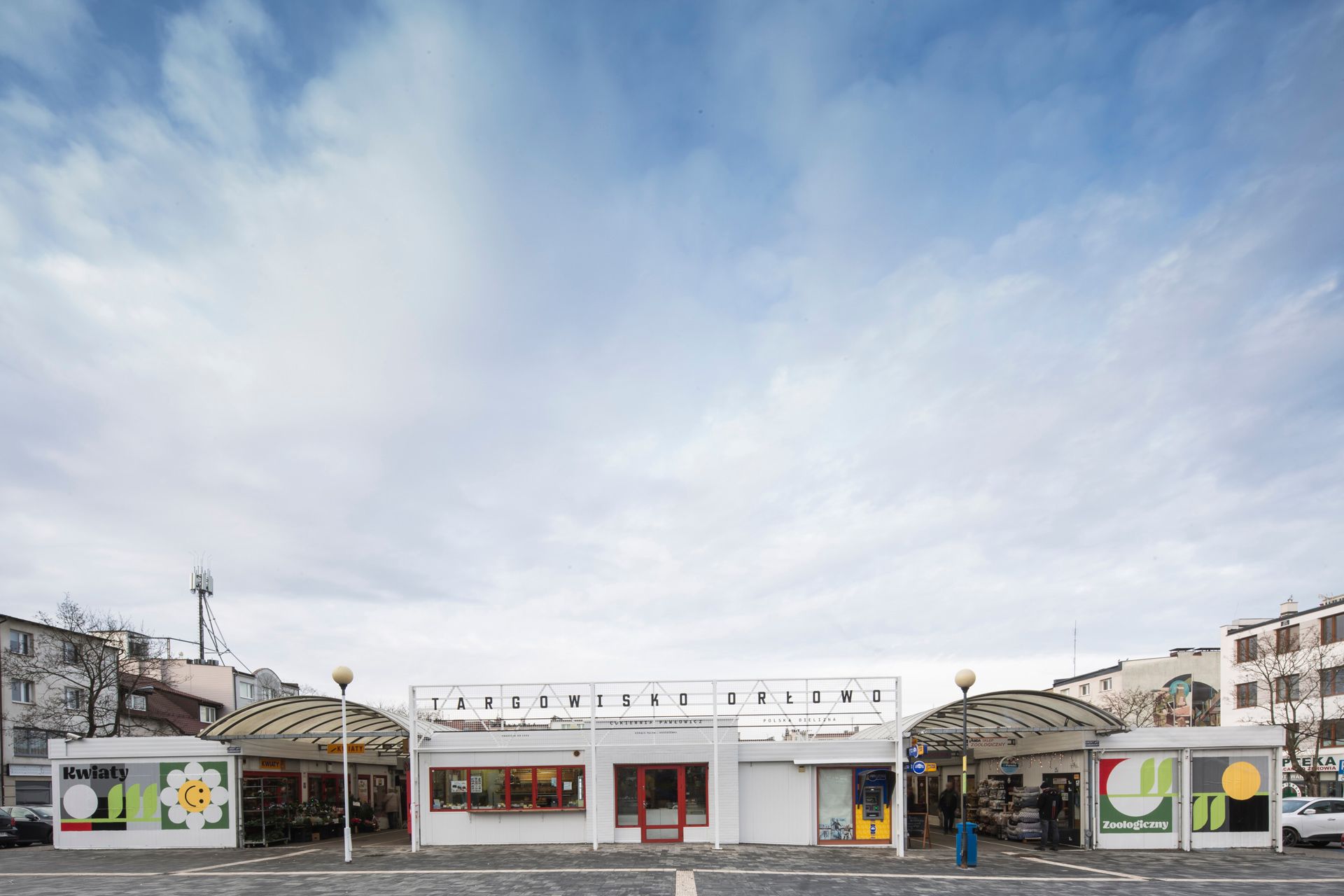
Photos: Traffic Design

Visual refreshment in applied animation | Krakout Film
The most beautiful cafés in Eastern Europe | TOP 5


