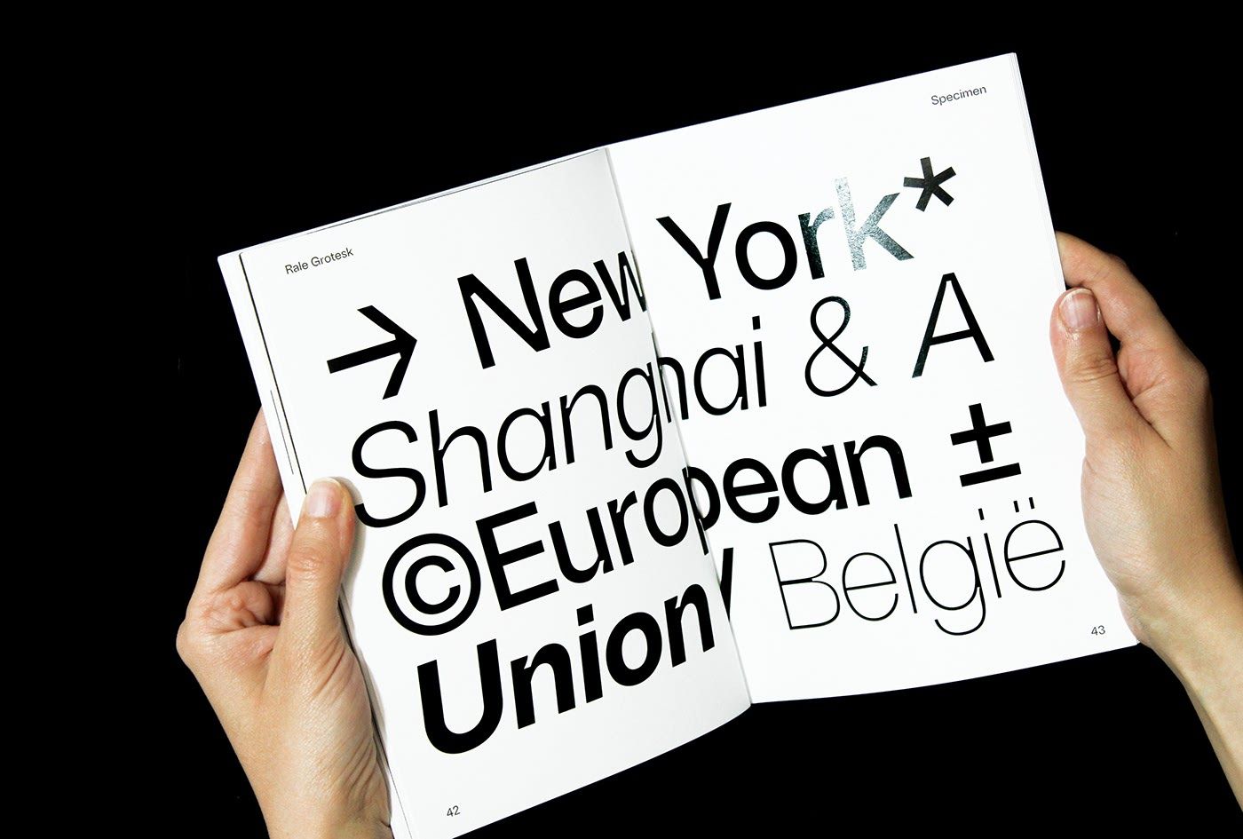
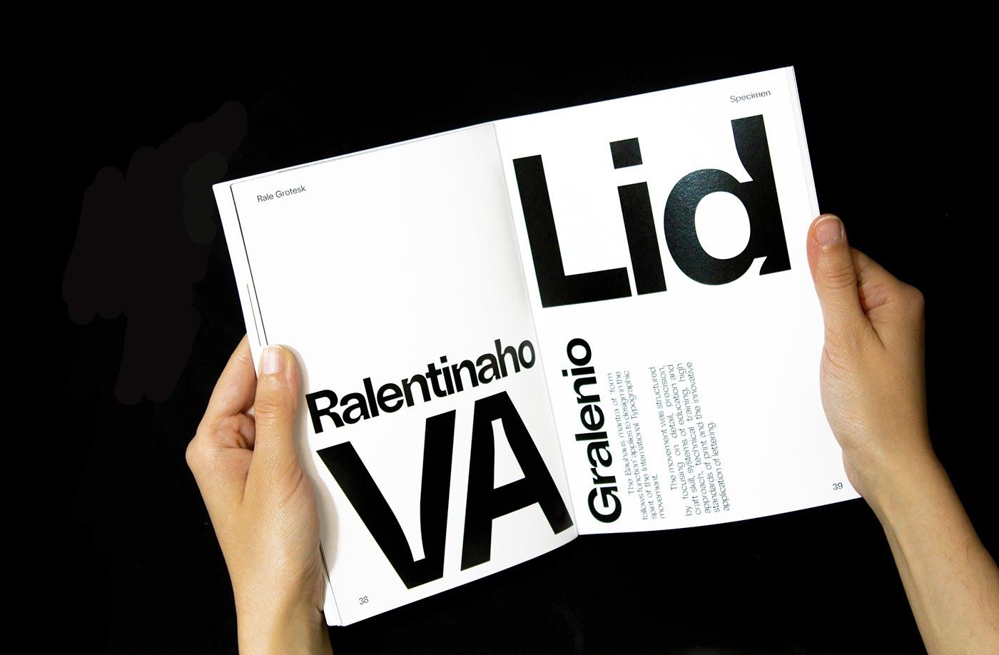
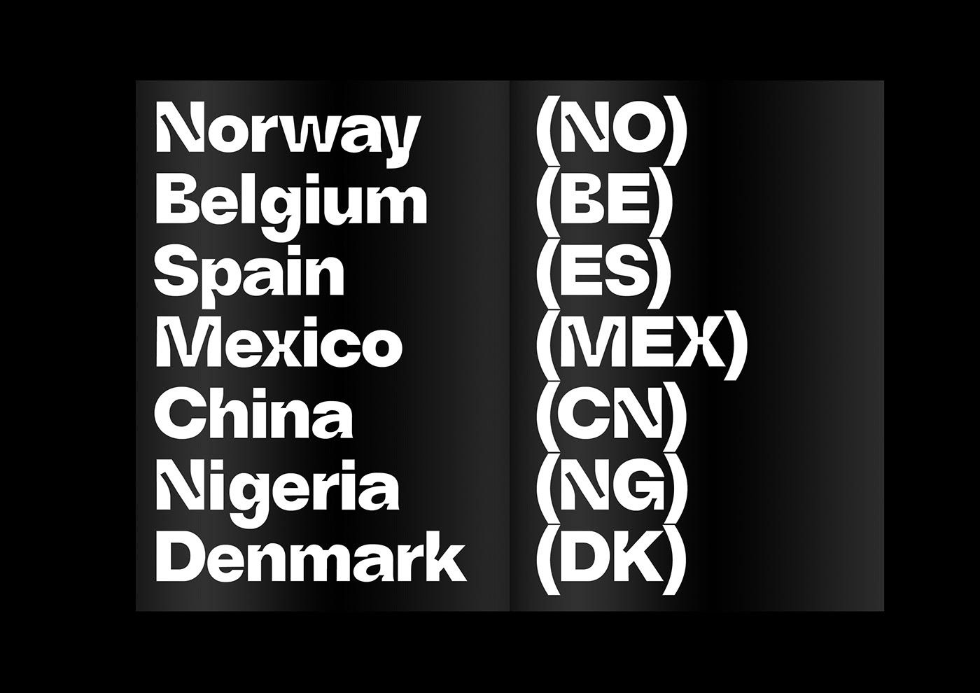
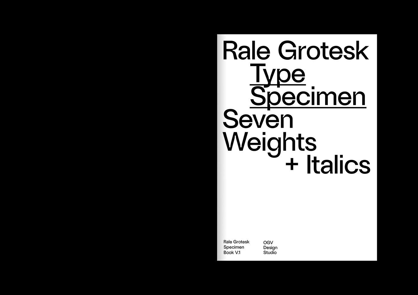
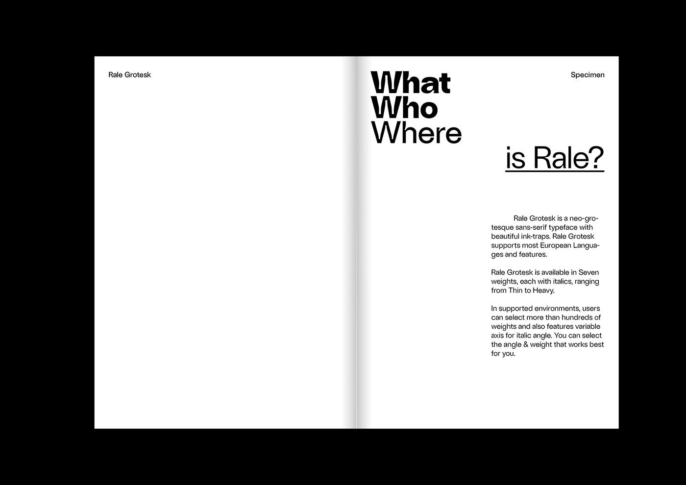
Serbian graphic designer and art director Ognjen Gligorijevic created a beautiful font family: lo and behold, Rale Grotesk!
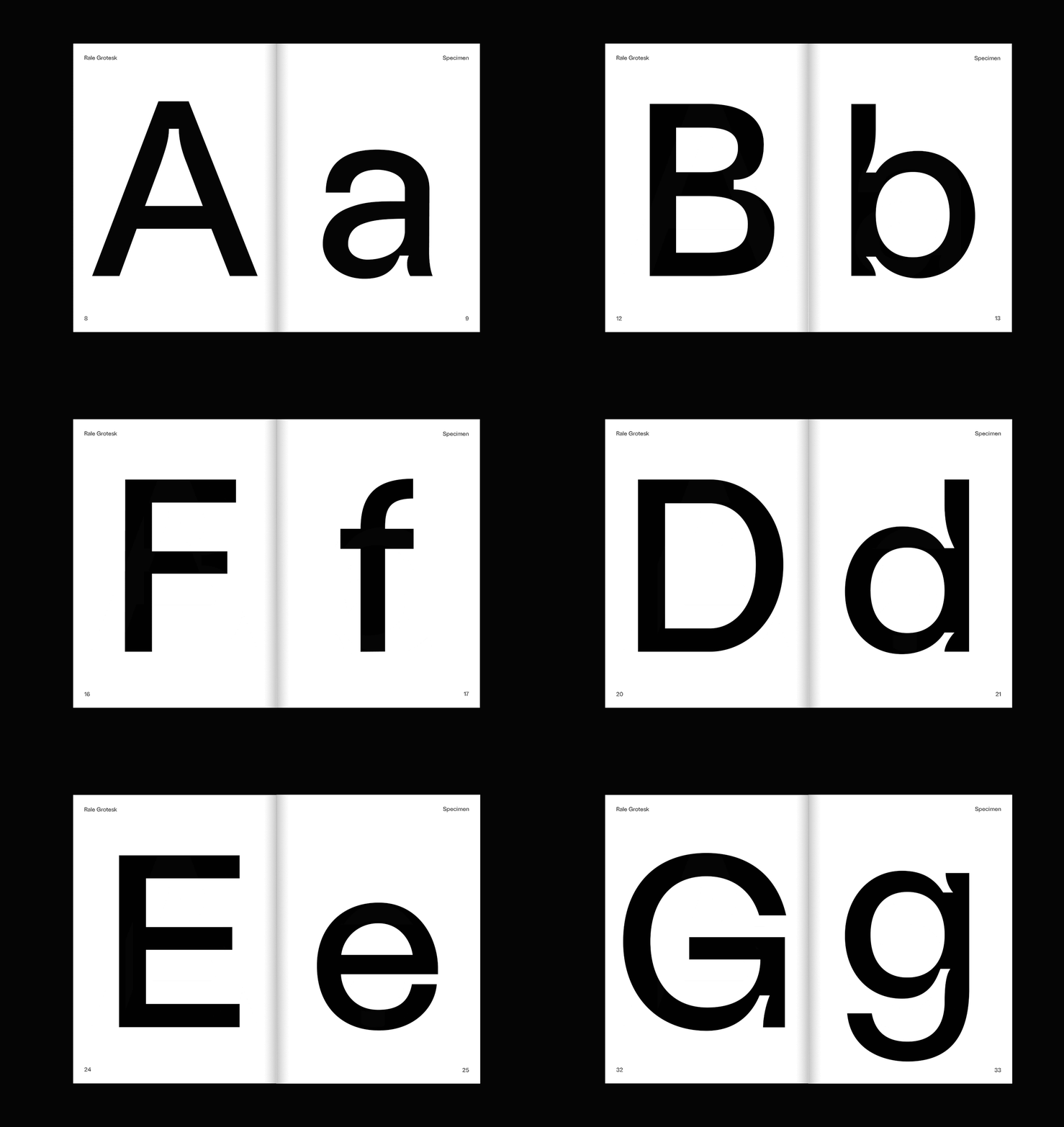
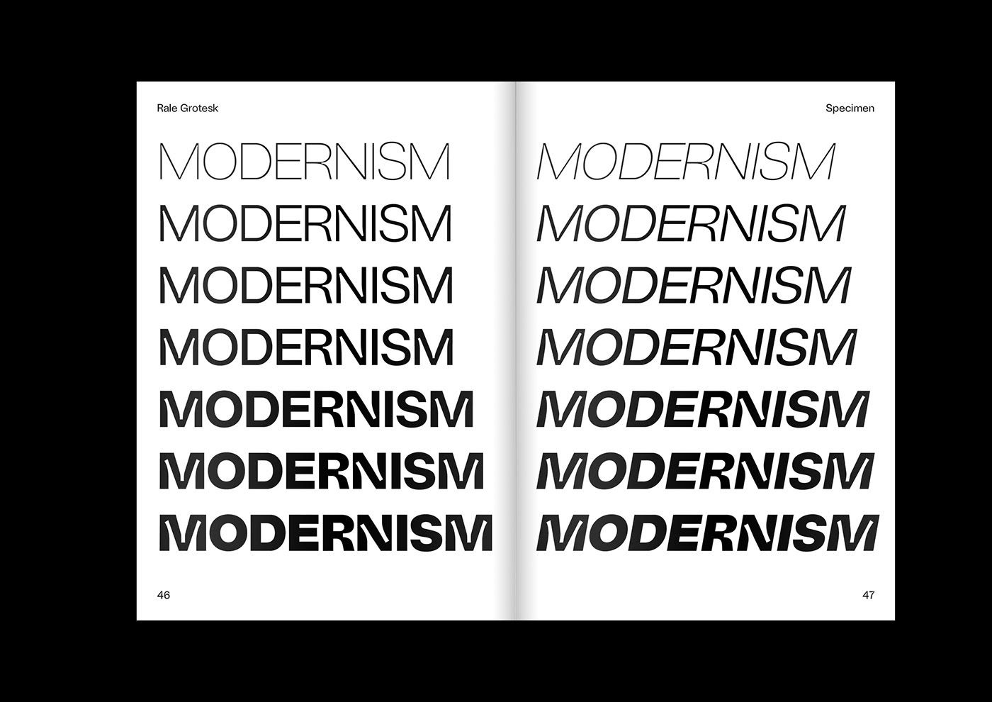
Recently, a new typographic approach has gained ground in the world of mainstream visuals. The exaggeration of ink traps is an obvious projection of the process in which elements that have lost their original role are given a decorative function. Ink traps were originally parts of printed letters’ design, intended to prevent the accumulation of ink at the connection of font elements when using traditional printing methods, thereby making letters more recognizable. This feature has lost its importance with the advent of precise printing technology, but now in the font of Gligorijevic, ink traps decorate grotesque letters, which, without them, could be regarded a bit boring by now.
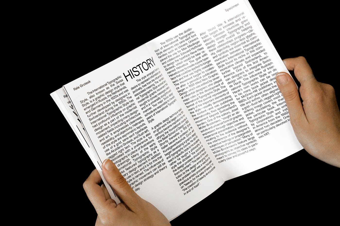
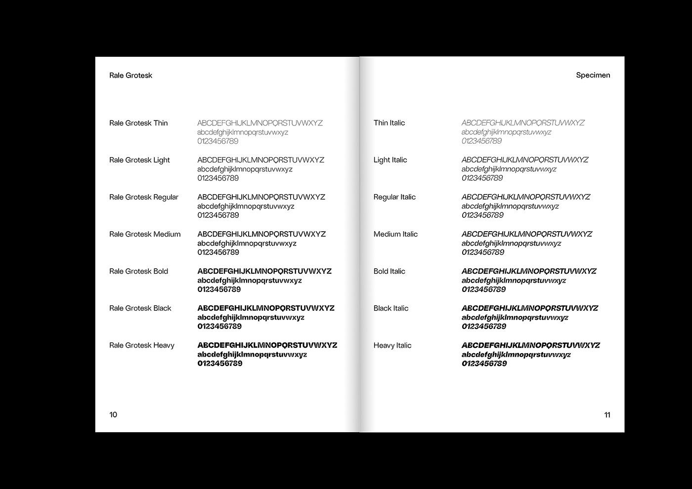
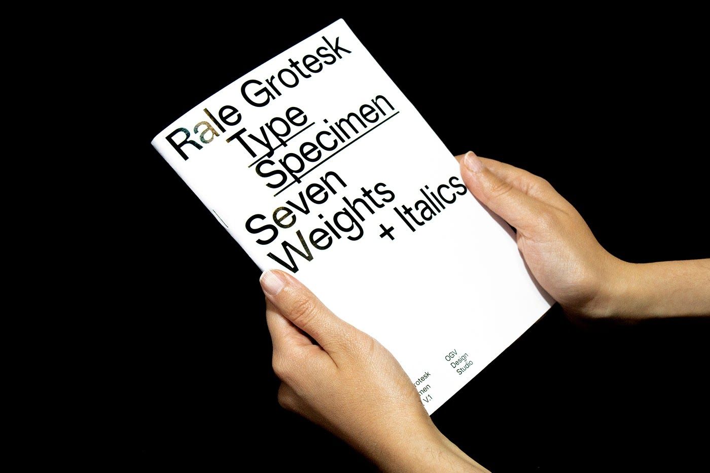
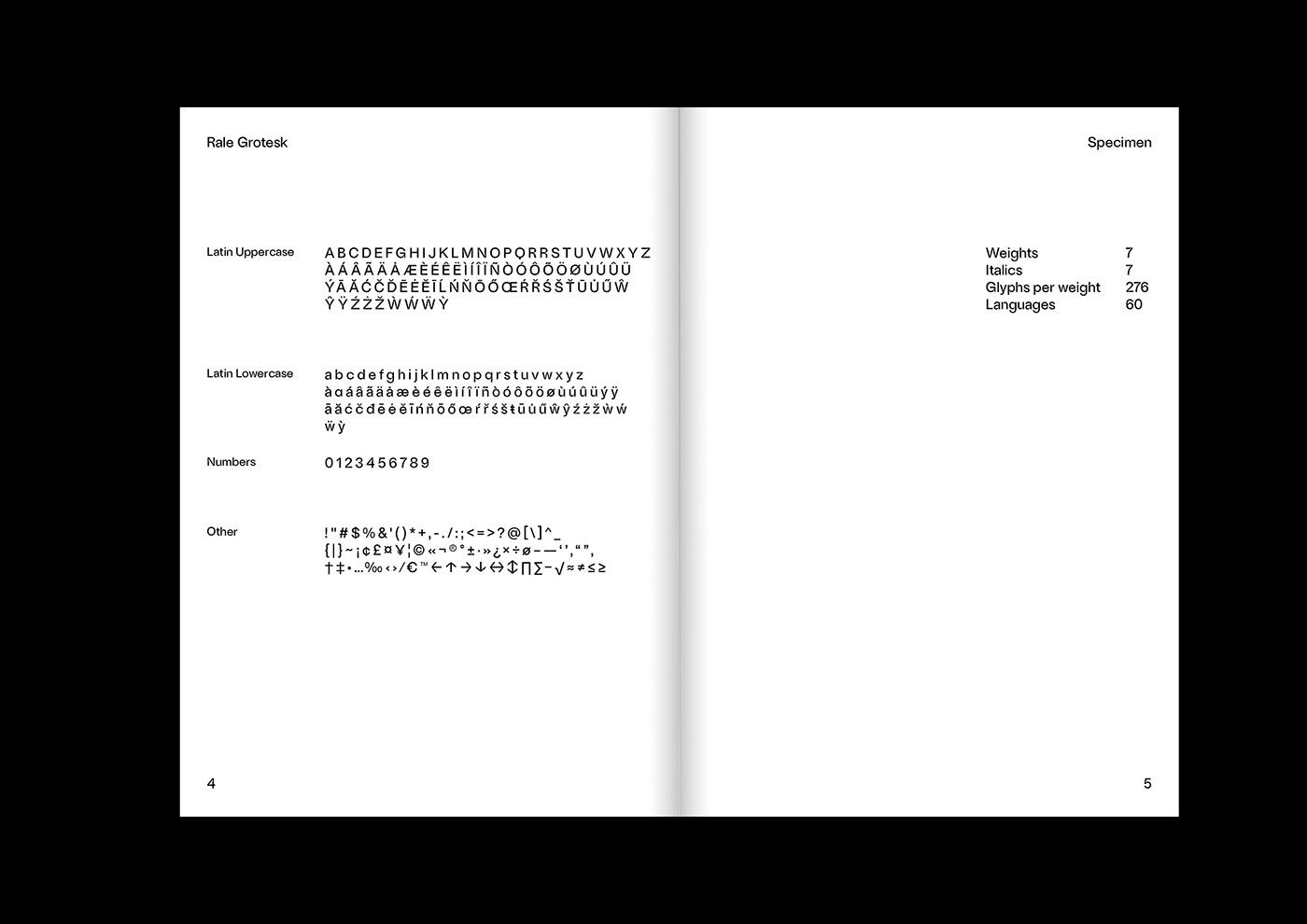
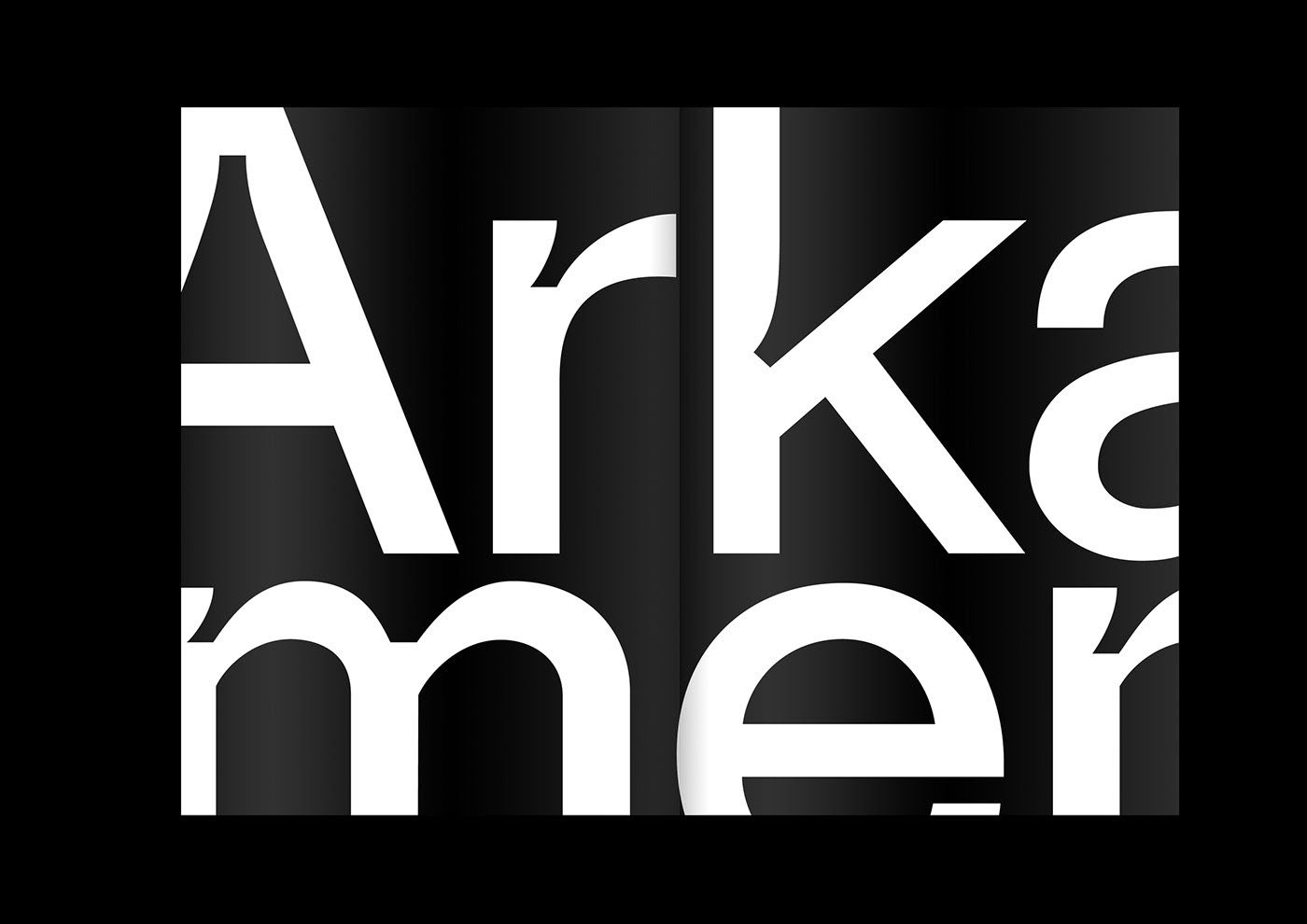
Ognjen has summarized his font in a publication.

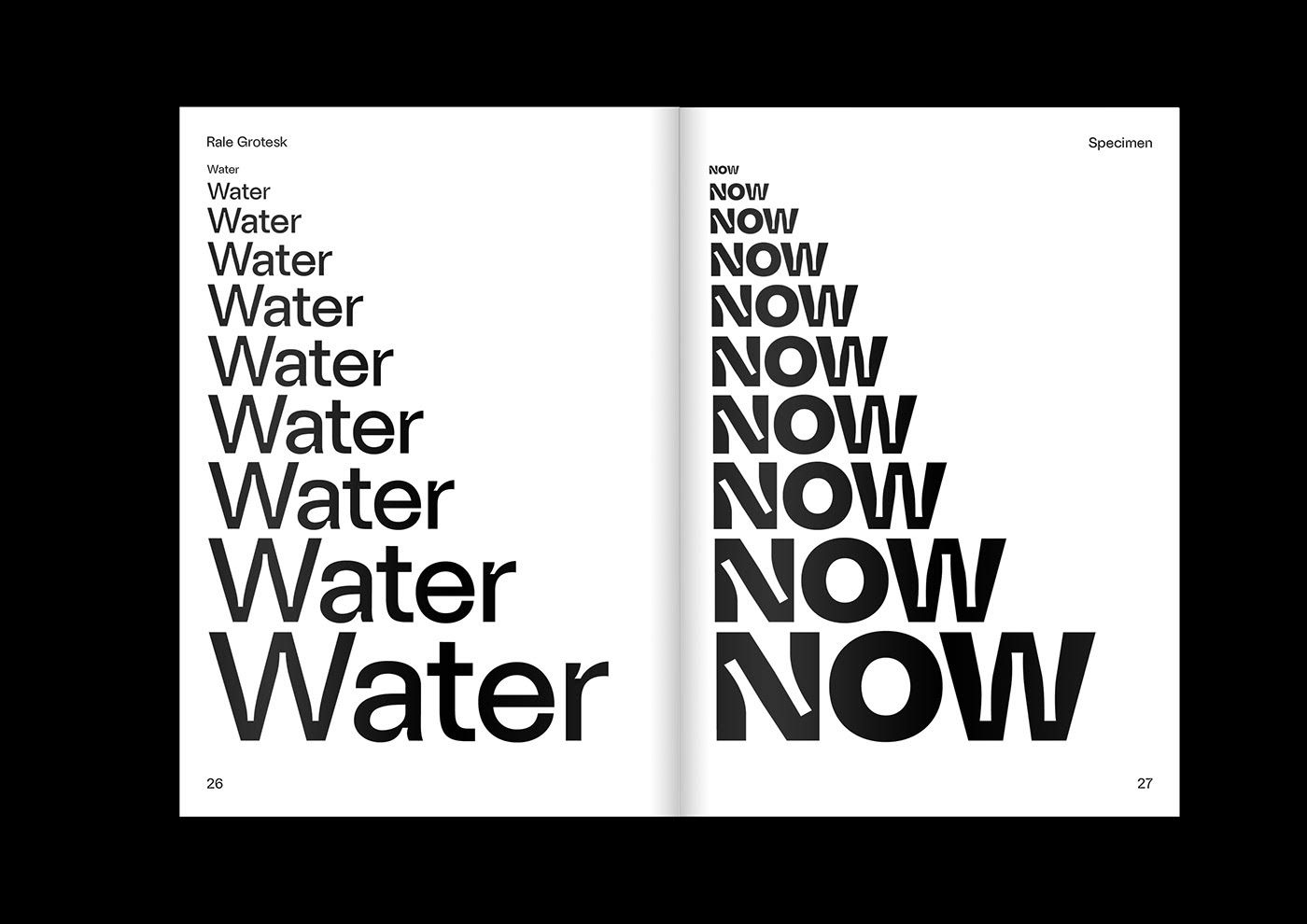
Ognjen Gligorijevic | Web | Instagram
Source: abduzeedo.com

A bakery you can come home to—Kenyérke
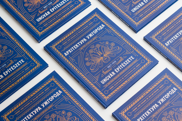
Book recommendation from Ukraine | Architecture of Uzhhorod


