


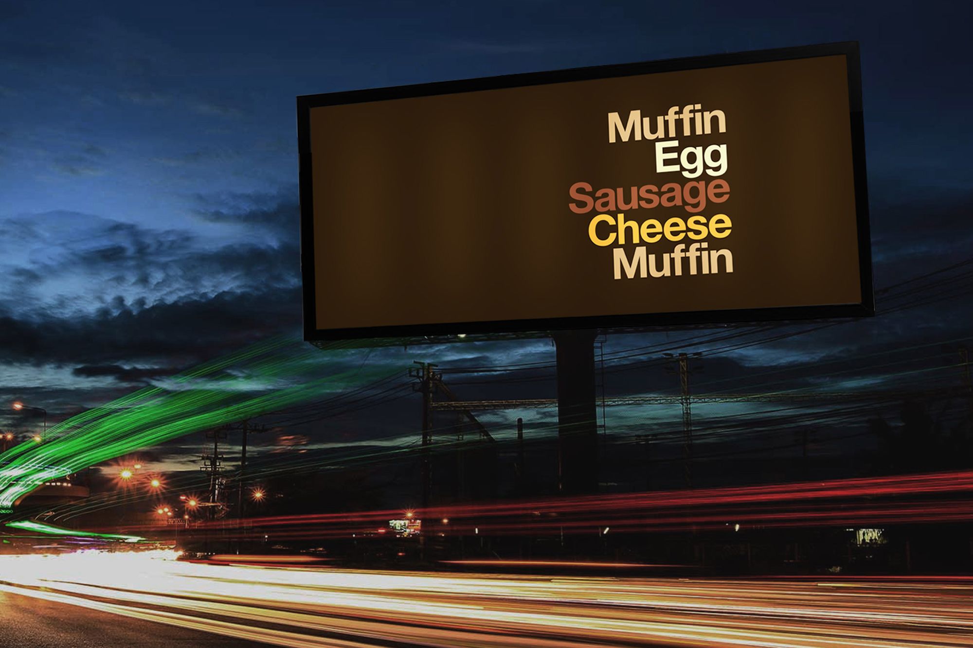
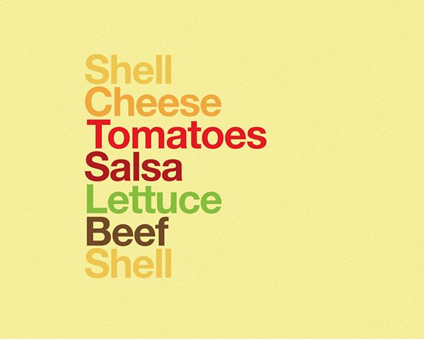
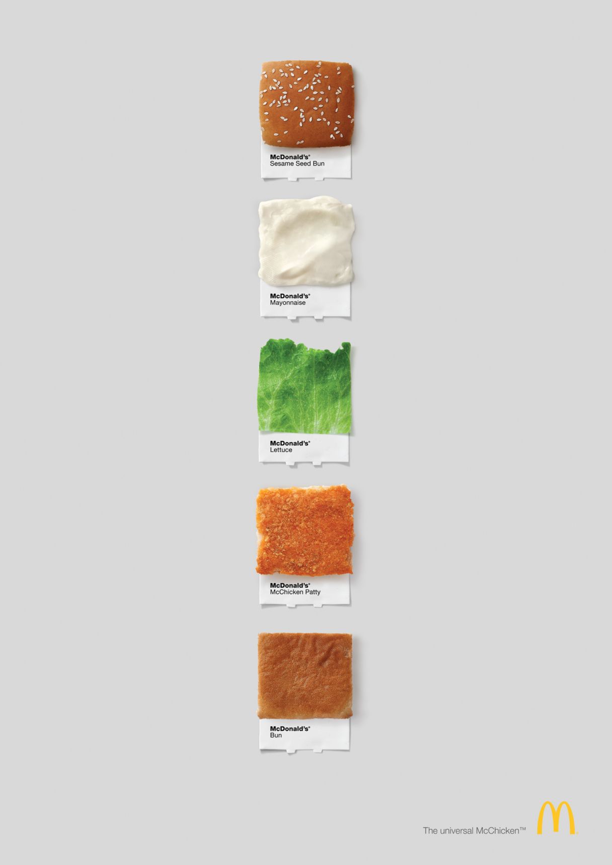
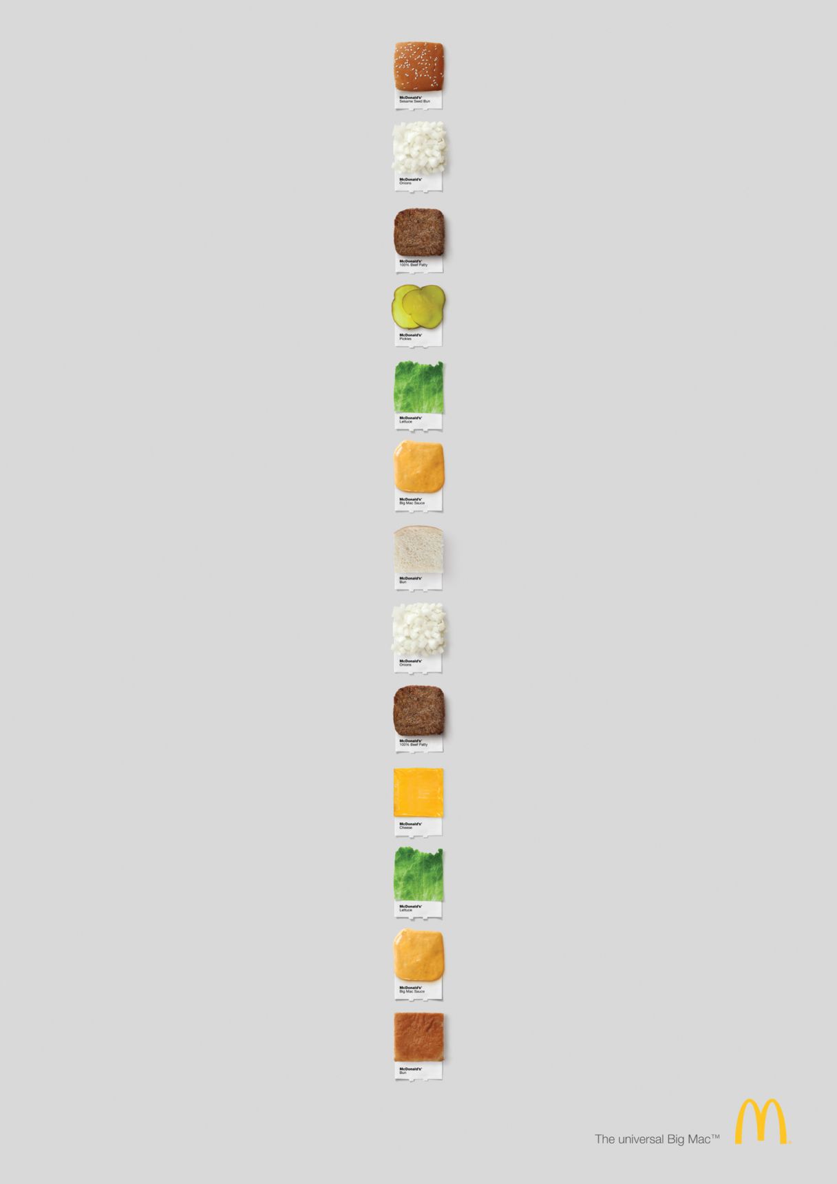
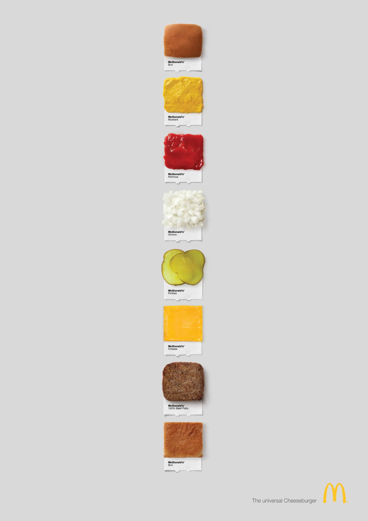
We have been looking at the attempts of McDonald’s at trying to prove that they are green, edible, clean and beautiful. Most of the time, the attempts are successful, and of course every adult can decide what he or she wants to consume.
This time, the campaign created by Leo Burnett focuses on the ingredients without brand names, which is, let’s face it, not something many could afford.
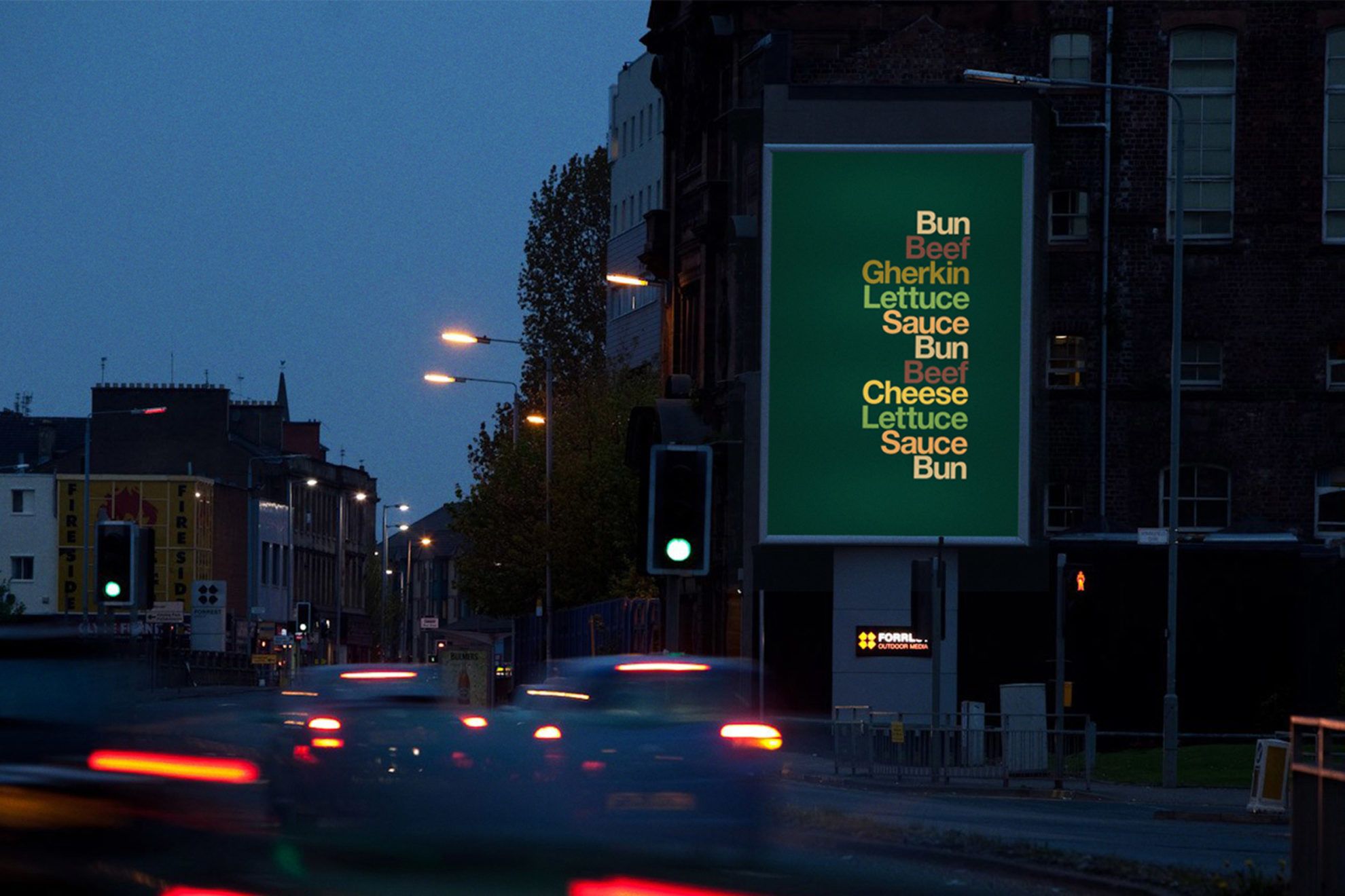
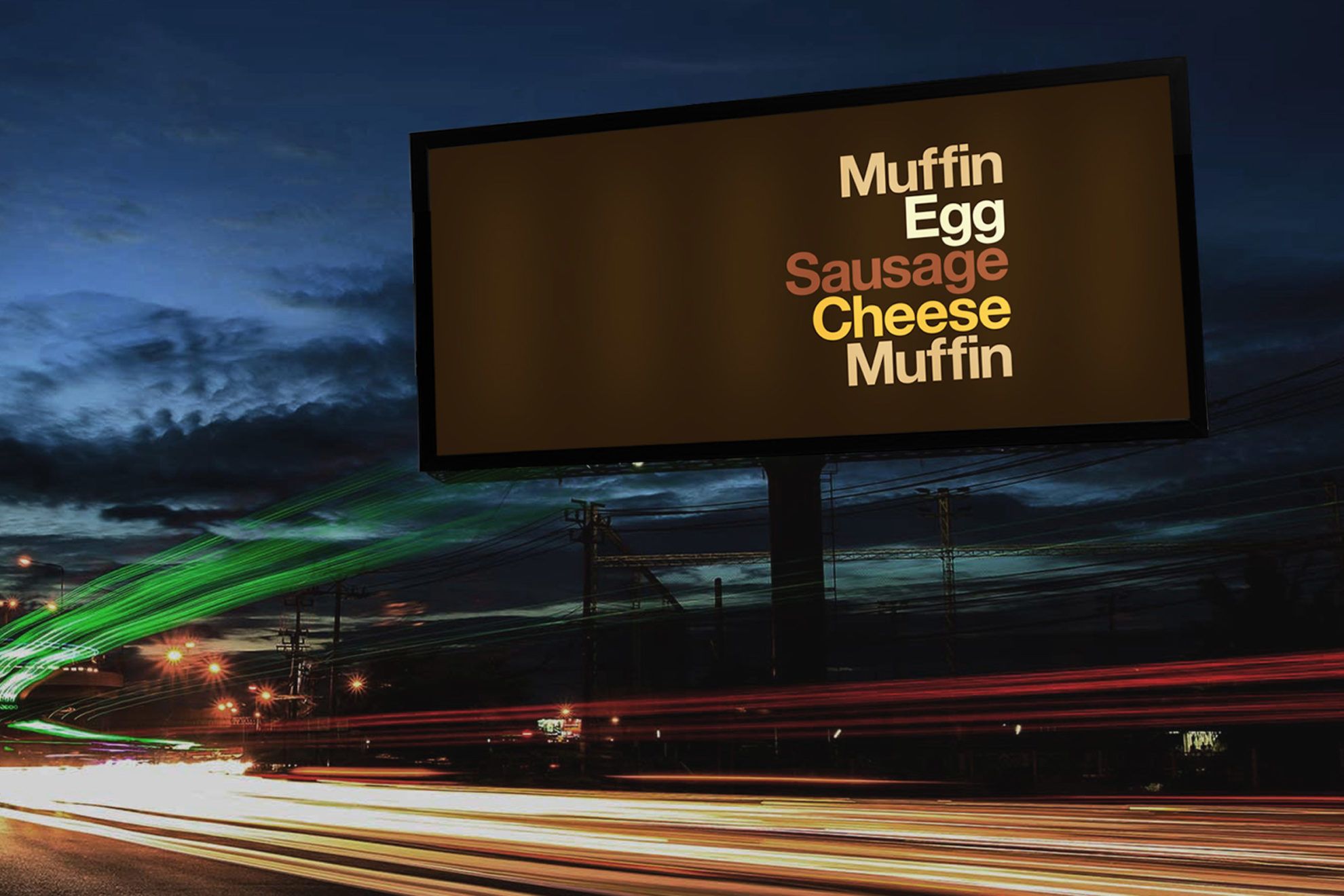
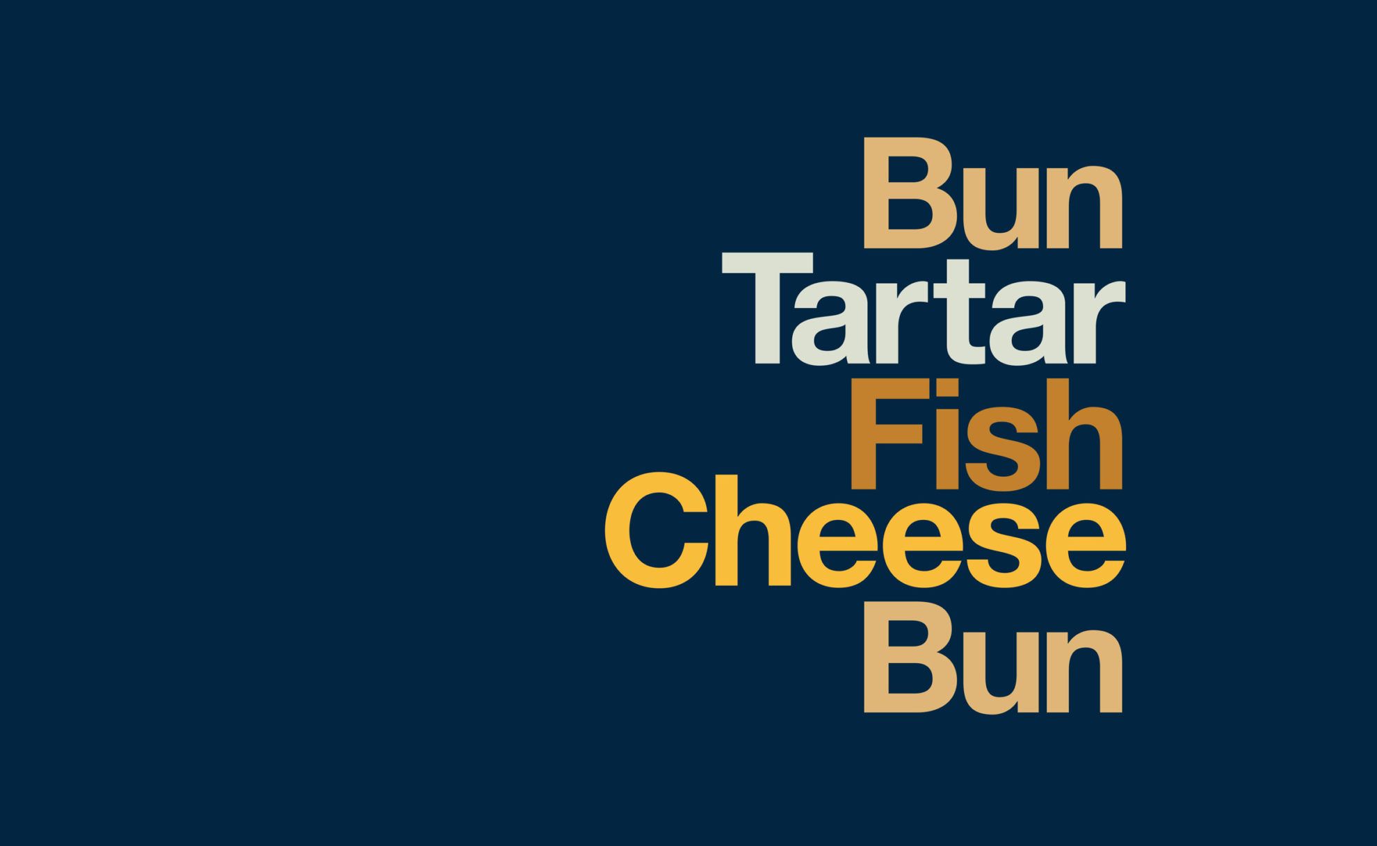
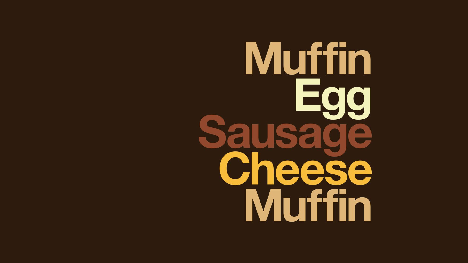
The message is simple: nothing else, just the ingredients. With Helvetica and the appropriate colors. The antecedent of the project is the Type Sandwiches project of designer David Schwen from 2011, and the McDonald’s campaign in Dubai in 2015:

more to read
budapest
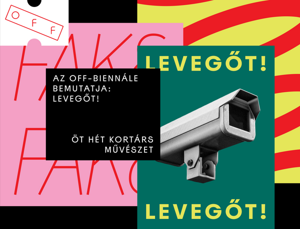
INHALE! | OFF-Biennial 2020
The OFF-Biennial is halfway through to reaching age of maturity – it has been
five years since the first issue started and according to certain opinions, in
the case of biennials, it takes 10 years for the event to truly find itself. In
relation to this year’s program, the organizers
architecture
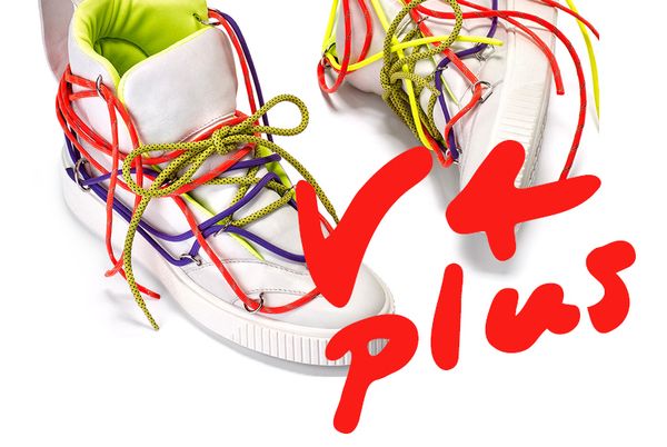
V4PLUS | Our favorite Czech brands_05
We would never, not even in our wildest dreams thought that there will be a time
when we will be raving about a TV tower in our V4 selection. It seems that the
“Prague rocket” made its way to our bucket list, just like we wouldn’t say no to
arthungry
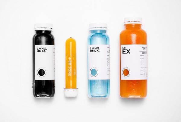
Juices from the lab | The image of SUPERJUICE
If we only saw the minimalist label of Superjuice (without the juice itself), we
could easily think that there is some kind of medicine behind the image. The aim
of designer Nóra Kaszanyi was exactly this: to give an appearance to the
super-healthy fruit juices as if they were prescribed