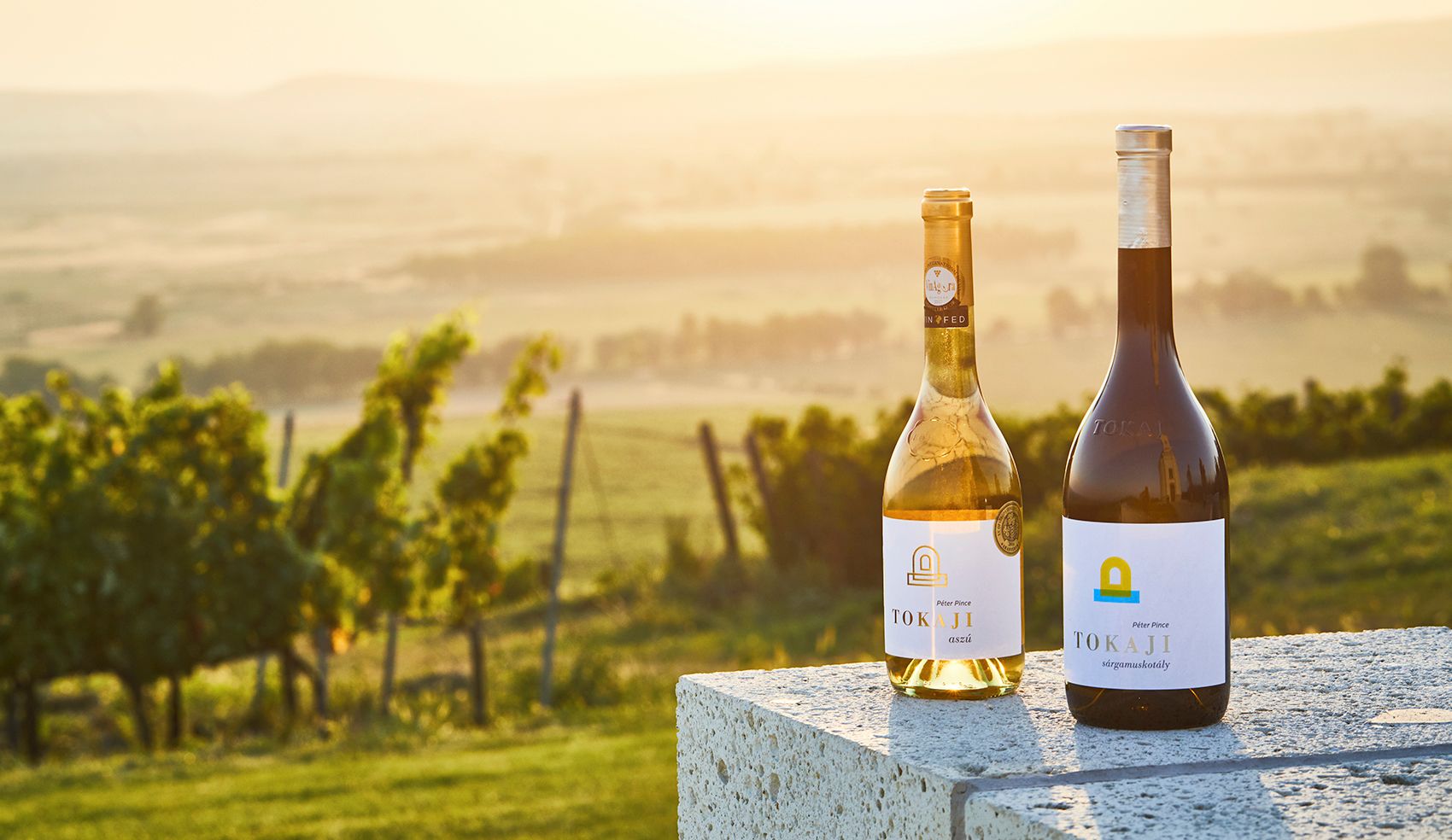
Good work takes time – who else knows this better than a winemaker? In the course of its branding process, Péter Pincészet worked together with the representatives of other fields with care and respect to create a unified and candid visual identity. The task of designing the visual identity and branding of the winery was assigned to graphic designer Ferenc Forrai, who tells the story of Péter Pincészet creating a unique visual language. And now he told the story of this project with words, together with winemaker Ákos Péter.
This is not your first time designing a visual identity for a winery. What’s your take: is appearance particularly importance in the case of wines?
Ferenc Forrai: Yes, I have designed complete visual identities for several wineries, which also encompassed product identity. I received my first enquiry to design a packaging in the wine field in the early 2000s, in 2002 to be more accurate.
This was a separate packaging project, and then later I occasionally took on other projects related to existing visual identities, but for a long time now I have only worked on designing complete visual identities and systems.
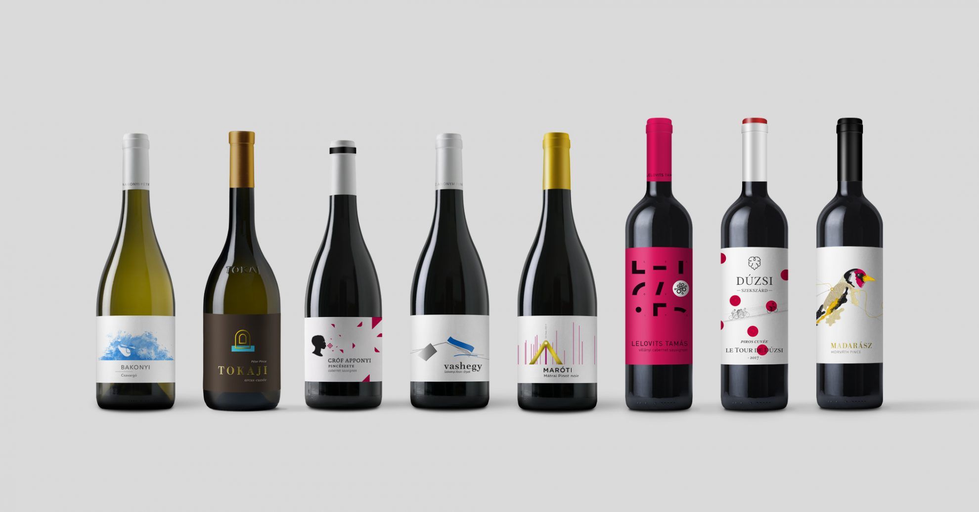
In the course of the projects, everything is of the same importance, regardless of the field. I don’t distinguish between brands or fields. I consider branding and with it defining the visual identity important for everything and everyone. To decode the message by creating a unique visual language with which the given brand can be introduced and sold. The professional challenge is to apply my knowledge on the given field, for which I have to find or create the channel-language through which I can connect and convey the message formulated. This challenge motivates me every single time, it fills me with excitement.
This means that your style suits this field and the visual identity of winemakers very well.
F.F.: Over the years I somehow ended up getting the majority of my enquires from the wine field, which of course I influenced too by taking the projects and publishing them. One job brought the other. These were exciting years and happenings, I was able to work with some very good people. I am particularly glad that this work also allowed me to visit the beautiful wine regions of Hungary.
My connection to the wine field was also influenced by my hometown, Szekszárd and the passion for collecting I had in my childhood: I collected packagings and ads, I used to cut them out of “Western” magazines that were really hard to find at that time. I loved ads with texts on them, the typographic direction of German magazines.
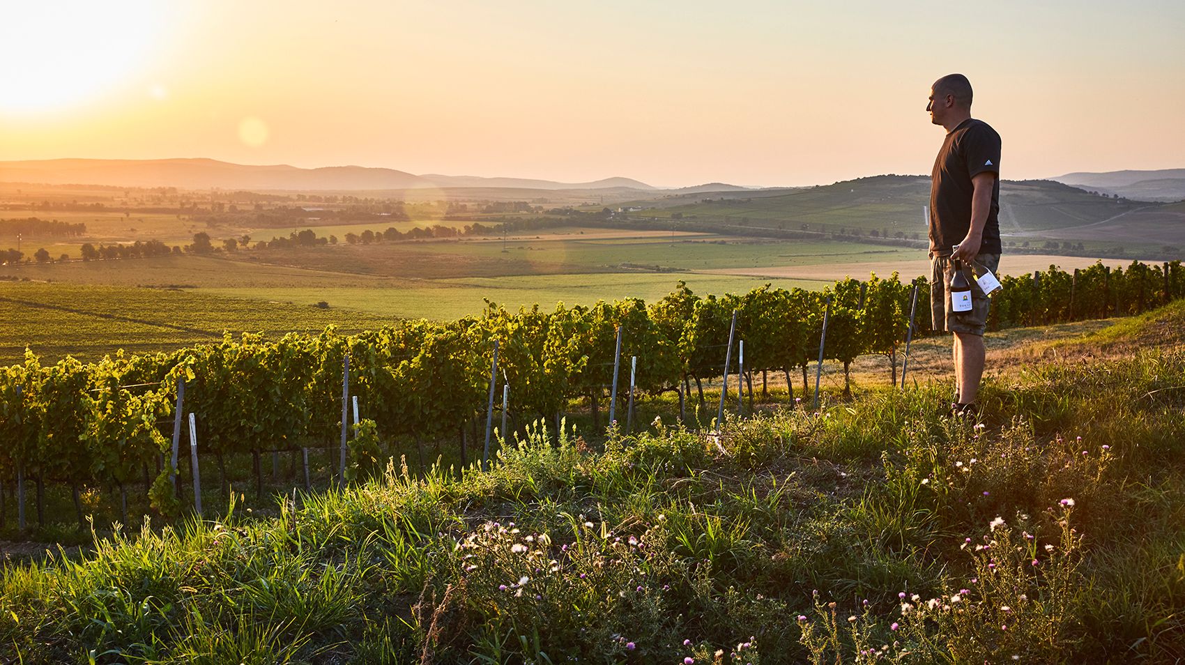
In the case of the complex visual identity designed for Péter Pincészet, where did the ideas and your inspiration come from?
F.F.: The same as in the case of every other job, design was preceded by deliberate, careful and comprehensive research. Collection, gathering information and systemization. Examining the environment, the brand – comparison, placement and ratios. It is during this process – and of course during the conversations with the winemaker and his family – when the thoughts that give me impetus and encourage me during design are conceived
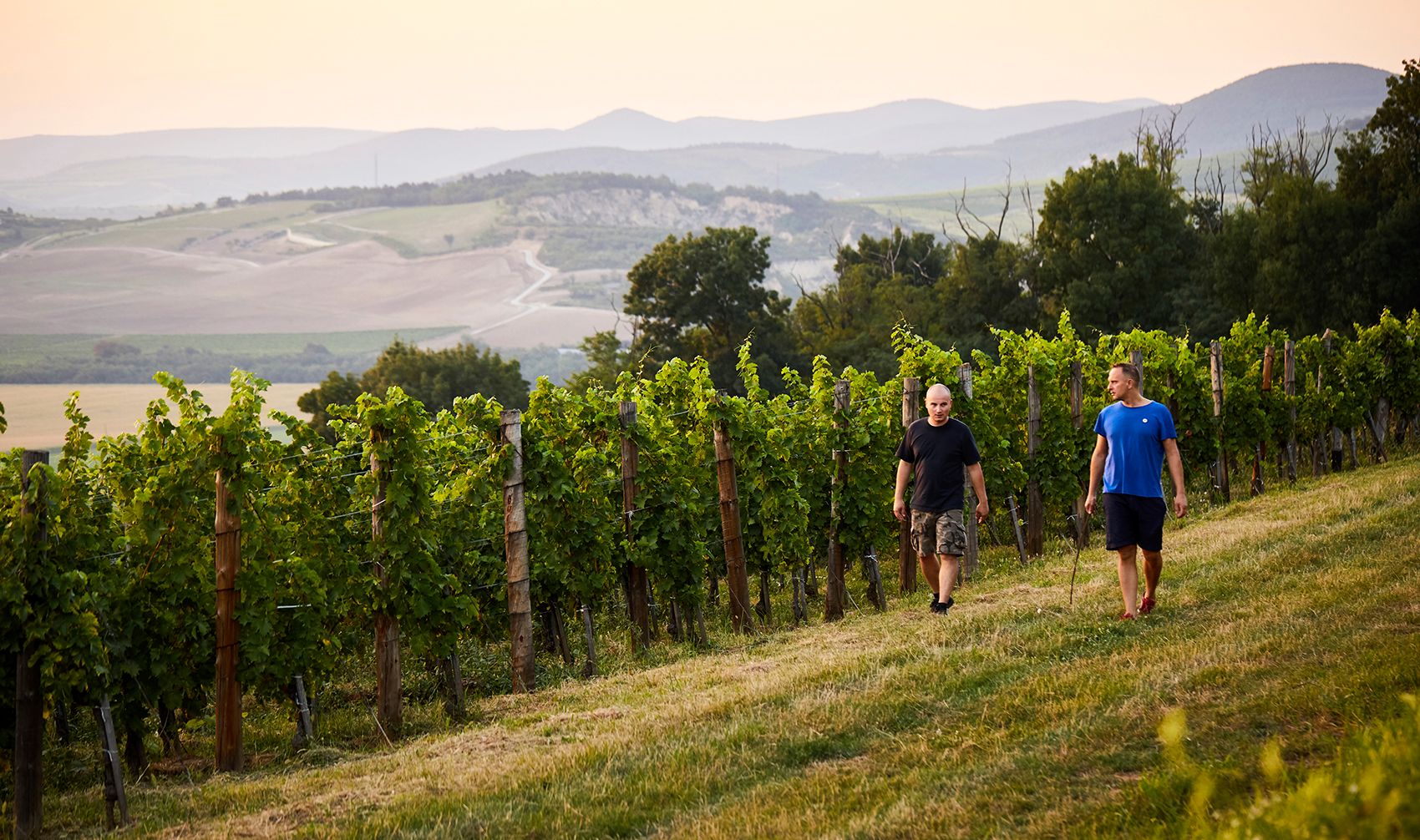
I love working with Ákos and his family. It works, and it works well. Over the years, the rhythm and method of our work together has been established, based on mutual respect, acceptance and attention. I think this also shows on the visual identity: creating together in harmony and while feeling good, letting it come to life and convey the message. The message of the family which we formulated together with the visual identity. It feels right this way.
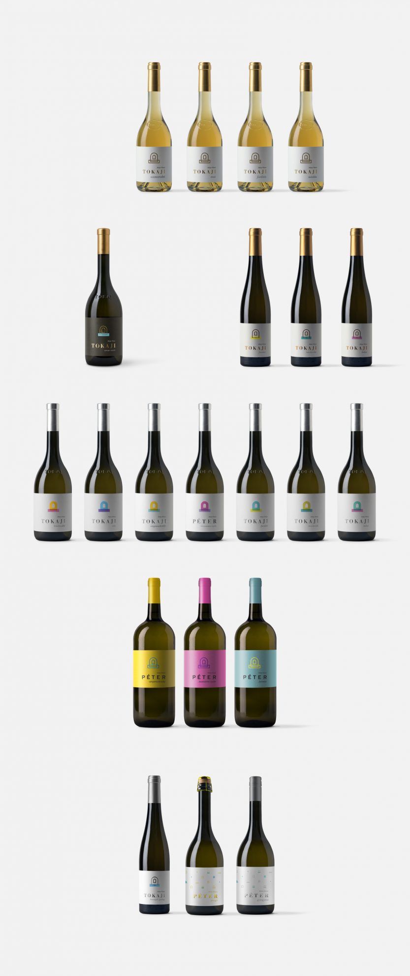
Ákos Péter: First, Feri does a quick scan to see whether we can work together effectively of not. I wanted to have a complete, new, one-of-a-kind and premium quality product packaging and visual identity, appearing on every product and accessory. Feri and I spent several days in Tokay in the winery, the vineyard and at every place that is important to us. We talked a lot, he got to know us and then he presented the elements of the visual identity, logo and typeface we use unto this day.
Even the tiniest detail has an important role in this work. For me it became obvious quite soon that this needs to be managed in a comprehensive manner, because not only a label, but a strong image forming the basis of the brand is created, which fit into our ideas perfectly, as we paid particular attention to branding already at that time. We established product families, so Feri could also build up the colors and use of materials along these (bottles, packaging materials, sealing materials). We strived for premium quality in everything, and to reflect to our consumers that not only will they purchase a bottle of wine, but a reliable product of a powerful brand, to which they can return to and which they can trust.

I find it very exciting that the logo is built up of several buzzwords, as if several associations were synthetized into a single shape.
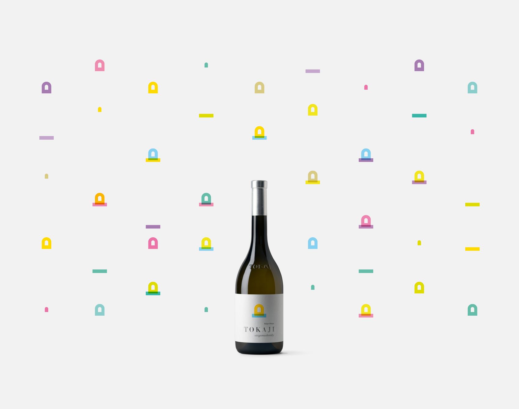
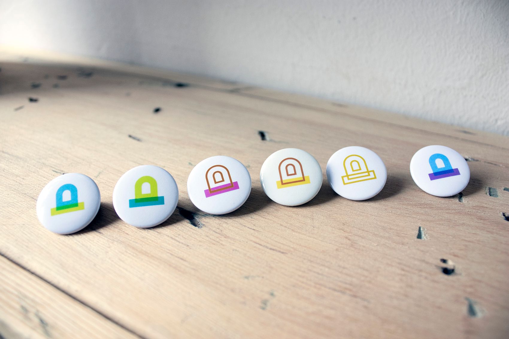
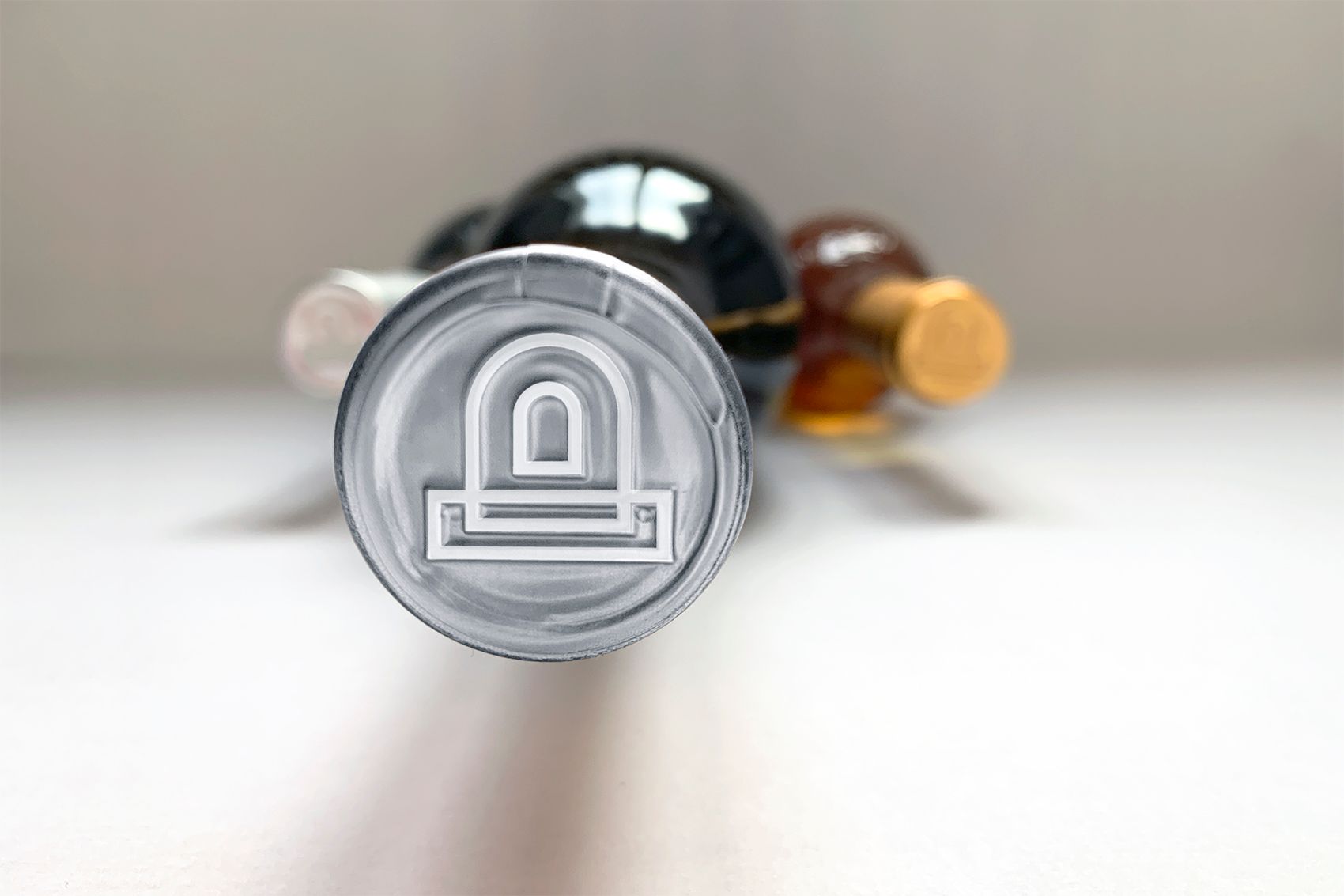
F.F.: The starting element of the visual language symbolizes the arched entrance of the cellar and the related base, the stairway. You can track the formation of the sign and the symbolism of its elements on the animation above: the initials of the family name, door, hospitality, winery, cellar, arch, dome, earth, field, base…
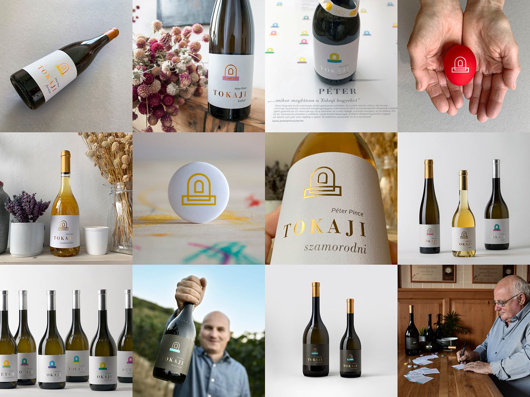
These words, thoughts and emotions are continuously expanded on the certain surfaces, by being displayed in different environments, by being molded into different shapes and by connecting to consumers. The visual identity, the same as the brand and its environment, is always in motion, it continuously changes, and is part of a process.
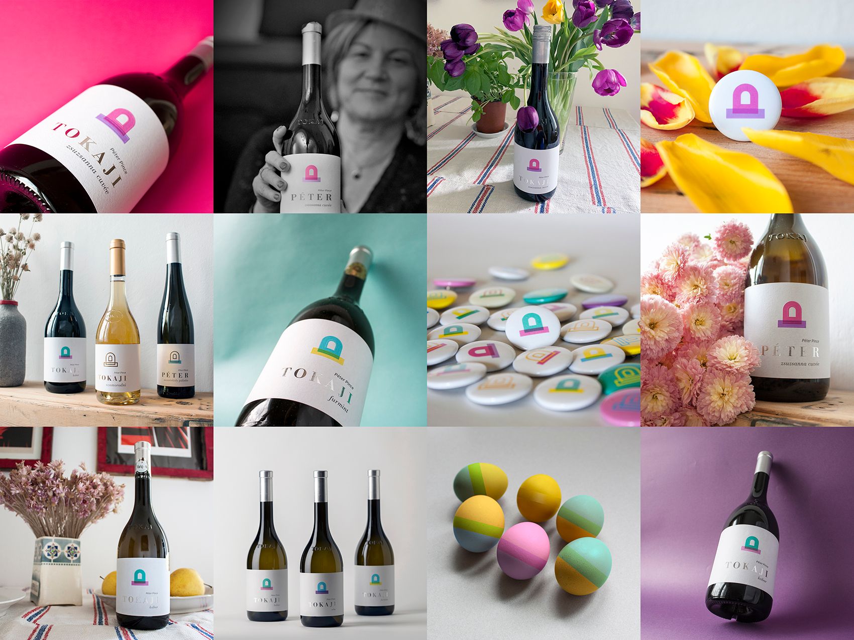
The complex visual identity also encompasses the texts or poems belonging to the wines, which make the products even more personal. What should we know about these?
P. Á.: Feri and I agreed that we didn’t want to display wine-dish recommendations or other worn-out and meaningless texts on the back of the bottles. This is how the idea of putting poems suiting the various categories and providing more intimate information to the consumers about them came. The poems written by Gábor Képes and Lili Farkas-Zentai, and we invited Kitti Mayer to write the texts. The poems are closely linked to the brand, the given wine and to our family. A fine example for this is the following:
„Aranyló napfény simogatása a langyos eső után.
Nektárt csepegtető vidéken ráérős családi ebéd.
Van idő, van bor: minden együtt.”(Gábor Képes)
Ferenc Forrai | Web (applied) | Web (autonomous) | Instagram

The era of no-contact menus might start soon | SpeedPro

Volkswagen’s latest campaign promises a brighter future
