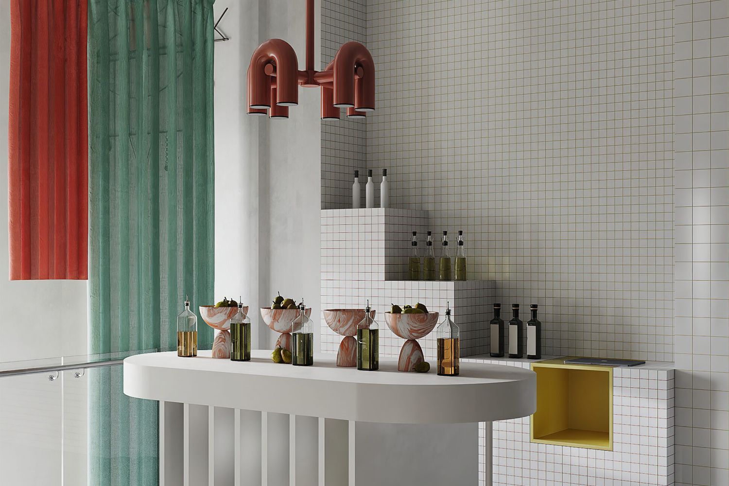
Excellent ingredients are essential for cooking good food, a piece of wisdom shared by this grocery store in Spain. The interior design of the Granada store was created by the Madrid-based design studio Puntofilipino. Behold, the Altelier!
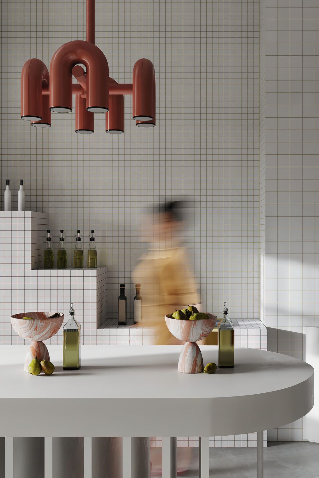
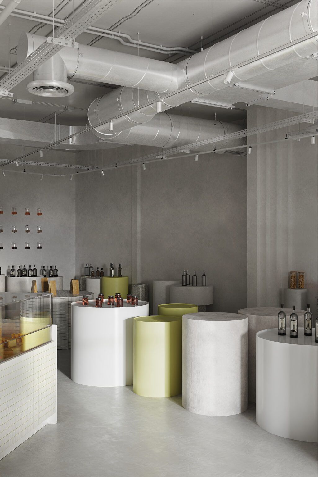
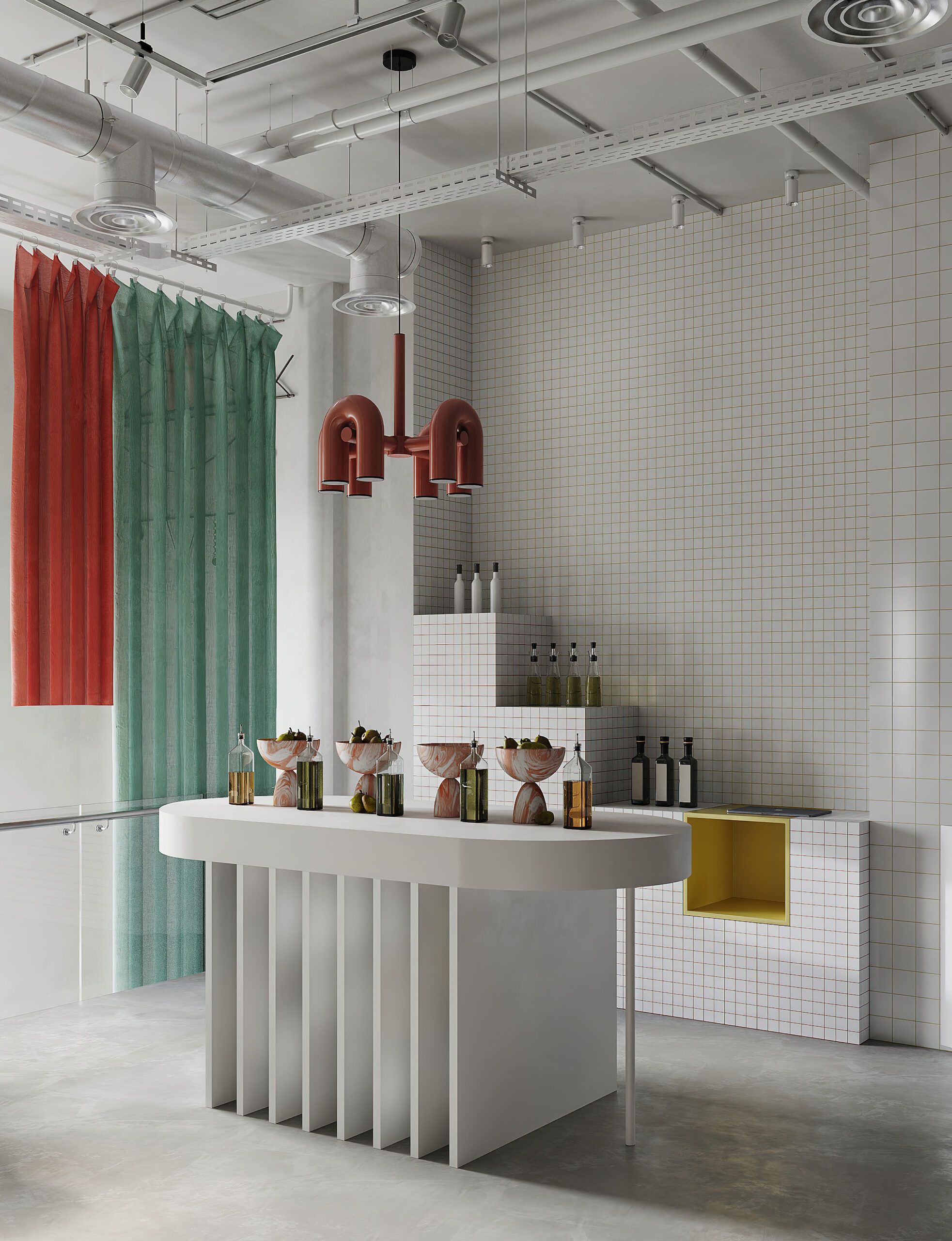
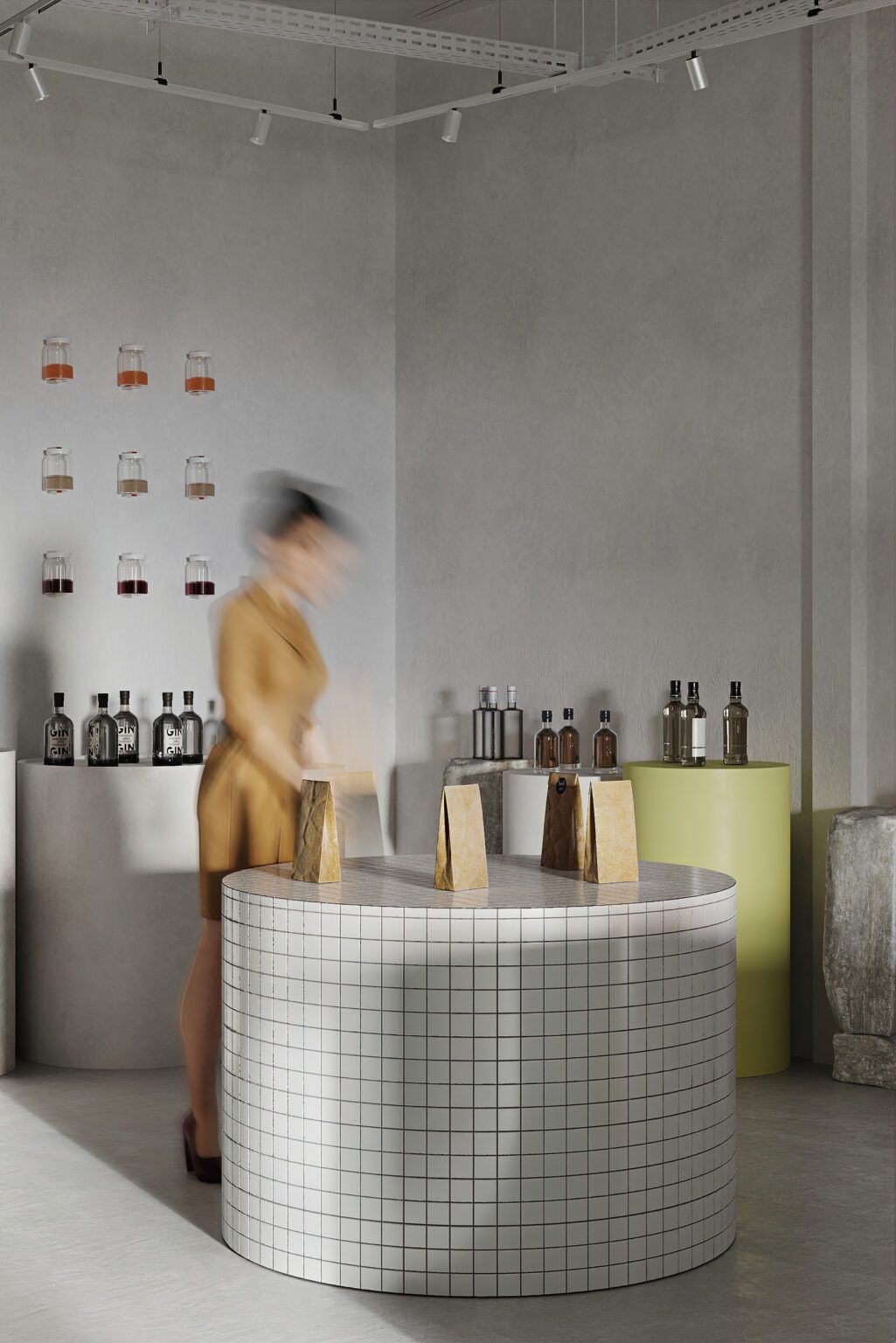
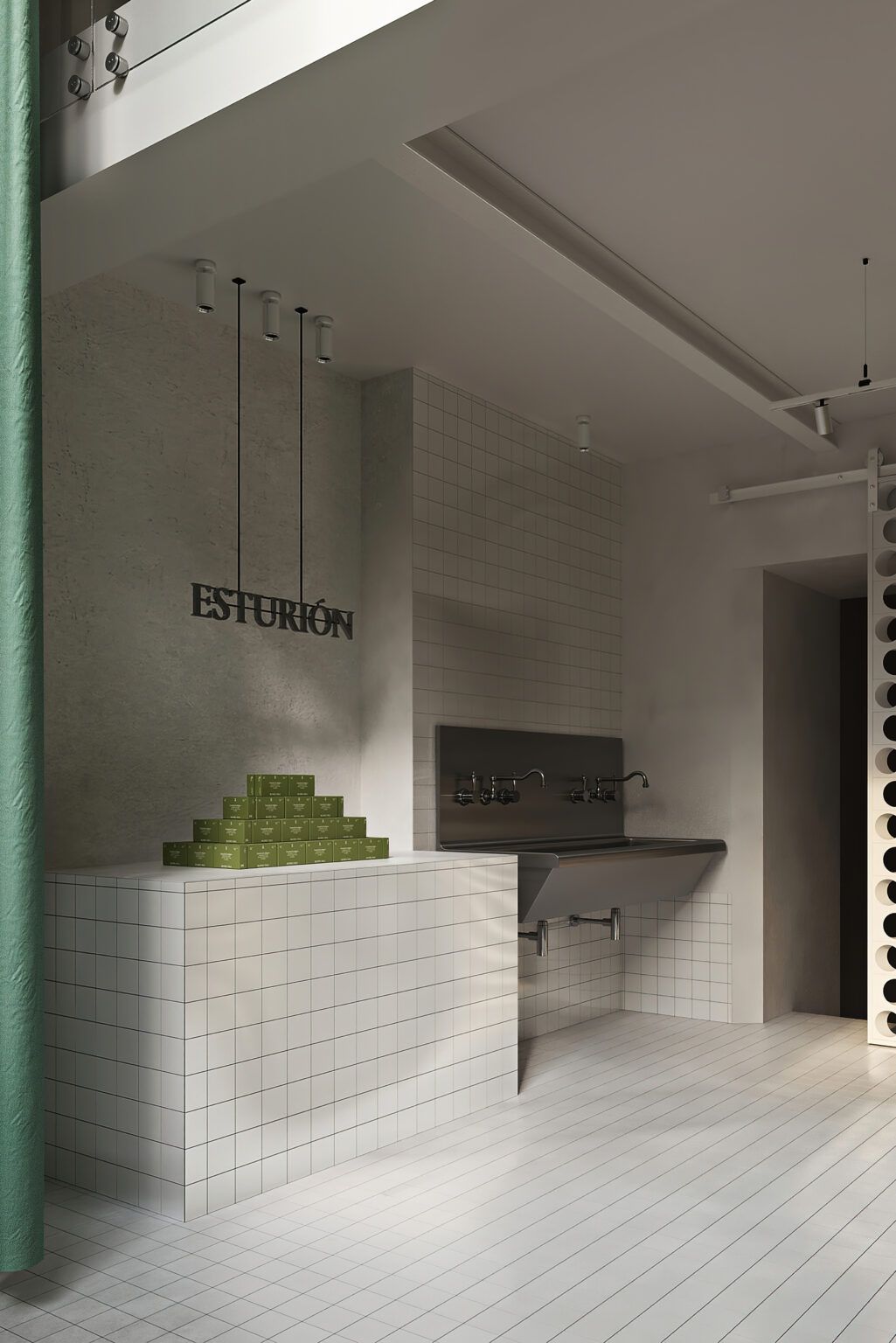
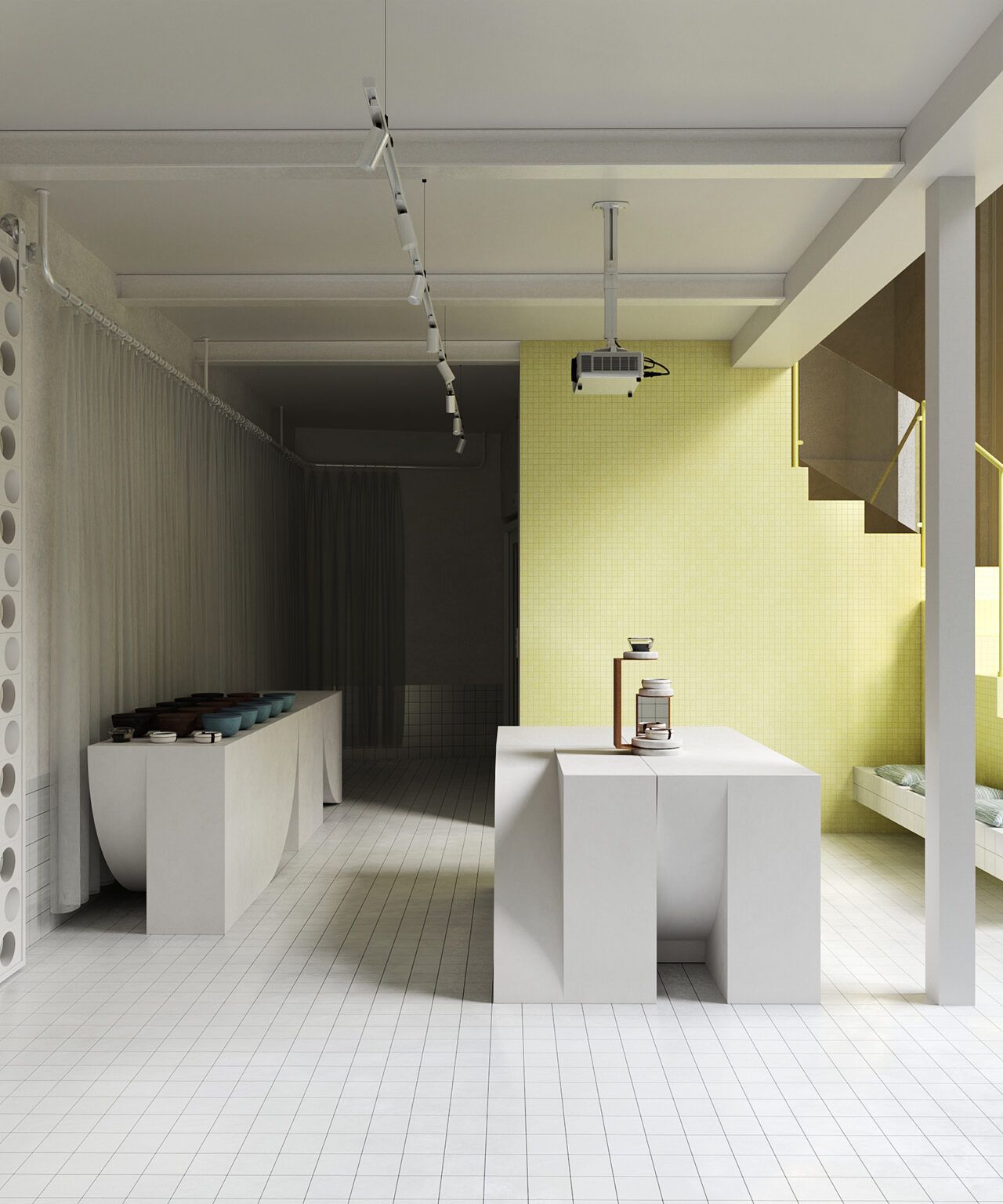
The delicate spatial layout proposed by the designers at Puntofilipino allows the carefully selected food products to become the protagonists of the store’s interior. Indeed, the selection of Altelier is presented as if we were looking at works of art in a gallery space: bottles of oil and vinegar are displayed on stone pedestals, illuminated by directional lighting.
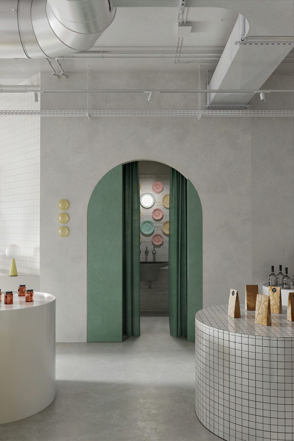
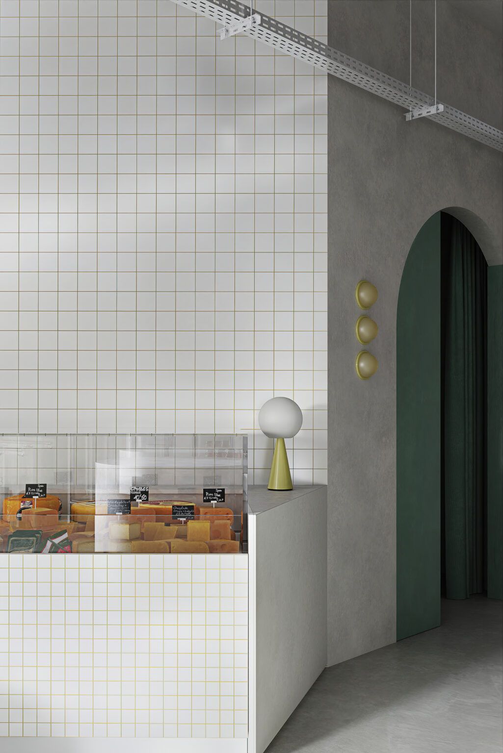
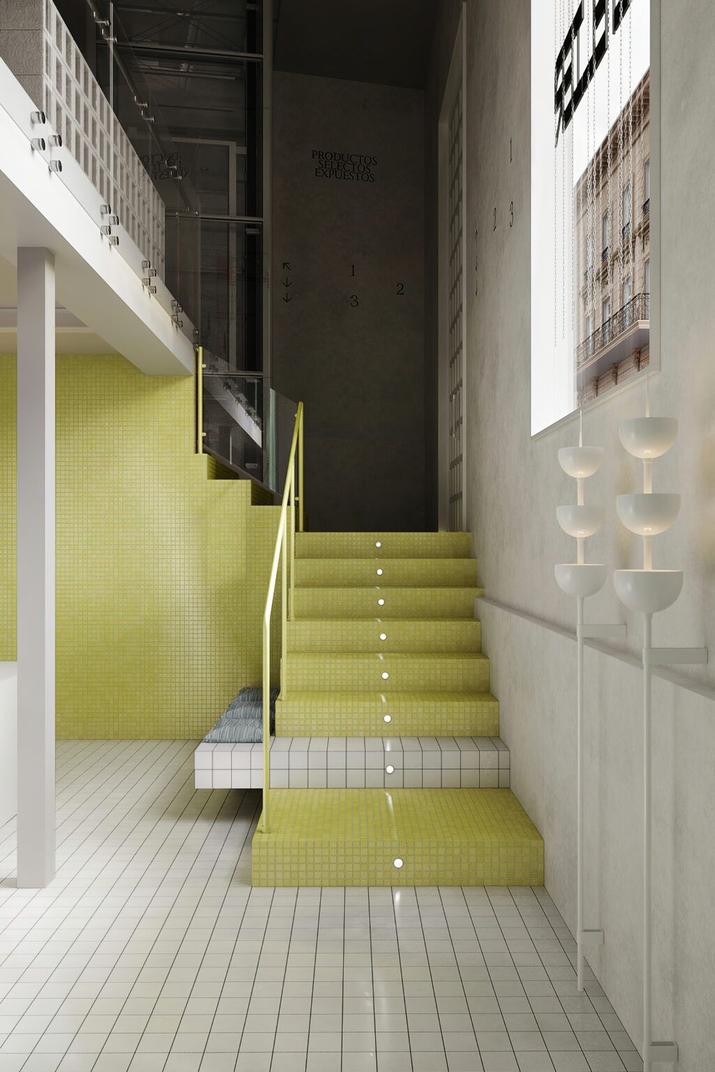
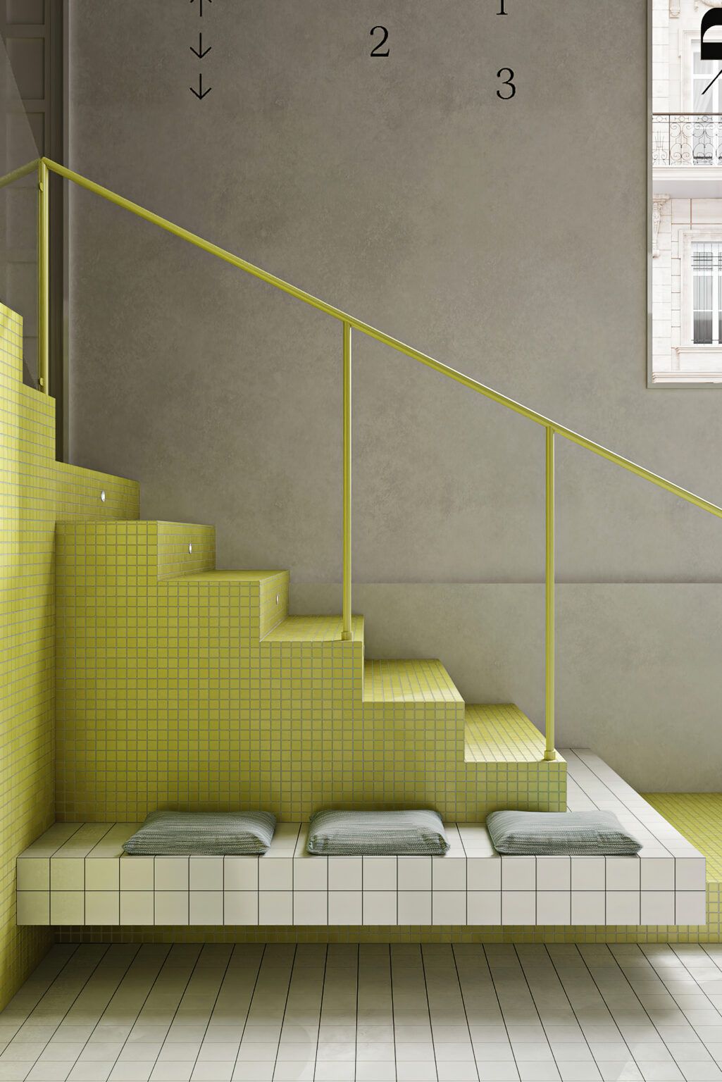
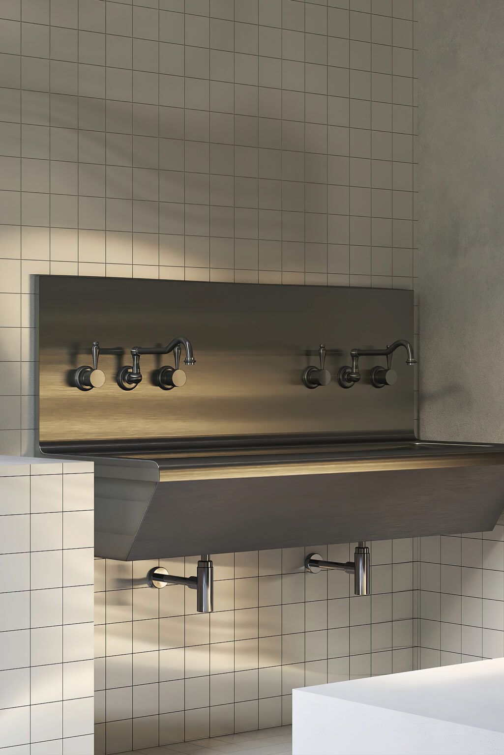
The entire space is dominated by a palette of soft whites, muted yellows, and teal. Reddish light fittings and green accents evoke fresh produce and extra virgin olive oil. The walls of the shop are covered with lime and mosaic tiles, while product displays are made of natural stone, tiles, and lacquer. The shop floor is covered in hand-applied resin, giving the space a clean feel.
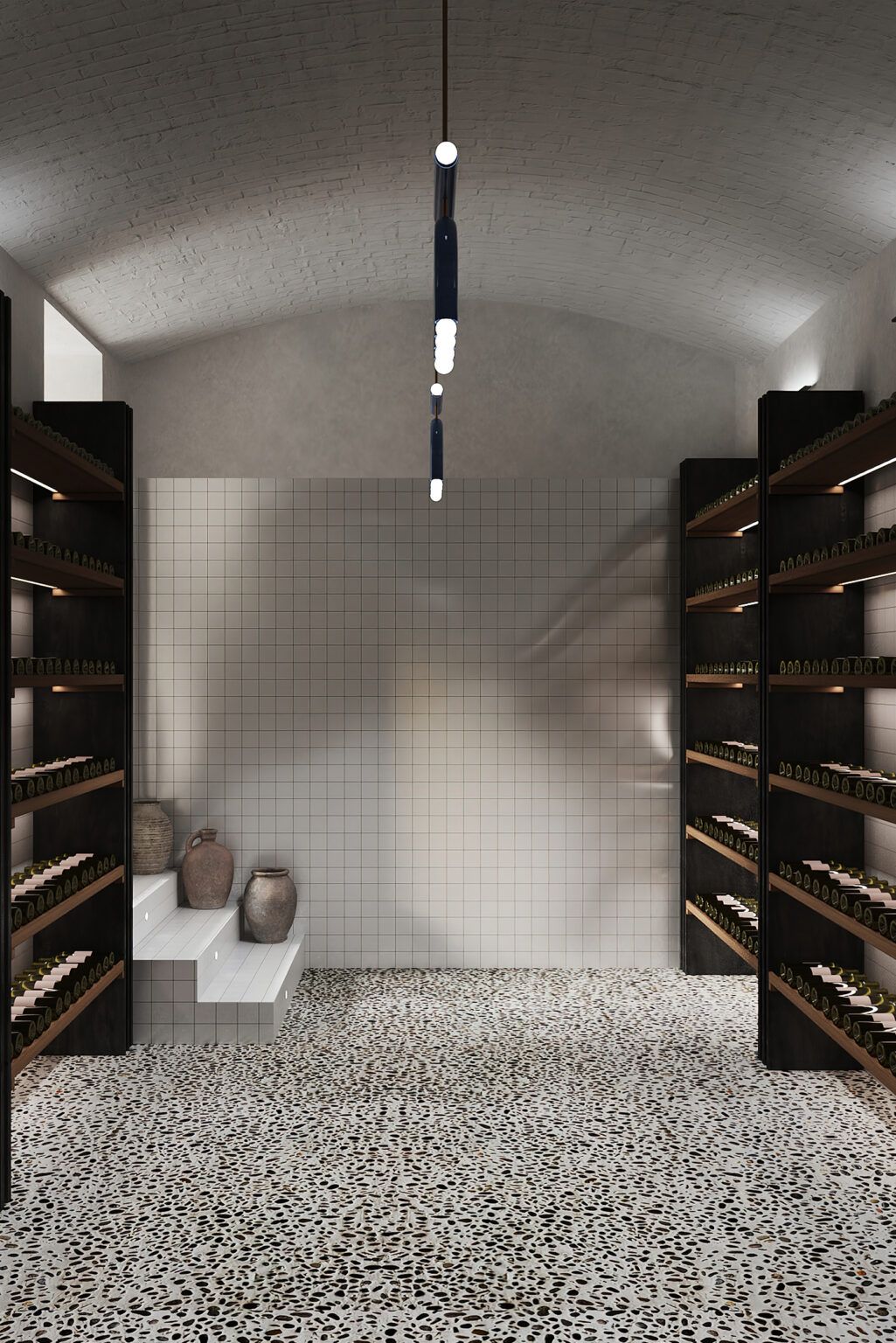
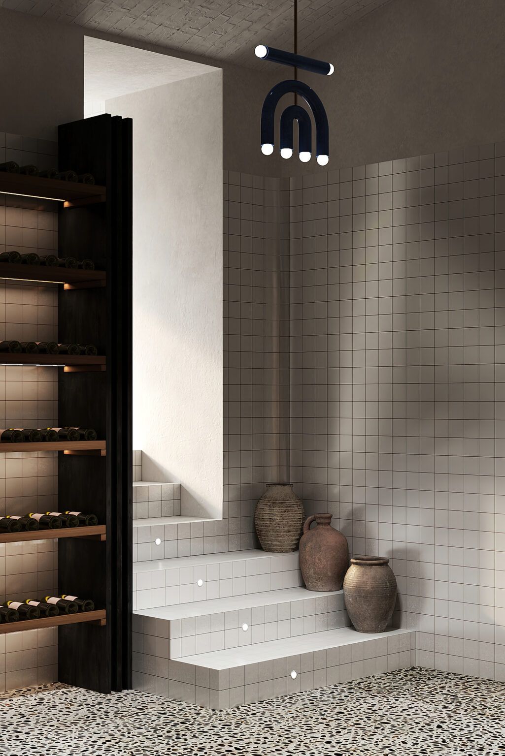
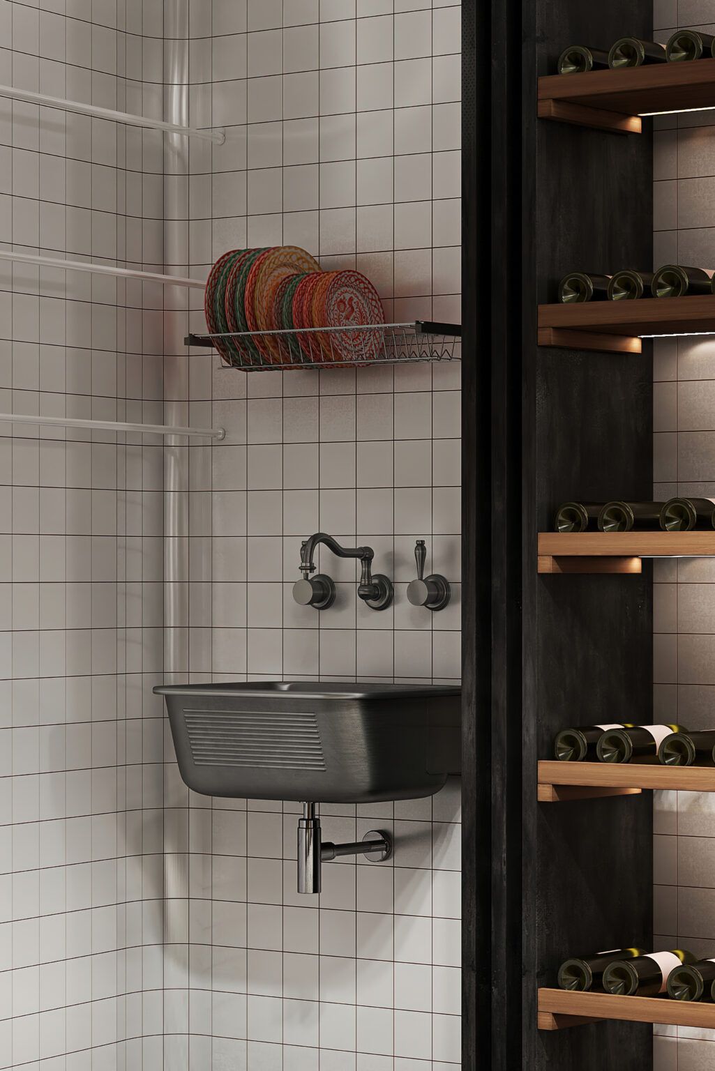
Photos: Polina Parcevskya
Puntofilipino | Web | Instagram
Source: Frame
Downtown romance in the spirit of slowness | Dash Interiors
Where you find what you’re looking for | Csemege


