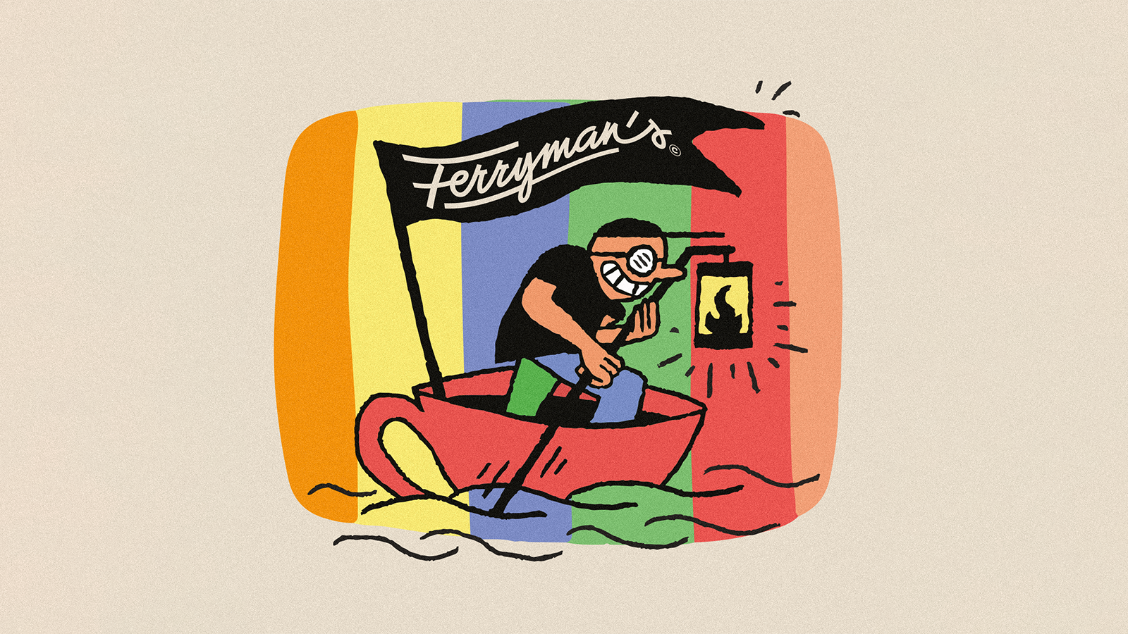
A ferryman rowing in a cup, a fish bathing in a mug, or a scalded rooster in a modern style with a retro touch. Here is Ferryman’s new-wave coffee, made even more distinctive by the visual world of Péter Molnár’s identity design and the illustrations of Dániel Labrosse.
Péter Molnár originally started his career as a drawing teacher and immersed himself in the world of graphic design about fifteen years ago. Since then, he had the opportunity to work on a wide variety of projects: from cryptocurrency to tattoo artists to complete spa and hotel identities, but his portfolio also includes product packaging, entertainment venues, Western European restaurants, and zero waste projects. His design approach is characterized by the pursuit of powerful atmospheres and playfulness. “I have a strong, orthodox belief in concepts. Music and rhythm always play a big part in my work, whether in visible or invisible forms, often accompanied by freehand lettering,” he notes.
As Péter explains, he prefers interesting commissions, especially those with a certain added value. “These are the ones where I feel the potential and the challenge, and that I am the one who can unlock it,” he stresses. He then adds that perhaps he has a soft spot for beverage packaging design.
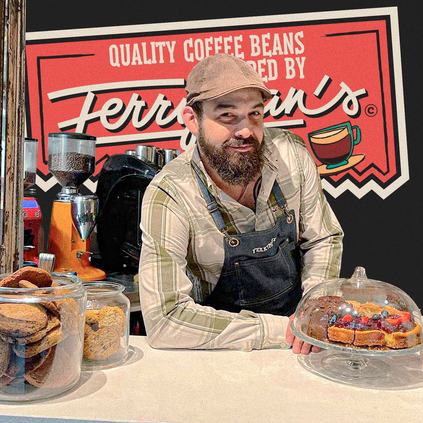
For Péter, the design of Ferryman’s coffees is another special project, as he says it “allows for a very different approach to the clean minimal design that is common in the specialty coffee world.” Ferryman’s started out as a small café inside the legendary Budapest bar, Szimpla Kert, a few years ago, and by this summer they started offering their private label house-roasted coffee. So the visual identity of the brand and the packaging of the beans was inspired by the well-known bohemian world of Szimpla.
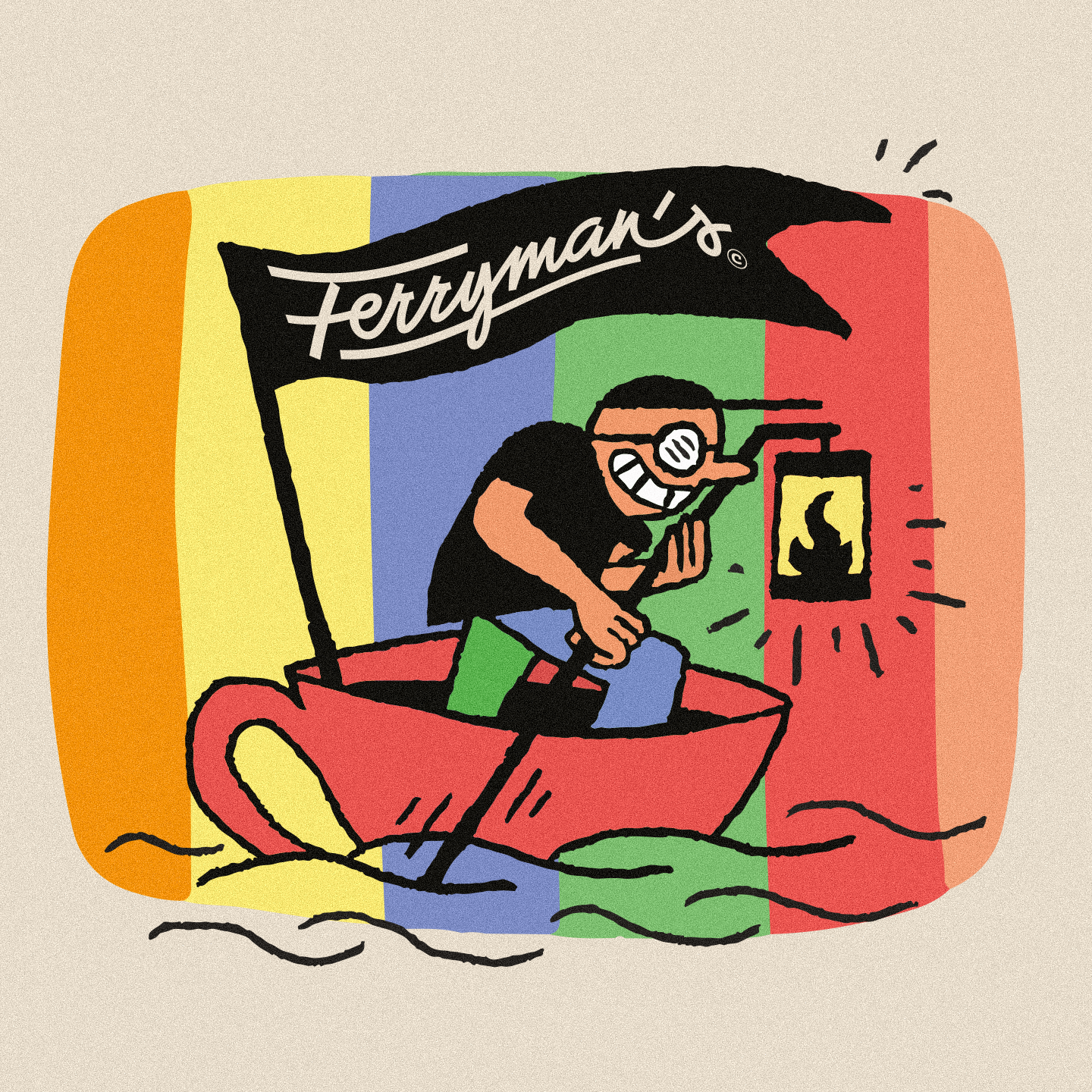
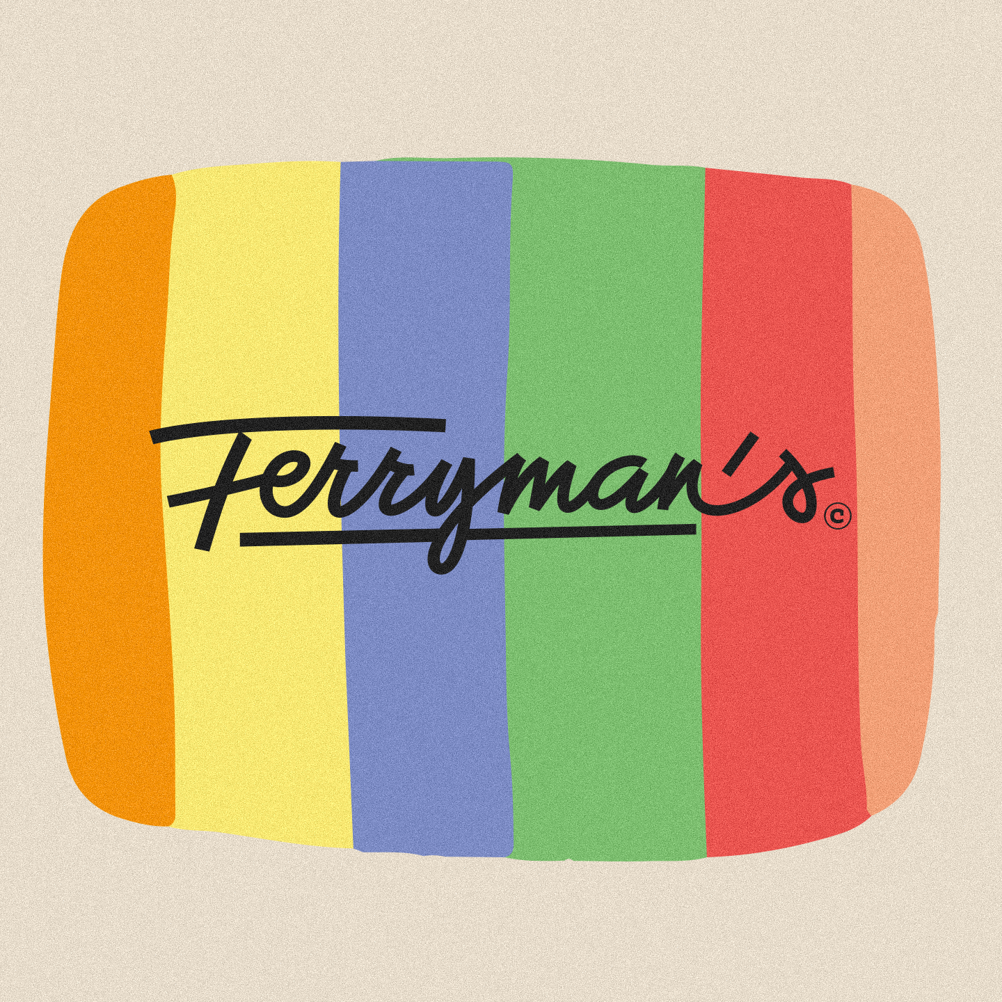
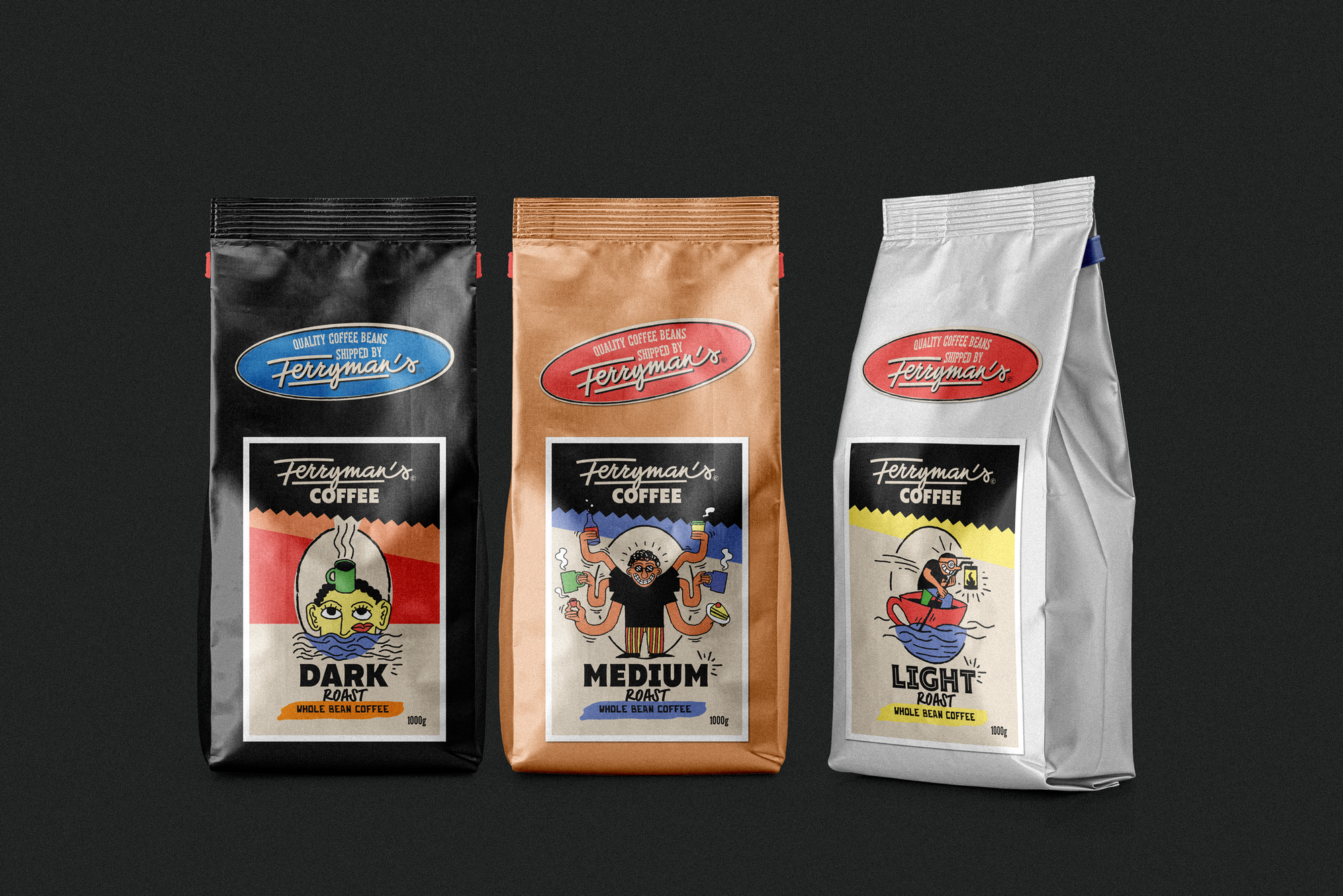
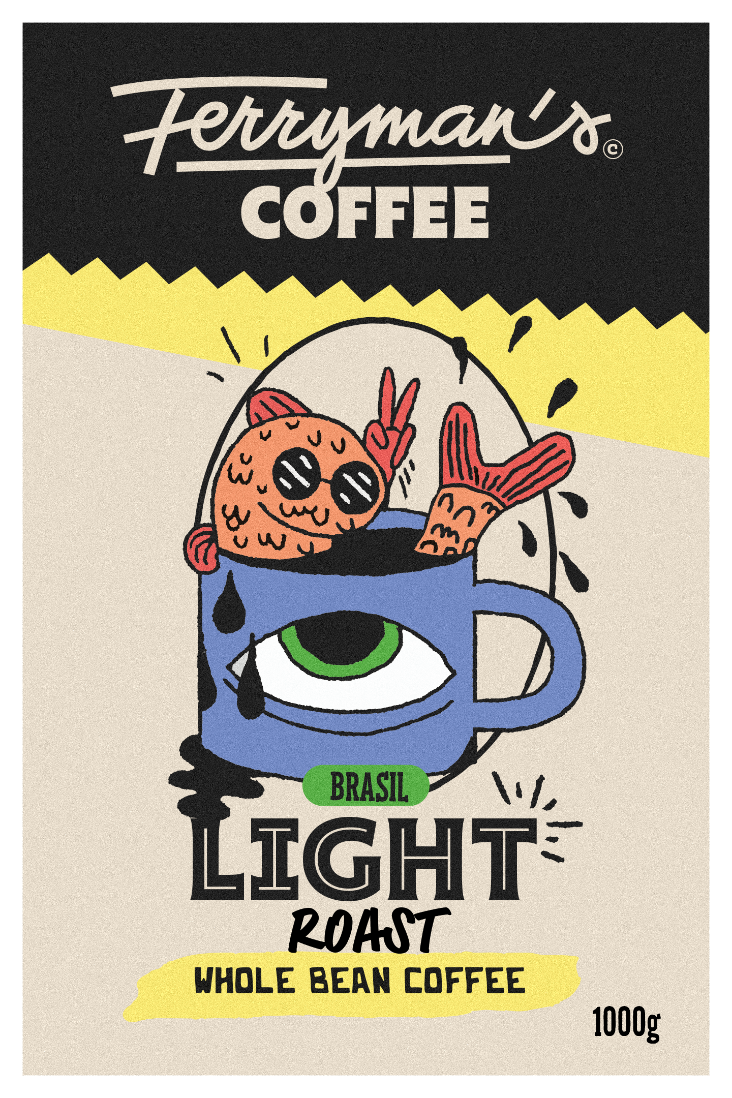
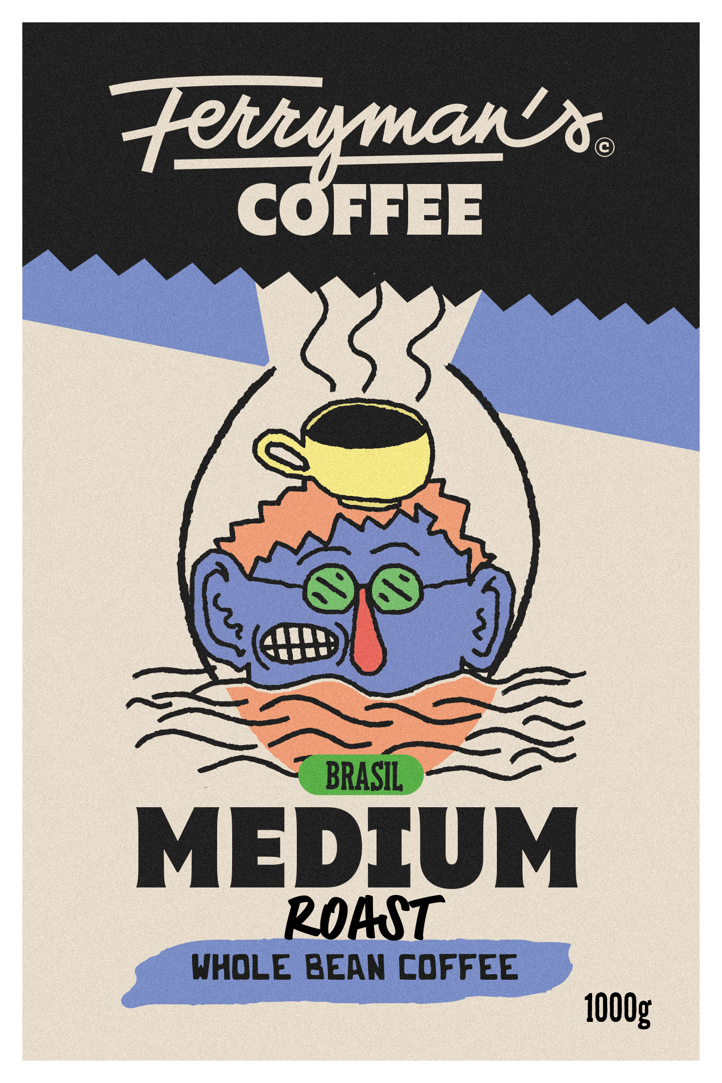
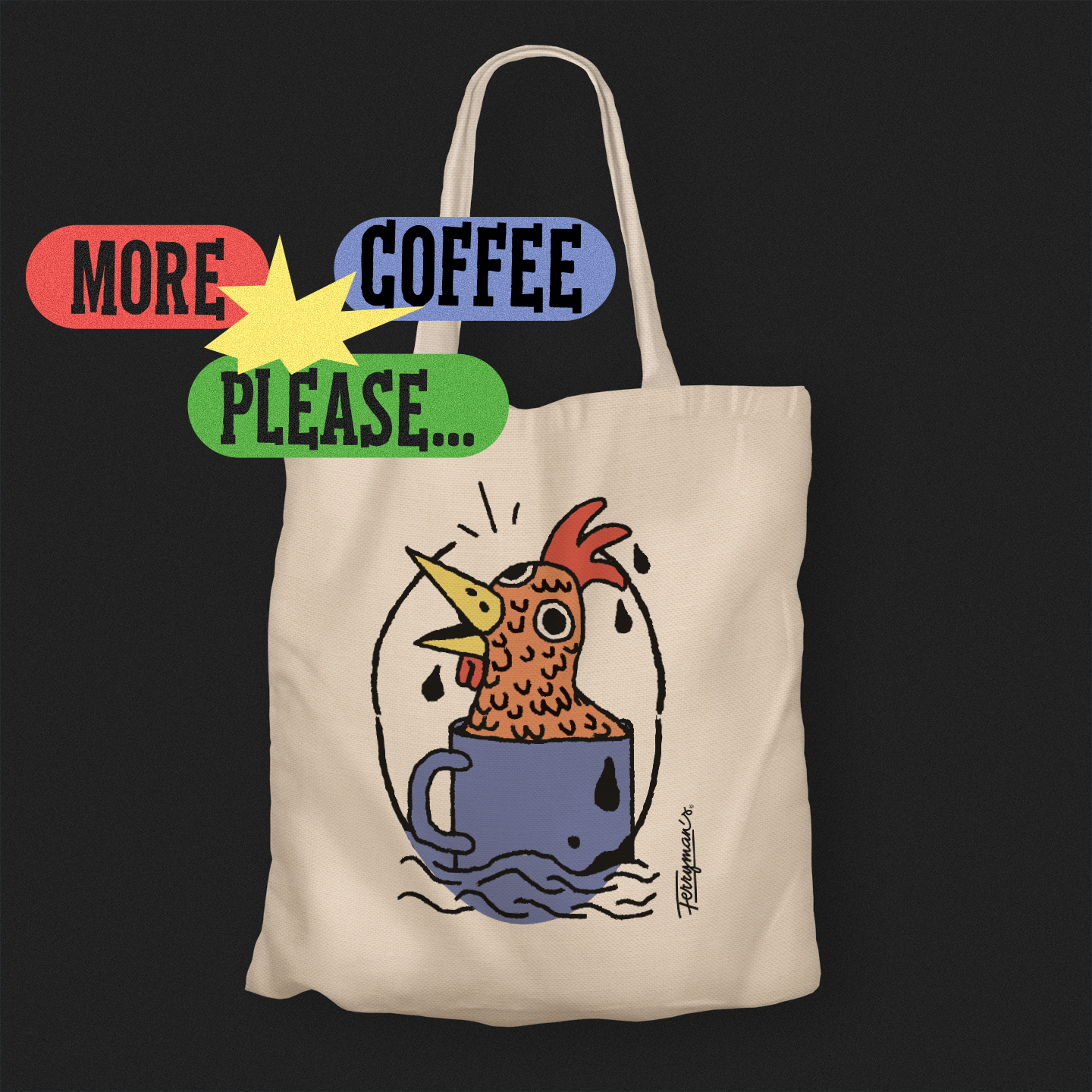
Another source of inspiration for the designer’s work were the distinctive characters of Dániel Labrosse. “Dani’s characters were the first elements to be created, something that gave us direction and strongly defined this infinitely expandable universe. These illustrations were the words I put into sentences, formed into a concept. In fact, we built almost everything around them: the handwritten logo, the typographic and branding elements,” he explains. Thus, the main motif of the retro-inspired brand image became the ferryman sailing in a cup, which was then made complete by additional characters. “The illustrations resonate terrifically with the different roasts of coffee: the fish bathing in the mug is the light roast, the figure with the octopus hands is the medium roast, which is most widely consumed, and the scalded rooster is the strong roast,” Peter elaborates.
Moreover, Dani’s bohemian characters are underpinned by a strong, clear, and effective typeface and a distinctive color palette. The range of design elements was primarily driven by practicality. “The seasonal offerings were accompanied by complementary drawings and signs, as well as badges that convey the Ferryman’s vibe even without the illustrations,” adds Péter.

“A good identity, regardless of style, is an experience in itself. In particular, I believe that a coffee brand should have an identifiable mood and communicate the values that make us love it. A good specialty coffee image is always close to the customer,” he concludes.
The designer is currently working with the Ferryman’s team on the brand’s online platform, as well as a variety of animations. In the meantime, discover the Ferryman’s seasonal offer at the Szimpla Kert site!
Péter Molnár | Facebook | Instagram | Behance
Dániel Labrosse | Instagram
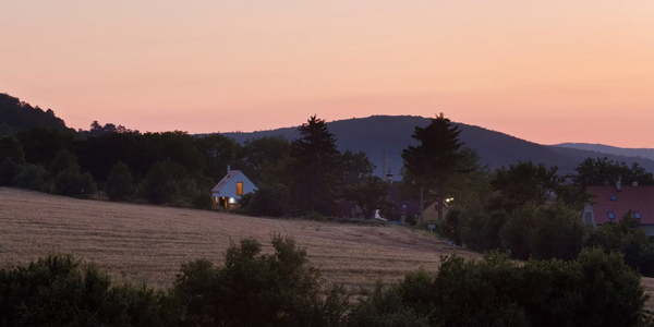
Cozy home in nature’s embrace | Casa De Mi Luna
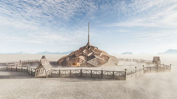
Design at a thousand degrees | The most spectacular building at this year’s Burning Man