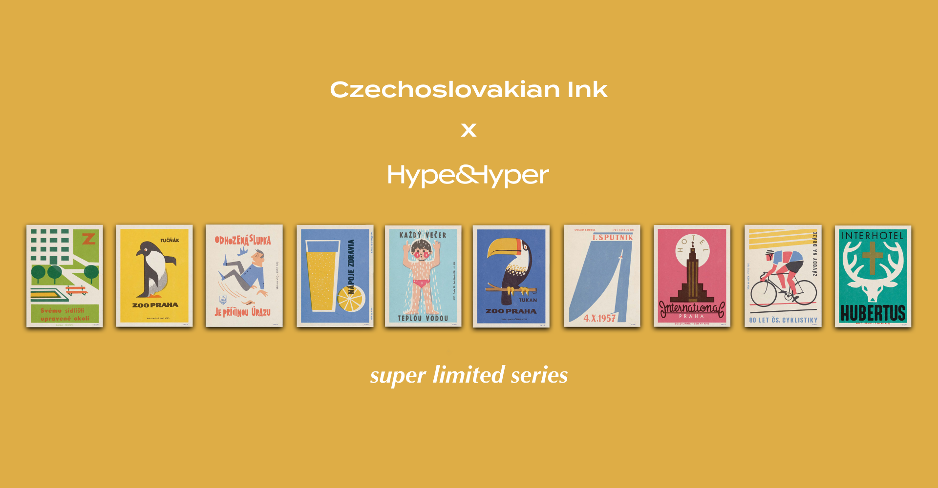
Previously, we wrote about Jiri Kubik and Jan Rambousek’s special project, Czechoslovakian Ink, in which the creative duo selected 600 matchbox labels from the 1950s and 1970s and created a publication with unique design and content, which also won a Red Dot Award. The artwork was also used to create a limited-edition poster collection, selected pieces of which are now available in the Hype Store!
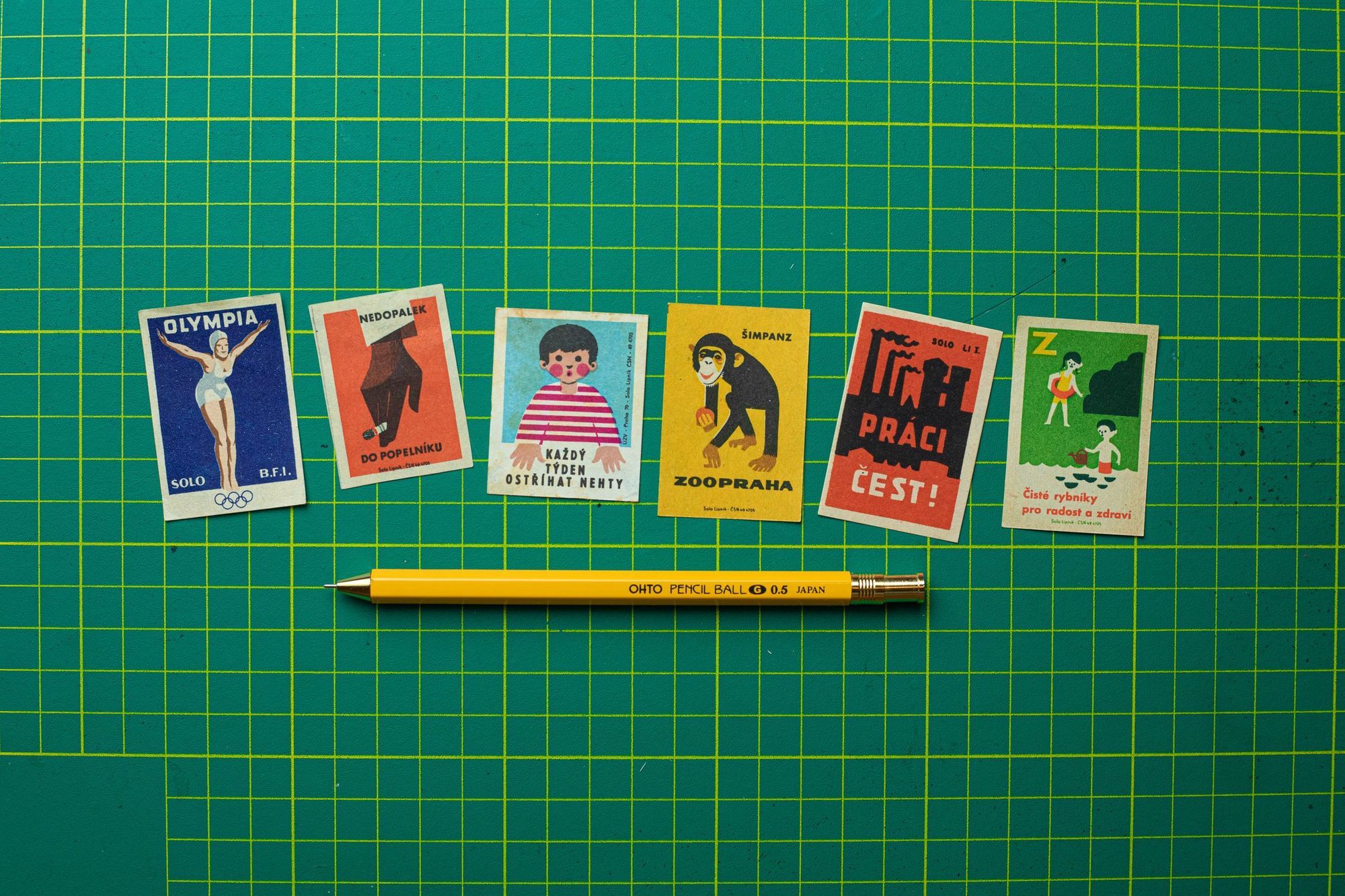
The messages encapsulated on the matchbox labels covered essentially all aspects of daily life at the time: many illustrations were related to education, precaution, anniversaries, health or diet advice, and of course, often to a wide range of completely irrelevant topics. Visually, the designs were generally characterized by two to five different hues of bright colors and a simple, minimalist design dictated by the size of the medium, the matchbox, and the printing technology of the time.
 Réka Vikárius
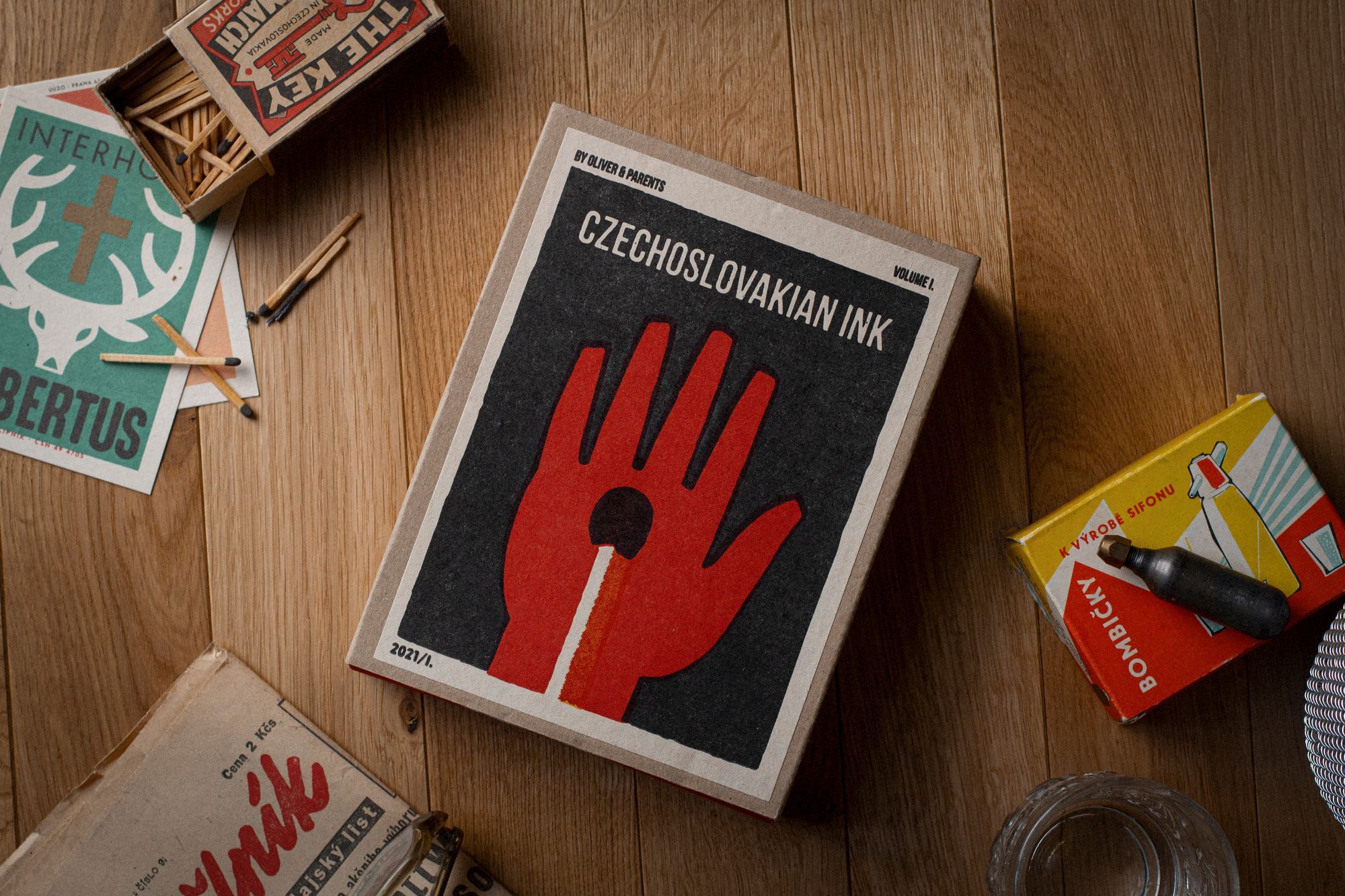
The Hype Store’s new collection features ten different designs, including the inhabitants of the Prague Zoo, as well as some hygiene or dietary tips. This time it’s a ‘first-come-gets-served’ deal, as only one of each numbered 30x40 print is available.
Have a look and snatch your favorite!
Creative women in the region | TOP 5
Monumental spaces, bold characters