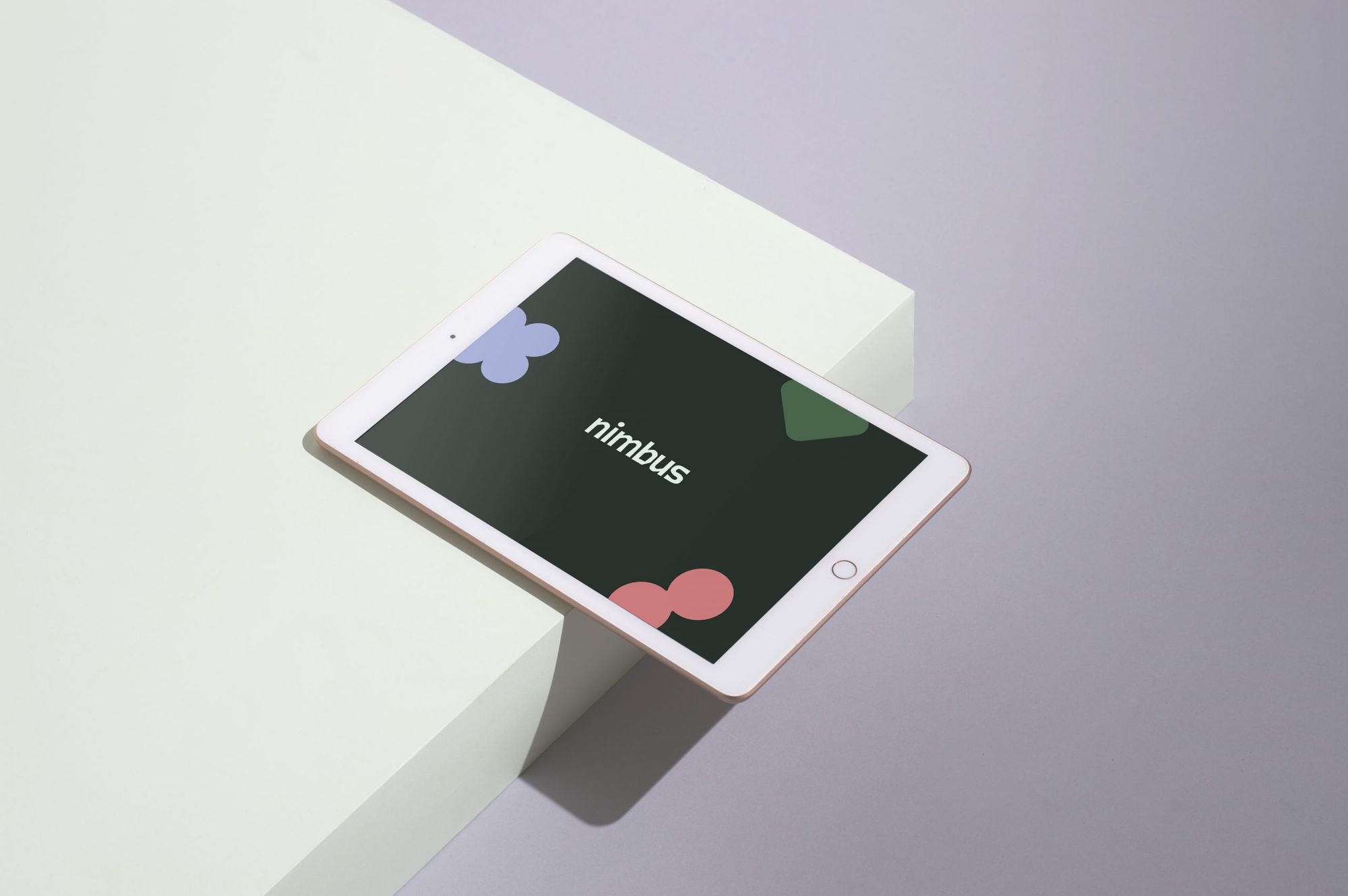
An app that helps to learn the meaning of words and phrases in foreign languages with the use of different illustrations. There it is. Nimbus, the visual design of which was created by Alíz Stocker.
During her studies, Alíz discovered that many people struggle with language learning. The designer says she had no bad experience with regards to language teaching, but she spent a lot of time even outside school looking at those colorful, picture books made for children. One of these books was the inspiration for Nimbus. “I think many people had already faced difficulties before online education began. Common problems are for example the insufficient number and intensity of language lessons and the lack of spoken language practices. As learning a language thus quickly becomes boring and tedious, many people don’t have the energy or interest to carry on, so acquiring a language exam seems more and more distant. Of course, speaking a language is not only important in order to get a paper, as being able to make yourself understood in a foreign language is enjoyable just by itself, and it is also a basic requirement today,” says Alíz.
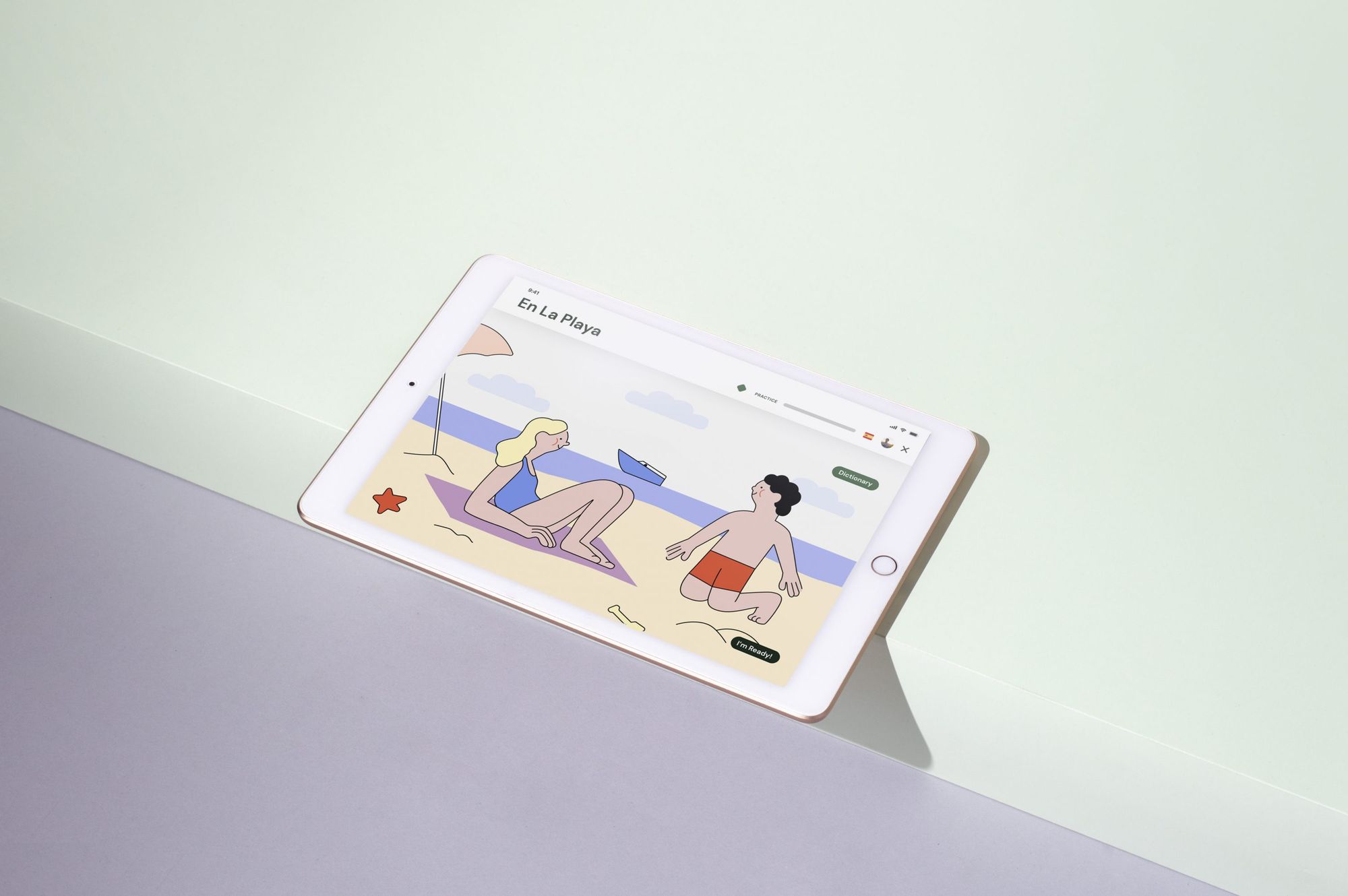
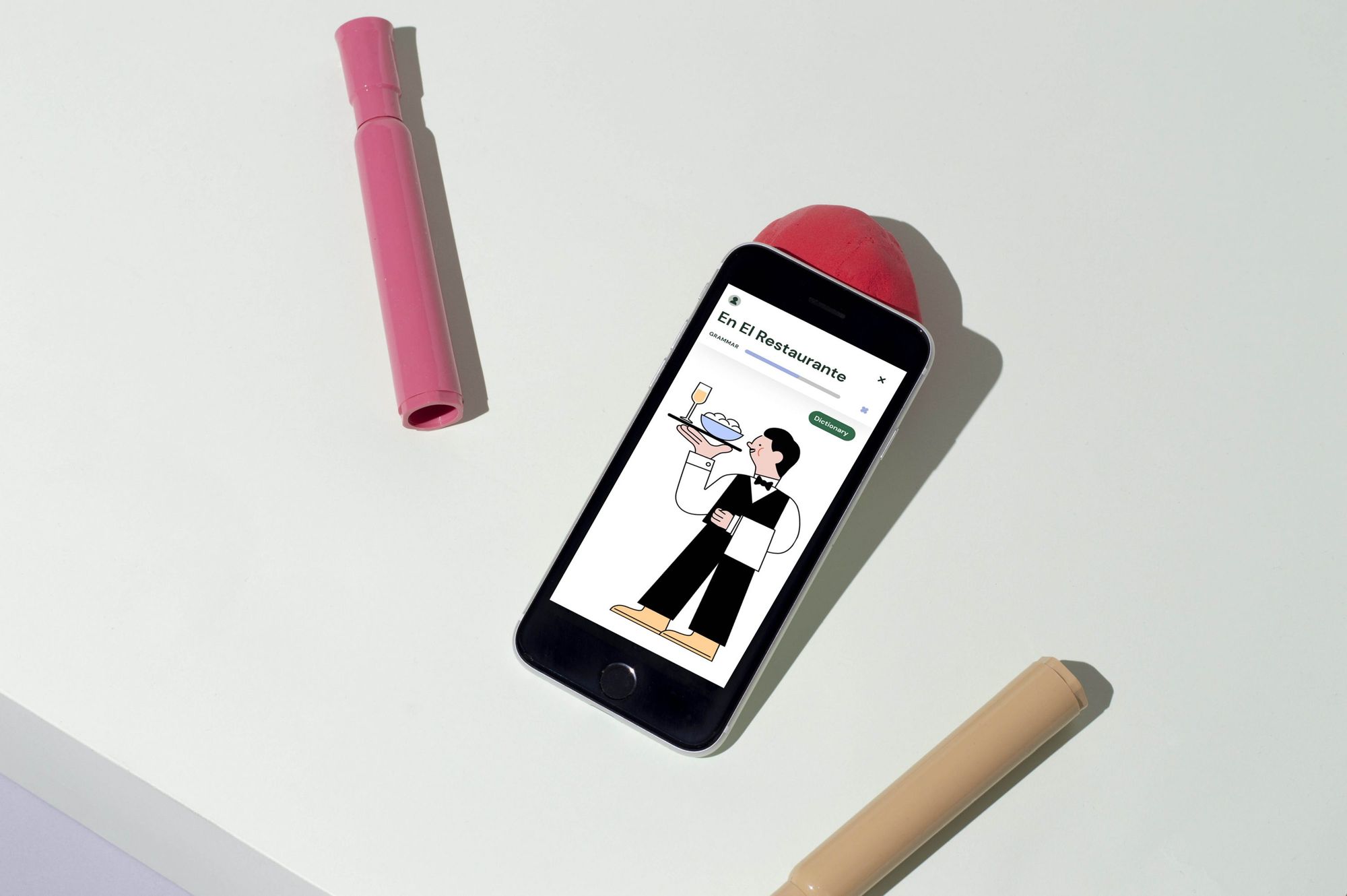
The concept of Nimbus, which was created as a diploma project, was essentially based on the picture book mentioned above. This was actually a visual dictionary, where the meanings of different drawings were associated with their meanings in both Hungarian and English. This method is actually a widely known idea that can be a useful tool for a child struggling with language learning. Alíz wanted to translate the essence of the book into an app and add features that go beyond the genre of a book. Such as playing together with friends or customized exercises. This is how the idea of the Nimbus language-learning app was born, which functions basically like an interactive visual dictionary.
The name of the application is of Latin origin, meaning cloud and, somewhat metaphorically, it also means the well-earned prestige: “I wanted to use the term Nimbus to refer to the phenomenon when something is suddenly understood, when it suddenly becomes clear,” Alíz highlighted.
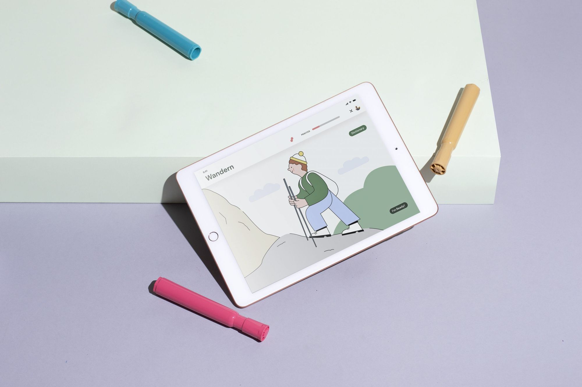
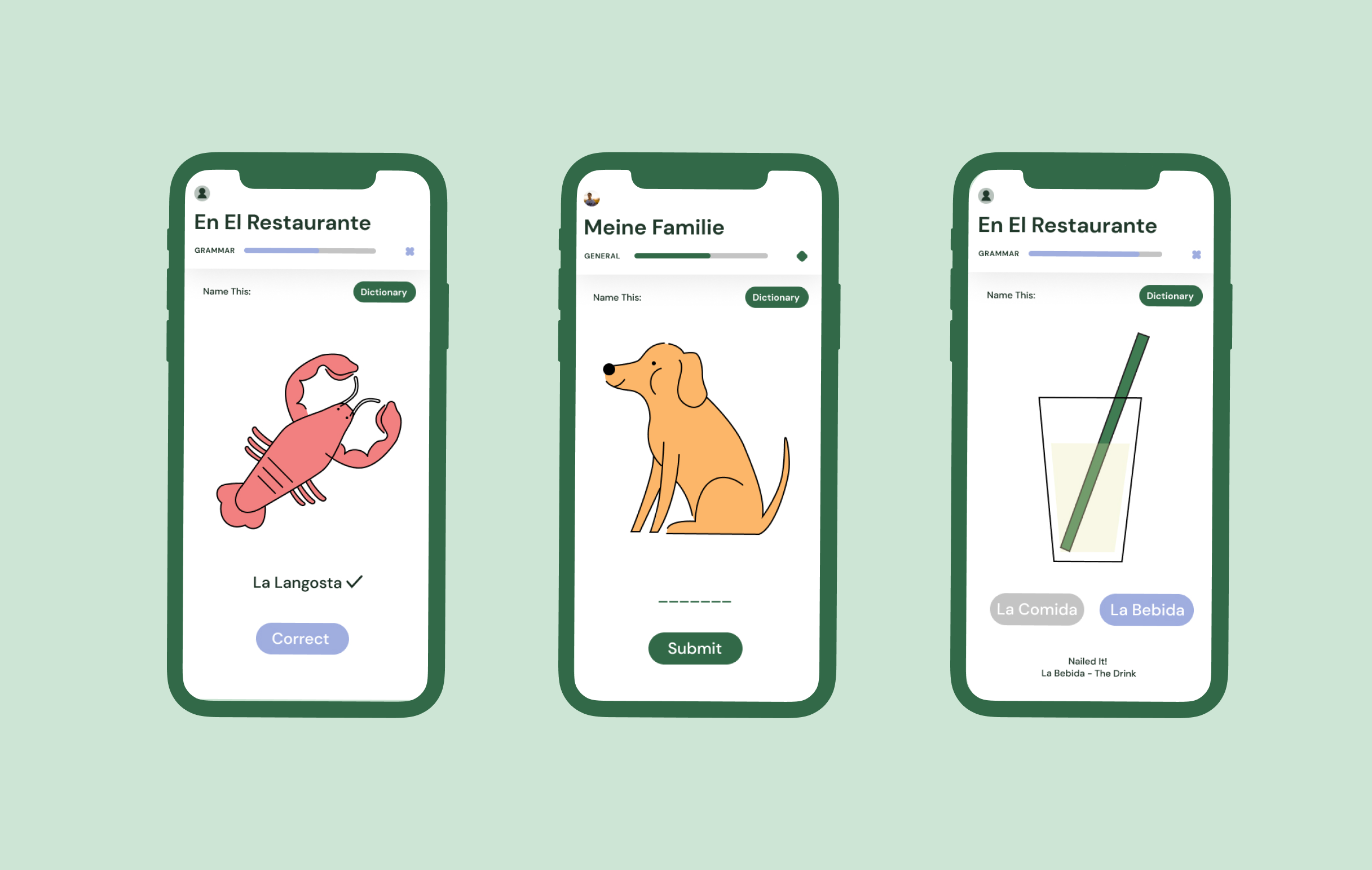
We also asked the designer what the difference between the methodology of the app she envisaged and that of other apps already on the market is. “One of such key features is the visuality-based tasks and that the app compiles the tasks for the user according to age groups and language level. In the popular Duolingo, for example, you can also find illustrative elements, but there this is more of a complementary feature and it does not have a predominant role. In the tasks in Nimbus, situations are provided where we can click on the different elements to see the meaning, and the complexity of this varies from level to level,” she said.
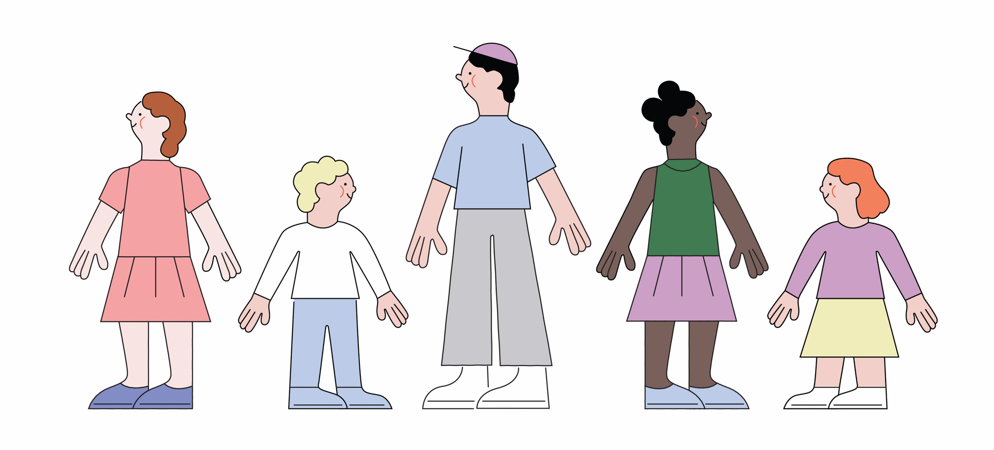
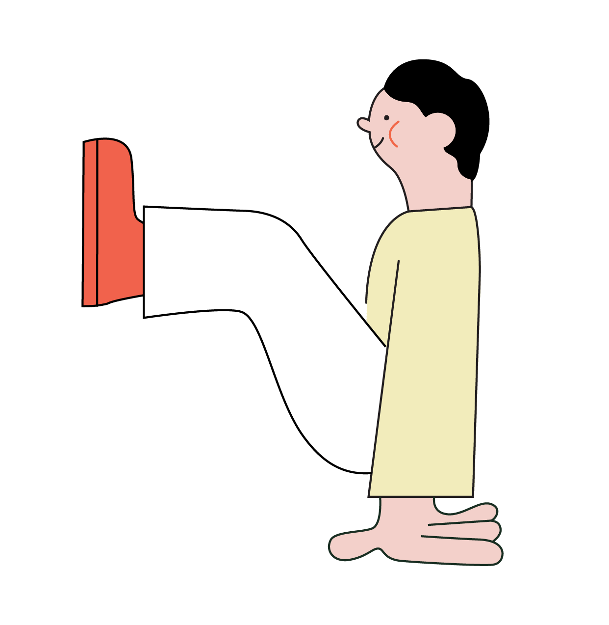
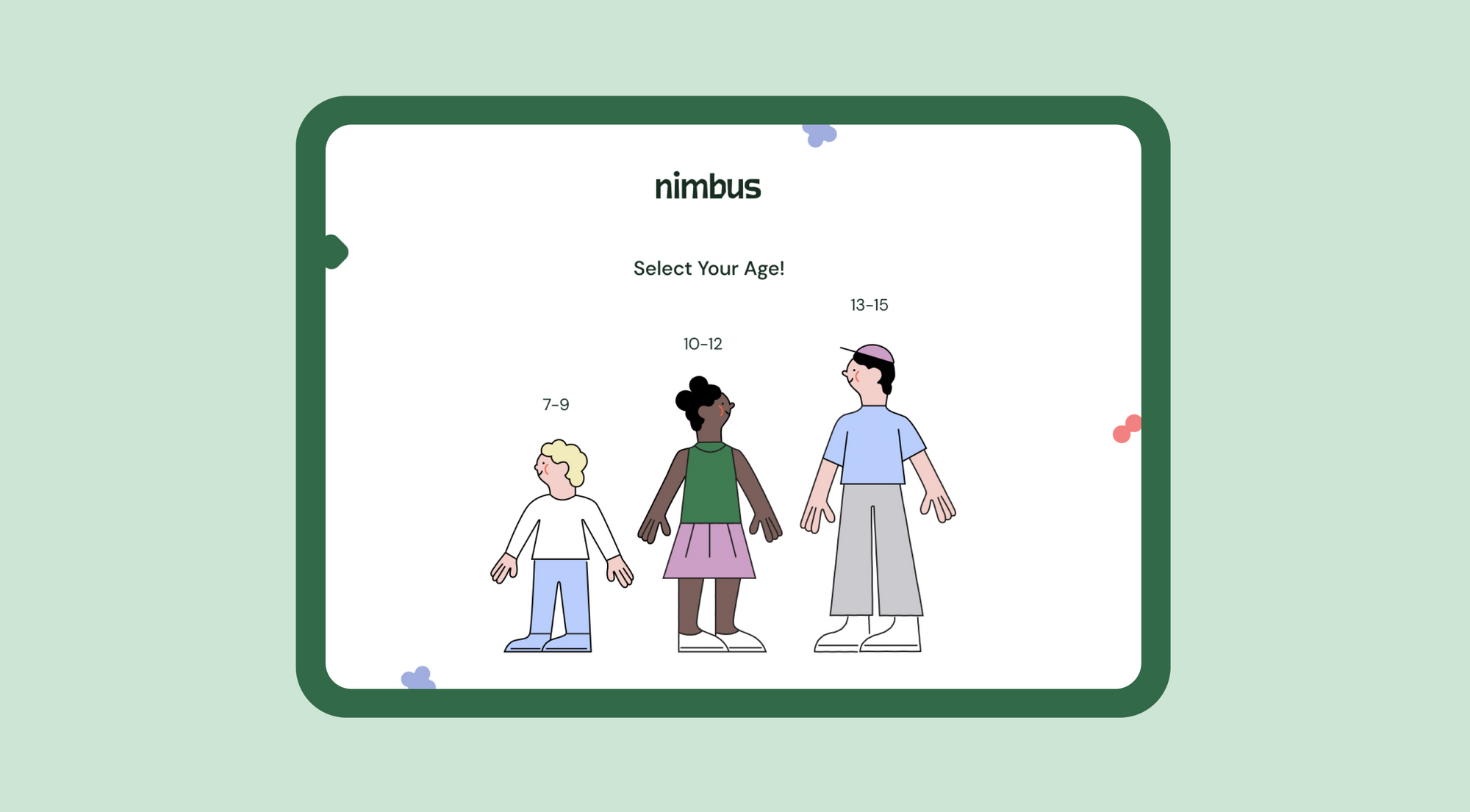
The visual elements of Nimbus are simple and user-friendly, based on generatively shapable characters. It was important to differentiate the age groups with the help of the graphic elements but still be able to integrate them into a coherent system. The result is a system that can be easily customized and in which each character can simply be altered.


The project has been created as a diploma project for the time being, but Alíz would like to include others with whom she can develop it further if the opportunity arose.

With love from Vietnam—Lam Sơn life

When Eastern bazaars and a minimalist Ukrainian brand meet


