The DOOR Fizioterápiás Mozgásközpont (DOOR Physical Therapy and Movement Center) focuses on being whole and complete, which not only appears in the philosophy of the center, but also in its visual communication. We asked founder Gréta Szabó and graphic designer Aliz Borsa about the concept of the center and its brand identity.
Gréta Szabó has known it from a very young age that she wanted to work in the field of physiotherapy and physical therapy, and to establish her own physiotherapy center in the long run. She has worked in two renowned fitness centers before, but to be able to implement her plans and ideas, she needed to have a place on her own. In the first half of last year, during the enforced break brought about by the epidemic, she had time to think and look around, and in the summer of 2020 she opened the DOOR Physical Therapy and Movement Center, with a well-thought-out concept and a remarkable visual identity.
Gréta says her choice of name was purely coincidental. “The idea occurred to me while sitting on the couch, looking at my books: my eyes were caught by Magda Szabó’s novel ‘The Door’. The book’s plot is not related to the world of movement and health in any way whatsoever, but it is about being brave, looking for answers and daring to take a step. These are all indispensable on the road to recovery, too. As Aliz Borsa, the designer of the visual identity has put it, the door symbolizes a passage between disease and health,” she added.
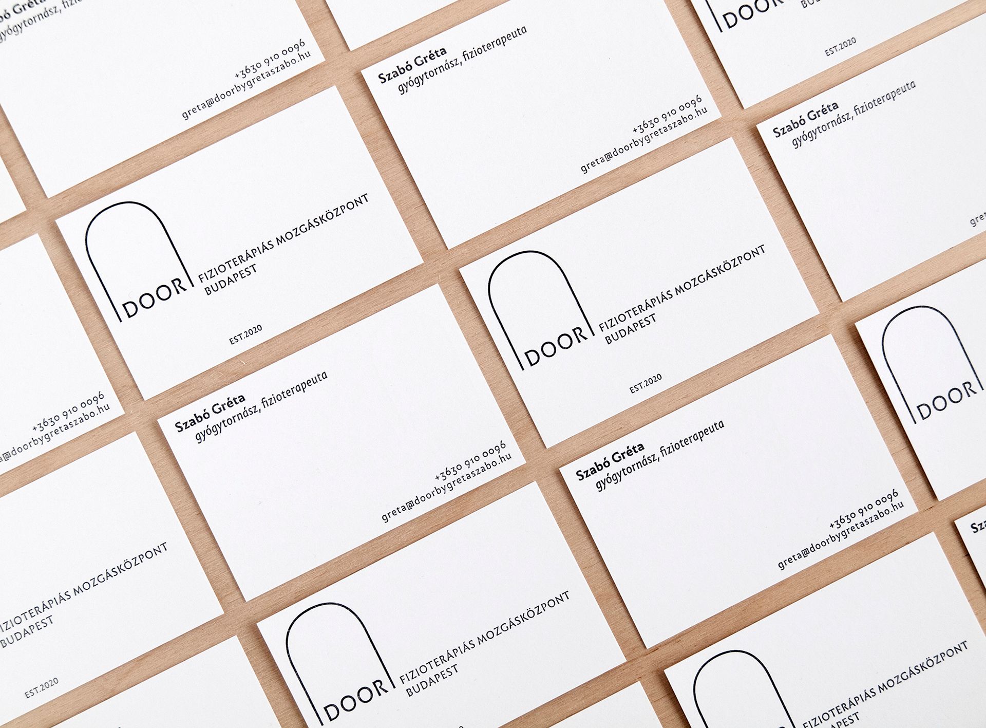
Along this line of thought, the visual identity’s concept explores the situation of the therapist and their role in the patient’s life. The emblem of the center features an arched line as a symbol of the door, while the logotype is positioned in its axis of symmetry as a central element. “The placement of the word DOOR symbolizes the strong fundament provided by Gréta’s expertise and devotion,” added Aliz, the designer of the visual identity.
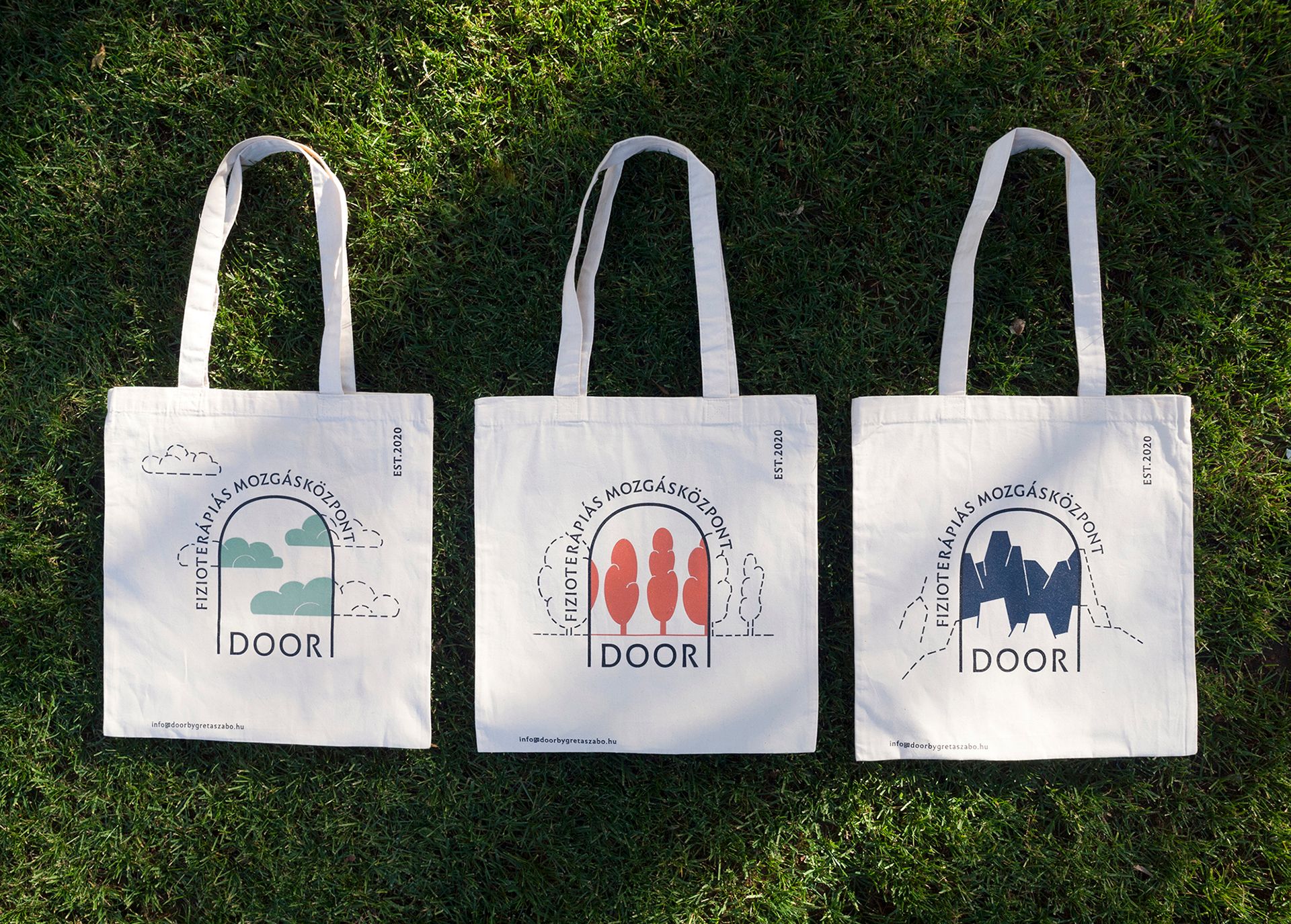
In addition to the basic elements of the brand identity, they opted for organic cotton tote bags with eloquent illustrations to replace traditional flyers.
“The changing views appearing in the door portray possible forms of movement for those looking to recover, but can also be interpreted metaphorically, in a broader context. The freedom of movement, the ease of walking, the gift of experiencing ordinary things, the ability to do well in extreme situations becomes a reality if we pass through the door. Until then, it seems implausible, faint and hazy—as shown by the images continuing outside the door,” Aliz explained.

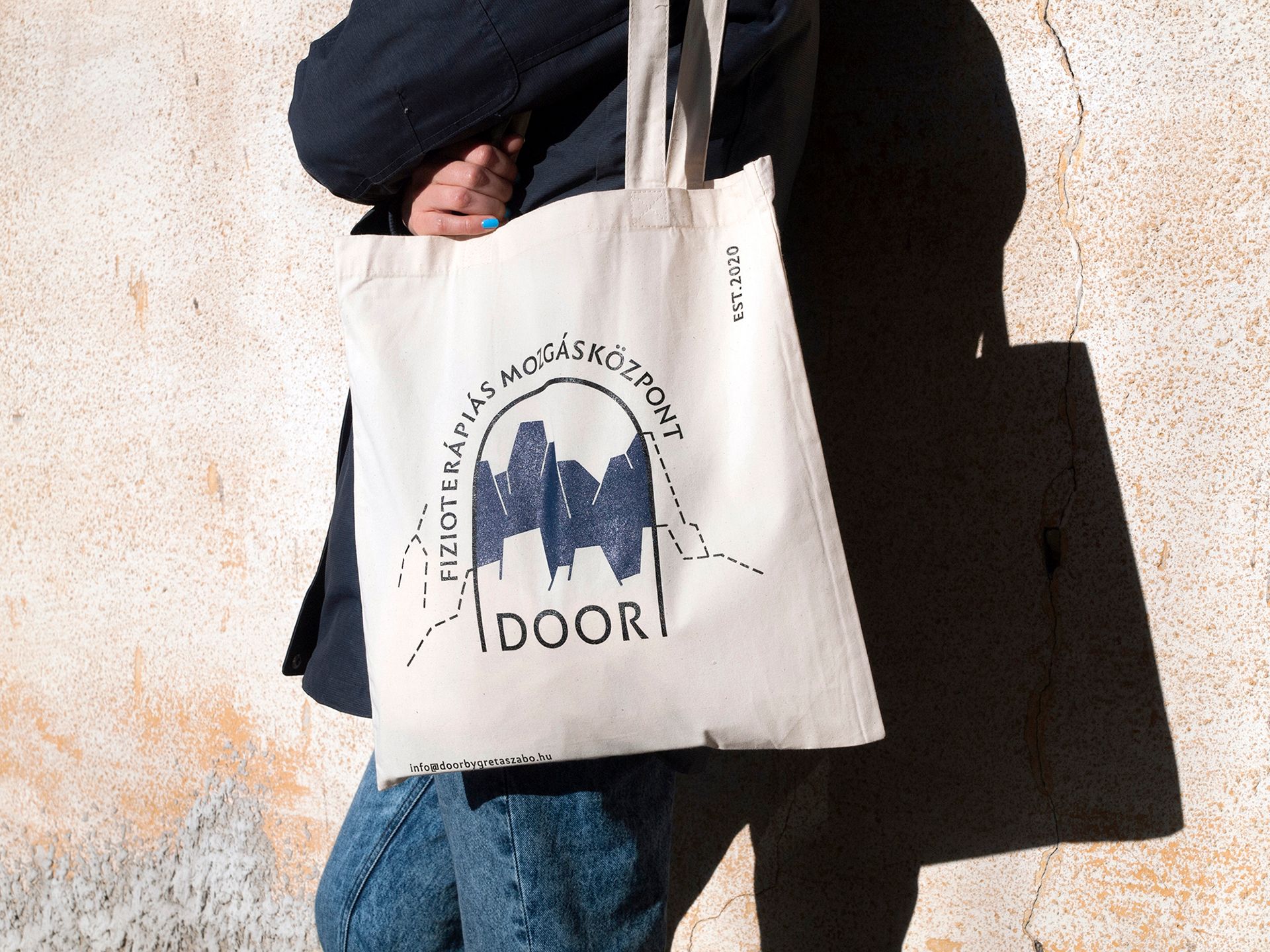
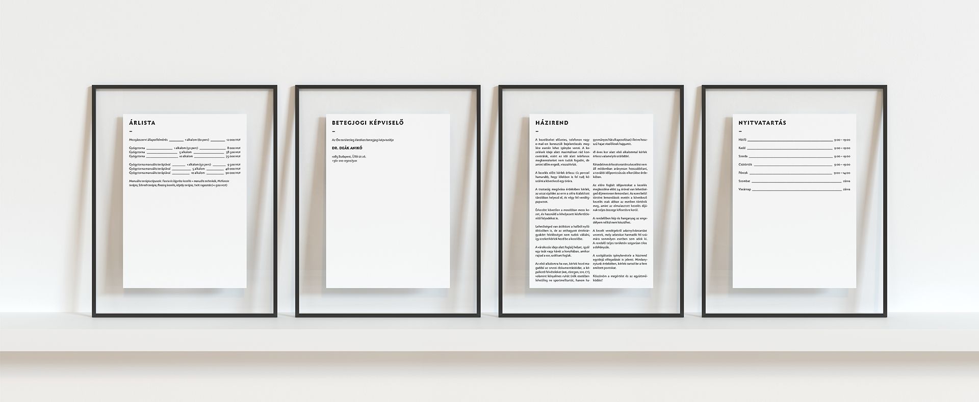
The characteristic elements of the DOOR’s brand identity are not only intended to promote the services of the center, but would also like to introduce the toolkit of the profession and its details to a broader audience.
“Gréta fundamentally offers a service, but in addition to that, she also undertook to educate her audience about diseases, therapies, the benefits of various sports activities and mental health in the form of posts each week. I think this is a commitment that generates a real value,” Aliz highlighted. Thus, in addition to the various graphic elements, Gréta and Aliz also built up an entire communicational system as part of the project.
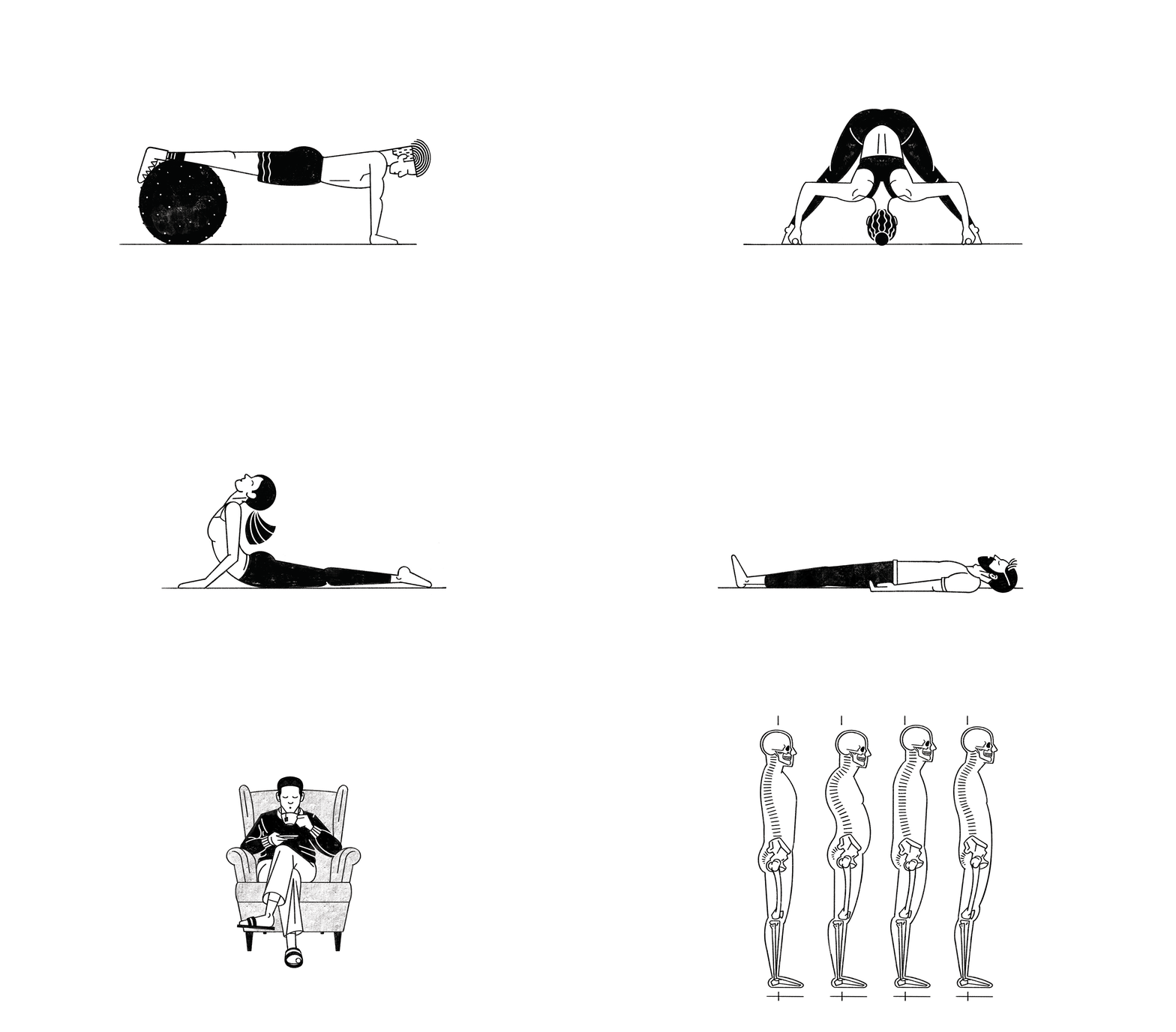
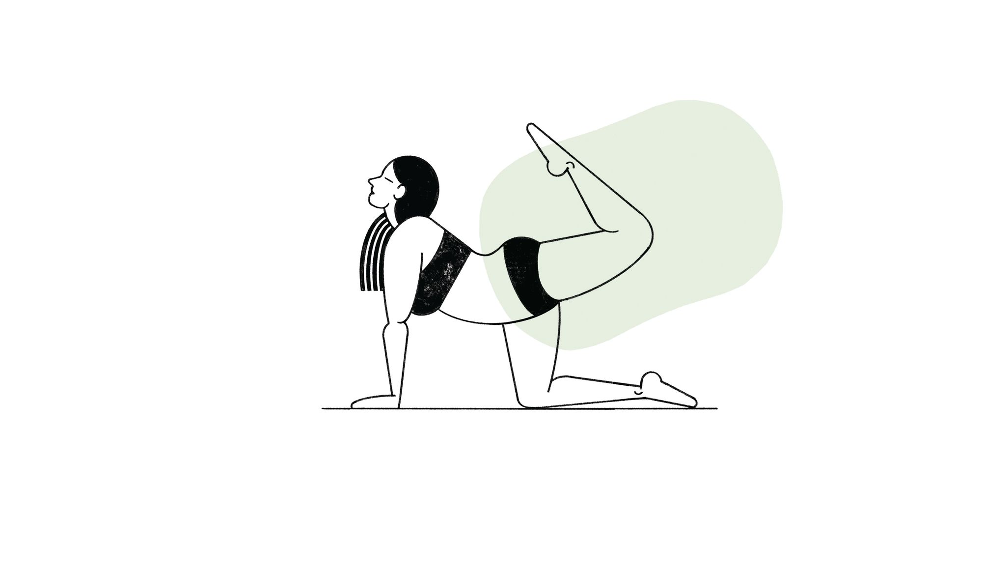
The illustrations published on social media cover the fields of problems and diseases, therapies, sports and mental health. As another type of content, photos documenting the work taking place in the center and the and feedback provided by patients also appear on these platforms. “The posts are connected by a number of color-coded, fluid bubbles. These will also appear on the website to be launched later on, in an animated manner,” added Aliz.
When creating the illustrations, representing all body types was one of the most important aspects, so that everyone wandering on the DOOR’s platforms would feel addressed. Another peculiar feature of the illustrations is that they are all hand-drawn, this way alluding to the basic instrument of the physiotherapist: the hand. As Aliz also highlighted, “the therapist’s hands are one of the main tools of physiotherapy: it is used for instruction and to create a direct relationship between the therapist and the patient. My choice of tools reflects this personal relationship, as pencils are basic tools, just like our hands.”

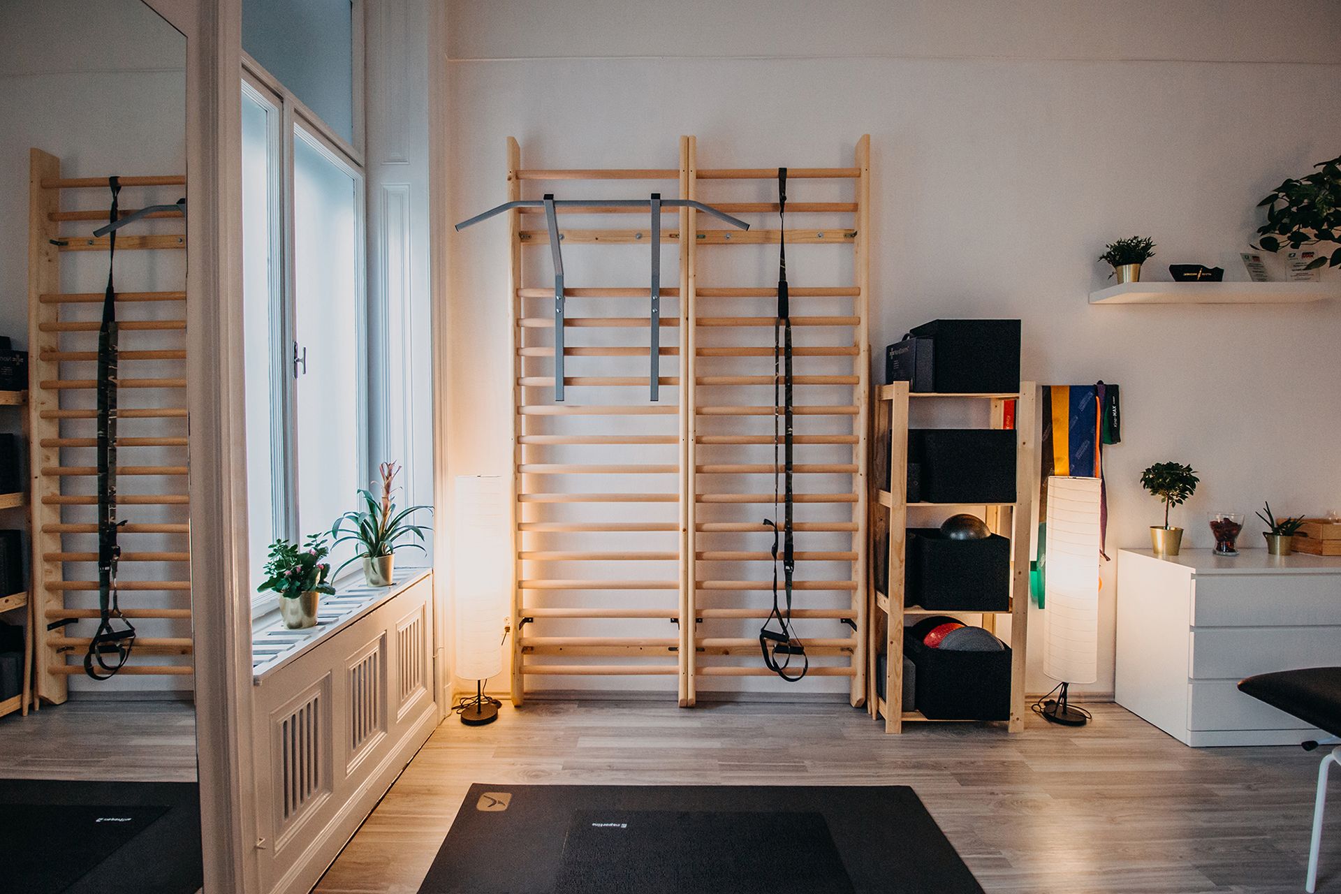
“Unfortunately, today people still think of group trainings for the elderly when hearing the word physiotherapy, which is, of course, something we do, but only gives one percent of our work. Moreover, people don’t seem to understand how important our role is in prevention, how complex our treatment is, how vast our array of tools is and how many manual techniques we use. Our goal is complete physical and mental balance. The fact that these can be introduced with such a gorgeous and unique design is all thanks to Aliz” added Gréta as a closing note.
Creatives: Aliz Borsa
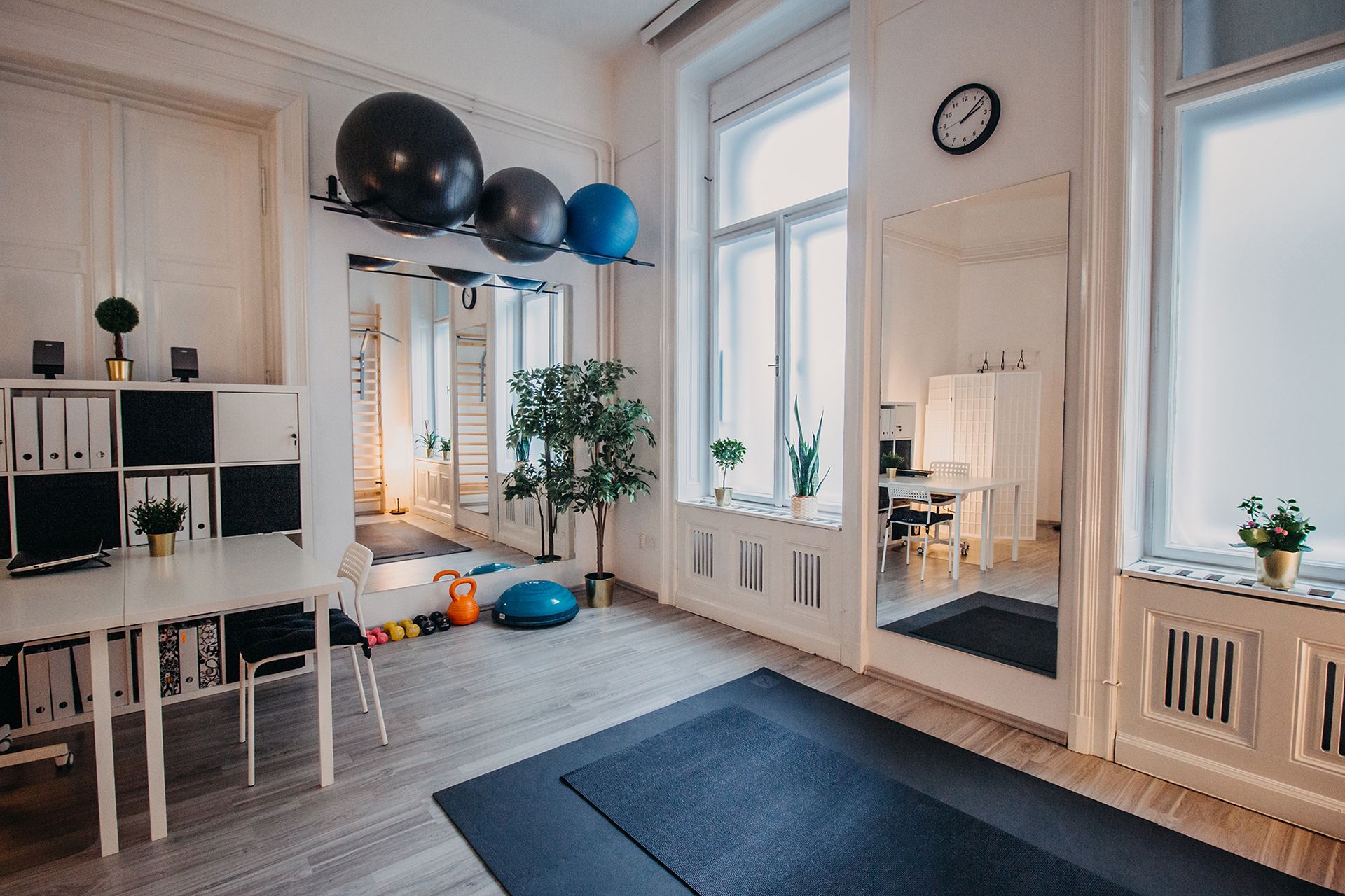
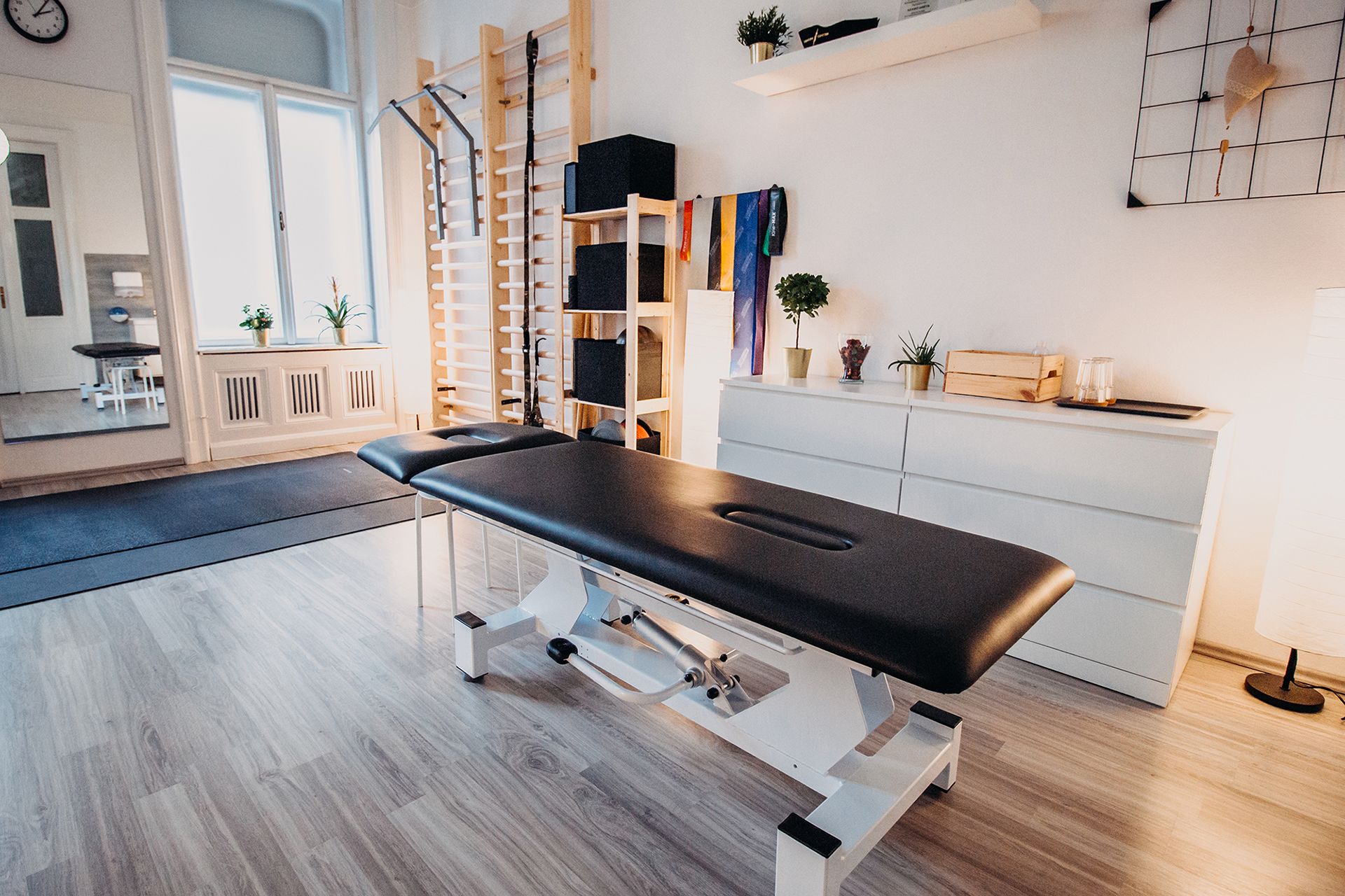
Interior photos: Lilla Varga
Aliz Borsa | Instagram | Behance
DOOR Physical Therapy and Movement Center | Facebook | Instagram
Who to follow this February: @oldschoolmoms

Climate apocalypse as seen by a drone
