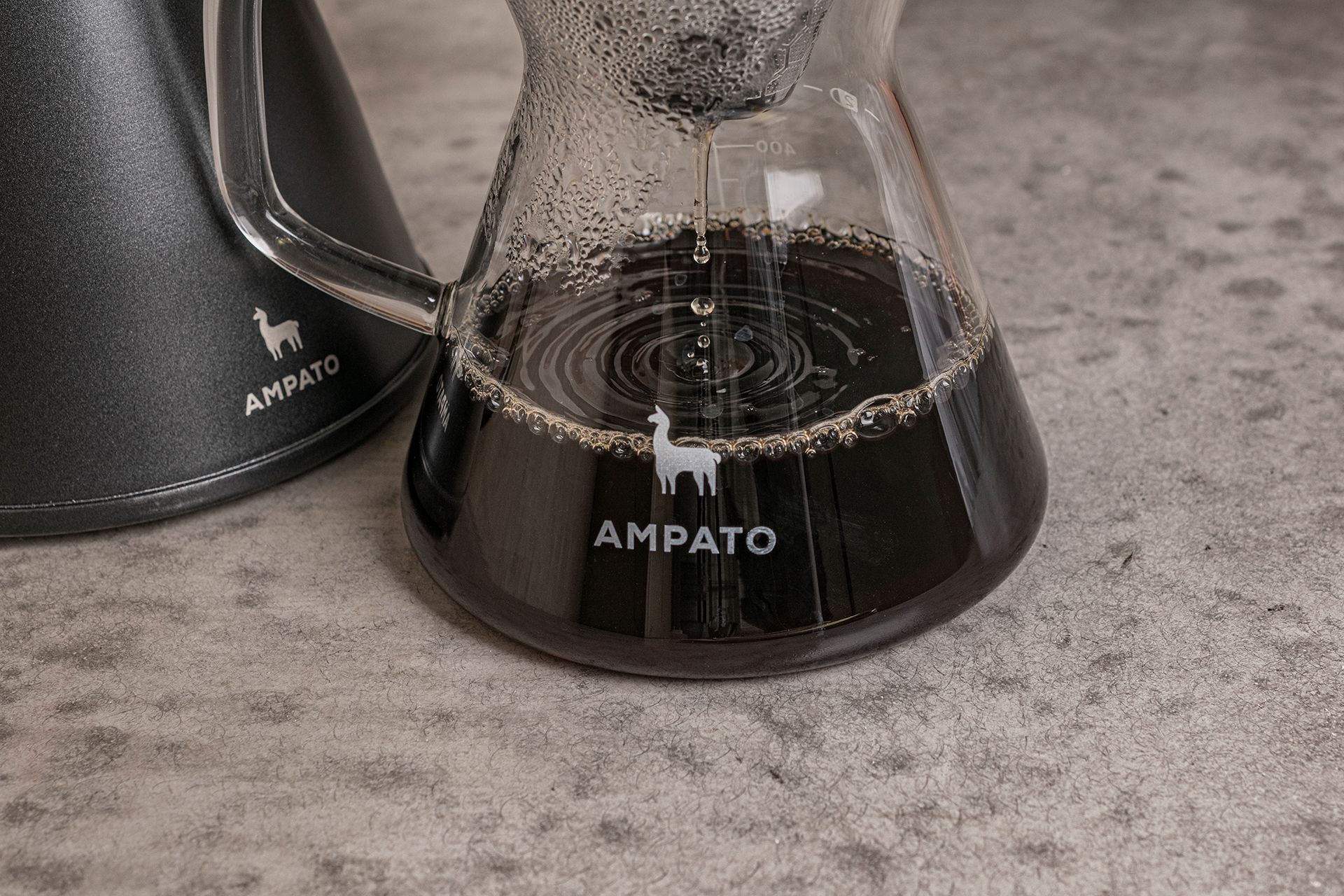
Specialty coffee and ritual in our homes, in packaging designed by Hidden Characters: this time, the Hungarian graphic design studio celebrating its 10th anniversary created an expressive visual identity for Ampato Coffee targeting coffee gourmets.
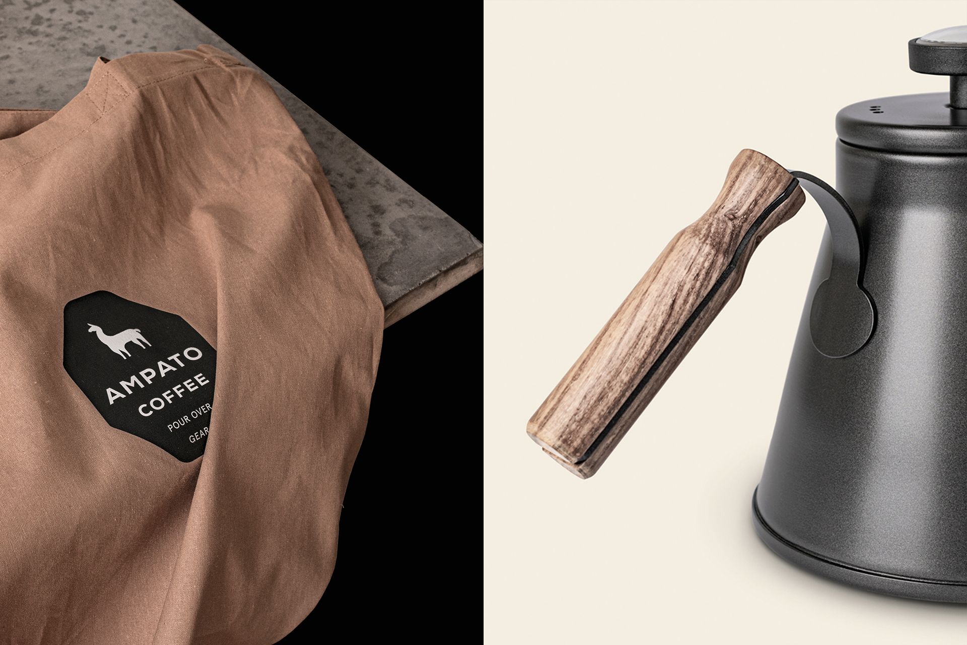
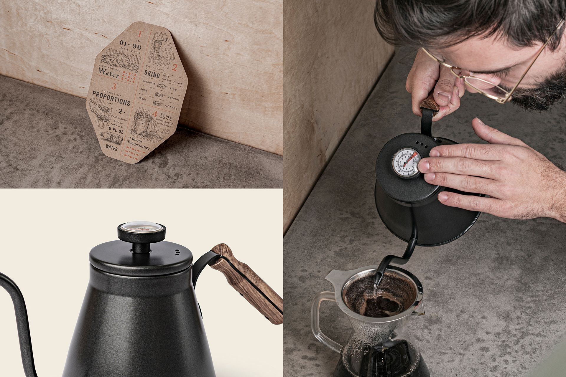
Accessing high quality, premium coffees not only in specialty cafés, but also away from the urban environment, even in the comfort of our own homes is becoming a more and more explicit need today. Realizing this, Swiss Ampato Coffeehas built their product palette around various coffee accessories, with one of their main products being an all-time favorite of coffee fans, the pour-over coffeemaker.
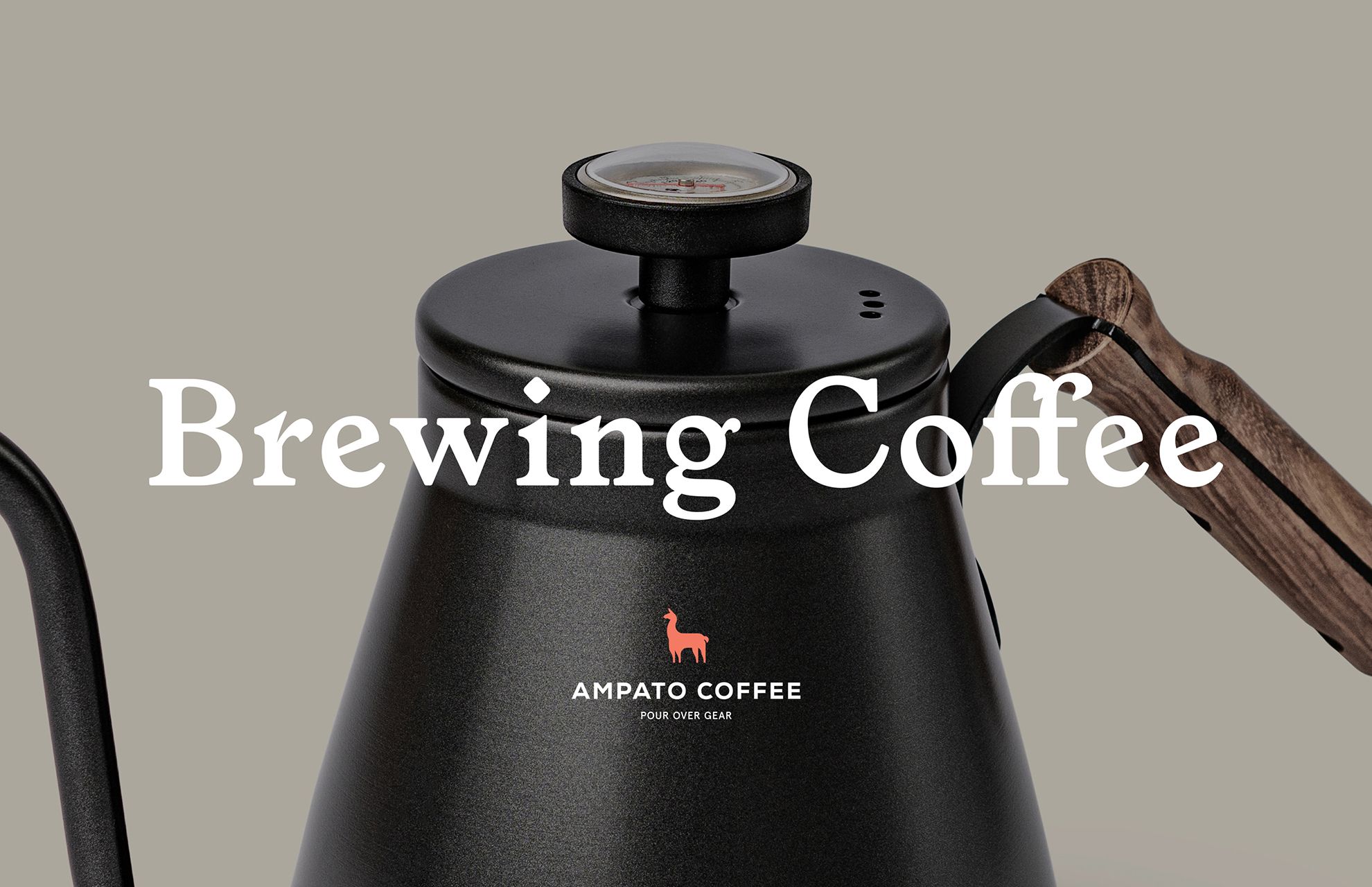
The high-quality products come with a high-quality appearance: the carefully planned visual identity elements were designed by Hidden Characters. The end result is a good reflection on the studio’s complex approach, and conveys the message of the brand with simple, clean forms and tones. In Ampato’s philosophy, coffee-making is like a special work of art that becomes available and accessible to anyone, anywhere.
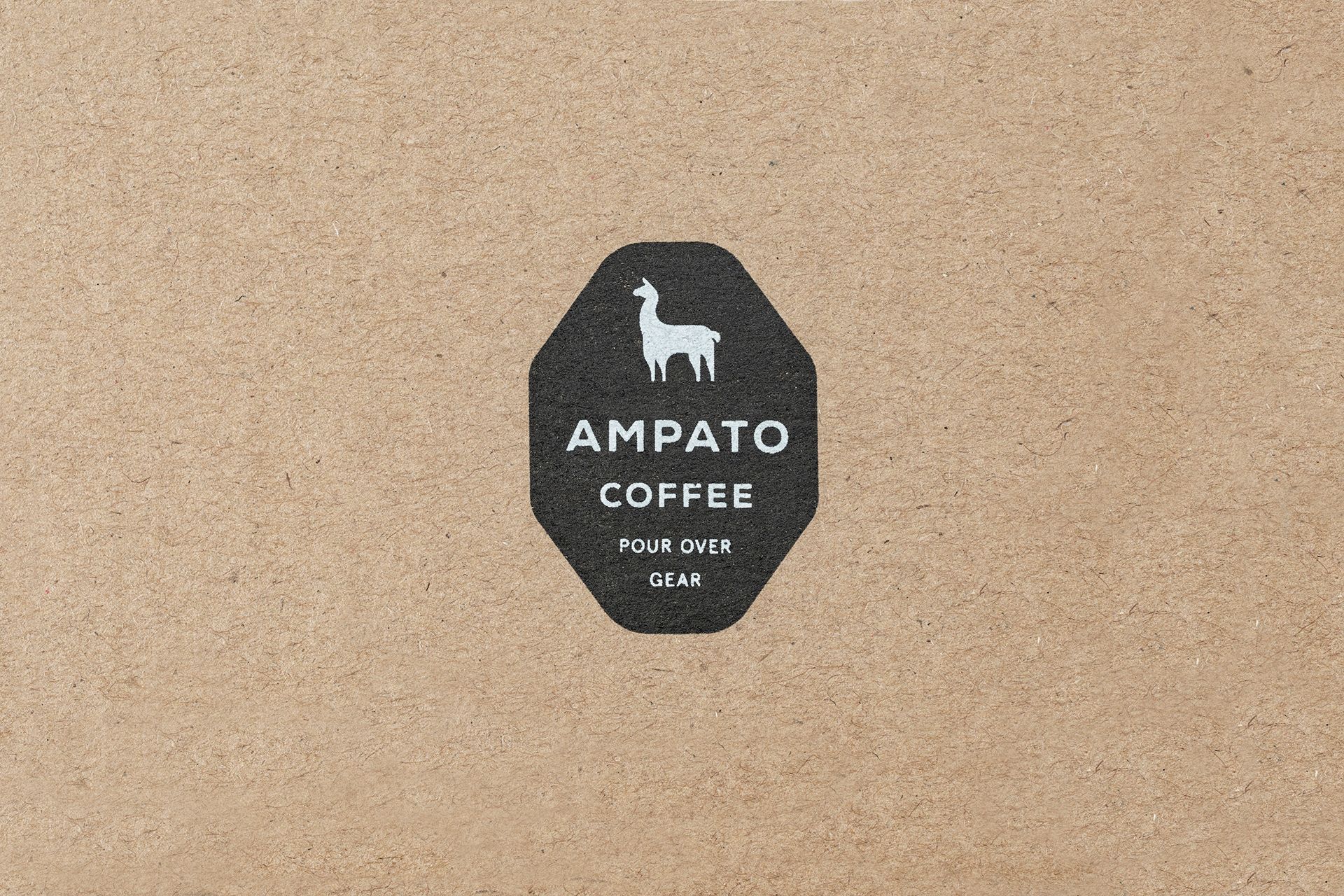
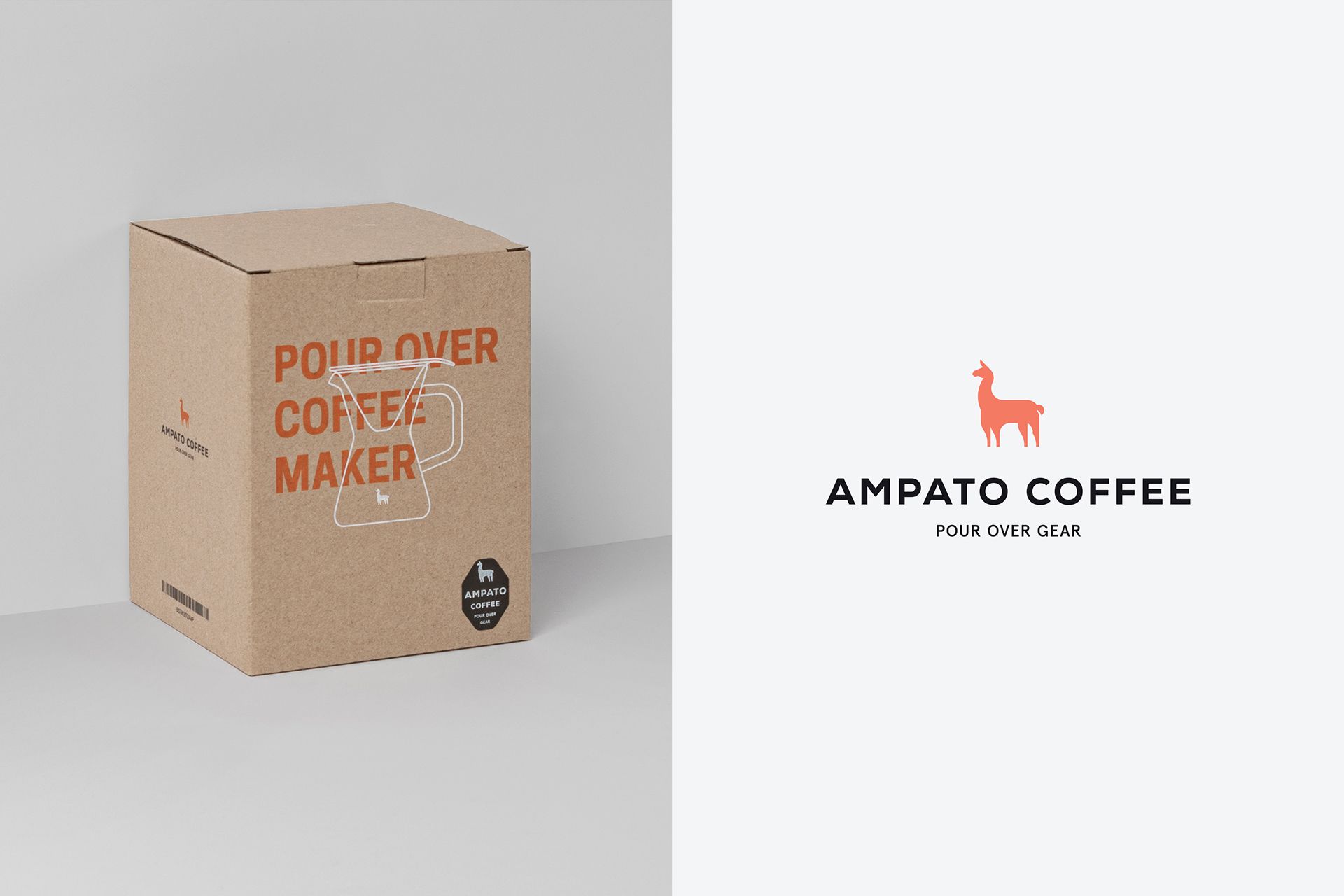
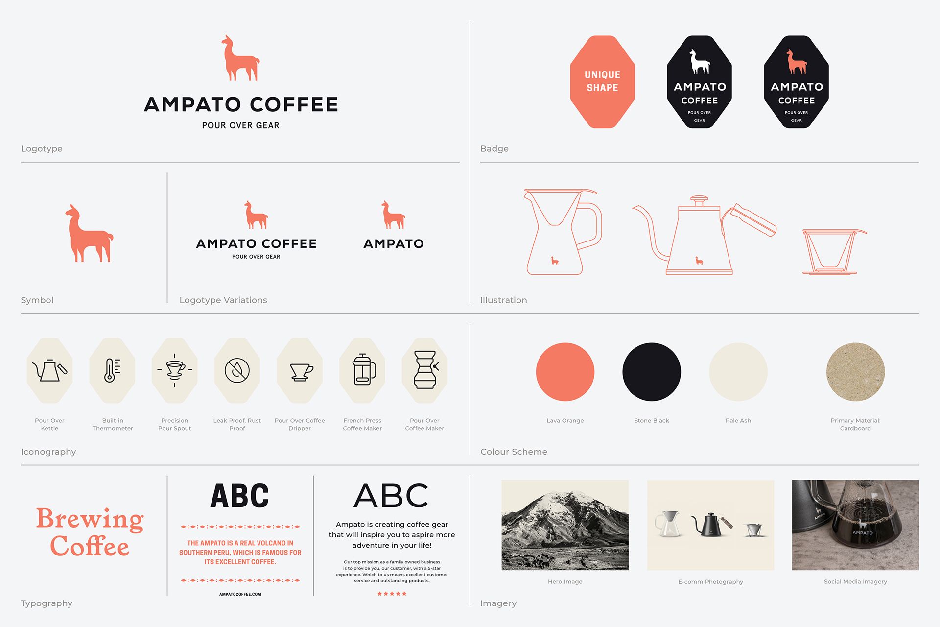
“We were commissioned to design the entire branding, and we were particularly happy about it because we like complex, multi-player jobs very much, in which the complete brand is subject to a vision or an ideology. After creating the logo and the elements of the visual identity, we could also design the packaging, the extra items accompanying it, including a thank you card, and finally the photos of the products too” – highlighted Hidden Characters founders Dániel Nagy and Péter Orbán.
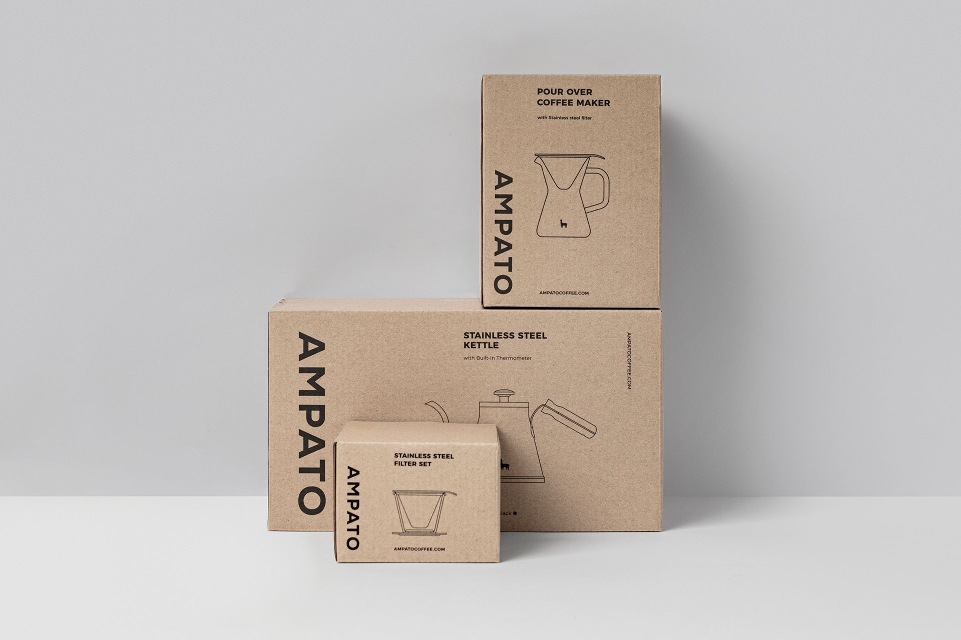
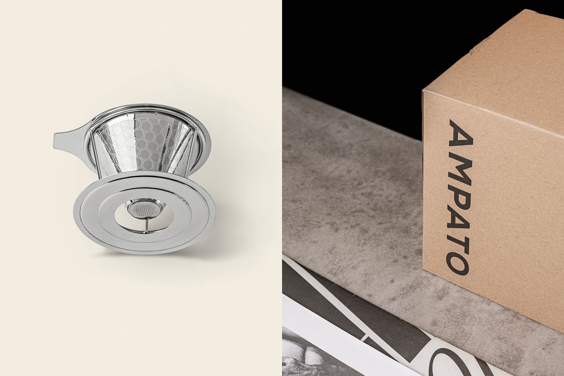
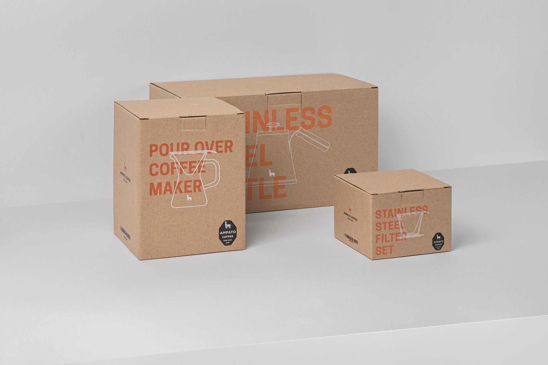
The first step of design was getting to know and understand the target audience thoroughly. According to Hidden Characters, the target group includes young and middle aged urban people who enjoy hiking and traveling, characterized by openness, a desire to get to know various cultures and who are regular guests of local new wave cafés.
“We were looking to answer the question of how to catch the attention of the products’ users , to find out what the context of their taste was. This is where the screen-printed natural cardboard surfaces, the Peruvian llama as a basic symbol and the objects used on the brand photos like the Casio quartz watch used as an accessory came from” – they added. “Another important factor was the choice of name. The name Ampato comes from a Peruvian volcano, a region where they make excellent coffee. The colors pay tribute to this region: we named the beige-ash color ‘pale ash’ for example, and the orange ‘lava orange’. Needless to say, the client fell in love with it instantly” – they continued.

If you are a fan of complex visual approaches, we have good news: Hidden Characters is also working on their new website on account of their anniversary. Until then, go and explore Péter and Dániel’s projects on the studio’s Instagram and Behance pages!
Hidden Characters | Facebook | Instagram | Behance
Ampato Coffee | Web | Instagram
art+design | Attila Kertész
A boardgame that could revolutionize education | Histheory
