In today’s selection, we collected five book designs that are sure to warm any bookworm’s heart. Let’s see!
It’s getting harder and harder to keep people’s curiosity and attention these days, as everyone is used to a constant and fast information flow that reading can’t keep up with. Children’s books are full of pictures and attractive textures to keep them interested, but books for adults tend to lack such stimuli.
The following experimental book designs give the old stories a fresh look or interior. In doing so, they open up new dimensions that contribute to a richer reading experience and help to immerse readers in the world of stories.
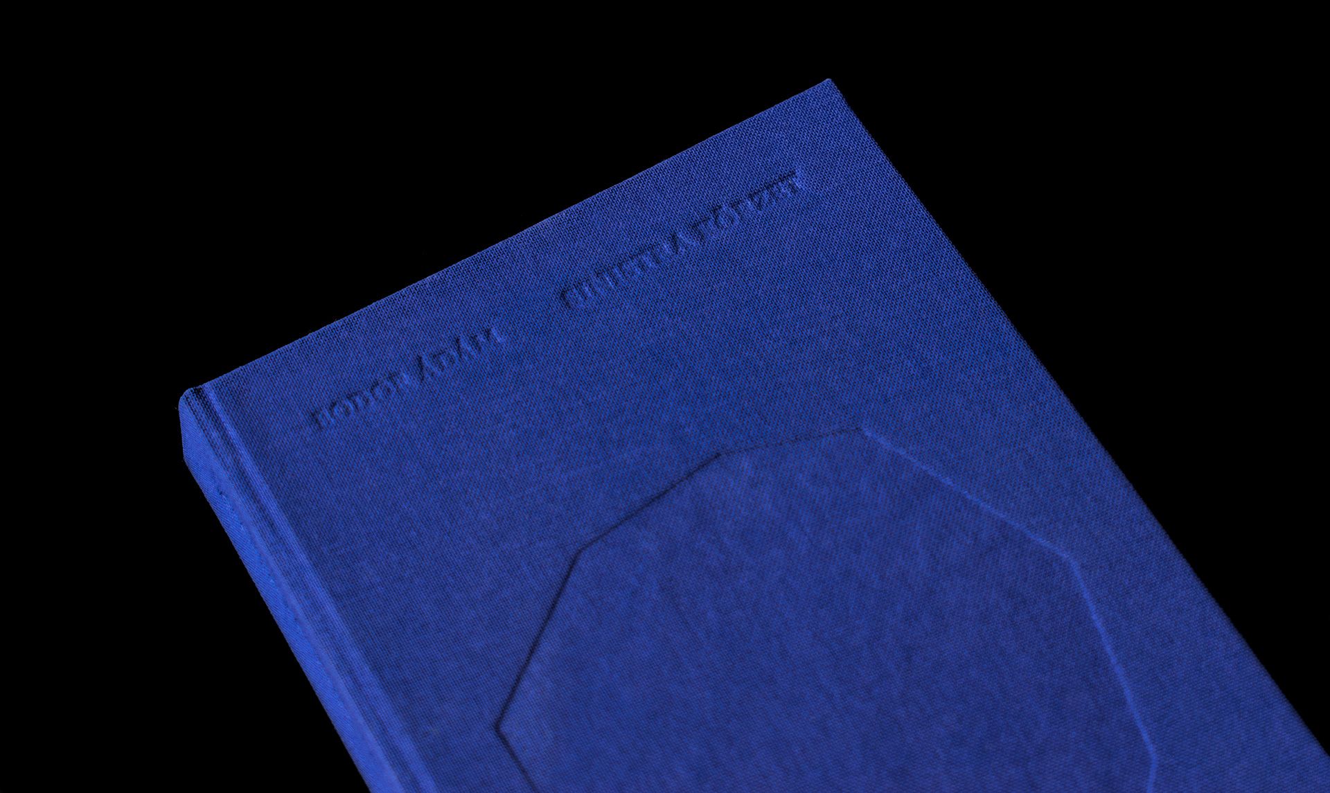
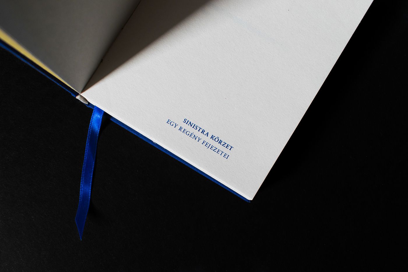
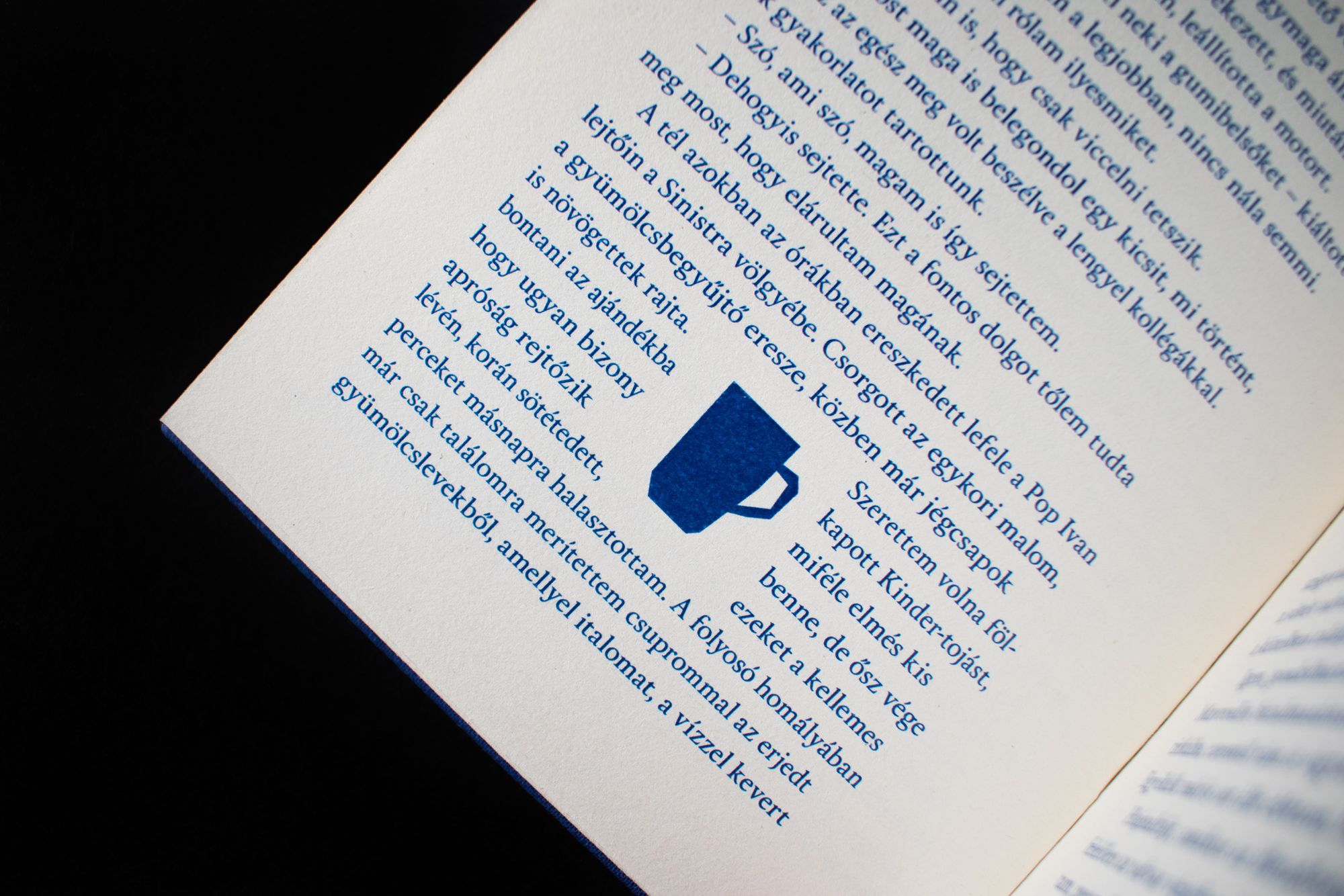
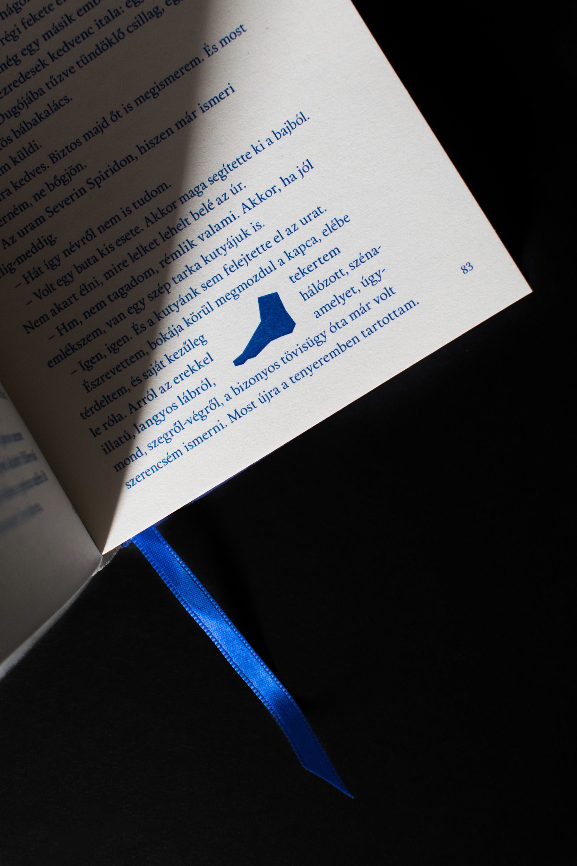
Ádám Bodor: The Sinistra Zone
Sebestyén Boér | Romania
Ádám Bodor’s novel, wrapped in a minimalist cover. The design counterbalances the absurd and surreal atmosphere of the story while fitting in perfectly.



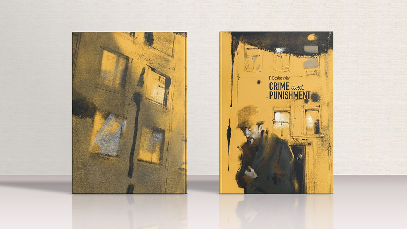
Fyodor Mikhailovich Dostoevsky: Crime and Punishment
Slava Shults | Ukraine
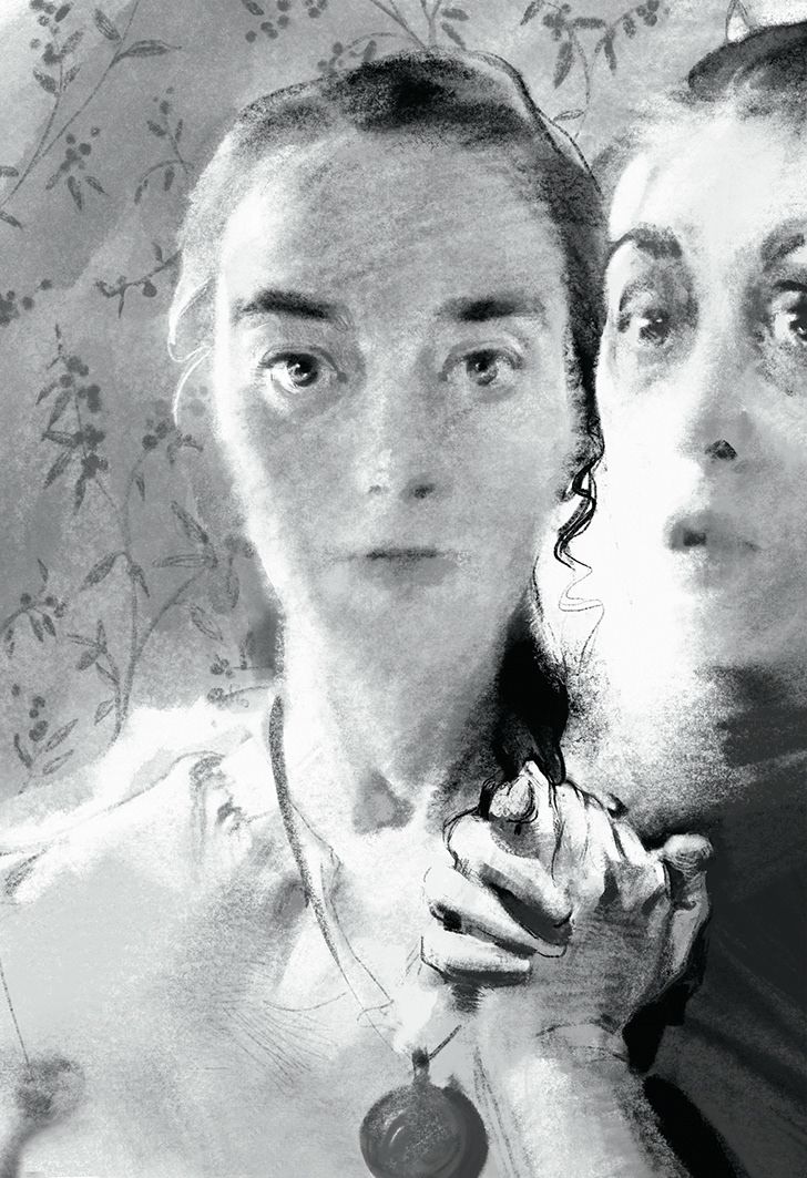
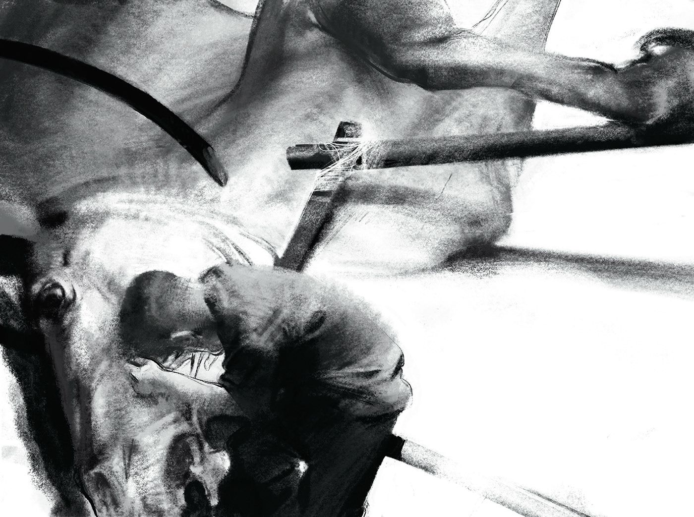
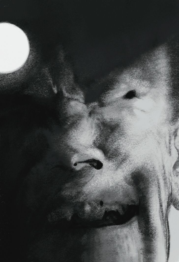
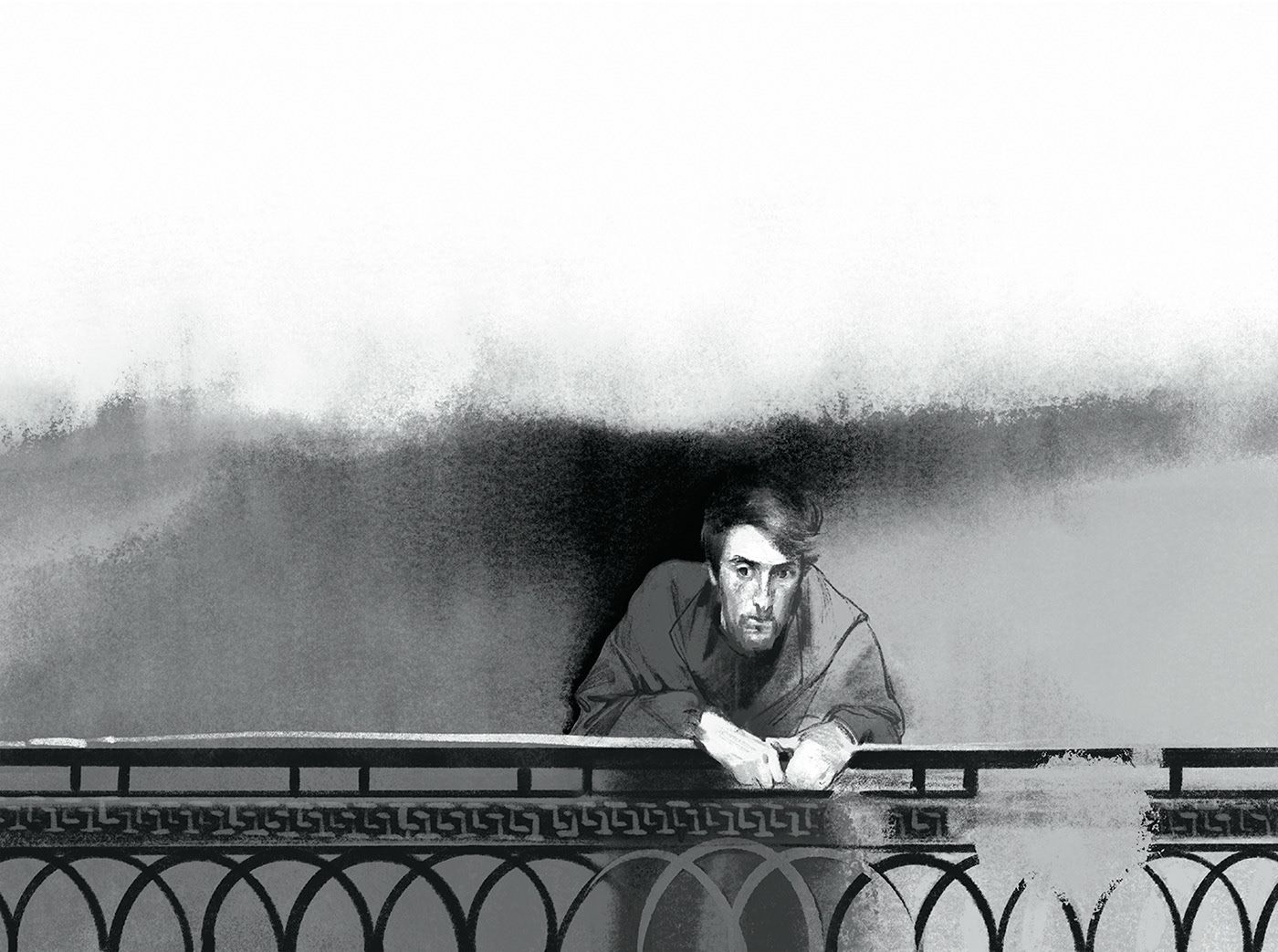
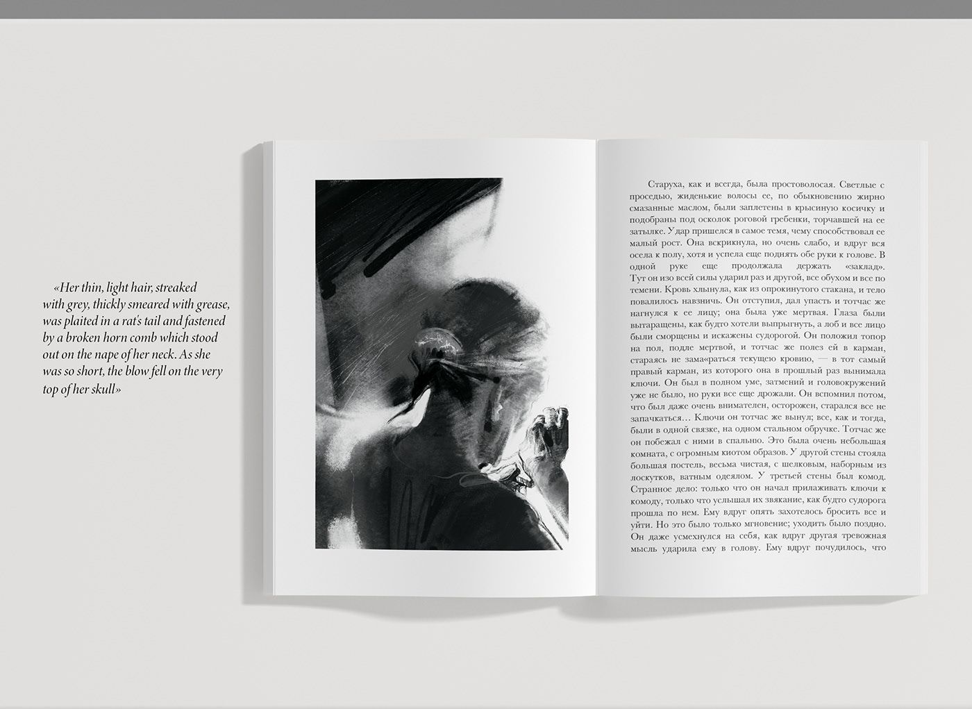
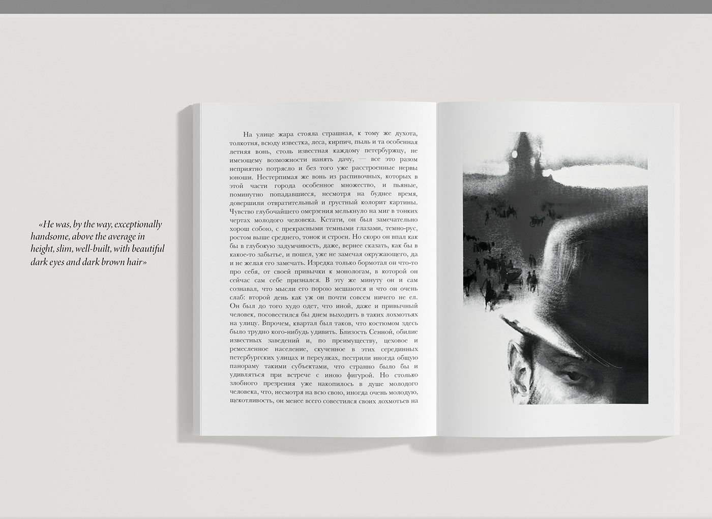
The graphic designer has spent months trying to grasp the characters in the novel and thus get closer to them. However, this is no easy task for a work of Crime and Punishment’s caliber, which reveals all of life’s struggles and presents choices we would normally prefer to avoid. The illustrations below are the result of months of coexistence.
Stephen King: IT
Max Löffler – Dominik Langegger | Austria
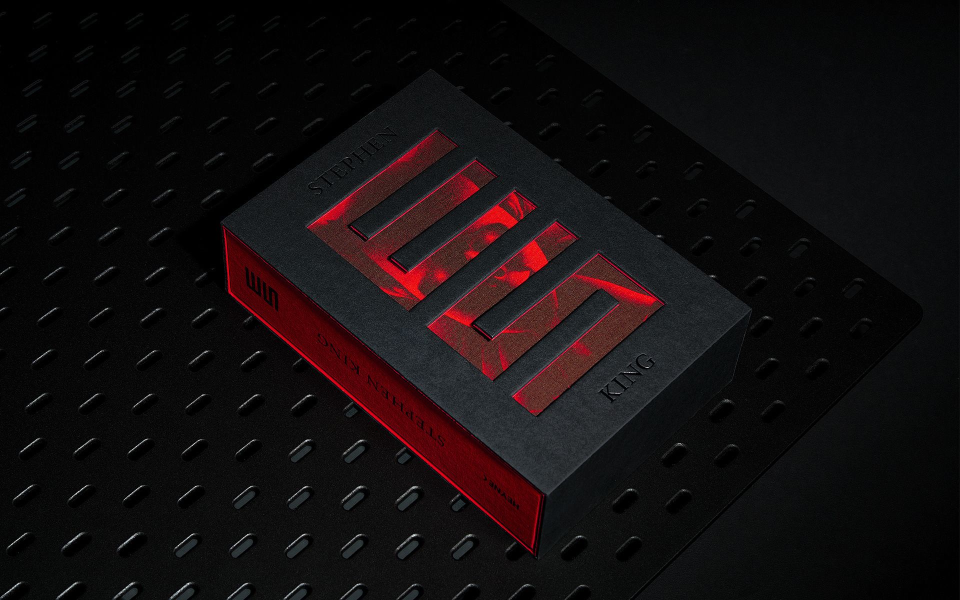
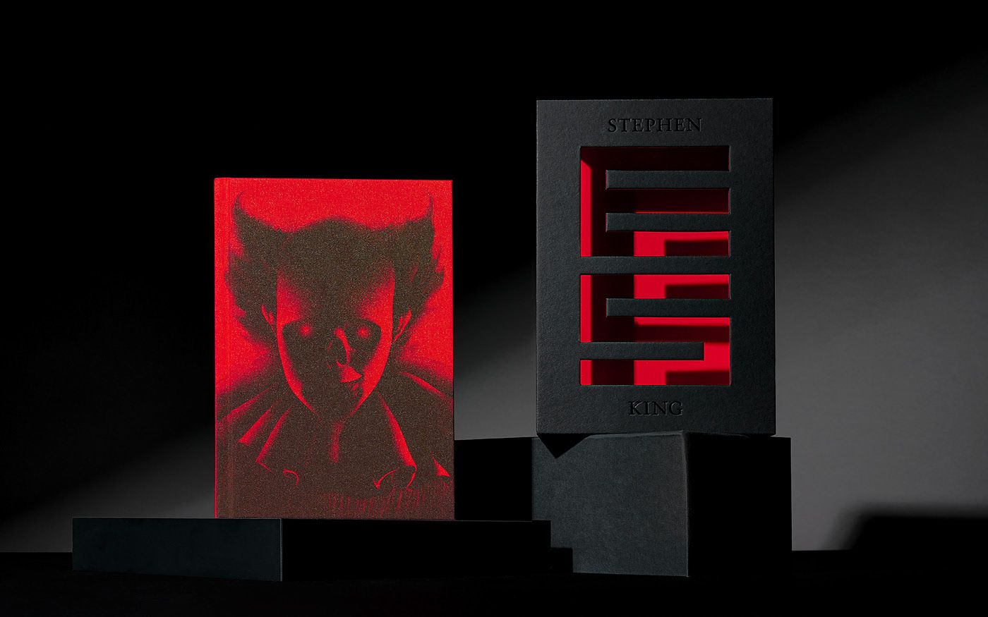
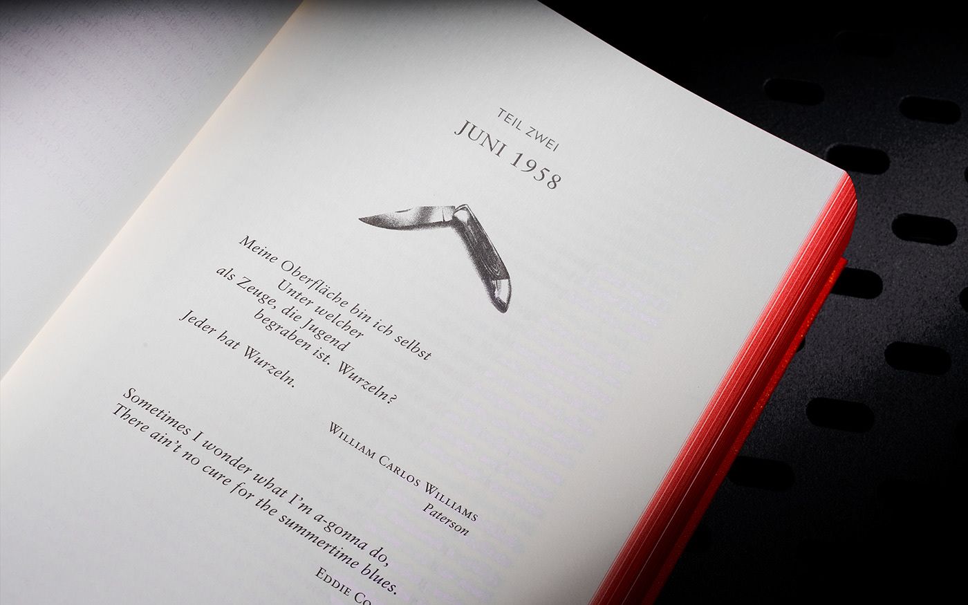
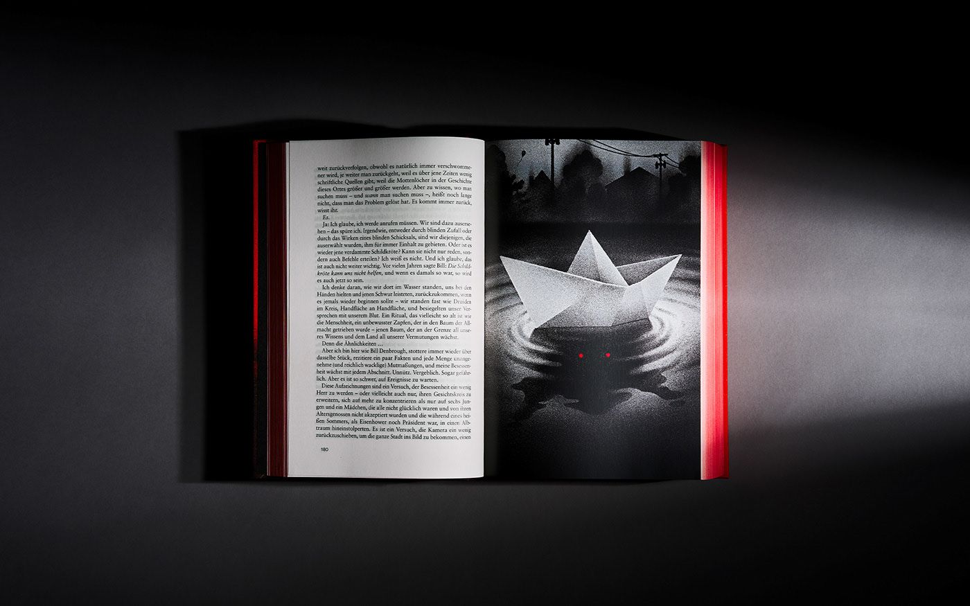
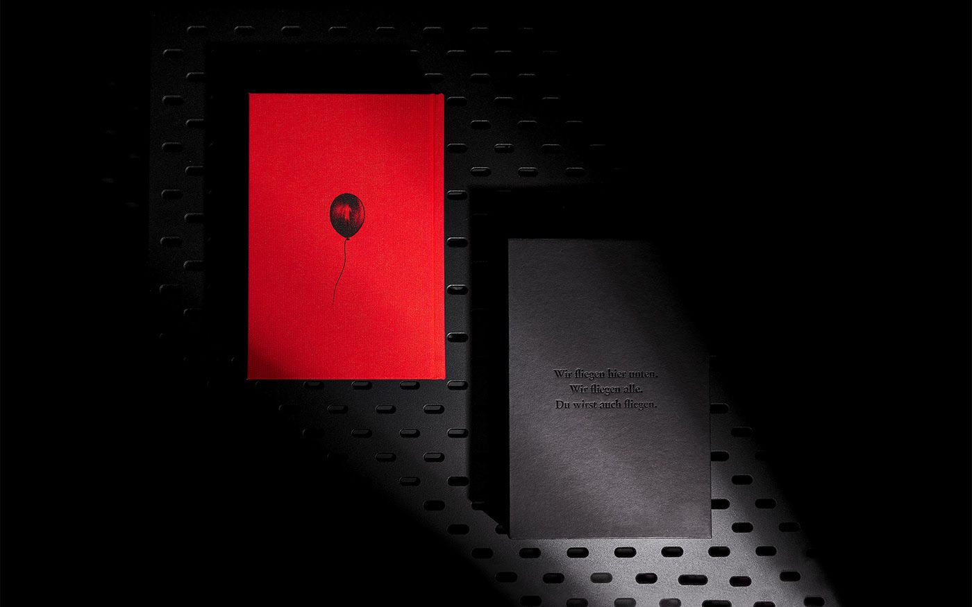
Stephen King celebrated his 75th birthday this year. To mark the occasion, a celebratory edition of one of the author’s most famous works has been published by the German publisher Heyne Verlag. The book can be slipped into a black case with the word “Es” cut out, the German equivalent of the title. From here, the book’s antagonist, Pennywise, stares at us from the sewer, just as it does in the story, preying on its victims. This volume is an odd one out in the sense that it can be ordered by the general public in German.



Photos: Matthias Tildach
Lajos Kassák: Days
Áron Borbély | Hungary
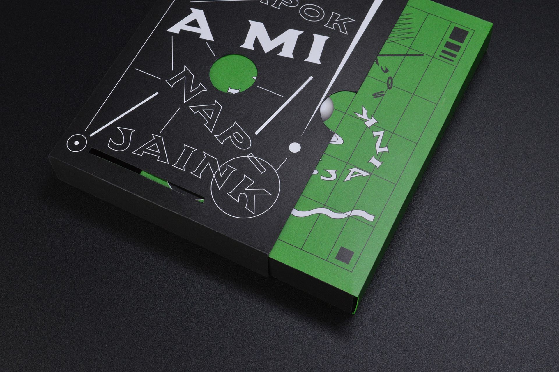
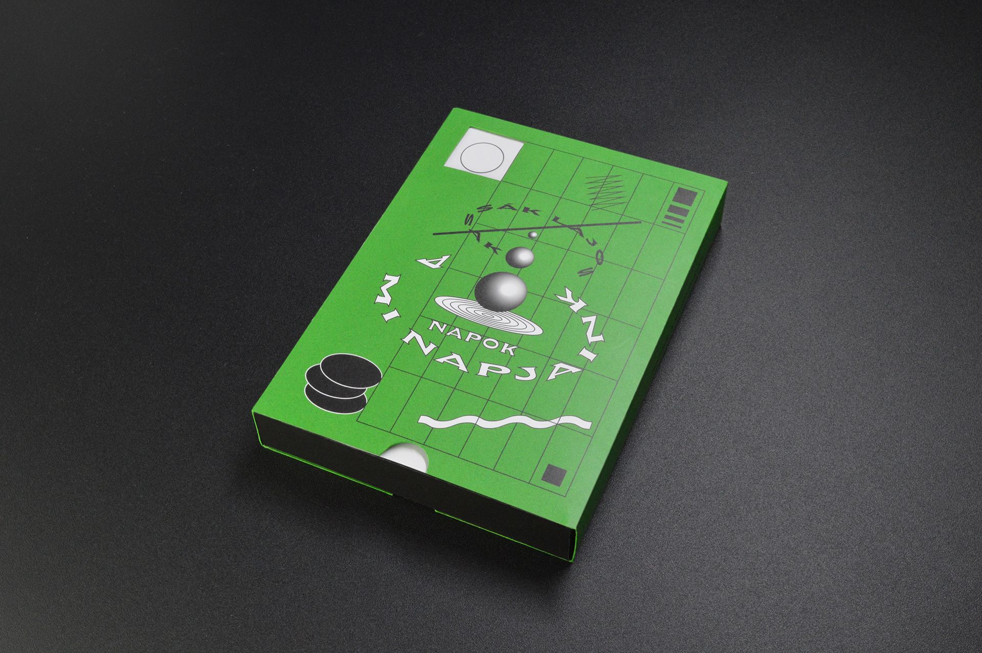
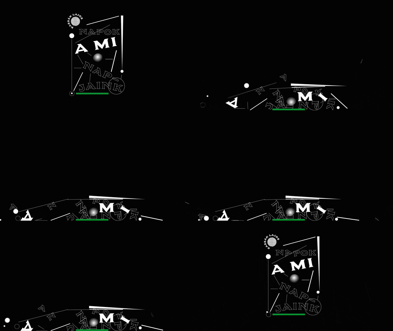
Lajos Kassák is one of the outstanding figures of the Hungarian avant-garde. On the cover, the designer wanted to represent the artist’s way of thinking in a visual and tangible way. The cover is made up of six layers, which can be seen separately in the gif below.


László Krasznahorkai: From North a Hill, from South a Lake, From West Roads, from East a River
Lilla Vincze | Hungary
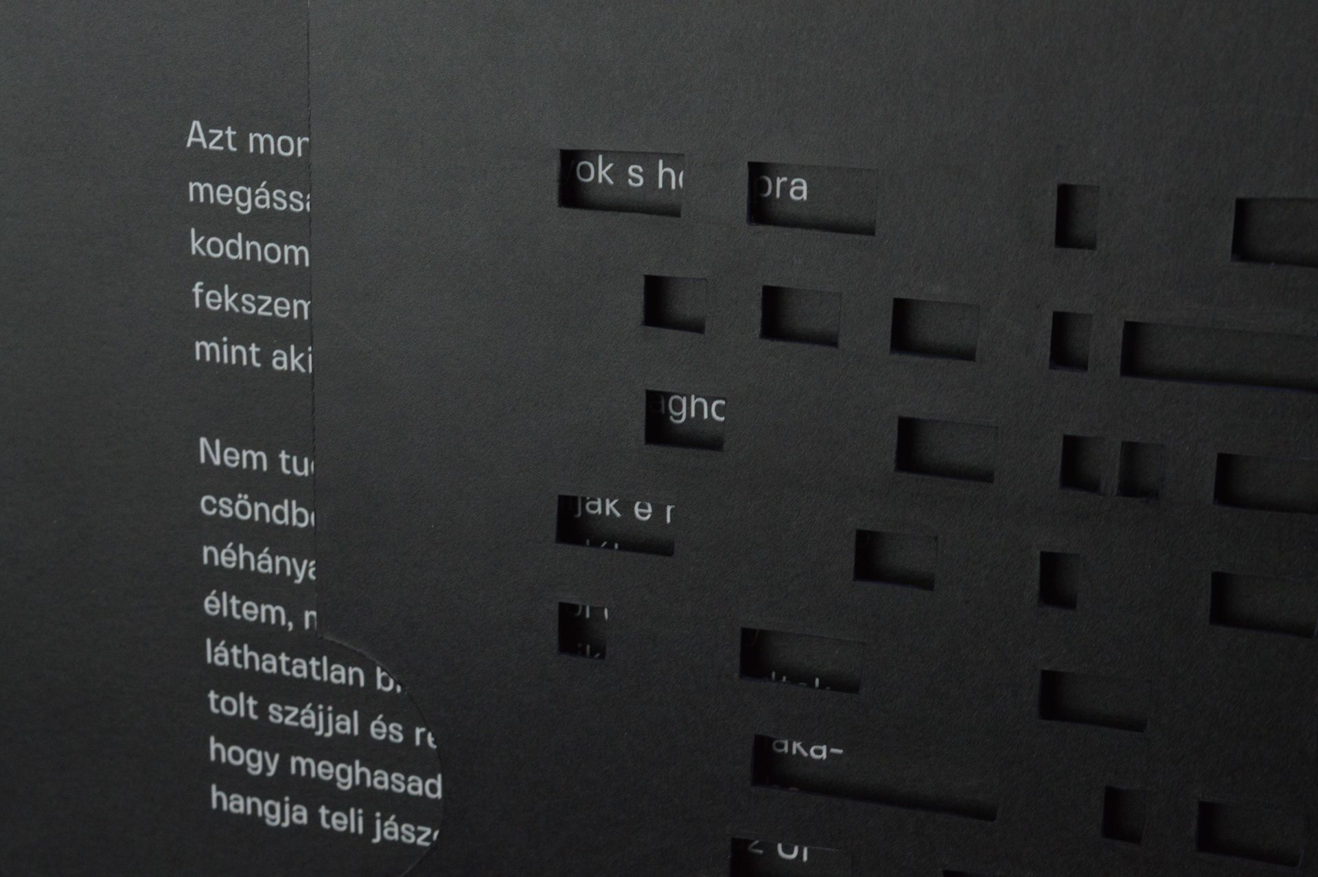
Krasznahorkai takes us to Kyoto. The serenity and melancholy that permeates his story are reflected in the book’s appearance. One of the many special features of the book is that the illustrations are hidden between two pages (see picture 2), a feature made possible by the Japanese fukuro-toji bookbinding style.


Sebestyén Boér | Behance | Instagram | Facebook
Slava Shults | Behance | Instagram | Facebook
Max Löffler | Behance | Instagram | Facebook
Dominik Langegger | Behance | Instagram | Facebook
Áron Borbély | Behance | Instagram | Facebook
Lilla Vincze | Behance | Instagram
Source: Behance

Kimchi factory to open in Poland

Ukrainian art projection covers monumental Chicago building


