We present you the star designer of the Czech, who has already designed for Belgian, Italian and French manufacturers. We will take a peak into our favorite bookstore in Prague, where one cannot only find books, but cool prints, too. We will tell you about a super colorful and sustainable clothing line, and will also reveal what “visual vulgarism” means. Finally, a completely minimalistic Nativity Scene also turns up, which is not too relevant at the moment, but it looks really cool.
Lucie Koldová Studio
Our heart skipped a beat when we found designer Lucie Koldová, and at the same time we also felt ashamed that we didn’t learn about her existence sooner. The designer swept us off of our feet in an instant with the Jean Baudrillard quote on her website, and then we were simply astonished by her rich portfolio.
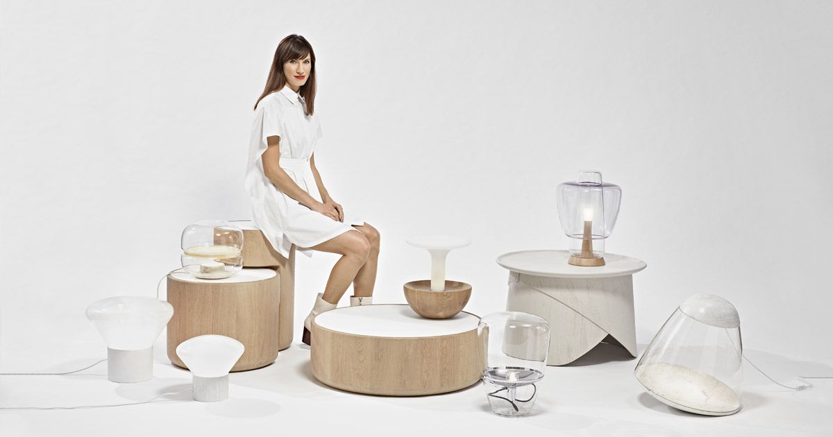
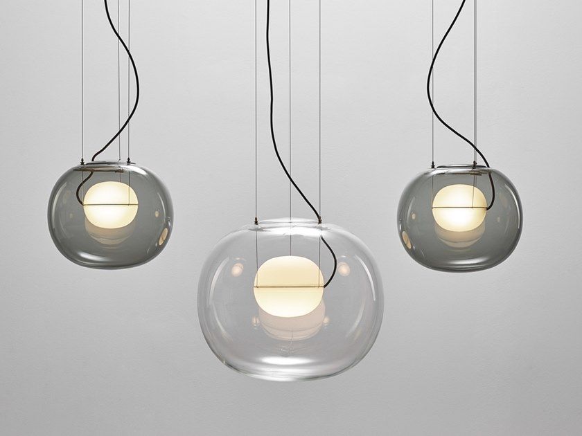
After graduation, in 2011, Lucie Koldová travelled to Paris, where she gained experience in the studio of Tel-Aviv-born artist-designer Arik Levy. The Czech designer’s name quickly grew together with the name of Brokis: the Czech company has been making special lamps since 2006, and Koldová designed the majority of the pieces that have become iconic since (as of 2014, Koldová not only functions as a designer, but also participates in developing the Brokis brand as an art director.)
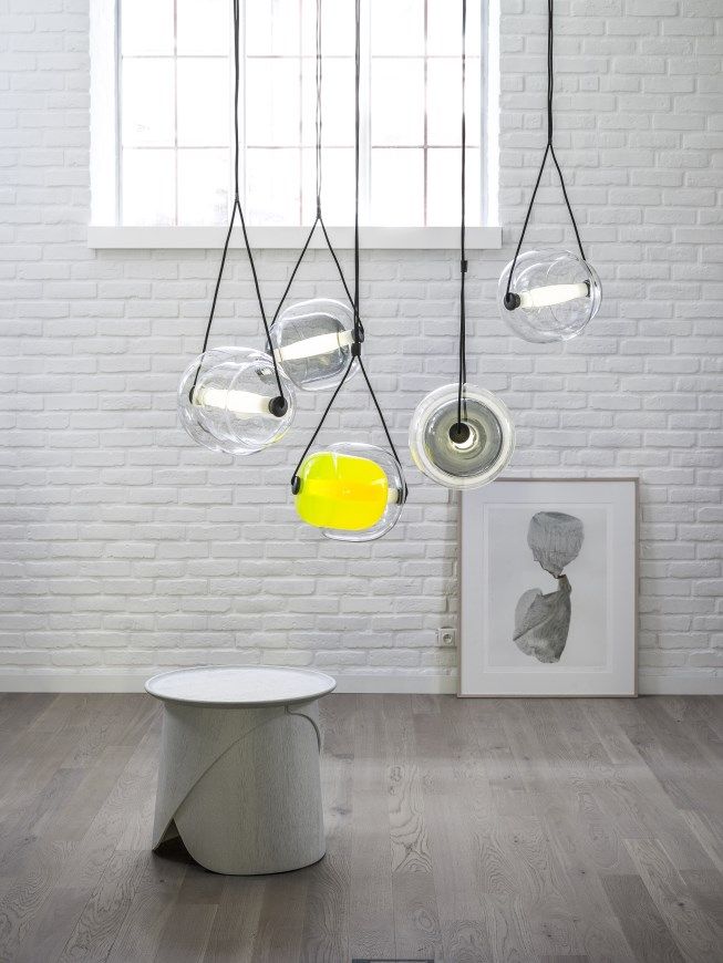
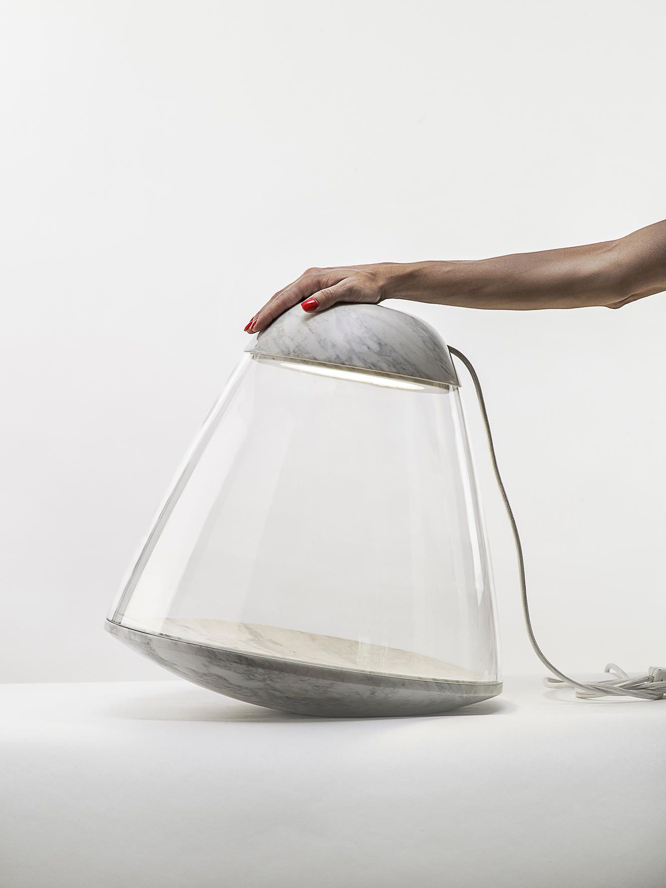
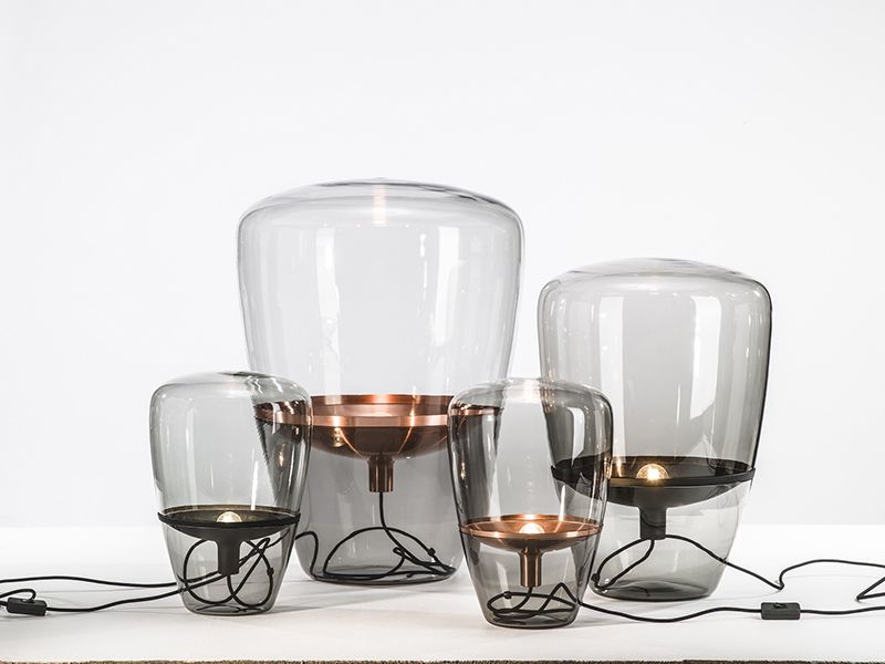
Let’s see the gorgeous objects! Here is „Apollo” as a starter: it stands out from the other lamps with its use of precious materials and special atmosphere. The lamp resembling a space probe, made with Carrara marble was co-designed by Koldová and Dan Yeffet, the same as the „Balloons” and „Muffins” lamps.
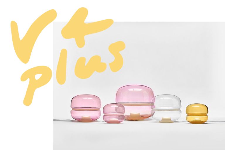
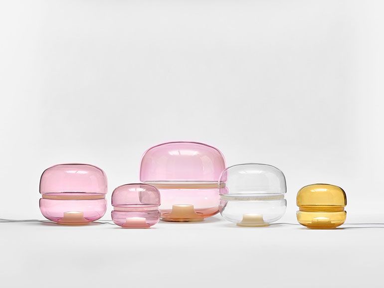
Koldová has won numerous international design awards: the last time, for example, she won the Red Dot award with her outdoor furniture set “Manta” designed for mmcité, and her lamp collection “Big One” won her the Design Plus Award. Beyond all that, our personal favorite is the brilliant “Macaron” lamp family.
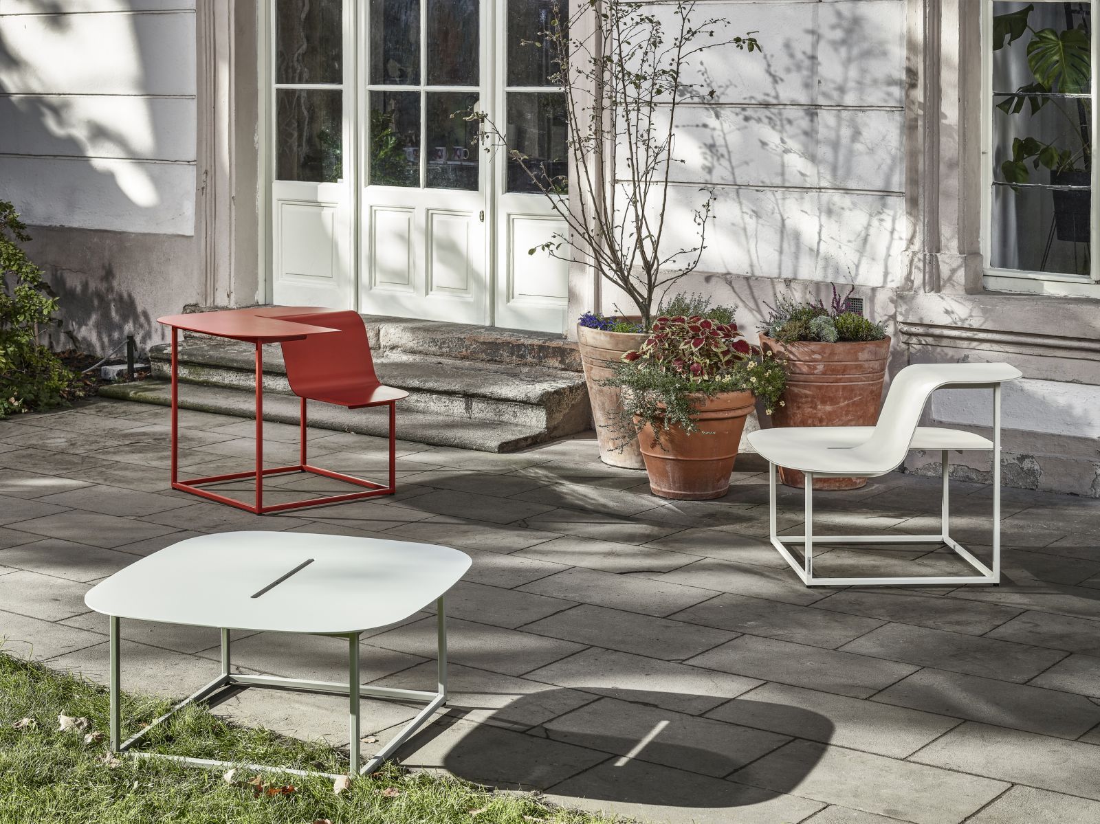
Besides Brokis, she also designed rugs for the French Chevalier Édition, you can find the previously mentioned “Apollo” lamp in the selection of the French La Chance, but the Italian Fabbian and the Belgian Per/Use are also be proud to have a Koldová piece in their palette.
Take Take Take
Allegedly, establishing your own book publishing company is not that big of a deal. At least that’s what Czech illustrator Jindřich Janíček says, who founded Take Take Take publishing company with his wife, Nikola Klímová in Prague.
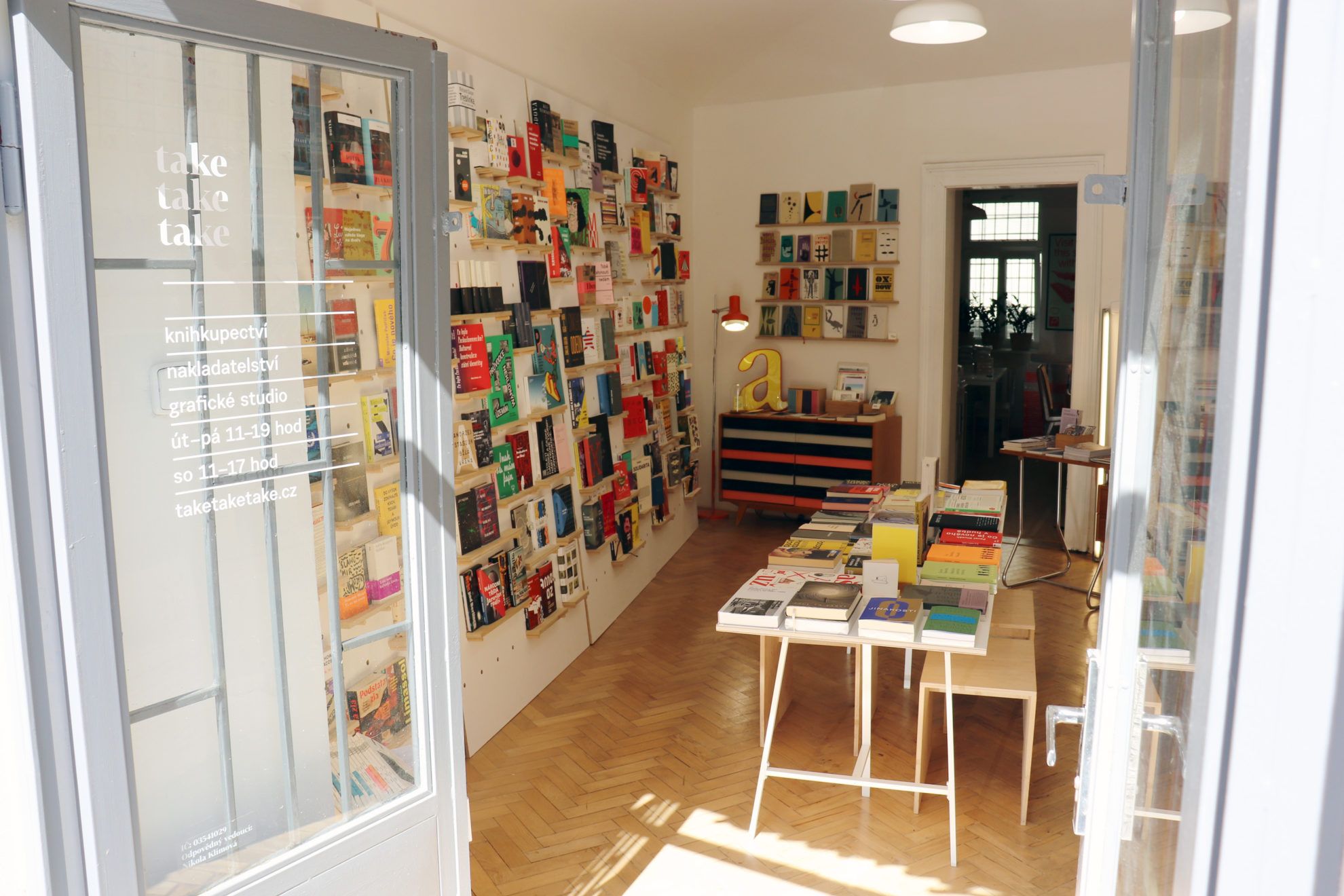
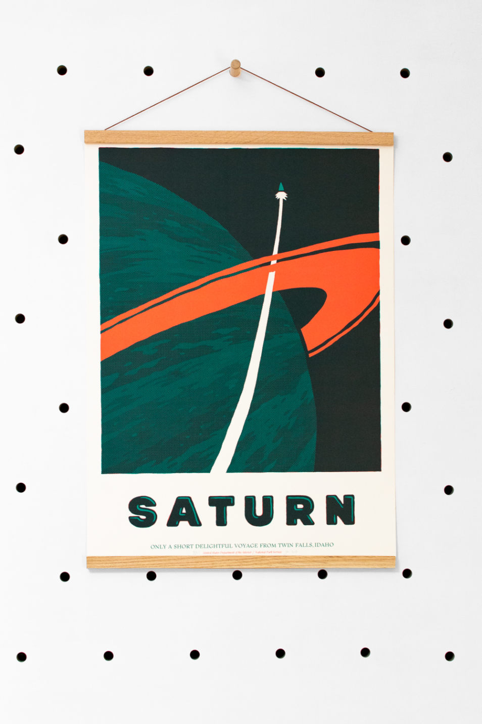
They don’t overcomplicate it: they think a book should look good, and all it takes is a good font, cool illustrations and simple but good quality paper. Their recipe must have worked out quite well, because anytime we visited Designblok in Prague, we saw lengthy lines before their booth, and, well, we also spent a good amount of time there. In addition to book publishing, they also offer graphic design services and they run a shop, too, where one cannot only purchase fantastic books, but prints designed by the duo, as well.
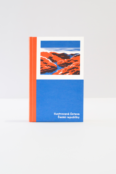
The bookshelves mostly feature works of Czech authors, but Gogol’s and Jack London’s name also surface on some covers, and you can also buy the illustrated constitution of the Czech Republic.

Tereza Rosalie Kladošová
In 2018, Tereza Rosalie Kladošová was elected the fashion designer of the year in the Czech Republic: she won the award with her collection titled „Merino Recycle”, in which she used recycled wool for creating the pieces of the collection. The designer collected the remaining materials of Czech factories, and then softened and pressed the wool fabrics with various techniques. This is how the collection showing a completely new face of wool instead of the regular knitted sweaters was born, and Kladošová brought out the best of it.
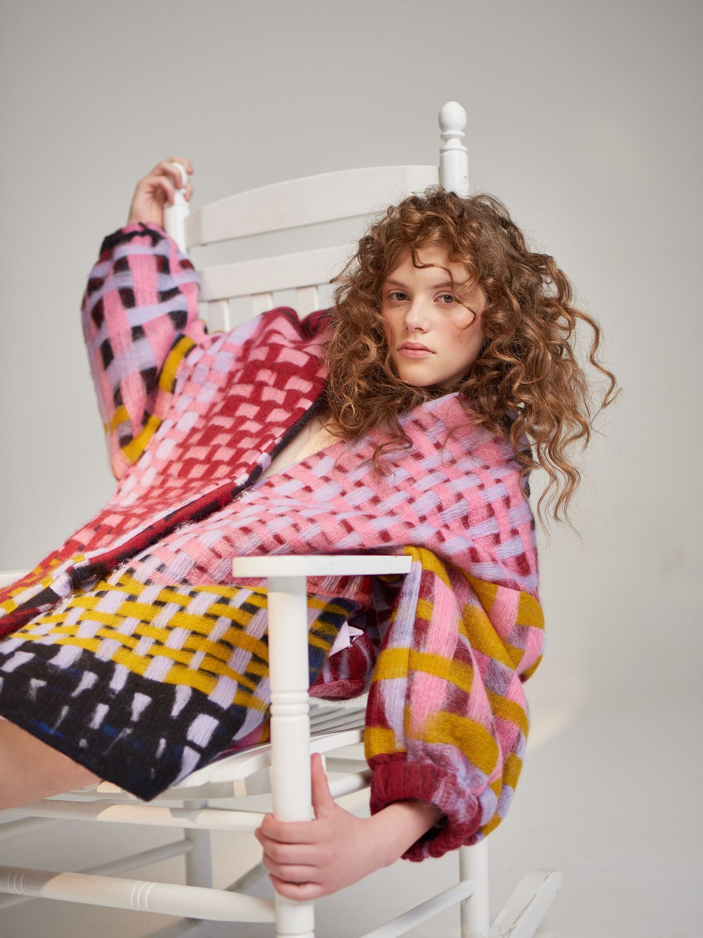
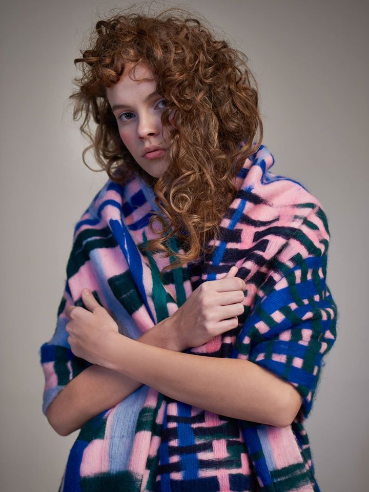
Exciting patterns, vivid colors and humor blend in the designer’s collections, who mostly approaches the raw materials as a sculptor rather than as a fashion designer, as she says, and she creates her special items building on this approach. The wool also appears on the pieces that are not made of this material: the colored Merino wool surfaces indirectly, in the form of a digital print, organized into patchwork-like patterns on each item. Her „Coloring of species” collection in 2019 was inspired by Africa, in which, in addition to the recycled wool, she also used tencel, another eco-conscious material.
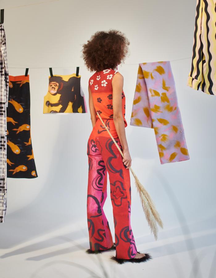
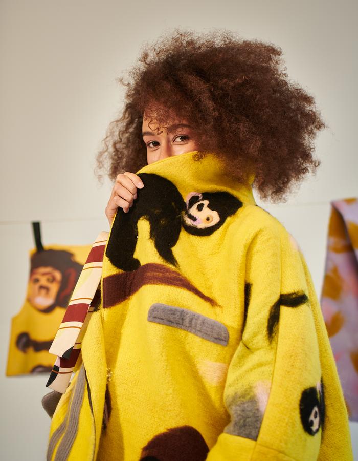
Kladošová first studied in Zlín and then at UMPRUM Prague, but she also spent some time in Jerusalem, which had an undisputable effect on her later works. Her love for wool also manifested in her projects with Anna Štěpánková: they created wool carpets and designed the shop windows of brands such as Hermés or Ambiente in Prague.
Veronika Rút Nováková
Veronika Rút Nováková is another Czech Grand Design award-winner, who earned the appreciation of the Czech design sector as a graphic designer. This does not come as a surprise to us, as we are completely blow away by her handbook on urban image. To tell you the whole story, Nováková already paid great attention to the city image of Brno in her diploma project: in her project “Visual Smog”, she approached the disturbing, misleading, many times tasteless and unreasonable street signs, graphical elements and shop windows surrounding us from a critical angle. She systematically collected and analyzed this “harmful visual content” and then drew the “visual smog” map of the selected part of Brno. The same as it is inappropriate to talk dirty with children around, the unthoughtful and many times aggressive “visual vulgarism” does not contribute to our character development either. We can totally agree with Nováková, although we simply call the masses of ugly, tasteless signs “visual environmental pollution”.
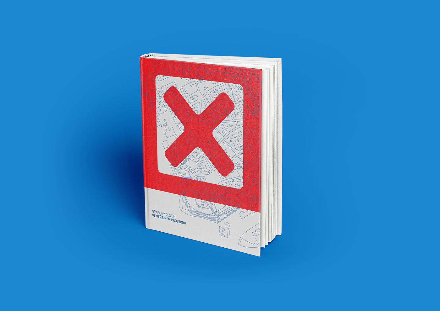
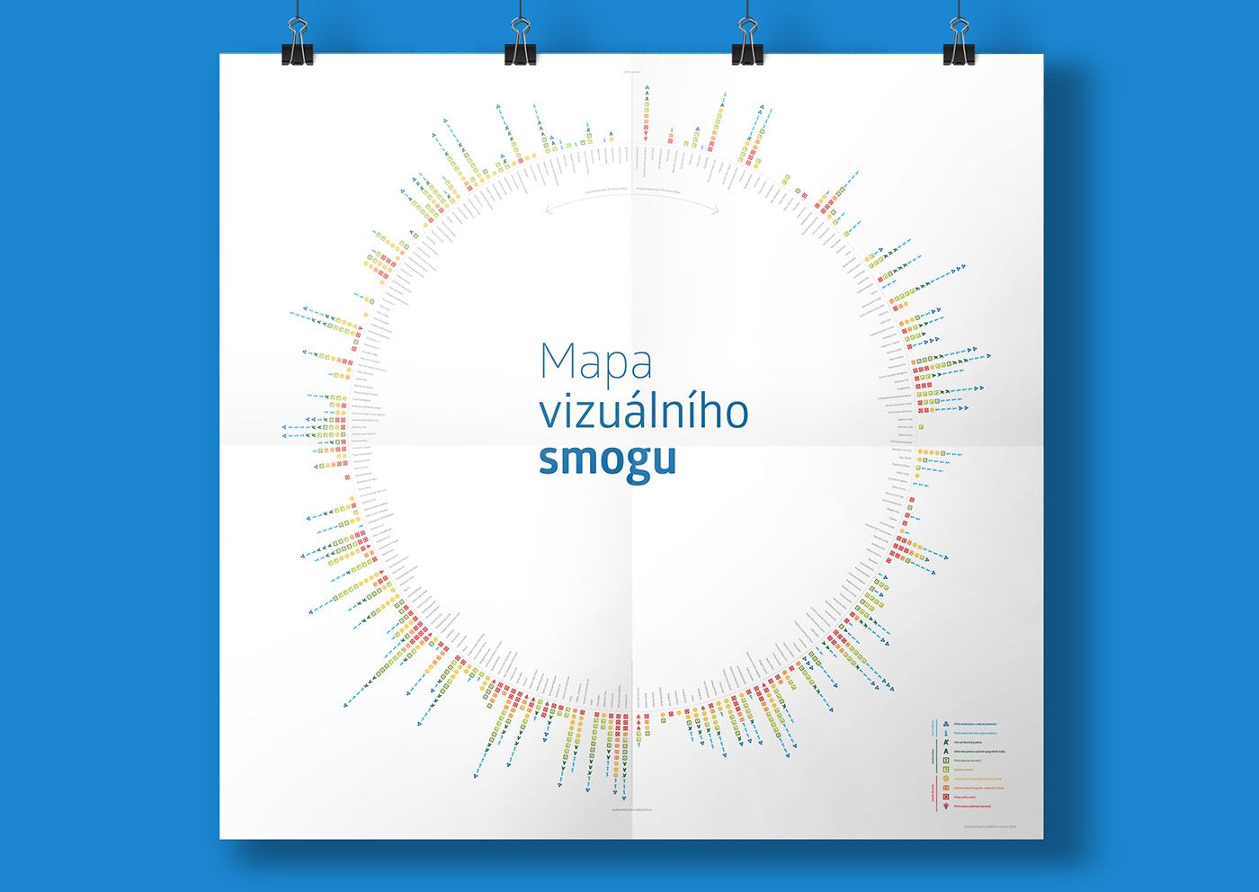
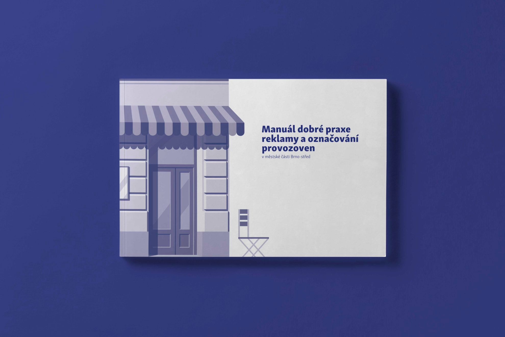
And what can a graphic designer do to prevent all this? For example, they can spend three years as a member of a professional team with compiling a handbook in cooperation with city management and monument protection authorities that can serve as a guide for tenants and shop owners who would like to communicate their businesses effectively and who would like to do all this in a stylish and compliant way, by also conforming to the buildings subject to monument protection. There were similar attempts in Budapest, too, including the Nagykörút Portal program or the slightly different yet similar in its spirit Rögtön jövök! (I’ll be right back!) program, but we have no knowledge of any publications similar to the Czech designer issued so far.
Studio Muck
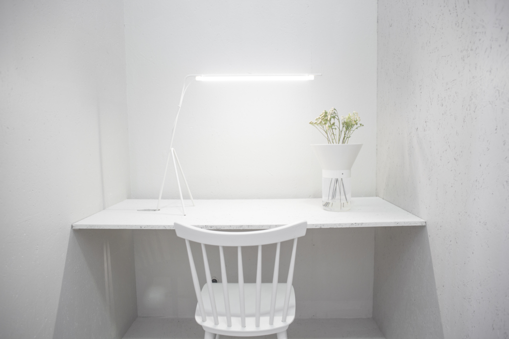
We remembered the name of Studio Muck when we visited a Designblok event in October 2017: the shining of the amazing “GRID VASE” and “LINE LAMP” completely stole our hearts. The booth of the team focusing on interior design, furniture and product design was also memorable with its clean lines, sophisticated structure and well-chosen colors.
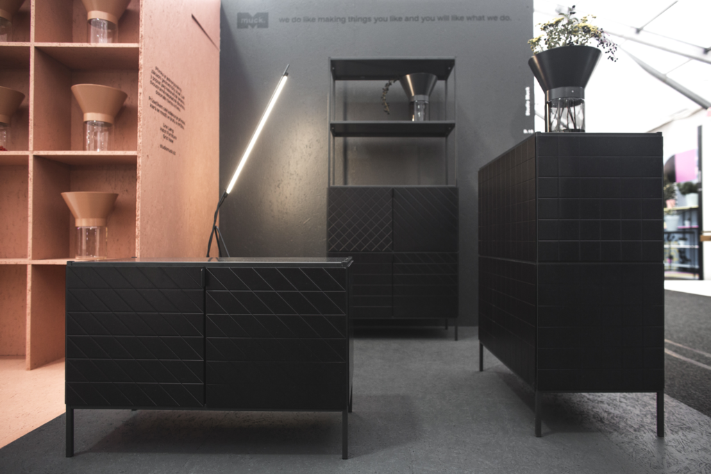
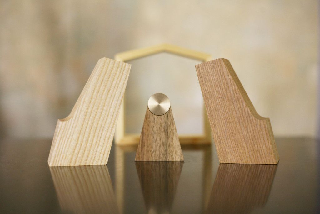
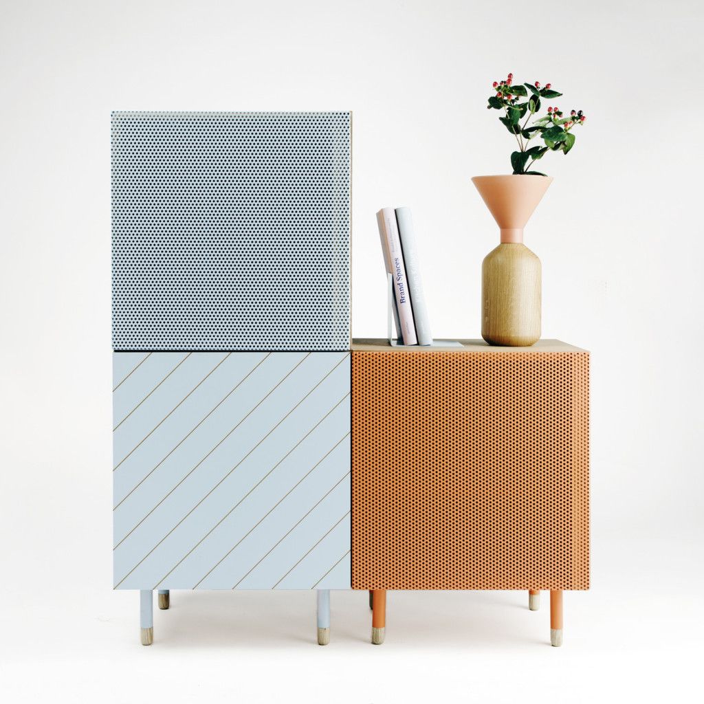
Romana Jašková, Kristýna Kouřilová and Ondřej Červený founded the studio while still in university in 2013, and they have designed many apartments, catering units and object collections since. Out of the latter, our personal favorite is the yellow brass golden pig related to the Christmas holidays (but that could work in any other occasions just as well in our opinions), and we must mention the completely minimalistic Nativity Scene as our ultimate favorite, which is less relevant at this time of the year, but it looks really cool: the Wise Men and the lambs are missing, but the Holy Family formed out of different types of wood (oak, nut, ash, maple) is still remarkable. We also love their “UNI” furniture collection: different materials, surfaces and colors meet here and we can freely vary the items as we like.
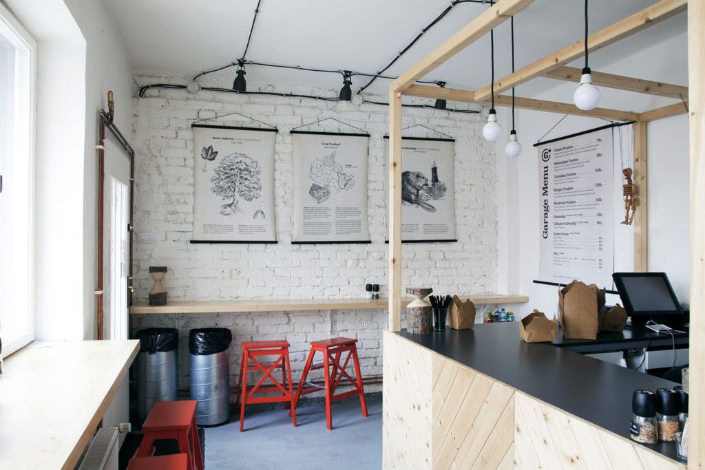
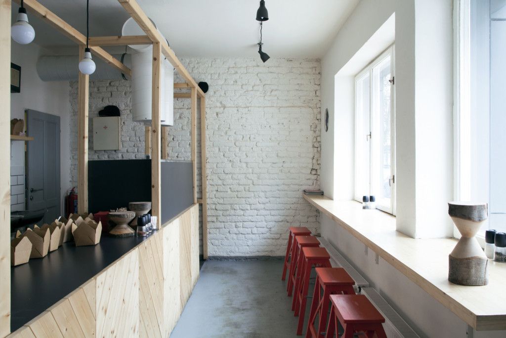
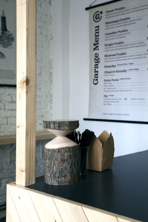
We would have bet a good sum of money that there’s no way we can order real Canadian food in Prague, but we were wrong. The Canadian national dish poutine (fries, cheese and gravy) also took up some square meters in the Czech capital. The interiors of „Garage” bistro was designed by Studio Muck: in line with the Canadian virtue, they worked with natural wood surfaces, in the spirit of puritan minimalism (don’t worry, there are some beavers, too).
In our biweekly series, we present the Czech, Slovakian and Polish brands and design spots that we consider worthy of being placed on our mental design map. It is a guide for those looking for something other than usual tourist sights.
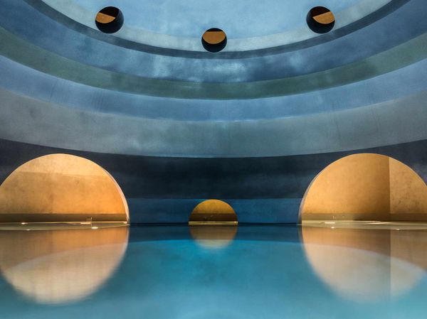
Euphoria Spa | Mystras, Greece
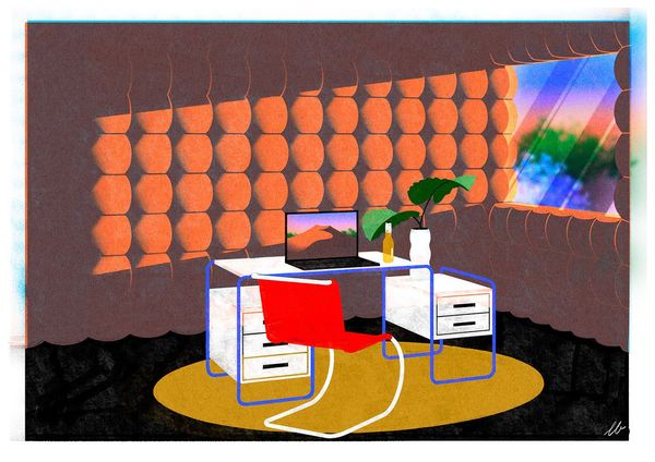
The spaces we lost - the quarantine office concept
